

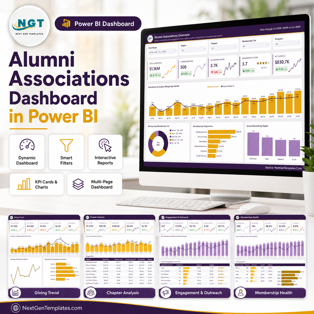
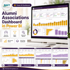
The Alumni Associations Dashboard in Power BI turns a single alumni export into five linked report pages covering giving, chapters, engagement and membership health. The sample semantic model ships with 500 alumni records, 18 months of monthly history (Feb 2025 to Jul 2026), 8 regional chapters, 5 membership tiers, 6 giving programmes and 6 outreach channels, so every card, chart and matrix is populated the moment you open it. Built and page-tested by a Microsoft Certified Professional with 15+ years in Excel and Power BI. Instant download, lifetime access, free minor updates, and direct email support at info@NextGenTemplates.Com if a measure needs reshaping. Every figure in the screenshots below is fictional sample data, included only so you can see the report working. Alumni Associations Dashboard in Power BI
Key Features of the Alumni Associations Dashboard in Power BI
- An editable semantic model, not a locked report. One Power Query import table for the alumni fact data plus a date table generated in M. Open Transform Data and you can see and change every step.
- Named DAX measures you can read. Total Donations, Total Pledged, Pledge Fulfillment %, Avg Gift Size, Major Donors, Net Surplus, Surplus Margin %, Engagement Score, Churn Rate and the rest are written as explicit measures with MoM variants, so you can trace or edit any number.
- 25 SVG KPI cards with MoM deltas. Each card carries an arrow, a percentage against the prior month and a lollipop sparkline of the trailing series – green for improvement, red for decline, applied consistently across all five pages.
- Slicers synced page to page. Date Range, Region, Chapter and Membership Tier are shared; each page then adds one slicer of its own (Program, Graduation Decade, Faculty, Engagement Channel, Membership Status). Filter once, read everywhere. Alumni Associations Dashboard in Power BI
- A hidden Details drillthrough page. Right-click a chapter bar, a cohort row or a tier and drill through to the record-level rows behind it, with the filter context carried over.
- Two custom tooltip pages. Hovering a visual returns a small formatted report rather than a raw value.
- A theme JSON you can rebrand. Colours, fonts and visual defaults live in the theme file – swap the palette to your institution’s colours and the whole report follows. Alumni Associations Dashboard in Power BI
- Sample data that behaves like real data. Uneven monthly donations, lapsed and cancelled members, and a volunteer-hours series that dips – so you can see how the visuals handle a bad month.
What’s Inside the Alumni Associations Dashboard in Power BI
Page 1 – Alumni Associations Overview
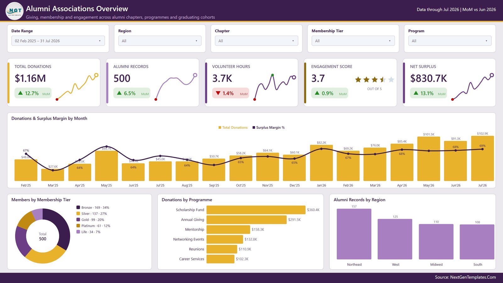
The landing page: five KPI cards (Total Donations, Alumni Records, Volunteer Hours, Engagement Score out of 5, Net Surplus), a combined column-and-line chart Donations & Surplus Margin by Month, a donut of Members by Membership Tier, a bar chart of Donations by Programme and a column chart of Alumni Records by Region. Five slicers sit above the cards.
Page 2 – Giving Trend
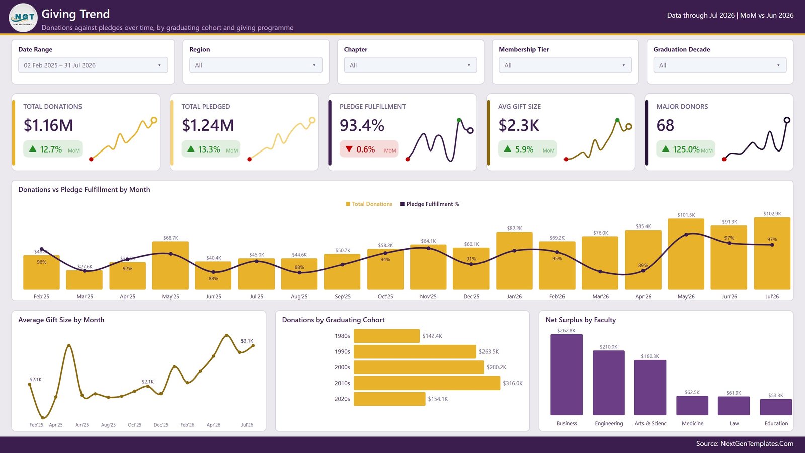
Donations measured against pledges. Cards for Total Donations, Total Pledged, Pledge Fulfillment %, Avg Gift Size and Major Donors sit above Donations vs Pledge Fulfillment by Month, a line chart of Average Gift Size by Month, a bar chart of Donations by Graduating Cohort (1980s through 2020s) and Net Surplus by Faculty. The Graduation Decade slicer is unique to this page.
Page 3 – Chapter Analysis
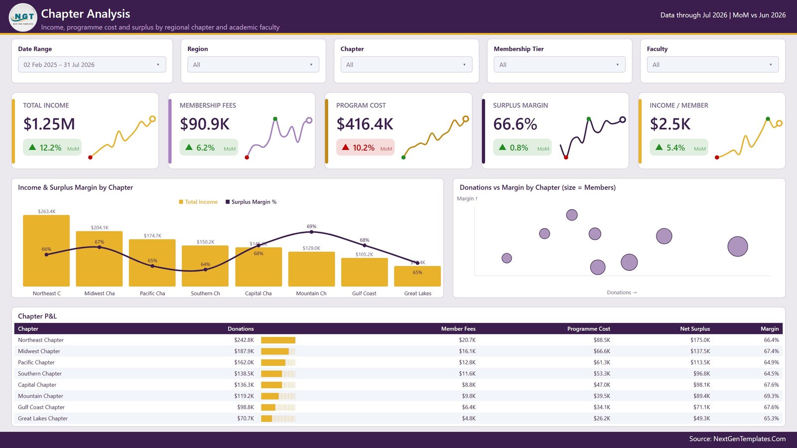
The money page. Total Income, Membership Fees, Program Cost, Surplus Margin and Income / Member sit over Income & Surplus Margin by Chapter, a scatter chart of Donations vs Margin by Chapter where bubble size is member count, and a full Chapter P&L matrix listing donations, member fees, programme cost, net surplus and margin for all eight chapters with in-cell data bars.
Page 4 – Engagement & Outreach
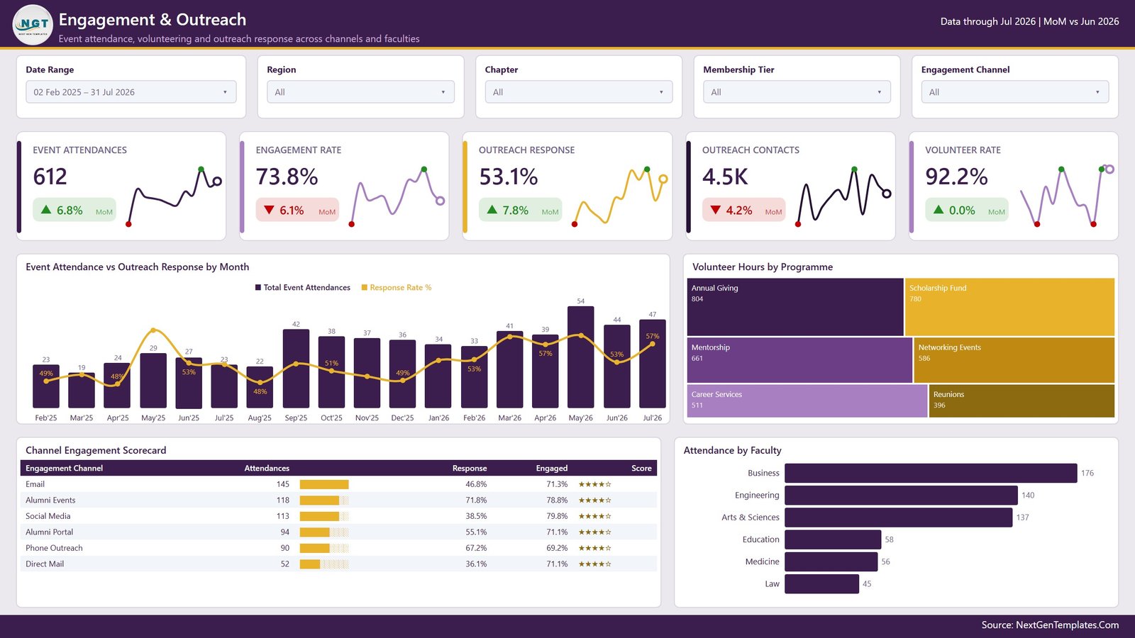
Event attendance, volunteering and outreach response. Cards for Event Attendances, Engagement Rate, Outreach Response, Outreach Contacts and Volunteer Rate; Event Attendance vs Outreach Response by Month; a treemap of Volunteer Hours by Programme; a Channel Engagement Scorecard matrix ranking Email, Alumni Events, Social Media, Alumni Portal, Phone Outreach and Direct Mail; and Attendance by Faculty.
Page 5 – Membership Health
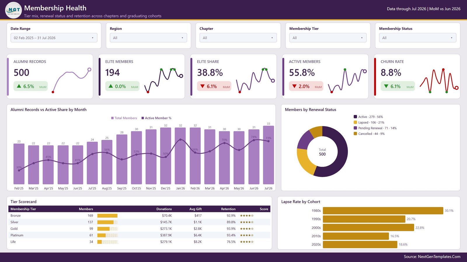
Retention. Alumni Records, Elite Members, Elite Share, Active Members and Churn Rate sit above Alumni Records vs Active Share by Month, a donut of Members by Renewal Status (Active, Lapsed, Pending Renewal, Cancelled), a Tier Scorecard matrix with members, donations, average gift and retention per tier, and Lapse Rate by Cohort.
Page 6 – Get More Dashboards
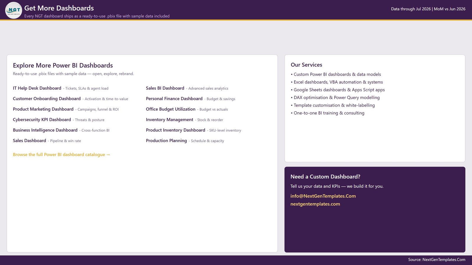
A catalogue page inside the report linking to other NextGenTemplates Power BI builds and to our customisation service. Delete it in one click if you are sharing the file internally.
Alumni Associations Dashboard in Power BI vs. an Excel Dashboard vs. a Paid Alumni CRM – Where This Fits
| What matters | This Power BI dashboard | Excel dashboard | Paid alumni CRM / SaaS |
|---|---|---|---|
| Cost | One-time purchase | One-time purchase | Annual subscription, usually priced per constituent record |
| Platform | Power BI Desktop (free) or Power BI Service | Microsoft Excel | Vendor-hosted web app |
| Setup time | Around 20 minutes to repoint the query and refresh | Around 15 minutes to paste data | Weeks – data migration plus onboarding |
| Real-time team collaboration | Yes, once published to a Power BI workspace | Via OneDrive co-authoring | Yes, built in |
| Mobile access | Yes, Power BI mobile app | Limited | Yes |
| Customisable fields and measures | Full – edit the M query, the DAX and the theme | Full – edit formulas and pivots | Only what the vendor exposes |
| Share with a link | Yes, through the Power BI Service | File sharing only | Yes |
| Year-1 cost at 5 users | The one-time price on this page | The one-time price of the Excel edition | Quoted annually by the vendor |
| Drillthrough to record level | Yes, hidden Details page with filter context | Manual – filter the data sheet | Yes |
| Owns your data | You do – the file sits on your machine | You do | The vendor hosts it |
If you already run a constituent CRM, this report is the reporting layer on top of its export. If you do not, it is a self-contained way to see giving, chapters and retention in one place.
Who This Template Is For – and Who It’s Not For
A good fit if you are: an alumni relations officer who exports a member list every month; a development or advancement analyst who needs chapter-level surplus reporting; a small university foundation with no BI seat licence budget; a chapter president reporting to a national board; or a Power BI learner who wants a finished, readable model to pull apart.
Not the right fit if you need: live two-way sync with a CRM (this reads an export, it does not write back); automated email or gift-acknowledgement workflows; payment processing, receipting or any compliance or tax function – this is a reporting file only, and you should keep those in your finance and CRM systems; or a hosted portal your alumni log into themselves. If you want the same five pages without installing Power BI, the Alumni Associations Dashboard in Excel covers the same ground. Alumni Associations Dashboard in Power BI
How to Use the Alumni Associations Dashboard in Power BI
- Unzip and open. Extract the download and open the .pbix file in Power BI Desktop (free from Microsoft). The report loads with sample data.
- Tour it first. Click through the five pages with the sample data in place so you know what each measure means before you replace anything. Alumni Associations Dashboard in Power BI
- Point the query at your export. Home > Transform Data, select the Alumni query, and change the source path to your own file. Keep the column headers as they are – the DAX measures reference them by name.
- Refresh. Close & Apply, then Refresh. Every card, chart, matrix and slicer repopulates from your data.
- Check the date table. The M date table spans the range in your data; if your history is longer or shorter, adjust the start and end parameters in that query.
- Rebrand. View > Themes > Browse for themes, and load an edited copy of the supplied theme JSON to apply your institution’s colours across all pages.
- Publish or share. Publish to a Power BI workspace for links and mobile access, or send the .pbix file as-is.
Real-World Use Cases
Priya, alumni relations manager at a mid-size university. She exports the member table on the first working day of each month, repoints the query and refreshes. The Membership Health page tells her which tiers are lapsing; she drills through to the record-level rows and hands her team a call list the same morning.
Daniel, development analyst reporting to a foundation board. He uses Chapter Analysis: the P&L matrix and the donations-versus-margin scatter answer the board’s standing question – which chapters cover their own programme cost – without him rebuilding a deck each quarter.
Maya, volunteer president of a regional chapter. She sets the Chapter slicer to her own chapter, reads Engagement & Outreach, and sees which channels her members actually respond to before planning the next reunion mailing.
Frequently Asked Questions
Do I need a paid Power BI licence?
No. Power BI Desktop is free from Microsoft and opens this file completely. A Power BI Pro or Premium licence is only needed if you want to publish the report to a workspace and share it online.
Is the alumni data in the screenshots real?
No. Every name, donation figure, chapter and percentage in the sample model is fictional, generated purely so the visuals render on first open. Replace it with your own export.
Can I add my own columns and measures?
Yes. The semantic model is fully open – add columns in Power Query, write new DAX measures, and drop them onto any page. Nothing is locked or password protected.
What file format is the download?
A ZIP containing the .pbix report file. Unzip it before opening.
Does this connect directly to my alumni CRM?
Not out of the box. It reads a flat export. If your CRM has a supported Power BI connector you can swap the source in Power Query, but the shipped configuration expects a file.
Can I use it for donor receipting or compliance reporting?
No – treat it strictly as a reporting and tracking layer. Receipting, acknowledgement and any regulatory or tax reporting should stay in your finance and CRM systems.
Do I get updates?
Yes. Minor updates to this template are free for the lifetime of the product, and support is available at info@NextGenTemplates.Com.
About the Author
Built by PK – Microsoft Certified Professional with 15+ years of Excel, Google Sheets, and Power BI experience. Founder of NextGenTemplates, reaching 300K+ subscribers across YouTube channels. Every template is hand-built and tested before release.
Explore Related Templates
- Alumni Associations Dashboard in Excel – the same five pages, built with pivot tables and slicers instead of DAX.
- Nonprofit Fundraising Dashboard in Power BI – campaign-level giving rather than membership.
- Disability Support NGOs Dashboard in Power BI – programme delivery and beneficiary reporting.
- Political Campaign Dashboard in Power BI – donations and volunteer hours in a campaign context.
- Donation Allocation and Beneficiary Dashboard in Google Sheets – a lighter, browser-based alternative.
- Browse the full Power BI Dashboard category or the whole Power BI collection.
Download the Alumni Associations Dashboard in Power BI and have giving, chapters, engagement and membership health in one refreshable report this afternoon. Instant delivery, lifetime access, free minor updates, and a reply from a real person at info@NextGenTemplates.Com if you get stuck.
Last updated: 14 August 2026.









Reviews
There are no reviews yet.