

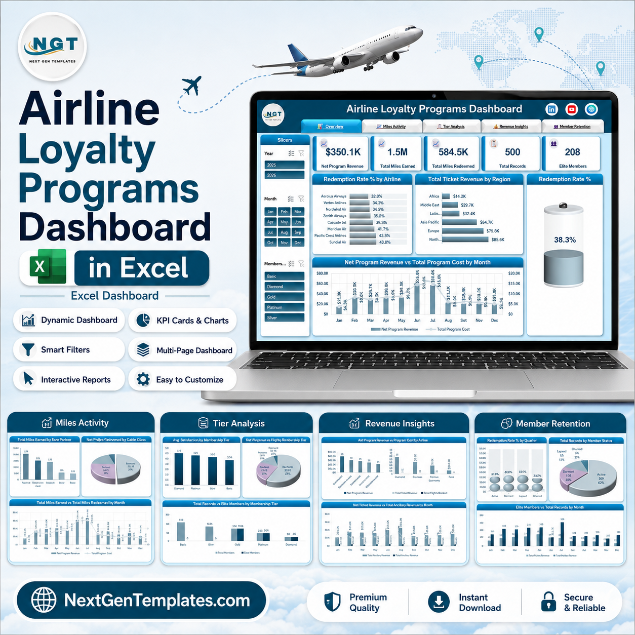
The Airline Loyalty Programs Dashboard in Excel turns a flat table of frequent-flyer activity into five linked report pages you can filter in one click. The sample build reads 500 member records and reports $350.1K net program revenue, 1.5M miles earned, 584.5K miles redeemed, a 38.3% redemption rate and 208 elite members – every figure recalculating the moment you change Year, Month, Membership Tier, Region or Cabin Class. There are no add-ins, no macros and no subscription: it is one workbook that opens in Excel 2016 or later and in Microsoft 365. Instant download, lifetime access, and a refund if the file does not open for you.
Every figure in the screenshots below is sample data shipped with the template. It is not real airline, member or revenue data.
Key Features of the Airline Loyalty Programs Dashboard in Excel
- 5 report pages with a tab strip at the top of each one, so navigation is a single click rather than a hunt through sheet tabs.
- 5 KPI cards on the Overview page: Net Program Revenue, Total Miles Earned, Total Miles Redeemed, Total Records and Elite Members.
- 5 slicers on every page – Year, Month, Membership Tier, Region and Cabin Class – each one driving all charts on that page at once.
- 18 charts across the five pages, all built as native pivot charts so they extend automatically when you add rows.
- A gauge for Redemption Rate %, which is the single number most loyalty teams get asked for first.
- Earn-partner breakdown covering Flight, Co-Brand Card, Hotel, Car Rental, Dining and Retail.
- Five membership tiers – Basic, Silver, Gold, Platinum and Diamond – reported on satisfaction, revenue share and elite-member count.
- Six regions and four cabin classes already wired into the pivot model.
What’s Inside the Airline Loyalty Programs Dashboard in Excel
Page 1 – Overview
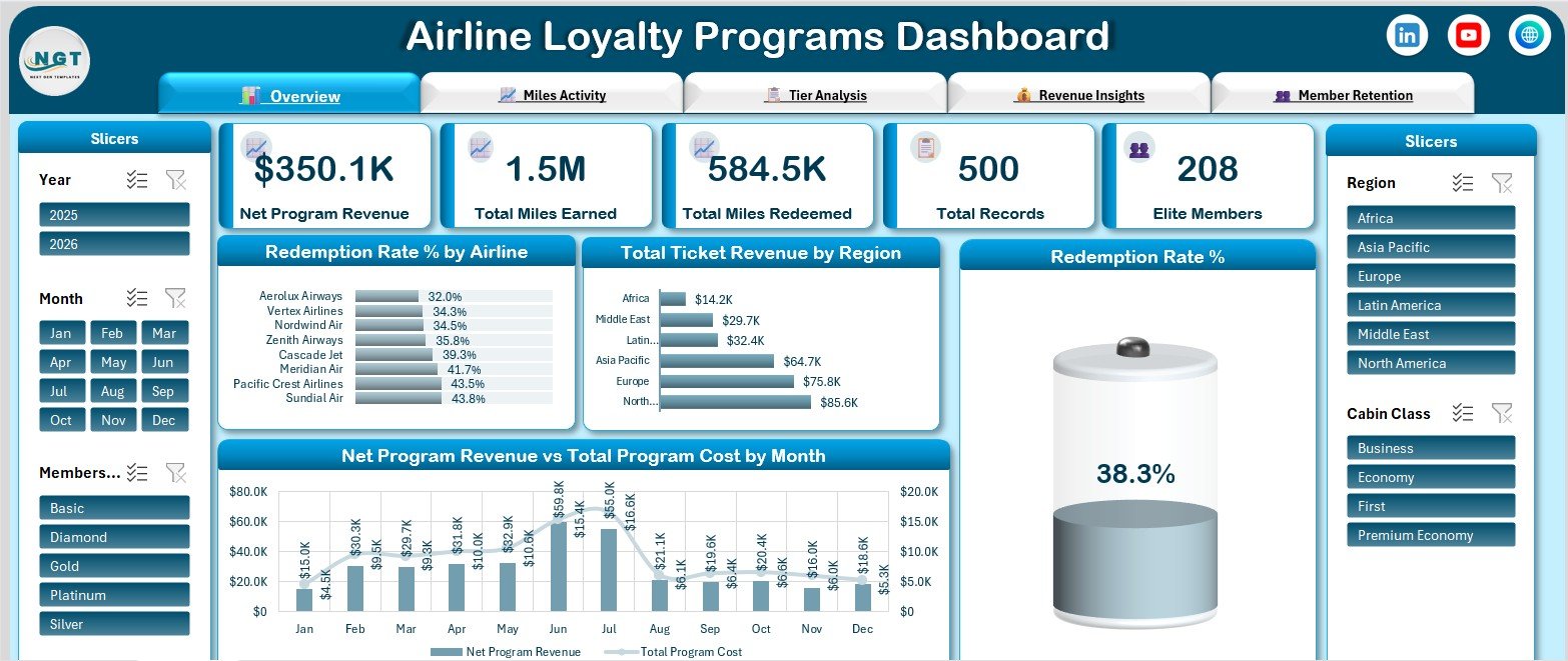
The landing page carries the five KPI cards and answers the standing questions: how much the programme is worth, how many miles went out, how many came back. Below them sit Redemption Rate % by Airline, Total Ticket Revenue by Region, a Redemption Rate % gauge and a combination chart of Net Program Revenue vs Total Program Cost by Month, so the revenue line and the cost line are read together rather than on separate sheets.
Page 2 – Miles Activity
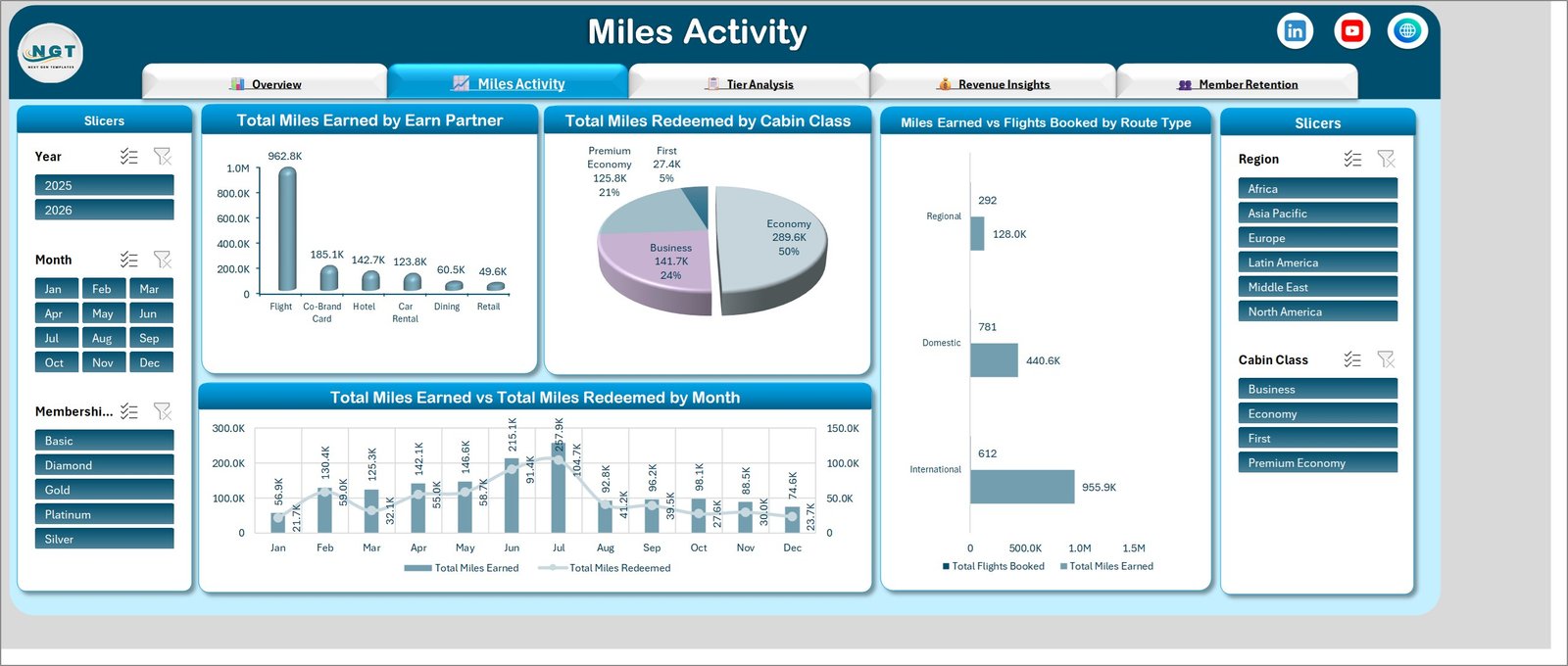
This is the earn-and-burn page. Total Miles Earned by Earn Partner ranks the six accrual sources, Total Miles Redeemed by Cabin Class shows where the miles land, Miles Earned vs Flights Booked by Route Type compares International, Domestic and Regional traffic, and Total Miles Earned vs Total Miles Redeemed by Month puts accrual and redemption on one timeline so the gap between them is visible.
Page 3 – Tier Analysis
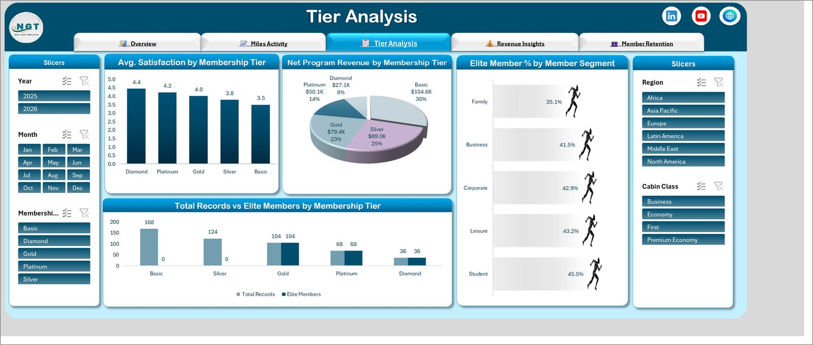
Four charts on tier structure: Avg. Satisfaction by Membership Tier, Net Program Revenue by Membership Tier, Elite Member % by Member Segment across Family, Business, Corporate, Leisure and Student, and Total Records vs Elite Members by Membership Tier. Together they show where the members are versus where the revenue is – in the sample data those are not the same tiers.
Page 4 – Revenue Insights
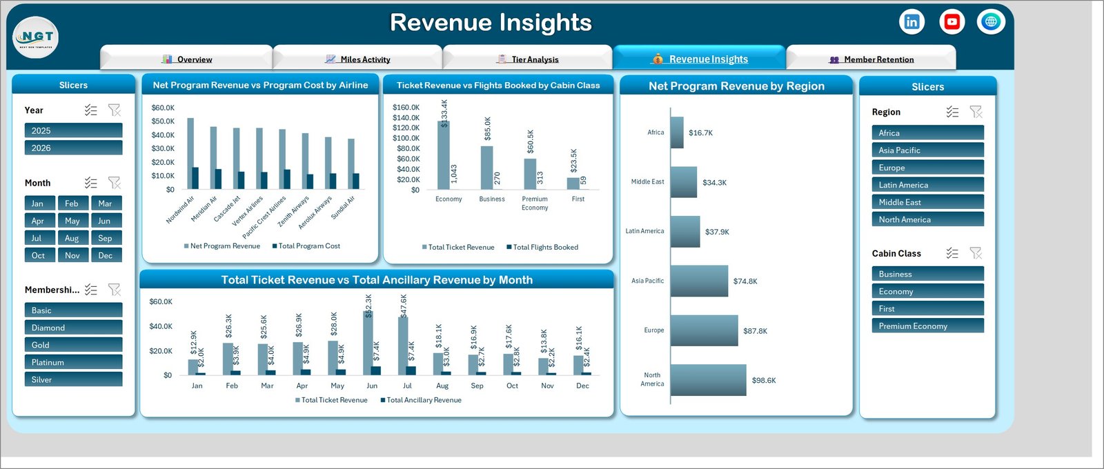
The commercial page. Net Program Revenue vs Program Cost by Airline ranks eight partner carriers on margin rather than volume, Ticket Revenue vs Flights Booked by Cabin Class pairs value against traffic, Net Program Revenue by Region ranks the six regions, and Total Ticket Revenue vs Total Ancillary Revenue by Month separates the ticket line from the ancillary line month by month.
Page 5 – Member Retention
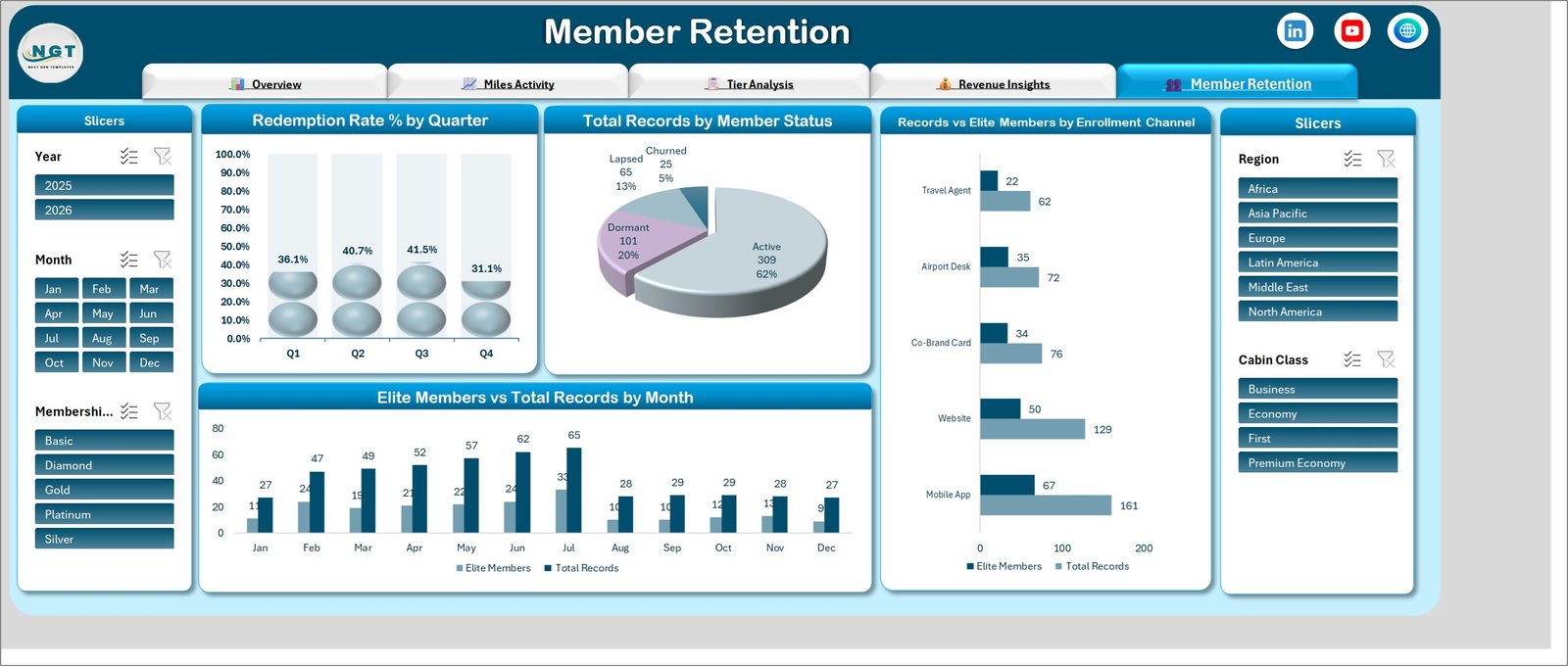
Redemption Rate % by Quarter, Total Records by Member Status across Active, Dormant, Lapsed and Churned, Records vs Elite Members by Enrollment Channel for Mobile App, Website, Co-Brand Card, Airport Desk and Travel Agent, and Elite Members vs Total Records by Month. This is the page that tells you which sign-up channel actually produces elite members instead of just producing sign-ups.
Airline Loyalty Programs Dashboard in Excel vs. Google Sheets vs. Paid Loyalty SaaS – Where This Fits
| This Excel Dashboard | Google Sheets loyalty tracker | Paid loyalty platform (Antavo, Annex Cloud) | |
|---|---|---|---|
| Cost | $17.99 one-off | Free to $30 one-off | $500-$3,000+ per month |
| Platform | Excel 2016+ / Microsoft 365 | Browser | Vendor cloud |
| Setup time | Under 15 minutes | Under 15 minutes | 4-12 weeks with vendor onboarding |
| Real-time team collaboration | Via OneDrive or SharePoint | Yes, built in | Yes |
| Mobile access | Excel mobile app, read-friendly | Yes | Yes |
| Customisable fields | Fully – it is your workbook | Fully | Vendor-defined schema |
| Share with link | Yes, once stored in OneDrive | Yes | Yes |
| Year-1 cost at 5 users | $17.99 | $0-$30 | $6,000-$36,000+ |
| Miles earn vs burn split by partner | Yes, built in | Build it yourself | Yes |
| Runs member campaigns and issues points | No – reporting only | No | Yes |
The honest summary: a loyalty platform runs the programme, this workbook reports on it. Many teams use both, exporting from the platform and reporting in Excel because that is where the finance review happens.
Who This Template Is For – and Who It’s Not For
A good fit if you are a loyalty or CRM analyst at an airline or travel group, a revenue-management team reporting programme cost against programme revenue, a co-brand card partner reviewing accrual volumes, a consultant building a loyalty review deck, or a student or job candidate who needs a realistic airline analytics portfolio piece.
Not a good fit if you need to issue points, run tier promotions or send member emails – this file does none of that. It is also the wrong tool if your source data has more than a few hundred thousand rows, if you need live API sync to a loyalty platform, or if you need per-user permissions on individual member records. And if your team lives in Power BI rather than Excel, take the Airline Loyalty Programs Dashboard in Power BI instead – same five pages, same measures, built as a PBIX.
How to Use the Airline Loyalty Programs Dashboard in Excel
- Unzip and open. The download contains one .xlsx file. Open it in Excel and click through the five tabs with the sample data still in place, so you can see what each page is meant to answer.
- Look at the Data sheet. It defines the columns the model expects – member, tier, region, cabin class, earn partner, route type, enrolment channel, miles earned, miles redeemed, ticket revenue, ancillary revenue, programme cost, satisfaction score and date.
- Paste your export over the sample rows. Match the column order. Keep dates as real dates, not text, or the Month and Year slicers will not group.
- Refresh. Data > Refresh All. Every pivot table, chart, KPI card and slicer rebuilds from your rows.
- Filter and read. Start on the Overview, then use the slicers to narrow to one region, one tier or one quarter. The slicers on each page filter that whole page.
- Keep it clean. Report on aggregates. If your export carries names, emails or card numbers, strip those columns before you paste – the dashboard needs none of them to produce any chart in the file.
Real-World Use Cases
Priya, loyalty analyst at a mid-size carrier. Her monthly pack used to be six separate pivot tables pasted into slides. She now pastes the export, refreshes, and screenshots the Overview and Revenue Insights pages. The Net Program Revenue vs Total Program Cost by Month chart is the one her director opens first, because it shows the two lines converging or diverging without any interpretation.
Daniel, co-brand card partnership manager. He filters Miles Activity to the Co-Brand Card earn partner and to one region, then compares miles accrued against the elite-member counts on the Member Retention page. That comparison tells him whether card sign-ups are converting into flying members or just into dormant accounts.
Sofia, consultant on a programme redesign. She uses Tier Analysis to show a client that the Basic tier holds the largest share of programme revenue while the Diamond tier holds the highest satisfaction – the kind of finding that reframes a tier-threshold discussion in one chart.
Frequently Asked Questions
Which Excel versions does this work in?
Excel 2016, 2019, 2021 and Microsoft 365 on Windows. It uses pivot tables, pivot charts and slicers only, so there are no version-specific formulas. Excel for Mac opens and reads it; slicer styling can differ slightly.
Are there macros in the file?
No. It is a plain .xlsx workbook. Nothing to enable, nothing your IT team needs to whitelist.
Is the data in the screenshots real?
No. All 500 records are generated sample data used to demonstrate the layout. Carrier names such as Nordwind Air and Cascade Jet are invented for the sample set.
Can I add my own tiers, regions or earn partners?
Yes. The charts are pivot-driven, so new values in your data appear automatically after a refresh. You only need to touch the workbook if you want to change chart formatting.
How many rows can it handle?
Tens of thousands comfortably. Past roughly 200,000 rows the file will feel slow, and that is the point at which the Power BI version is the better choice.
Does it store member personal data?
Not by design. Every chart runs on aggregates – tier, region, channel, cabin class, dates and amounts. You do not need to load names, emails or card numbers, and we recommend you do not.
Do I get updates?
Yes. Improvements to this file are free for anyone who has bought it, and the download link in your account stays live.
About the Author
Built by PK – Microsoft Certified Professional with 15+ years of Excel, Google Sheets, and Power BI experience. Founder of NextGenTemplates, reaching 300K+ subscribers across YouTube channels. Every template is hand-built and tested before release.
Explore Related Templates
- Airline Loyalty Programs Dashboard in Power BI – the same five pages rebuilt as a PBIX report.
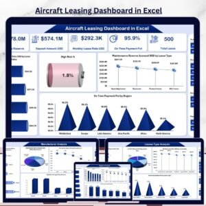
- Aircraft Leasing Dashboard in Excel – fleet and lease-portfolio reporting.
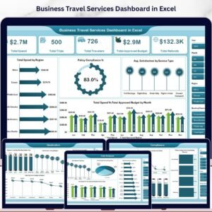
- Business Travel Services Dashboard in Excel – corporate travel spend and supplier mix.
- Airports Dashboard in Excel – passenger, movement and terminal metrics.
- Airline Catering Dashboard in Excel – meal cost and service-quality reporting.
- Loyalty Programs Management Dashboard in Power BI – a cross-industry loyalty view.
- Browse the full Excel Dashboard category and the Power BI Dashboard category.
Get the Airline Loyalty Programs Dashboard in Excel
One workbook, five pages, five slicers and every loyalty metric your monthly pack asks for – for less than the cost of one hour of the analyst time it replaces. Add it to your cart and the download is available immediately.
Last updated: 14 August 2026.

















Reviews
There are no reviews yet.