The ERP Systems Dashboard in Power BI is a ready-to-use PBIX report for anyone who has to explain an ERP programme to the people funding it. It covers implementation budget and actual cost, user adoption, transaction volume, system availability and support performance across seven ERP modules, five business units and five regions. Open the file, point it at your own workbook, and the five analysis pages redraw against your numbers.
This is a reporting template over data you supply. It does not connect to an ERP system. There is no connector, no API, no live sync and no automatic import of any kind – you refresh it from an Excel workbook that you control. The file opens populated with 500 rows of clearly fictional demo data, so every visual is readable before you touch it.
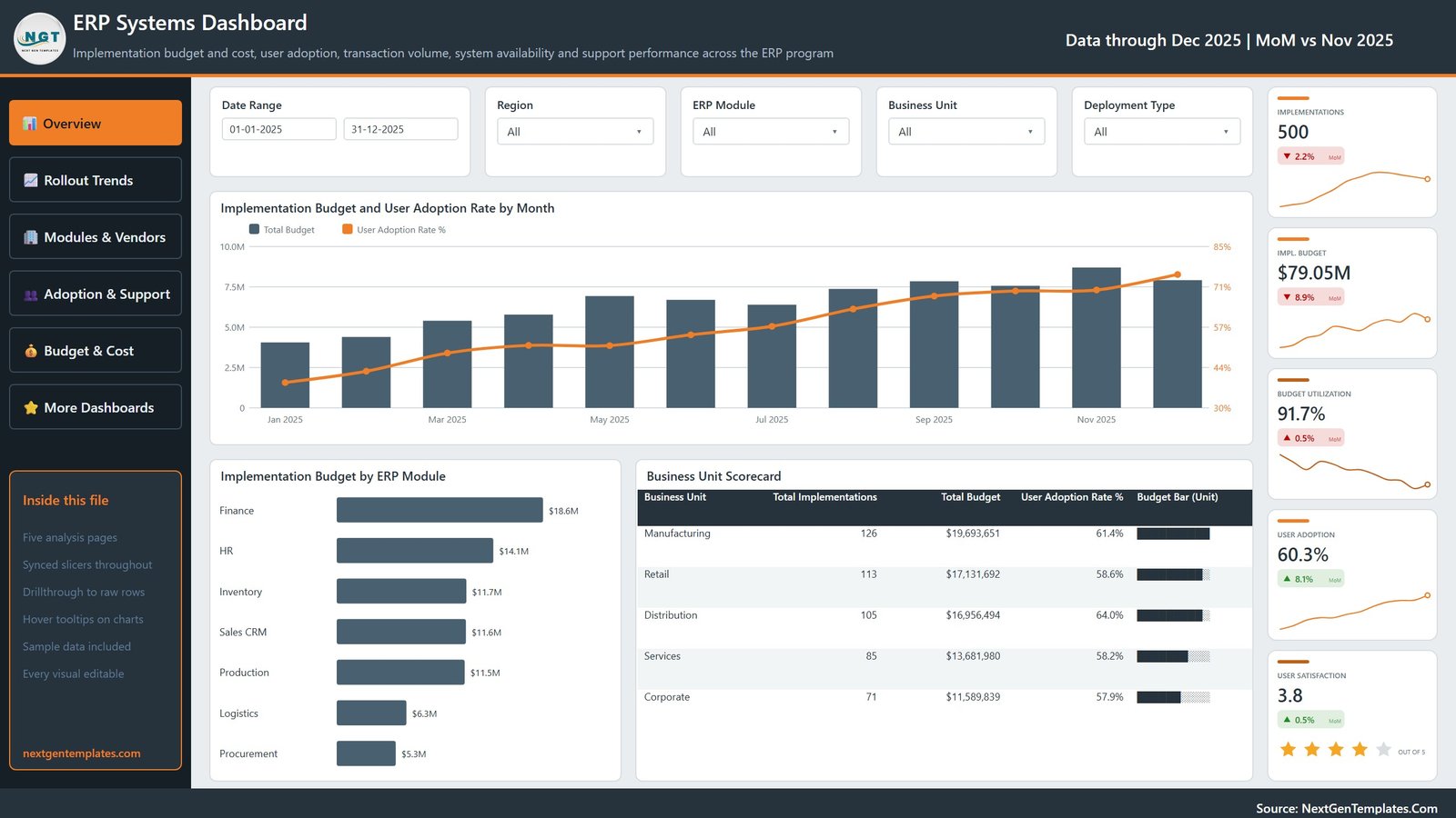
ERP Systems Dashboard in Power BI: the five analysis pages
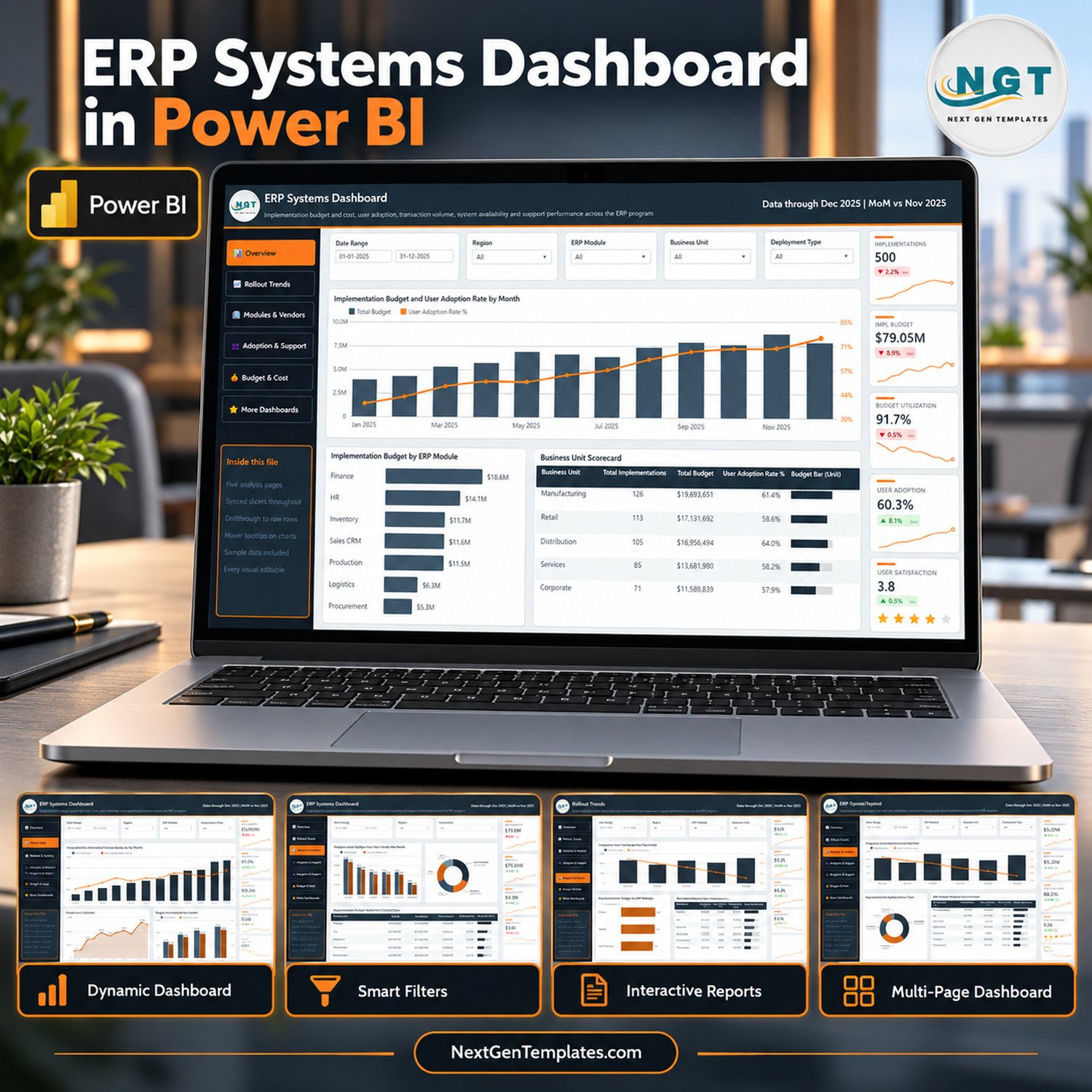
Each analysis page carries the same left-hand navigation, the same five synced slicers and its own row of five KPI cards with month-on-month movement indicators and sparklines.
- Overview – headline programme position. KPI cards for implementations, implementation budget, budget utilization, user adoption and user satisfaction, above Implementation Budget and User Adoption Rate by Month, Implementation Budget by ERP Module and a Business Unit Scorecard table.
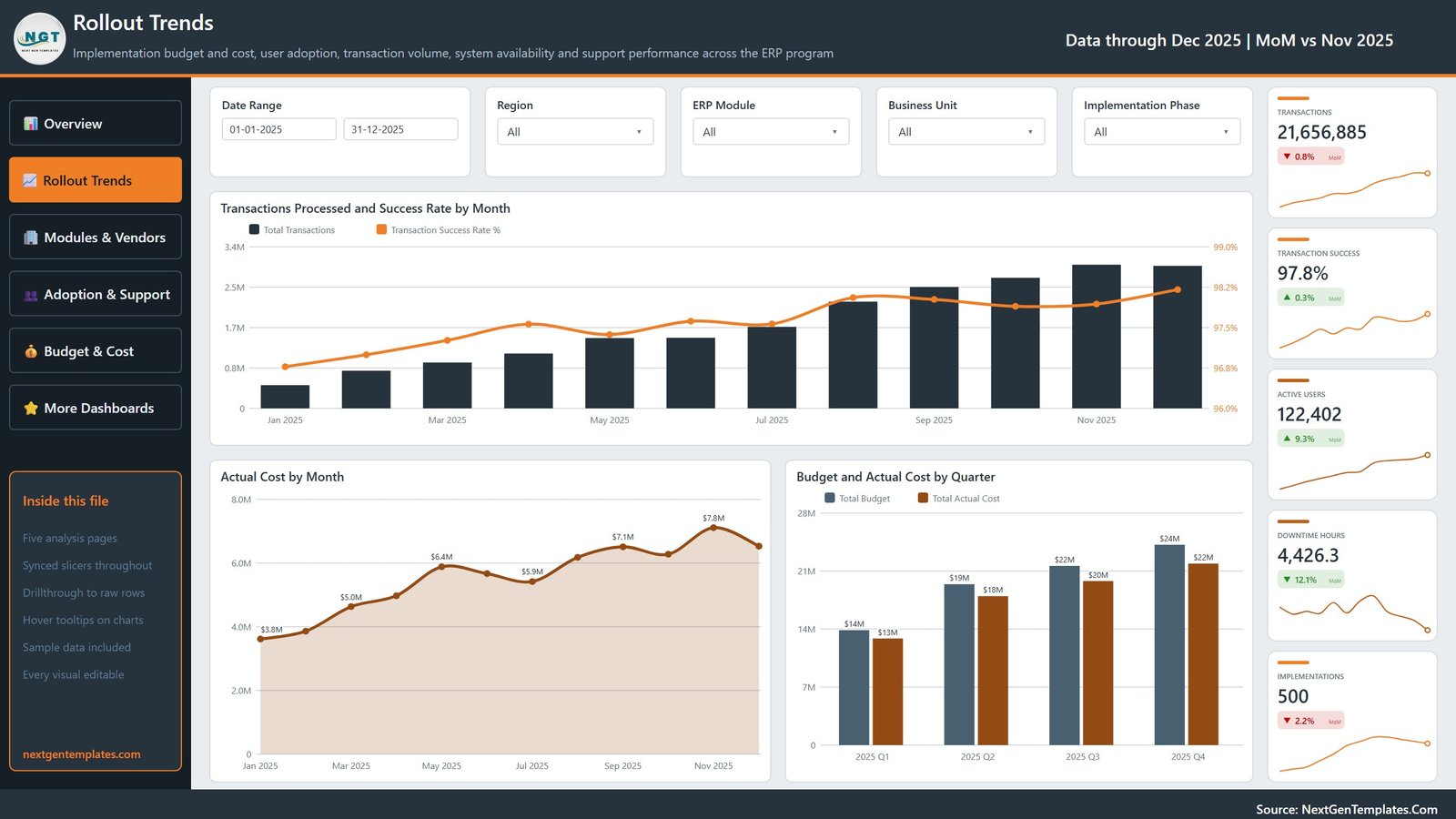
- Rollout Trends – throughput and spend over time. Transactions Processed and Success Rate by Month, Actual Cost by Month and Budget and Actual Cost by Quarter.
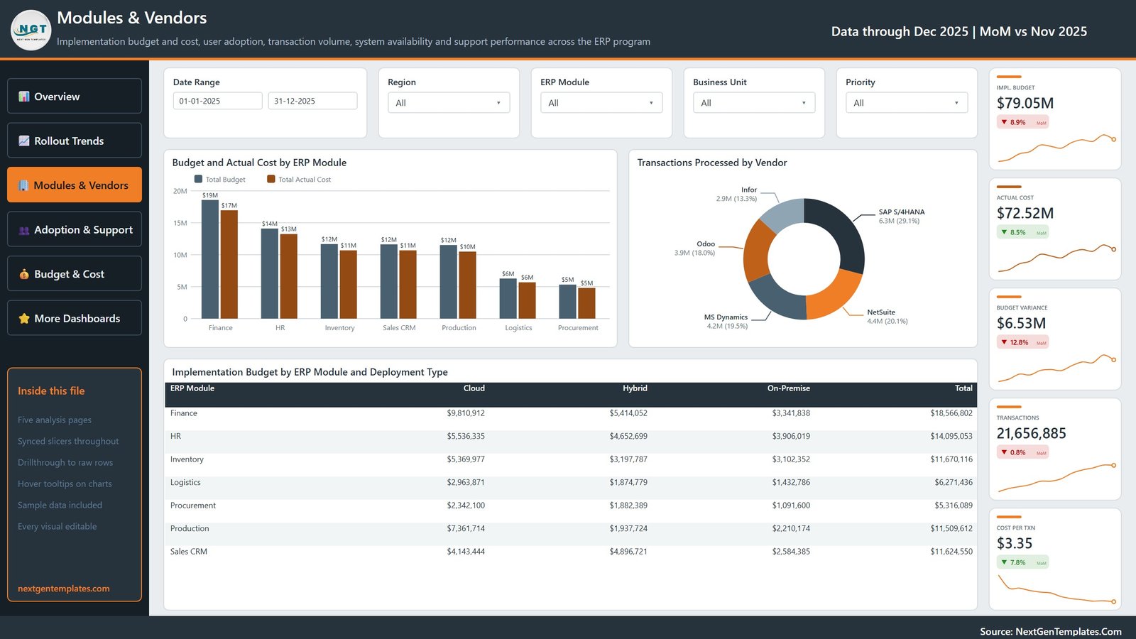
- Modules & Vendors – where the money and the volume sit. Budget and Actual Cost by ERP Module, Transactions Processed by Vendor and a matrix of Implementation Budget by ERP Module and Deployment Type.
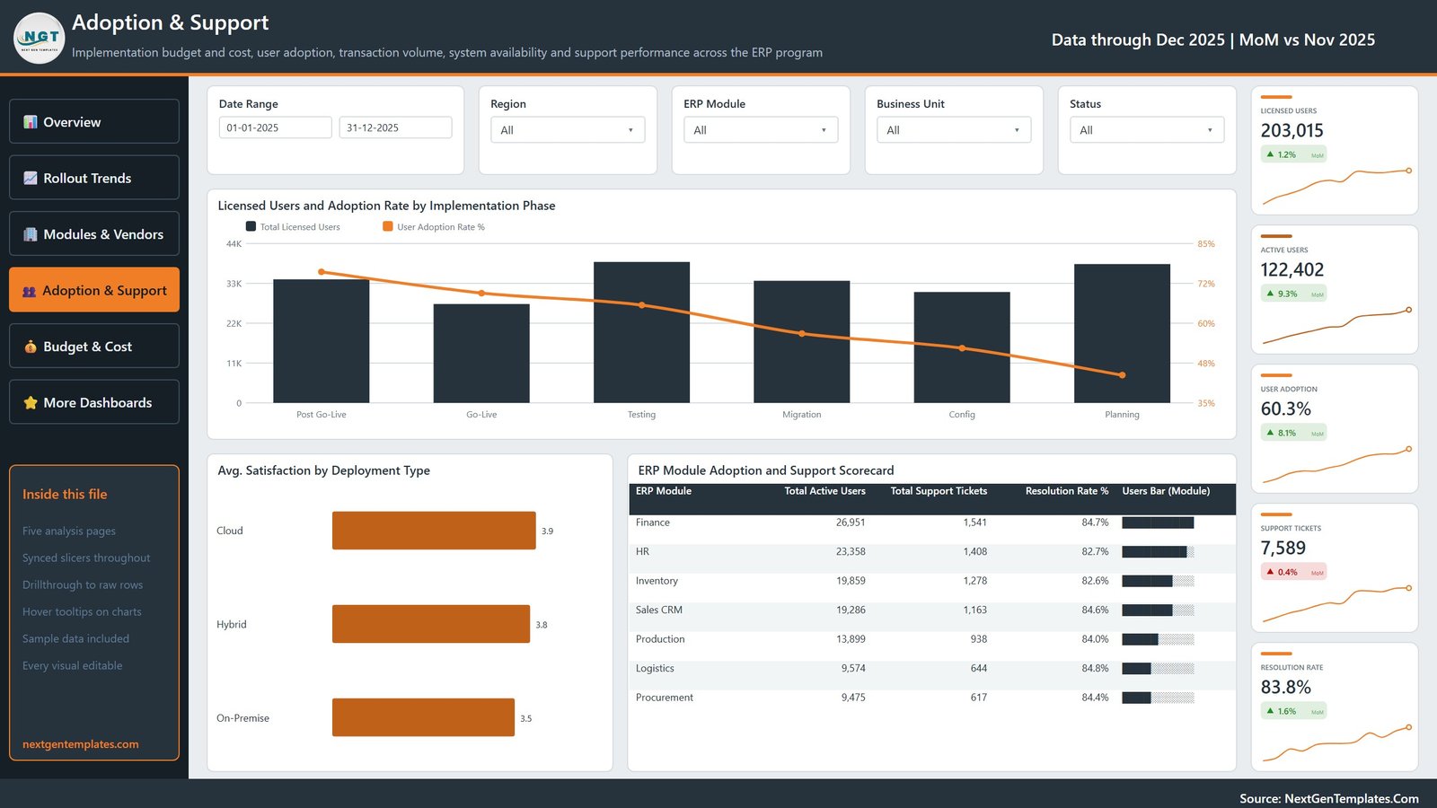
- Adoption & Support – whether people are actually using it. Licensed Users and Adoption Rate by Implementation Phase, Avg. Satisfaction by Deployment Type and an ERP Module Adoption and Support Scorecard.
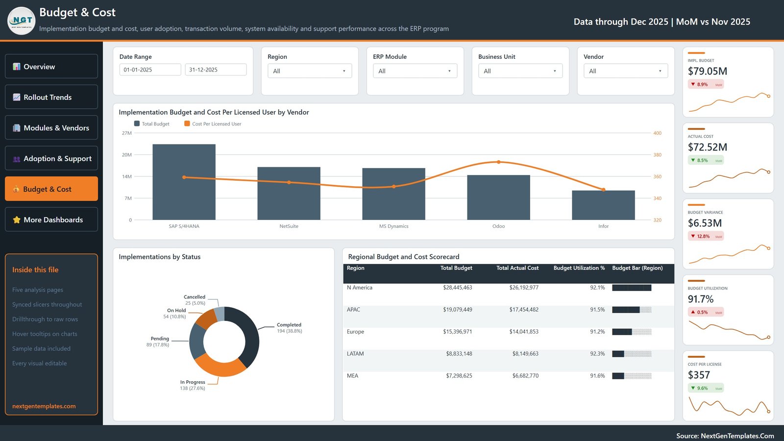
- Budget & Cost – unit economics. Implementation Budget and Cost Per Licensed User by Vendor, Implementations by Status and a Regional Budget and Cost Scorecard.
A sixth page, Get More Dashboards, is a reference and catalogue page rather than an analysis page – it lists other NextGenTemplates reports and how to commission a custom build.
Three hidden pages that are already wired
Behind the five analysis pages sit three pages that do not appear in the page tabs but are already connected:
- A Details drillthrough page with five KPI cards and an Implementation Level Detail table, bound on eight fields – ERP Module, Business Unit, Region, Deployment Type, Vendor, Implementation Phase, Priority and Status. Right-click a visual and you land on the underlying rows, filtered, with a Back button waiting.
- Two tooltip pages – Metric Detail and Trend Detail – that appear on hover with three cards and a supporting bar chart instead of the default Power BI tooltip.
That is the part most template buyers end up building themselves. Here it ships done.
Filters that stay in step
Every analysis page carries a date-range slicer plus Region, ERP Module and Business Unit, and then one page-specific slicer: Deployment Type on Overview, Implementation Phase on Rollout Trends, Priority on Modules & Vendors, Status on Adoption & Support and Vendor on Budget & Cost. The shared slicers are synced, so a selection follows you from page to page instead of resetting.
The 500-row sample dataset
The included Data.xlsx holds a single Data sheet – 500 records across 21 columns, dated across the 2025 calendar year. Eight of those columns are the dimensions the report slices by:
| Dimension | Distinct demo values |
|---|---|
| ERP Module | 7 – Finance, HR, Inventory, Logistics, Procurement, Production, Sales CRM |
| Business Unit | 5 – Corporate, Distribution, Manufacturing, Retail, Services |
| Region | 5 – APAC, Europe, LATAM, MEA, N America |
| Implementation Phase | 6 – Planning, Config, Migration, Testing, Go-Live, Post Go-Live |
| Deployment Type | 3 – Cloud, Hybrid, On-Premise |
| Status | 5 – Pending, In Progress, Completed, On Hold, Cancelled |
| Priority | 4 – Low, Medium, High, Critical |
| Vendor | 5 placeholder names, used only as sample text |
The measure columns are licensed and active users, transactions processed and failed, downtime hours, support tickets raised and resolved, implementation budget, actual cost, training hours and a user satisfaction score. Swap the rows for your own, keep the column headers, and every visual, card and scorecard follows.
On the vendor names: the demo rows use five well-known ERP product names purely as realistic placeholder text in a slicer. This template is vendor-agnostic. It is not affiliated with, endorsed by, certified by or integrated with any ERP vendor, and naming one implies no partnership and no data connection whatsoever. Replace them with your own list – they are just strings in a column.
How this differs from the ERP KPI dashboards
NextGenTemplates publishes two different ERP report families, and they answer different questions:
| This analytical dashboard | The KPI dashboard line | |
|---|---|---|
| Question it answers | Where budget, adoption and support load are going, and why | Are we on target this month against a defined KPI set |
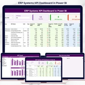
| Shape | Five exploratory pages, drillthrough to row level, hover tooltips | A month-picker scorecard with targets, traffic lights and MTD / YTD columns |
| Best for | Programme reviews, steering committees, budget deep-dives | A recurring monthly KPI pack |
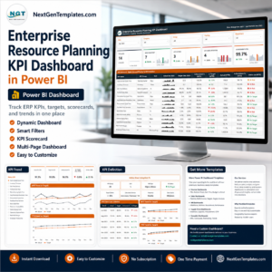
They are separate products, not versions of each other. If a target-and-variance scorecard is what you actually need, the ERP Systems KPI Dashboard in Power BI and the Enterprise Resource Planning KPI Dashboard in Power BI are the ones to look at. There is also an ERP Systems KPI Dashboard in Excel and an Enterprise Resource Planning KPI Dashboard in Google Sheets for teams not on Power BI.
Excel edition: a matching workbook build of this same dashboard, ERP Systems Dashboard in Excel (product 94745), is being prepared and is not yet on sale. It is deliberately not linked here because it has not been published – look it up by name in the catalogue once it goes live.
Putting it to work
- Open the PBIX in Power BI Desktop. Every visual, measure and colour is editable – nothing is locked.
- Point Power Query at your own workbook – one file path – and Refresh.
- Publish to the Power BI Service, or export to PDF or PowerPoint for a review pack.
What you receive
ERP Systems Dashboard in Power BI.pbix– the full report: five analysis pages, the reference page, and three hidden drillthrough and tooltip pagesData.xlsx– the editable 500-row, 21-column sample datasetPower BI Dashboard - User Manual.pdf– setup and customisation guide
Delivered as a single ZIP, downloadable straight after checkout. Power BI Desktop is a free Microsoft application and is not included.
Frequently asked questions
Does the ERP Systems Dashboard in Power BI connect to my ERP system?
No. It reads an Excel workbook you maintain. There is no connector, no API call, no live sync and no automatic import. If you can export your ERP data to Excel, you can use this report.
Is the data in the file real?
No. All 500 rows are fictional demo data generated to make the visuals legible. Every figure on every page – budgets, adoption rates, ticket counts – comes from that sample and describes no real organisation.
Can I use it for financial or statutory reporting?
Treat it as a management-reporting layout, not a financial control. It makes no claim about data accuracy, financial-reporting correctness, audit acceptance, or any particular treatment under SOX, IFRS or GAAP, and it does not predict implementation outcomes. Your figures and your review process stay your responsibility.
Which version of Power BI do I need?
A current build of Power BI Desktop. The report uses standard built-in visuals only – there is nothing from AppSource to license separately.
Can I rebrand it or use it for client work?
Yes. Colours, logo, page names and measures are all editable, and the licence covers commercial client work.
Watch the demo video:
Watch the demo video: