

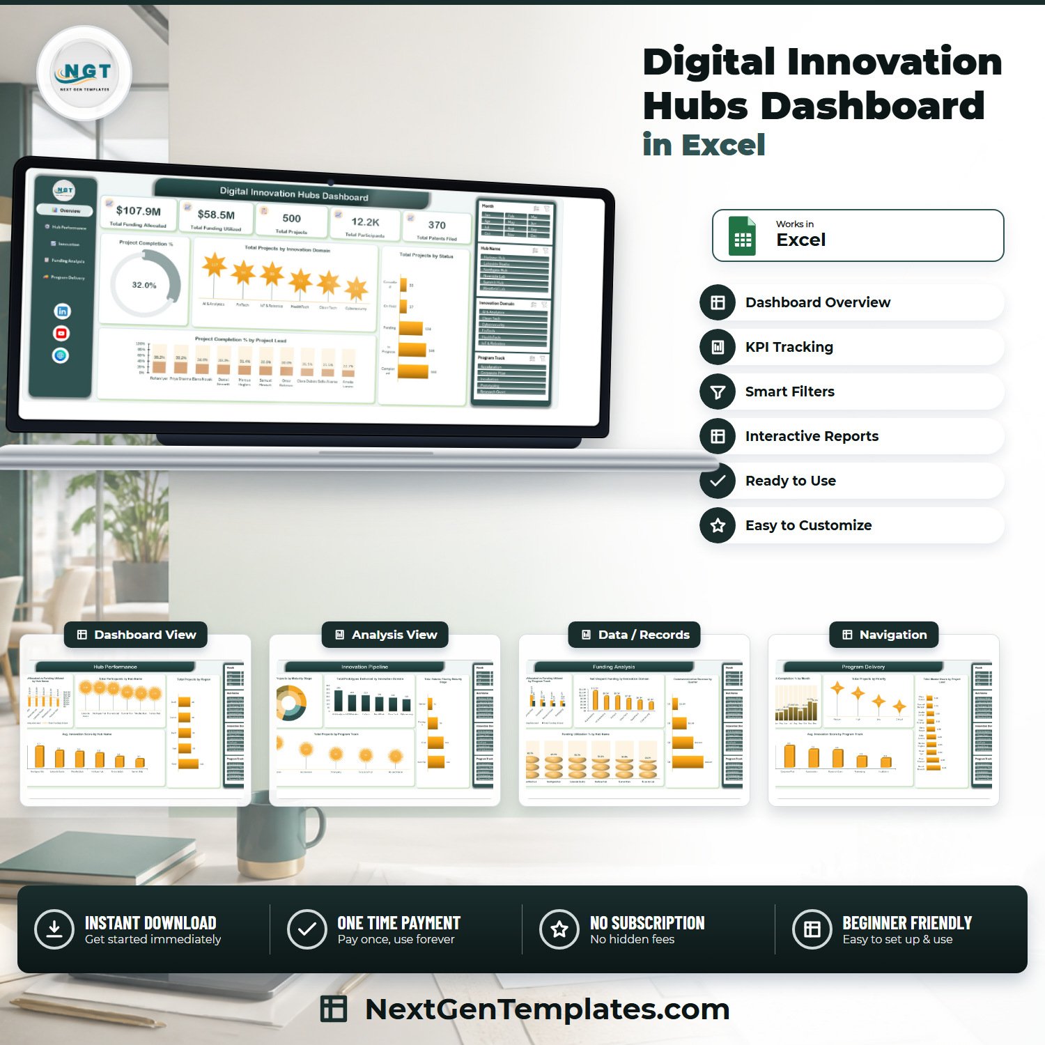

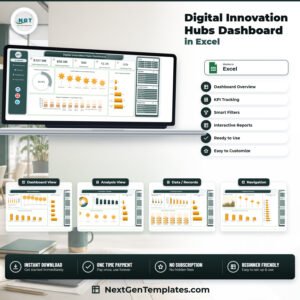
The Digital Innovation Hubs Dashboard in Excel turns 500 innovation-project records into five linked report pages that answer what a hub director is asked every quarter: how much of the $107.9M allocated has actually been spent, why utilisation stops at $58.5M, which of six hubs converts funding into patents, and which projects are stuck. This is the analytical Excel dashboard line – pivot tables and slicers, not a traffic-light scorecard. $17.99 once, instant download, no subscription, no macros.
Key Features of the Digital Innovation Hubs Dashboard in Excel
- Five report pages – Overview, Hub Performance, Innovation Pipeline, Funding Analysis, Program Delivery – reached from a fixed left navigation panel.
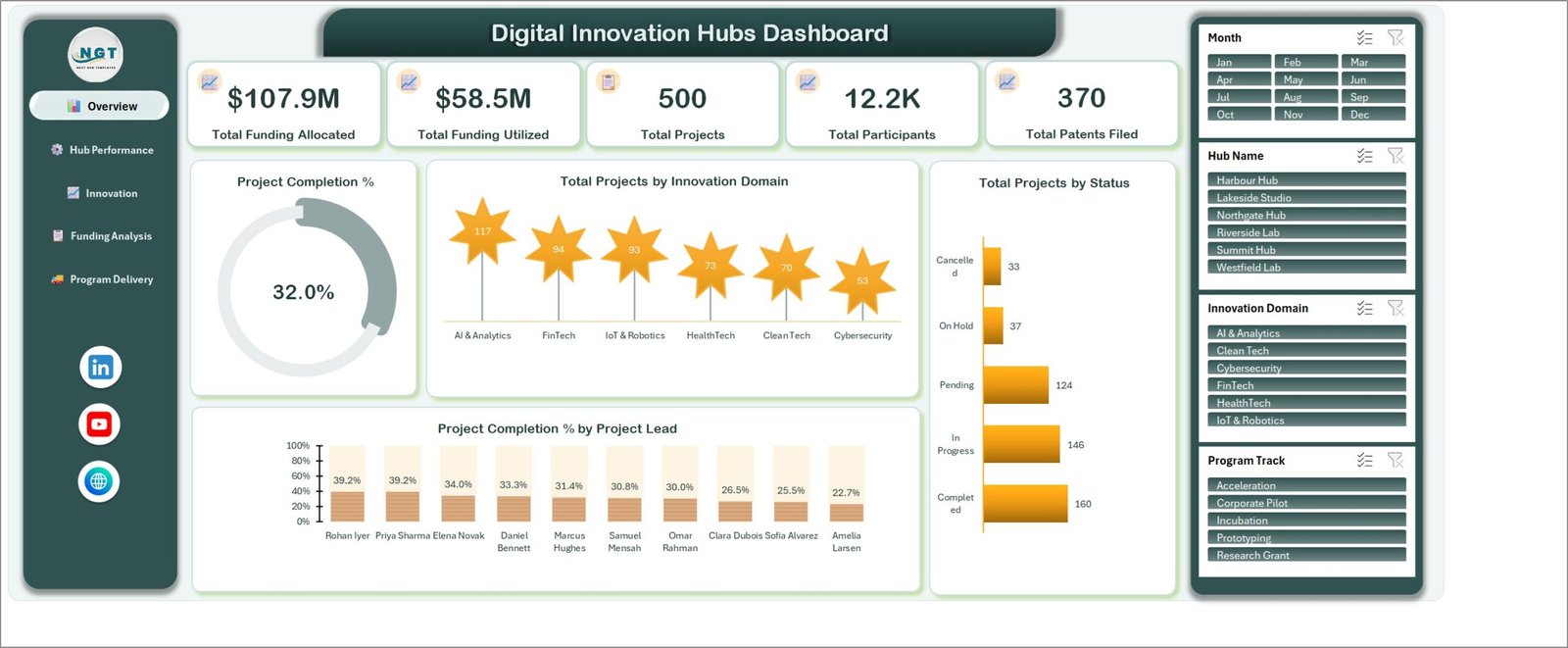
- Five KPI cards: Total Funding Allocated, Total Funding Utilized, Total Projects, Total Participants, Total Patents Filed.
- Four synchronised slicers – Month, Hub Name, Innovation Domain, Program Track – filter every chart on every page at once.
- 18 charts, each named for its metric (for example Net Unspent Funding by Innovation Domain), so a screenshot needs no caption.
- Six hubs and six domains pre-loaded: Harbour Hub, Lakeside Studio, Northgate Hub, Riverside Lab, Summit Hub, Westfield Lab across AI & Analytics, Clean Tech, Cybersecurity, FinTech, HealthTech and IoT & Robotics.
- Five program tracks – Incubation, Acceleration, Prototyping, Corporate Pilot, Research Grant.
- 500 sample project rows. Paste your own export over them, refresh, and every page redraws.
- No VBA – a plain .xlsx for Excel 2016+, Microsoft 365 and Excel for Mac, with a PDF user manual in the ZIP.
What’s Inside the Digital Innovation Hubs Dashboard in Excel
Overview. The KPI cards sit above a Project Completion % gauge reading 32.0%, Total Projects by Innovation Domain (AI & Analytics 117 down to Cybersecurity 53), Total Projects by Status (Completed 160, In Progress 146, Pending 124, On Hold 37, Cancelled 33) and Project Completion % by Project Lead, ranking ten leads from 39.2% to 22.7%.
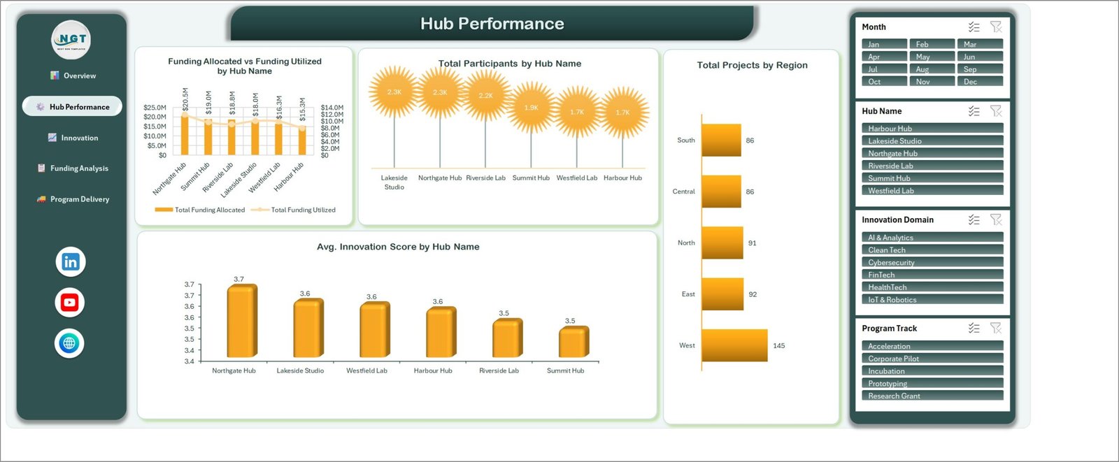
Hub Performance. Funding Allocated vs Funding Utilized by Hub Name puts Northgate Hub’s $20.5M against Harbour Hub’s $15.3M, beside Total Participants by Hub Name, Total Projects by Region (West 145, Central 86) and Avg. Innovation Score by Hub Name, where the six hubs cluster between 3.5 and 3.7.
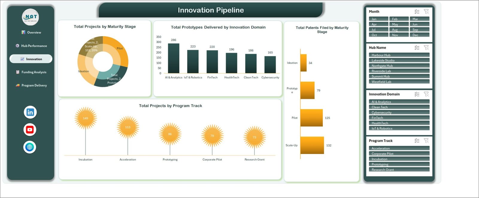
Innovation Pipeline. Total Projects by Maturity Stage splits Ideation, Prototype, Pilot and Scale-Up; Total Prototypes Delivered by Innovation Domain runs 286 down to 165; Total Patents Filed by Maturity Stage shows 132 at Scale-Up against 34 at Ideation; Total Projects by Program Track puts Incubation at 149.
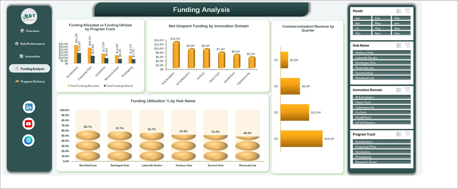
Funding Analysis. The widest allocation gap sits at Acceleration – $33.3M allocated, $18.8M used. Net Unspent Funding by Innovation Domain leaves $12.5M idle in AI & Analytics alone, Commercialization Revenue by Quarter climbs from $3.2M to $18.4M, and Funding Utilization % by Hub Name spreads from 60.7% at Westfield Lab to 48.3% at Riverside Lab.
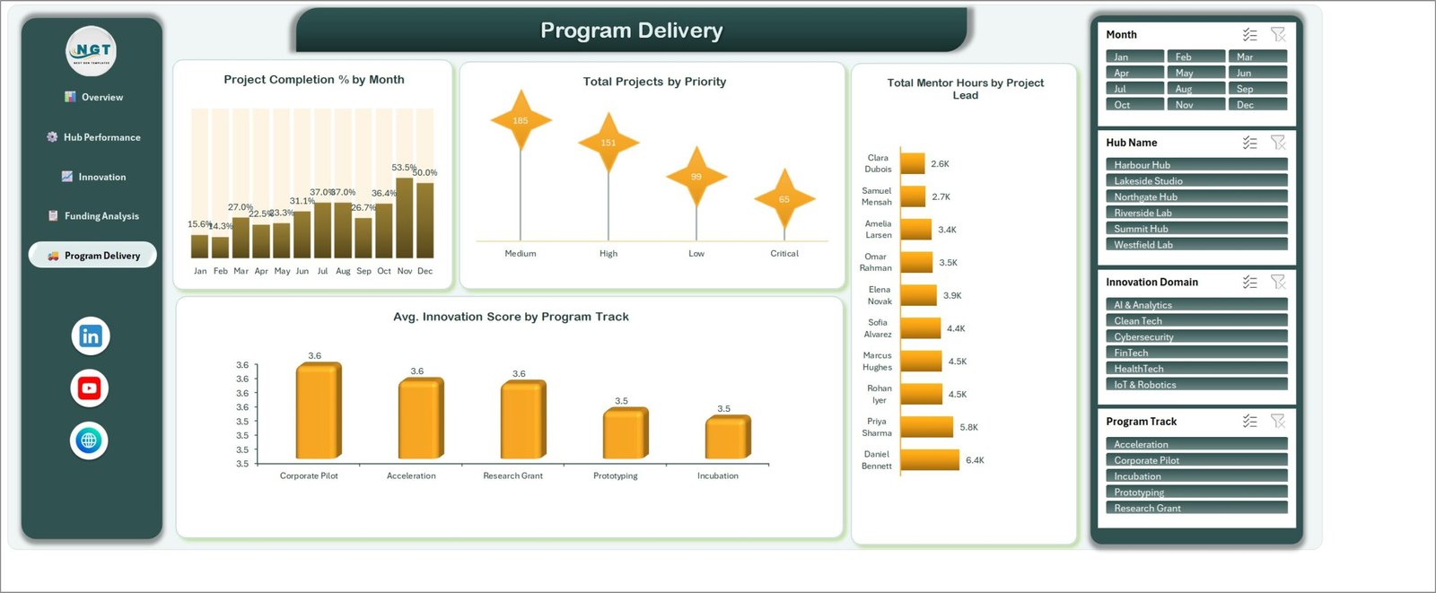
Program Delivery. Project Completion % by Month traces 15.6% in January to a 53.5% peak in November, next to Total Projects by Priority (Medium 185, High 151, Low 99, Critical 65), Total Mentor Hours by Project Lead (6.4K down to 2.6K) and Avg. Innovation Score by Program Track.
Digital Innovation Hubs Dashboard in Excel vs. Google Sheets vs. Paid Innovation SaaS – Where This Fits
| What matters | This Excel dashboard | Google Sheets equivalent | Paid SaaS (Sopheon, Planview, Brightidea) |
|---|---|---|---|
| Cost | $17.99 once | $9.99 once | $15,000-$60,000 per year |
| Platform | Excel 2016+, Microsoft 365, Mac | Browser, any device | Vendor cloud only |
| Setup time | Under 15 minutes | Under 15 minutes | 6-12 weeks |
| Real-time team collaboration | OneDrive or SharePoint co-authoring | Native, simultaneous | Native, with approvals |
| Mobile access | Excel mobile app | Full browser and app | Full app |
| Customizable fields | Any column you add | Any column you add | Admin-configured, often chargeable |
| Share with link | OneDrive share link | Sheet link | Per-seat licence |
| Year-1 cost at 5 users | $17.99 | $9.99 | $25,000+ |
| Patents and prototypes by maturity stage | Built in | Built in | Usually a paid IP module |
| Data leaves your organisation | No | Stays in your Google account | Yes, vendor-hosted |
Who This Template Is For – and Who It’s Not For
A good fit for: innovation-hub and incubator directors running two to ten sites, university technology-transfer offices reporting grant spend and patent filings, corporate innovation teams tracking pilots across business units, and development agencies that must show a funder how allocation became prototypes, patents and revenue.
Not a good fit if you need live idea submission and stage-gate voting from hundreds of staff – that is workflow software, not a reporting workbook. It is also wrong if your portfolio runs past roughly 100,000 rows, if you need row-level permissions per hub, or if you want nightly syncing from a grants system. If you only want a one-page monthly scorecard with red/amber/green thresholds, the Excel KPI dashboard line fits better than this analytical build.
How to Use the Digital Innovation Hubs Dashboard in Excel
- Download the ZIP and unzip it – you get the .xlsx workbook and a PDF user manual.
- Open the workbook and read the Overview page against the sample data so you know what each chart measures.
- Replace the 500 sample rows on the data sheet with your own export, keeping the column headers exactly as they are.
- Match your values to the existing Hub Name, Innovation Domain, Program Track, Maturity Stage, Status and Priority entries, or edit them once and let the slicers pick up the new names.
- Press Ctrl + Alt + F5 (Data > Refresh All) to rebuild every pivot and chart.
- Filter with the four slicers – one hub for a board pack, one domain for a funder update – then export that page to PDF.
Real-World Use Cases
Meera, innovation-hub director, six sites. Her quarterly board pack was four spreadsheets stitched together. She now filters Hub Name to one site and shows why Westfield Lab converts 60.7% of its allocation while Riverside Lab sits at 48.3%.
Daniel, university technology-transfer manager. He reports on patents, not projects. The Innovation Pipeline page gives him patents filed by maturity stage in one screenshot, and the mentor-hours chart justifies the staffing line in next year’s bid.
Priya, corporate innovation lead. Filtering to Corporate Pilot shows $28.3M allocated against $13.9M spent – the number that started the conversation about moving budget to Acceleration.
Frequently Asked Questions
Which Excel versions does this work in?
Excel 2016, 2019, 2021, 2024 and Microsoft 365 on Windows, and Excel for Mac. It is a standard .xlsx with pivot tables and slicers – no macros to enable, no add-ins.
How is this different from the Excel KPI Dashboard and KPI Scorecard templates?
This is the analytical dashboard line: five exploration pages, 18 charts and free-form slicing across 500 records. A KPI dashboard is a month-picker scorecard with targets and traffic lights; a KPI scorecard is a one-page summary. They answer different questions.
Can I add my own hubs, domains or program tracks?
Yes. Type your own values into the data sheet and refresh – the slicers and charts rebuild around whatever list they find. Nothing is hard-coded to the six sample hubs.
How many project records can it hold?
It ships with 500 rows and stays responsive into the tens of thousands. Past roughly 100,000 rows, refresh times become noticeable on an average laptop.
Do the charts update automatically when I paste new data?
They update on refresh. Paste your rows, then Data > Refresh All (Ctrl + Alt + F5) redraws all five pages in one step.
Is any of the sample data real?
No. Hub names, project leads and figures are realistic sample data used to demonstrate the charts. Replace them before sharing anything externally.
About the Author
Built by PK – Microsoft Certified Professional with 15+ years of Excel, Google Sheets, and Power BI experience. Founder of NextGenTemplates, reaching 300K+ subscribers across YouTube channels. Every template is hand-built and tested before release.
Explore Related Templates
- Quantum Computing Labs Dashboard in Excel – the same five-page build for a deep-tech research lab.
- Machine Learning Labs Dashboard in Excel – model pipelines instead of hubs.
- Knowledge Transfer Partnerships Dashboard in Excel – academic-industry partnerships and grant spend.
- Product Development KPI Dashboard in Power BI – the scorecard view, with targets and thresholds.
- Research Institutions Dashboard in Google Sheets – the browser-based alternative.
- Browse the Excel Dashboard category or every MS Excel template.
Get the Digital Innovation Hubs Dashboard in Excel for $17.99 (regular $29.99) – instant download, one-time payment, lifetime access, no subscription.
Last updated: 1 September 2026.
Watch the demo video:
Compatibility and Requirements
- Works in Microsoft Excel desktop (Excel 2016 or later, or Microsoft 365).
- The four slicers (Month, Hub Name, Innovation Domain, Program Track) filter every page at once. Microsoft explains them in Use slicers to filter data.
More Questions About This Template
Is there a Power BI version of this dashboard?
Yes. See the Digital Innovation Hubs Dashboard in Power BI.
Which Excel versions does it need?
Excel 2016 or later, or Microsoft 365. It uses pivot tables and slicers and has no VBA.
Can I filter the dashboard to one hub or domain?
Yes. Use the Hub Name and Innovation Domain slicers and every chart on every page updates together.
Where do I enter my own project data?
Paste your records over the 500 sample rows on the data sheet, keep the column headers as they are, then choose Data > Refresh All.
Related Innovation and Digital Templates
- Digital Innovation Hubs Dashboard in Power BI: the same hub dashboard for Power BI Desktop
- Digital Transformation KPI Dashboard in Excel: a KPI view of digital programs
- Digital Transformation KPI Dashboard in Google Sheets: the same KPIs in Google Sheets
- KPI Dashboard Library (Excel): 15 Excel KPI dashboards in one bundle
Browse all Excel KPI dashboards.












Reviews
There are no reviews yet.