

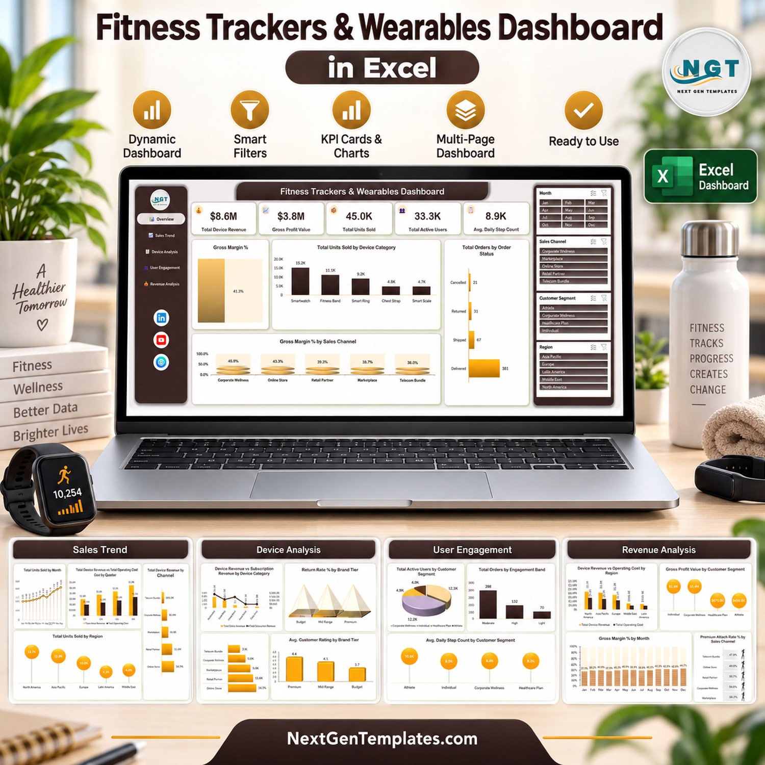
The Fitness Trackers & Wearables Dashboard in Excel turns a 500-row, 30-column sales and usage table into 5 interactive dashboard pages, 5 KPI cards and 20 pivot charts. Four slicers (Month, Sales Channel, Customer Segment and Region) sit on every page, so one click re-cuts the whole report. This wearables dashboard in Excel needs no macros and no add-ins: paste your own orders into the data table, press Refresh All, and every page updates.
🌍 Built by the NextGenTemplates team, which sells one-time-purchase Excel, Google Sheets, Power BI and HTML templates to teams that would rather own their reports than rent them.
✅ Instant download · One-time payment · No subscription · No per-user fees · Lifetime access
🔑 Key Features of the Wearables Dashboard in Excel
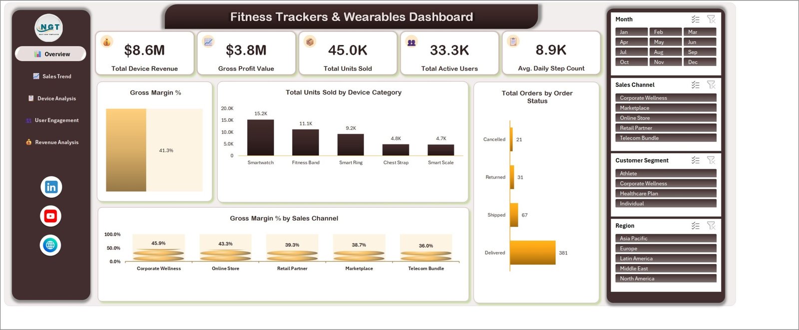
📊 Five KPI cards on the Overview page. Total Device Revenue ($8.6M in the sample), Gross Profit Value ($3.8M), Total Units Sold (45.0K), Total Active Users (33.3K) and Avg. Daily Step Count (8.9K) read straight from the pivot cache and move with every slicer.
📈 20 charts, four per page. Every chart follows the Metric by Category naming, for example Total Units Sold by Device Category, Total Device Revenue by Sales Channel and Avg. Daily Step Count by Month, so a reader knows what each visual measures before looking at the bars.
🎛️ Four synchronised slicers. Month (Jan to Dec), Sales Channel (Corporate Wellness, Marketplace, Online Store, Retail Partner, Telecom Bundle), Customer Segment (Athlete, Corporate Wellness, Healthcare Plan, Individual) and Region (Asia Pacific, Europe, Latin America, Middle East, North America).
🧭 Left navigation rail. Buttons for Overview, Sales Trend, Device Analysis, User Engagement and Revenue Analysis jump between pages without hunting through sheet tabs.
🗂️ One Excel Table feeds everything. The Data sheet is a structured table (TblData) with helper columns for Month, Year, Quarter, order-status counts, a premium-subscriber flag and an Engagement Band (High, Moderate, Light by daily steps). New rows are picked up by the pivots on refresh.
💾 Plain .xlsx. No VBA, no Power Query connection and no external links, so the file opens offline in desktop Excel. The ZIP also includes the Excel Dashboard User Manual PDF.
📦 What’s Inside the Fitness Trackers & Wearables Dashboard
Page 1: Overview
The five KPI cards sit above Gross Margin % (41.3% in the sample), Total Units Sold by Device Category (Smartwatch, Fitness Band, Smart Ring, Chest Strap, Smart Scale), Total Orders by Order Status (Delivered, Shipped, Returned, Cancelled) and Gross Margin % by Sales Channel.
Page 2: Sales Trend
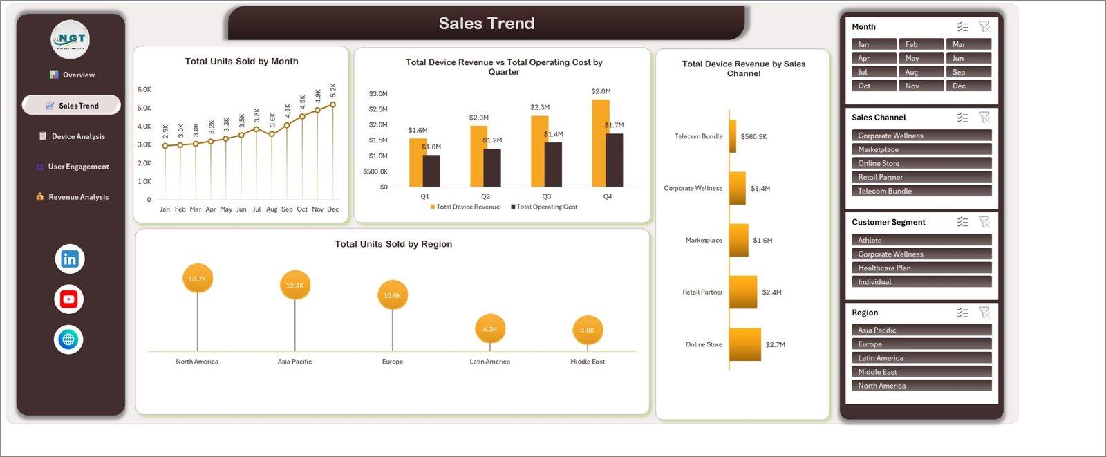
Total Units Sold by Month, Total Device Revenue vs Total Operating Cost by Quarter, Total Device Revenue by Sales Channel and Total Units Sold by Region show where and when devices move.
Page 3: Device Analysis
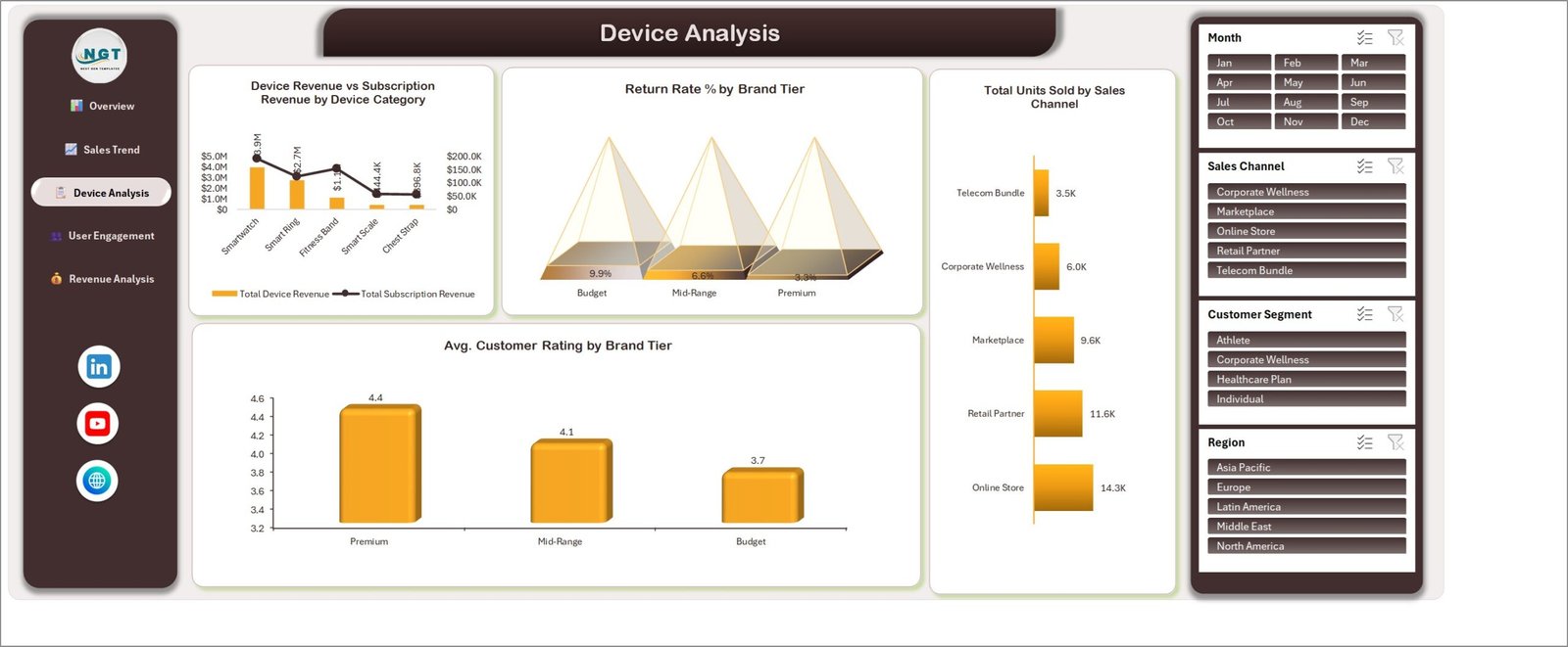
Device Revenue vs Subscription Revenue by Device Category, Return Rate % by Brand Tier (Budget, Mid-Range, Premium), Avg. Customer Rating by Brand Tier and Total Units Sold by Sales Channel compare the product line itself.
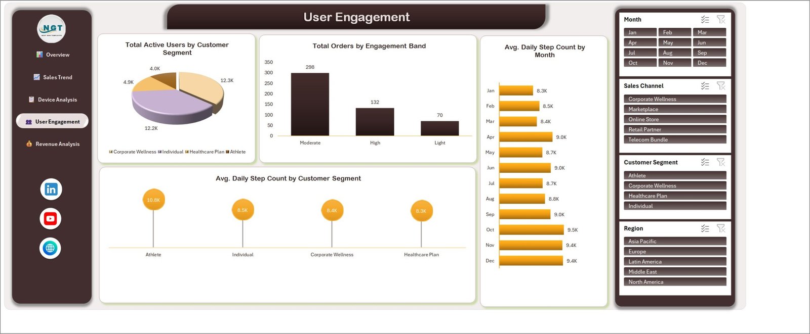
Page 4: User Engagement
Total Active Users by Customer Segment, Total Orders by Engagement Band, Avg. Daily Step Count by Month and Avg. Daily Step Count by Customer Segment describe how buyers actually use their devices.
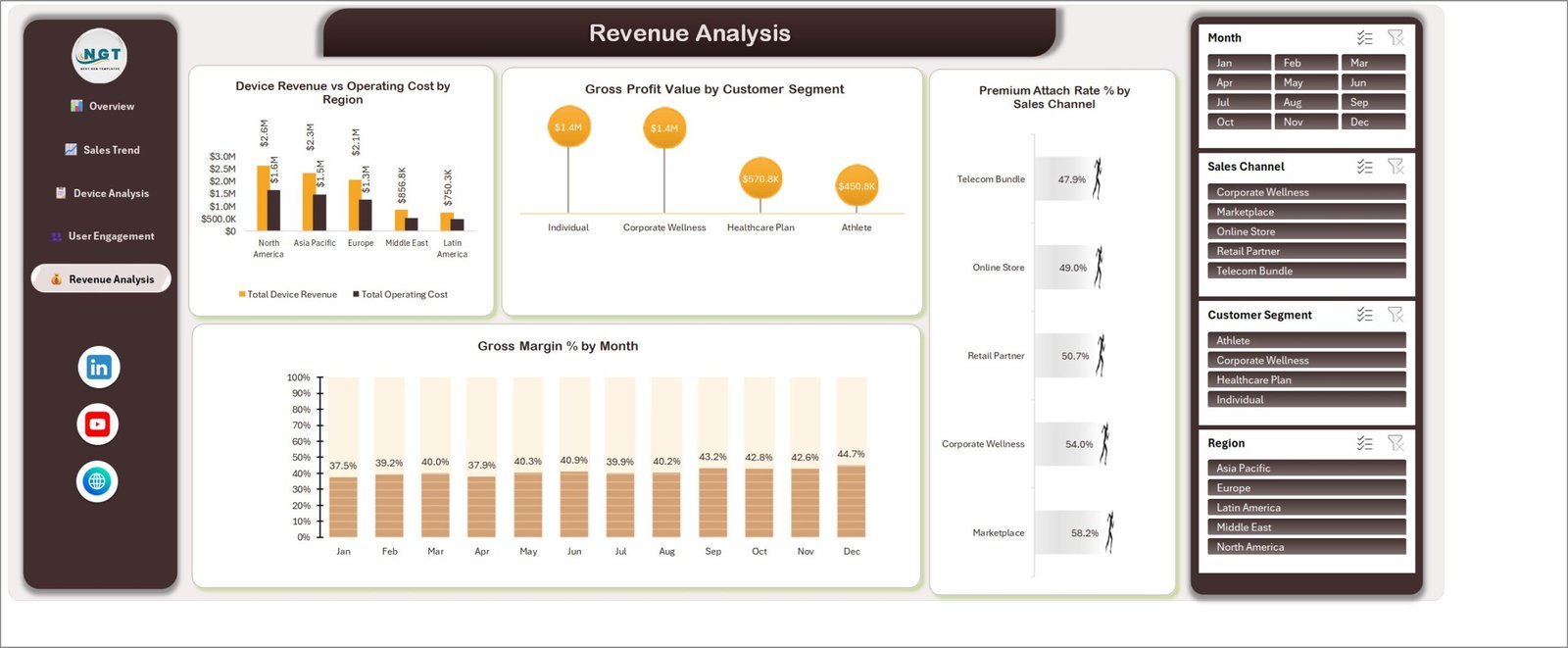
Page 5: Revenue Analysis
Device Revenue vs Operating Cost by Region, Gross Profit Value by Customer Segment, Premium Attach Rate % by Sales Channel and Gross Margin % by Month close the report with profitability.
📊 Fitness Trackers & Wearables Dashboard vs. Google Sheets Equivalent vs. Paid BI SaaS — Where This Fits
| Feature | Fitness Trackers & Wearables Dashboard in Excel | Google Sheets equivalent | Paid BI SaaS (Tableau / Looker-style) |
|---|---|---|---|
| Cost | ✅ $17.99 one-time | One-time template price | Monthly per-user subscription |
| Platform | Microsoft Excel desktop | Browser (Google account) | Vendor cloud |
| Setup time | ✅ Paste data, Refresh All | Copy file, paste data | Connectors, modelling, licences |
| Real-time team collaboration | Via OneDrive/SharePoint co-authoring | ✅ Native | ✅ Native |
| Mobile access | Excel mobile app (viewing) | ✅ Sheets app | ✅ Vendor app |
| Customizable fields | ✅ Full access to table, pivots and charts | ✅ Full | Limited by licence tier |
| Works offline | ✅ Yes | Limited | No |
| Year-1 cost at 5 users | ✅ $17.99 total | One-time template price | Five annual seats |
| Wearables charts ready to use | ✅ 20 charts built | Depends on template | Build from scratch |
For device brands and resellers who want a wearables sales report without a per-seat BI bill, this Excel dashboard sits in the sweet spot.
👥 Who This Template Is For — and Who It’s Not For
✅ This template is built for:
- Sales and category managers at fitness tracker, smartwatch or smart ring brands
- Retail partners, marketplaces and telecom teams that bundle wearables
- Corporate wellness program coordinators who buy devices in volume and want order, return and engagement numbers in one file
- Analysts who want a ready pivot-and-slicer model to adapt
❌ This template is NOT for:
- Teams needing a live API feed from device clouds; it reports on data you paste in
- Anyone looking for medical, clinical or health-monitoring software; step counts here are business analytics, not health advice
- Users on Excel versions without slicer support for pivot tables
⚙️ How to Use the Wearables Dashboard in Excel
- Open the workbook in Microsoft Excel and go to the Data sheet.
- Replace the sample rows in TblData with your own orders, keeping the column headers.
- Leave the helper-formula columns (Month to Engagement Band) in place; they fill down with the table.
- Click Data > Refresh All. The pivots do not refresh on open, so this step is required after every data change.
- Use the navigation buttons and the four slicers to explore each page.
Microsoft’s guide to using slicers to filter data explains the filter buttons if you are new to them.
💼 Real-World Use Cases
Priya manages online sales for a smart ring start-up. She pastes each month’s store export into the table, filters Region to Europe and checks Return Rate % by Brand Tier before deciding which ring tier to discount.
Marco runs channel partnerships for a fitness band distributor. He compares Total Device Revenue by Sales Channel with Premium Attach Rate % by Sales Channel to see whether Telecom Bundle deals bring subscription buyers or only hardware volume.
Aisha coordinates a corporate wellness device program. She sets Customer Segment to Corporate Wellness and follows Avg. Daily Step Count by Month alongside delivered orders, reporting participation to HR without a paid analytics seat.
❓ Frequently Asked Questions
What KPIs does the Fitness Trackers & Wearables Dashboard track?
It shows five KPI cards: Total Device Revenue, Gross Profit Value, Total Units Sold, Total Active Users and Avg. Daily Step Count, plus 20 charts covering gross margin, returns, customer rating, operating cost, subscription revenue, engagement bands and premium attach rate.
Does this wearables dashboard in Excel need macros?
No. It is a plain .xlsx built on one Excel Table, pivot tables, pivot charts and slicers. Nothing runs in VBA, so there are no macro warnings and it works offline in desktop Excel.
How long does setup take?
Usually under 15 minutes. Paste your rows into the Data sheet with the same headers, then click Data > Refresh All. The pivots do not refresh automatically when the file opens, so refresh after every paste.
How does it compare to a paid BI subscription?
A BI tool charges per user every month and still needs the model built. This template costs one payment and arrives with 5 pages and 20 charts already designed; the trade-off is no live data connector or browser sharing.
Is this a KPI Dashboard with a month picker and targets?
No. It is an analytical dashboard with slicers. Our Smart Wearables KPI Dashboard in Excel is a different template built around KPI targets.
Can I track sleep or battery data?
The data table includes Avg Sleep Hours, Sync Sessions, Battery Life Hours and Warranty Claims columns, but none of the 20 charts use them yet. You can add your own pivot charts for them.
👤 About the Author
Built by PK, Microsoft Certified Professional with 15+ years of Excel, Google Sheets and Power BI experience and founder of NextGenTemplates. Tutorials are on YouTube at @PKAnExcelExpert. Every template is hand-built and tested before release.
🔗 Explore Related Templates
📌 Consumer Electronics Service Dashboard in Excel covers repair and service operations for device sellers.
📌 Online Fitness Communities Dashboard in Excel tracks membership and engagement for fitness platforms.
📌 Exoskeleton Tech Firms Dashboard in Excel reports on another wearable-hardware business.
🔎 Same topic, different family: Wearable Tech KPI Dashboard in Google Sheets. Browse all Excel Dashboard Templates.
📖 Click here to read the Detailed Blog Post
🎥 Visit our YouTube channel for step-by-step video tutorials
👉 YouTube.com/@PKAnExcelExpert
Sample data is invented for demonstration. Reporting template only; not medical or health advice.
Watch the step-by-step video Demo:
📅 Last updated: September 2026








Reviews
There are no reviews yet.