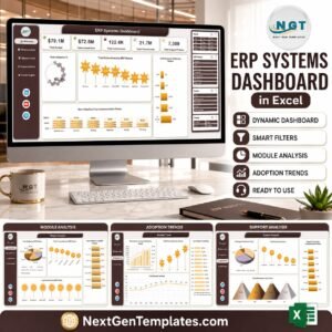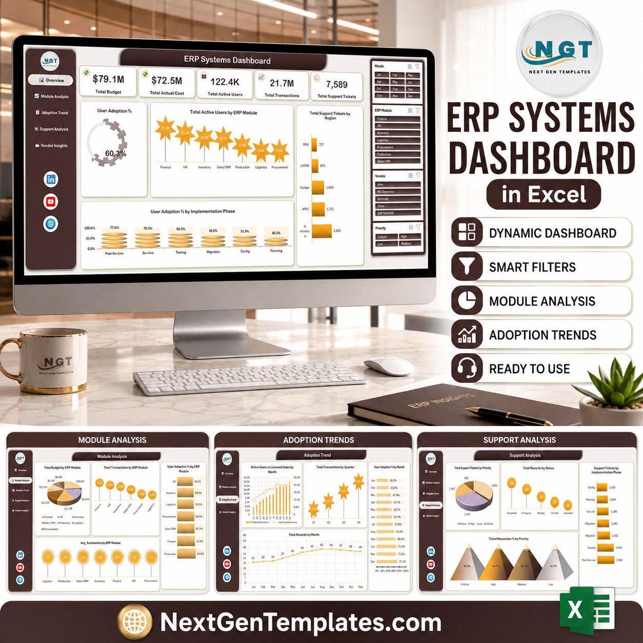
The ERP Systems Dashboard in Excel turns 500 sample implementation records into five linked report pages, five headline KPI cards and 20 charts, all driven by four slicer groups. The source table carries 33 columns on one Data sheet — swap the demo rows for your own export and every page redraws.
🌍 Join 8,400+ teams in 40+ countries using NextGenTemplates to replace subscription reporting tools with one-time-purchase Excel, Google Sheets and Power BI templates.
✅ Instant download · One-time payment · No subscription · No per-user fees · Lifetime access
📌 Read this first. This is an Excel reporting template with manually entered or pasted data. It does not connect to any ERP system: there is no live sync, no API, no connector and no automatic import. Every figure in the screenshots is demo data, and the template makes no claim about data accuracy, financial reporting correctness, audit acceptance, SOX/IFRS/GAAP treatment or implementation outcomes.
🔑 Key Features of the ERP Systems Dashboard in Excel
📊 Five report pages driven by one table. Overview, Module Analysis, Adoption Trend, Support Analysis and Vendor Insights each read from the same Data sheet, so a single paste refreshes all of them. A left-hand button strip moves between the five pages.
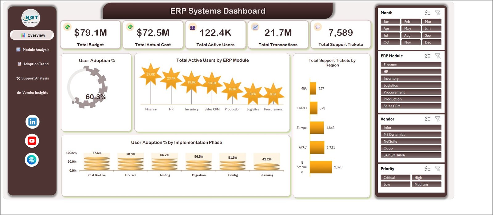
🎛️ Four slicer groups on every page. Month (Jan–Dec), ERP Module (Finance, HR, Inventory, Logistics, Procurement, Production, Sales CRM), Vendor and Priority (Critical, High, Low, Medium) filter all five pages together.
📈 Five headline cards. The Overview page reports Total Budget, Total Actual Cost, Total Active Users, Total Transactions and Total Support Tickets. In the demo data these read $79.1M, $72.5M, 122.4K, 21.7M and 7,589 respectively.
🧾 33-column source table with 500 sample rows. Fields include Record ID, Date, ERP Module, Business Unit, Region, Deployment Type, Vendor, Implementation Phase, Priority, Status, Licensed Users, Active Users, Transactions Processed, Failed Transactions, Downtime Hours, Support Tickets, Tickets Resolved, Implementation Budget, Actual Cost, Training Hours and User Satisfaction Score.
🏷️ Vendor-neutral by design. The demo Vendor column uses five well-known ERP product names purely as sample text labels. The template is not affiliated with, endorsed by, partnered with or integrated with any of them — rename that column to whatever your organisation actually runs.
📄 User manual included. The download is a ZIP containing the workbook plus an Excel Dashboard user manual PDF.
📦 What’s Inside the ERP Systems Dashboard
Page 1: Overview
Five KPI cards across the top, then a User Adoption % gauge (60.3% in the demo data), Total Active Users by ERP Module, Total Support Tickets by Region and User Adoption % by Implementation Phase. The phase chart runs from Post Go-Live at 77.6% down to Planning at 42.2%.
Page 2: Module Analysis
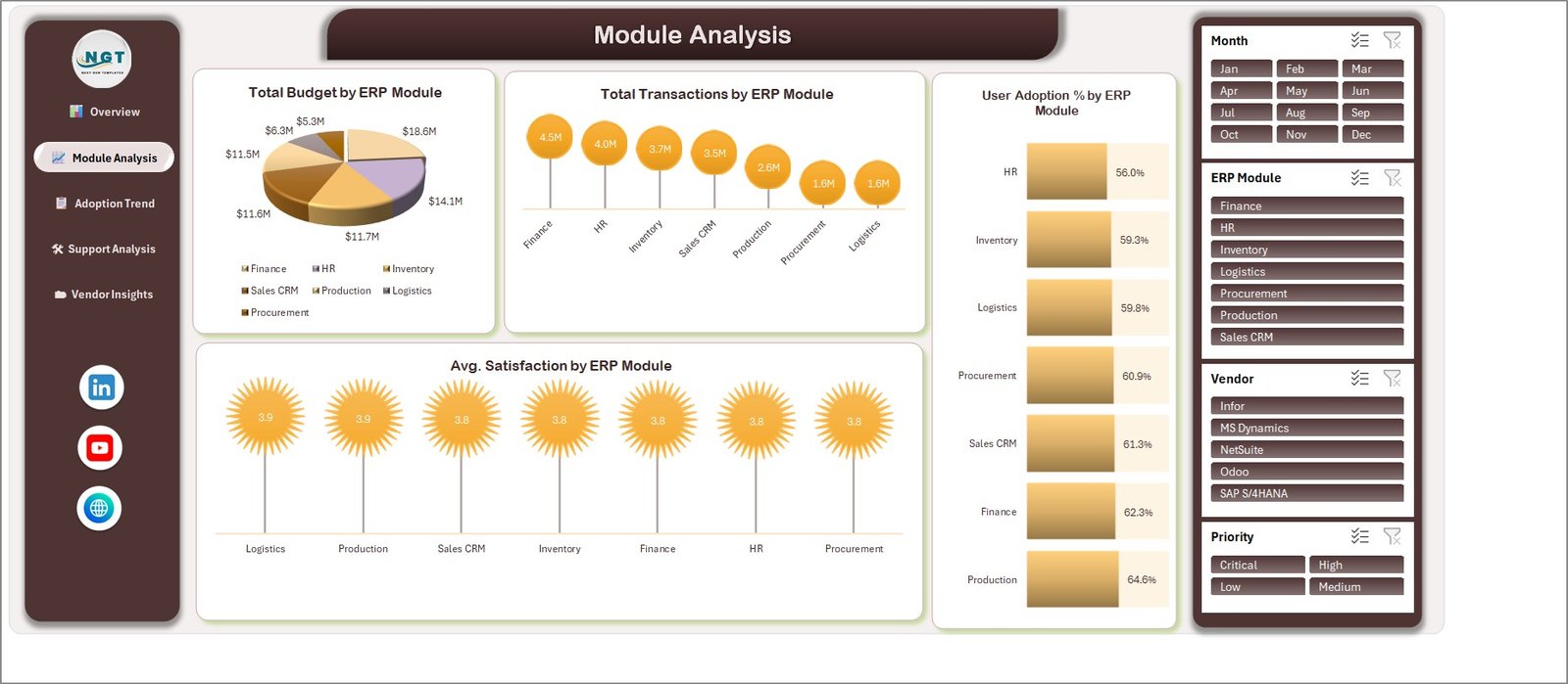
Compares the seven modules four ways: Total Budget by ERP Module, Total Transactions by ERP Module, User Adoption % by ERP Module and Avg. Satisfaction by ERP Module. Finance leads transactions at 4.5M in the demo rows; satisfaction sits in a tight 3.8–3.9 band.
Page 3: Adoption Trend
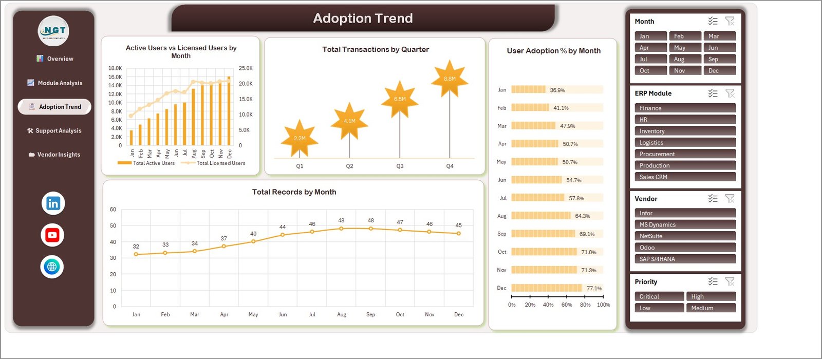
The time view. Active Users vs Licensed Users by Month plots both series on a dual axis, alongside Total Transactions by Quarter, User Adoption % by Month and Total Records by Month. Demo adoption climbs from 36.9% in January to 77.1% in December.
Page 4: Support Analysis
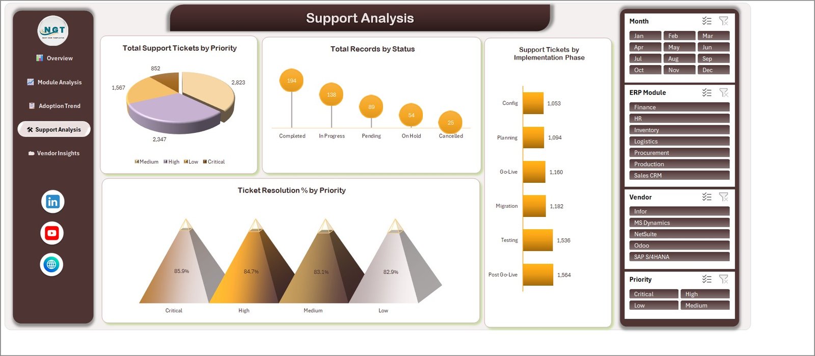
Total Support Tickets by Priority, Total Records by Status, Support Tickets by Implementation Phase and Ticket Resolution % by Priority. Resolution rates in the sample sit between 82.9% and 85.9% across the four priority bands.
Page 5: Vendor Insights
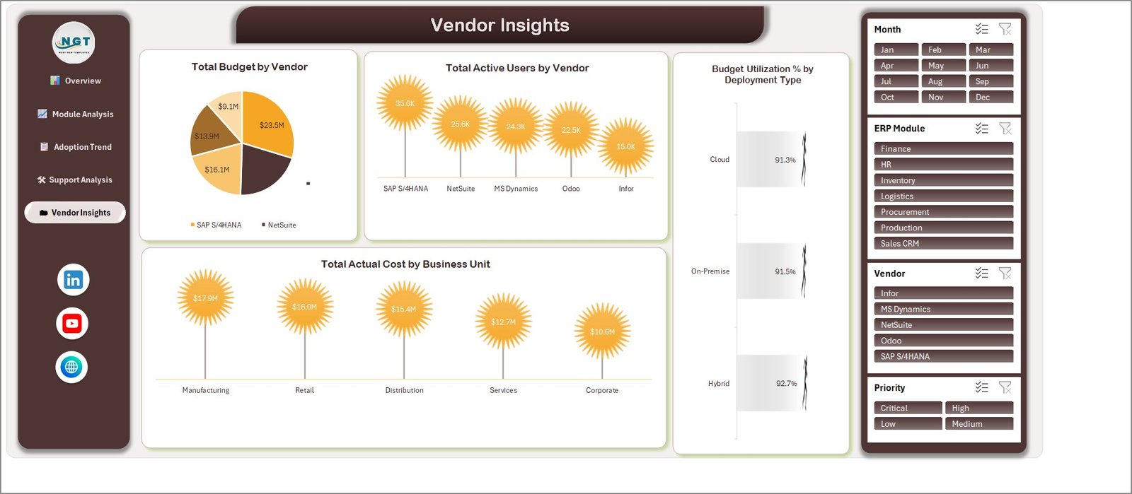
Total Budget by Vendor, Total Active Users by Vendor, Total Actual Cost by Business Unit and Budget Utilization % by Deployment Type. Business units split into Manufacturing, Retail, Distribution, Services and Corporate; deployment splits into Cloud, On-Premise and Hybrid.
Data sheet
A flat 33-column table holding 500 demo rows. This is the only sheet you edit. Keep the headers, replace the rows, and refresh the workbook.
Support sheet
The calculation layer. One block per report page feeds the charts and slicers. Leave it alone unless you are adding a chart of your own.
📊 ERP Systems Dashboard in Excel vs. a Google Sheets Build vs. a Paid Analytics Subscription
| Feature | This Excel template | Google Sheets build | Paid BI / ERP analytics subscription |
|---|---|---|---|
| Cost | $17.99 one-time | Free tool, your build time | $20–$150 per user per month |
| Platform | Microsoft Excel, offline ✅ | Browser, Google account | Vendor cloud |
| Setup time | Under 15 minutes ✅ | Days to build from scratch | Weeks, plus onboarding |
| Live connection to your ERP | No — paste or type data | No, unless scripted | Yes ✅ |
| Real-time team collaboration | Via shared drive only | Yes ✅ | Yes ✅ |
| Mobile access | Excel mobile, read-only in practice | Yes ✅ | Yes ✅ |
| Editable charts and fields | Fully editable, no lock-in ✅ | Editable | Limited to vendor options |
| Per-user fees | None ✅ | None | Yes, scales with headcount |
| Year-1 cost at 5 users | $17.99 ✅ | $0 plus build time | $1,200–$9,000 |
For teams that want an ERP implementation and adoption report without a per-seat analytics contract, this template sits in the sweet spot — provided you are happy to paste the data in yourself.
👥 Who This Template Is For — and Who It’s Not For
✅ Built for:
- ERP programme managers who need a monthly status pack and already export data to a spreadsheet
- IT PMO and business-analyst teams reporting adoption, tickets and budget burn to a steering committee
- Consultants who present implementation progress to clients and want an editable Excel deliverable
- Anyone who wants a ready-made dashboard layout to adapt rather than build charts from zero
❌ Not for:
- Teams needing a live feed from their ERP — there is no connector or API in this workbook
- Statutory, audit or regulatory reporting — this is a management view, not a controlled financial report
- Organisations that need row-level security, SSO or an audit trail on the report itself
- Anyone wanting the data model rebuilt for them; the 33 columns are fixed unless you edit the Support sheet
⚙️ How to Use It
- Unzip the download and open the workbook in Microsoft Excel on desktop.
- Open the Data sheet and read the 33 headers in row 2.
- Delete the 500 demo rows and paste your own export underneath the same headers.
- Rename the Vendor, Business Unit and ERP Module values to match your organisation.
- Refresh the workbook so the Support sheet recalculates.
- Use the four slicer groups to filter, then print or export the page you need.
💼 Real-World Use Cases
Anita runs the PMO for a 900-person manufacturer mid-rollout. She exports module usage and ticket counts each Friday, pastes them into the Data sheet, and takes the Overview and Support Analysis pages straight into the Monday steering call — no analyst time, no dashboard licence.
Marco is an independent implementation consultant. He ships the Adoption Trend page to each client as a monthly one-pager, showing active versus licensed users so the client can see how much of what they bought is actually in use.
Priya heads internal IT at a retail group with three business units. She uses Vendor Insights and Module Analysis to argue for shifting budget away from a module her people barely open.
🛠️ Known Display Issues in This Build
Two cosmetic issues ship in the current file and are visible in the page 5 screenshot above. On Total Budget by Vendor, the pie legend prints only two of the five vendor entries and leaves a stray unlabelled legend marker beside the chart — the slice data labels still show every value. On Budget Utilization % by Deployment Type, the bars use a pale grey-to-white gradient on a white card, so the bars themselves read faintly; the 91.3%, 91.5% and 92.7% labels are clear. Both are chart formatting, fixable in a few clicks, and neither affects any calculation.
❓ Frequently Asked Questions
Does the ERP Systems Dashboard in Excel connect to my ERP system?
No. It is a manual reporting template. You export or type your figures into the Data sheet and the five pages recalculate. There is no connector, API, live sync or automatic import of any kind, and none can be added without building it yourself.
Which ERP vendors does it support?
All of them and none of them — the template is vendor-neutral. The Vendor column in the demo data uses recognisable product names as sample labels only; there is no integration, partnership or endorsement involved. Replace them with whatever your organisation runs.
How many records can I load?
The sample table holds 500 rows across 33 columns. Excel itself handles far more, but the charts and Support sheet formulas are sized around this range, so extend the ranges if you paste a much larger export.
How long does setup take?
Under 15 minutes for most buyers: unzip, open the Data sheet, paste your rows under the existing headers, rename the category values and refresh. The user manual PDF in the ZIP walks through it.
Is this the same as the KPI Dashboard or KPI Scorecard versions?
No. The similarly named KPI Dashboard and KPI Scorecard lines are separate templates with different layouts and different metric sets. This is the five-page analytics dashboard edition, built for Microsoft Excel.
Are the numbers in the screenshots real?
No. Every value shown is demo data generated for the sample file. Nothing in the template asserts accuracy, audit acceptance or any particular accounting treatment of your own figures.
👤 About the Author
Built by PK — Microsoft Certified Professional with 15+ years of Excel, Google Sheets and Power BI experience. Founder of NextGenTemplates, reaching 300K+ subscribers across YouTube channels (@PKAnExcelExpert, @NextGenTemplates). Every template is hand-built and tested before release.
🔗 Explore Related Templates
Also available in other formats and depths: the ERP Systems KPI Dashboard in Excel is the lighter KPI-card edition of this same subject, while the Enterprise Resource Planning KPI Scorecard in Excel is a month-picker scorecard rather than an analytics dashboard.
Prefer another platform? See the Enterprise Resource Planning KPI Dashboard in Power BI and the Enterprise Resource Planning KPI Dashboard in Google Sheets. Browse the full Dashboard Templates category for more.
📖 Click here to read the detailed blog post
🎥 Visit our YouTube channel for step-by-step video tutorials
👉 YouTube.com/@NextGenTemplates
📅 Last updated: September 2026