

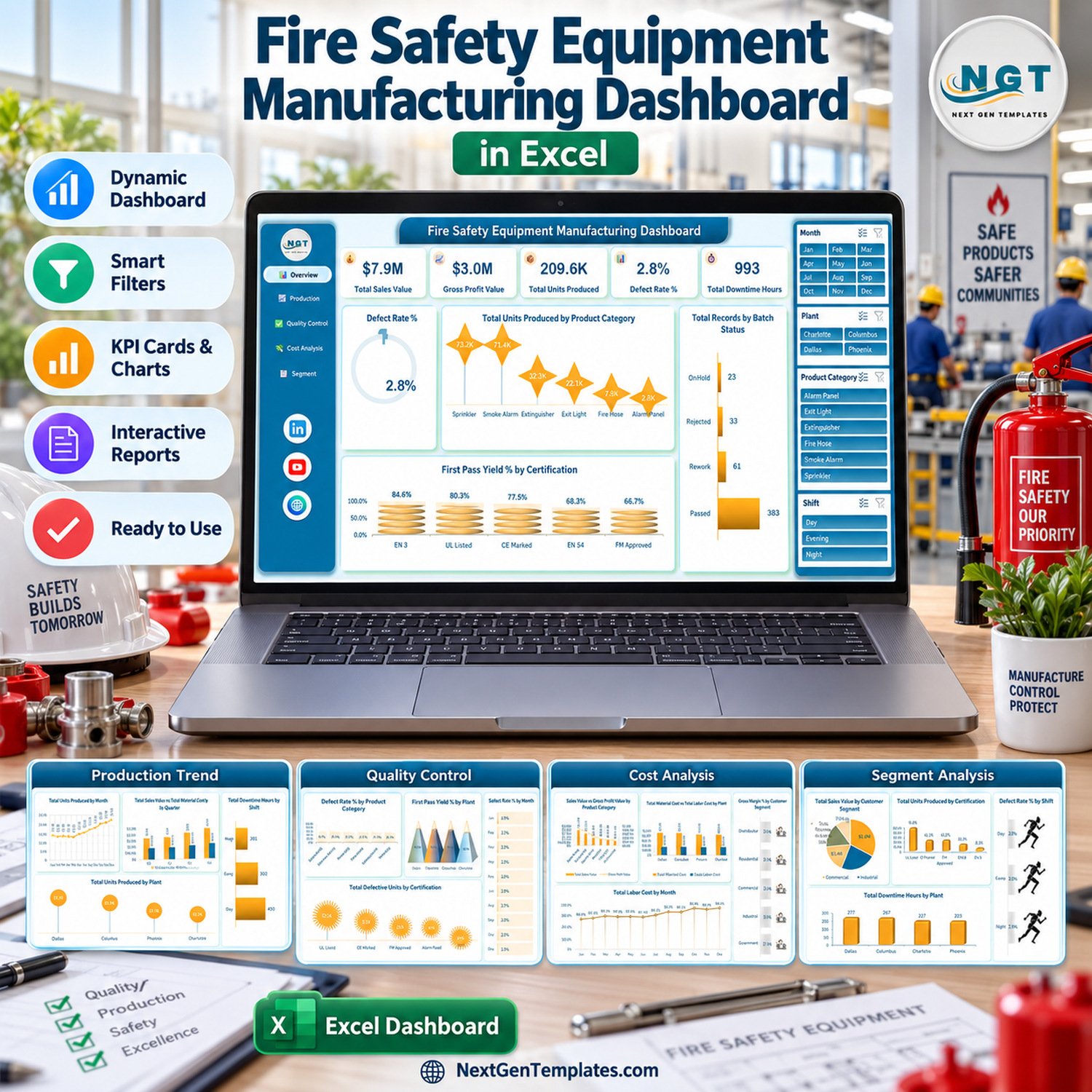
The Fire Safety Equipment Manufacturing Dashboard in Excel turns 500 sample batch records into 5 slicer-driven dashboard pages with 5 KPI cards and 20 charts. It tracks sales value, gross profit, units produced, defect rate %, first pass yield % and downtime hours across 4 plants, 3 shifts, 6 product categories and all 12 months of 2025. Paste your own batch data into one table, click Refresh All and every page follows.Fire Safety Equipment Manufacturing Dashboard in Excel
🏭 Built for production, quality and plant managers who want one clear view of output, defects and cost in the Excel they already use, instead of waiting for a manufacturing execution system rollout.Fire Safety Equipment Manufacturing Dashboard in Excel
✅ Instant download · One-time payment · No subscription · No macros · Workbook + user manual PDF
⚠️ Please note: this is an analytics workbook filled with fictional sample data. It is not a quality-management, inspection, testing or certification system, and it does not verify or imply compliance with UL, FM, EN, CE, NFPA, BIS or any other standard. Certification names such as “UL Listed” or “EN 54” are simply sample category labels that you can rename to match your own product groups.Fire Safety Equipment Manufacturing Dashboard in Excel
🔑 Key Features of This Fire Safety Equipment Manufacturing Dashboard
📊 5 KPI cards on the Overview – Total Sales Value ($7.9M), Gross Profit Value ($3.0M), Total Units Produced (209.6K), Defect Rate % (2.8%) and Total Downtime Hours (993) sit across the top of the first page and recalculate with every slicer selection.Fire Safety Equipment Manufacturing Dashboard in Excel
🎛️ 4 slicers on every page – Month, Plant, Product Category and Shift slicers appear on all five pages, so you can isolate, for example, night-shift sprinkler output at the Dallas plant in two clicks and see every chart on that page respond.
📈 20 charts across 5 pages – production trend, quality control, cost analysis and customer segments, from Total Units Produced by Month to Gross Margin % by Customer Segment. All charts read from 25 pivot tables built on a single Excel Table, so nothing is typed in by hand.
✅ Quality metrics already defined – Defect Rate % is defective units divided by units produced (5,868 of 209,599 in the sample), and First Pass Yield % is the share of batches whose status is Passed. Both break down by product category, plant, certification label, shift and month.
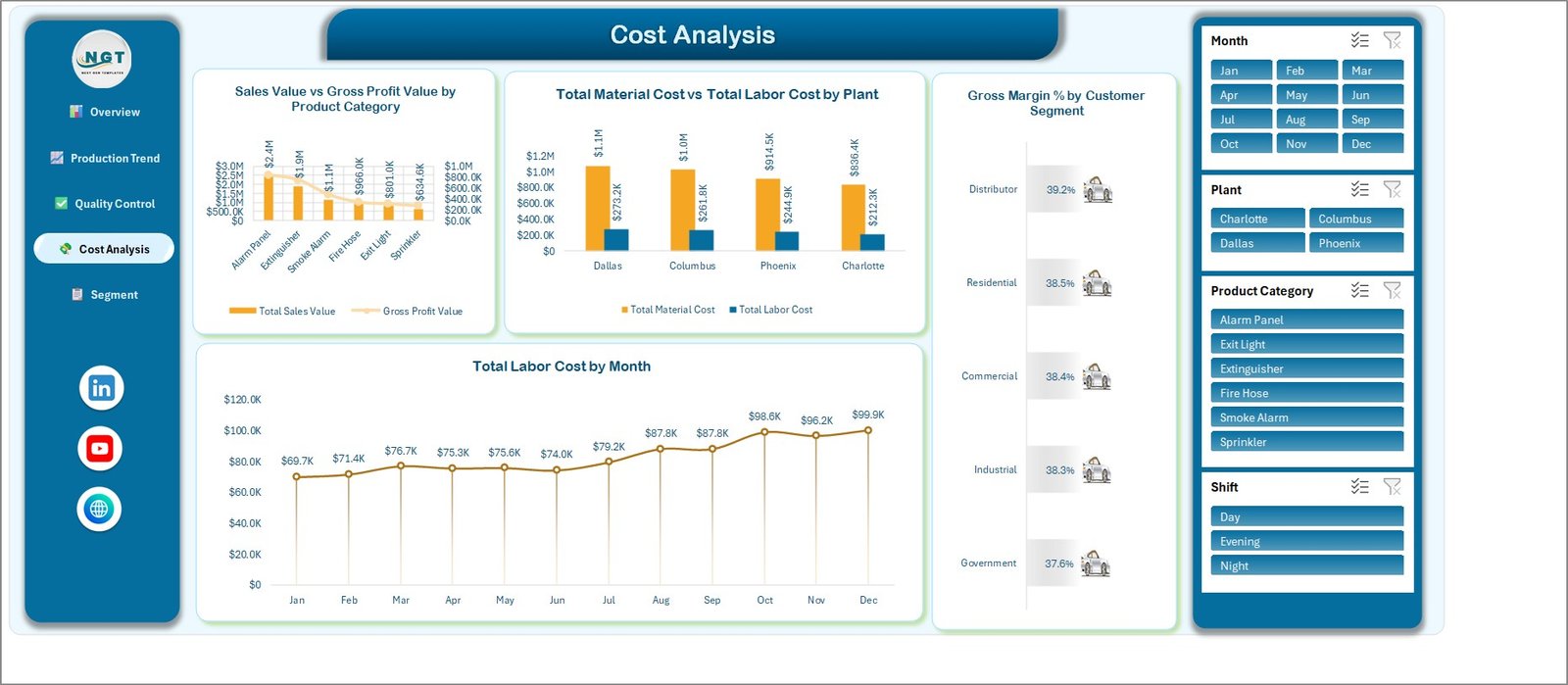
💰 Cost and margin view – gross profit is sales value minus material cost and labor cost, giving a 38.4% gross margin on the sample. The Cost Analysis page compares material against labor cost by plant and ranks gross margin by customer segment.
🗂️ 27-column data table – 500 batch rows (FSE-0001 to FSE-0500) with Production Date, Plant, Production Line, Shift, Supervisor, Product Category, Certification, Customer Segment, Batch Status, units, downtime, costs, sales value and inspection score, plus helper columns for Month, Year, Quarter and status counts.
🔓 No macros, no add-ins – a standard .xlsx workbook using native pivot tables, pivot charts and Excel slicers. There is nothing to enable and no external data connection.
📦 What’s Inside the Workbook
The download is a ZIP holding the .xlsx workbook and the Excel Dashboard user manual PDF. The workbook has seven sheets: five dashboard pages with a left navigation panel, a Data sheet and a Support sheet.
Page 1: Overview
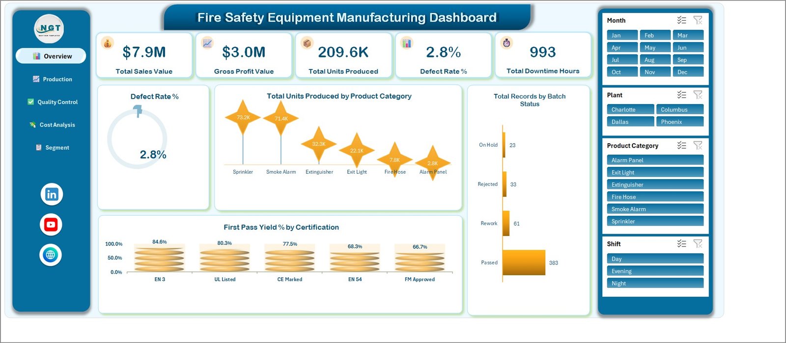
The five KPI cards sit above Defect Rate % (a 2.8% ring gauge), Total Units Produced by Product Category (Sprinkler 73.2K and Smoke Alarm 71.4K lead, Alarm Panel trails at 2.8K), Total Records by Batch Status (383 Passed, 61 Rework, 33 Rejected, 23 On Hold) and First Pass Yield % by Certification (EN 3 at 84.6% down to FM Approved at 66.7%).
Page 2: Production Trend
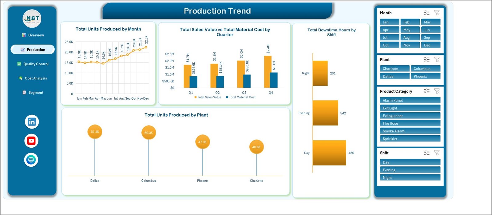
Shows Total Units Produced by Month (15.3K in January rising to 22.3K in December), Total Sales Value vs Total Material Cost by Quarter (Q4 reaches $2.4M against $1.1M), Total Downtime Hours by Shift (Day 450, Evening 342, Night 201) and Total Units Produced by Plant (Dallas 61.4K, Columbus 60.3K, Phoenix 47.3K, Charlotte 40.6K).
Page 3: Quality Control
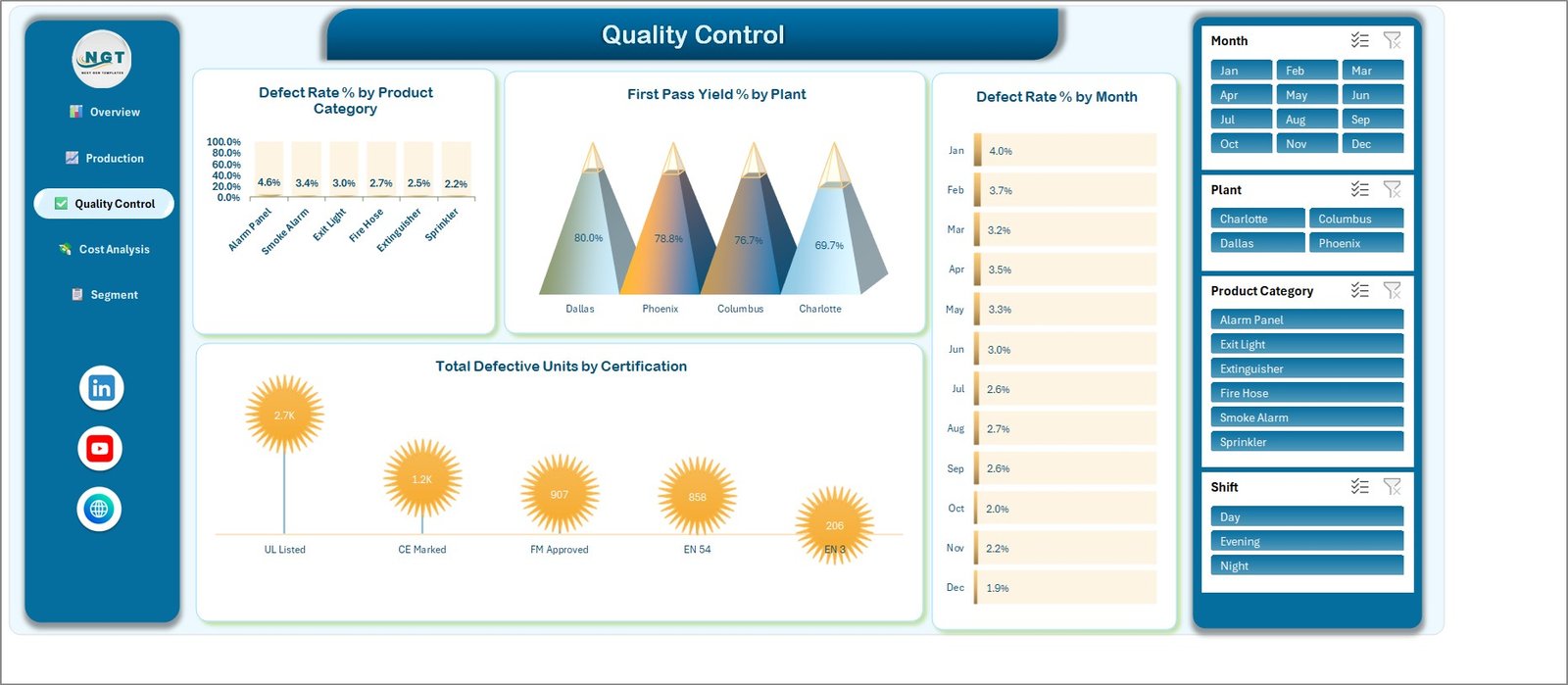
Covers Defect Rate % by Product Category (Alarm Panel highest at 4.6%, Sprinkler lowest at 2.2%), First Pass Yield % by Plant (Dallas 80.0%, Phoenix 78.8%, Columbus 76.7%, Charlotte 69.7%), Defect Rate % by Month (4.0% in January easing to 1.9% in December) and Total Defective Units by Certification (UL Listed 2.7K, CE Marked 1.2K, FM Approved 907, EN 54 858, EN 3 206).
Page 4: Cost Analysis
Compares Sales Value vs Gross Profit Value by Product Category and Total Material Cost vs Total Labor Cost by Plant (Dallas: $1.1M material against $273.2K labor), then shows Gross Margin % by Customer Segment (Distributor 39.2% down to Government 37.6%) and Total Labor Cost by Month ($69.7K in January to $99.9K in December).
Page 5: Segment Analysis
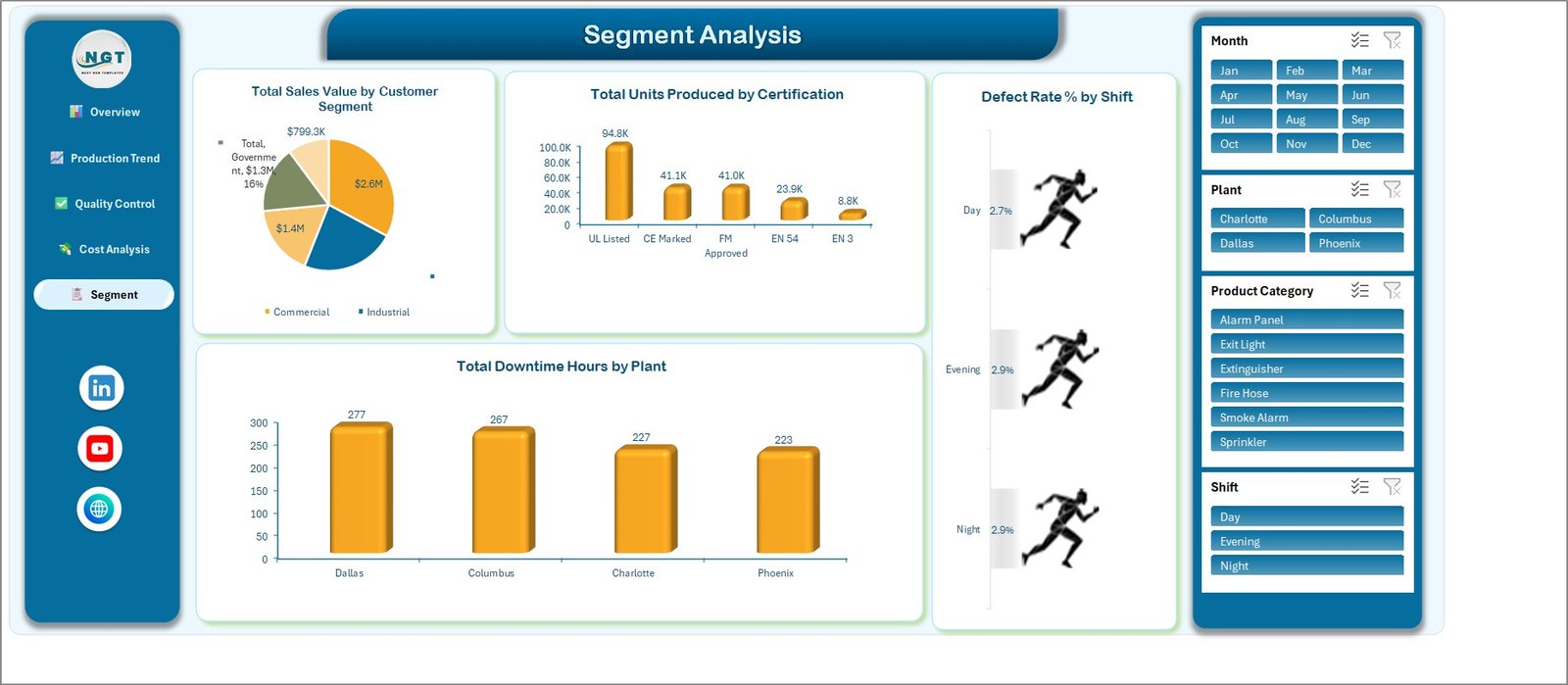
Breaks results down with Total Sales Value by Customer Segment (Commercial is the largest slice at $2.6M), Total Units Produced by Certification (UL Listed 94.8K, CE Marked 41.1K, FM Approved 41.0K), Defect Rate % by Shift (Day 2.7%, Evening and Night 2.9%) and Total Downtime Hours by Plant (Dallas 277, Columbus 267, Charlotte 227, Phoenix 223).
Data Sheet
An Excel Table named TblData holds the 500 sample batches in 27 columns. Because every pivot table uses this table as its source, new rows you paste inside it are picked up on the next refresh without editing any chart range.
Support Sheet
The Support sheet holds the 25 pivot tables and helper calculations behind the cards and charts. You never need to edit it; leave it in place so the dashboard pages keep their links.
📊 Excel Dashboard vs. Google Sheets vs. Paid MES Software — Where This Fits
| Feature | This Excel Dashboard | DIY Google Sheets Build | Paid MES / QMS Platform |
|---|---|---|---|
| Cost | ✅ $17.99 one-time (sale price) | Free tool, but you build every chart | Quote-based subscription |
| Platform | Desktop Microsoft Excel | Web browser | Vendor cloud or on-premise |
| Setup time | ✅ Minutes: paste data, Refresh All | Hours to days | Weeks of implementation |
| Ready-made charts and KPI cards | ✅ 20 charts, 5 KPI cards | None until built | ✅ Configurable |
| Slicer filtering | ✅ Month, Plant, Product Category, Shift | Possible if you build it | ✅ |
| Real-time team collaboration | Through OneDrive or SharePoint co-authoring | ✅ Native | ✅ Native |
| Live machine or shop-floor data | ❌ Manual paste | ❌ Manual entry | ✅ Usually via integrations |
| Test records, audit trail, certification evidence | ❌ Not included | ❌ Not included | Depends on the modules bought |
| Year-1 cost at 5 users | ✅ $17.99 total | $0 plus build time | Typically thousands |
For manufacturers who want a monthly view of output, defects, yield and margin without paying for an enterprise platform, this workbook sits in the sweet spot.
👥 Who This Template Is For — and Who It’s Not For
✅ This template is built for:
- Plant and production managers at small and mid-sized makers of extinguishers, smoke alarms, sprinklers, fire hoses, exit lights or alarm panels
- Quality analysts who want defect rate % and first pass yield % by plant, shift, product category and month in one file
- Operations and finance leads who need material cost, labor cost and gross margin by plant and customer segment
- Excel learners practising pivot-table dashboards on a realistic manufacturing dataset
❌ This template is NOT for:
- Teams that need a certified quality-management system, product test records, an audit trail or compliance evidence
- Plants that want live machine feeds, OEE from sensors or automatic MES integration
- Users working only in Excel for the web or Google Sheets
⚙️ How to Use the Dashboard
- Unzip the download and open the .xlsx in desktop Microsoft Excel (Microsoft 365 or Excel 2016 or later on Windows recommended).
- Click through the five pages from the left navigation panel and try the Month, Plant, Product Category and Shift slicers on the sample data.
- Open the Data sheet and replace the rows inside TblData with your own batch records, keeping the column headers unchanged.
- Fill the helper columns for each new row: Month, Year and Quarter carry formulas you can copy down; Total Records and the four status counts are 1 or 0.
- Go to Data > Refresh All so all 25 pivot tables, 20 charts and 5 KPI cards update. See Microsoft’s guide to PivotTables if you are new to them.
- Clear the slicer filters and review each page before sharing it in your monthly production meeting.
💼 Real-World Use Cases
Maria runs production at a two-plant extinguisher and fire hose maker. She pastes each month’s batch log into the Data sheet, refreshes, and uses the Plant slicer to show why one site’s first pass yield trails the other before the weekly operations review.
Dev is the quality analyst for a smoke alarm and alarm panel line. He filters the Quality Control page by product category and shift to see where defect rate % climbs, then takes the Defect Rate % by Month chart into his corrective-action meeting as a trend picture, not as a test report.
Aisha manages finance for a distributor-facing sprinkler business. She opens the Cost Analysis page to compare material and labor cost by plant and to check which customer segment carries the best gross margin before annual price talks.
❓ Frequently Asked Questions
What does the Fire Safety Equipment Manufacturing Dashboard in Excel track?
It tracks Total Sales Value, Gross Profit Value, Total Units Produced, Defect Rate % and Total Downtime Hours as KPI cards, plus first pass yield, material cost, labor cost and gross margin in 20 charts. You can slice everything by month, plant, product category and shift.
Does it certify products or prove UL, FM or EN compliance?
No. The workbook is an analytics template on fictional sample data. It does not test, inspect or certify anything and makes no UL, FM, EN, CE, NFPA or BIS compliance claim. Certification names are sample labels that group production records for charting.
Which Excel version do I need?
Use desktop Microsoft Excel, ideally Microsoft 365 or Excel 2016 or later on Windows, where it was built. It needs no macros or add-ins. Excel for Mac and Excel for the web can open the file, but slicer layout and chart styling may render differently there.
Does the dashboard update automatically when I add data?
The pivot tables read an Excel Table, so pasted rows are included, but Excel does not refresh pivots on its own. After changing the Data sheet, click Data > Refresh All once and every KPI card, chart and slicer updates.
How long does setup take?
With a batch export already in the same column order, setup takes about 10 to 15 minutes: paste the rows into the Data sheet, copy the helper formulas down, and click Refresh All. Renaming plants, categories or segments needs no changes to the charts.
How does this compare to paid MES or quality software?
A paid MES or QMS platform adds live machine data, workflows and audit records on a subscription. This workbook costs $17.99 once and gives a fast monthly view of output, defects, yield and margin from data you already export, without replacing those systems.
👤 About the Author
Built by PK — Microsoft Certified Professional with 15+ years of Excel, Google Sheets and Power BI experience and founder of NextGenTemplates. Find step-by-step tutorials on YouTube at @PKAnExcelExpert, @NextGenTemplates and @NeoTechNavigators. Every template is hand-built and tested before release.
🔗 Explore Related Templates
Browse all Excel Dashboard Templates or the Excel Manufacturing Templates collection. Close matches for this workbook:
- 🏭 Digital Twins in Manufacturing Dashboard in Excel – another multi-page manufacturing analytics workbook.
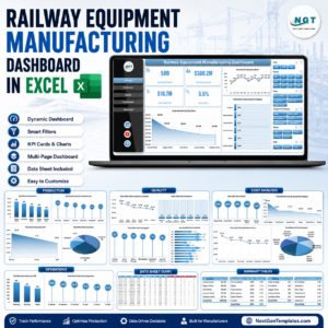
- 🚆 Railway Equipment Manufacturing Dashboard in Excel – production and quality KPIs for heavy equipment.
- 🛡️ Defense Equipment Manufacturing Dashboard in Excel – output, cost and delivery analysis.
- 🧯 Fire Safety Services KPI Dashboard in Excel – a month-picker KPI scorecard for fire protection service firms (a different template family).
- 📋 Fire Safety Equipment Checklist in Excel – a simple equipment checklist.
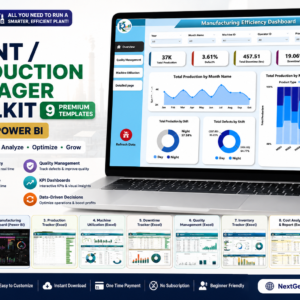
💎 Save more with a bundle – get 9 production templates in the Plant Production Manager Toolkit →
📖 Click here to read the Detailed Blog Post
🎥 Visit our YouTube channel for step-by-step video tutorials
Watch the step-by-step video Demo:
👉 YouTube.com/@NextGenTemplates
📅 Last updated: September 2026







Reviews
There are no reviews yet.