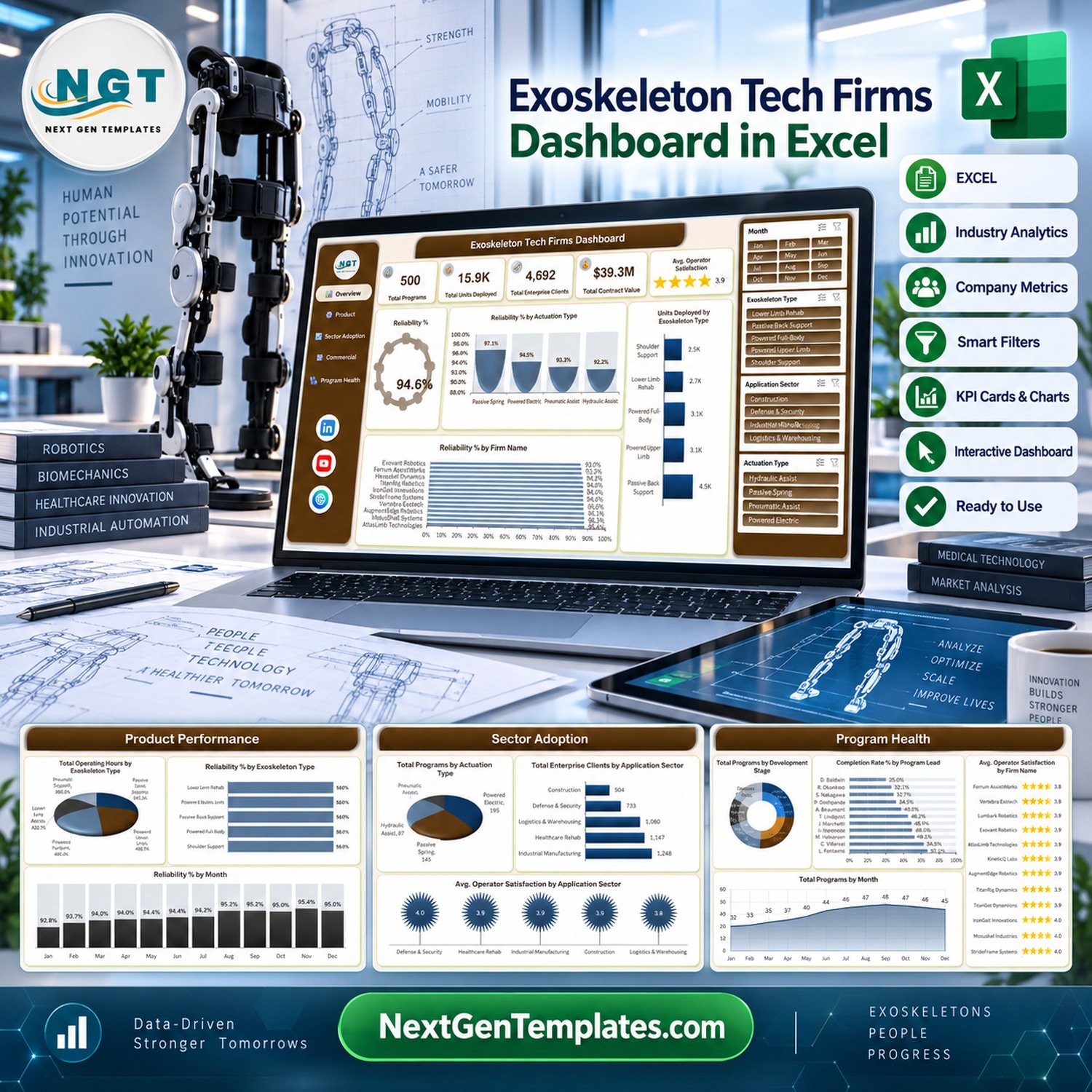
The Exoskeleton Tech Firms Dashboard in Excel reports on 500 sample exoskeleton programs across 5 interactive pages, with 5 KPI cards, 20 charts and 4 slicers (Month, Exoskeleton Type, Application Sector, Actuation Type). The sample data table carries 27 columns and 500 rows. Setup takes under 10 minutes: paste your own records over the Data sheet, refresh, and every page recalculates.
🌍 Join 8,400+ teams in 40+ countries using NextGenTemplates to replace paid SaaS tools with one-time-purchase Excel, Google Sheets, Power BI and HTML templates.
✅ Instant download · One-time payment · No subscription · No per-user fees · Lifetime access
⚠️ Please read first. This is a reporting template that charts figures you type or paste in. It is not medical, clinical, rehabilitation, ergonomic or occupational-health advice. It does not assess or establish compliance with FDA clearance or approval, CE marking, the EU MDR, ISO 13485, ISO 13482, or any medical-device, machinery or PPE regulation. It does not evaluate device safety, efficacy, injury-reduction performance, or fitness for any clinical or workplace use. It is not investment advice — every funding, contract-value, margin and market figure shipped with the file is invented demo data, not research. All 12 firm names in the sample workbook (Exovant Robotics, Ferrum Assist Works, TitanRig Dynamics, Hexoskel Industries, Lumbarix Robotics, IronGait Innovations, StrideFrame Systems, Vertebra Exotech, AugmentEdge Robotics, MotusShell Systems, Kinetiq Exo Labs, AtlasLimb Technologies) are placeholder names. They are not real companies and imply no association with, endorsement by, or data from any actual exoskeleton manufacturer.
This is the Microsoft Excel edition. Our similarly-named KPI Dashboard and KPI Scorecard lines are different templates with a different structure — see the links at the end if a month-picker scorecard suits you better.
🔑 Key Features of the Exoskeleton Tech Firms Dashboard
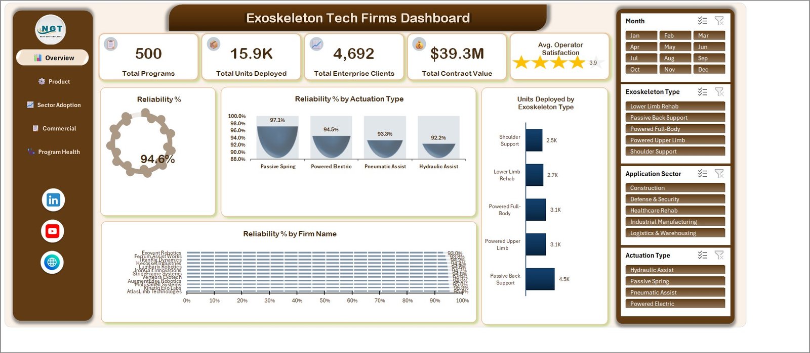
📊 Five KPI cards on one screen. The Overview header carries Total Programs, Total Units Deployed, Total Enterprise Clients, Total Contract Value and Avg. Operator Satisfaction, plus a Reliability % ring gauge. In the shipped sample these read 500 programs, 15.9K units, 4,692 enterprise clients, $39.3M contract value, 3.9 satisfaction and 94.6% reliability.
🎛️ Four slicers wired to every page. Month, Exoskeleton Type, Application Sector and Actuation Type sit in a fixed right-hand rail on all five pages, so one click re-cuts all 20 charts at once.
🧮 Three calculated fields do the arithmetic for you. Contract Margin (Contract Value minus Production Cost), Reliability Rate (Fault Free Hours divided by Operating Hours) and Program Completion Rate (Completed Count divided by Total Records) are pivot calculated fields, so they recompute under every slicer combination rather than sitting as static formulas.
🗂️ A 27-column data table you overwrite. TblData holds Firm Name, Region, Exoskeleton Type, Application Sector, Development Stage, Program Lead, Actuation Type, Project Status, Units Deployed, Operating Hours, Fault Free Hours, Enterprise Clients, Contract Value, Production Cost, Operator Satisfaction, Month, Year, Quarter and the counter columns the pivots aggregate.
📁 Two files in the download. The ZIP contains the .xlsx workbook and an Excel Dashboard – User Manual.pdf. No macros, no add-ins, no internet connection required.
📦 What’s Inside the Exoskeleton Tech Firms Dashboard in Excel
Seven sheets: five dashboard pages plus a Data sheet and a Support sheet that feeds the pivot helpers. All five gallery images below are genuine dashboard pages — none of them is a “Get More Templates” upsell page.
Page 1: Overview
Five KPI cards (Total Programs, Total Units Deployed, Total Enterprise Clients, Total Contract Value, Avg. Operator Satisfaction) sit above a Reliability % ring gauge. Charts are Reliability % by Actuation Type, Units Deployed by Exoskeleton Type and Reliability % by Firm Name.
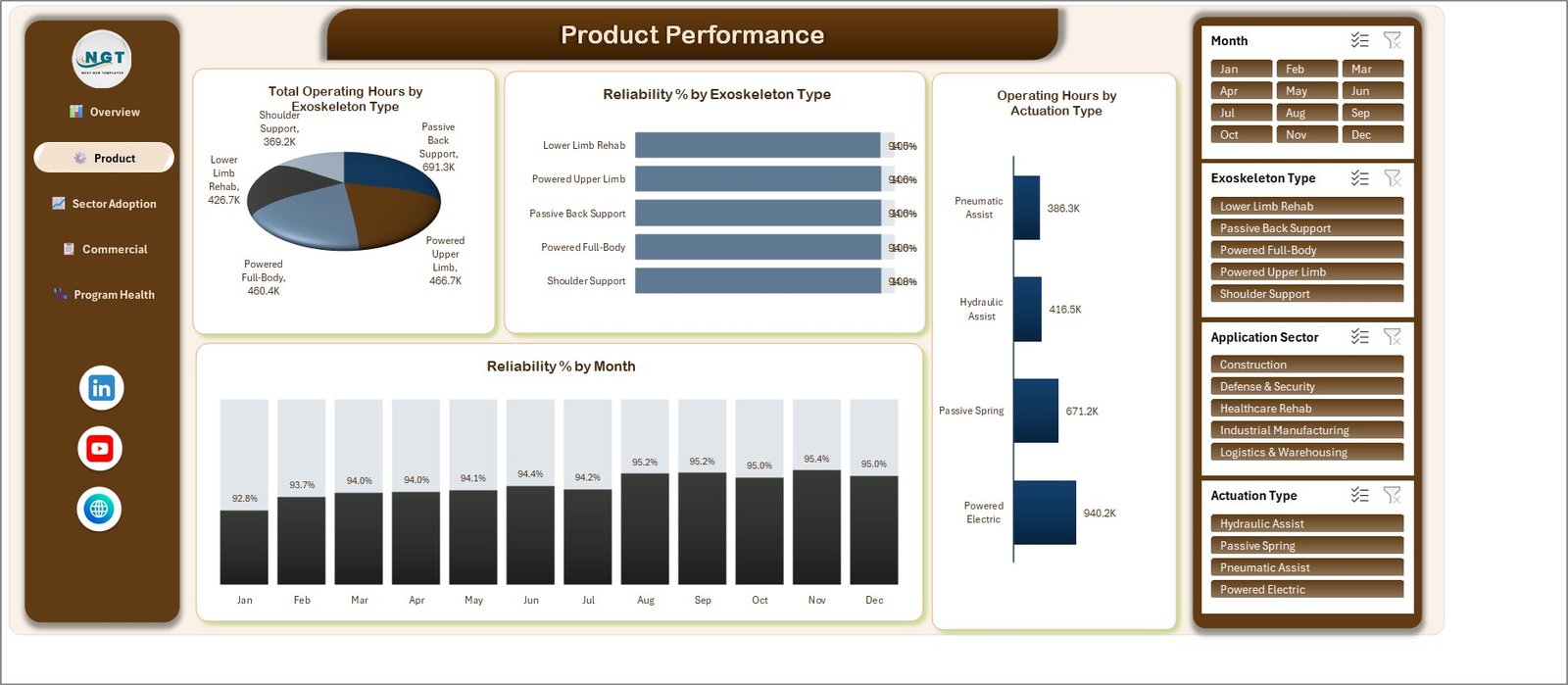
Page 2: Product Performance
Compares uptime and reliability by hardware family. Charts are Total Operating Hours by Exoskeleton Type, Reliability % by Exoskeleton Type, Operating Hours by Actuation Type and Reliability % by Month.
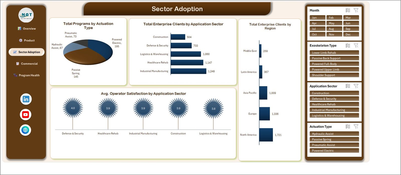
Page 3: Sector Adoption
Shows where the fleet is being taken up. Charts are Total Programs by Actuation Type, Total Enterprise Clients by Application Sector, Total Enterprise Clients by Region and Avg. Operator Satisfaction by Application Sector.
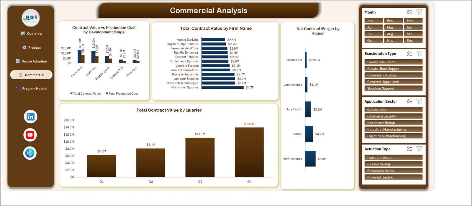
Page 4: Commercial Analysis
The money view. Charts are Contract Value vs Production Cost by Development Stage, Total Contract Value by Firm Name, Net Contract Margin by Region and Total Contract Value by Quarter.
Page 5: Program Health
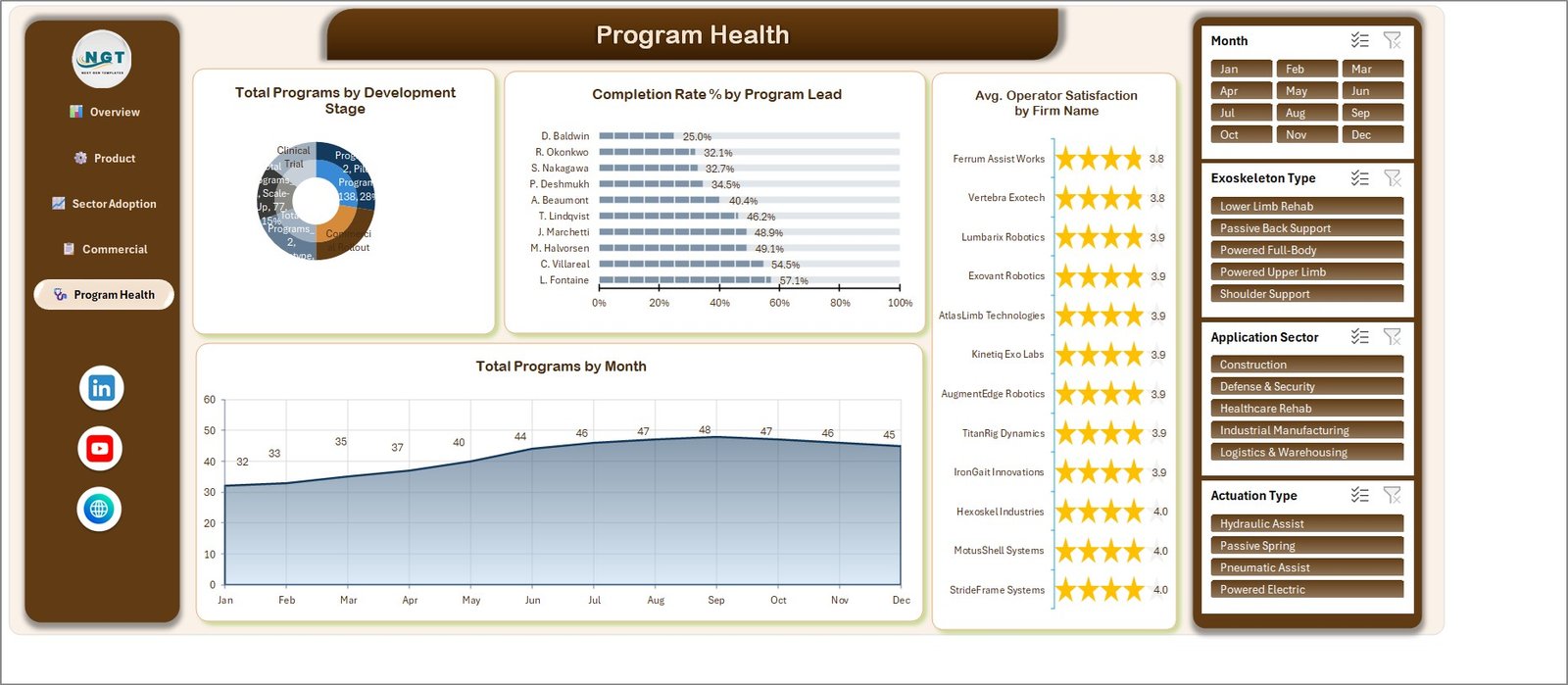
Delivery and ownership. Charts are Total Programs by Development Stage, Completion Rate % by Program Lead, Avg. Operator Satisfaction by Firm Name and Total Programs by Month.
Data sheet and Support sheet
The Data sheet holds TblData — 500 rows by 27 columns of sample records. The Support sheet holds the pivot caches and helper blocks the charts read from. Replace the Data rows; leave Support alone.
🧾 Honest notes on this build
We check every page before listing and publish what we find. Four cosmetic label problems ship in this file:
- On Page 2, “Reliability % by Exoskeleton Type” prints the 100% target-cap label on top of the value label, so each bar reads as an overlapping smudge instead of a clean percentage.
- On Page 5, the “Total Programs by Development Stage” doughnut overflows its labels into the ring and clips them, and the series name (“Total Programs_2”) leaks into the label text. Only the Pilot Program and Scale-Up values stay readable.
- On Page 1, “Reliability % by Firm Name” squeezes 12 category labels and 12 value labels into a short band, so they touch and overlap.
- On Page 4, the “Commercial Rollout” axis category truncates to “Commerci…”.
All four are chart-label formatting, not wrong maths, and all are fixable in a few clicks (right-click the series, then Format Data Labels, or make the chart taller). We also checked for the other faults that turn up on this line and did not find them: no count KPI is currency-formatted, neither pie hides categories from its labels, and no series is washed out to near-white.
✅ The totals reconcile. We recomputed them by hand: the five Units Deployed bars (2.5K + 2.7K + 3.1K + 3.1K + 4.5K) sum to the 15.9K KPI card; the Application Sector bars and the Region bars each sum to 4,692 enterprise clients; the Actuation Type pie (195 + 145 + 87 + 73) and the twelve monthly points (32 through 45) each sum to 500 programs; the quarterly contract values ($6.2M + $8.1M + $11.1M + $13.9M) reach the $39.3M card; and the regional margins total $14.7M, which is the $39.2M of contract value less the $24.5M of production cost.
📊 Exoskeleton Tech Firms Dashboard vs. Google Sheets vs. Paid BI/SaaS — Where This Fits
| Feature | Exoskeleton Tech Firms Dashboard (Excel) | Google Sheets equivalent | Tableau / Power BI Pro / Domo |
|---|---|---|---|
| Cost | $17.99 one-time ✅ | $0-30 one-time | $14-83 / user / month |
| Platform | Microsoft Excel, desktop, offline ✅ | Browser, needs an account | Cloud service plus licence |
| Setup time | Under 10 minutes ✅ | 15-30 minutes | Days to weeks |
| Works with no internet | Yes ✅ | No | No |
| Real-time team collaboration | Via OneDrive / SharePoint | Native ✅ | Native ✅ |
| Customisable fields and charts | Fully, it is a plain workbook ✅ | Fully | Within the vendor model |
| Pre-built pages out of the box | 5 pages, 20 charts, 4 slicers ✅ | Build your own | Build your own |
| Your data leaves your machine | Never ✅ | Stored by Google | Stored by the vendor |
| Year-1 cost at 5 users | $17.99 total ✅ | $0-30 total | $840-4,980 |
For a team that wants a finished exoskeleton programme report today without a BI licence or a per-seat bill, this template sits in the sweet spot.
👥 Who This Template Is For — and Who It’s Not For
✅ Built for:
- Programme managers and PMO analysts at exoskeleton, wearable-robotics or assistive-device firms who already keep their programme data in a spreadsheet
- Business-development and commercial teams who report contract value, production cost and margin by region and stage to a board
- Industry analysts, consultants and students who need a presentable reporting layout and will bring their own numbers
- Anyone who wants an Excel reporting layer and does not want a monthly BI subscription
❌ Not for:
- Anyone needing regulatory evidence — this file has no role in FDA, CE, EU MDR, ISO 13485 or ISO 13482 submissions and is not a quality record
- Clinical, rehabilitation or occupational-health decision-making, or any judgement about whether a device is safe for a patient or a worker
- Investors looking for market research — the numbers in the file are invented demo data
- Teams needing live database connections, row-level security or scheduled refresh — that is Power BI’s job
- Buyers who want a month-picker KPI scorecard with traffic lights — that is our KPI Scorecard line, not this one
⚙️ How to Use It
- Unzip the download and open the .xlsx in Microsoft Excel (2016 or later, or Microsoft 365).
- Open the Data sheet and paste your own records over TblData, keeping the 27 column headers exactly as they are.
- Press Ctrl+Alt+F5, or Data then Refresh All, so every pivot and chart picks up your rows.
- Use the four slicers in the right-hand rail to filter by Month, Exoskeleton Type, Application Sector or Actuation Type.
- Rename the page headers and recolour the theme to match your own branding, then print or export to PDF.
💼 Real-World Use Cases
Priya runs the PMO at a 40-person industrial exoskeleton maker. She pastes her monthly programme extract into the Data sheet and uses the Program Health page to show her leadership which development stages are stacking up and how completion rate differs by programme lead — without buying a BI seat for everyone who just wants to read a chart.
Daniel is a commercial analyst at a rehabilitation-device distributor. Each quarter he filters the Commercial Analysis page by region and exports the Contract Value vs Production Cost view straight into his board pack, using the Net Contract Margin by Region chart to open the pricing conversation.
Aisha teaches an operations-analytics module. She hands students the shipped sample workbook as a modelling exercise — the data is openly fictional, which is exactly what she wants for a classroom.
❓ Frequently Asked Questions
Does this assess device safety or give investment advice?
No — to both. The Exoskeleton Tech Firms Dashboard in Excel is a reporting template that charts figures you enter. It makes no judgement about device safety, efficacy or injury reduction, and it is not investment, medical, clinical or regulatory advice of any kind.
Are the companies in the sample file real?
No. All 12 firm names, along with every funding, contract and satisfaction figure, are invented placeholder data shipped so the charts have something to draw. They imply no association with, or endorsement by, any real exoskeleton manufacturer.
What does the template actually track?
Across five pages it tracks programme counts, units deployed, enterprise clients, contract value, production cost, contract margin, operating hours, reliability rate, programme completion rate and operator satisfaction, cut by firm, region, exoskeleton type, actuation type, application sector, development stage, programme lead, month and quarter.
How long does setup take?
Under 10 minutes. Paste your rows over the sample table on the Data sheet, keep the column headers, then press Refresh All. There are no macros to enable and no add-ins to install.
How does this compare to Tableau or Power BI Pro?
Those are licensed BI platforms charging roughly $14-83 per user per month and needing a modelling project to get started. This is a finished Excel workbook for a one-time $17.99, working offline on a laptop, with your data never leaving your machine.
Is this the same as your Robotics KPI Dashboard or KPI Scorecard?
No — they are separate products. This is the analytical, multi-page Excel dashboard line. The KPI Dashboard and KPI Scorecard lines are month-picker scorecards with traffic lights and MTD/YTD columns, built on a different layout.
Can I edit the charts and add my own KPIs?
Yes. It is an ordinary .xlsx with pivot tables and standard Excel charts — no macros, no protection, no locked sheets. Add columns to the data table, drop new fields into the pivots, and restyle anything you like.
👤 About the Author
Built by PK — Microsoft Certified Professional with 15+ years of Excel, Google Sheets and Power BI experience. Founder of NextGenTemplates, reaching 300K+ subscribers across YouTube channels (@PK-AnExcelExpert, @NextGenTemplates, @NeoTechNavigators). Every template is hand-built and tested before release.
🔗 Explore Related Templates
If you report on automation and robotics more broadly, the Robotics Process Automation Dashboard in Excel follows the same five-page layout for RPA programmes, and the Digital Twins in Manufacturing Dashboard in Excel covers simulation programmes on the factory floor. For a device-industry angle, see the Brain Computer Interfaces Dashboard in Excel.
Prefer a scorecard to an analytical dashboard? The Robotics Industry KPI Dashboard in Excel and the Robotics Industry KPI Scorecard in Excel are the month-picker versions — different templates, not duplicates of this one. Browse the full Excel Dashboard Templates collection for more.
Also available as: there is no Power BI or Google Sheets edition of this exoskeleton dashboard yet. The closest cross-platform pair is the Robotics Process Automation Dashboard in Power BI.
📖 Click here to read the Detailed Blog Post
🎥 Visit our YouTube channel for step-by-step video tutorials
👉 YouTube.com/@NextGenTemplates
📅 Last updated: September 2026