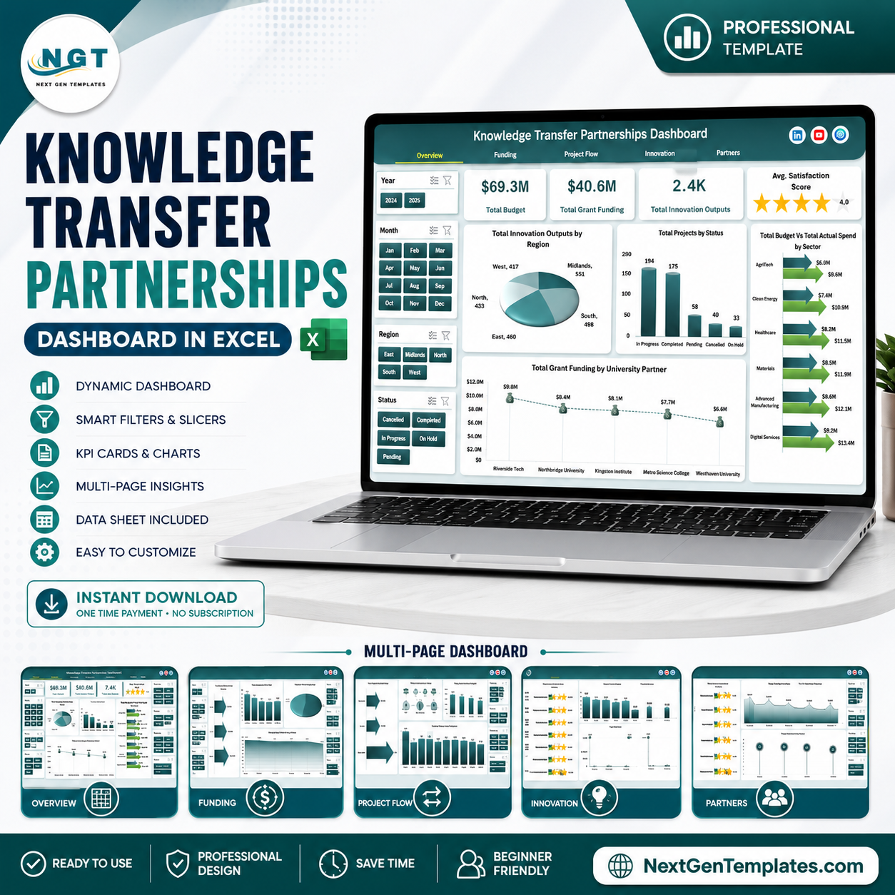


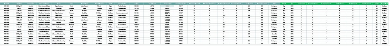
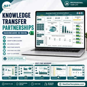
Knowledge Transfer Partnerships Dashboard in Excel helps universities, innovation teams, grant managers, and partnership leads review budget, actual spend, grant funding, milestones, innovation outputs, jobs created, satisfaction, regions, sectors, project stages, and partner performance in one workbook. Partnership reporting often gets delayed because finance, project flow, innovation, and partner data sit in separate files. This Excel dashboard gives you a practical one-time reporting file with sample data, slicers, pivot-driven charts, and a low-risk workflow: replace the sample rows, refresh the workbook, and review the updated dashboard before monthly or quarterly meetings.
Key Features of Knowledge Transfer Partnerships Dashboard in Excel
- Seven worksheet tabs covering Overview, Funding, Project Flow, Innovation, Partners, Data Sheet, and Support Sheet.
- High-level cards for Total Budget, Total Grant Funding, Total Innovation Outputs, Total Jobs Created, and Avg. Satisfaction Score.
- Interactive slicers so users can filter dashboard pages quickly without rebuilding formulas or charts.
- Funding analysis for budget vs actual spend, grant funding by year, leverage ratio, and milestones by project stage.
- Project flow tracking by priority, knowledge area, status, month, and milestone completion percentage.
- Innovation and partner reporting for outputs, satisfaction, jobs created, regions, organizations, sectors, project managers, and university partners.
- Editable Data Sheet where users can paste their own records in the same structure.
- Support Sheet with pivot tables that refresh the full dashboard after the data is updated.
Knowledge Transfer Partnerships Dashboard in Excel
What’s Inside the Knowledge Transfer Partnerships Dashboard in Excel
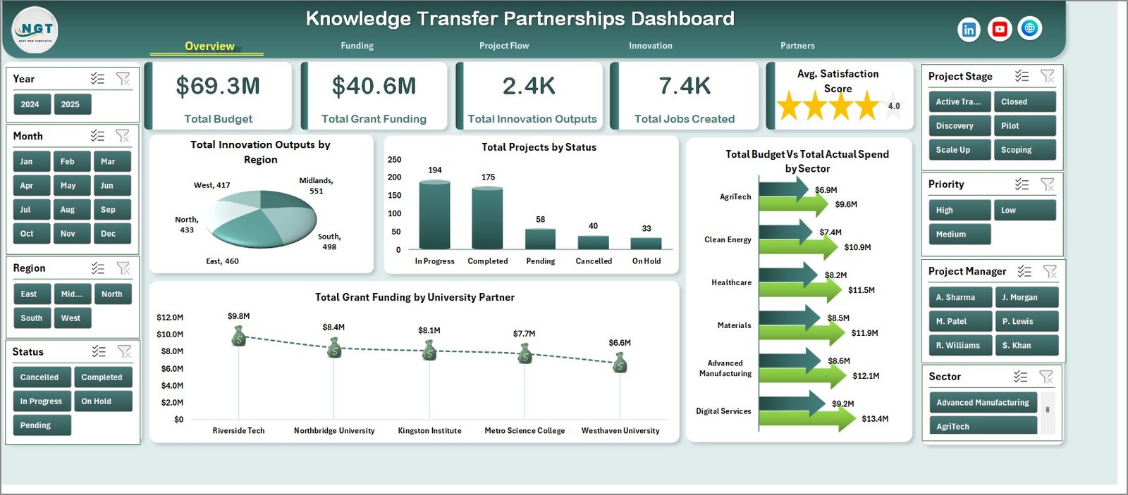
The workbook is built as a multi-page Excel reporting system for knowledge transfer partnership performance. The Overview Page gives leadership a fast read on Total Budget, Total Grant Funding, Total Innovation Outputs, Total Jobs Created, and Avg. Satisfaction Score. It also includes charts for Total Innovation Outputs by Region, Total Projects by Status, Total Grant Funding by University Partner, and Total Budget Vs Total Actual Spend by Sector.
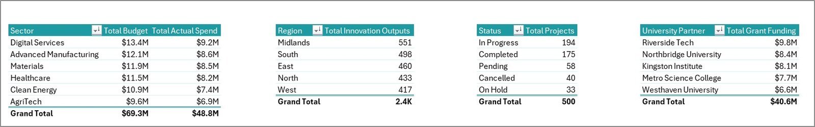
Total Innovation Outputs by Region helps you see which regions are producing the most measurable innovation activity. Use it to compare regional contribution and spot areas where projects may need more support.
Total Projects by Status summarizes the project pipeline across active, planned, completed, delayed, or similar statuses. It is useful for quickly identifying delivery pressure before a review meeting.
Total Grant Funding by University Partner shows which academic partners are linked with the highest funding value. This helps grant teams review partner concentration and funding distribution.
Total Budget Vs Total Actual Spend by Sector compares planned budget with actual spend across sectors. It helps users find sectors that are over budget, underutilized, or tracking close to plan.
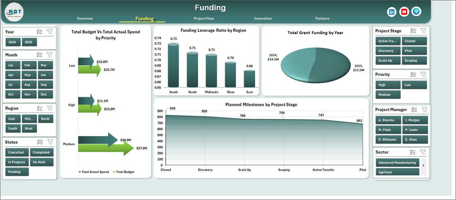
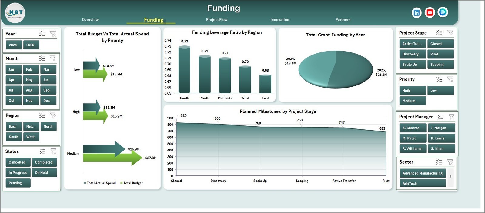
Funding
The Funding sheet includes Total Budget Vs Total Actual Spend by Priority, Funding Leverage Ratio by Region, Total Grant Funding by Year, and Planned Milestones by Project Stage. These charts help finance and grant teams compare money planned, money spent, funding growth, leverage, and expected delivery activity.
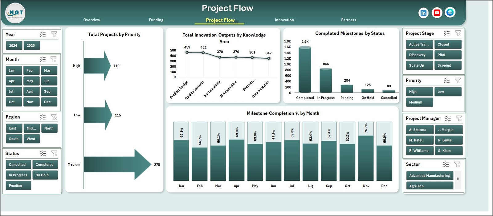
Project Flow
The Project Flow sheet covers Total Projects by Priority, Total Innovation Outputs by Knowledge Area, Completed Milestones by Status, and Milestone Completion % by Month. It is designed for delivery reviews where project managers need to see priority mix, knowledge-area output, milestone progress, and monthly completion trends.
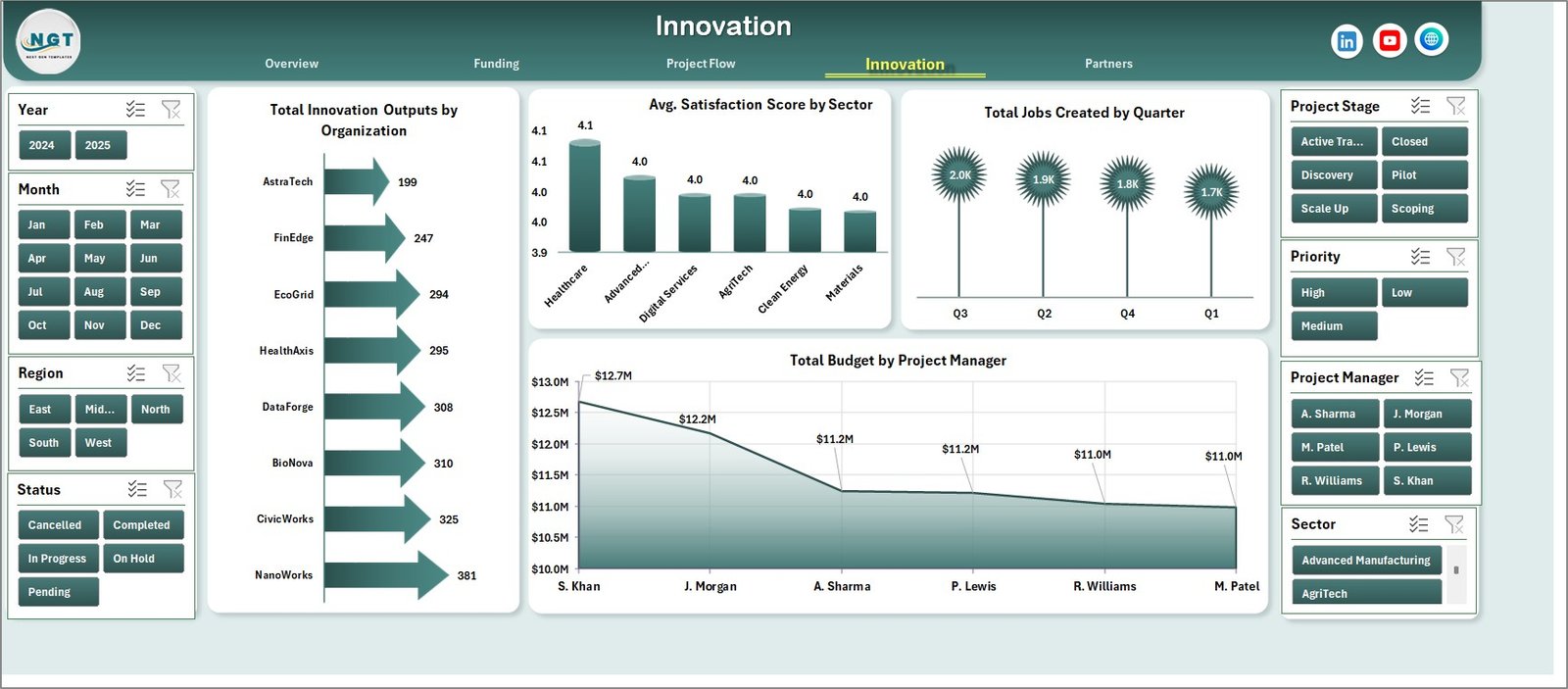
Innovation
The Innovation sheet analyzes Total Innovation Outputs by Organization, Avg. Satisfaction Score by Sector, Total Jobs Created by Quarter, and Total Budget by Project Manager. It connects project investment with visible outcomes such as jobs, partner satisfaction, and organization-level innovation activity.
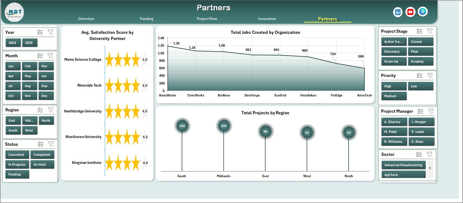
Partners
The Partners sheet focuses on Avg. Satisfaction Score by University Partner, Total Jobs Created by Organization, and Total Projects by Region. It is useful for partnership managers who need to review university performance, business outcomes, and geographic project coverage.
Knowledge Transfer Partnerships Dashboard in Excel vs. Google Sheets vs. Paid Project Management SaaS – Where This Fits
| Area | This Excel Dashboard | Google Sheets Alternative | Paid SaaS Alternative |
|---|---|---|---|
| Cost | One-time Excel template purchase | Low cost, but usually needs manual build | Monthly or annual subscription |
| Platform | Microsoft Excel | Browser-based Google Sheets | Asana, Monday.com, Smartsheet, grant software, or BI tools |
| Setup time | Replace sample records and refresh pivots | Requires formulas, pivots, and chart setup | Requires onboarding, permissions, and configuration |
| Real-time collaboration | Best for controlled offline or shared-drive reporting | Good browser collaboration | Strong multi-user workflow management |
| Customizable fields | Editable Excel data, pivots, charts, and slicers | Editable, but lighter dashboard workflow | Depends on plan and admin settings |
| Mobile access | Limited through Excel mobile or shared files | Good through browser and mobile apps | Usually strong mobile support |
| Share with link | Possible through OneDrive or SharePoint | Built in | Built in |
| Year-1 cost at 5 users | $17.99 one-time sale price | $0 plus setup time | Often hundreds to thousands of dollars per year |
| Best use | Monthly KTP reporting and review packs | Light shared tracking | Live task management, approvals, and workflow automation |
Who This Template Is For – and Who It’s Not For
This template is useful for knowledge transfer partnership managers, university enterprise teams, grant administrators, innovation program leads, project management offices, regional development teams, and consultants preparing partnership performance packs. It is especially helpful when your team exports project records from different systems and needs a clear Excel dashboard for management review.
It is not a grant application system, finance ledger, CRM, student information system, or live project management platform. It does not submit funding claims, manage contracts, or send workflow reminders. It is a reporting dashboard workbook for analysis after your source data is prepared.
How to Use the Knowledge Transfer Partnerships Dashboard in Excel
- Open the workbook in Microsoft Excel.
- Go to the Data Sheet and replace the sample rows with your own partnership project records.
- Keep the same column structure so slicers, pivots, and charts can read the data correctly.
- Go to the Data tab in the Excel Ribbon and click Refresh All.
- Use slicers on the dashboard pages to filter by year, region, sector, university partner, organization, priority, project stage, status, or project manager.
- Review Overview, Funding, Project Flow, Innovation, and Partners before sharing the workbook with stakeholders.
Data Sheet tab

Support sheet tab
Real-World Use Cases
Sarah, university KTP manager: uses the Overview and Partners pages before quarterly board meetings to explain grant funding, project status, partner satisfaction, and regional activity. James, innovation program lead: uses the Innovation page to connect budget, project managers, outputs, jobs created, and sector satisfaction in one review pack. Anita, grant finance analyst: uses the Funding sheet to compare budget vs actual spend by priority and sector before preparing stakeholder updates.
Frequently Asked Questions
What does the Knowledge Transfer Partnerships Dashboard in Excel track?
It tracks budget, actual spend, grant funding, innovation outputs, jobs created, satisfaction score, projects, priorities, milestones, project stages, sectors, regions, organizations, university partners, and project managers.
How many worksheet tabs are included?
The workbook includes seven tabs: Overview, Funding, Project Flow, Innovation, Partners, Data Sheet, and Support Sheet.
Do the charts update automatically?
The charts are powered by pivot tables. After updating the Data Sheet, click Refresh All from the Excel Data tab to update the dashboard pages.
Can I use my own partnership data?
Yes. Replace the sample rows in the Data Sheet with your own records while keeping the same column format.
Can the Support Sheet be hidden?
Yes. The Support Sheet contains pivot tables used to build the dashboard dynamically, and it can stay hidden during normal use.
Is this a live project management system?
No. It is an Excel reporting dashboard, not a task management, approval, grant submission, or CRM system.
About the Author
Built by PK – Microsoft Certified Professional with 15+ years of Excel, Google Sheets, and Power BI experience. Founder of NextGenTemplates, reaching 300K+ subscribers across YouTube channels. Every template is hand-built and tested before release.
Explore Related Templates
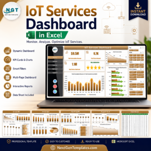
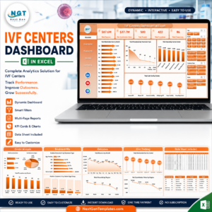
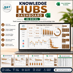
You may also like the Knowledge Hubs Dashboard in Excel, IVF Centers Dashboard in Excel, and FP&A Financial Planning & Analysis Pack. Browse more Excel Dashboard templates and Project Management Excel templates.
Download the Knowledge Transfer Partnerships Dashboard in Excel today and build a cleaner reporting workflow for funding, project flow, innovation, partner outcomes, and stakeholder review.
Last updated: June 28, 2026.


Reviews
There are no reviews yet.