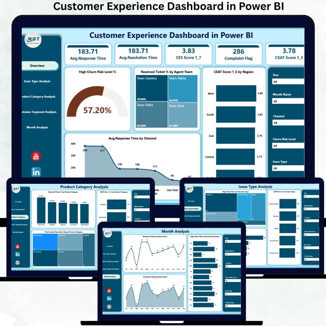
Delivering an outstanding customer experience is no longer optional—it is a competitive necessity. Customers expect faster responses, consistent service, and seamless interactions across channels. However, when customer data lives in scattered systems, static Excel files, or delayed reports, organizations struggle to identify service gaps and churn risks in time.
That is exactly why the Customer Experience Dashboard in Power BI becomes a powerful and practical solution 🚀.
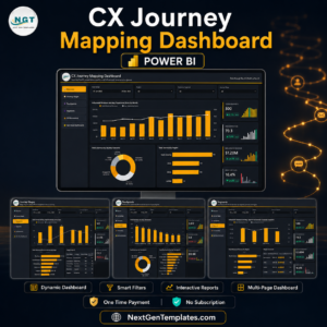
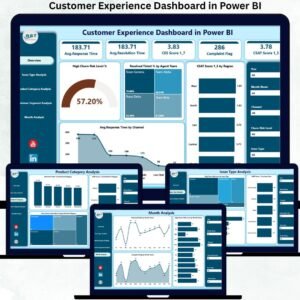
The Customer Experience Dashboard in Power BI is a ready-to-use, interactive analytics dashboard designed to track, analyze, and improve customer satisfaction, service quality, resolution efficiency, and churn risk—all from a single centralized view.
Instead of manually reviewing support reports or guessing customer sentiment, this dashboard converts raw customer service data into clear KPI cards, interactive visuals, and trend-based analysis. As a result, customer support leaders, operations teams, and senior management gain immediate clarity on what is working and what needs attention.
Because the dashboard runs on Power BI, it delivers real-time insights, smooth filtering, and strong visual storytelling—without complex tools or heavy technical effort.
✅ Key Features of Customer Experience Dashboard in Power BI
🎯 Customer-Centric KPIs – CSAT, churn risk, resolution rate, response time
📊 Centralized Experience Monitoring – One dashboard, complete visibility
⚡ Real-Time Insights – Faster response to service issues
🔽 Interactive Slicers – Analyze by issue type, product, segment, channel, or month
📈 Trend Analysis – Track improvement or decline over time
🚨 Early Churn Risk Identification – Act before customers leave
🧩 Scalable Design – Works for small teams to enterprise support centers
📦 What’s Inside the Customer Experience Dashboard in Power BI
✅ Overview Page – Executive Control Center
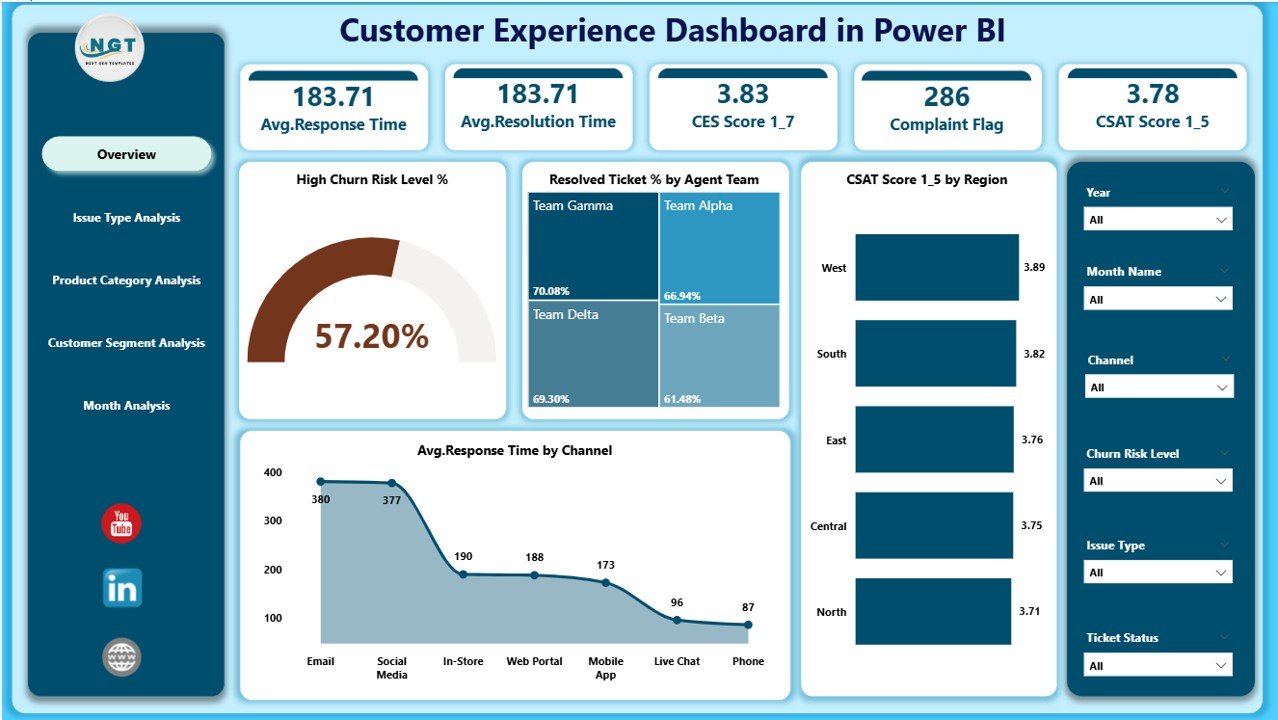
This is the first page leadership relies on for instant visibility.
KPI Cards
High Churn Risk Level %
Resolved Ticket %
Average CSAT Score
Average Response Time
Charts
High Churn Risk Level %
Resolved Ticket % by Agent Team
CSAT Score by Region
Average Response Time by Channel
With one glance, decision-makers know exactly where service performance stands.
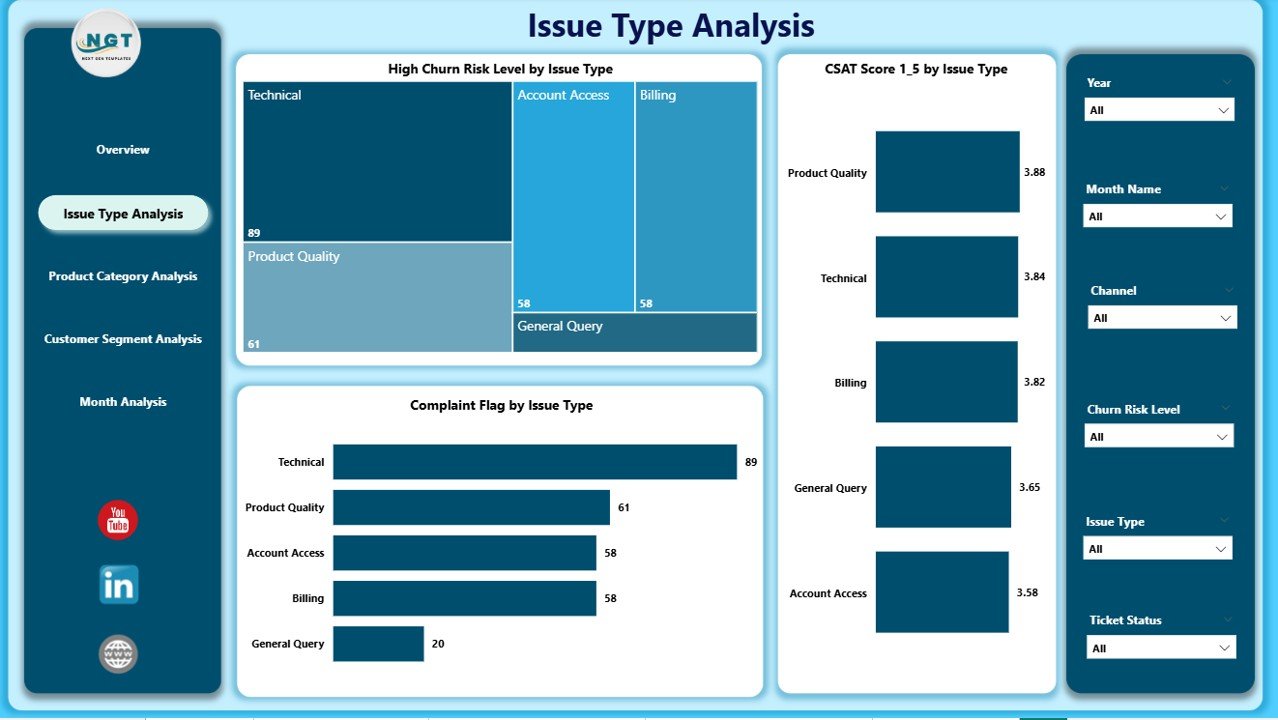
✅ Issue Type Analysis Page
This page explains why customers are unhappy.
Key Insights
High Churn Risk % by Issue Type
CSAT Score by Issue Type
Complaint Flag by Issue Type
This analysis helps teams:
Fix root-cause issues
Improve self-service and knowledge bases
Reduce repeat complaints
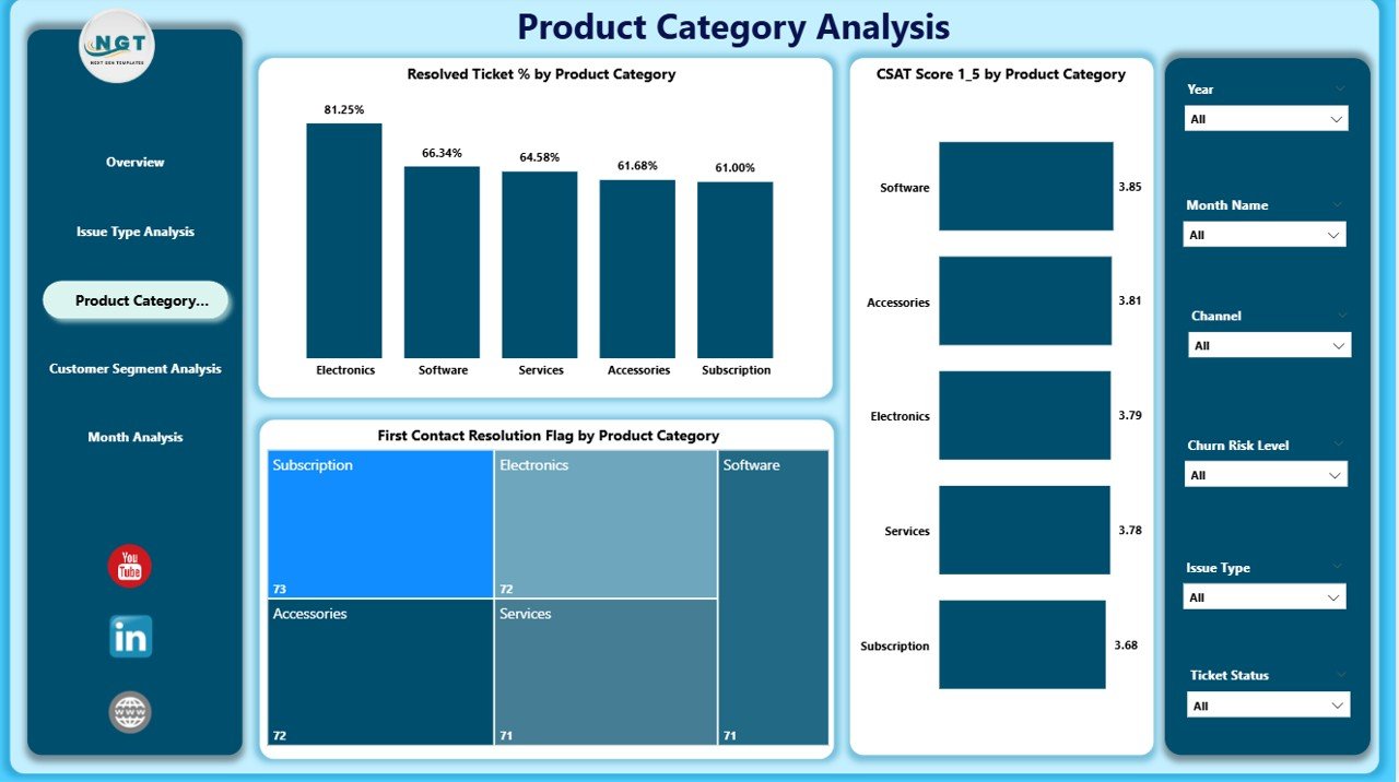
✅ Product Category Analysis Page
Not all products create the same customer experience.
Charts Included
Resolved Ticket % by Product Category
CSAT Score by Product Category
First Contact Resolution Flag by Product Category
This page supports:
Product-level service improvements
Better support documentation
Reduced resolution time
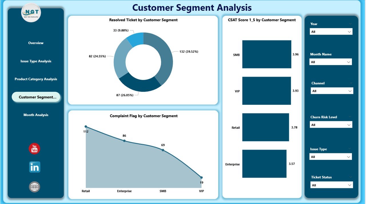
✅ Customer Segment Analysis Page
Different customer groups expect different service levels.
Insights Delivered
Resolved Ticket % by Customer Segment
CSAT Score by Customer Segment
Complaint Flag by Customer Segment
Using this page, teams can:
Prioritize high-value customers
Personalize service strategies
Reduce churn in critical segments
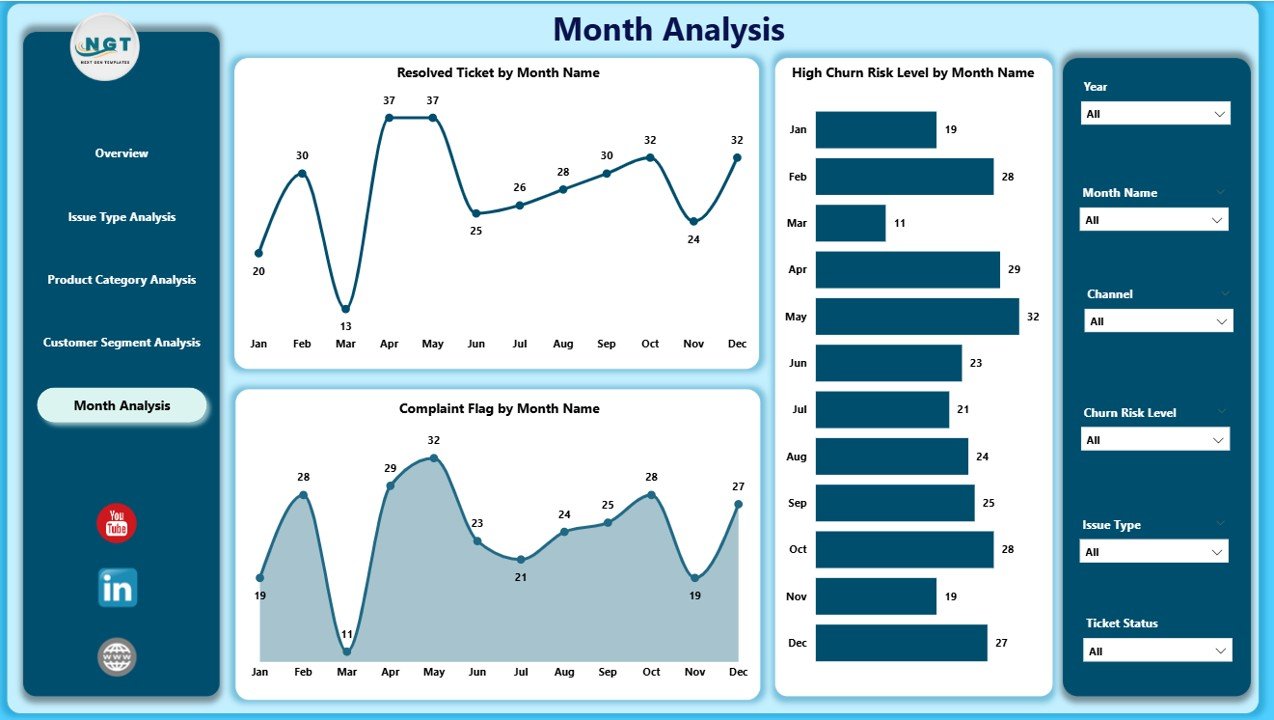
✅ Monthly Trends Page
Trends reveal patterns that daily metrics cannot.
Charts Included
Resolved Tickets by Month
High Churn Risk Level % by Month
Complaint Flag by Month
This page supports forecasting, staffing decisions, and continuous improvement.
🛠️ How to Use the Customer Experience Dashboard in Power BI
1️⃣ Connect customer data from Excel, CRM, or support systems
2️⃣ Refresh the Power BI file
3️⃣ Use slicers to filter by time, channel, product, or segment
4️⃣ Monitor churn risk and CSAT trends
5️⃣ Share insights with support, operations, and leadership teams
✅ No advanced Power BI skills required
👥 Who Can Benefit from This Dashboard
📞 Customer Support Teams
📊 Customer Experience Managers
⚙️ Operations Leaders
📈 Business & Data Analysts
🏢 Senior Management
🛍️ Retail, SaaS, Telecom, Banking, Healthcare & E-commerce Teams
If customer satisfaction matters to your business, this dashboard is built for you.
🚀 Why This Dashboard Creates Real Business Impact
✅ Improves customer retention
✅ Reduces churn proactively
✅ Enhances service quality
✅ Aligns teams around customer KPIs
✅ Eliminates manual reporting
✅ Supports data-driven CX strategy
This dashboard turns customer experience into a measurable, manageable, and improvable process.
📘 Click here to read the Detailed blog post
🎥 Visit our YouTube channel to learn step-by-step video tutorials
👉 https://youtube.com/@PKAnExcelExpert