

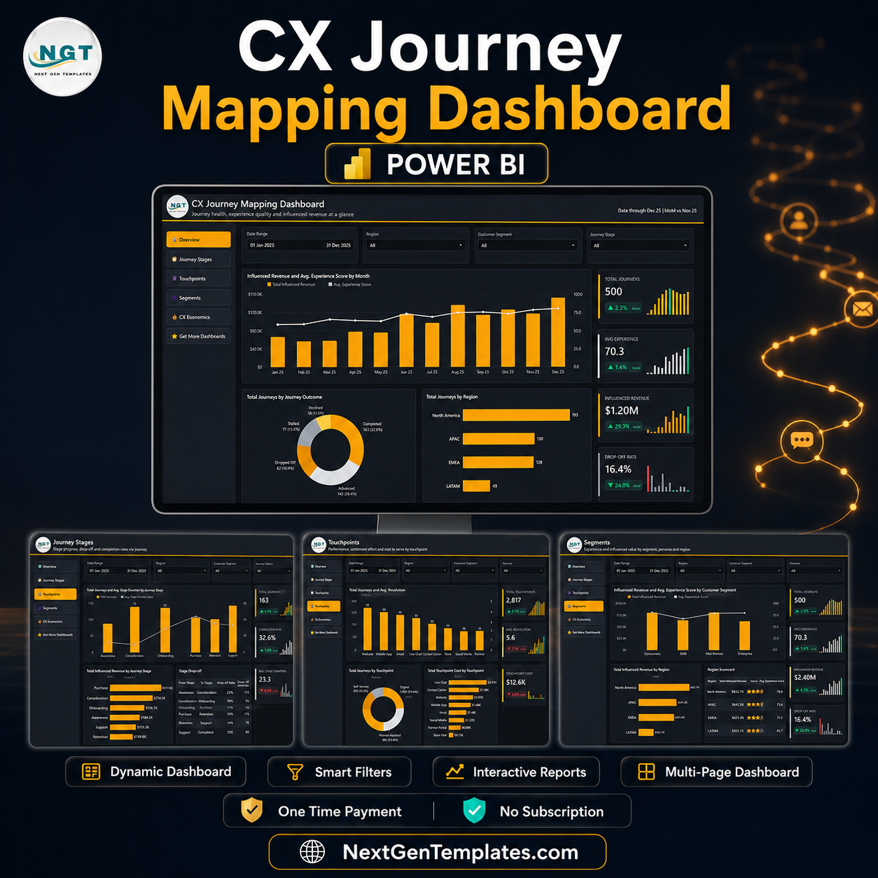

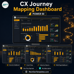
The CX Journey Mapping Dashboard in Power BI turns 500 sample customer journeys into a five-page report that shows exactly where experience breaks and what it costs you. The demo model carries 6 journey stages, 8 touchpoints, 4 channels, 4 customer segments, 5 personas, 8 CX owners and 4 regions across a full year (Jan-Dec 2025), and headlines it with 500 journeys, 2,817 interactions, a 70.3 average experience score, $1.20M of influenced revenue and a 16.4% drop-off rate. Built and tested by a Microsoft Certified Professional with 15+ years in Excel, Google Sheets and Power BI. One-time payment, lifetime access, instant download, no subscription and no per-user seat fee.
🔑 Key Features of the CX Journey Mapping Dashboard in Power BI
- 5 report pages – Overview, Journey Stages, Touchpoints, Segments and CX Economics, each laid out on the same 1280×720 grid with the NGT header and left navigation.
- 4 synced slicers on every page – Date Range plus three page-specific filters (Region and Customer Segment are constant; the fourth is Journey Stage, Journey Outcome, Channel, Persona or Priority depending on the page).
- 20 KPI cards – four per page, each with a month-on-month delta and an inline sparkline, covering 16 distinct metrics: Total Journeys, Avg. Experience, Influenced Revenue, Drop-off Rate, Completed Journeys, Completion Rate, Avg. Stage Hours, Escalation Rate, Total Interactions, Avg. Interactions, Touchpoint Cost, Cost per Interaction, Revenue per Journey, Avg. Effort Score, CX ROI and Cost per Journey.
- 15 visuals across the five pages – combo charts, donuts, ranked bar charts and two scorecard tables with in-cell data bars.
- A hidden Details drillthrough page – right-click any bar or slice and drill through on Customer Segment, Journey Stage, Touchpoint, Channel, Region, Persona, CX Owner, Priority or Journey Outcome.
- Two custom tooltip pages – “Journey Detail” and “Period Detail” replace the plain Power BI hover card with a designed mini-report.
- A 17-column, 500-row data table – Journey ID, Date, Customer Segment, Journey Stage, Touchpoint, Channel, Region, Persona, CX Owner, Priority, Journey Outcome, Interactions, Stage Duration, Experience Score, Effort Score, Touchpoint Cost and Influenced Revenue.
- A dedicated Date table in Power Query – month, month-year and sort keys already built, so time intelligence and the MoM deltas work the moment you swap in your own data.
- A custom dark theme – the amber-on-charcoal palette is a theme JSON inside the file, so re-branding is a colour swap rather than a visual-by-visual edit.
📦 What Is Inside the CX Journey Mapping Dashboard in Power BI
Page 1: Overview
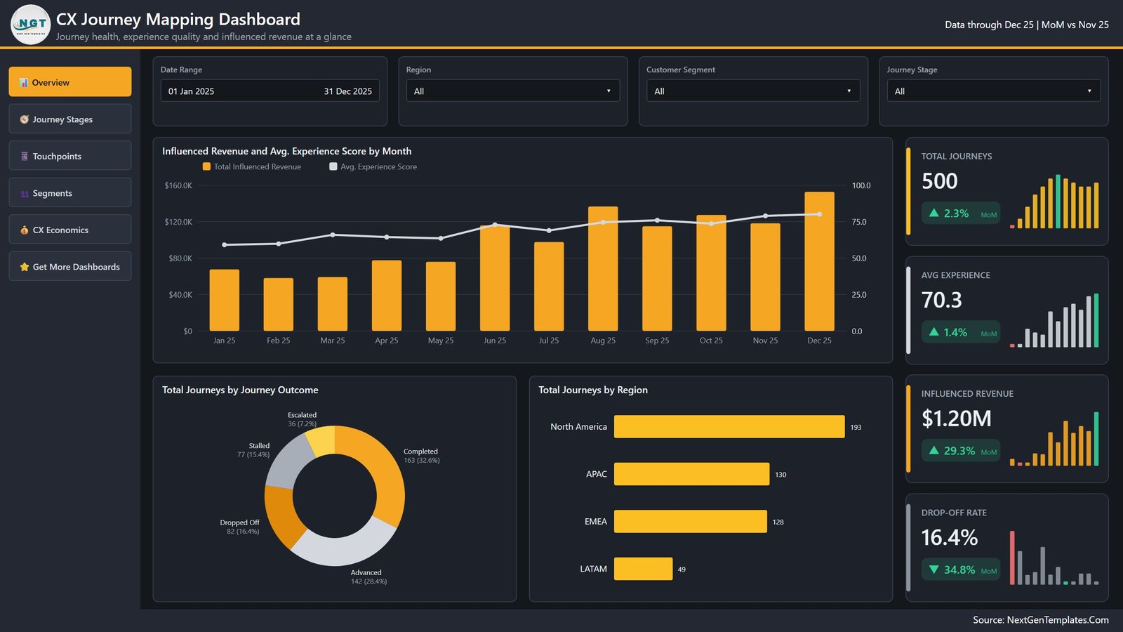
The landing page answers “is the journey healthy this month”. Influenced Revenue and Avg. Experience Score by Month puts revenue columns against an experience-score line for all twelve months, so you can see the score climb from the high 50s to the mid 70s while revenue steps up from roughly $68K in January to $152K in December. Total Journeys by Journey Outcome splits the 500 journeys into Completed 163 (32.6%), Advanced 142 (28.4%), Dropped Off 82 (16.4%), Stalled 77 (15.4%) and Escalated 36 (7.2%). Total Journeys by Region ranks North America 193, APAC 130, EMEA 128 and LATAM 49. The KPI rail carries Total Journeys 500, Avg. Experience 70.3, Influenced Revenue $1.20M and Drop-off Rate 16.4%.
Page 2: Journey Stages
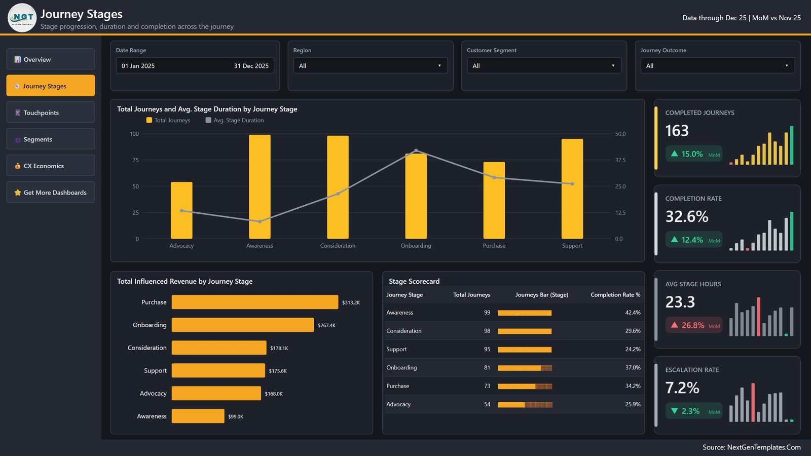
Total Journeys and Avg. Stage Duration by Journey Stage pairs volume columns with a duration line across Advocacy, Awareness, Consideration, Onboarding, Purchase and Support – the line peaks at Onboarding, which is where journeys sit longest. Total Influenced Revenue by Journey Stage ranks Purchase $313.2K, Onboarding $267.4K, Consideration $178.1K, Support $175.6K, Advocacy $168.0K and Awareness $99.0K. The Stage Scorecard table lists each stage with its journey count and completion rate (Awareness 99 / 42.4%, Consideration 98 / 29.6%, Support 95 / 24.2%, Onboarding 81 / 37.0%, Purchase 73 / 34.2%, Advocacy 54 / 25.9%). KPIs: Completed Journeys 163, Completion Rate 32.6%, Avg. Stage Hours 23.3, Escalation Rate 7.2%.
Page 3: Touchpoints
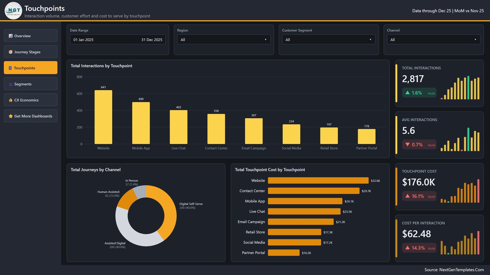
Total Interactions by Touchpoint ranks Website 641, Mobile App 499, Live Chat 403, Contact Center 358, Email Campaign 307, Social Media 234, Retail Store 197 and Partner Portal 178. Total Journeys by Channel shows the digital-versus-human mix – Digital Self-Serve 200 (40.0%), Assisted Digital 200 (40.0%), Human Assisted 63 (12.6%), In Person 37 (7.4%). Total Touchpoint Cost by Touchpoint re-ranks the same eight touchpoints by spend, which is where Contact Center jumps to second at $29.7K on far fewer interactions than the Website’s $32.6K. KPIs: Total Interactions 2,817, Avg. Interactions 5.6, Touchpoint Cost $176.0K, Cost per Interaction $62.48.
Page 4: Segments
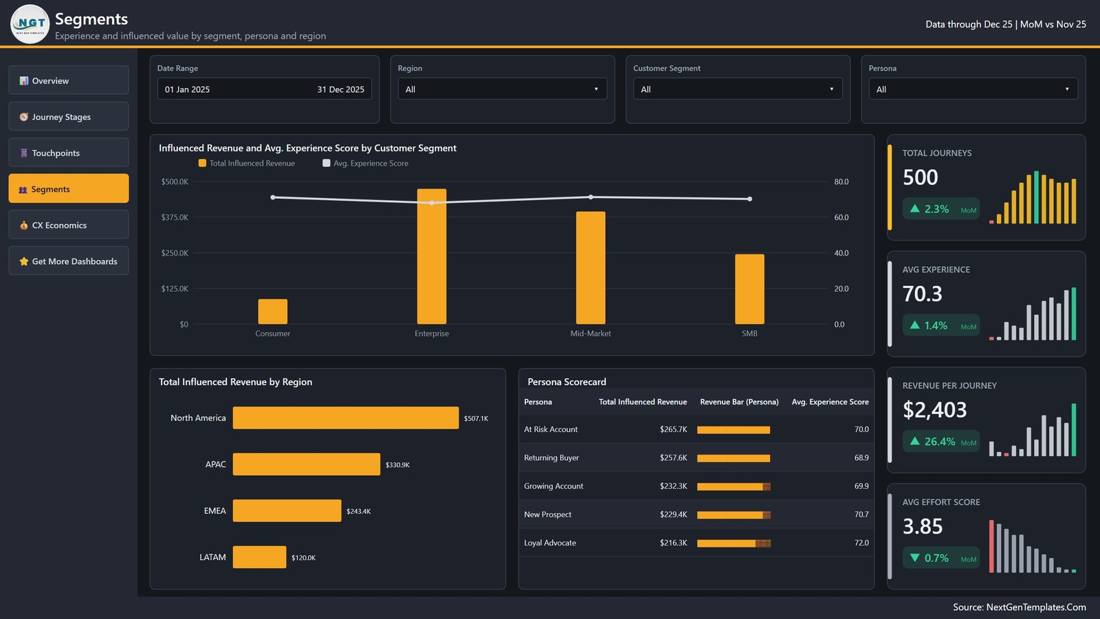
Influenced Revenue and Avg. Experience Score by Customer Segment compares Consumer, Enterprise, Mid-Market and SMB on revenue columns and a score line – Enterprise carries the revenue while the experience score stays flat across all four. Total Influenced Revenue by Region gives North America $507.1K, APAC $330.9K, EMEA $243.4K and LATAM $120.0K. The Persona Scorecard ranks At Risk Account $265.7K / 70.0, Returning Buyer $257.6K / 68.9, Growing Account $232.3K / 69.9, New Prospect $229.4K / 70.7 and Loyal Advocate $216.3K / 72.0. KPIs: Total Journeys 500, Avg. Experience 70.3, Revenue per Journey $2,403, Avg. Effort Score 3.85.
Page 5: CX Economics
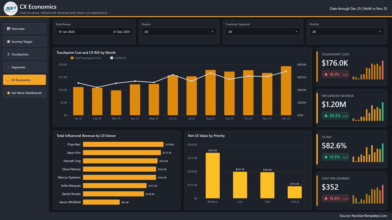
The money page. Touchpoint Cost and CX ROI by Month tracks spend columns against a return line that runs between roughly 450% and 690% across the year. Total Influenced Revenue by CX Owner ranks all eight owners from Priya Nair at $179.0K down to Aaron Whitfield at $81.6K. Net CX Value by Priority shows Medium $423.3K, Low $247.2K, High $242.5K and Critical $112.3K – a useful reminder that the loudest tickets are not always the valuable ones. KPIs: Touchpoint Cost $176.0K, Influenced Revenue $1.20M, CX ROI 582.6%, Cost per Journey $352.
Hidden pages
Three pages stay hidden in view mode: a Details drillthrough bound to nine fields, and the Journey Detail and Period Detail tooltip pages. A sixth visible page, Get More Dashboards, links back to the NextGenTemplates catalogue and can be deleted in one click before you share the report internally.
📊 CX Journey Mapping Dashboard in Power BI vs. Tableau vs. Medallia / Qualtrics – Where This Fits
| Factor | This Power BI template | Tableau Creator build | Medallia / Qualtrics CX |
|---|---|---|---|
| Cost | $17.99 one time | $75 per user / month | $25,000+ per year, quoted |
| Platform | Power BI Desktop (free) + .pbix | Tableau Desktop / Cloud | Vendor SaaS platform |
| Setup time | 10-15 minutes to swap the data source | 2-4 weeks to build the equivalent | 6-12 week implementation |
| Real-time team collaboration | Yes, once published to the Power BI Service | Yes, on Tableau Cloud | Yes |
| Mobile access | Power BI mobile app | Tableau mobile app | Vendor app |
| Customisable fields | Full – model, DAX and theme are all open | Full | Limited to the vendor schema |
| Share with link | Yes, via the Power BI Service | Yes | Yes |
| Year-1 cost at 5 users | $17.99 (+ Power BI Pro if you publish) | $4,500 | $25,000+ |
| Journey stage and drop-off analysis | Built in on page 2 | You build it | Built in |
| Cost-to-serve vs. influenced revenue | Built in on pages 3 and 5 | You build it | Usually an add-on module |
👥 Who This Template Is For – and Who It Is Not For
It is for CX and customer-service managers who already export journey or ticket data and need a board-ready view of it; Power BI analysts who want a finished, themed report to adapt rather than a blank canvas; consultants running journey-mapping workshops who need real numbers on screen by the second session; and operations leads who have to defend a support budget with a cost-to-serve figure.
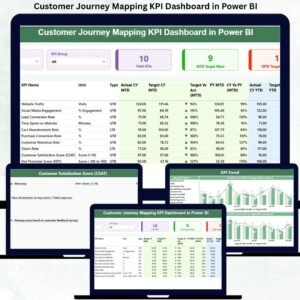
It is not for you if you need live survey collection, closed-loop case management or NPS text analytics – that is what Medallia and Qualtrics are for, and this template does not replace them. It is also the wrong pick if nobody on the team will open Power BI Desktop; the CX Journey Mapping Dashboard in Excel covers the same ground in a plain workbook. And if you want a compact monthly scorecard rather than an analytical report, look at the Customer Journey Mapping KPI Dashboard in Power BI instead.
⚙️ How to Use the CX Journey Mapping Dashboard in Power BI
- Download the ZIP and extract the .pbix file, Data.xlsx and the PDF user manual.
- Open the .pbix in Power BI Desktop (free from Microsoft) and click through the five pages with the sample data to see how the slicers and drillthrough behave.
- Open Data.xlsx and replace the 500 sample rows with your own, keeping the 17 column headers exactly as they are.
- In Power BI Desktop, use Transform data > Data source settings to point the query at your file, then Close & Apply.
- Refresh. Every KPI card, chart, scorecard and MoM delta recalculates from the new rows.
- Optional: open View > Themes > Customize to swap the amber accent for your brand colour, and delete the Get More Dashboards page before you share.
- Publish to the Power BI Service if you want scheduled refresh and a shareable link.
💼 Real-World Use Cases
Priya, CX manager at a 40-seat SaaS support team. She loads six months of ticket and journey data and finds the Contact Center costing $29.7K against far fewer interactions than the website. The Touchpoints page becomes the evidence for a deflection project, and the Cost per Interaction card is what she reports on monthly.
Marcus, retail operations lead across four regions. He uses the Region slicer on the Segments page to show that LATAM produces $120.0K of influenced revenue on 49 journeys, then drills through on Region to see which touchpoints those journeys actually used before pitching a regional staffing change.
Elena, an independent CX consultant. She reskins the theme per client, drops in their export, and walks into the kickoff with the Journey Stages page already showing where their journeys stall – a workshop deliverable in an afternoon instead of a fortnight.
❓ Frequently Asked Questions
What exactly does the CX Journey Mapping Dashboard in Power BI track?
Journey volume and outcome, stage duration and completion, interactions and cost by touchpoint and channel, experience and effort scores by segment, persona and region, and the resulting influenced revenue, CX ROI and cost per journey.
Do I need a paid Power BI licence?
No. Power BI Desktop is free and opens the .pbix, refreshes it and lets you edit everything. A Power BI Pro licence is only needed if you want to publish the report to the Power BI Service and share it with colleagues.
How long does setup take?
About 10-15 minutes. The work is replacing the rows in Data.xlsx and repointing the data source; nothing in the model or the visuals has to be rebuilt as long as the 17 column headers stay the same.
Can I add my own journey stages, touchpoints or channels?
Yes. The stages, touchpoints, channels, personas, priorities and outcomes are all values in the data, not hard-coded lists, so new categories appear in the charts and slicers on the next refresh.
Is this the same as the Customer Journey Mapping KPI Dashboard?
No. That one is a month-picker KPI scorecard with traffic lights. This is a five-page analytical report with slicers, drillthrough and custom tooltips – a different tool for a different meeting.
How many rows can it handle?
The sample carries 500. Power BI’s import engine handles hundreds of thousands of rows on a normal laptop; the practical limit is your machine, not the template.
Is there documentation?
Yes – a Power BI Dashboard user manual PDF ships inside the ZIP alongside the .pbix and Data.xlsx.
👤 About the Author
Built by PK – Microsoft Certified Professional with 15+ years of Excel, Google Sheets, and Power BI experience. Founder of NextGenTemplates, reaching 300K+ subscribers across YouTube channels. Every template is hand-built and tested before release.
🔗 Explore Related Templates
- CX Journey Mapping Dashboard in Excel – the same journey model in a plain .xlsx workbook.
- AI in Customer Service Dashboard in Power BI – deflection, automation and containment analytics.
- Customer Satisfaction Dashboard in HTML – a browser-based CSAT view for teams without Power BI.
- Customer Lifetime Value KPI Dashboard in Google Sheets – the value side of the same customers.
- Customer Service & Support Bundle – 8 premium templates at 40% off.
- Browse more in Power BI templates and Power BI dashboards.
📖 Click here to read the detailed blog post
🎥 Visit our YouTube channels for step-by-step video tutorials
PK: An Excel Expert | NextGenTemplates | NeoTechNavigators
Buy the CX Journey Mapping Dashboard in Power BI once, use it for every review, every quarter, forever. Instant download, lifetime access, free bug fixes, no subscription.
Last updated: 29 August 2026.












Reviews
There are no reviews yet.