


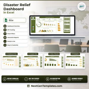
The Disaster Relief Dashboard in Excel tracks 5 headline KPIs across 5 interactive pages, with 20 pre-built pivot charts, 25 pivot tables and 4 cross-page slicers. The sample file carries 500 relief operation records across 19 data fields, so every chart is populated the moment you open it. Setup takes under 10 minutes: paste your own relief log into the Data sheet, refresh, and all five pages update together.
🌍 Join 8,400+ teams in 40+ countries using NextGenTemplates to replace paid SaaS tools with one-time-purchase Excel, Google Sheets, Power BI, and HTML templates.
✅ Instant download · One-time payment · No subscription · No per-user fees · Lifetime access
This is the analytical Disaster Relief dashboard — a five-page pivot-driven report on funds, kits, response time and beneficiary impact. It is a different template from the Disaster Relief KPI Dashboard in Excel, which is a month-picker scorecard with traffic lights. Both are listed separately, and many relief teams run them side by side.
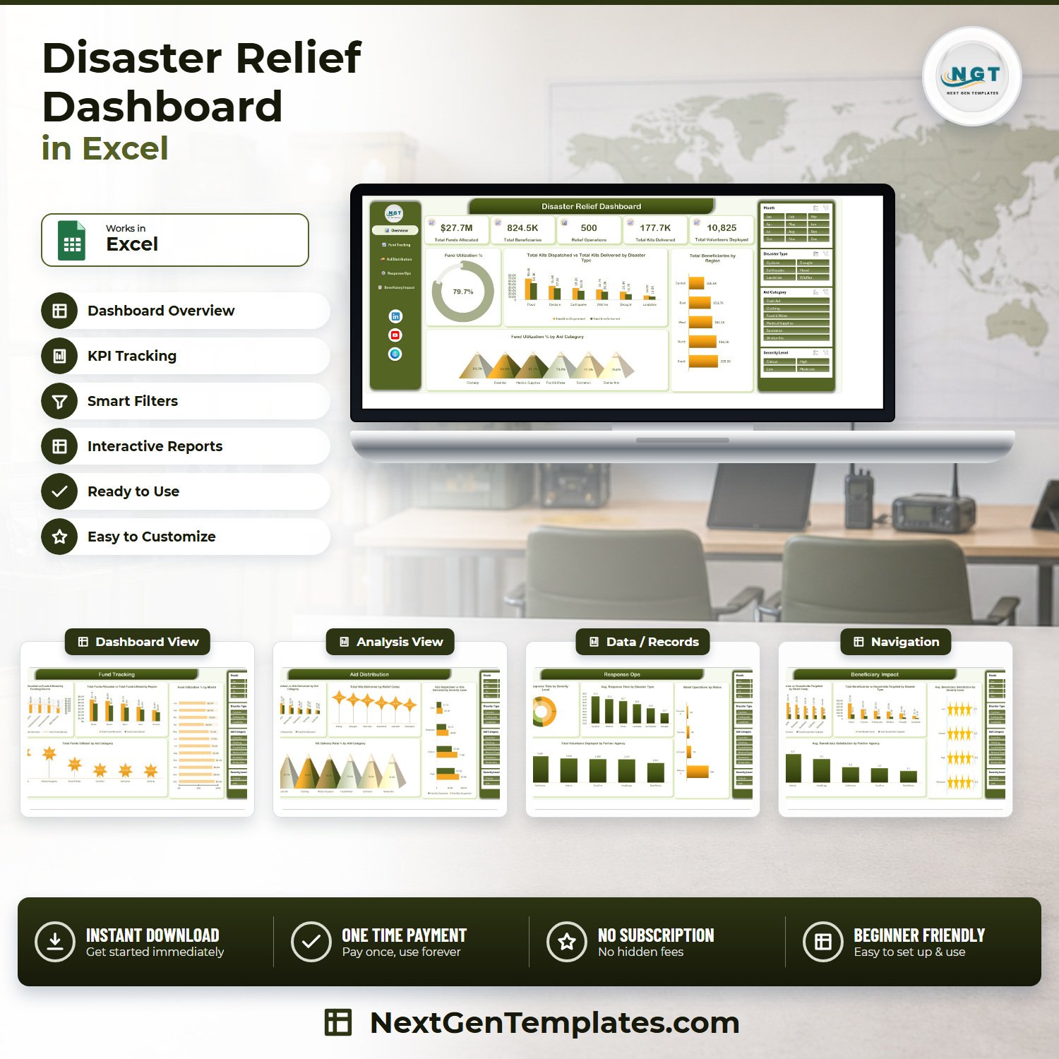
🔑 Key Features of the Disaster Relief Dashboard in Excel
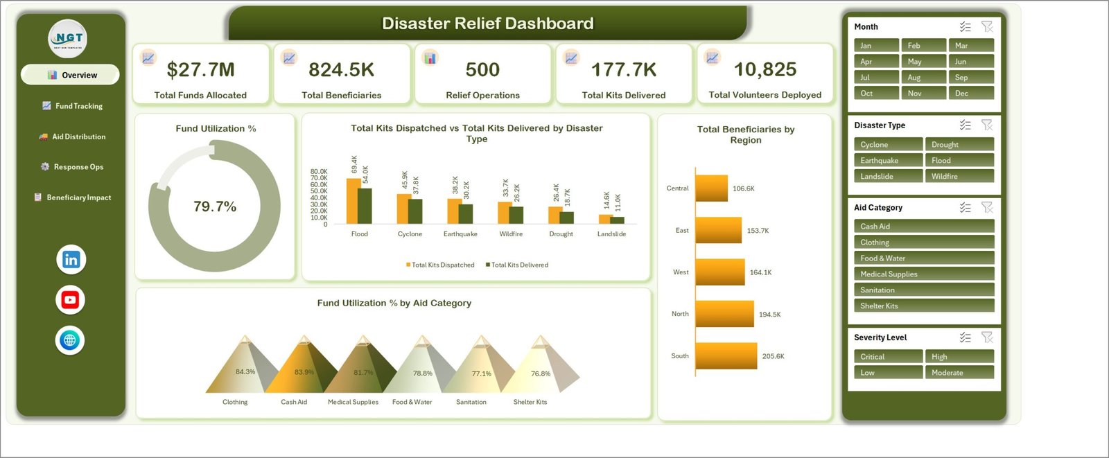
📊 Five KPI cards on the Overview page. Total Funds Allocated, Total Beneficiaries, Relief Operations, Total Kits Delivered and Total Volunteers Deployed sit across the top of the Overview sheet. In the sample data they read $27.7M, 824.5K, 500, 177.7K and 10,825 — every card is a live pivot value that recalculates the moment a slicer is clicked.
🎛️ Four slicers repeated on every page. Month, Disaster Type, Aid Category and Severity Level are wired to all 25 pivot tables, so choosing “Cyclone” or “Critical” filters funds, kits, response time and satisfaction at once. There is no re-filtering page by page.
💰 Fund tracking that separates allocated from utilized. The workbook holds Funds Allocated and Funds Utilized as separate fields and derives Fund Utilization % from them — 79.7% overall in the sample, broken down by funding source, region, month and aid category.
📦 Kit dispatch versus kit delivery, everywhere. Relief Kits Dispatched and Relief Kits Delivered are charted side by side by disaster type, aid category, relief camp and severity level, plus a Kit Delivery Rate % view that exposes the leakage between the two.
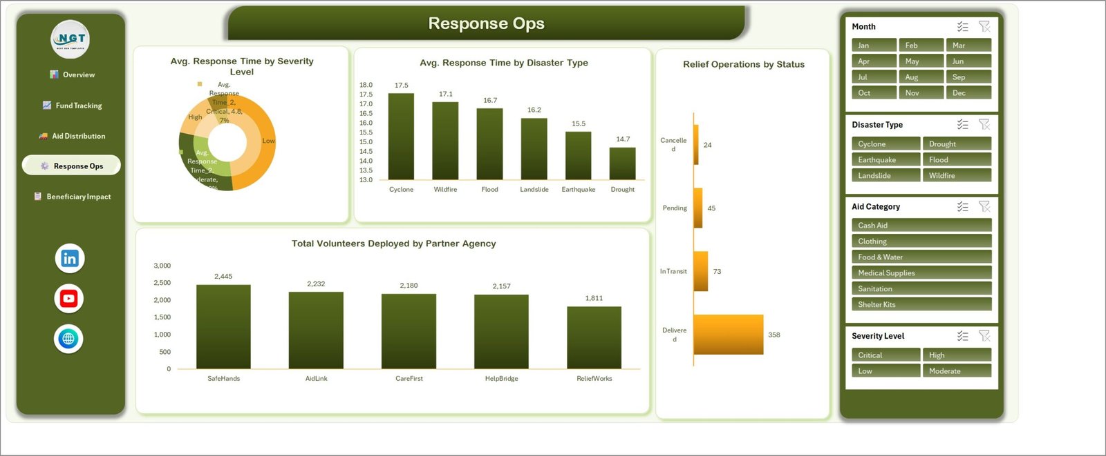
⏱️ Response time and volunteer load. Average Response Time Hours is charted by severity level and by disaster type, alongside relief operation status counts (Delivered, In Transit, Pending, Cancelled) and volunteers deployed per partner agency.
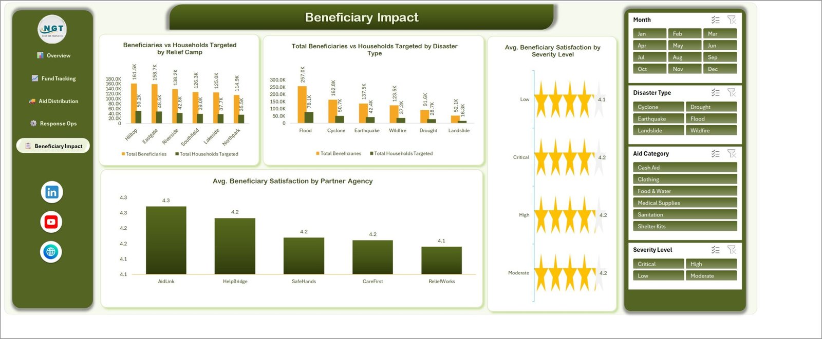
⭐ Beneficiary satisfaction on a 5-point scale. Average Beneficiary Satisfaction is scored by partner agency and by severity level, using a star-rating visual so field coordinators can read agency performance at a glance.
🧭 Sidebar navigation. A left rail on every sheet jumps to Overview, Fund Tracking, Aid Distribution, Response Ops and Beneficiary Impact — no sheet-tab hunting.
📦 What’s Inside the Disaster Relief Dashboard in Excel
Page 1: Overview
This page shows the five KPI cards — Total Funds Allocated, Total Beneficiaries, Relief Operations, Total Kits Delivered and Total Volunteers Deployed — plus a Fund Utilization % gauge. Charts include Total Kits Dispatched vs Total Kits Delivered by Disaster Type, Total Beneficiaries by Region, and Fund Utilization % by Aid Category.
Page 2: Fund Tracking
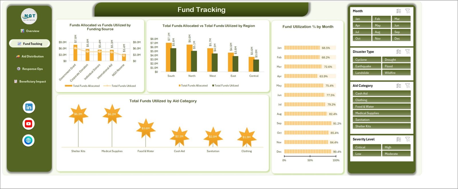
This page follows the money from source to spend. Charts include Funds Allocated vs Funds Utilized by Funding Source, Total Funds Allocated vs Total Funds Utilized by Region, Fund Utilization % by Month, and Total Funds Utilized by Aid Category.
Page 3: Aid Distribution
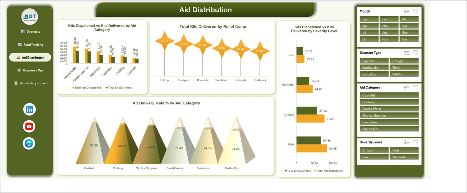
This page measures what was dispatched against what actually reached people. Charts include Kits Dispatched vs Kits Delivered by Aid Category, Total Kits Delivered by Relief Camp, Kits Dispatched vs Kits Delivered by Severity Level, and Kit Delivery Rate % by Aid Category.
Page 4: Response Ops
This page covers operational speed and staffing. Charts include Avg. Response Time by Severity Level, Avg. Response Time by Disaster Type, Relief Operations by Status, and Total Volunteers Deployed by Partner Agency.
Page 5: Beneficiary Impact
This page compares reach against target and scores the experience. Charts include Beneficiaries vs Households Targeted by Relief Camp, Total Beneficiaries vs Households Targeted by Disaster Type, Avg. Beneficiary Satisfaction by Severity Level, and Avg. Beneficiary Satisfaction by Partner Agency.
Data Sheet
A flat table of 500 sample relief records with 19 fields: Relief ID, Response Date, Disaster Type, Region, Relief Camp, Partner Agency, Aid Category, Severity Level, Funding Source, Status, Households Targeted, Beneficiaries Reached, Relief Kits Dispatched, Relief Kits Delivered, Funds Allocated, Funds Utilized, Response Time Hours, Volunteers Deployed and Beneficiary Satisfaction. Replace the rows with your own log and keep the headers.
Support Sheet
Holds the 25 pivot tables that feed all 20 charts. You never need to edit it — it exists so the dashboard sheets stay clean — but it is unhidden if you want to add a chart of your own.
📊 Disaster Relief Dashboard in Excel vs. a Google Sheets Build vs. Paid Humanitarian SaaS — Where This Fits
| Feature | Disaster Relief Dashboard in Excel | Google Sheets equivalent | Salesforce Nonprofit Cloud / DevResults |
|---|---|---|---|
| Cost | $17.99 one-time | $0 but built by you | $40-100 / user / month |
| Platform | Microsoft Excel desktop, offline | Browser, needs connectivity | Cloud only |
| Setup time | Under 10 minutes | Several days to build | 4-12 week implementation |
| Works in the field with no internet | ✅ Yes | ❌ No | ❌ No |
| Real-time team collaboration | Via OneDrive / SharePoint | ✅ Native | ✅ Native |
| Mobile access | Excel mobile app (view) | ✅ Browser | ✅ Native app |
| Customizable fields and charts | ✅ Full — it is your workbook | ✅ Yes | Limited without a consultant |
| Fund allocated vs utilized tracking | ✅ Built in, with utilization % | Build it yourself | ✅ Yes, at a price |
| Year-1 cost at 5 users | $17.99 total | $0 + build time | $2,400-6,000 |
For relief teams that want fund, kit and beneficiary reporting without a per-seat contract or a 12-week rollout, the Disaster Relief Dashboard in Excel sits in the sweet spot.
👥 Who This Template Is For — and Who It’s Not For
✅ This template is built for:
- NGO and relief programme managers reporting on 100-2,000 relief operations a year
- Disaster response coordinators who need offline reporting from a field office
- Grant and donor reporting officers who must show funds allocated versus funds utilized by source
- Logistics leads tracking kit dispatch, delivery rate and camp-level distribution
- Consultants and analysts building a relief report for a client in a day, not a month
❌ This template is NOT for:
- Live incident command — this is a reporting layer, not a real-time dispatch or alerting system
- Teams needing 20+ people editing the same file simultaneously; use a database-backed tool instead
- Storing personally identifiable beneficiary data — the sample schema is deliberately aggregate, and personal records belong in a system with proper access control
- Mac-only shops that need full slicer behaviour; slicers work best in Excel for Windows desktop
⚙️ How to Use the Disaster Relief Dashboard in Excel
- Download the ZIP and extract both files: the workbook and the Excel Dashboard user manual PDF.
- Open the workbook in Microsoft Excel and click through the five pages using the sidebar to see how the sample data behaves.
- Open the Data sheet and replace the 500 sample rows with your own relief log, keeping the 19 column headers exactly as they are.
- Press Ctrl+Alt+F5 (Refresh All) so every pivot table and chart picks up your rows.
- Use the Month, Disaster Type, Aid Category and Severity Level slicers to filter all five pages at once.
- Print or export any page to PDF for a donor or board pack.
💼 Real-World Use Cases
Priya coordinates flood response for a regional NGO. She logs every distribution in the Data sheet, then uses the Aid Distribution page to show her board that Food & Water kits are delivering at 75.4% while Cash Aid clears 87.3% — the gap that justified her next warehousing request.
Daniel manages donor reporting for a disaster relief fund. Each quarter he filters the Fund Tracking page by funding source and exports a single page showing Government Grant, Corporate Donation, Individual Donors, International Aid and NGO Reserve side by side — allocated against utilized — instead of rebuilding the same chart in a slide deck.
Amina runs field operations across six relief camps. She uses the Response Ops and Beneficiary Impact pages to compare average response time by severity and satisfaction by partner agency, which is how she decided to move two volunteer teams between agencies mid-season.
❓ Frequently Asked Questions
What KPIs does the Disaster Relief Dashboard in Excel track?
The Disaster Relief Dashboard in Excel tracks five headline KPIs — Total Funds Allocated, Total Beneficiaries, Relief Operations, Total Kits Delivered and Total Volunteers Deployed — plus Fund Utilization %, Kit Delivery Rate %, average response time in hours and average beneficiary satisfaction.
How long does setup take?
Under 10 minutes. Open the Disaster Relief Dashboard in Excel, paste your relief log into the Data sheet under the existing 19 headers, and press Refresh All. Every pivot table, chart and KPI card recalculates automatically — no formulas to rewrite.
How does this compare to Salesforce Nonprofit Cloud or DevResults?
Those platforms cost roughly $40-100 per user per month and need a multi-week implementation. The Disaster Relief Dashboard in Excel is a one-time $17.99 purchase that works offline in a field office. It reports rather than orchestrates, which is exactly what most small relief programmes need.
Is this the same as the Disaster Relief KPI Dashboard?
No. The Disaster Relief Dashboard in Excel is the analytical five-page report described here. The Disaster Relief KPI Dashboard in Excel is a separate month-picker scorecard with traffic-light targets. Many teams buy both, but they are different templates with different layouts.
Can I add my own charts or change the disaster types?
Yes. The Disaster Relief Dashboard in Excel is an unlocked workbook with a visible Support sheet holding all 25 pivot tables. Change the Disaster Type, Region, Aid Category or Partner Agency values in the Data sheet and the slicers and charts follow your list.
Does it work in Excel for Mac or Excel Online?
The Disaster Relief Dashboard in Excel opens in both, and the charts render correctly. Slicer behaviour is best on Excel for Windows desktop, which is the tested environment. There are no macros, so nothing needs to be enabled.
What file do I actually get?
A ZIP containing the Disaster Relief Dashboard in Excel workbook (.xlsx) and the Excel Dashboard user manual PDF. It is an instant download after checkout, with lifetime access and no subscription.
👤 About the Author
Built by PK — Microsoft Certified Professional with 15+ years of Excel, Google Sheets, and Power BI experience. Founder of NextGenTemplates, reaching 300K+ subscribers across YouTube channels (@PKAnExcelExpert, @NextGenTemplates, @NeoTechNavigators). Every template is hand-built and tested before release.
🔗 Explore Related Templates
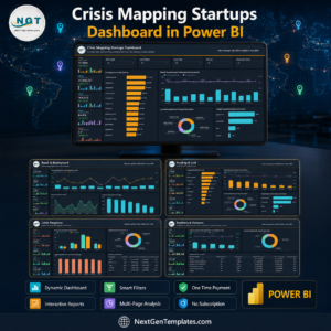
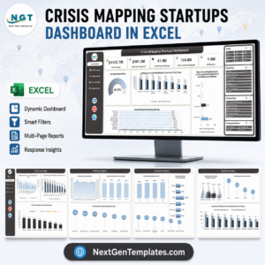
- Crisis Mapping Startups Dashboard in Excel — the same five-page analytical layout applied to crisis mapping and incident data.
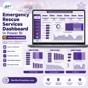
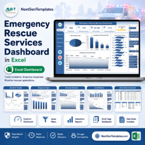
- Emergency Rescue Services Dashboard in Excel — response times, call volumes and crew utilization for rescue services.
- Relief Distribution Data Entry System in Excel — the data-capture front end that feeds a dashboard like this one.
- Donation Register Data Entry System in Excel — log incoming donations before they become allocated funds.
Also available as: the scorecard cousins — Disaster Relief KPI Dashboard in Excel and Disaster Relief KPI Dashboard in Google Sheets. Browse the full library of Excel Dashboard Templates or the MS Excel Templates category for more.
📖 Click here to read the Detailed Blog Post
🎥 Visit our YouTube channel for step-by-step video tutorials
👉 YouTube.com/@NextGenTemplates
📅 Last updated: September 2026
Watch the demo video:
Compatibility and Requirements
- Works in Microsoft Excel desktop (Excel 2016 or later, or Microsoft 365). Slicers work best in Excel for Windows.
- The four slicers (Month, Disaster Type, Aid Category and Severity Level) filter all five pages at once. Microsoft explains them in Use slicers to filter data.
More Questions About This Template
Is there a Power BI version of this dashboard?
Yes. See the Disaster Relief Dashboard in Power BI.
Do I need macros to use it?
No. The workbook is an .xlsx file with pivot tables and slicers, so nothing needs to be enabled.
Which fields do I need in my own data?
The Data sheet has 19 fields, from Relief ID and Response Date to Funds Utilized and Beneficiary Satisfaction. Keep the headers as they are and paste your rows below them, then use Refresh All.
Can I see funds allocated and funds utilized by funding source?
Yes. The Fund Tracking page charts Funds Allocated against Funds Utilized by funding source and by region. It also shows Fund Utilization % by month.
Related Relief and Emergency Templates
- Disaster Relief Dashboard in Power BI: the same dashboard for Power BI Desktop
- Disaster Preparedness Checklist in Excel: a checklist for planning before an event
- Relief Distribution Data Entry System in Excel: a data entry system for logging distributions
Browse all Health and Safety templates.












Reviews
There are no reviews yet.