

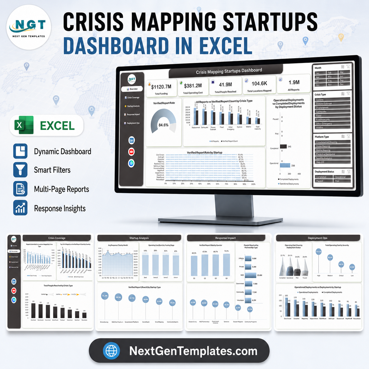

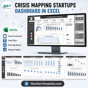
The Crisis Mapping Startups Dashboard in Excel turns 500 sample deployment records into five linked report pages, 20 charts and 5 headline KPI cards – $1,120.7M tracked funding, $381.2M operating cost, 41.9M people reached, 104.6K locations mapped and 1.9M crisis reports at an 84.6% verification rate. It is a plain .xlsx workbook: no macros, no add-ins, no monthly fee. Four slicers (Month, Crisis Type, Platform Type, Deployment Status) drive every page at once. Built and screen-tested by NextGenTemplates, whose templates reach 300K+ subscribers across our YouTube channels. Replace the sample data with your own and every card, chart and share recalculates – and if it does not fit your reporting, our 30-day support window is there to sort it out.
Key Features of the Crisis Mapping Startups Dashboard in Excel
- Five report pages, one dataset – Overview, Crisis Coverage, Startup Analysis, Response Impact and Deployment Ops, all reading from a single Data sheet.
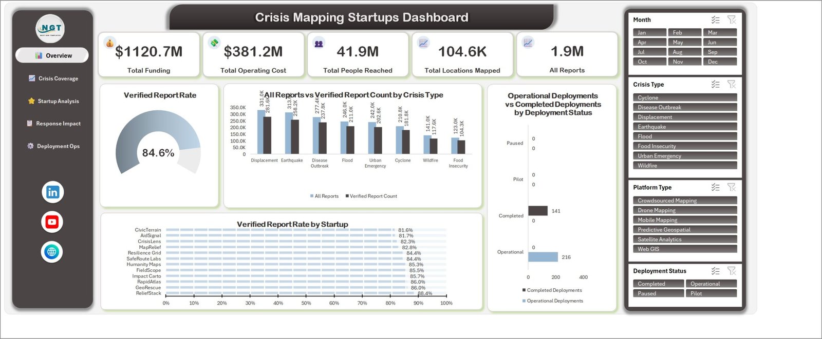
- Four synced slicers – Month, Crisis Type, Platform Type and Deployment Status filter every chart on every page at the same time.
- 20 charts – gauge, combo, clustered column, 100% stacked, lollipop, star rating and pyramid formats, each titled by metric and dimension rather than by chart type.
- 500 sample records across 22 fields – startup, headquarters region, crisis region, country, crisis type, funding stage, platform type, deployment status, severity, data source, partnership type, funding, operating cost, people reached, locations mapped, total and verified reports, response hours, accuracy rating and team size.
- 13 named sample startups plus 8 crisis types, 8 crisis regions, 10 ranked countries, 6 platform types, 6 data sources, 6 partnership types, 5 funding stages, 4 severity levels and 4 deployment statuses.
- Left-rail page navigation – one click between pages, no tab hunting.
- No VBA and no external connections – the file opens in Excel 2016, 2019, 2021 and Microsoft 365 on Windows and Mac.
What’s Inside the Crisis Mapping Startups Dashboard in Excel
Overview carries the five KPI cards, a Verified Report Rate gauge reading 84.6%, All Reports vs Verified Report Count by Crisis Type, Operational vs Completed Deployments by Deployment Status, and Verified Report Rate by Startup ranked from 81.6% to 88.4%.
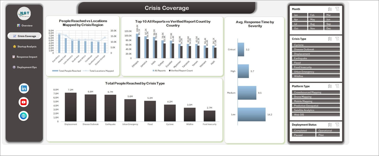
Crisis Coverage pairs People Reached vs Locations Mapped by Crisis Region with a Top 10 All Reports vs Verified Report Count by Country ranking, Avg. Response Time by Severity, and Total People Reached by Crisis Type – 7.2M for Displacement down to 2.7M for Food Insecurity.
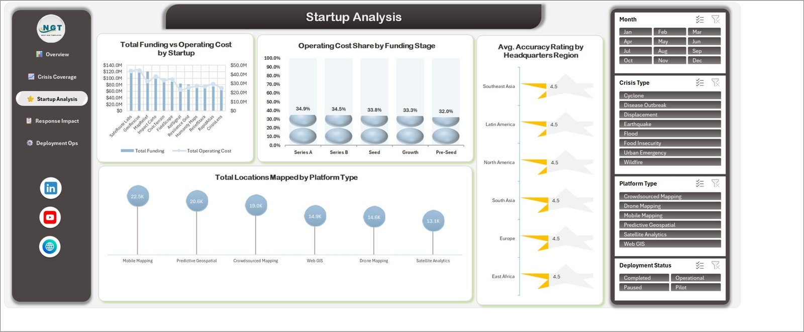
Startup Analysis compares Total Funding vs Operating Cost by Startup, Operating Cost Share by Funding Stage, Avg. Accuracy Rating by Headquarters Region, and Total Locations Mapped by Platform Type, where Mobile Mapping leads at 22.5K locations.
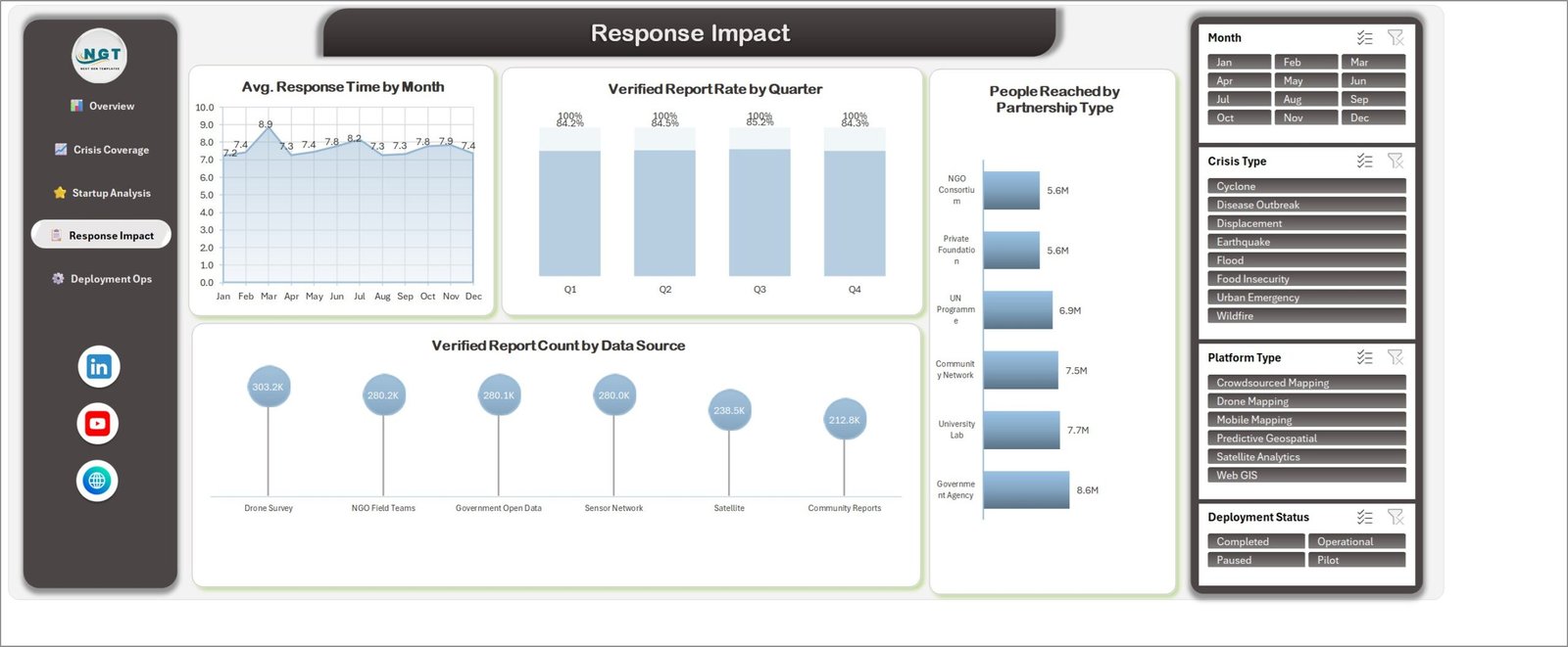
Response Impact tracks Avg. Response Time by Month across all twelve months, Verified Report Rate by Quarter, People Reached by Partnership Type, and Verified Report Count by Data Source.
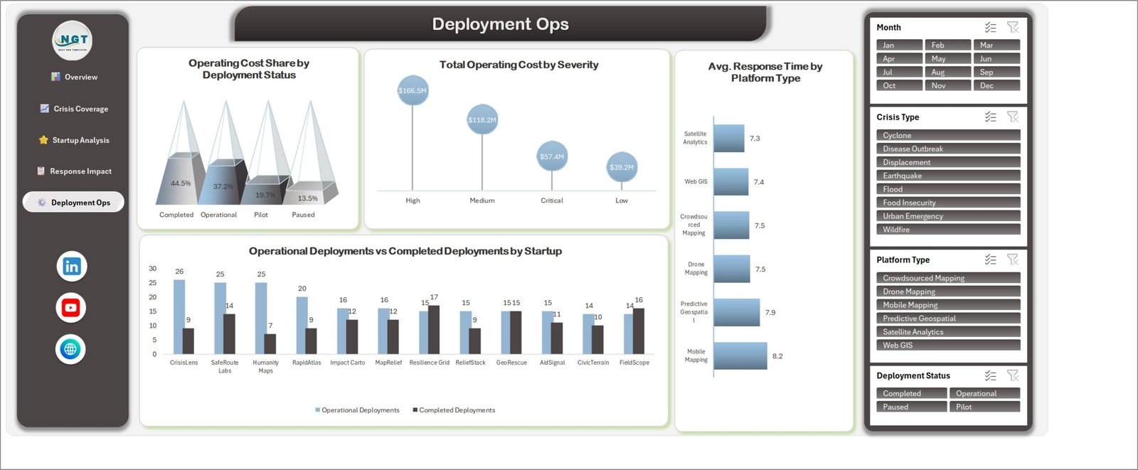
Deployment Ops closes with Operating Cost Share by Deployment Status, Total Operating Cost by Severity, Avg. Response Time by Platform Type, and Operational vs Completed Deployments by Startup.
Behind those five pages sit two working sheets: Data, the 500-row table you replace, and Support, the aggregation tables that feed every chart.
Crisis Mapping Startups Dashboard in Excel vs. Google Sheets vs. Paid BI SaaS – Where This Fits
| This Excel dashboard | Google Sheets build | Paid BI / GIS SaaS | |
|---|---|---|---|
| Cost | One payment of 17.99 | One payment, similar | Commonly 10-70 per user per month |
| Platform | Excel 2016+ and Microsoft 365, Windows and Mac | Any browser | Browser plus admin console |
| Setup time | Under 15 minutes | Under 15 minutes | Days to weeks |
| Real-time team collaboration | Through OneDrive or SharePoint co-authoring | Native | Native |
| Mobile access | Excel mobile app | Browser and app | Dedicated app |
| Customizable fields | Every column and chart is yours to edit | Yes | Often fixed to the vendor schema |
| Share with link | Through a OneDrive share link | Native | Native |
| Year-1 cost at 5 users | 17.99 once | Similar | Roughly 600 – 4,200 |
| Works offline | Yes | No | No |
| Where the file lives | Your own disk | Google Drive | Vendor cloud |
Who This Template Is For – and Who It’s Not For
It fits crisis mapping and humanitarian mapping startups reporting deployment activity to investors and partners; NGO and UN programme teams comparing mapping vendors; accelerators and impact funds reviewing a portfolio of geospatial companies; and operations leads who need a monthly management pack without a BI licence.
It is not for you if you need live map rendering, geocoding or layer analysis – this is a reporting workbook, not a GIS. It will not connect to an API or refresh itself, it does not verify a single field report, and it is not a case-management or incident-dispatch system. If your data sits in a database and has to refresh hourly, a Power BI build suits you better.
How to Use the Crisis Mapping Startups Dashboard in Excel
- Open the workbook in Excel and enable editing.
- Go to the Data sheet and replace the 500 sample rows with your own, keeping the 22 column headers exactly as they are.
- Keep the Month, Year and Quarter columns filled – the trend and quarter charts read those helper columns.
- Press Ctrl + Alt + F5 to refresh, then click any page name in the left rail.
- Use the four slicers on the right to filter a month, a crisis type, a platform type or a deployment status; clear a slicer with the filter icon in its header.
- Recolour or retitle any chart the usual Excel way – nothing is locked or protected.
Real-World Use Cases
Priya, co-founder of a drone-mapping startup, filters to Q3 and Drone Mapping before an investor call and reads funding, operating cost and verified report rate off one page instead of three spreadsheets.
Daniel, programme officer at an NGO consortium, compares Avg. Response Time by Platform Type across six mapping vendors before renewing a partnership.
Aisha, portfolio analyst at an impact fund, uses Startup Analysis to rank thirteen portfolio companies on funding against operating cost in a single quarterly review.
Frequently Asked Questions
Does this dashboard draw maps?
No. It reports on mapping activity – locations mapped, reports verified, response times, coverage by region and country – using standard Excel charts. There is no map layer and no geocoding.
Do I need macros or an add-in?
No. It is a plain .xlsx file with no VBA, no external data connection and no add-in dependency.
Can I add more than 500 rows?
Yes. Extend the Data table downward and refresh; the Support sheet aggregations follow the table.
Is the sample data real?
No. Every startup name, funding figure and report count is generated demo data, included so the charts render on first open. Replace it before you share anything.
Which Excel versions does it open in?
Excel 2016, 2019, 2021 and Microsoft 365 on Windows and Mac. Slicers need a desktop version; Excel for the web displays the sheets but slicer behaviour there is limited.
Is there a Power BI version?
Yes – the same topic is built as the Crisis Mapping Startups Dashboard in Power BI, covering the same five subject areas.
Can I use it for compliance or donor assurance reporting?
No. It makes no claim of conformance with any humanitarian standard, donor framework or audit requirement, and it does not validate the accuracy of any report you enter.
About the Author
Built by PK – Microsoft Certified Professional with 15+ years of Excel, Google Sheets, and Power BI experience. Founder of NextGenTemplates, reaching 300K+ subscribers across YouTube channels. Every template is hand-built and tested before release.
Explore Related Templates
- Crisis Mapping Startups Dashboard in Power BI – the same five subject areas rebuilt as a Power BI report.
- Crisis Management Firms Dashboard in Excel – the consultancy side of the same market.
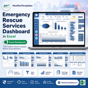
- Emergency Rescue Services Dashboard in Excel – field response rather than mapping.
- Satellite Imaging KPI Dashboard in Excel – the imagery layer behind geospatial work.
- Disaster Relief KPI Dashboard in Google Sheets – a browser-based alternative for field teams.
- Browse more Excel dashboard templates, or the wider MS Excel template library.
Download the Crisis Mapping Startups Dashboard in Excel today and have a five-page deployment report ready before your next board or partner update. Instant download, lifetime access, and free bug fixes to this file.
Last updated: 26 August 2026.











Reviews
There are no reviews yet.