

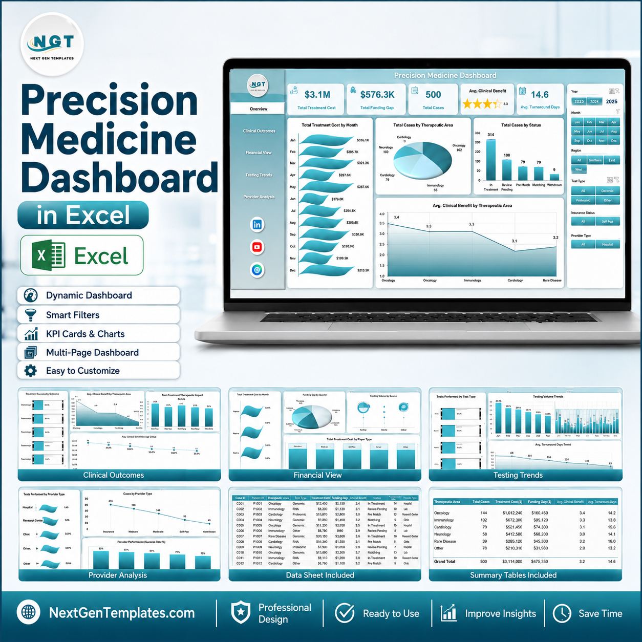



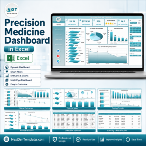
Precision Medicine Dashboard in Excel gives healthcare, genomics, oncology, and clinical operations teams a ready-to-use way to monitor treatment cost, funding gaps, case volume, clinical benefit, turnaround days, therapy matching, reimbursement coverage, adverse events, and provider performance. Precision medicine is no longer a small experimental workflow: the FDA describes it as tailoring prevention and treatment around differences in genes, environments, and lifestyles. This Excel dashboard helps teams bring that same precision to reporting. It is an instant-download, one-time-purchase template with editable sample data and no monthly SaaS subscription risk.
Click here to purchase the Precision Medicine Dashboard in Excel.
Key Features of Precision Medicine Dashboard in Excel
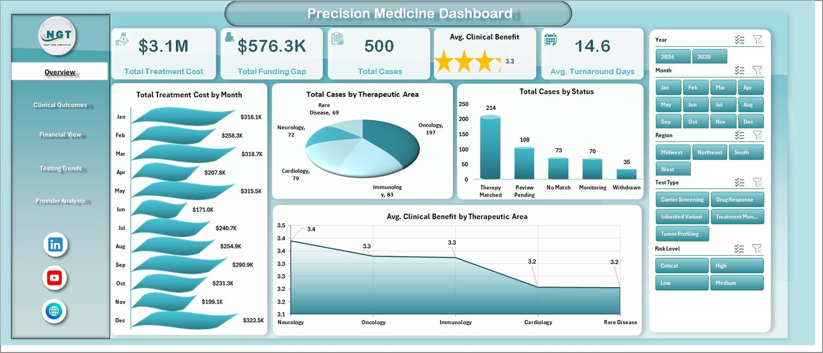
Five executive KPI cards. The overview page highlights Total Treatment Cost, Total Funding Gap, Total Cases, Avg. Clinical Benefit, and Avg. Turnaround Days so leadership can see the program position in seconds.
Multi-page analysis layout. The workbook includes Overview, Clinical Outcomes, Financial View, Testing Trends, Provider Analysis, Data, and Support sheets. Each page focuses on a separate decision area instead of crowding every chart into one screen.
Interactive slicers and dynamic pivots. Built-in slicers let users filter the dashboard quickly by key dimensions such as month, region, status, care center, patient segment, clinician, therapeutic area, genomic panel, and test type depending on the page.
Precision medicine workflow metrics. Track therapy match percentage, matched therapies, clinical benefit, risk level, adverse events, reimbursement coverage, funding gap, treatment cost, and turnaround time in one connected workbook.
Editable Excel data structure. Replace the sample records in the Data sheet with your own program data, then refresh the workbook to update pivots, charts, cards, and slicers.
No cloud dependency. The template runs in Microsoft Excel, making it practical for teams that prefer local reporting files or need to keep sensitive operational data inside their own environment.
What’s Inside the Precision Medicine Dashboard in Excel
Overview Page
The Overview page provides the high-level program snapshot. It includes cards for Total Treatment Cost, Total Funding Gap, Total Cases, Avg. Clinical Benefit, and Avg. Turnaround Days. These metrics help program leaders understand whether personalized therapy workflows are improving outcomes while staying financially manageable.
The Overview analysis includes Total Treatment Cost by Month, Total Cases by Therapeutic Area, Total Cases by Status, and Avg. Clinical Benefit by Therapeutic Area. Total Treatment Cost by Month helps identify seasonal or operational spikes in spend. Total Cases by Therapeutic Area shows which disease groups are driving precision medicine demand. Total Cases by Status makes it easier to monitor active, completed, pending, or delayed cases. Avg. Clinical Benefit by Therapeutic Area compares outcome impact across service lines.
Precision Medicine Dashboard in Excel
Clinical Outcomes Sheet
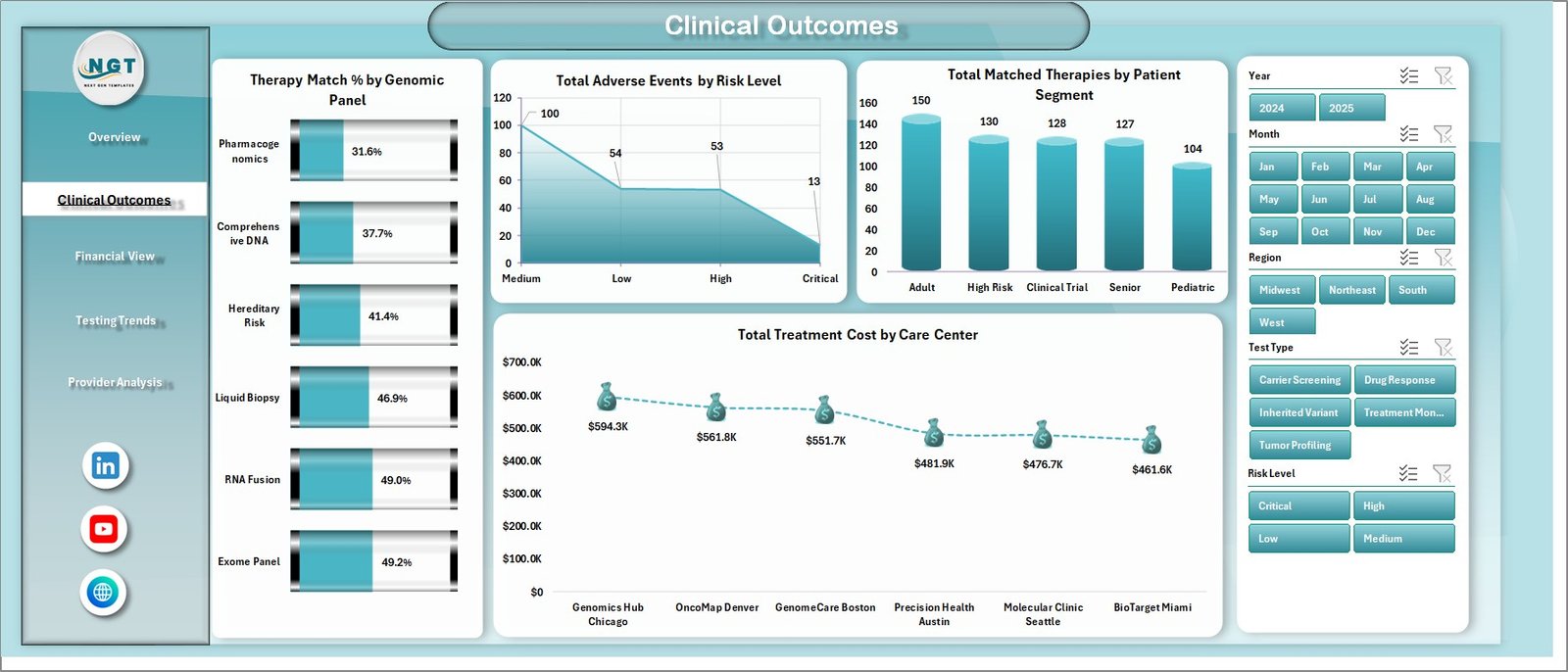
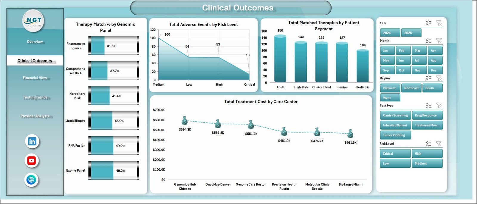
The Clinical Outcomes sheet focuses on patient and treatment effectiveness. Therapy Match % by Genomic Panel shows how different testing panels support actionable treatment decisions. Total Adverse Events by Risk Level helps teams monitor safety patterns and concentrate follow-up where risk is highest.
Total Matched Therapies by Patient Segment identifies where personalized treatment options are being found most often. Total Treatment Cost by Care Center compares the cost profile across participating locations, helping leaders discuss variation with local teams.
Clinical Outcomes sheet
Financial View Sheet
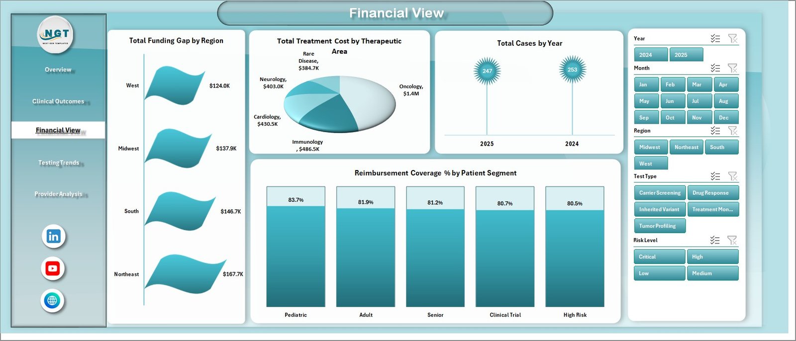
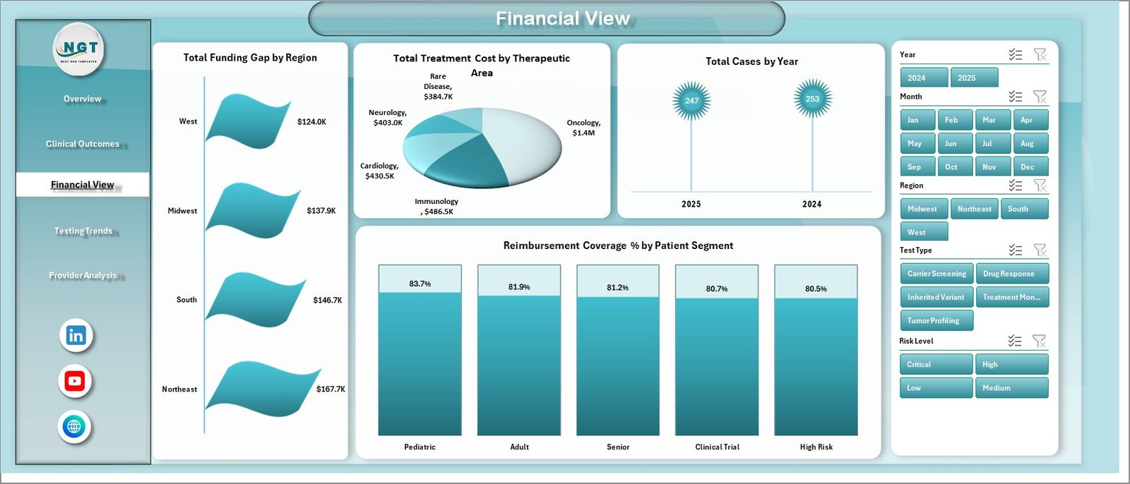
The Financial View sheet turns cost, funding, and reimbursement into a practical review page. Total Funding Gap by Region highlights where affordability pressure is strongest. Total Treatment Cost by Therapeutic Area shows which clinical programs carry the largest treatment investment.
Total Cases by Year helps users understand adoption and program growth over time. Reimbursement Coverage % by Patient Segment reveals which populations may need payer support, financial navigation, or alternative funding pathways.
Financial View sheet
Testing Trends Sheet
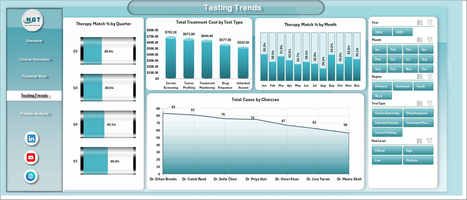
The Testing Trends sheet tracks how genomic testing and treatment matching are changing over time. Therapy Match % by Quarter gives a strategic view of match-rate improvement or decline. Total Treatment Cost by Test Type connects testing approach with downstream treatment expense.
Therapy Match % by Month is useful for short-term monitoring and operational reviews. Total Cases by Clinician shows which clinicians are contributing the largest case volume, helping managers understand adoption and training needs.
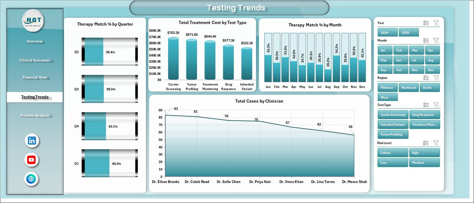
Testing Trends sheet
Provider Analysis Sheet
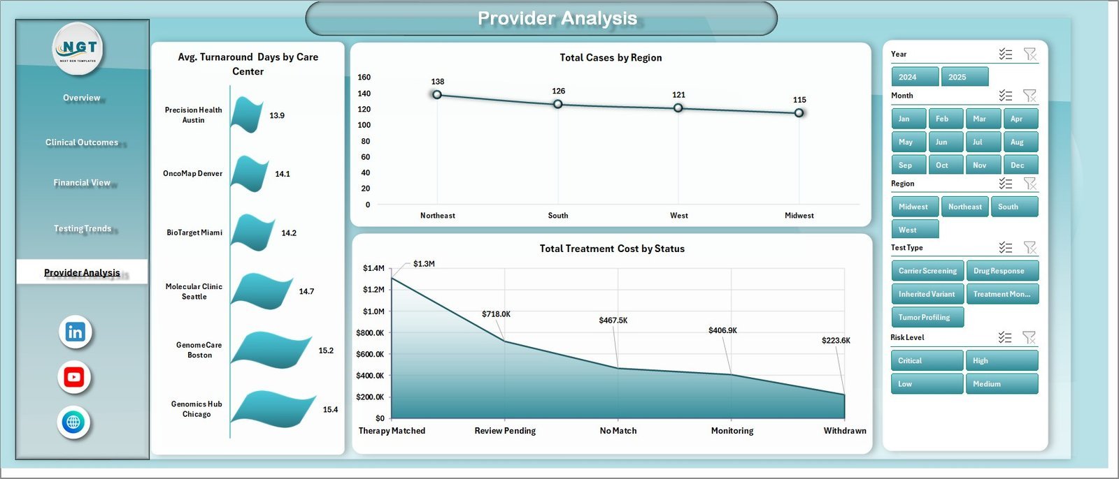
The Provider Analysis sheet helps teams review care delivery variation. Avg. Turnaround Days by Care Center shows where testing and review cycles are fastest or slowest. Total Cases by Region gives a geographic view of demand and program reach.
Total Treatment Cost by Status helps finance and clinical operations teams understand how cost is distributed across the case lifecycle, from pending cases through completed treatment decisions.
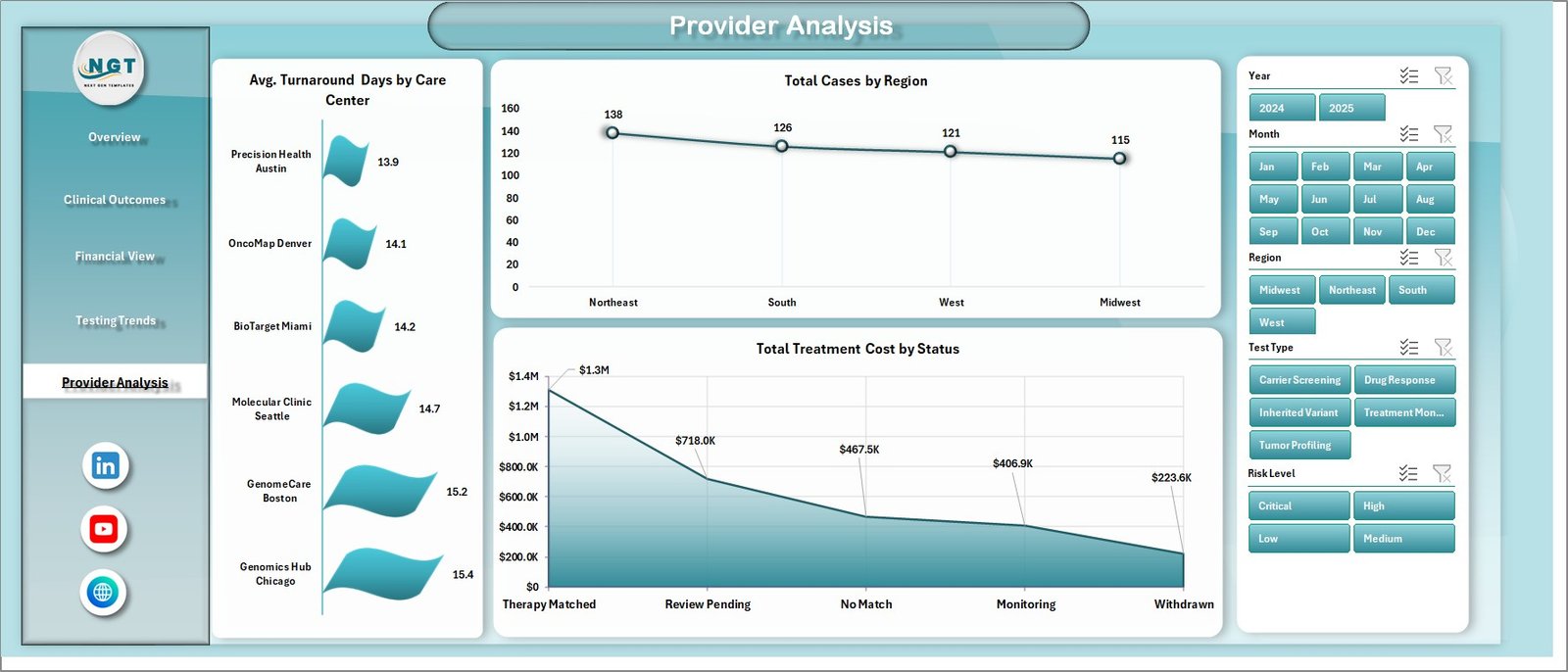
Provider Analysis sheet
Data Sheet Tab
The Data sheet is where users replace the sample records with their own precision medicine program data. Keep the same column format, paste or enter new records, and refresh the dashboard to update the entire reporting layer.

Data Sheet tab
Support Sheet Tab
The Support sheet contains the pivot tables used to create the dashboard dynamically. After updating the Data sheet, go to the Excel Ribbon, open the Data tab, and click Refresh All. The pivots, charts, cards, and filtered dashboard views will refresh. You can keep this sheet hidden during normal use.

Support sheet tab
Precision Medicine Dashboard in Excel vs. Google Sheets vs. Paid Healthcare SaaS – Where This Fits
| Feature | Precision Medicine Dashboard in Excel | Google Sheets Alternative | Paid Healthcare SaaS |
|---|---|---|---|
| Cost | One-time $17.99 sale price | Low cost, but usually custom-built | Often monthly or annual subscription |
| Platform | Microsoft Excel | Google Sheets | Vendor-hosted cloud app |
| Setup time | Replace sample data and refresh | Requires rebuilding charts and formulas | Implementation and onboarding required |
| Real-time team collaboration | Best with shared file workflows | Strong browser collaboration | Usually included |
| Mobile access | Limited by Excel mobile experience | Good browser/mobile support | Usually included |
| Customizable fields | Fully editable workbook | Fully editable but must be designed | Depends on vendor plan |
| Share with link | Share file or OneDrive link | Native link sharing | Role-based app access |
| Year-1 cost at 5 users | $17.99 one-time | Mostly staff build time | Can become expensive quickly |
| Precision medicine KPIs | Prebuilt treatment, genomics, cost, reimbursement, and outcome views | Must be designed manually | May require configuration or custom reports |
Who This Template Is For – and Who It’s Not For
This template is for clinical operations managers, healthcare analysts, oncology program coordinators, genomics labs, care center leaders, reimbursement teams, and consultants who need a clean Excel-based reporting layer for precision medicine activity.
It is not for teams that need real-time EHR integration, patient-level clinical decision support, HIPAA-hosted case management, automated payer submission, or a replacement for validated medical software. This is a reporting template, not a diagnostic or treatment recommendation tool.
How to Use the Precision Medicine Dashboard in Excel
- Download and unzip the Excel dashboard file.
- Open the workbook in Microsoft Excel.
- Go to the Data sheet and replace the sample rows with your own data in the same format.
- Use Excel’s Data tab and click Refresh All.
- Review the Overview, Clinical Outcomes, Financial View, Testing Trends, and Provider Analysis pages.
- Use slicers to filter the dashboard by program, region, status, care center, clinician, patient segment, and other available dimensions.
- Keep the Support sheet hidden after confirming the pivot tables refresh correctly.
Real-World Use Cases
Dr. Meera, an oncology program director, uses the dashboard to review therapy match rate, clinical benefit, adverse events, and turnaround days before monthly tumor board performance meetings.
James, a healthcare finance analyst, monitors treatment cost, reimbursement coverage, and funding gaps by region so the organization can prioritize financial navigation support.
Ana, a genomics operations manager, compares therapy match percentage by genomic panel, quarter, month, and clinician to identify training needs and testing process bottlenecks.
Frequently Asked Questions
What does the Precision Medicine Dashboard in Excel track?
It tracks treatment cost, funding gap, cases, clinical benefit, turnaround days, therapy match percentage, adverse events, matched therapies, reimbursement coverage, care centers, regions, clinicians, test types, and therapeutic areas.
Can I replace the sample data?
Yes. Use the Data sheet tab to add your own records in the same format. After updating the data, click Refresh All from the Excel Data tab.
Does this dashboard work without macros?
The dashboard is designed around Excel sheets, charts, slicers, and pivot tables. If your file includes any macro-enabled features, enable content only from a trusted source.
Is this a medical decision support tool?
No. It is a reporting dashboard for operational, financial, and analytical review. It does not diagnose patients or recommend treatment.
Can I customize the KPIs and charts?
Yes. The workbook is editable, so experienced Excel users can modify formulas, pivots, charts, labels, and layout to fit their organization.
Who should use this dashboard?
Healthcare analysts, precision medicine program managers, genomics teams, reimbursement analysts, care center leaders, and consultants can use it for structured reporting.
About the Author
Built by PK – Microsoft Certified Professional with 15+ years of Excel, Google Sheets, and Power BI experience. Founder of NextGenTemplates, reaching 300K+ subscribers across YouTube channels. Every template is hand-built and tested before release.
Explore Related Templates
Explore more healthcare and Excel dashboards from NextGenTemplates:
- Healthcare Administrator Toolkit
- Home Healthcare KPI Dashboard in Excel
- Employee Health and Safety Dashboard in Excel
- Dental Practice KPI Dashboard in Excel
Browse the Excel Dashboard collection and the Excel KPI Dashboard collection.
Download the Precision Medicine Dashboard in Excel today and start reviewing precision medicine operations with cleaner, faster Excel reporting.
Watch the demo video:
Compatibility and Requirements
- Works in Microsoft Excel desktop (Excel 2016 or later, or Microsoft 365).
- The dashboard filters through slicers on top of pivot tables. Microsoft explains them in Use slicers to filter data.












Reviews
There are no reviews yet.