

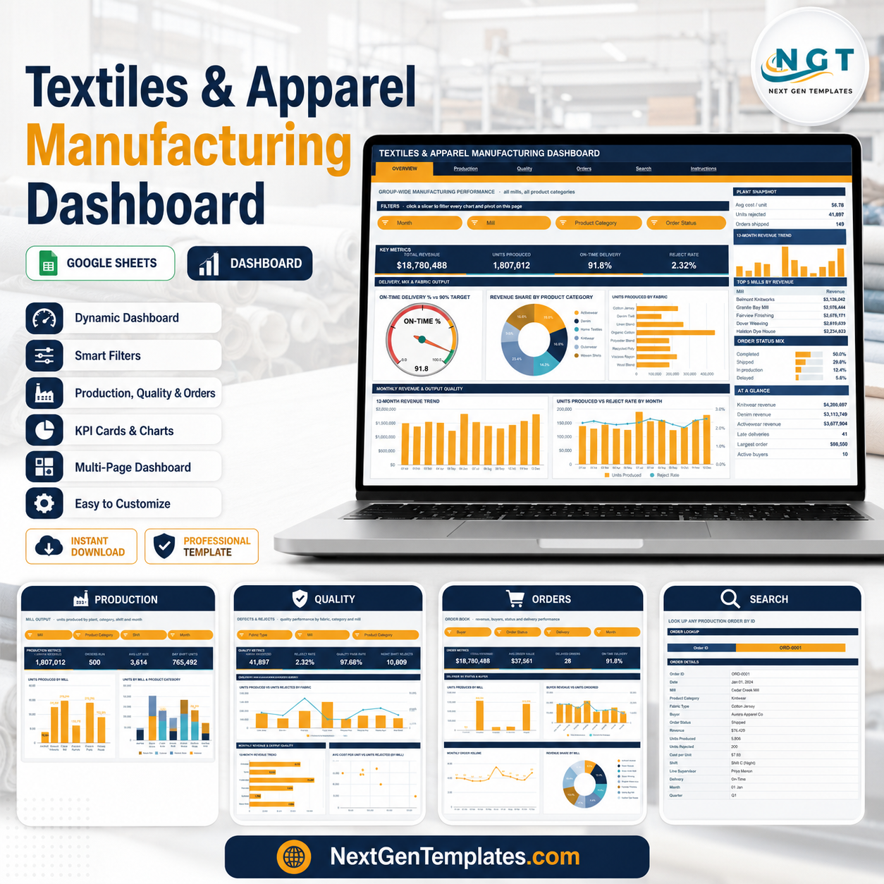

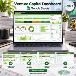
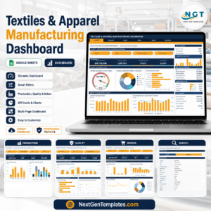
The Textiles & Apparel Manufacturing Dashboard in Google Sheets tracks 16 KPI cards across 4 interactive report pages, draws 16 pivot-driven charts, and gives you 15 slicers to filter by mill, fabric, shift, buyer and month. The sample production log holds 500 orders across 8 mills, 6 product categories, 8 fabric types and 10 buyers, and every formula, pivot and slicer already reaches row 1,001 – so setup takes under 10 minutes: paste your own orders over the sample rows and the whole dashboard redraws.
🌍 Join 8,400+ teams in 40+ countries using NextGenTemplates to replace paid SaaS tools with one-time-purchase Excel, Google Sheets, Power BI, and HTML templates.
✅ Instant download · One-time payment · No subscription · No per-user fees · Lifetime access
🔑 Key Features of the Textiles & Apparel Manufacturing Dashboard
- 📊 Four report pages, sixteen KPI cards. Overview carries Total Revenue, Units Produced, On-Time Delivery % and Reject Rate. Production carries Units Produced, Orders Run, Avg Lot Size and Day Shift Units. Quality carries Units Rejected, Reject Rate, Quality Pass Rate and Night Shift Rejects. Orders carries Total Revenue, Avg Order Value, Delayed Orders and On-Time Delivery %.
- 🎛️ Fifteen native slicers. Month, Mill, Product Category and Order Status on Overview; Mill, Product Category, Shift and Month on Production; Fabric Type, Mill and Product Category on Quality; Buyer, Order Status, Delivery and Month on Orders. Click one and every chart and pivot on that page moves together.
- ⏱️ An on-time delivery gauge with a 90% target. Red below 70%, amber between 70% and 90%, green above 90% – it re-reads the delivery pivot, so slicers move the needle.
- 🧵 Fabric and category analysis built in. Units Produced by Fabric, Revenue Share by Product Category, Units Rejected by Product Category and Units Produced vs Units Rejected by Fabric are all standing charts, not something you have to build.
- 🏭 Mill, shift and supervisor breakdowns. Units Produced by Mill, Units by Mill & Product Category, Units Produced by Line Supervisor and a Shift Output Share panel splitting Shift A (Day), Shift B (Swing) and Shift C (Night).
- 🔍 An Order lookup page. Choose any Order ID and the Search page prints all 16 fields of that record – date, mill, product category, fabric type, buyer, status, revenue, units produced, units rejected, cost per unit, shift, line supervisor, delivery, month and quarter.
- 📈 A sidebar that never leaves. Every report page carries a snapshot panel, a 12-month revenue trend, a Top 5 ranking table, a share bar panel, an At a Glance list and a 12-month order volume sparkline.
- 🧮 Pivot-table architecture. Each chart reads a pivot parked to the right of its page, so the file stays fast as the production log grows – and you can scroll right to inspect the numbers behind any chart.
📦 What’s Inside the Textiles & Apparel Manufacturing Dashboard
Six tabs across the top – Overview, Production, Quality, Orders, Search and Instructions – plus a Data sheet holding the production log.
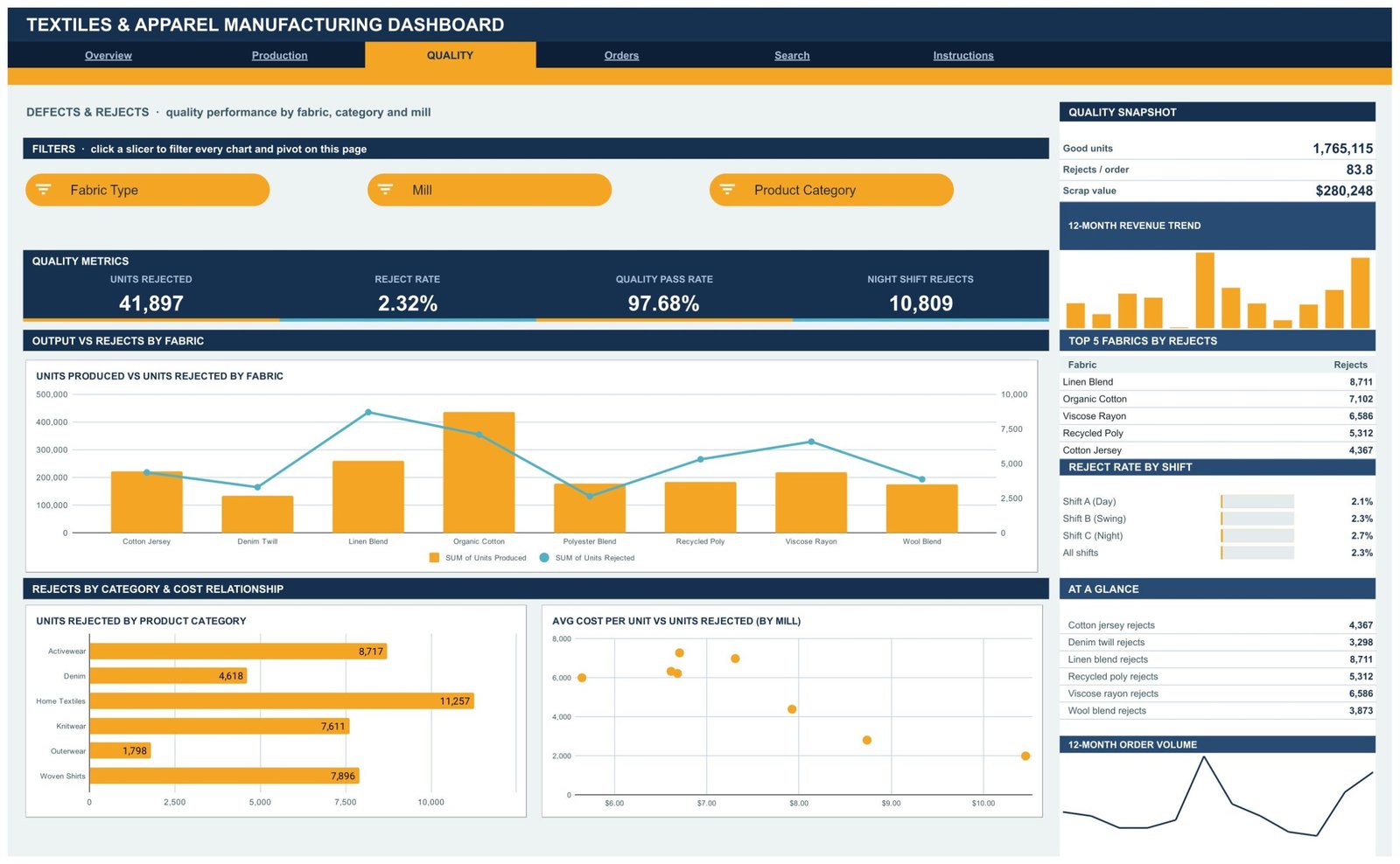
Page 1: Overview – Group-Wide Manufacturing Performance
Total Revenue of $18,780,488, 1,807,012 Units Produced, 91.8% On-Time Delivery and a 2.32% Reject Rate sit across the top, filtered by Month, Mill, Product Category and Order Status slicers. Charts include On-Time Delivery % vs 90% Target, Revenue Share by Product Category, Units Produced by Fabric, 12-Month Revenue Trend and Units Produced vs Reject Rate by Month, with a sidebar showing Plant Snapshot, Top 5 Mills by Revenue and Order Status Mix.
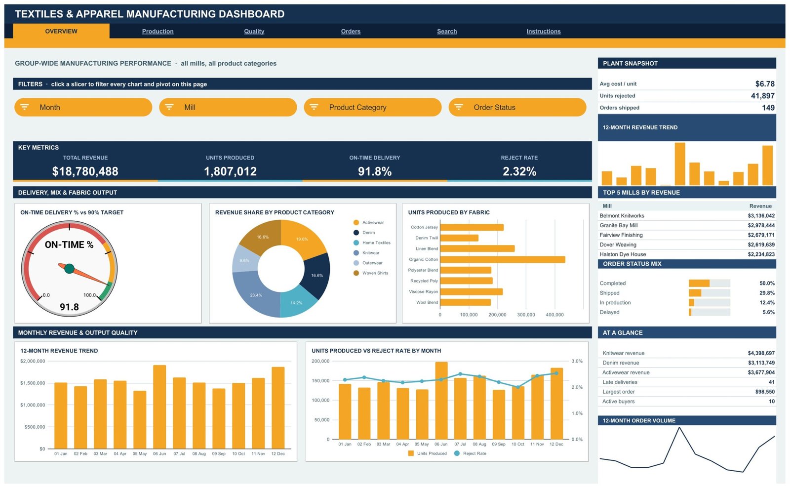
Page 2: Production – Mill Output by Plant, Category, Shift and Month
Units Produced, Orders Run, Avg Lot Size and Day Shift Units head the page, with Mill, Product Category, Shift and Month slicers. Charts include Units Produced by Mill, Units by Mill & Product Category, Monthly Units Produced and Units Produced by Line Supervisor, while the sidebar ranks the Top 5 Mills by Units and splits Shift Output Share across the three shifts.
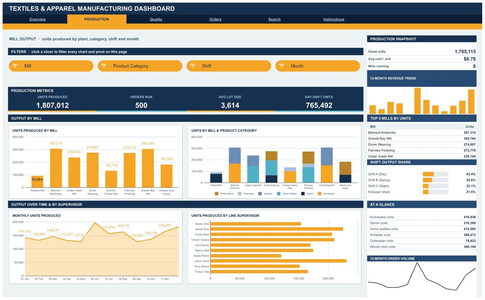
Page 3: Quality – Defects and Rejects by Fabric, Category and Mill
Units Rejected, Reject Rate, Quality Pass Rate and Night Shift Rejects lead, filtered by Fabric Type, Mill and Product Category. Charts include Units Produced vs Units Rejected by Fabric, Units Rejected by Product Category and Avg Cost per Unit vs Units Rejected by Mill, with a sidebar listing Top 5 Fabrics by Rejects and Reject Rate by Shift.
Page 4: Orders – Revenue, Buyers, Status and Delivery Performance
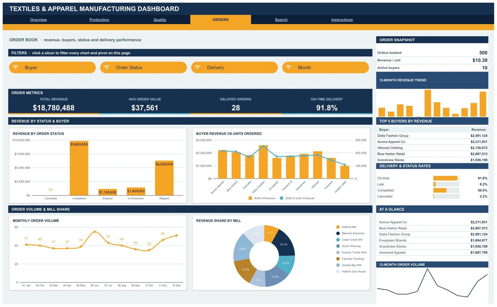
Total Revenue, Avg Order Value, Delayed Orders and On-Time Delivery % head the order book, filtered by Buyer, Order Status, Delivery and Month. Charts include Revenue by Order Status, Buyer Revenue vs Units Ordered, Monthly Order Volume and Revenue Share by Mill, with Top 5 Buyers by Revenue and Delivery & Status Rates in the sidebar.
Page 5: Search – Look Up Any Production Order by ID
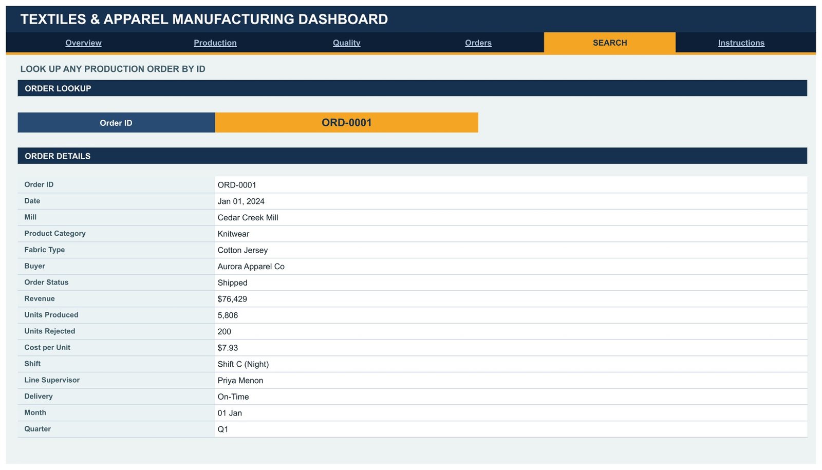
Pick an Order ID from the dropdown and the page prints that order’s full record: date, mill, product category, fabric type, buyer, order status, revenue, units produced, units rejected, cost per unit, shift, line supervisor, delivery, month and quarter.
Page 6: Instructions – How This Dashboard Works
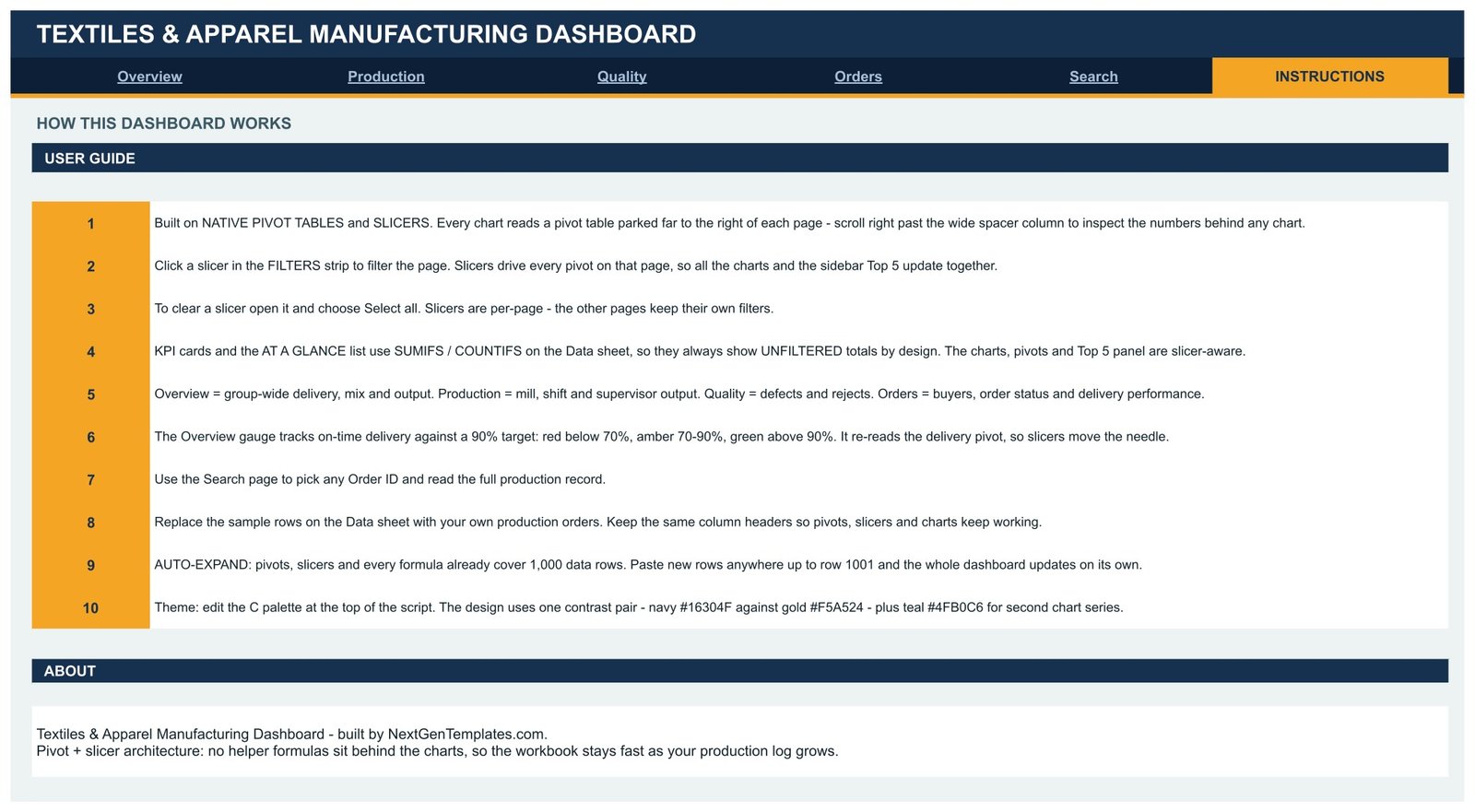
A ten-step user guide covering the pivot and slicer architecture, how to clear a slicer, why the KPI cards show unfiltered totals by design, how the delivery gauge bands work, how to replace the sample rows, and where to edit the colour palette.
The Data Sheet
500 sample production orders with 16 columns – Order ID, Date, Mill, Product Category, Fabric Type, Buyer, Order Status, Revenue, Units Produced, Units Rejected, Cost per Unit, Shift, Line Supervisor, Delivery, Month and Quarter. Keep the headers, replace the rows, and every pivot, slicer and chart follows up to row 1,001.
📊 Textiles & Apparel Manufacturing Dashboard vs. Excel vs. Katana MRP / NetSuite ERP – Where This Fits
| Feature | Textiles & Apparel Manufacturing Dashboard in Google Sheets | Microsoft Excel Dashboard | Katana MRP / NetSuite ERP |
|---|---|---|---|
| Cost | $9.99 one-time | $13.99-$29.99 one-time + Office licence | $179-$999+ / month |
| Platform | Any browser, Google Sheets | Desktop Excel | Vendor cloud |
| Setup time | Under 10 minutes | 15-20 minutes | Weeks of implementation |
| Real-time team collaboration | ✅ Built in | Only via OneDrive co-authoring | ✅ Included |
| Mobile access | ✅ Sheets app | Limited | ✅ Included |
| Customisable fields and charts | ✅ Every pivot and chart is editable | ✅ Editable | ❌ Vendor-defined |
| Share with a link | ✅ One link, view or edit | File attachment | Named seats only |
| Year-1 cost at 5 users | $9.99 total | $13.99-$29.99 + licences | $2,148-$11,988 |
| Mill, shift and fabric analysis out of the box | ✅ 16 charts pre-built | ✅ Pre-built | Requires report configuration |
| Owns your data | ✅ Your Drive, your copy | ✅ Your file | ❌ Vendor-hosted |
For mills and apparel factories that want mill, shift, fabric and buyer reporting without a monthly MRP subscription, the Textiles & Apparel Manufacturing Dashboard sits in the sweet spot.
👥 Who This Template Is For – and Who It’s Not For
✅ This template is built for:
- Production managers at textile mills and garment units running 1-20 plants who report weekly output, rejects and delivery numbers.
- Apparel manufacturers and CMT units that need a buyer-wise order book without buying an MRP system.
- Quality supervisors who want reject rate split by fabric, category, mill and shift in one screen.
- Merchandisers and sourcing teams tracking on-time delivery against a target for a handful of key buyers.
- Consultants and MBA students who need a realistic manufacturing analytics model to study or adapt.
❌ This template is NOT for:
- Teams that need live machine data – this reads a production log you maintain, not shop-floor sensors or an IoT feed.
- Factories needing full MRP: bill of materials, capacity planning, purchase orders and inventory netting are not included.
- Anyone expecting a compliance or audit tool – it makes no claim about OEKO-TEX, GOTS, WRAP, SA8000, BSCI or any other certification, and passing a reject-rate target is not a compliance result.
- Groups with more than 1,000 orders per reporting period, unless you extend the pivot and formula ranges yourself.
⚙️ How to Use the Textiles & Apparel Manufacturing Dashboard
- Buy and download the PDF guide, open it, and click the Google Sheets copy link inside.
- Choose Make a copy – the dashboard lands in your own Google Drive with all pivots and slicers intact.
- Open the Data sheet and replace the 500 sample orders with your own production log, keeping the column headers exactly as they are.
- Paste rows anywhere up to row 1,001; pivots, slicers and formulas already cover that range.
- Refresh the pivot tables, then open Overview and click a slicer to filter every chart on that page.
- Use the Search page to pull up any single Order ID and read its full record.
- Edit the colour palette on the Instructions page notes if you want the dashboard in your own brand colours.
- Share the file with your team by link – viewers see live numbers without touching the data.
💼 Real-World Use Cases
Ramesh runs production planning at a knitwear mill with three plants. Every Monday he pastes last week’s orders into the Data sheet, opens the Production page, and uses the Mill and Shift slicers to see which plant and which shift produced the most units – then reads Units Produced by Line Supervisor to decide where to move overtime.
Anita is a quality head at an apparel exporter. She lives on the Quality page: Units Produced vs Units Rejected by Fabric tells her which fabric is costing her the most scrap, and Reject Rate by Shift shows whether the night shift is the problem. She exports the page to PDF for her monthly review.
Marcus merchandises for ten retail buyers. He uses the Orders page to check Avg Order Value and Delayed Orders per buyer before every call, and the Search page to answer a buyer’s question about one specific order in seconds – without paying per-seat for an ERP login.
❓ Frequently Asked Questions
What KPIs does the Textiles & Apparel Manufacturing Dashboard track?
The Textiles & Apparel Manufacturing Dashboard tracks 16 KPI cards including Total Revenue, Units Produced, On-Time Delivery %, Reject Rate, Orders Run, Avg Lot Size, Day Shift Units, Quality Pass Rate, Night Shift Rejects, Avg Order Value and Delayed Orders. All of them recalculate when you replace the sample data.
How long does setup take?
Under 10 minutes. Open the PDF, click the copy link, replace the 500 sample rows on the Data sheet with your own production orders, and refresh the pivots. The Textiles & Apparel Manufacturing Dashboard already covers 1,000 data rows, so no range editing is needed.
How does this compare to Katana MRP or NetSuite?
Those are full MRP and ERP systems that plan materials and capacity, and they charge monthly per seat. The Textiles & Apparel Manufacturing Dashboard is a one-time $9.99 reporting layer over a production log you already keep – it reports output, quality and delivery, it does not plan production.
Do I need any add-ons or Apps Script?
No. The Textiles & Apparel Manufacturing Dashboard uses only native Google Sheets features – pivot tables, slicers, SUMIFS and COUNTIFS formulas, and built-in charts. It opens in any browser with a Google account and needs no installation.
Can more than 1,000 orders be loaded?
Yes, but you have to extend the ranges yourself. Pivots, slicers and formulas ship covering rows 2 to 1,001. Beyond that, widen each pivot’s source range and the formula ranges on the KPI cards, and the Textiles & Apparel Manufacturing Dashboard will keep working.
Why do the KPI cards ignore my slicer selection?
By design. In the Textiles & Apparel Manufacturing Dashboard the KPI cards and the At a Glance list use SUMIFS and COUNTIFS on the Data sheet, so they always show unfiltered totals as a constant reference. The charts, pivots and Top 5 panels are the slicer-aware parts.
Is this the same as the KPI scorecard version?
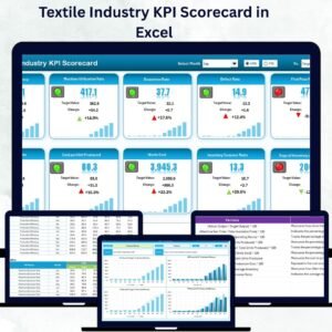
No. This is the analytical dashboard – four report pages of charts and pivots. The Textiles & Apparel Manufacturing KPI Dashboard in Excel is a month-picker scorecard with traffic lights and trend pages. They are different templates.
👤 About the Author
Built by PK – Microsoft Certified Professional with 15+ years of Excel, Google Sheets, and Power BI experience. Founder of NextGenTemplates, reaching 300K+ subscribers across YouTube channels (@PK-AnExcelExpert, @NextGenTemplates, @NeoTechNavigators). Every template is hand-built and tested before release.
🔗 Explore Related Templates
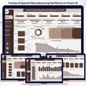
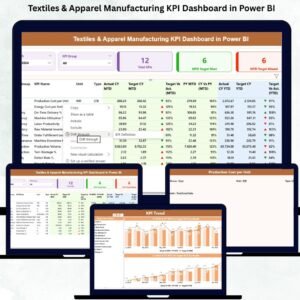
Also available as: the Textiles & Apparel Manufacturing Dashboard in Excel for desktop users, and the Textiles & Apparel Manufacturing Dashboard in Power BI if you publish to a Power BI workspace.
Working across a plant group? Pair it with the Chemical Manufacturing Dashboard in Google Sheets, the Steel & Metals Dashboard in Google Sheets or the Electronics & Semiconductors Dashboard in Google Sheets. For daily shop-floor entry, the Daily Production Output Tracker in Google Sheets feeds this dashboard neatly, and there are more in our Google Sheets Dashboards and Dashboard Templates collections.
📖 Click here to read the Detailed Blog Post
🎥 Visit our YouTube channel for step-by-step video tutorials
👉 YouTube.com/@NextGenTemplates
Watch the step-by-step video Demo:
📅 Last updated: August 2026























Reviews
There are no reviews yet.