

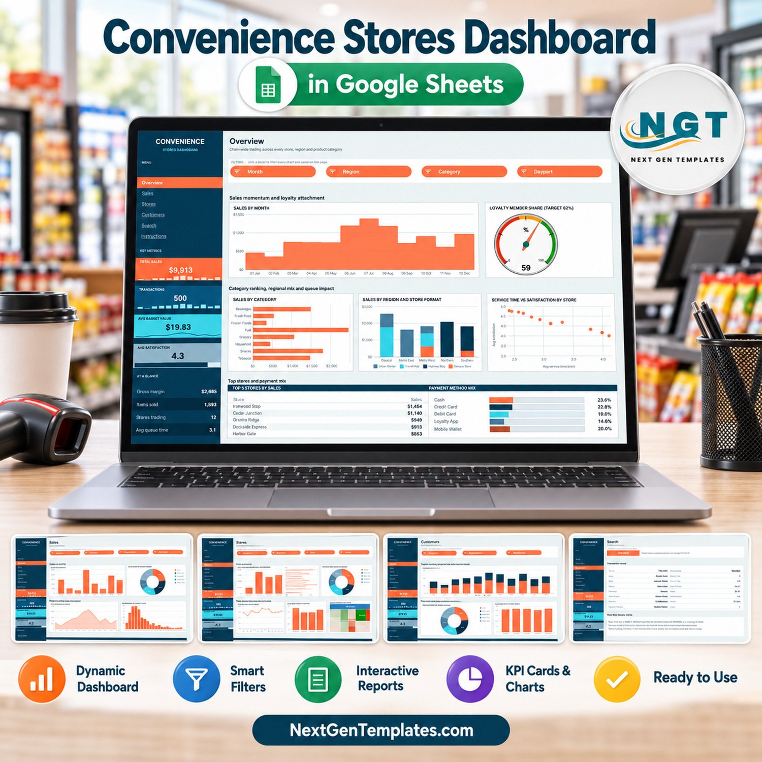
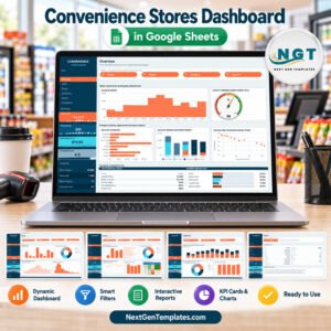
The Convenience Stores Dashboard in Google Sheets turns a transaction log into a seven-tab trading report: 500 sample transactions across 12 stores, 5 regions, 4 store formats and 8 product categories, drawn as 18 charts on four analysis pages with 15 slicers, a transaction Search page and a built-in Instructions page. Every chart reads a native Google Sheets pivot table over the Data tab, and the ranges already reach 1,000 transactions. Make your copy, paste your own rows over the sample and the whole workbook redraws itself.
🌍 Join 8,400+ teams in 40+ countries using NextGenTemplates to replace paid SaaS tools with one-time-purchase Excel, Google Sheets, Power BI and HTML templates.
✅ Instant download · One-time payment · No subscription · No per-user fees · Lifetime access
🔑 Key Features of the Convenience Stores Dashboard in Google Sheets
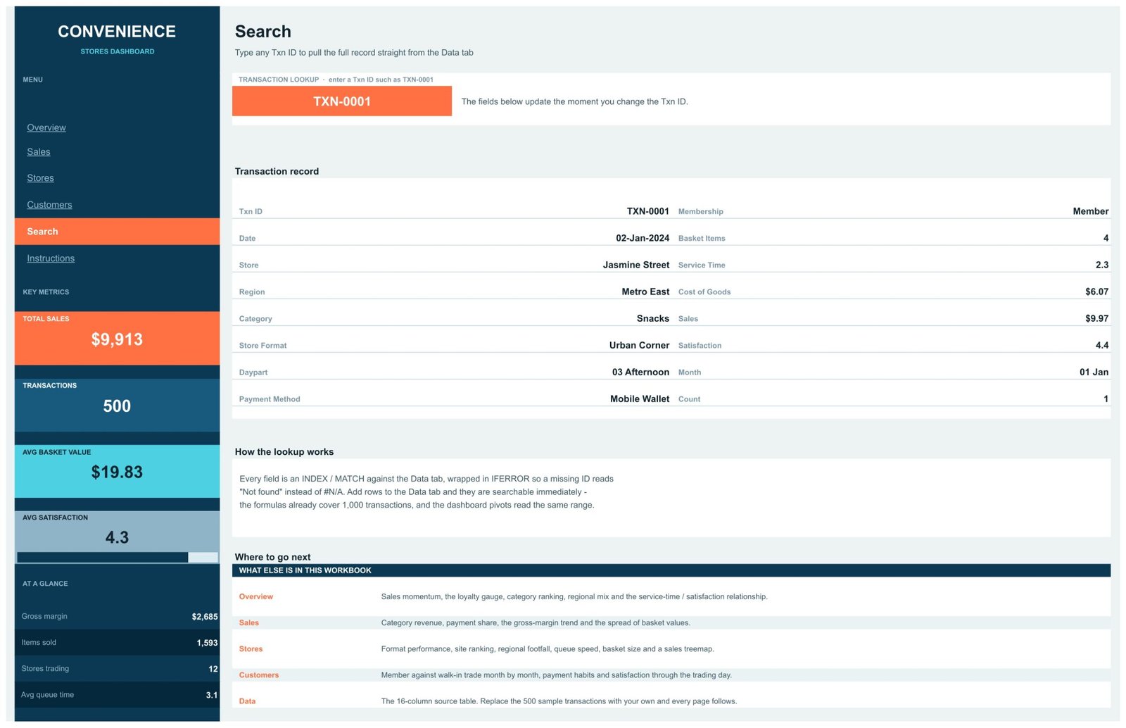
🔹 A navy navigation rail that travels with you. Every page carries the same rail: links to Overview, Sales, Stores, Customers, Search and Instructions, four KPI cards (Total Sales, Transactions, Avg Basket Value, Avg Satisfaction) with small sparklines, and an AT A GLANCE list for Gross margin, Items sold, Stores trading and Avg queue time.
🔹 18 charts across four analysis pages. Overview carries 5, Sales 4, Stores 6 and Customers 3, including a stepped-area sales trend, a loyalty gauge against a 62% target, a service-time versus satisfaction scatter, a basket-value histogram and a sales treemap by region and store.
🔹 15 slicers, set per page. Month, Region, Category and Daypart on Overview; Month, Category, Payment Method and Store Format on Sales; Region, Store Format, Store and Month on Stores; Daypart, Payment Method and Membership on Customers. Each page keeps its own selection.
🔹 Store-floor measures, not just revenue. Alongside sales and gross margin (sales minus cost of goods), the data model carries basket items, service time in minutes, a 1-5 satisfaction score, daypart, payment method and loyalty membership, so queue speed and customer experience sit next to the till total.
🔹 A transaction Search page. Type a Txn ID such as TXN-0001 and read back all 16 fields of that sale, pulled by INDEX / MATCH and wrapped in IFERROR so an unknown ID reads “Not found”.
🔹 Room for 1,000 transactions. The pivots read A1:P1001 on the Data tab, so you can paste up to 1,000 rows before anything needs extending.
🧾 What This Template Does, and What It Deliberately Does Not Do
This is a reporting template for a convenience store chain’s transaction export. It summarises sales, margin, basket size, service time, satisfaction, payment mix and loyalty membership by month, store, region, format, category and daypart. It is not a point-of-sale, inventory, stock-ordering or fuel-management system. It rings up nothing, tracks no stock levels or shrinkage, and has no live connection to your tills: you paste an export into the Data tab and the pages recalculate. The 500 sample transactions and the store names are fictional, dated across 2024.
Two behaviours worth knowing before you filter. The rail’s KPI cards, the AT A GLANCE list and the PAYMENT METHOD MIX strip are plain SUM, AVERAGE and COUNTIF formulas over the whole Data tab, so they always show chain-wide totals and do not move with the slicers. The charts, the loyalty gauge and the Top 5 ranking panels read the pivots and do follow the slicers on their page. On the Sales page this means the donut (share of sales value) and the strip beneath it (share of transactions) show slightly different percentages side by side, which is expected rather than an error.
📦 What’s Inside the Convenience Stores Dashboard in Google Sheets
Page 1: Overview, sales momentum and loyalty attachment
Four slicers (Month, Region, Category, Daypart) sit above Sales by Month as a stepped area chart and a Loyalty Member Share gauge reading 59 against a 62% target. The second band holds Sales by Category (Fuel leads), Sales by Region and Store Format as a stacked column, and Service Time vs Satisfaction by Store as a scatter where the slower stores score lower. The foot of the page lists the Top 5 Stores by Sales, led by Ironwood Stop at $1,454, beside the Payment Method Mix.

Page 2: Sales, what sells, how it is paid for and the margin it leaves
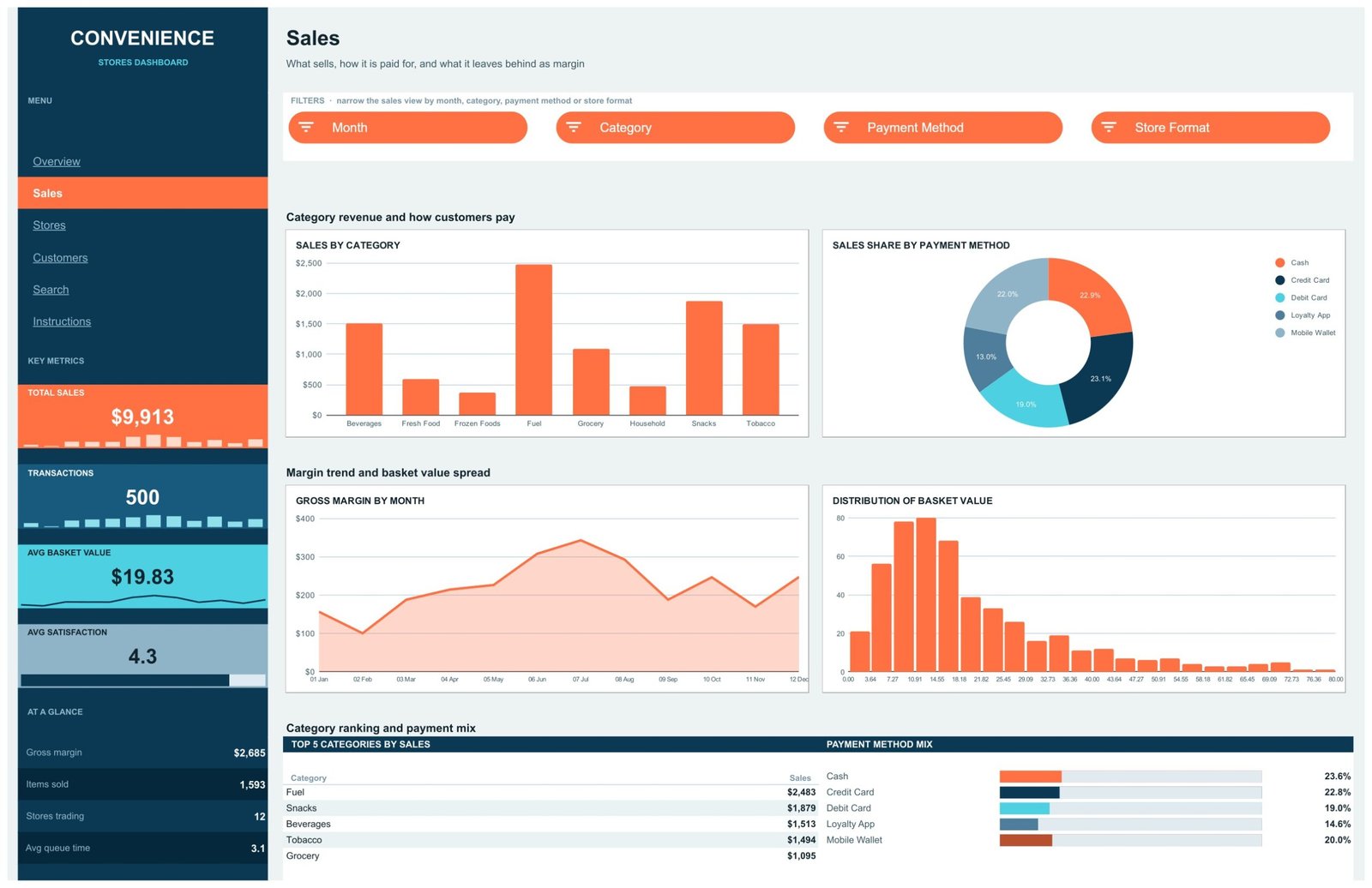
Filtered by Month, Category, Payment Method and Store Format. Charts are Sales by Category as a column chart (Fuel $2,483, Snacks $1,879, Beverages $1,513), Sales Share by Payment Method as a donut, Gross Margin by Month as an area chart, and a Distribution of Basket Value histogram showing most baskets clustering between about $7 and $18. A Top 5 Categories by Sales panel sits at the foot.
Page 3: Stores, format performance, site ranking and regional footfall
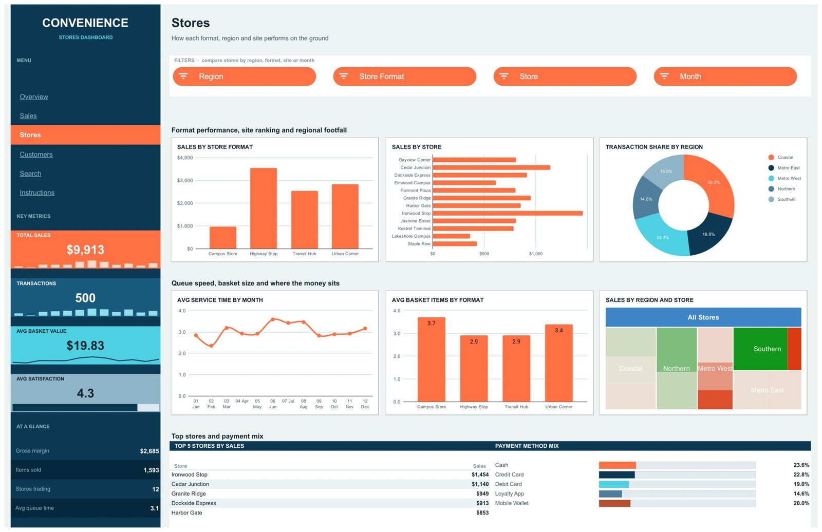
Filtered by Region, Store Format, Store and Month. Six charts: Sales by Store Format across Campus Store, Highway Stop, Transit Hub and Urban Corner; Sales by Store for all 12 sites; Transaction Share by Region as a donut (Coastal 29.2%); Avg Service Time by Month; Avg Basket Items by Format (Campus Store 3.7, Urban Corner 3.4); and a Sales by Region and Store treemap.
Page 4: Customers, membership, payment habits and satisfaction by daypart
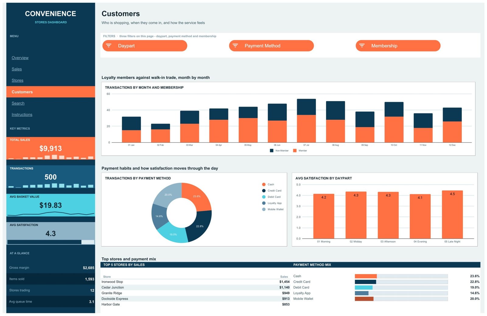
Filtered by Daypart, Payment Method and Membership. Transactions by Month and Membership stacks loyalty members against walk-in trade, Transactions by Payment Method shows Cash at 23.6% and Credit Card at 22.8%, and Avg Satisfaction by Daypart runs from 4.1 in the Evening to 4.5 Late Night.
Page 5: Search, pull any transaction by Txn ID
Enter a Txn ID in the orange cell and the Transaction record returns date, store, region, category, store format, daypart, payment method, membership, basket items, service time, cost of goods, sales, satisfaction, month and count. A Where to go next table summarises every other tab.
Page 6: Instructions, the user guide inside the file
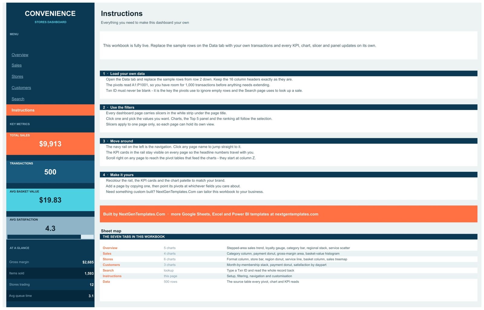
Four short steps cover loading your own data, using the filters, moving around with the rail (the pivot tables start at column Z on each page) and recolouring the workbook, followed by a sheet map of all seven tabs.
📊 Google Sheets Dashboard vs. an Excel Dashboard vs. a Paid BI Suite, Where This Fits
| Feature | This Google Sheets dashboard | Microsoft Excel dashboard | Power BI Pro / Tableau Creator |
|---|---|---|---|
| Cost | $9.99 one-time ✅ | One-time + Microsoft 365 | $14-75 / user / month |
| Platform | Google Sheets, browser only ✅ | Desktop Excel | Desktop authoring + service |
| Setup time | Under 10 minutes ✅ | Under 15 minutes | Days: model, publish, licence |
| Share with area managers | A Google Drive link ✅ | File send or OneDrive link | Viewers need a licence |
| Mobile access | Google Sheets app ✅ | Excel mobile, limited slicers | Vendor app, per seat |
| Service time, satisfaction and loyalty views | Ready-made ✅ | Build or buy separately | Build your own model |
| Single-transaction lookup | Search page, no add-ons ✅ | Needs a lookup sheet | Drillthrough page |
| Live feed from tills | No, paste an export | No, paste or Power Query | Yes, with connectors ✅ |
| Row capacity out of the box | 1,000 transactions | Excel row limit | Millions ✅ |
For a small chain that wants a monthly trading picture without per-seat BI licences, this Google Sheets dashboard sits in the sweet spot. If you need every till sale in real time, a BI suite with connectors is the better tool.
👥 Who This Template Is For, and Who It’s Not For
✅ Built for:
- Owners and area managers of small convenience store, forecourt shop or campus store chains who can export transactions to a spreadsheet
- Operations leads comparing highway, transit, campus and urban formats side by side
- Store managers who want queue time and satisfaction next to sales, not in a separate survey file
- Loyalty and marketing teams checking member share against a target by month, daypart and payment method
❌ Not for:
- Anyone looking for a POS, inventory, reordering or fuel pump system; this reads an export, it does not run the store
- Chains needing a live till feed, stock or shrinkage tracking
- Estates with well over 1,000 transactions per reporting period unless you summarise first or extend the ranges
⚙️ How to Use the Dashboard
- Open the PDF in your download and click the Google Sheets copy link to create your own editable copy in Drive.
- Read the Instructions tab first; it explains the four setup steps and maps all seven tabs.
- Open the Data tab and replace the sample rows from row 2 down, keeping the 16 column headers exactly as they are.
- Never leave Txn ID blank: the pivots use it to ignore empty rows and the Search page uses it to find a sale.
- Click any slicer in a FILTERS strip to filter that page’s charts, gauge and Top 5 panel together.
- Use the Search page to pull any single transaction by its Txn ID.
💼 Real-World Use Cases
Dana runs six forecourt and highway shops. On the Stores page she filters Store Format to Highway Stop and reads Avg Service Time by Month next to Sales by Store, so the site with the slowest queues is the first stop on her next visit.
Marcus manages a loyalty app for a campus store group. He opens Overview, checks the Loyalty Member Share gauge against the 62% target, then moves to Customers and filters Daypart to see when walk-in trade outweighs members.
Priya is the finance lead for a regional chain. She uses the Sales page, Gross Margin by Month and Sales by Category, to see whether fuel volume or higher-margin snacks and beverages are driving the month.
❓ Frequently Asked Questions
What KPIs does the Convenience Stores Dashboard in Google Sheets show?
The rail shows Total Sales, Transactions, Avg Basket Value and Avg Satisfaction, plus Gross margin, Items sold, Stores trading and Avg queue time. The pages add a loyalty member share gauge and 17 further charts.
Is this a POS or inventory system?
No. It records no sales, holds no stock counts and connects to no till or back-office system. It reports on a transaction export you paste into the Data tab.
Do the KPI cards follow the slicers?
No, by design. The rail cards, AT A GLANCE list and Payment Method Mix strip always show whole-dataset totals. Charts, the gauge and the Top 5 panels follow the slicers on their page.
How is it different from the Convenience Store KPI Dashboard in Google Sheets?
That template is a separate KPI build focused on target versus actual with MTD and YTD views. This one is a transaction-level analytics dashboard: store formats, regions, dayparts, payment methods, membership, service time, satisfaction and a transaction Search page.
Is it the same file as the Excel or Power BI Convenience Stores Dashboard?
No. Those are separate builds with their own layouts and sample data. This Google Sheets edition was built on its own data model with 16 columns and 500 sample transactions.
How many transactions can it hold?
The pivots read rows 2 to 1001 of the Data tab, so 1,000 transactions out of the box. The sample fills 500 of them.
👤 About the Author
Built by PK, Microsoft Certified Professional with 15+ years of Excel, Google Sheets and Power BI experience. Founder of NextGenTemplates, reaching 300K+ subscribers across YouTube channels (@PKAnExcelExpert, @NextGenTemplates, @NeoTechNavigators). Every template is hand-built and tested before release.
🔗 Explore Related Templates
Browse the full range of Google Sheets Dashboards and the wider Google Sheets template library. New to pivot-driven filters? Google’s guide to slicers in Google Sheets explains how they work.
Same subject, other platforms: the Convenience Stores Dashboard in Excel and the Convenience Stores Dashboard in Power BI are separate builds with their own pages and sample data, not ports of this file.
Different families, same subject: the Convenience Store KPI Dashboard in Google Sheets and the Convenience Store KPI Scorecard in Excel track targets against actuals, and the General Store POS Web App handles billing at the counter rather than reporting on it. A Supermarkets Dashboard in Google Sheets is being prepared.
📖 Click here to read the Detailed Blog Post
🎥 Visit our YouTube channel for step-by-step video tutorials
👉 YouTube.com/@NextGenTemplates
📅 Last updated: September 2026























Reviews
There are no reviews yet.