

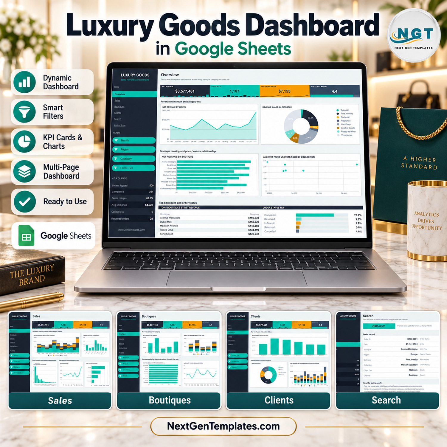
The Luxury Goods Dashboard in Google Sheets tracks 4 headline KPIs and 6 at-a-glance stats across 6 pages, with 16 charts and 15 filter chips driven by pivot tables. The sample file carries 500 orders and the formulas already reach 1,000 rows, so setup is a paste-and-go job: replace the rows on the Data tab and every tile, chart and slicer panel redraws on its own.
🌍 Join 8,400+ teams in 40+ countries using NextGenTemplates to replace paid SaaS tools with one-time-purchase Excel, Google Sheets, Power BI, and HTML templates.
✅ Instant download · One-time payment · No subscription · No per-user fees · Lifetime access
🔑 Key Features of the Luxury Goods Dashboard in Google Sheets
📊 Four KPI tiles that travel with you. Net Revenue, Units Sold, Avg Order Value and Avg Client Rating sit under the page title on every dashboard page, each with its own inline spark strip, so the headline numbers never leave the screen while you drill into a region or a collection.
🧭 A dark navigation rail with a live at-a-glance block. The rail links straight to Overview, Sales, Boutiques, Clients, Search and Instructions, and carries six running stats underneath: Orders logged, Completed, Gross margin, Avg unit price, Collections and Returned orders.
🎛️ 15 slicer chips across four dashboard pages. Overview filters by Month, Region, Category and Client Tier; Sales by Month, Channel, Category and Order Status; Boutiques by Boutique, Region, Client Tier and Month; Clients by Client Tier, Collection and Month. Slicers apply per page, so each page holds its own view.
📈 16 pivot-backed charts. Revenue trend, category mix, boutique ranking, price-versus-volume scatter, channel build-up, order value distribution, regional tiering and client-book analysis — every one reads a pivot table on the same page rather than a hand-typed range.
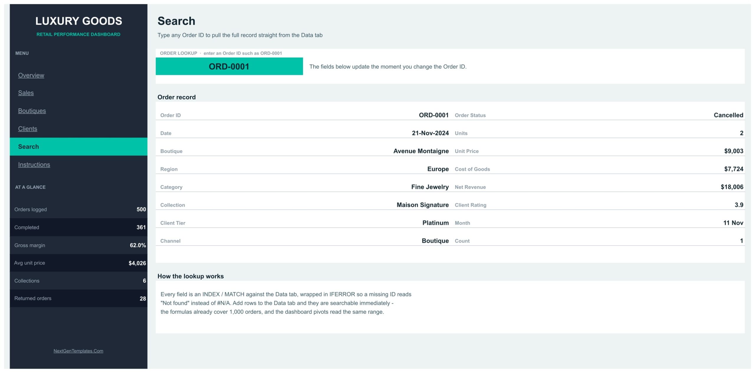
🔍 An INDEX / MATCH order lookup. The Search page pulls all 16 fields of any order straight from the Data tab by Order ID, wrapped in IFERROR so a missing ID reads “Not found” instead of #N/A.
🏷️ Seven dimensions already modelled. 9 boutiques, 5 regions, 8 product categories, 6 collections, 4 client tiers, 4 sales channels and 5 order statuses are wired through the pivots, so a luxury retail dashboard for your own door list is a find-and-replace away.
📦 What’s Inside the Luxury Goods Dashboard in Google Sheets
Page 1: Overview
Group-wide luxury retail performance across every boutique, category and client tier. The KPI row reads Net Revenue $3,577,461, Units Sold 1,167, Avg Order Value $7,155 and Avg Client Rating 4.4 on the sample data. Charts are Net Revenue by Month, Revenue Share by Category, Net Revenue by Boutique and Avg Unit Price vs Units Sold by Collection, closing with a Top 5 Boutiques by Net Revenue table and an Order Status Mix bar set. Filters: Month, Region, Category, Client Tier.

Page 2: Sales
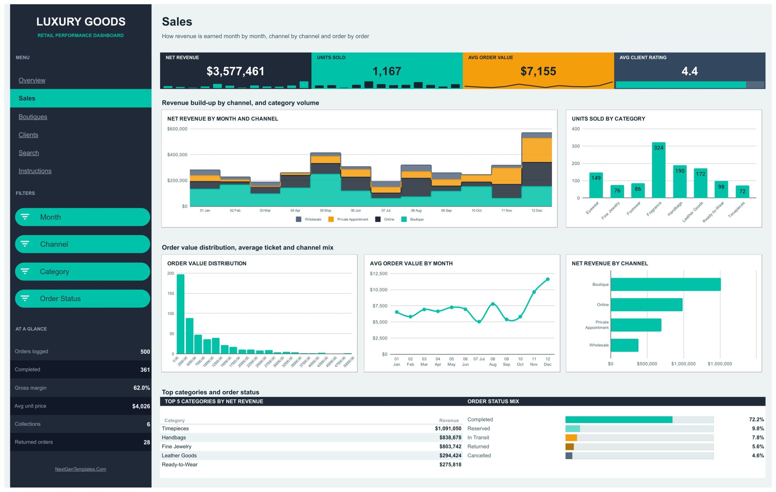
How revenue is earned month by month, channel by channel and order by order. Charts include Net Revenue by Month and Channel, Units Sold by Category, Order Value Distribution, Avg Order Value by Month and Net Revenue by Channel, with a Top 5 Categories by Net Revenue table and the Order Status Mix bars. The four channels are Boutique, Online, Private Appointment and Wholesale. Filters: Month, Channel, Category, Order Status.
Page 3: Boutiques
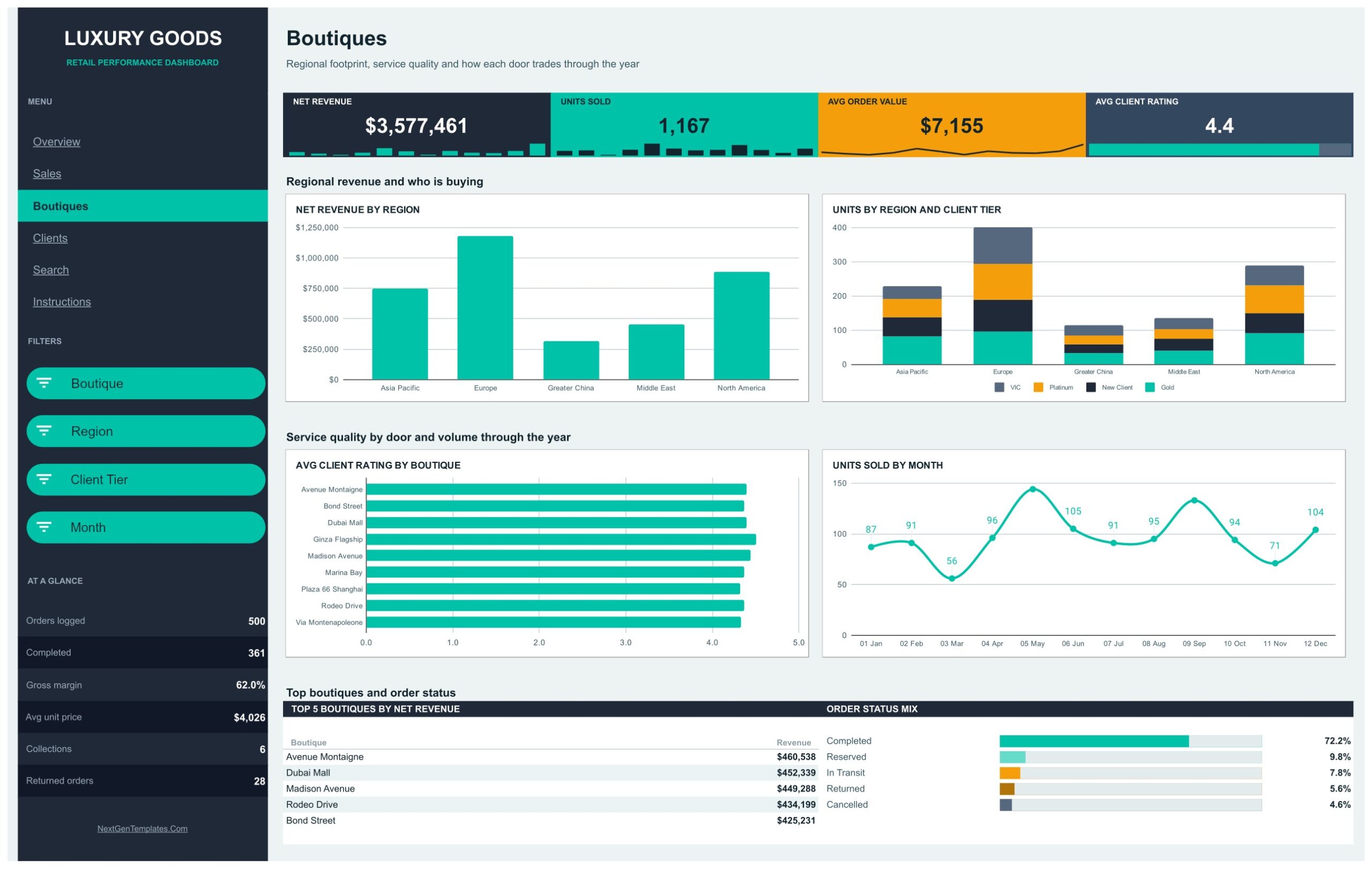
Regional footprint, service quality and how each door trades through the year. Charts are Net Revenue by Region, Units by Region and Client Tier, Avg Client Rating by Boutique and Units Sold by Month, plus the Top 5 Boutiques by Net Revenue table and Order Status Mix. Regions run Asia Pacific, Europe, Greater China, Middle East and North America. Filters: Boutique, Region, Client Tier, Month.
Page 4: Clients
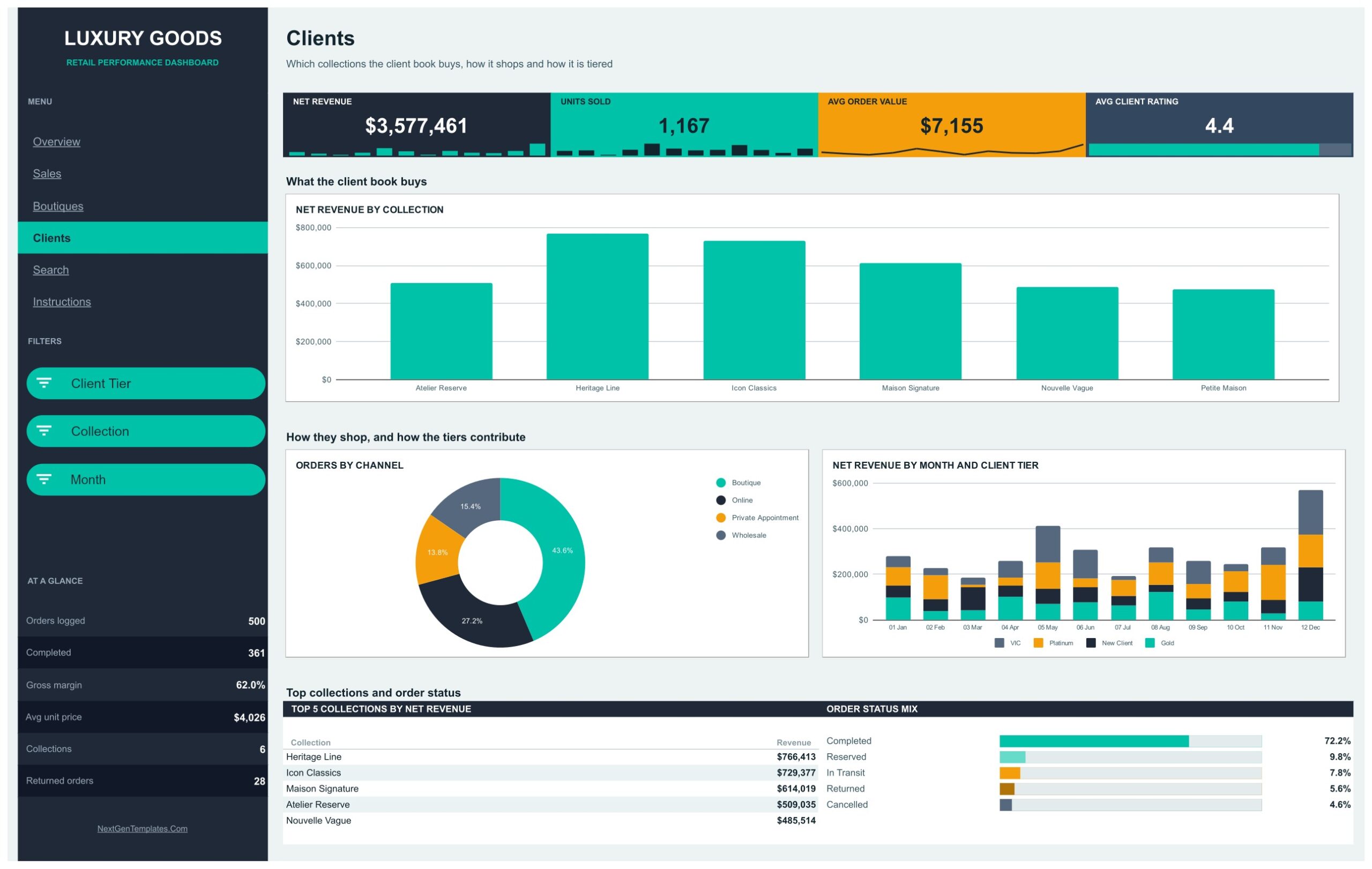
Which collections the client book buys, how it shops and how it is tiered. Charts are Net Revenue by Collection, Orders by Channel and Net Revenue by Month and Client Tier, with a Top 5 Collections by Net Revenue table and Order Status Mix. The six collections are Atelier Reserve, Heritage Line, Icon Classics, Maison Signature, Nouvelle Vague and Petite Maison; tiers are VIC, Platinum, Gold and New Client. Filters: Client Tier, Collection, Month.
Page 5: Search
Type any Order ID, such as ORD-0001, and the full order record appears: Order ID, Date, Boutique, Region, Category, Collection, Client Tier, Channel, Order Status, Units, Unit Price, Cost of Goods, Net Revenue, Client Rating, Month and Count. Every field is an INDEX / MATCH against the Data tab wrapped in IFERROR, and new rows are searchable the moment you add them.
Page 6: Instructions
A four-step setup guide covering how to load your own data, how the filter chips work, how to move between pages and how to recolour the rail, tiles and chart palette. It also states where the pivot tables live — scroll right on any page and they start at column Z.

A hidden Data tab sits behind all of it with 16 column headers; the pivots read A1:P1001, so there is room for 1,000 orders before anything needs extending. You will find more Google Sheets Dashboards in the same build style across the catalogue.
📊 Luxury Goods Dashboard vs. a Microsoft Excel Dashboard vs. Retail BI SaaS — Where This Fits
| Feature | This Google Sheets template | Microsoft Excel Dashboard | Lightspeed Analytics / NetSuite ERP |
|---|---|---|---|
| Cost | One-time purchase ✅ | One-time purchase, plus an Office licence | Subscription, billed per location or per user |
| Platform | Any browser, no install ✅ | Desktop Excel | Vendor cloud |
| Setup time | Under 10 minutes ✅ | Under 15 minutes | Weeks of onboarding and data mapping |
| Real-time team collaboration | Yes, native to Google Sheets ✅ | Co-authoring only via OneDrive | Yes |
| Mobile access | Google Sheets mobile app ✅ | Excel mobile app | Vendor app |
| Customisable fields and charts | Full control of all 16 charts ✅ | Full control | Limited to the vendor’s report builder |
| Share with a link | Yes, one link ✅ | File attachment or OneDrive link | Requires a paid seat per viewer |
| Year-1 cost at 5 users | The purchase price, once ✅ | Purchase price plus 5 Office licences | Typically thousands per year |
| Connects to a live POS or ERP | No — you paste or import your export | No | Yes ✅ |
For boutique groups that want a shared luxury retail dashboard without a per-seat BI bill, this template sits in the sweet spot.
👥 Who This Template Is For — and Who It’s Not For
✅ This template is built for:
- Retail directors at multi-door luxury groups with 3–30 boutiques who need one revenue view across regions
- Watch, jewellery and fashion boutique owners who export orders from a POS and want a boutique performance dashboard rather than a spreadsheet of raw rows
- Brand and merchandising managers tracking collection performance and client-tier mix month by month
- Retail analysts and consultants who need a presentable luxury brand analytics template to hand a client this week
❌ This template is NOT for:
- Teams that need a live POS, ERP or e-commerce connection — this file has no integration and is loaded by paste or import
- Anyone needing authentication, provenance or serial-number verification of goods; it reports on orders, not on items’ authenticity
- Resale-market price tracking — there is no secondary-market pricing feed anywhere in the workbook
- Enterprise groups that require row-level security, SSO or an audit trail on every figure
⚙️ How to Use the Luxury Goods Dashboard in Google Sheets
- Open the PDF in your download and click the “Make a copy” link to create your own editable copy in Google Drive.
- Open the Data tab and replace the sample rows from row 2 down, keeping all 16 column headers exactly as they are.
- Never leave Order ID blank — it is the key the pivots use to ignore empty rows and the Search page uses to look up an order.
- Go to any dashboard page and click a filter chip in the dark rail to pick the months, regions, categories or tiers you want.
- Use the Search page to pull a single order record by its Order ID when a client or a boutique queries a line.
- Recolour the rail, the KPI tiles and the chart palette on the Instructions page’s guidance to match your house style.
💼 Real-World Use Cases
Claudia runs retail operations for a nine-door watch and jewellery group. Every Monday she exports the weekend’s orders, pastes them onto the Data tab, and opens the Boutiques page to see Net Revenue by Region and Avg Client Rating by Boutique side by side — the conversation with her regional managers now starts from one shared link instead of nine emailed spreadsheets.
Tom is a merchandising manager at a leather goods house. He lives on the Clients page, filtering by Collection and Client Tier to see which lines the VIC book actually buys versus what new clients pick up, and takes the Top 5 Collections by Net Revenue panel straight into the seasonal buy meeting.
Priya is a freelance retail analyst. She keeps a copy of this google sheets retail dashboard as her starting point for boutique clients: swap the door names, paste twelve months of orders, recolour the rail to the client’s brand, and a credible review deck exists by the afternoon.
❓ Frequently Asked Questions
What KPIs does the Luxury Goods Dashboard in Google Sheets track?
This dashboard tracks four headline KPIs — Net Revenue, Units Sold, Avg Order Value and Avg Client Rating — plus six at-a-glance stats in the rail: Orders logged, Completed, Gross margin, Avg unit price, Collections and Returned orders. All of them recalculate when you replace the sample data.
How many orders can the file hold?
The pivots read A1:P1001 on the Data tab, so the file handles 1,000 orders without any change. The sample file ships with 500 orders. Beyond 1,000 rows you extend the pivot source ranges — the Instructions page explains where they sit.
How long does setup take?
Under 10 minutes. Make your copy from the link in the PDF, paste your own orders onto the Data tab from row 2 down, keep the 16 headers as they are, and all 16 charts, the four KPI tiles and the filter chips update on their own. No formula editing is required.
Does it connect to my POS or e-commerce platform?
No. The Luxury Goods Dashboard in Google Sheets is a reporting file loaded by paste or CSV import, with no POS, ERP or e-commerce integration. That is deliberate — it means it works with any system you already run, as long as you can export an order list.
How does this compare to a paid retail BI subscription?
Tools like Lightspeed Analytics or NetSuite ERP bill per location or per seat and connect to live systems. This template is a one-time purchase you own, shared by a single link, with full control over every chart — and no live connection.
Can I add my own boutiques, collections and categories?
Yes. The nine boutiques, six collections, eight categories, five regions, four client tiers and four channels are all just values on the Data tab. Replace them with your own and the pivots, slicers and charts pick the new names up automatically.
Is an Excel or Power BI version available?
Yes — the same topic ships as the Luxury Goods Dashboard in Excel and the Luxury Goods Dashboard in Power BI. They are separate builds with their own page layouts, so pick the platform your team actually works in.
👤 About the Author
Built by PK — Microsoft Certified Professional with 15+ years of Excel, Google Sheets, and Power BI experience. Founder of NextGenTemplates, reaching 300K+ subscribers across YouTube channels (@PKAnExcelExpert, @NextGenTemplates, @NeoTechNavigators). Every template is hand-built and tested before release.
🔗 Explore Related Templates
🧾 Luxury Goods KPI Scorecard in Google Sheets — a month-picker scorecard with traffic lights, for when you want target-versus-actual rather than a full analytics dashboard.
📐 Luxury Goods KPI Dashboard in Google Sheets — the KPI-led sibling of this file, built around trend and variance pages.
🛒 Supermarkets Dashboard in Google Sheets — the same multi-page build applied to grocery retail, if you run both formats.
👜 Luxury Handbags Dashboard in Excel — a narrower category cut for handbag-led businesses.
Also available as: Luxury Goods Dashboard in Excel · Luxury Goods Dashboard in Power BI. Browse the full range of Google Sheets templates for trackers, calendars and scorecards built the same way.
📚 New to slicers and pivot tables in Sheets? Google’s own guide to filtering data with slicers explains the control this dashboard’s filter chips are built on.
📖 Click here to read the Detailed Blog Post
🎥 Visit our YouTube channel for step-by-step video tutorials
👉 YouTube.com/@NextGenTemplates
Watch the step-by-step video Demo:
📅 Last updated: September 2026























Reviews
There are no reviews yet.