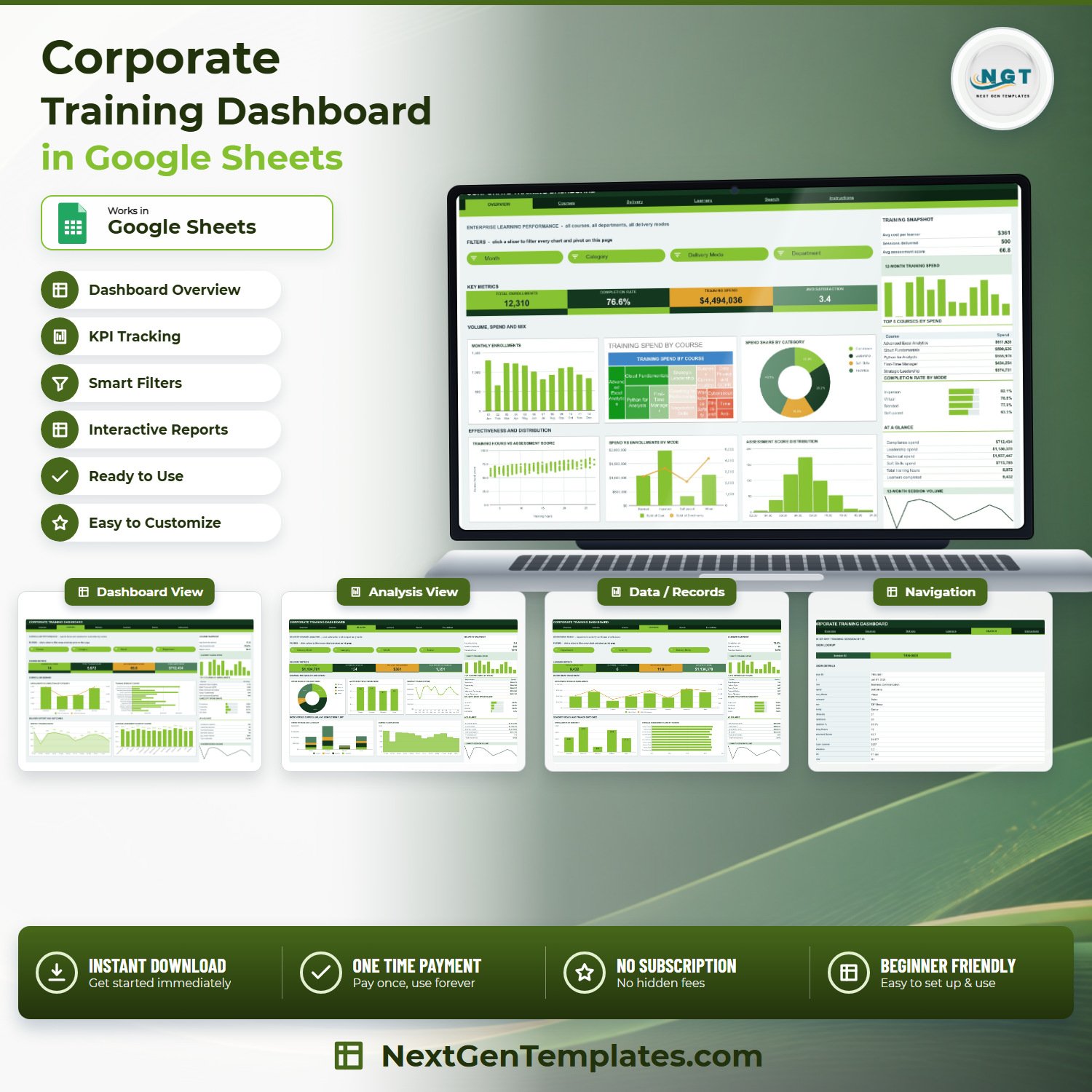
The Corporate Training Dashboard in Google Sheets reports on 500 sample training sessions across 6 tabs, with 16 KPI cards, 18 charts and 15 slicers already wired to native pivot tables. The sample company runs 14 courses across 4 categories, 4 delivery modes, 8 departments and 10 trainers, and the sheet is formula-ready for 1,000 rows out of the box. Setup takes under 10 minutes: make your copy, paste your own training log over the Data sheet, and every pivot, chart and slicer follows.
🌍 Join 8,400+ teams in 40+ countries using NextGenTemplates to replace paid SaaS tools with one-time-purchase Excel, Google Sheets, Power BI and HTML templates.
✅ Instant download · One-time payment · No subscription · No per-user fees · Lifetime access
🔑 Key Features of the Corporate Training Dashboard in Google Sheets
📊 Four analysis pages, one training log. Overview reports enterprise learning performance, Courses reports curriculum spend and assessment outcomes, Delivery reports channel cost and satisfaction, and Learners reports department, seniority and trainer reach. All four read the same Data sheet, so a single paste updates the whole file.
🎯 16 KPI cards with real training measures. The sample data returns Total Enrollments 12,310, Completion Rate 76.6%, Training Spend $4,494,036, Avg Satisfaction 3.4, Courses Delivered 14, Total Training Hours 5,972, Avg Assessment Score 66.8, Virtual Spend $1,104,701, Avg Cost per Learner $361, Total Completions 9,432 and Leadership Spend $1,130,370.
🎛️ 15 slicers, and every one drives its whole page. Overview filters on Month, Category, Delivery Mode and Department; Courses adds a Course slicer; Delivery adds Trainer; Learners filters on Department, Seniority and Delivery Mode. Click one and the charts, pivots and the sidebar Top 5 panel move together.
⚡ Native pivot tables, no helper columns. Every chart reads a pivot table parked to the right of its page rather than a hidden block of formulas, so the file stays fast as the training log grows past a few thousand rows.
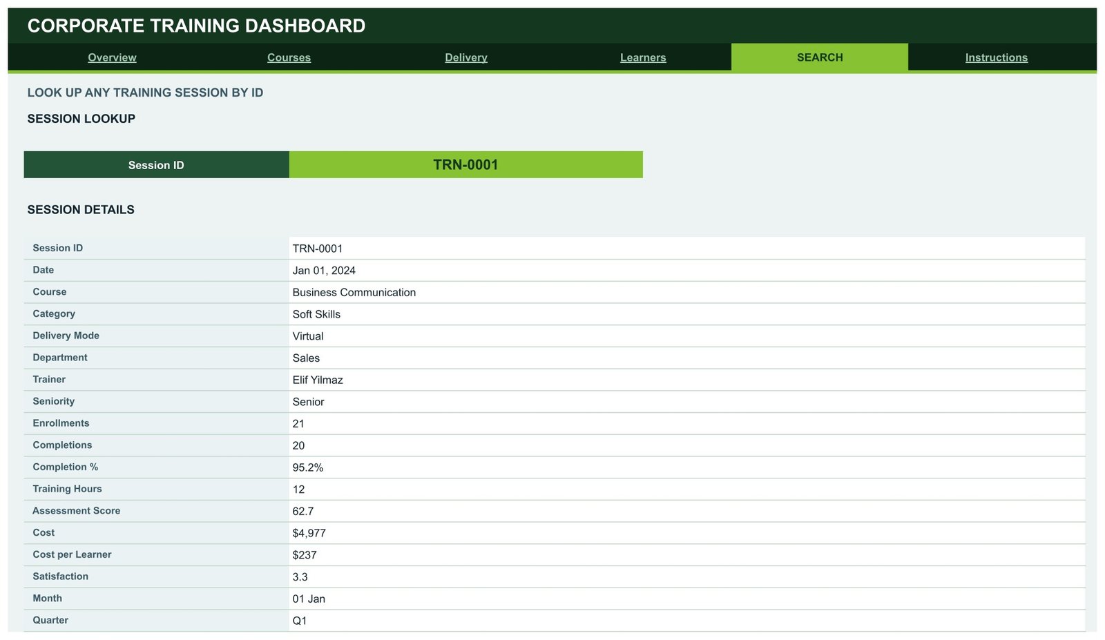
🔍 A Search page that returns one full session record. Pick a Session ID such as TRN-0001 and the page prints 17 fields for it: date, course, category, delivery mode, department, trainer, seniority, enrollments, completions, completion %, training hours, assessment score, cost, cost per learner, satisfaction, month and quarter.
🎨 One-line re-theming. The workbook ships in a Forest and Lime palette. The colour constants sit at the top of the Apps Script file, so a brand palette is a three-value edit, not a redesign.
📦 What’s Inside the Corporate Training Dashboard in Google Sheets
Page 1: Overview — Enterprise Learning Performance
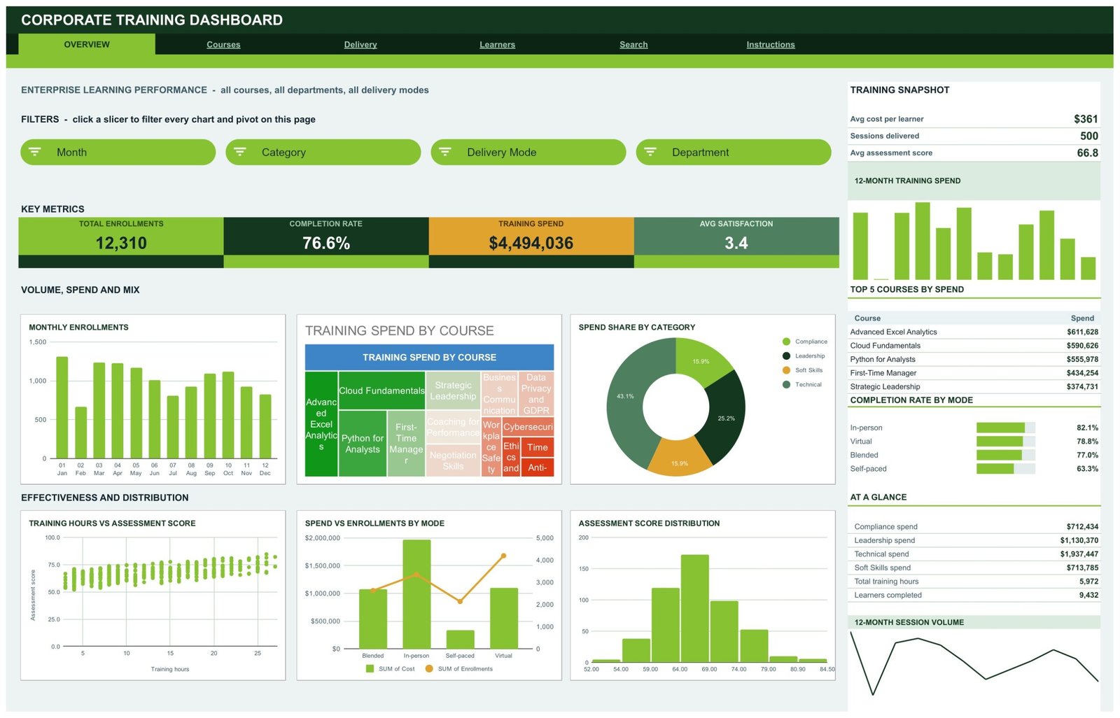
The landing page reports all courses, all departments and all delivery modes together. KPI cards show Total Enrollments, Completion Rate, Training Spend and Avg Satisfaction, and the charts are Monthly Enrollments, Training Spend by Course, Spend Share by Category, Training Hours vs Assessment Score, Spend vs Enrollments by Mode, and Assessment Score Distribution. The right-hand rail carries a Training Snapshot, 12-Month Training Spend, Top 5 Courses by Spend, Completion Rate by Mode and a 12-Month Session Volume line.
Page 2: Courses — Curriculum Performance
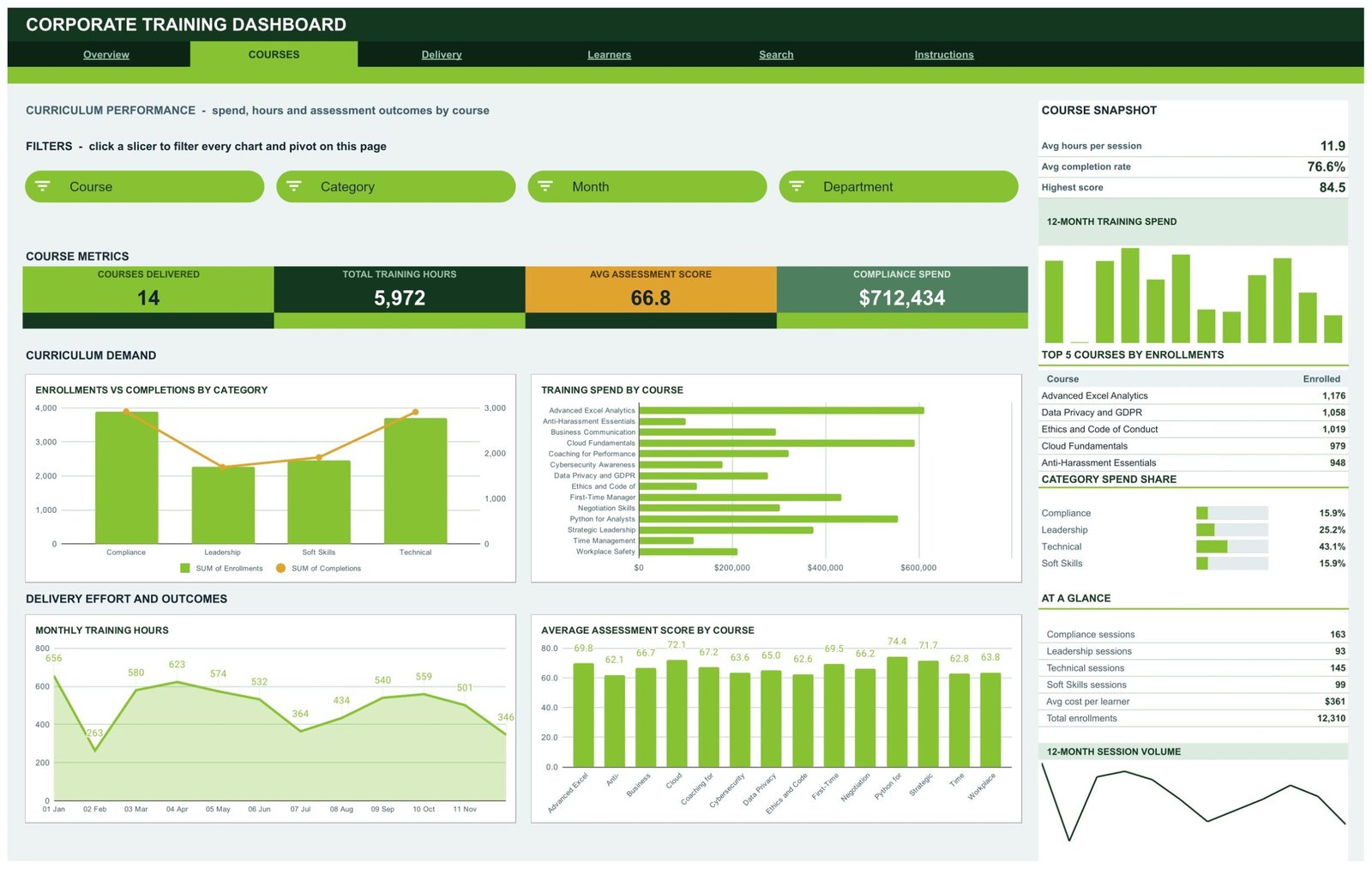
This page reports spend, hours and assessment outcomes by course. KPI cards show Courses Delivered, Total Training Hours, Avg Assessment Score and Compliance Spend, and the charts are Enrollments vs Completions by Category, Training Spend by Course, Monthly Training Hours, and Average Assessment Score by Course. The sidebar adds a Course Snapshot, Top 5 Courses by Enrollments and Category Spend Share.
Page 3: Delivery — Delivery Channel Analysis
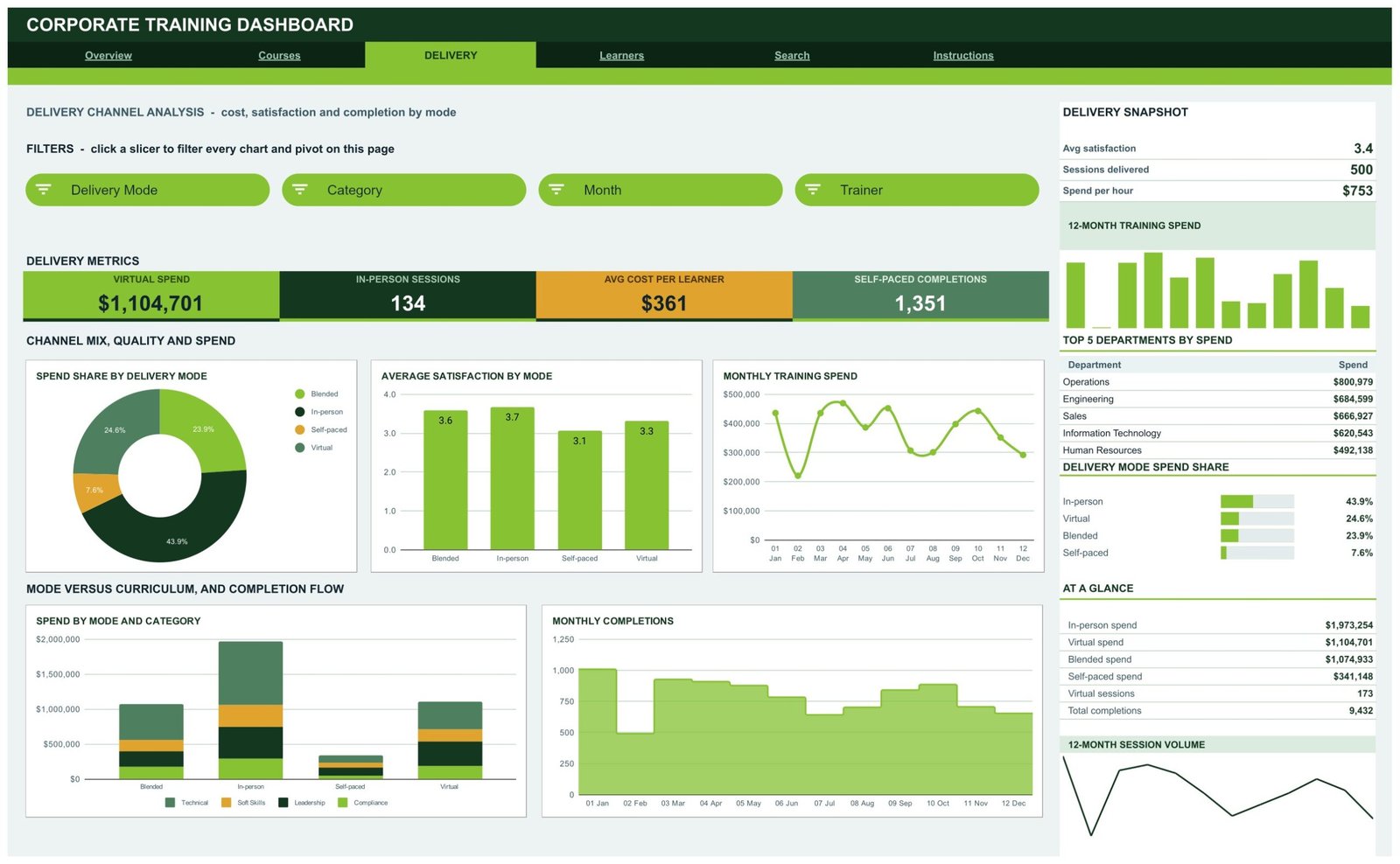
This page compares cost, satisfaction and completion across Blended, In-person, Self-paced and Virtual delivery. KPI cards show Virtual Spend, In-person Sessions, Avg Cost per Learner and Self-paced Completions, and the charts are Spend Share by Delivery Mode, Average Satisfaction by Mode, Monthly Training Spend, Spend by Mode and Category, and Monthly Completions. The sidebar lists Top 5 Departments by Spend and Delivery Mode Spend Share.
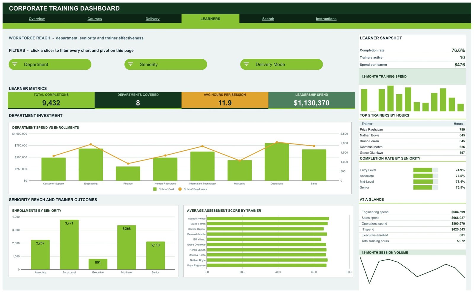
Page 4: Learners — Workforce Reach
This page reports who is actually being trained. KPI cards show Total Completions, Departments Covered, Avg Hours per Session and Leadership Spend, and the charts are Department Spend vs Enrollments, Enrollments by Seniority, and Average Assessment Score by Trainer. The sidebar carries a Learner Snapshot, Top 5 Trainers by Hours and Completion Rate by Seniority across Entry Level, Associate, Mid-Level and Senior.
Page 5: Search — Session Lookup
Choose any Session ID and the Session Details panel returns the full record for it, including course, category, delivery mode, department, trainer, seniority, enrollments, completions, completion percentage, training hours, assessment score, cost, cost per learner and satisfaction. It is the page to open when someone asks about one specific session.
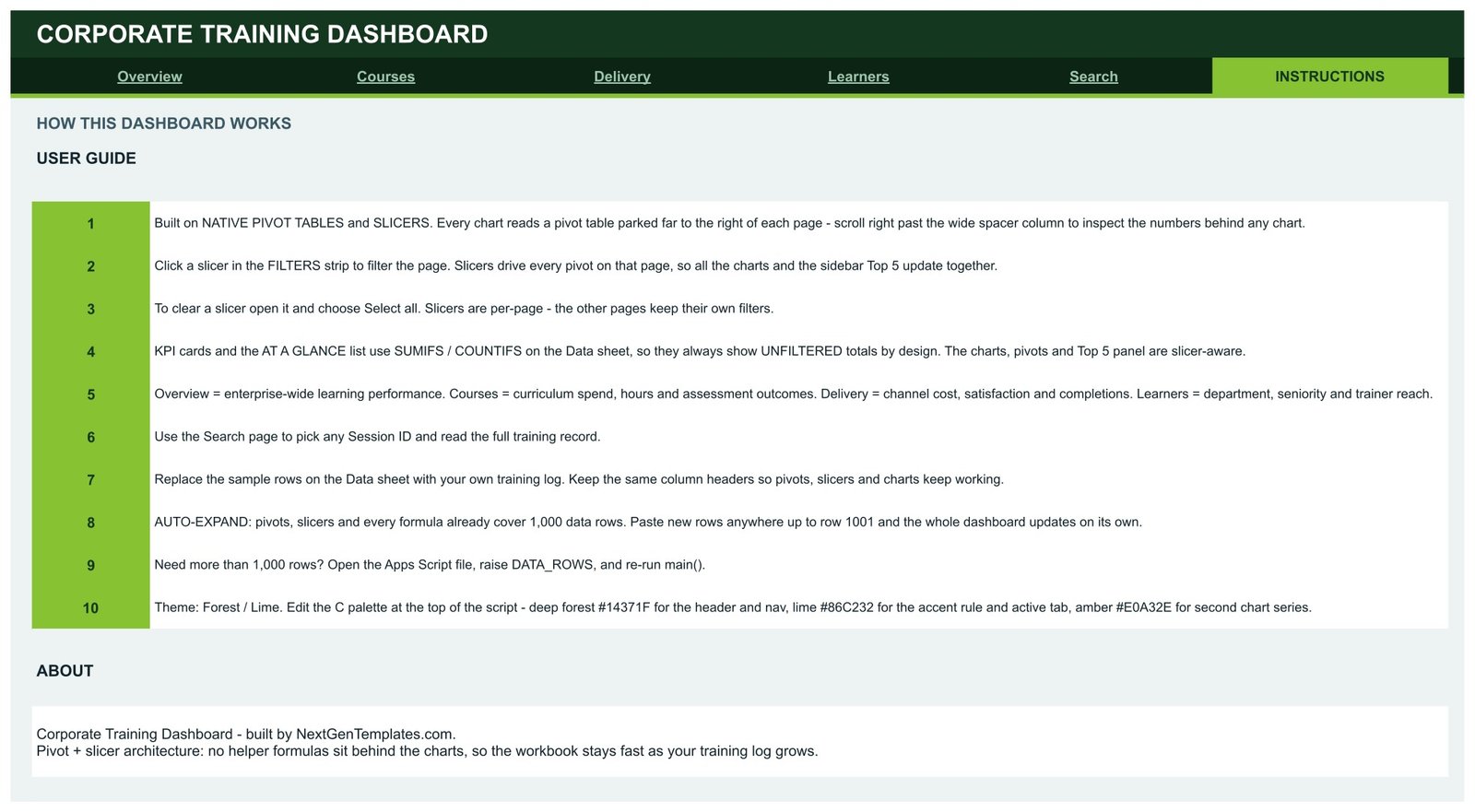
Page 6: Instructions — User Guide
A 10-point guide covering how the pivot-and-slicer architecture works, how to clear a slicer, why the KPI cards deliberately stay unfiltered, how to replace the sample rows, how the 1,000-row auto-expand behaves, and where to change the colour palette.
The file also carries a Data sheet holding 500 sample training sessions with the column headers every pivot depends on — replace the rows, keep the headers, and the dashboard rebuilds itself.
📊 Corporate Training Dashboard in Google Sheets vs. Microsoft Excel Dashboard vs. Paid LMS Analytics — Where This Fits
| Feature | Corporate Training Dashboard in Google Sheets | Microsoft Excel Dashboard | Docebo / Cornerstone / TalentLMS |
|---|---|---|---|
| Cost | $9.99 one-time | $14-30 one-time + an Excel licence | $3-15 per user per month, annual contract |
| Platform | Google Sheets, any browser | Desktop Excel | Vendor cloud platform |
| Setup time | Under 10 minutes | 15-30 minutes | Weeks — implementation and data migration |
| Real-time team collaboration | ✅ Built in via Google Drive sharing | Only through OneDrive co-authoring | ✅ Yes |
| Mobile access | ✅ Google Sheets app | Limited on mobile Excel | ✅ Yes |
| Customisable fields and charts | ✅ Every pivot, chart and colour is editable | ✅ Editable | ❌ Vendor-defined reports only |
| Share with a link | ✅ One Drive share link | File must be sent or synced | ✅ Yes, inside the platform |
| Year-1 cost at 5 users | $9.99 total | $14-30 plus licences | $180-900 |
| Owns your training data | ✅ Your Drive, your file | ✅ Your file | ❌ Export required to leave |
For L&D teams that want spend, completion and trainer reporting without signing an annual LMS contract, the Corporate Training Dashboard in Google Sheets sits in the sweet spot.
👥 Who This Template Is For — and Who It’s Not For
✅ This template is built for:
- L&D and HR managers at 50-2,000 person companies reporting training spend and completion to leadership
- Training coordinators who already keep a session log in a spreadsheet and need it to report on itself
- Corporate training providers and consultants presenting course, trainer and delivery-mode performance to a client
- Compliance and safety teams tracking mandatory course completion by department and seniority
- Operations leads comparing in-person, virtual, blended and self-paced delivery on cost and satisfaction
❌ This template is NOT for:
- Teams that need a full LMS — this reports on training, it does not host courses, serve content or issue certificates
- Anyone needing automatic sync from Workday, SAP SuccessFactors or an LMS API; you paste or import the log yourself
- Enterprises that require SOC 2, SSO or row-level permissions inside the reporting tool
- Individual learners tracking their own courses — this is built around a company-wide session log
⚙️ How to Use the Corporate Training Dashboard in Google Sheets
- Download the PDF in your purchase and click the “Make a copy” link inside it to save the dashboard to your own Google Drive.
- Open the Instructions tab first — the 10-point guide explains the pivot-and-slicer architecture in about two minutes.
- Go to the Data sheet and replace the 500 sample sessions with your own training log, keeping every column header exactly as it is.
- Return to Overview. The KPI cards, charts, pivots and the sidebar Top 5 panel all recalculate on your data.
- Click any slicer in the FILTERS strip to filter that page by month, category, delivery mode, department, course, trainer or seniority.
- Open a slicer and choose Select all to clear it. Slicers are per-page, so the other tabs keep their own filters.
- Use the Search tab to pull the full record for one Session ID when someone asks about a specific session.
- Paste rows anywhere up to row 1001 — pivots, slicers and formulas already cover that range. For more, raise DATA_ROWS in the Apps Script file and re-run main().
- Share the file from Google Drive with the colleagues who need it, and re-theme it from the colour constants at the top of the script if you want your own brand palette.
💼 Real-World Use Cases
Meera runs L&D for a 600-person software company. Every quarter she has to explain where the training budget went. She opens the Delivery tab, filters to the quarter, and shows leadership that in-person delivery carries the largest share of spend while self-paced has the lowest completion rate — the argument she needs to shift next year’s budget, made in one screen instead of a week of pivot-building.
Daniel is a corporate training provider with eight client accounts. He keeps one copy of the dashboard per client. When a client asks which of their departments actually turned up, he uses the Learners tab to show department spend against enrollments and completion rate by seniority, then exports the page as a PDF for the account review.
Priya coordinates compliance training at a manufacturing group. She filters the Courses tab to the Compliance category and reads the completion rate and assessment scores course by course, so the two courses that are lagging get a follow-up session booked before the audit rather than after it.
❓ Frequently Asked Questions
What KPIs does the Corporate Training Dashboard in Google Sheets track?
The Corporate Training Dashboard in Google Sheets tracks 16 KPIs across four pages, including total enrollments, completion rate, training spend, average satisfaction, courses delivered, total training hours, average assessment score, virtual spend, average cost per learner, total completions and leadership spend. All of them recalculate when you replace the sample data.
How long does setup take?
Under 10 minutes. Open the PDF, click the copy link to put the Corporate Training Dashboard in Google Sheets in your own Drive, paste your training log over the Data sheet keeping the same column headers, and every pivot table, chart and slicer updates on its own. No Apps Script edits are needed for normal use.
How does this compare to a paid LMS like Docebo or TalentLMS?
An LMS hosts and delivers courses and bills $3-15 per user per month. The Corporate Training Dashboard in Google Sheets does not host courses — it is the reporting layer, a one-time purchase that turns a training session log into spend, completion, satisfaction and trainer analytics you fully own.
How many training sessions can the dashboard handle?
Pivots, slicers and formulas already cover 1,000 rows, and the file ships with 500 sample sessions. Paste rows anywhere up to row 1001 and everything updates automatically. For a larger log, raise the DATA_ROWS value at the top of the Apps Script file and re-run main().
Can I change the colours to match our brand?
Yes. The Corporate Training Dashboard in Google Sheets ships in a Forest and Lime palette, and the colour constants sit at the top of the Apps Script file. Change the header, accent and secondary-series values and re-run the script to re-theme the whole workbook.
Why do the KPI cards not change when I click a slicer?
That is deliberate. The KPI cards and the AT A GLANCE list use SUMIFS and COUNTIFS on the Data sheet so they always show unfiltered totals as a constant reference point, while the charts, pivot tables and Top 5 panel are slicer-aware and respond to every filter you set.
Do I need Excel or any add-on to use it?
No. The Corporate Training Dashboard in Google Sheets runs entirely in Google Sheets in any browser, using native pivot tables, native slicers and built-in charts. There is no add-on, no subscription and no per-user fee — and it works on the Google Sheets mobile app too.
👤 About the Author
Built by PK — Microsoft Certified Professional with 15+ years of Excel, Google Sheets and Power BI experience. Founder of NextGenTemplates, reaching 300K+ subscribers across YouTube channels (@PK-AnExcelExpert, @NextGenTemplates, @NeoTechNavigators). Every template is hand-built and tested before release.
🔗 Explore Related Templates
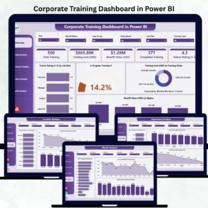
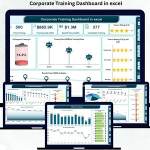
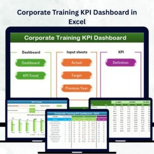
Also available as: the same topic is already live on two other platforms — the Corporate Training Dashboard in Excel for teams that live in desktop Excel, and the Corporate Training Dashboard in Power BI for teams that publish to a Power BI workspace. If you want a month-picker scorecard rather than analysis pages, the Corporate Training KPI Dashboard in Excel and the Corporate Training Providers KPI Dashboard in Power BI cover that shape.
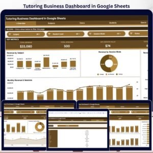
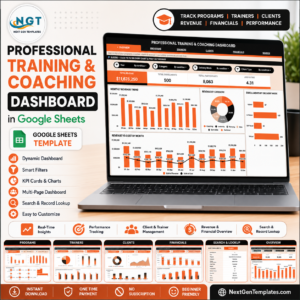
Working across the wider learning function? The Professional Training and Coaching Dashboard in Google Sheets reports on a coaching practice, the Education Services Dashboard in Google Sheets and the EdTech Dashboard in Google Sheets cover the provider side, and the Tutoring Business Dashboard in Google Sheets suits a smaller teaching operation. Browse the full range of Google Sheets Dashboards or the wider Dashboard Templates library.
📖 Click here to read the Detailed Blog Post
🎥 Visit our YouTube channel for step-by-step video tutorials
👉 YouTube.com/@NextGenTemplates
Watch the step-by-step video Demo:
📅 Last updated: September 2026