

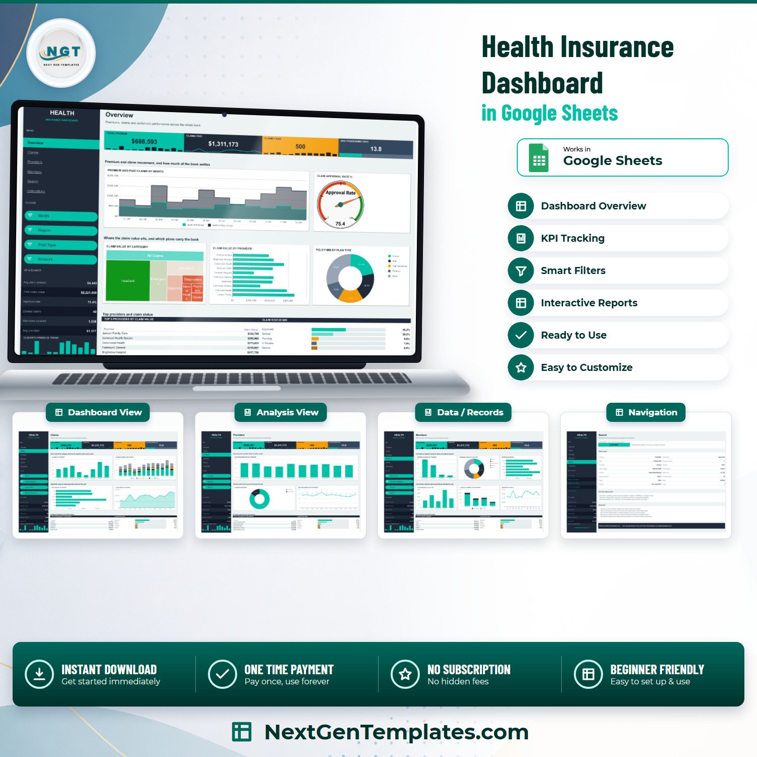

The Health Insurance Dashboard in Google Sheets turns a flat list of claims into four filtered reporting pages you can read in about a minute. The file ships with 500 sample claim rows covering a full 2024 calendar year, 18 pivot-driven charts, 15 slicers and a single-record lookup page – and the formulas are already sized for 1,000 claims, so you can paste your own book in without rebuilding anything. Total premium in the sample reads $688,593 against $1,311,173 of claims paid across 1,538 covered lives, which is exactly the kind of ratio a monthly reporting pack has to show. One file, one price, no subscription. If it does not open and recalculate for you, email [email protected] and we will fix it or refund it.Health Insurance Dashboard in Google Sheets
Key Features of the Health Insurance Dashboard in Google Sheets
- Four filtered reporting pages – Overview, Claims, Providers and Members, each with its own slicer set so one page can hold a different view from the next.Health Insurance Dashboard in Google Sheets
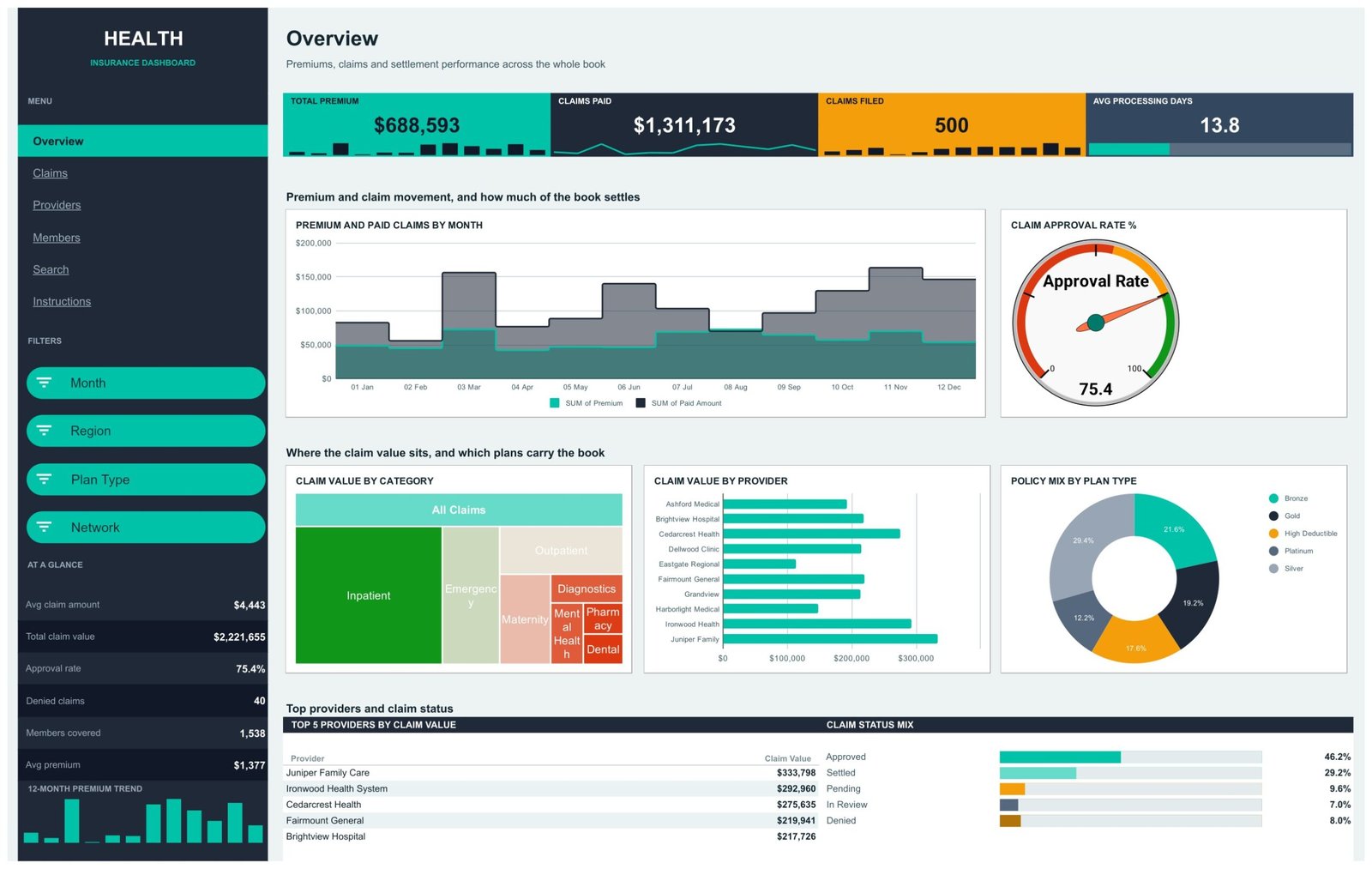
- One KPI band that travels with you – Total Premium, Claims Paid, Claims Filed and Avg Processing Days sit under the title on all four pages, each with an inline sparkline.Health Insurance Dashboard in Google Sheets
- A six-stat side rail – Avg claim amount, Total claim value, Approval rate, Denied claims, Members covered and Avg premium, plus a 12-month premium trend bar strip.Health Insurance Dashboard in Google Sheets
- 18 charts, every one driven by a pivot table – change a pivot field and the chart follows, because nothing is hardcoded.
- 15 slicers across the four pages – Month, Region, Plan Type, Network, Claim Category, Claim Status, Member Segment and Provider.Health Insurance Dashboard in Google Sheets
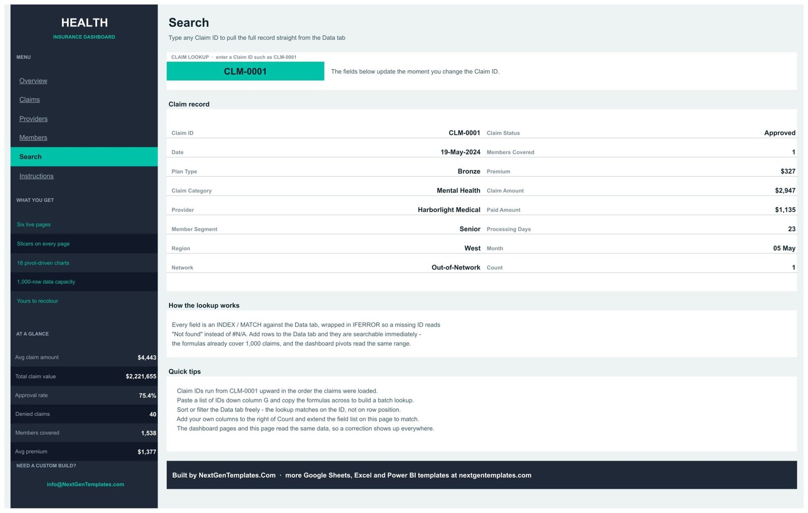
- A Search page that pulls a whole claim record – type a Claim ID and all 16 fields resolve by INDEX/MATCH, wrapped in IFERROR so a bad ID reads “Not found” instead of #N/A.
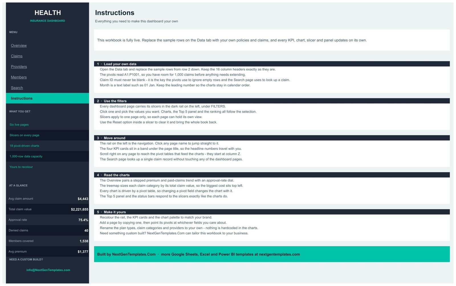
- A written Instructions tab – five numbered sections covering loading data, using filters, moving around, reading the charts and recolouring the file.Health Insurance Dashboard in Google Sheets
- Nothing to install – no add-on, no Apps Script, no macro. It is a plain Google Sheets file you copy to your own Drive.
What’s Inside the Health Insurance Dashboard in Google Sheets
Seven tabs in total: six you look at and one you type into.
Overview pairs a stepped Premium and Paid Claims by Month chart with a Claim Approval Rate dial (75.4% in the sample), then a treemap of Claim Value by Category, a Claim Value by Provider bar chart and a Policy Mix by Plan Type ring. Under those sit Top 5 Providers by Claim Value and a Claim Status Mix strip.
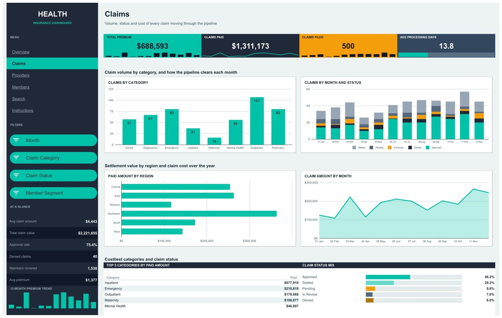
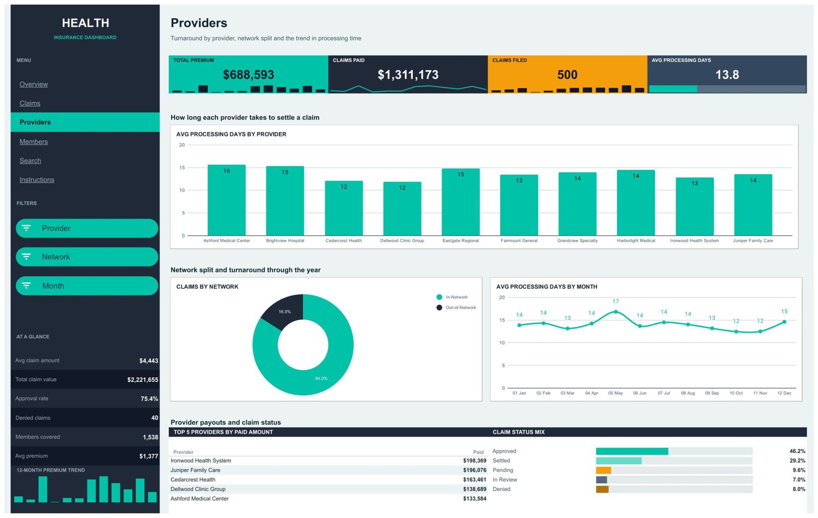
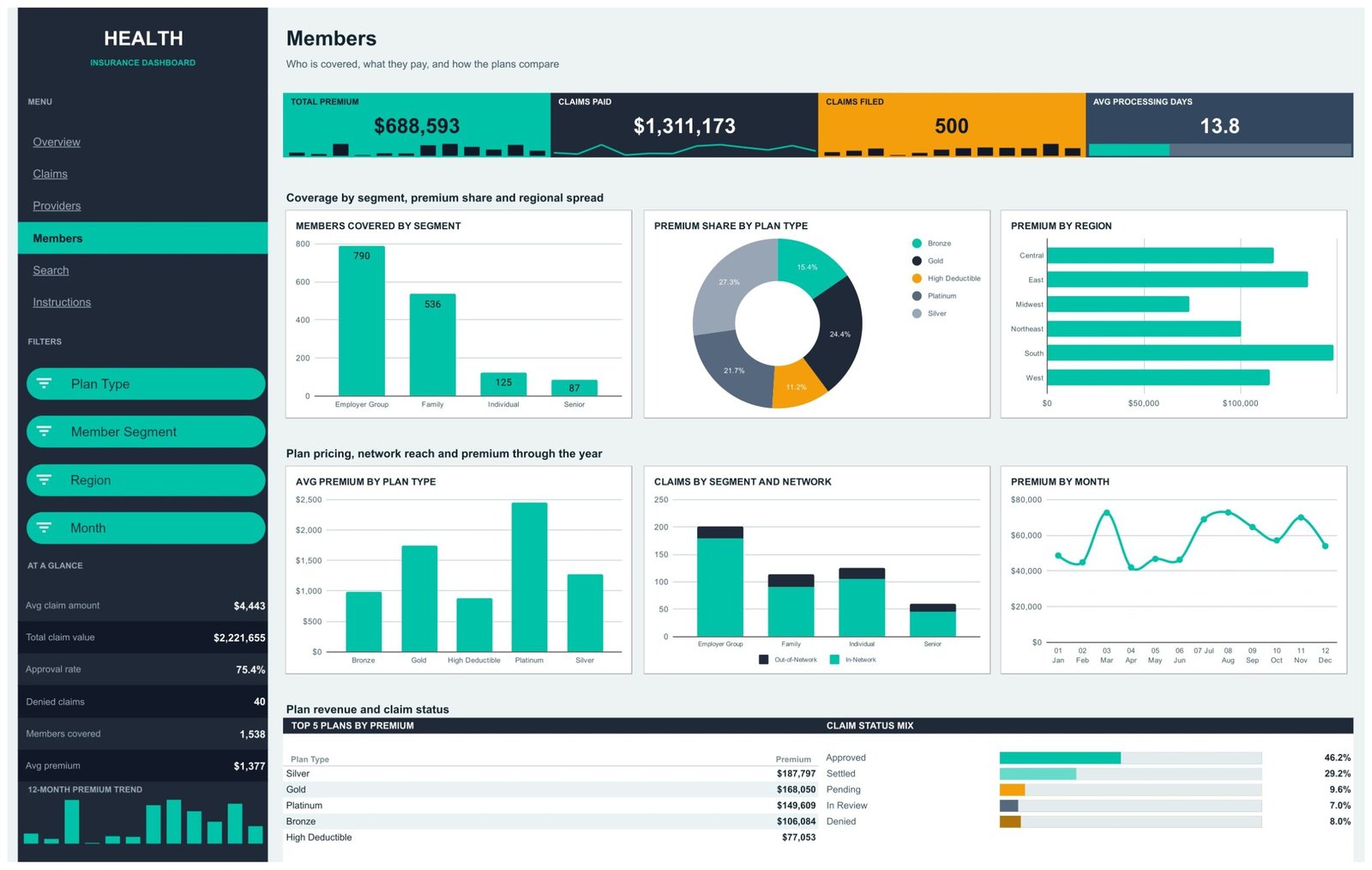
Claims counts volume by category (Outpatient leads the sample at 107 claims, Maternity trails at 16), stacks each month by status, ranks Paid Amount by Region and traces Claim Amount by Month. Providers charts Avg Processing Days for each of the ten named facilities, splits claims In-Network against Out-of-Network (84% / 16% in the sample) and tracks turnaround month by month. Members covers who is insured – members by segment, premium share and average premium by plan type, premium by region and by month, and claims split by segment and network.
Search is a one-record lookup: enter CLM-0001 and you get its date, plan type, claim category, provider, member segment, region, network, status, premium, claim amount, paid amount and processing days side by side. Instructions explains the whole file in plain language.
Data is the only tab you edit. It carries exactly 16 columns: Claim ID, Date, Plan Type, Claim Category, Provider, Member Segment, Region, Network, Claim Status, Members Covered, Premium, Claim Amount, Paid Amount, Processing Days, Month and Count. Every pivot reads A1:P1001.
What the Data Tab Holds – and What It Does Not
Worth being exact, because this is claims data. The sample Data tab contains no member or claimant names, no policy numbers, no member IDs, no diagnosis or procedure codes, no dates of birth and no addresses. The only identifier is a sequential claim reference (CLM-0001 upward) and the ten provider names are invented. Claim Category is a broad service line – Inpatient, Outpatient, Emergency, Maternity, Mental Health, Diagnostics, Pharmacy, Dental – not a coded diagnosis.
What you put in is a different matter. If you paste a real book of business into those 16 columns, the file then holds health-related information about identifiable claims, and a Google Sheet has no access control of its own beyond how you share it in Google Drive. Treat the copy the way you would treat any other claims extract: restrict sharing, and aggregate or de-identify before you circulate it.
This template also carries no regulatory or compliance standing of any kind. It is not HIPAA-certified, not GDPR-certified, not built to NAIC or Solvency II reporting requirements, and it provides none of these. It is a spreadsheet that charts numbers you supply.
Health Insurance Dashboard in Google Sheets vs. Excel vs. a Paid BI Suite – Where This Fits
| This Google Sheets dashboard | The same build in Microsoft Excel | A paid BI suite (Tableau, Power BI Pro) | |
|---|---|---|---|
| Cost | $9.99 once | $13.99 once + an Office licence | $14-$70 per user per month |
| Platform | Google Sheets, any browser | Excel desktop | Desktop authoring + cloud service |
| Setup time | Copy the file, paste your claims, done | Similar, plus file distribution | Days: connect, model, build, publish |
| Real-time team collaboration | Yes, native | Only via OneDrive co-authoring | Yes, on the paid service |
| Mobile access | Google Sheets app | Excel mobile | Vendor app |
| Customisable fields | Yes – rename plan types, categories and providers freely | Yes | Yes, with modelling work |
| Share with a link | Yes | No, you send a file | Yes, to licensed viewers |
| Year-1 cost at 5 users | $9.99 | $13.99 + licences | $840-$4,200 |
| Claim-level record lookup | Built in on the Search page | Built in | Needs a drill-through page |
| Row capacity out of the box | 1,000 claims | Larger | Millions |
A note on a fourth category people sometimes compare this to: a policy administration or claims adjudication system (the software an insurer actually runs its book on) is not on this list because it is a different kind of product entirely. This template does not adjudicate, price, rate, reserve or determine eligibility, and it is not a substitute for one. It reports on claims that some other system has already processed.
Who This Template Is For – and Who It’s Not For
A good fit if you are a broker, TPA analyst, benefits manager, small insurer’s reporting lead or a finance team member who currently rebuilds the same claims pivot every month; if your book is under a thousand claims a period; or if you need something a non-technical colleague can open in a browser and filter without training.
Not a good fit if you need a live feed from a claims system – there is no connector, no API and no scheduled import here, and every refresh is a paste. Nor if you need more than 1,000 rows without extending the pivot ranges yourself, per-user row-level security, an audit trail of who changed what, or coded clinical detail at ICD or CPT level – the Data tab has no column for it.
How to Use the Health Insurance Dashboard in Google Sheets
- Open the PDF in your download and click the “Make a copy” link. The file lands in your own Google Drive.
- Go to the Data tab and replace the sample rows from row 2 down. Keep all 16 headers exactly as they are.
- Never leave Claim ID blank – it is the key the pivots use to skip empty rows and the Search page uses to find a record.
- Keep Month as a text label with its leading number (“01 Jan”), so the charts stay in calendar order.
- Refresh the pivot tables, then use the slicers in the dark rail on each page. Each page filters on its own.
- Recolour the rail, the KPI cards and the chart palette to your own brand – nothing in the charts is hardcoded to a plan or provider name.
Real-World Use Cases
Priya, an employee benefits broker, pastes her client’s quarterly claims extract into the Data tab and uses the Members page to show the HR director where premium sits by plan type before renewal talks.
Daniel, an analyst at a third-party administrator, uses the Providers page to see which facilities are settling slowest – the sample runs 12 to 16 average days – and takes that straight into a provider review.
Rekha, finance lead at a small health plan, keeps the Overview page open during the monthly close and reads premium against paid claims month by month without waiting for a report from IT.
Frequently Asked Questions
Does this connect to my claims system?
No. It is a static reporting file. You paste or type data into the Data tab; there is no connector, API or scheduled import of any kind.
How many claims can it handle?
The pivots read A1:P1001, so 1,000 claim rows out of the box. Beyond that you extend the pivot ranges yourself – the Instructions tab says where.
Does the approval rate mean a claim was approved?
No. The 75.4% figure is simply the share of rows whose Claim Status column reads “Approved”. It reports a decision someone else already made; the template makes no adjudication or eligibility decisions itself.
Is it HIPAA or GDPR compliant?
It carries no compliance certification of any kind and provides none. It is a spreadsheet. How you handle the data you put in it is entirely your own responsibility.
Can I rename the plan types and providers?
Yes. The five plan types, eight claim categories and ten providers in the sample are just values in the Data tab. Replace them with yours and every chart, slicer and Top 5 panel follows.
Do I need Excel or any add-on?
No. It runs in Google Sheets in a browser. There is no Apps Script, no macro and nothing to install.
How is this different from your Healthcare Insurance KPI Dashboard?
That one is a KPI scorecard with a month picker and traffic lights. This is an analytical dashboard – slicers, pivot charts and a record lookup across four pages. Different products, and many people own both.
About the Author
Built by PK – Microsoft Certified Professional with 15+ years of Excel, Google Sheets, and Power BI experience. Founder of NextGenTemplates, reaching 300K+ subscribers across YouTube channels. Every template is hand-built and tested before release.
Explore Related Templates
- Health Insurance Dashboard in Power BI – the same subject with a full data model behind it.
- Health Insurance Dashboard in Excel – the desktop build for teams that live in Office.
- Healthcare Insurance KPI Dashboard in Google Sheets – the month-picker scorecard version.
- Insurance Policy and Premium Tracker in Google Sheets – policy-side record keeping.
- Medical Expense & Claims Tracker in Google Sheets – the household-level companion.
- Browse every Google Sheets dashboard or the wider Google Sheets template library.
Get the Health Insurance Dashboard in Google Sheets for $9.99 – instant download, one payment, yours forever. A full walkthrough of every page is on the NeoTechNavigators blog.
Watch the step-by-step video Demo:
Last updated: 1 September 2026.
Compatibility and Requirements
- Works in Google Sheets. You need a free Google account and a web browser.
- The four pages use slicers and pivot-driven charts, and the Search page looks up a claim by Claim ID. Google explains how charts work in Add and edit a chart or graph.




























Reviews
There are no reviews yet.