

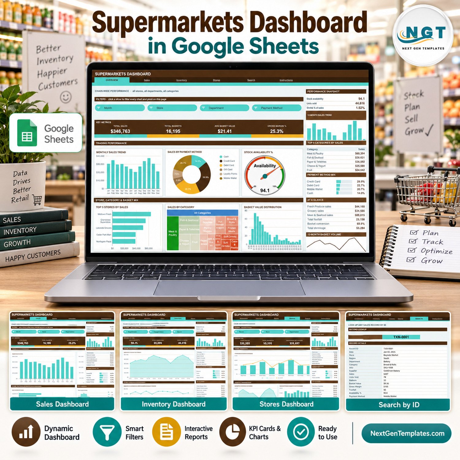
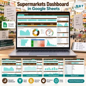
The Supermarkets Dashboard in Google Sheets turns a store sales log into a six-page chain report: 500 sample records, 4 headline KPI cards per page, 18 charts and 15 slicers, all driven by native Google Sheets pivot tables. The sample data covers 8 fictional stores in 3 regions, 8 departments, 16 categories, 10 suppliers and 6 payment methods across the twelve months of 2025, and the pivots already read 1,000 data rows. Make your copy, paste your own records over the sample rows and every chart redraws itself.
🌍 Join 8,400+ teams in 40+ countries using NextGenTemplates to replace paid SaaS tools with one-time-purchase Excel, Google Sheets, Power BI and HTML templates.Supermarkets Dashboard in Google Sheets
✅ Instant download · One-time payment · No subscription · No per-user fees · Lifetime access
🔑 Key Features of the Supermarkets Dashboard in Google Sheets
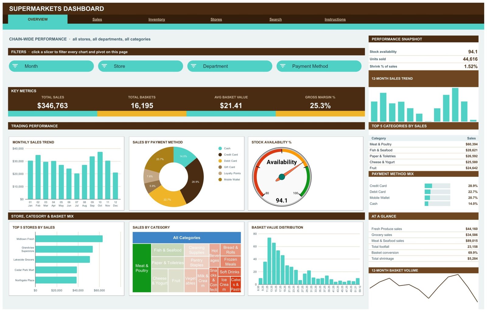
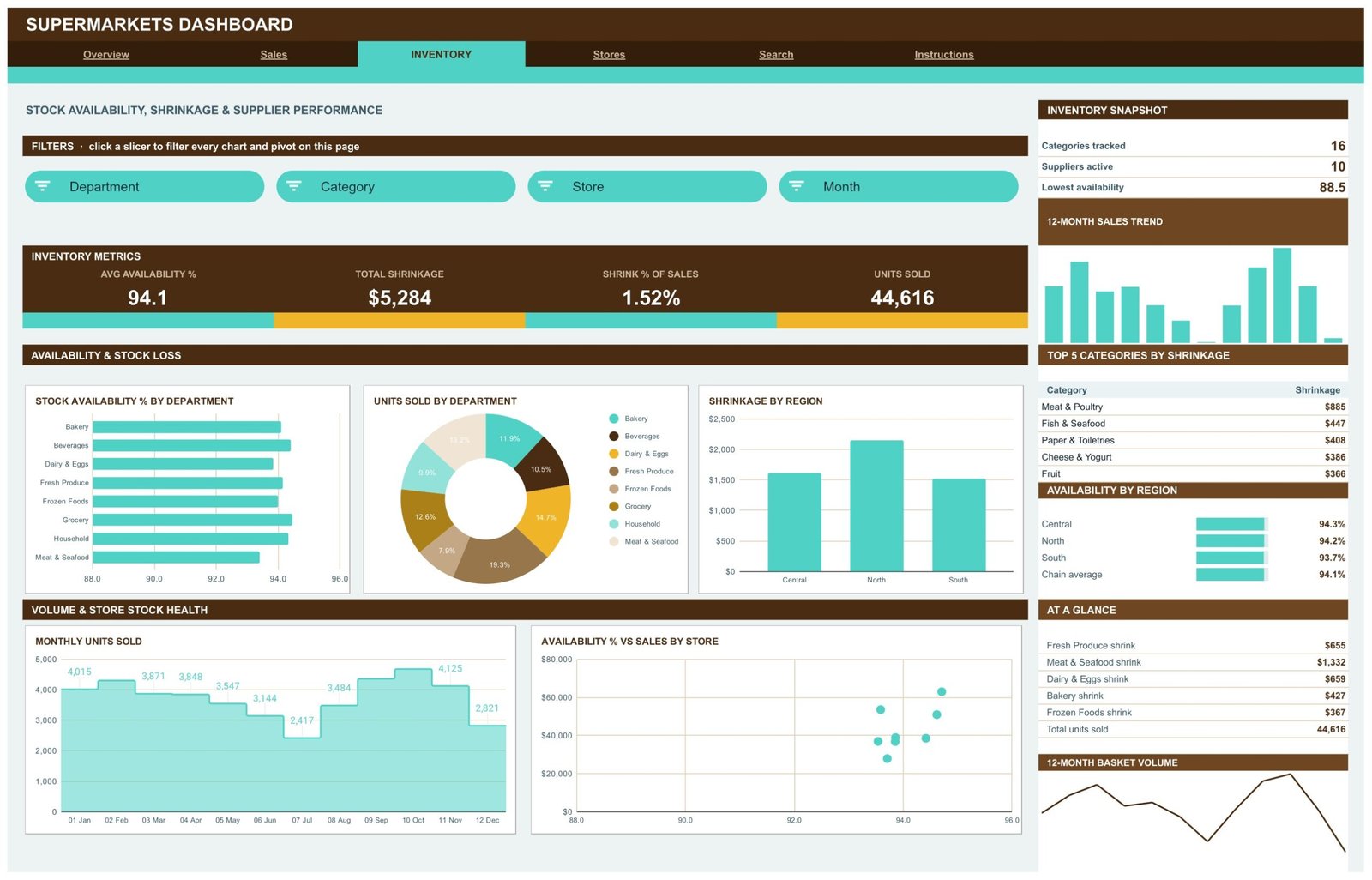
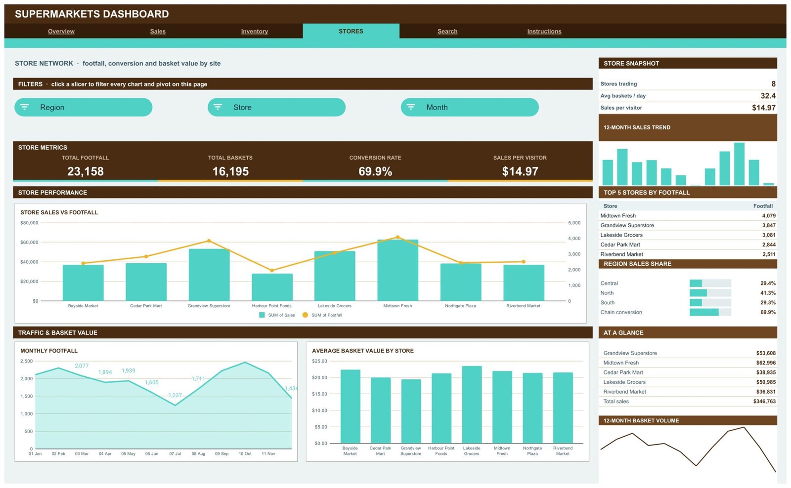
🔹 Sales, margin, stock and footfall in one file. The sample chain reads Total Sales $346,763, Total Baskets 16,195, Avg Basket Value $21.41 and Gross Margin 25.3% on the Overview page, with shrinkage ($5,284, 1.52% of sales), stock availability (94.1) and footfall (23,158) on the Inventory and Stores pages.
🔹 Four analysis pages with their own filters. Overview filters by Month, Store, Department and Payment Method; Sales by Month, Store, Region and Payment Method; Inventory by Department, Category, Store and Month; Stores by Region, Store and Month. Slicers apply per page, so each page keeps its own view.
🔹 Chart types a store manager can read at a glance. A stock availability gauge, a sales-by-category treemap, a basket value histogram, a stepped monthly units chart, an availability-versus-sales scatter by store and a sales-and-footfall combo chart sit alongside the usual bars, lines and donuts.
🔹 A sidebar on every analysis page. A snapshot block, a 12-month sales trend, a Top 5 table (categories, departments or stores), a share panel and an AT A GLANCE list give the headline story without scrolling.
🔹 A record Search page. Type a Record ID such as TXN-0001 and read the full record: date, store, region, department, category, SKU, supplier, sales, units, baskets, basket value, gross margin, footfall, availability and payment method.
🧾 What This Template Does, and What It Deliberately Does Not Do
This is a reporting template for supermarket sales records you already keep. It summarises what sold, where, through which supplier and payment method, and how stock availability and shrinkage looked. It is not a point-of-sale system, it does not manage stock levels or reorders, and it has no live data connection: the numbers change when you paste new rows into the Data tab. Every store and supplier name in the sample (Midtown Fresh, Bayside Market, Harvest Valley and so on) is fictional.
Two behaviours to know before you filter. The built-in Instructions page states that the KPI cards and the AT A GLANCE list use SUMIFS / COUNTIFS on the Data sheet, so they always show unfiltered totals by design; the charts, pivots and Top 5 panels are the parts that follow the slicers. And the share panels list only their top rows: Department Sales Share shows 4 of the 8 departments and Payment Method Mix shows 4 of the 6 payment methods, so the bars there do not add up to 100%.
📦 What’s Inside the Supermarkets Dashboard in Google Sheets
Page 1: Overview, chain-wide trading
Overview shows Monthly Sales Trend, Sales by Payment Method (Credit Card leads at 28.9%), a Stock Availability % gauge at 94.1, Top 5 Stores by Sales (Midtown Fresh first), Sales by Category as a treemap and a Basket Value Distribution histogram. The sidebar lists the Top 5 Categories by Sales, with Meat & Poultry at $60,394.
Page 2: Sales, departments, suppliers and margin
Sales breaks the year down with Sales by Month and Department (stacked across all 8 departments), Monthly Gross Margin, Sales by Supplier for the 10 suppliers and Average Basket Value by Month. Meat & Seafood is the top department at $89,015, and the snapshot shows 2.75 units per basket and $14.97 sales per visitor.

Page 3: Inventory, availability and shrinkage
Inventory covers Stock Availability % by Department, Units Sold by Department, Shrinkage by Region (North is highest), Monthly Units Sold as a stepped area chart and Availability % vs Sales by Store. The sidebar ranks the Top 5 Categories by Shrinkage and shows availability for Central, North and South against the 94.1 chain average.
Page 4: Stores, footfall, conversion and basket value
Stores compares the 8 sample stores: Store Sales vs Footfall on one combo chart, Monthly Footfall and Average Basket Value by Store. The KPI row reads Total Footfall 23,158, Conversion Rate 69.9% and Sales per Visitor $14.97, and the sidebar ranks the Top 5 Stores by Footfall and the Region Sales Share (North 41.3%).
Page 5: Search, look up any sales record by ID
Search pulls one record straight from the Data tab, showing all 16 fields from Record ID to Payment Method, so you can check the detail behind any number on the analysis pages.

Page 6: Instructions, the user guide inside the file
Ten numbered notes explain the pivot-and-slicer build, how to clear a slicer, which figures stay unfiltered, what each page is for, how to replace the sample rows, the 1,000-row auto-expand range and how to change the colour palette.

📊 Google Sheets Dashboard vs. an Excel Dashboard vs. a Paid BI Suite, Where This Fits
| Feature | This Google Sheets dashboard | Microsoft Excel dashboard | Power BI Pro / Tableau Creator |
|---|---|---|---|
| Cost | $9.99 one-time ✅ | One-time template + Microsoft 365 | $14-75 / user / month |
| Platform | Google Sheets, browser only ✅ | Desktop Excel | Desktop authoring + service |
| Setup time | Under 10 minutes ✅ | Under 15 minutes | Days: model, publish, licence |
| Real-time team collaboration | Built in ✅ | Only via OneDrive co-authoring | Yes, per seat |
| Mobile access | Google Sheets app ✅ | Excel mobile, limited slicers | Vendor app, per seat |
| Share with store managers | Any Google account ✅ | File send or OneDrive link | Viewers need a licence |
| Sales record lookup | Search page, no add-ons ✅ | Needs a lookup sheet | Drillthrough page |
| Live POS connection | No, paste rows | No, paste or refresh | Yes, with a gateway ✅ |
| Row capacity out of the box | 1,000 records | Excel row limit | Millions ✅ |
For a small chain that exports sales to a spreadsheet and wants a monthly management pack without per-seat BI licences, this Google Sheets dashboard sits in the sweet spot.
👥 Who This Template Is For, and Who It’s Not For
✅ Built for:
- Owners and area managers of small supermarket or grocery chains who already export sales to a spreadsheet
- Category and buying teams comparing department, category and supplier sales month by month
- Retail lecturers and trainers who need realistic, clearly fictional supermarket data to teach with
❌ Not for:
- Anyone looking for a till, billing or stock-control system
- Teams that need live data from their POS or ERP; this file only reads the rows you paste in
- Chains logging far more than 1,000 records without extending the range; a database-backed BI tool fits better
⚙️ How to Use the Dashboard
- Open the PDF in your download and click the link to make your own copy in Google Drive.
- Open the Data tab and replace the sample rows, keeping the column headers exactly as they are.
- Give every row a Record ID so the Search page can find it.
- Keep the Month label format such as 03 Mar so the monthly charts stay in order.
- Pick values in the slicers on each page, and clear them with Select all to return to the whole chain.
💼 Real-World Use Cases
Aisha runs four neighbourhood supermarkets. She pastes the month’s sales export in, filters the Stores page by region and brings Store Sales vs Footfall to her managers’ meeting instead of building pivots by hand.
Tom is a category buyer for a regional grocer. He uses the Sales page to see which suppliers carry each department and checks the Inventory page for categories where shrinkage is climbing.
Lena teaches retail management. The fictional stores and suppliers let her students practise reading basket value, conversion and availability without touching a real retailer’s figures.
❓ Frequently Asked Questions
What does the Supermarkets Dashboard in Google Sheets track?
Sales, units, baskets, basket value, gross margin, footfall, stock availability and shrinkage, cut by store, region, department, category, supplier, payment method and month across 18 charts on four analysis pages.
Is it a POS or inventory management system?
No. It is a reporting template. It does not ring up sales, track stock on hand or raise purchase orders, and it has no live connection to a till. It summarises records you paste into the Data tab.
Do the KPI cards follow the slicers?
No. The Instructions page says the KPI cards and AT A GLANCE list always show unfiltered totals by design. The charts, pivots and Top 5 panels follow each page’s slicers.
How is it different from the Supermarkets Dashboard in Excel or Power BI?
Those are separate builds with their own layouts and data. This Google Sheets edition is built around sales, margin, availability, shrinkage, footfall and supplier fields, with a Search page and a slicer on every analysis page.
How many records can it hold?
The pivots, slicers and formulas already cover 1,000 data rows. Beyond that, the Instructions page explains how to raise the range in the Apps Script and re-run it.
👤 About the Author
Built by PK, a Microsoft Certified Professional with 15+ years of Excel, Google Sheets and Power BI experience. Founder of NextGenTemplates, reaching 300K+ subscribers across YouTube channels (@PKAnExcelExpert, @NextGenTemplates, @NeoTechNavigators). Every template is hand-built and tested before release.
🔗 Explore Related Templates
Browse the full range of Google Sheets Dashboards and the wider Google Sheets template library. Google’s own guide to slicers in Google Sheets explains the filters this workbook uses.
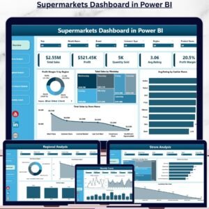
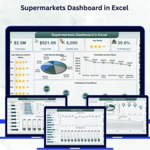
Same subject, other platforms: the Supermarkets Dashboard in Excel and the Supermarkets Dashboard in Power BI are separate builds with their own pages and sample data, not ports of this file.
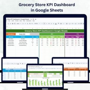
Month-picker scorecards: the Supermarkets KPI Dashboard in Excel and the Grocery Store KPI Dashboard in Google Sheets track targets with traffic lights instead of a transaction log.
Running the tills too? See the General Store POS Web App, or keep dated stock in check with the Product Expiration Date Calendar in Google Sheets.
📖 Click here to read the Detailed Blog Post
🎥 Visit our YouTube channel for step-by-step video tutorials
👉 YouTube.com/@NextGenTemplates
Watch the step-by-step video Demo:
📅 Last updated: September 2026























Reviews
There are no reviews yet.