

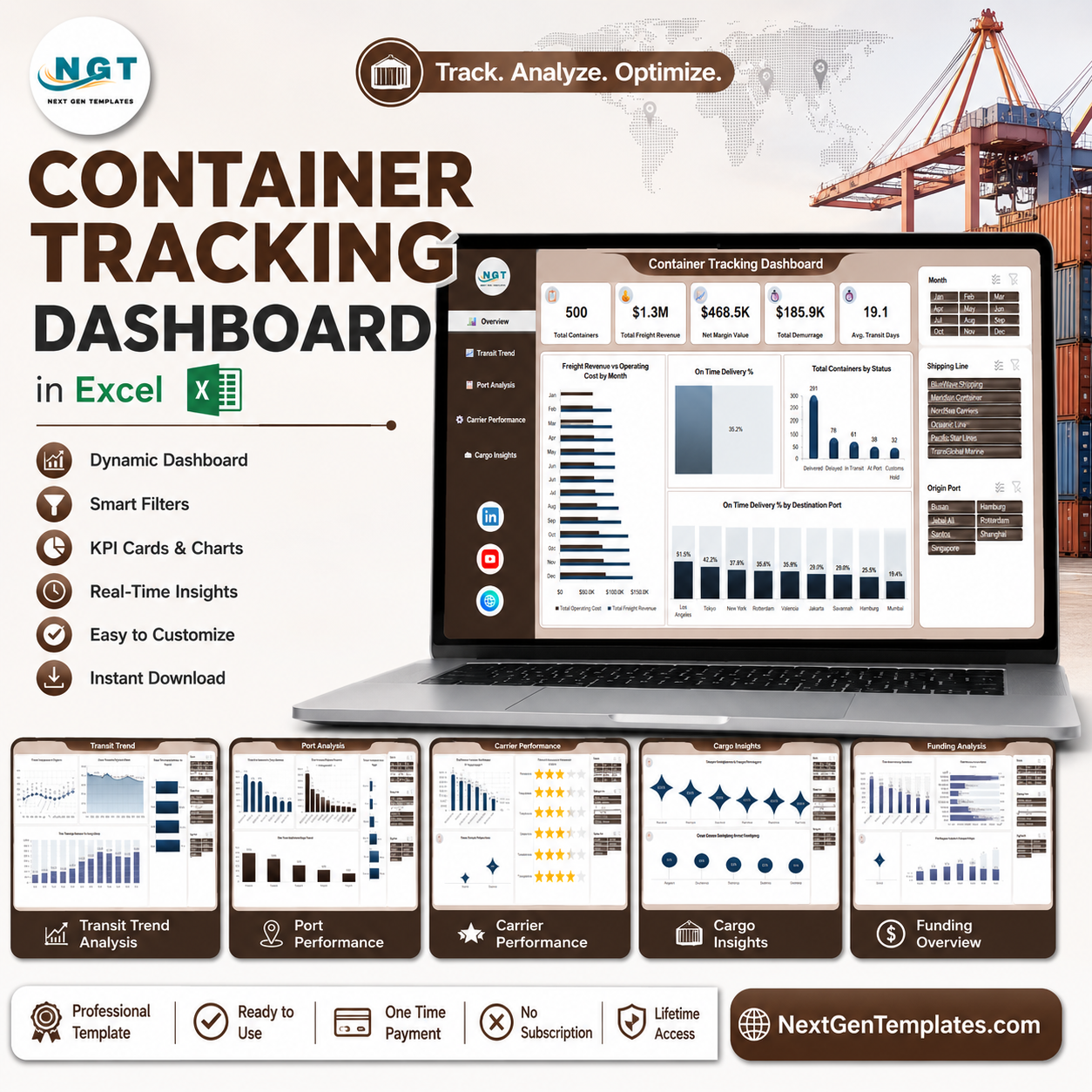
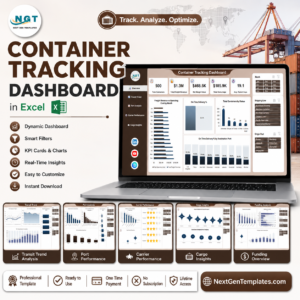
The Container Tracking Dashboard in Excel turns a flat booking list into a five-page control tower. The sample file carries 500 container movements worth $1.3M in freight revenue, $468.5K of net margin and $185.9K of demurrage – and it shows in seconds that on-time delivery is running at 35.2% while average transit sits at 19.1 days. Demurrage at that scale is roughly 14 cents of every revenue dollar, which is exactly the leak most shippers only find at month-end. Built by a Microsoft Certified Professional and used by teams across 300K+ subscribers. Plain .xlsx, no macros, instant download, and a 7-day refund if it is not what you expected.
This is the analytical Excel dashboard line – five drill-down pages built for lane and carrier analysis. It is not the KPI scorecard line. If you want a month-picker scorecard with traffic lights and target variance instead, look at the Transportation KPI Dashboard in Excel or the Order Fulfillment KPI Dashboard in Excel.
Key Features of Container Tracking Dashboard in Excel
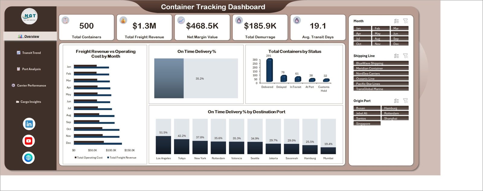
- Five KPI cards on the Overview page – Total Containers (500), Total Freight Revenue ($1.3M), Net Margin Value ($468.5K), Total Demurrage ($185.9K) and Avg. Transit Days (19.1).
- Three slicers that drive every page – Month (Jan-Dec), Shipping Line (BlueWave Shipping, Meridian Container, NordSea Carriers, Oceanic Line, Pacific Star Lines, TransGlobal Marine) and Origin Port (Busan, Hamburg, Jebel Ali, Rotterdam, Santos, Shanghai, Singapore).
- Container status split – Delivered 291, Delayed 78, In Transit 61, At Port 38, Customs Hold 32, so exception volume is a number rather than a feeling.
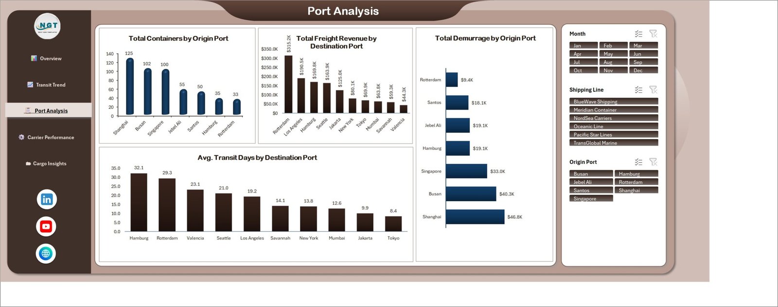
- Demurrage by origin port – Shanghai $46.8K, Busan $40.3K, Singapore $33.0K down to Rotterdam $9.4K.
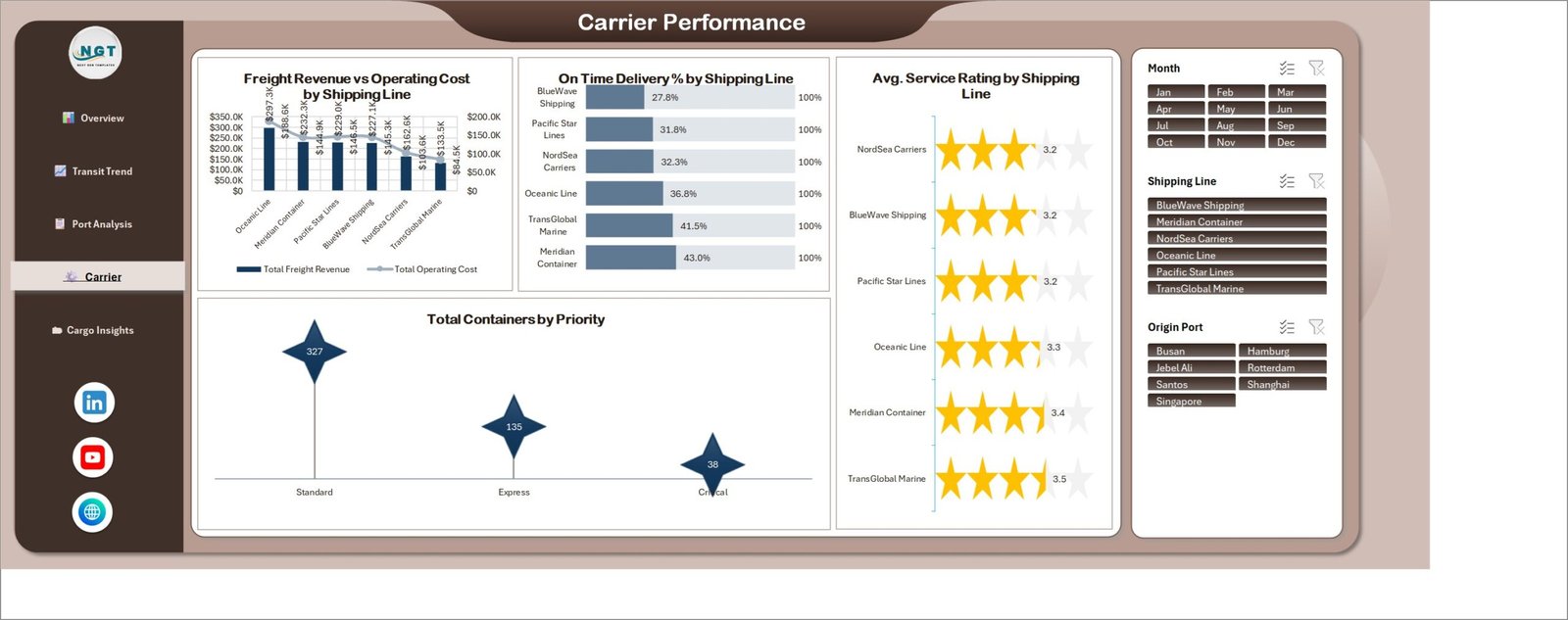
- Carrier scorecard – on-time delivery from 27.8% (BlueWave Shipping) to 43.0% (Meridian Container), with revenue vs operating cost and average service rating side by side.
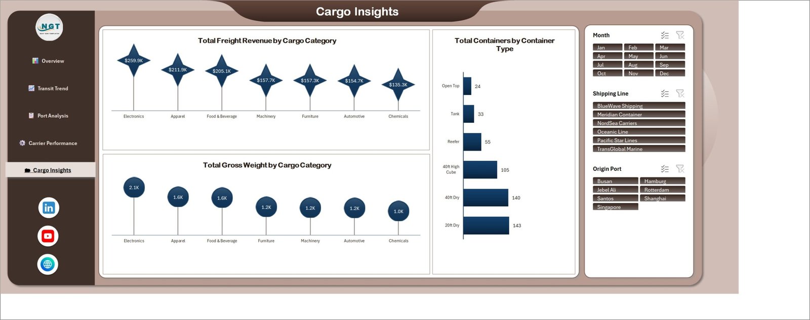
- Cargo economics – freight revenue and gross weight by cargo category, plus container counts by container type.
- Left-hand nav rail – one click between Overview, Transit Trend, Port Analysis, Carrier Performance and Cargo Insights.
What’s Inside the Container Tracking Dashboard in Excel
1. Overview. The five KPI cards sit above Freight Revenue vs Operating Cost by Month, an On Time Delivery % gauge, Total Containers by Status and On Time Delivery % by Destination Port – where Los Angeles leads at 51.5% and Mumbai trails at 19.4%.
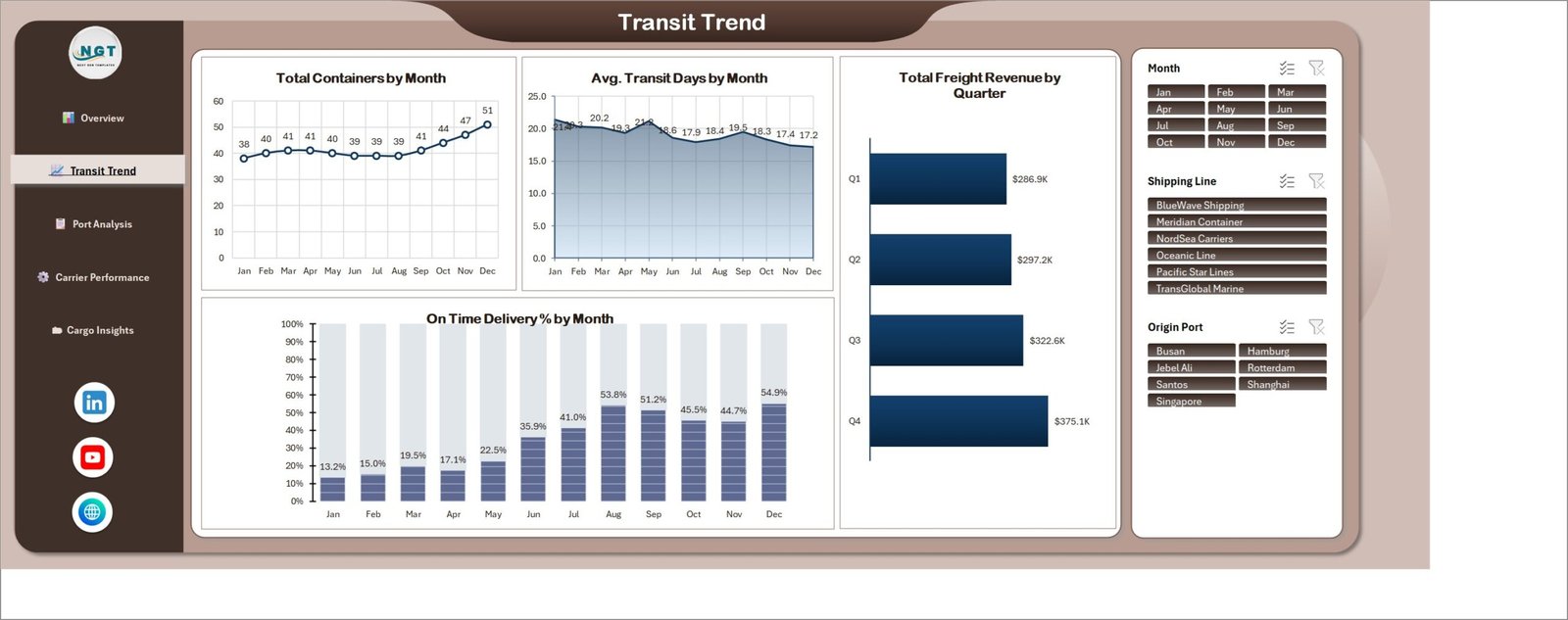
2. Transit Trend. Total Containers by Month climbs from 38 in January to 51 in December while Avg. Transit Days by Month falls from 21.4 to 17.2. Total Freight Revenue by Quarter runs $286.9K, $297.2K, $322.6K, $375.1K, and On Time Delivery % by Month moves 13.2% to 54.9% – the recovery story in one screen.
3. Port Analysis. Total Containers by Origin Port (Shanghai 125, Busan 102, Singapore 100), Total Freight Revenue by Destination Port (Rotterdam $315.2K down to Valencia $44.3K), Total Demurrage by Origin Port and Avg. Transit Days by Destination Port (Hamburg 32.1 days, Tokyo 8.4).
4. Carrier Performance. Freight Revenue vs Operating Cost by Shipping Line, On Time Delivery % by Shipping Line, Avg. Service Rating by Shipping Line (3.2 to 3.5 stars) and Total Containers by Priority – Standard 327, Express 135, Critical 38.
5. Cargo Insights. Total Freight Revenue by Cargo Category (Electronics $259.9K leads, Chemicals $135.3K trails), Total Gross Weight by Cargo Category and Total Containers by Container Type – 20ft Dry 143, 40ft Dry 140, 40ft High Cube 105, Reefer 55, Tank 33, Open Top 24.
You also get the underlying 500-row data sheet with every field the charts read, so adding your own bookings is a paste, not a rebuild.
Container Tracking Dashboard in Excel vs. Google Sheets vs. Paid Visibility SaaS – Where This Fits
| This Excel dashboard | Google Sheets build | Paid SaaS (project44, Zoho Inventory) | |
|---|---|---|---|
| Cost | $17.99 one time | Free tool, your build time | $300-$2,000+ per month |
| Platform | Excel 2016+ / Microsoft 365, offline | Browser only | Vendor cloud |
| Setup time | 10 minutes – paste your data | 2-3 days to build charts | 4-8 weeks onboarding |
| Real-time team collaboration | Via OneDrive / SharePoint | Native | Native |
| Mobile access | Excel mobile app | Yes | Yes |
| Customizable fields | Unlimited – it is your workbook | Unlimited | Vendor-defined |
| Share with link | OneDrive link | Yes | Yes |
| Year-1 cost at 5 users | $17.99 | $0 plus build time | $3,600-$24,000 |
| Demurrage and detention view | By origin port, built in | Build it yourself | Add-on module |
| Carrier scorecard | On-time %, cost and rating | Build it yourself | Yes |
Who This Template Is For – and Who It’s Not For
It fits freight forwarders, NVOCCs, import/export managers, 3PL account teams and supply chain analysts who already export a booking or shipment list from their TMS or forwarder portal and want lane, carrier and demurrage analysis without buying a visibility platform.
It does not fit if you need live AIS vessel positions or automatic carrier EDI feeds – this reads the data you paste in, it does not call an API. It is also the wrong choice if you want a single-page target-versus-actual scorecard; that is the KPI line, linked above. And if your team lives entirely in Google Workspace, take the Transportation Services Dashboard in Google Sheets instead.
How to Use the Container Tracking Dashboard in Excel
- Download the zip, unzip it and open the .xlsx in Excel 2016 or later. Nothing to enable – there are no macros.
- Open the data sheet and read the header row: container ID, month, shipping line, origin port, destination port, status, priority, cargo category, container type, transit days, freight revenue, operating cost, demurrage, gross weight, service rating.
- Delete the 500 sample rows and paste your own export in the same column order. Keep dates and numbers as real values, not text.
- Refresh (Data > Refresh All) so the pivot caches behind the charts pick up your rows.
- Use the Month, Shipping Line and Origin Port slicers to isolate a lane or a carrier; all five pages respond together.
- Start on Port Analysis – the demurrage chart usually names the problem lane before anyone opens the invoices.
Real-World Use Cases
Ravi, import manager at an electronics distributor. Electronics carries $259.9K of freight revenue and 2.1K of gross weight – the heaviest, most valuable category in the file. He filters Origin Port to Shanghai, sees $46.8K of demurrage against 125 containers, and moves the customs paperwork step two days earlier in the cycle.
Amelia, procurement lead at a 3PL. Contract renewal season. She opens Carrier Performance, puts BlueWave Shipping (27.8% on-time) next to Meridian Container (43.0% on-time) and walks into the negotiation with the delta rather than an anecdote.
Tom, supply chain analyst. He needs the December board pack. Transit Trend already shows containers up from 38 to 51 a month and average transit down from 21.4 to 17.2 days – two screenshots and the slide is written.
Frequently Asked Questions
Does this dashboard contain macros or VBA?
No. It is a plain .xlsx workbook. Nothing to enable, and it passes corporate macro policies that block .xlsm files.
Which Excel versions work?
Excel 2016, 2019, 2021 and Microsoft 365 on Windows or Mac. Slicers need a desktop version – Excel for the web renders the charts but slicer clicks are limited.
Can I add more than 500 container records?
Yes. The sample is 500 rows for file size, not as a cap. Paste in thousands of rows, refresh, and the charts follow.
Can I change the ports, carriers and cargo categories?
Yes. Every axis reads from the data sheet, so your own port codes, shipping lines, container types and cargo categories appear automatically after a refresh.
Does it connect to my TMS or a carrier tracking API?
No – it analyses data you paste or link in. Most users point it at a scheduled CSV export from their TMS or forwarder portal and refresh weekly.
How is this different from the KPI dashboards you sell?
This is the analytical line: five pages of lane, carrier and cargo drill-down. The KPI line is a single month-picker scorecard with targets, traffic lights and variance. Different jobs – many teams keep both.
What exactly do I get after buying?
A zip containing the .xlsx dashboard with the 500-row sample dataset. Instant download, lifetime access, free updates to this file.
About the Author
Built by PK – Microsoft Certified Professional with 15+ years of Excel, Google Sheets, and Power BI experience. Founder of NextGenTemplates, reaching 300K+ subscribers across YouTube channels. Every template is hand-built and tested before release.
Explore Related Templates
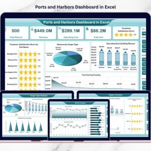
- Ports and Harbors Dashboard in Excel – terminal-side view of the same trade lanes.
- Port Logistics Dashboard in Power BI – the same story with Power BI drillthrough.
- Logistics Automation Dashboard in Power BI – warehouse and automation metrics.
- Carpooling Platforms Dashboard in Excel – another five-page Excel analytical build.
- Compliance Monitoring Dashboard in Excel – customs and audit-side reporting.
- Browse the full Excel Dashboard category or the Excel Logistics category.
Ready to see where your demurrage is going? Download the Container Tracking Dashboard in Excel for $17.99 (regular $29.99), paste in your booking export, and have a working control tower before your next carrier call. Read the full walkthrough on the Container Tracking Dashboard in Excel blog post.
Last updated: 19 August 2026.


















Reviews
There are no reviews yet.