

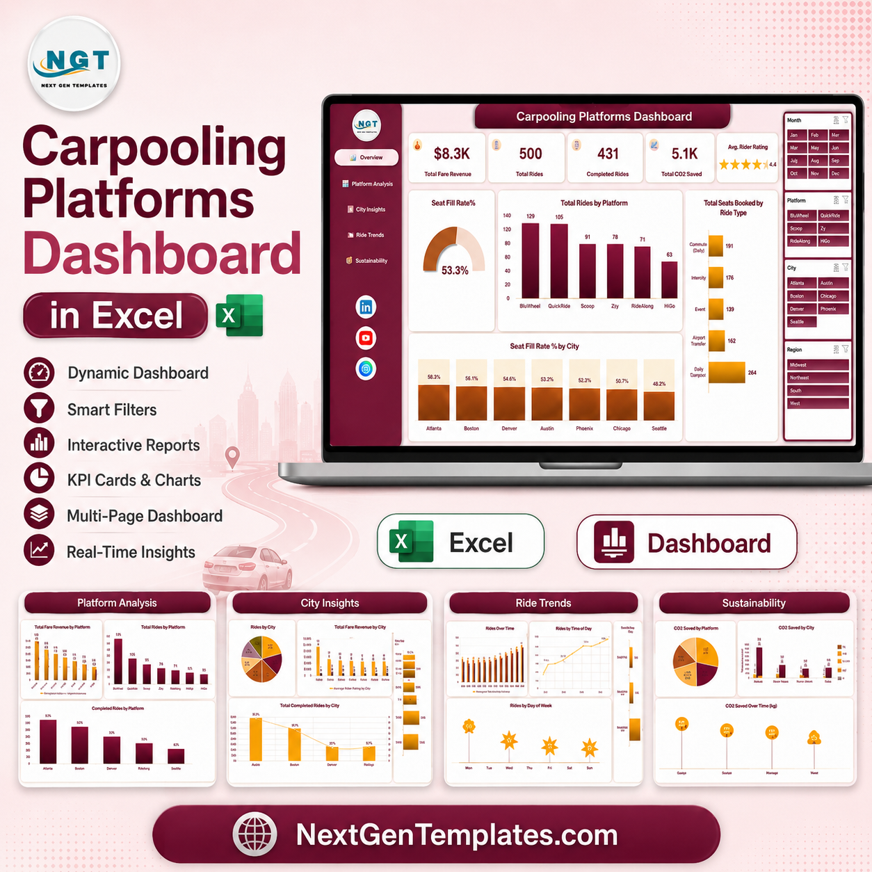
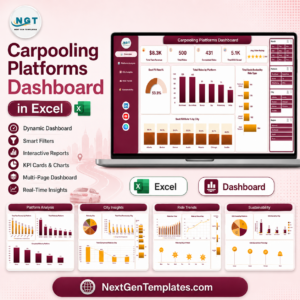
The Carpooling Platforms Dashboard in Excel turns a flat table of ride records into a five-page management report. The sample workbook carries 500 rides across six carpooling platforms, seven cities and four regions, and reports $8.3K of fare revenue, 431 completed rides, a 53.3% seat fill rate and 5.1K units of CO2 saved. It is built by NextGenTemplates, whose Excel and Power BI templates are used by analysts in more than 60 countries and backed by 300K+ subscribers across our YouTube channels. Every figure you see in the screenshots is sample data shipped with the file so you can test the model before loading your own. Download once, keep it forever, and if the workbook does not open and refresh as described, email us and we will fix it or refund you. Carpooling Platforms Dashboard in Excel
This is a reporting workbook, not an operations system. It reads a summary table of completed ride activity and produces the numbers a mobility operations lead or a city manager reports on each month.
Key Features of Carpooling Platforms Dashboard in Excel
- Five navigation-linked pages. A left sidebar on every sheet jumps to Overview, Platform Analysis, City Insights, Ride Trends and Sustainability.
- Four synced slicers. Month, Platform, City and Region sit on the right of each page and re-filter every chart on that page together.
- Native Excel only. Pivot tables, pivot charts and slicers. No macros, no Power Query dependency, no add-ins to install.
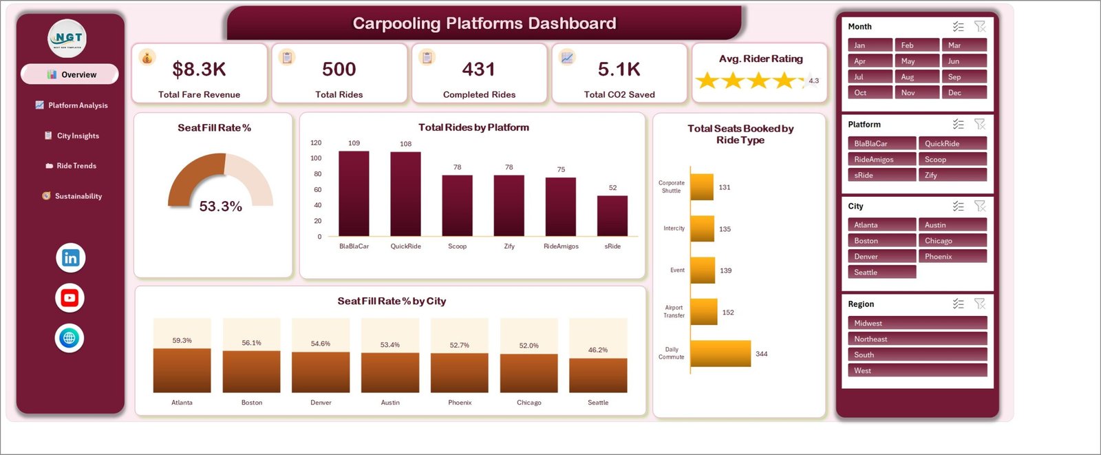
- A gauge for seat utilisation. The Overview page shows Seat Fill Rate % as a doughnut gauge – 53.3% in the sample data – so under-filled cars are visible immediately.
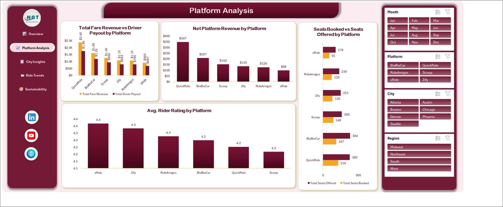
- Revenue and payout side by side. Platform Analysis charts Total Fare Revenue against Total Driver Payout so the margin per platform is a single glance.
- A dedicated CO2 page. Carbon saved is reported by vehicle type, by ride type against distance, and month by month.
- Aggregate-only model. The dashboard counts rides, seats, fares and distance. It does not ask for names, phone numbers, addresses or plate numbers, so you are not building a personal-data store to run a report. Carpooling Platforms Dashboard in Excel
What’s Inside the Carpooling Platforms Dashboard in Excel
Page 1 – Overview
Five KPI cards run across the top: Total Fare Revenue ($8.3K), Total Rides (500), Completed Rides (431), Total CO2 Saved (5.1K) and Avg. Rider Rating (4.3, shown as a star card). Below them sit the Seat Fill Rate % gauge, Total Rides by Platform (BlaBlaCar 109, QuickRide 108, Scoop 78, Zify 78, RideAmigos 75, sRide 52), Total Seats Booked by Ride Type (Daily Commute 344, Airport Transfer 152, Event 139, Intercity 135, Corporate Shuttle 131) and Seat Fill Rate % by City, which ranks Atlanta at 59.3% down to Seattle at 46.2%.
Page 2 – Platform Analysis
Four charts compare the six platforms. Total Fare Revenue vs Driver Payout by Platform puts QuickRide at $2.4K against $1.8K paid out; Net Platform Revenue by Platform reduces that to $347 for QuickRide, $207 for BlaBlaCar and $99 for sRide. Seats Booked vs Seats Offered by Platform exposes the utilisation gap, and Avg. Rider Rating by Platform ranks service quality from 4.4 down to 4.2.
Page 3 – City Insights
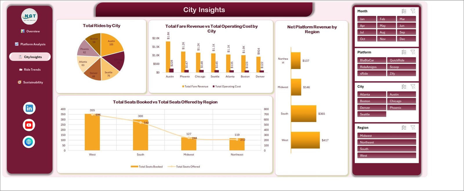
Total Rides by City is a pie led by Austin (105) and Chicago (73). Total Fare Revenue vs Total Operating Cost by City pairs each city’s revenue with its cost – Austin $1.8K against $228. Net Platform Revenue by Region puts West at $417 and Northeast at $137, and Total Seats Booked vs Total Seats Offered by Region overlays booked seats on offered seats so regional slack is obvious.
Page 4 – Ride Trends
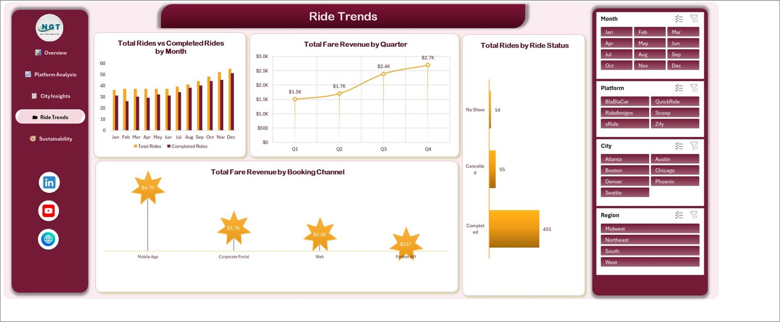
Total Rides vs Completed Rides by Month runs January to December and shows the sample year climbing into Q4. Total Fare Revenue by Quarter steps from $1.5K in Q1 to $2.7K in Q4. Total Rides by Ride Status splits 431 completed against 55 cancelled and 14 no-shows, and Total Fare Revenue by Booking Channel shows Mobile App at $4.7K ahead of Corporate Portal, Web and Partner API.
Page 5 – Sustainability
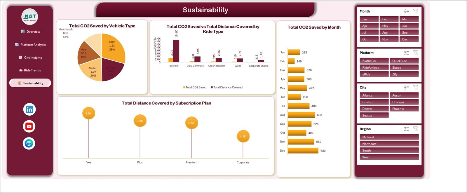
Total CO2 Saved by Vehicle Type splits the 5.1K total across SUV (29%), Sedan (20%), Electric (20%), Van (18%) and Hatchback (13%). Total CO2 Saved vs Total Distance Covered by Ride Type shows Intercity carrying 15.1K distance units for 3.0K of the saving. Total CO2 Saved by Month runs from 149 in February to 680 in December, and Total Distance Covered by Subscription Plan ranks Free, Plus, Premium and Corporate. Carpooling Platforms Dashboard in Excel
Carpooling Platforms Dashboard in Excel vs. Google Sheets vs. Paid Mobility SaaS – Where This Fits
| This template (Excel) | Google Sheets dashboard | Paid mobility / BI SaaS | |
|---|---|---|---|
| Cost | One-off $17.99 | One-off, lower price point | Typically $50-$200 per user per month |
| Platform | Microsoft Excel, desktop | Browser, Google account | Vendor cloud |
| Setup time | Paste data, refresh – under an hour | Copy file, paste data | Implementation project, often weeks |
| Real-time team collaboration | Via OneDrive / SharePoint co-authoring | Yes, natively | Yes |
| Mobile access | Excel mobile app, read-friendly | Yes, browser | Yes, native apps |
| Customisable fields | Full – it is your workbook | Full | Limited to the vendor’s schema |
| Share with link | Via OneDrive link | Yes | Yes |
| Year-1 cost at 5 users | $17.99 total | Under $20 total | $3,000-$12,000 |
| Multi-platform comparison | Built in – six platforms side by side | Built in | Usually single-operator only |
| CO2 / sustainability reporting | Dedicated page | Depends on the template | Often a paid add-on module |
Who This Template Is For – and Who It’s Not For
It is for: mobility operations analysts comparing several carpooling apps in one report; corporate travel and facilities teams running an employee ride-share scheme; city and campus transport offices tracking seat utilisation and cancellations; sustainability leads who need a monthly CO2-saved figure they can defend; and consultants building a mobility deck who want the charts already made.
It is not for: live dispatch or matching – this reports on rides that have already happened, it does not assign them. It is not a billing or driver-payout engine; it summarises payout figures you already hold. It will not ingest an API feed on its own – you export from your platform and paste into the Data sheet. And it is deliberately not a rider database: if you need per-person trip histories, use your platform’s own system, not a spreadsheet.
How to Use the Carpooling Platforms Dashboard in Excel
- Unzip the download and open the .xlsx workbook in Microsoft Excel 2016 or later, or Microsoft 365.
- Open the Data sheet and look at the sample columns – ride date, platform, city, region, ride type, ride status, vehicle type, subscription plan, booking channel, seats offered, seats booked, distance, fare, driver payout, operating cost, CO2 saved and rider rating.
- Export the same fields from your carpooling platform, aggregated at ride level. Keep the column order and delete the sample rows.
- Paste your rows in, then use Data > Refresh All so every pivot table and chart picks up the new range.
- Click any slicer – Month, Platform, City or Region – to filter the whole page. Use the eraser icon on a slicer to clear it.
- Use the left-hand navigation to move between the five pages, and print or export any page to PDF for your monthly pack. Carpooling Platforms Dashboard in Excel
Real-World Use Cases
Priya, mobility operations analyst at a multi-city carpool aggregator. She lists six partner platforms on the Platform Analysis page and sees that QuickRide earns $347 net against BlaBlaCar’s $207 on similar volume. The seats booked vs offered chart tells her why: BlaBlaCar offers 384 seats and fills 187. Her renegotiation case writes itself.
Daniel, facilities manager running a staff carpool scheme across three offices. He filters City Insights to his region each month, checks seat fill rate by city, and takes the Sustainability page’s CO2-saved figure straight into the company’s ESG report – without ever exporting a list of who rode with whom.
Anita, transport officer at a university campus. She watches Ride Trends: 55 cancellations and 14 no-shows against 431 completed rides. Because the monthly chart shows both total and completed rides, she can see whether a bad month is demand or reliability, and she compares booking channels to decide whether the mobile app or the portal deserves the next push. Carpooling Platforms Dashboard in Excel
Frequently Asked Questions
Which Excel versions does this work in?
Excel 2016, 2019, 2021 and Microsoft 365 on Windows. The pivot tables, pivot charts and slicers are all native features. Excel for Mac opens the file, though slicer styling can render slightly differently. Carpooling Platforms Dashboard in Excel
Are the numbers in the screenshots real?
No. Every figure – the 500 rides, the $8.3K revenue, the platform names – is sample data generated for the template so you can see the model working. Replace it with your own export.
Does it store rider or driver personal information?
No. The data model works at ride level with categories such as platform, city, ride type and vehicle type. There are no name, phone, email or address columns, and none of the charts need them. Keep it that way and your reporting stays aggregate.
Can I add my own platform names or cities?
Yes. The platform, city and region lists come from your data, not from a hard-coded list. Paste rows with new values, refresh, and the slicers pick them up.
Can I change the colours to match our brand?
Yes. The workbook uses a standard Excel theme, so Page Layout > Colors recolours every chart at once, and individual charts can be restyled normally.
Does it need macros or an internet connection?
Neither. It is a plain .xlsx with no VBA, so it opens without a macro-security prompt and works entirely offline.
Is there a Power BI version?
Yes – the same dashboard is available as the Carpooling Platforms Dashboard in Power BI, if you would rather publish to the Power BI service than share a workbook.
About the Author
Built by PK – Microsoft Certified Professional with 15+ years of Excel, Google Sheets, and Power BI experience. Founder of NextGenTemplates, reaching 300K+ subscribers across YouTube channels. Every template is hand-built and tested before release.
Explore Related Templates
- Carpooling Platforms Dashboard in Power BI – the same five pages, rebuilt as a PBIX report.
- School Transportation Services Dashboard in Excel – route, fleet and student ridership reporting.
- Roadside Assistance Networks Dashboard in Excel – response times and service coverage.
- Ride Hailing & Mobility Apps Dashboard in Power BI – the on-demand side of the same market.
- Transportation Services Dashboard in Google Sheets – a lighter, browser-based option if you do not run Excel.
- Browse the full Excel Dashboard category or the Excel Logistics templates.
Get the Carpooling Platforms Dashboard in Excel now – instant download, sample data included, yours to keep and edit. Read the full walkthrough on the Carpooling Platforms Dashboard in Excel blog post.
Last updated: 14 August 2026.























Reviews
There are no reviews yet.