

The Collaboration Platforms Dashboard in Excel tracks 5 high-level KPIs and 18 pivot-driven charts across 5 interactive sheets, covering every collaboration tool, department, region, license type and month on file. Setup takes under 10 minutes — replace the sample data in the Data Sheet, click Refresh All, and every card, chart and slicer updates automatically.
🌍 Join 8,400+ teams in 40+ countries using NextGenTemplates to replace paid SaaS-management tools with one-time-purchase Excel, Google Sheets, Power BI and HTML templates.
✅ Instant download · One-time payment · No subscription · No per-user fees · Lifetime access
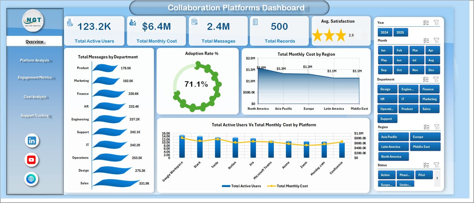
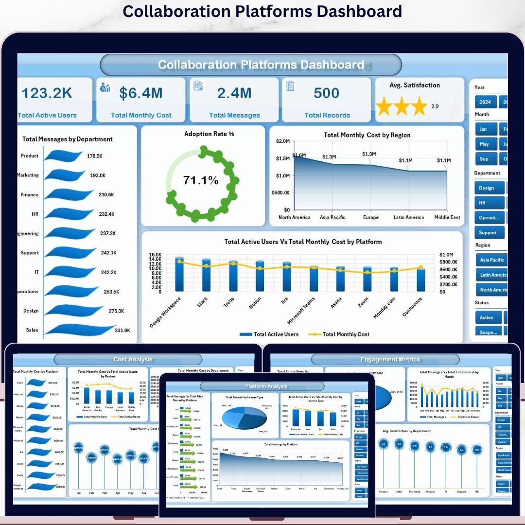
Overview Page — 5 KPI cards, 4 charts, and right-side slicers for instant filtering
🔑 Key Features of the Collaboration Platforms Dashboard in Excel
This Collaboration Platforms Dashboard in Excel tracks 5 executive KPIs — Total Active Users, Total Monthly Cost, Total Messages, Total Records and Avg. Satisfaction — and breaks them down across every department, region, platform, license type and month in your data. IT operations leads, ITSM managers and finance controllers use it to spot which platforms have the highest adoption, which regions burn the most license cost, and which departments report the lowest satisfaction with their collaboration stack.
🟢 5 KPI cards on the Overview page — Total Active Users, Total Monthly Cost, Total Messages, Total Records and Avg. Satisfaction recalculate the moment a new row hits the Data Sheet. The right-side slicer panel filters every card and chart on the page at once.
📊 18 pivot-driven charts across 5 pages — including Adoption Rate %, Total Active Users vs Total Monthly Cost by Platform, Total Messages vs Total Files Shared by Platform, Total Records by License Type, Avg. Satisfaction by Department and Total Support Tickets vs Total Resolved Tickets by Month. Each chart is built from the hidden Support Sheet, so a single click on Refresh All updates the entire dashboard.
🎚️ Slicers on every page for Department, Region, Platform, License Type and Year. Pick three platforms and one region and the whole dashboard rewires itself — no formula edits needed.
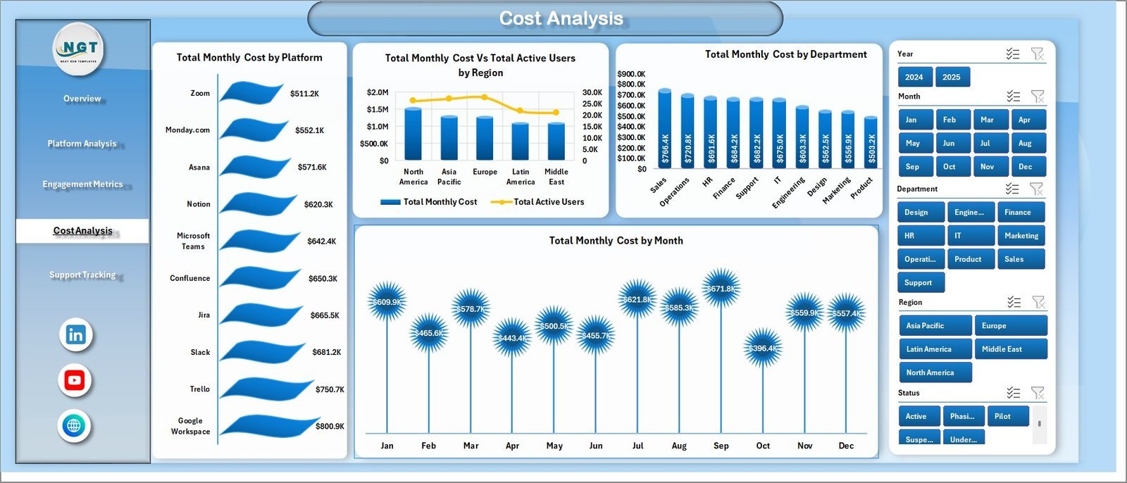
💰 Dedicated Cost Analysis page compares Total Monthly Cost by Platform, by Region (against Active Users), by Department and by Month — the four views finance teams need to challenge vendor renewals with hard numbers.
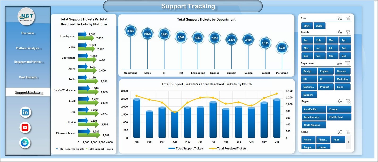
🎟️ Support Tracking page tracks Total Support Tickets vs Total Resolved Tickets by Platform, Total Support Tickets by Department and Total Tickets vs Resolved by Month — your built-in collaboration helpdesk scorecard.
🔁 One-click refresh workflow — update the Data Sheet, hit Data → Refresh All, and every pivot, chart, KPI card and slicer recalculates in seconds. No VBA, no Power Query knowledge required.
📦 What’s Inside the Collaboration Platforms Dashboard in Excel
The workbook ships with 7 worksheets, organised so non-technical users can start analysing immediately:
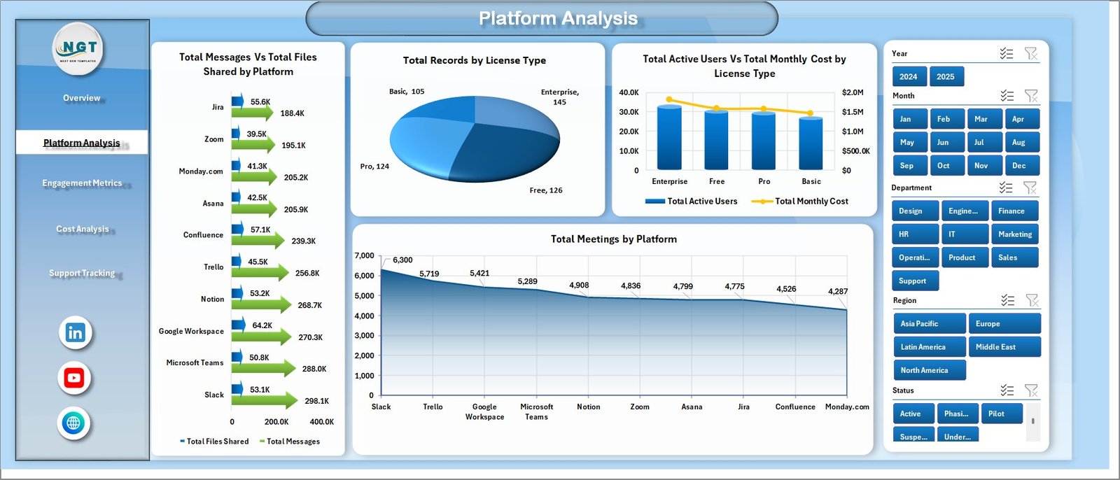
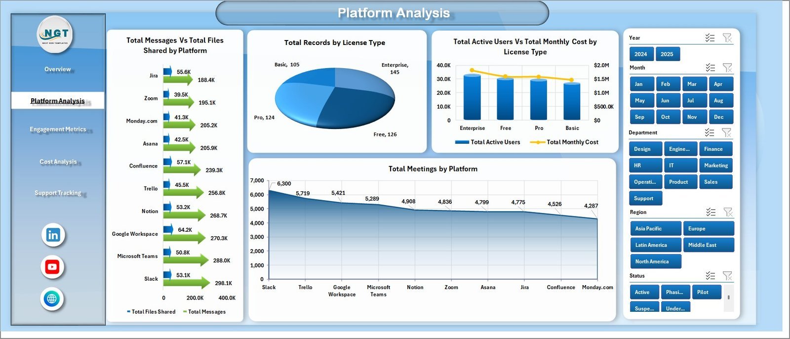
Platform Analysis Page
📍 1. Overview Page — 5 KPI cards (Total Active Users, Total Monthly Cost, Total Messages, Total Records, Avg. Satisfaction) and 4 charts: Total Messages by Department, Adoption Rate %, Total Monthly Cost by Region, and Total Active Users vs Total Monthly Cost by Platform.
📍 2. Platform Analysis — 4 charts comparing Total Messages vs Total Files Shared by Platform, Total Records by License Type, Total Active Users vs Total Monthly Cost by License Type, and Total Meetings by Platform.
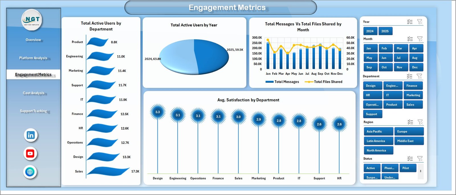
Engagement Metrics Page
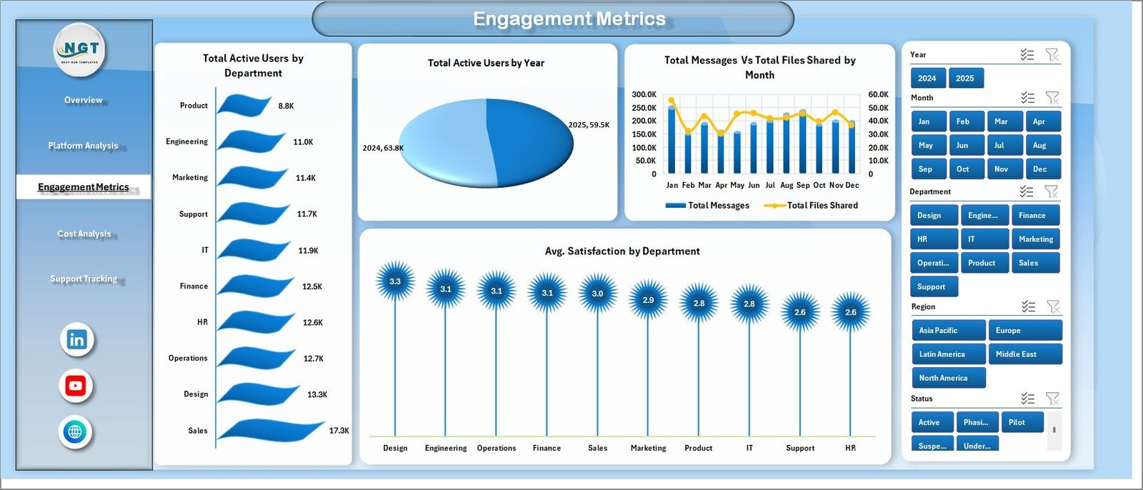
📍 3. Engagement Metrics — Total Active Users by Department, Total Active Users by Year, Total Messages vs Total Files Shared by Month, and Avg. Satisfaction by Department.
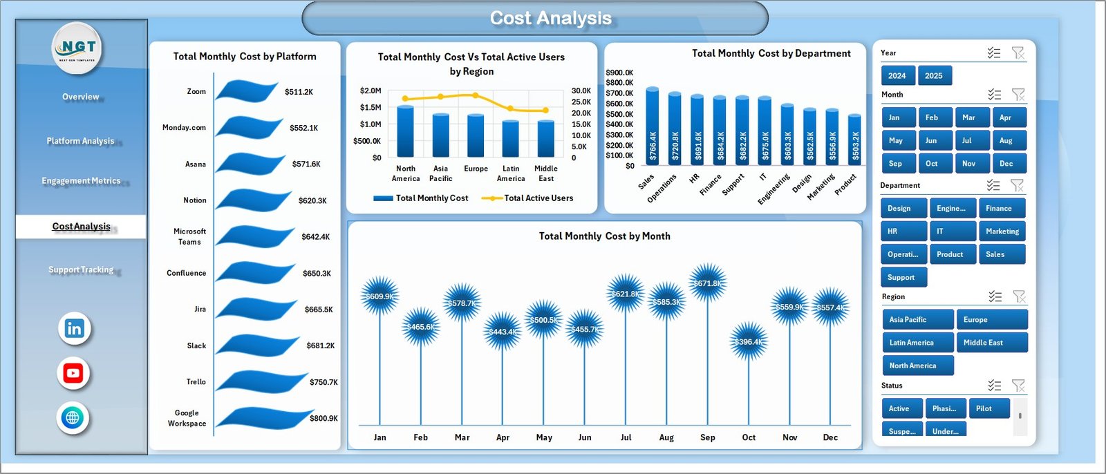
Cost Analysis Page
📍 4. Cost Analysis — Total Monthly Cost by Platform, Total Monthly Cost vs Total Active Users by Region, Total Monthly Cost by Department, and Total Monthly Cost by Month.

Support Tracking Page
📍 5. Support Tracking — Total Support Tickets vs Total Resolved Tickets by Platform, Total Support Tickets by Department, and Total Support Tickets vs Total Resolved Tickets by Month.

Data Sheet tab
📍 6. Data Sheet — the single source of truth. Paste or append your collaboration platform usage data in the same column structure and the entire dashboard recalculates.

Support sheet tab
📍 7. Support Sheet — hidden engine room containing every pivot table that powers the dashboard charts. Click Data → Refresh All after editing the Data Sheet and you can keep this tab hidden in production use.
📊 Collaboration Platforms Dashboard vs. Power BI vs. Paid SaaS Management Tools — Where This Fits
| Feature | Collaboration Platforms Dashboard in Excel | Power BI SaaS-Management Report | Productiv / Zylo / BetterCloud |
|---|---|---|---|
| Cost | $17.99 one-time | $9.99/user/month (Power BI Pro) + build time | $15,000-$50,000/year typical contract |
| Platform | Microsoft Excel 2016+ | Power BI Desktop + Service | Web SaaS (login required) |
| Setup time | Under 10 minutes | 2-6 weeks of DAX modelling | 4-12 weeks vendor onboarding |
| Works offline | ✅ Yes | Partial (Power BI Desktop) | ❌ No |
| 5 pre-built KPI cards | ✅ Yes | Build from scratch | ✅ Yes |
| Cost analysis by region & dept | ✅ Yes | Build from scratch | ✅ Yes |
| Slicers on every page | ✅ Yes | Yes | Yes |
| Year-1 cost at 5 users | $17.99 | ~$600 | $15,000+ |
| Data stays inside your tenant | ✅ Yes (local file) | Yes (with policies) | ❌ Vendor SaaS |
For IT and finance teams that want visibility into Microsoft Teams, Slack, Zoom and Google Workspace adoption and cost without paying $25k/year, the Collaboration Platforms Dashboard in Excel sits in the sweet spot.
👥 Who This Template Is For — and Who It’s Not For
✅ This template is built for:
- IT operations and ITSM leads at 50-2,000 person companies tracking 3+ collaboration platforms
- Finance controllers preparing quarterly SaaS spend reviews and vendor renewal negotiations
- HR and internal-comms teams measuring employee engagement with Teams, Slack and Zoom
- Consultants delivering SaaS rationalisation projects to client IT departments
- MSPs and managed-service providers reporting collaboration platform usage to multiple clients
❌ This template is NOT for:
- Enterprises that need real-time API integrations directly with Microsoft 365 admin centre or Slack Enterprise Grid — use a paid SaaS management platform instead
- Teams that want automated user provisioning or de-provisioning workflows (this is reporting, not action)
- Mac-only shops that don’t have Microsoft Excel desktop installed (Excel Online works but slicers are limited)
⚙️ How to Use the Collaboration Platforms Dashboard in Excel
- Open the file in Microsoft Excel 2016 or later on Windows or Mac desktop.
- Go to the Data Sheet and replace the sample rows with your own platform usage records, keeping the same column headers.
- Click Data → Refresh All on the Excel ribbon. Every pivot table on the hidden Support Sheet recalculates.
- Navigate to the Overview page to see the 5 KPI cards and 4 high-level charts update automatically.
- Use the slicers on the right side of each page to filter by Department, Region, Platform, License Type or Year.
- Move through the four analysis pages — Platform Analysis, Engagement Metrics, Cost Analysis, Support Tracking — to dig into specific questions.
- Hide the Support Sheet in production so end users only see the five clean dashboard pages.
💼 Real-World Use Cases
Priya runs IT operations at a 400-person fintech in Bengaluru. She uses the Collaboration Platforms Dashboard in Excel to track Microsoft Teams, Slack and Zoom usage across her 12 departments. By the second month she had cancelled 38 unused Zoom Pro licenses on the Cost Analysis page and saved roughly $7,200 a year — paying back the template 400x over.
Marco is a CIO at a manufacturing group with sites in Italy, Germany and Mexico. The Region slicer on the Cost Analysis page showed him that Mexico ran 60% higher cost per active user on Microsoft Teams Phone than Germany. He renegotiated the regional contract on the strength of that one chart.
Aisha is an IT consultant. She drops each new client’s exported usage CSV into the Data Sheet, refreshes, screenshots the five pages and delivers a polished SaaS-adoption report in under an hour — without paying for a Productiv or BetterCloud subscription.
❓ Frequently Asked Questions
What KPIs does the Collaboration Platforms Dashboard in Excel track?
The Collaboration Platforms Dashboard in Excel tracks five executive KPIs — Total Active Users, Total Monthly Cost, Total Messages, Total Records and Avg. Satisfaction — plus 18 pivot-driven charts covering adoption, cost, engagement and support tickets across every platform, department, region and license type in your data.
Which collaboration platforms can I analyse with this template?
Any platform you list in the Data Sheet. Customers typically track Microsoft Teams, Slack, Zoom, Google Workspace, Webex and Asana, but the Platform column is free text so you can mix in any internal tool. The Collaboration Platforms Dashboard in Excel groups everything in pivot tables automatically.
How long does setup take?
Under 10 minutes for most users. Open the file, paste your usage data into the Data Sheet keeping the column structure, click Data → Refresh All and the entire Collaboration Platforms Dashboard in Excel recalculates. No formulas, macros or Power Query edits are required.
How does this compare to Productiv, Zylo or BetterCloud?
The Collaboration Platforms Dashboard in Excel costs $17.99 once instead of $15,000-$50,000 a year. You give up live API connectors and automated provisioning, but you keep all reporting locally, get the same KPI views, and own the file forever — ideal for SMBs and finance-led reviews.
Does the dashboard work in Excel for Mac or Excel Online?
Yes, the Collaboration Platforms Dashboard in Excel opens in Excel for Mac and Excel Online. Pivot tables and most charts render correctly online, but slicers and Refresh All behave best in the Windows desktop application, which is the recommended environment.
Can I add new platforms or KPIs later?
Yes. Add new platform names directly in the Data Sheet’s Platform column and they appear automatically in every pivot and slicer after Refresh All. To add a new KPI, drop a measure into the Support Sheet pivots and link a fresh chart on the relevant page.
Is there a Google Sheets or Power BI version?
This is the Excel edition. If you want a Power BI variant of the Collaboration Platforms Dashboard, browse our Power BI Dashboards catalogue, or pair this with our API Development Dashboard in Excel for a full IT operations stack.
👤 About the Author
Built by PK — Microsoft Certified Professional with 15+ years of Excel, Google Sheets and Power BI experience. Founder of NextGenTemplates, reaching 300K+ subscribers across YouTube channels (@PK-AnExcelExpert, @NextGenTemplates, @NeoTechNavigators). Every template is hand-built and tested before release.
🔗 Explore Related Templates
📊 API Development Dashboard in Excel — pair with this dashboard for a complete IT operations view covering both collaboration platforms and internal APIs.
📊 Buy-Now-Pay-Later Platforms Dashboard in Excel — same multi-platform analytics pattern applied to BNPL providers.
📊 API Development KPI Dashboard in Excel — MTD/YTD KPI view for engineering leadership.
📁 Browse all Excel Dashboard Templates or our Google Sheets Dashboards for cross-platform reporting needs.
📖 Click here to read the Detailed Blog Post
🎥 Visit our YouTube channel for step-by-step video tutorials
👉 YouTube.com/@NextGenTemplates
Watch the step-by-step video tutorial: