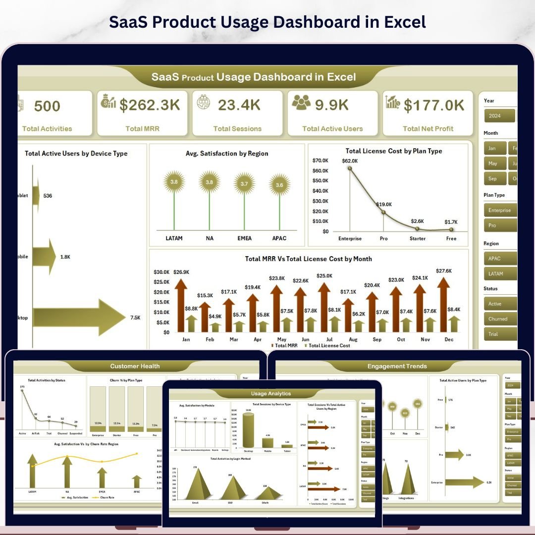
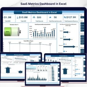
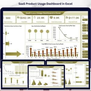
The SaaS Product Usage Dashboard in Excel tracks 5 high-level KPI cards — Total Activities, Total MRR, Total Sessions, Total Active Users, and Total Net Profit — across 5 interactive analysis pages with 19 pre-built charts powered by pivot tables and multi-field slicers. Setup takes under 10 minutes: paste your usage data into the Data Sheet and every chart, KPI card, and filter refreshes automatically through the Support Sheet pivot engine.
🌍 Join 8,400+ teams in 40+ countries using Nextgen Templates to replace paid SaaS analytics tools with one-time-purchase Excel, Google Sheets, and Power BI dashboards.
✅ Instant download · One-time payment · No subscription · No per-user fees · Lifetime access
🔑 Key Features of SaaS Product Usage Dashboard in Excel
🔹 5 KPI cards on the Overview page — Total Activities, Total MRR, Total Sessions, Total Active Users, and Total Net Profit refresh in one click after data updates.
🔹 19 charts across 5 dedicated pages — Overview, Usage Analytics, Customer Health, Revenue Analysis, and Engagement Trends, each engineered to answer a specific SaaS business question without writing formulas.
🔹 Pivot-driven architecture — every visual is built from a single Support Sheet of pivot tables. Click Refresh All and the entire dashboard updates in under 5 seconds, even with 50,000+ rows of usage events.
🔹 Multi-dimensional slicers — filter by Plan Type, Device Type, Region, Module, Login Method, and Industry. Slicer changes cascade across all charts on every page simultaneously.
🔹 Combined revenue + churn view — the only Excel SaaS dashboard that pairs Total MRR vs. Total License Cost by Month with Avg. Satisfaction vs. Churn Rate by Region in one workbook, so finance and customer-success teams use the same source of truth.
🔹 Hidden Support Sheet — the entire pivot infrastructure can be hidden so business users only see polished pages while you maintain full control of the data model.
📦 What’s Inside the SaaS Product Usage Dashboard in Excel
Page 1 — Overview: 5 KPI cards (Total Activities, Total MRR, Total Sessions, Total Active Users, Total Net Profit) plus 4 charts: Total Active Users by Device Type, Avg. Satisfaction by Region, Total License Cost by Plan Type, and Total MRR vs. Total License Cost by Month. Multi-field slicers anchor the page so any filter cascades to every chart instantly.
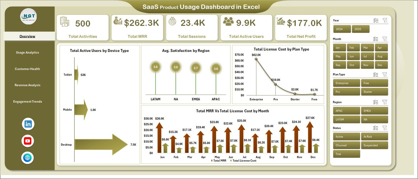 SaaS Product Usage Dashboard in Excel
Page 2 — Usage Analytics: Avg. Satisfaction by Module, Total Sessions by Device Type, Total Sessions vs. Total Active Users by Region, and Total Activities by Login Method. Identifies which modules drive engagement and which login methods correlate with deeper usage.
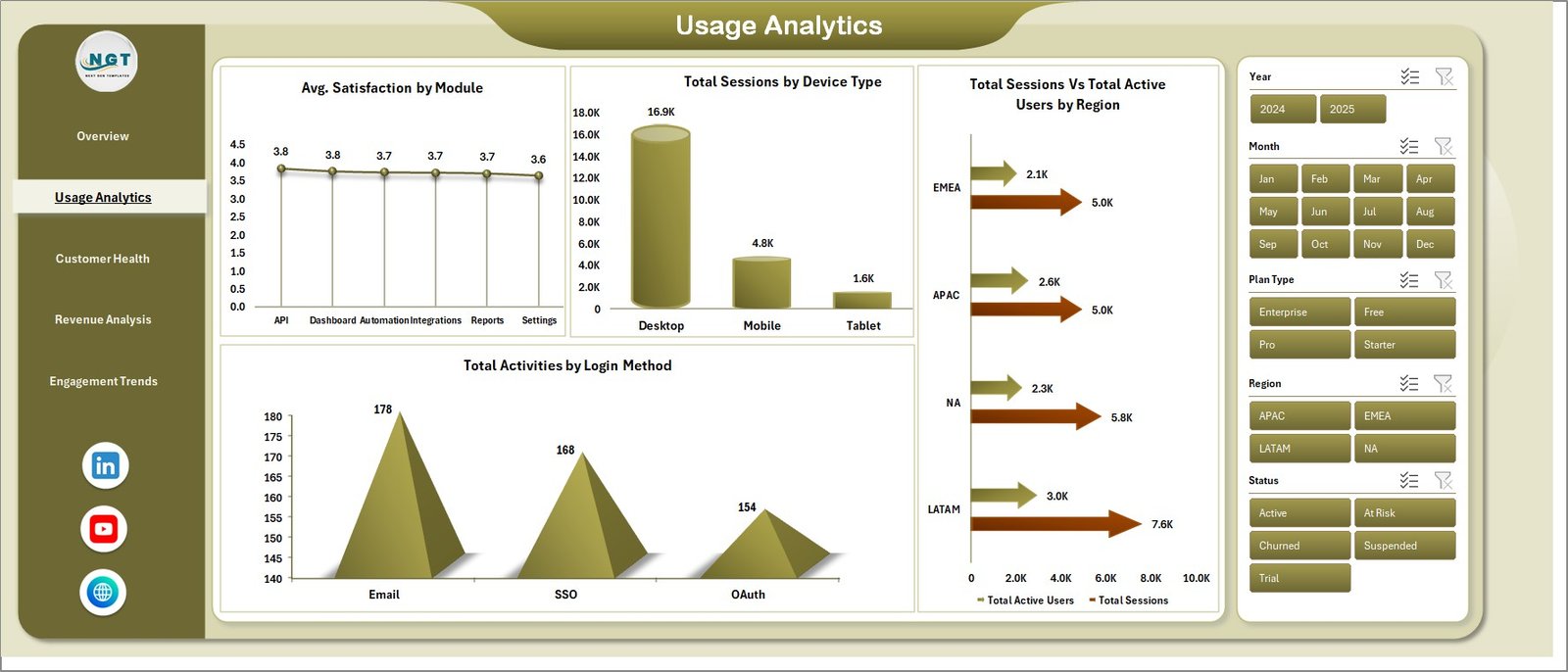 Usage Analytics
Page 3 — Customer Health: Total Activities by Status, Churn % by Plan Type, Avg. Satisfaction by Industry, and Avg. Satisfaction vs. Churn Rate by Region. The dual-axis satisfaction-vs-churn chart spots at-risk regions before churn lands in the next month’s invoice.
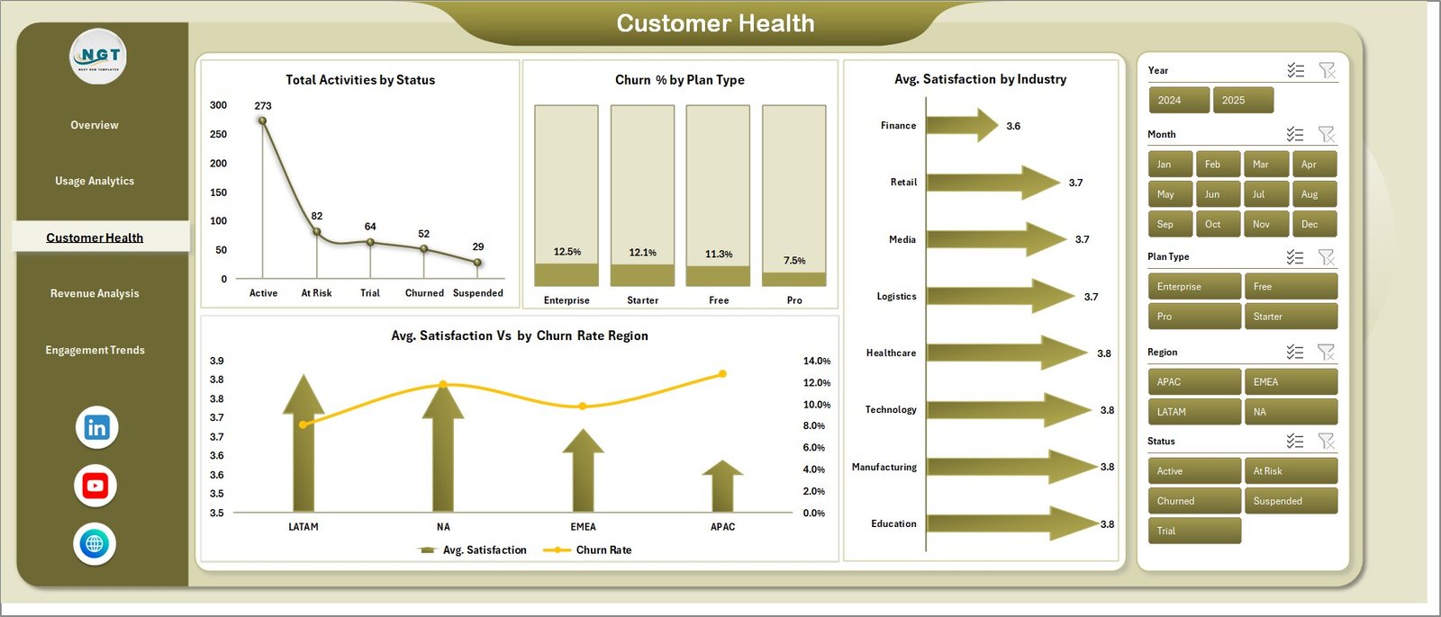 Customer Health
Page 4 — Revenue Analysis: Total MRR by Device Type, Total MRR by Plan Type, Total MRR by Month, and Total MRR vs. Total License Cost by Region. Pairs revenue trends with infrastructure cost so gross-margin shifts surface immediately.
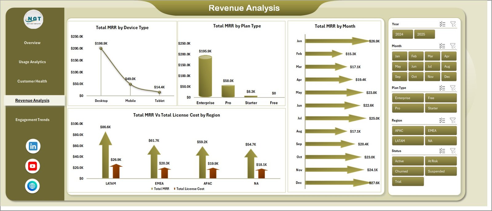 Revenue Analysis
Page 5 — Engagement Trends: Total Active Users by Month, Total Active Users by Plan Type, and Total Activities by Module. Turns raw event logs into the WAU/MAU patterns product teams quote in board meetings.
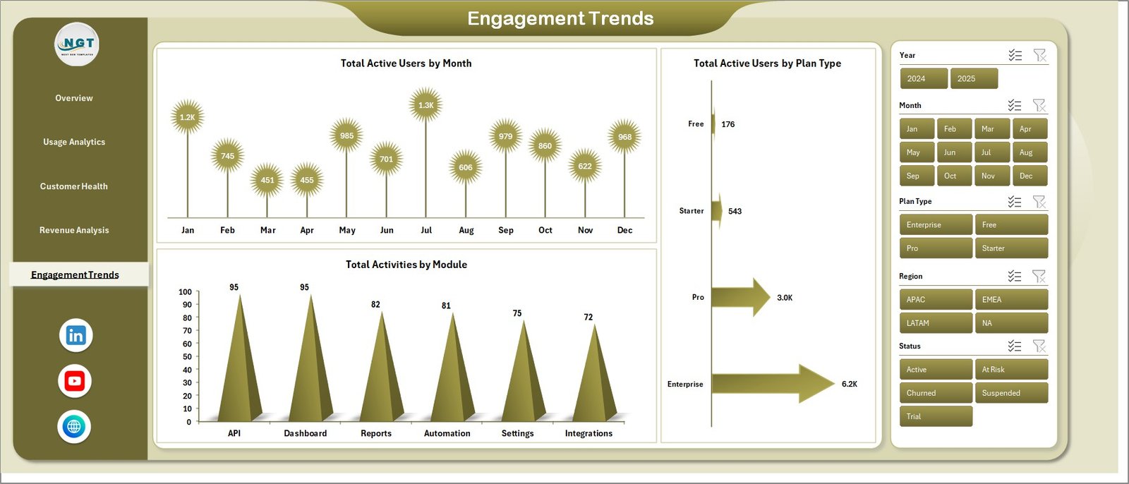 Engagement Trends
Data Sheet: The single source of truth. Drop in your SaaS usage records using the same column format as the sample data, and every page on the workbook updates after Refresh All.
 Data Sheet tab
Support Sheet: Houses every pivot table that powers the dashboard. Keep it hidden in production so business users only see the 5 polished pages while admins maintain the data model.
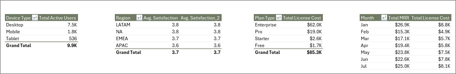 Support sheet tab
📊 SaaS Product Usage Dashboard in Excel vs. Google Sheets Alternative vs. Paid SaaS Analytics — Where This Fits
| Feature | SaaS Product Usage Dashboard in Excel | Google Sheets equivalent | HubSpot / Mixpanel / Amplitude |
|---|---|---|---|
| Cost | $17.99 one-time | $8-$15 one-time | $25-$2,000 / user / month |
| Platform | Microsoft Excel (offline) | Google Sheets (browser-only) | Cloud SaaS (vendor lock-in) |
| Setup time | Under 10 minutes | 10-15 minutes | 2-6 weeks (event tracking + SDK install) |
| Total KPIs + charts | 5 KPIs + 19 charts across 5 pages | Varies by template | Unlimited but requires query building |
| Pivot refresh architecture | ✅ Single-click Refresh All | Apps Script or manual rebuild | Auto, but requires event instrumentation |
| Customizable charts | ✅ Standard Excel pivots | ✅ Native Google charts | Limited to vendor’s chart library |
| Data ownership | ✅ Local .xlsx file | Tied to Google Drive | Stored on vendor servers |
| Year-1 cost at 5 users | $17.99 total | ~$10 total | $1,500 – $120,000 |
| Works offline | ✅ Yes | ❌ Browser required | ❌ Internet required |
For SaaS founders, customer-success leads, and FP&A teams who want full MRR + churn + usage visibility without paying $1,500/year for Mixpanel seats, the SaaS Product Usage Dashboard in Excel sits in the sweet spot.
👥 Who This Template Is For — and Who It’s Not For
✅ This template is built for:
- SaaS founders and operators at 5-200 employee companies tracking MRR, churn, and product usage in one workbook
- Customer-success managers who need a Customer Health page tied to satisfaction and churn by region/industry
- FP&A and finance leads who want MRR vs. license-cost margin trends without a BI license
- Product managers replacing $30-$200/month seat-based analytics tools during seed and Series A stages
❌ This template is NOT for:
- Enterprise SaaS teams needing real-time event streaming (use Mixpanel / Amplitude / Heap instead)
- Companies that require SOC 2 audit trails, SSO, or row-level security on usage data
- Teams without anyone comfortable opening Excel and refreshing pivot tables once a week
⚙️ How to Use the SaaS Product Usage Dashboard in Excel
- Download the SaaS Product Usage Dashboard in Excel zip file and extract the .xlsx workbook.
- Open the file in Microsoft Excel 2016 or later (Windows, Mac, or Microsoft 365).
- Go to the Data Sheet tab and replace the sample rows with your own SaaS usage records, keeping the same column headers.
- Click the Data tab in the Excel Ribbon and choose Refresh All so every pivot table picks up the new data.
- Move through the Overview, Usage Analytics, Customer Health, Revenue Analysis, and Engagement Trends pages and use the slicers to filter by Plan Type, Device, Region, Module, and Date.
💼 Real-World Use Cases
Priya runs growth at a 25-person B2B SaaS startup. She uses the SaaS Product Usage Dashboard in Excel to track MRR by Plan Type and Total Active Users by Month for her Tuesday investor update — generating the same numbers her old Mixpanel dashboard produced, but without the $400/month bill that became hard to justify after the seed round.
Marcus heads customer success at a 60-employee fintech SaaS. He pulls the Customer Health page weekly to monitor Avg. Satisfaction vs. Churn Rate by Region, flags any region where satisfaction drops below 4.0, and assigns a CSM to run a save call before renewal. Two regions caught early in Q3 saved roughly $48k in ARR.
Anita, an FP&A analyst at a Series A vertical SaaS, uses the Revenue Analysis page to compare Total MRR vs. Total License Cost by Region every month-end. The dashboard surfaces gross-margin compression in two regions where infrastructure scaling outpaced subscription growth, three quarters before it would have shown up in the company’s QuickBooks-only finance reporting.
❓ Frequently Asked Questions
What KPIs does the SaaS Product Usage Dashboard in Excel track?
The SaaS Product Usage Dashboard in Excel tracks 5 high-level KPIs — Total Activities, Total MRR, Total Sessions, Total Active Users, and Total Net Profit — plus 19 chart-level metrics covering customer satisfaction, churn rate, license cost, and active users by plan, device, region, and module.
How long does setup take for the SaaS Product Usage Dashboard in Excel?
Setup takes under 10 minutes. Open the file in Microsoft Excel, paste your usage data into the Data Sheet in the same column format, click Refresh All on the Data tab, and every chart and KPI card on all 5 dashboard pages updates automatically through the pivot-driven Support Sheet.
How does the SaaS Product Usage Dashboard in Excel compare to HubSpot or Mix panel?
HubSpot and Mix panel charge $25-$2,000 per month with per-event pricing and seat fees. The SaaS Product Usage Dashboard in Excel is a one-time $17.99 purchase with no subscription, no per-user limits, and full data ownership — ideal for early-stage SaaS teams who don’t need real-time event streaming.
Can I customize the charts and KPIs in the SaaS Product Usage Dashboard?
Yes — every chart in the SaaS Product Usage Dashboard in Excel is built on standard pivot tables in the Support Sheet. You can drag fields, change measures, swap chart types, recolor visuals, and add new pages without breaking the slicer connections or the pivot refresh chain.
Does the SaaS Product Usage Dashboard track churn and customer health together?
Yes — the dedicated Customer Health page tracks Total Activities by Status, Churn % by Plan Type, Avg. Satisfaction by Industry, and a combined Avg. Satisfaction vs. Churn Rate by Region chart. It lets you spot regions where satisfaction is dropping before churn spikes.
What data fields do I need for the SaaS Product Usage Dashboard in Excel?
The Data Sheet expects fields like Date, Region, Plan Type, Device Type, Module, Login Method, Status, Industry, Active Users, Sessions, Activities, MRR, License Cost, Satisfaction Score, and Churn Rate. Sample data is included so you can see the exact format before mapping your own export.
Will the SaaS Product Usage Dashboard work in Excel for Mac and Excel Online?
Yes — the SaaS Product Usage Dashboard in Excel works in Microsoft Excel 2016 and later on Windows and Mac, plus Excel for Microsoft 365. Slicer interactivity is fully supported in Excel Online for viewing, though pivot refreshes are best run in the desktop app.
👤 About the Author
Built by PK — Microsoft Certified Professional with 15+ years of Excel, Google Sheets, and Power BI experience. Founder of Nextgen Templates, reaching 300K+ subscribers across YouTube channels (@PK-AnExcelExpert, @NextGenTemplates, @NeoTechNavigators). Every template is hand-built and tested before release.
🔗 Explore Related Templates
📌 SaaS Onboarding Dashboard in Excel — pair this template with the onboarding companion to track activation alongside long-term usage.
📌 SaaS Metrics Dashboard in Excel — pairs MRR/ARR/expansion-revenue tracking with the usage signals from this dashboard.
📌 SaaS Customer Success Dashboard in Google Sheets — Google Sheets equivalent for teams already living in Drive.
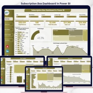
📌 Subscription Box Dashboard in Power BI — Power BI version for subscription-based revenue models.
Browse the full Excel Dashboard Templates library for more SaaS, finance, and operations dashboards.
📖 Click here to read the Detailed Blog Post
🎥 Visit our YouTube channel for step-by-step video tutorials
👉 YouTube.com/@NextGenTemplates
📅 Last updated: May 2026
Watch the step-by-step video tutorial:
YouTube


Reviews
There are no reviews yet.