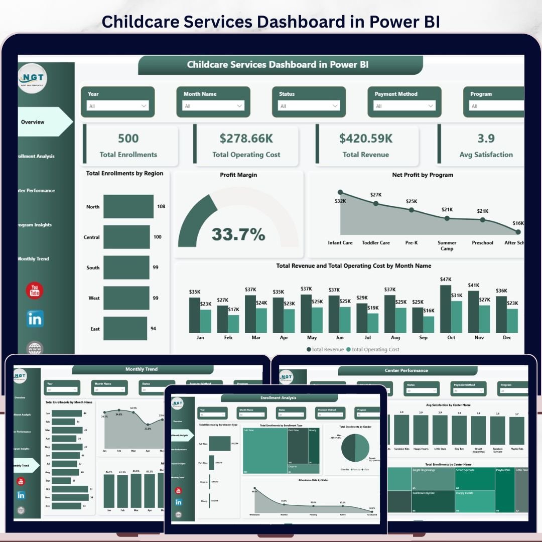


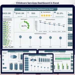
The Childcare Services Dashboard in Power BI tracks 4 KPI cards and 16+ visuals across 5 interactive pages, covering enrollments, revenue, operating cost, satisfaction, and program performance for every center you run. Setup takes under 10 minutes — point Transform Data at your enrollment file, click Refresh, and every visual on every page updates automatically.
🌍 Join 8,400+ teams in 40+ countries using NextGenTemplates to replace paid childcare management SaaS with one-time-purchase Excel, Google Sheets, Power BI, and HTML templates.
✅ Instant download · One-time payment · No subscription · No per-center fees · Lifetime access
🔑 Key Features of the Childcare Services Dashboard in Power BI
- 5 Interactive Power BI Pages – The .pbix file ships with Overview, Enrollment Analysis, Center Performance, Program Insights, and Monthly Trend pages, all wired to a single data model so a refresh on one source updates everything.
- 4 Headline KPI Cards on Overview – Total Enrollments, Total Operating Cost, Total Revenue, and Avg Satisfaction sit at the top of the Overview page and recalculate the instant you point Transform Data at fresh records.
- 16+ Power BI Visuals – Every chart in this Childcare Services Dashboard in Power BI is driven by the data model. Replace 100 rows or 100,000 rows of enrollment data and one click on Refresh updates every visual on every page.
- Multi-Dimension Slicers – Filter by Center Name, Region, Program, Enrollment Type, Gender, Status, and Month using native Power BI slicers and cross-filtering. Click one bar, every other visual reshapes instantly.
- Multi-Center Profitability View – Page 3 compares Total Revenue vs Total Operating Cost by Center Name on a single chart so directors can spot loss-making locations at a glance.
- Free Power BI Desktop Compatible – Opens in Power BI Desktop (free from Microsoft) on Windows. Optionally publish to Power BI Service to share with your team via the web and the Power BI mobile app.
📦 What’s Inside the Childcare Services Dashboard in Power BI
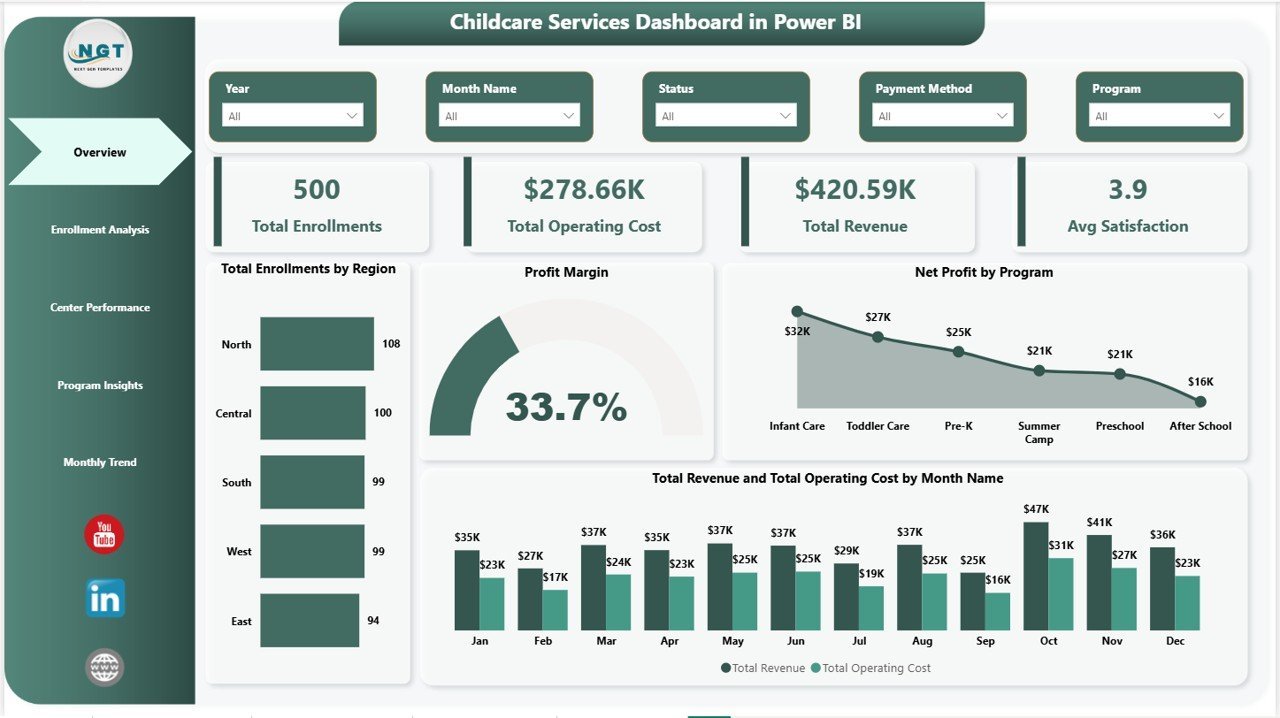
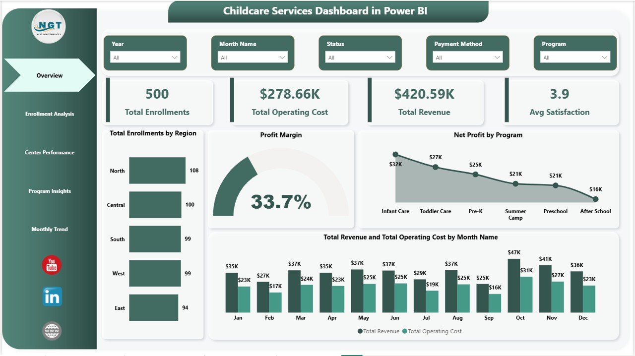
Page 1: Overview
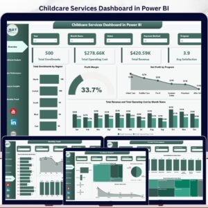
The Overview page is the executive snapshot. At the top, 4 KPI cards show Total Enrollments, Total Operating Cost, Total Revenue, and Avg Satisfaction. Below, four visuals — Total Enrollments by Region, Profit Margin, Net Profit by Program, and Total Revenue and Total Operating Cost by Month Name — give the full operating picture in one screen. Slicers at the top reshape every visual simultaneously, so center directors can filter by region, program, or month in seconds.
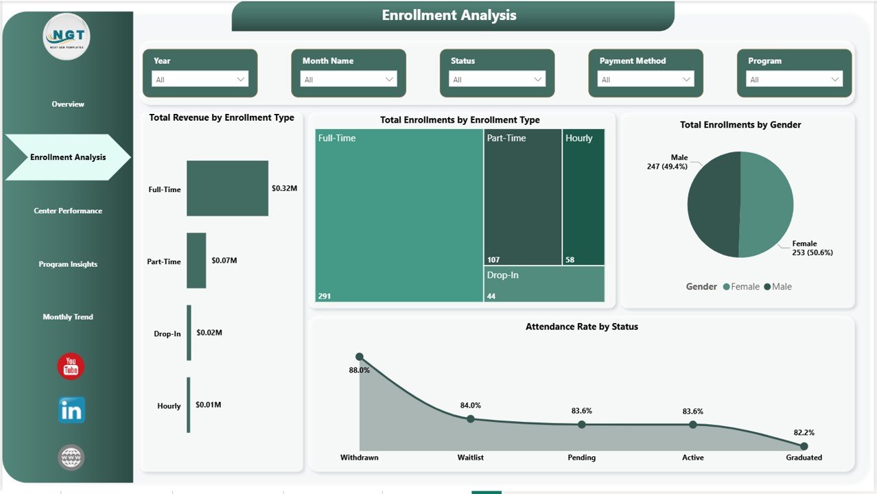
Page 2: Enrollment Analysis
The Enrollment Analysis page answers the question “who’s enrolling, and is it profitable?” Visuals include Total Revenue by Enrollment Type, Total Enrollments by Enrollment Type, Total Enrollments by Gender, and Attendance Rate by Status. This is the page enrollment coordinators open every Monday to see which programs are growing and which are losing momentum.
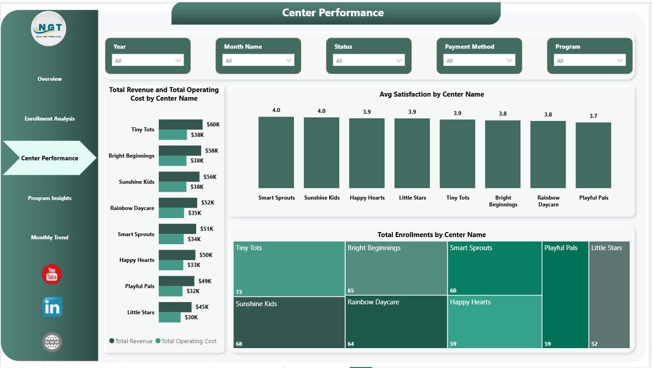
Page 3: Center Performance
The Center Performance page benchmarks every childcare center against the rest of the network. Total Revenue and Total Operating Cost by Center Name shows the P&L picture for each location side by side. Avg Satisfaction by Center Name and Total Enrollments by Center Name complete the picture — one page that tells multi-center owners exactly where to invest, expand, or fix.
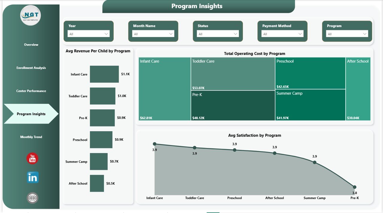
Page 4: Program Insights
Program Insights drills into the program level so coordinators can compare offerings. Visuals include Avg Revenue Per Child by Program, Total Operating Cost by Program, and Avg Satisfaction by Program. This is where program leads decide which offerings to expand, which to reprice, and which to retire — backed by data, not gut feel.
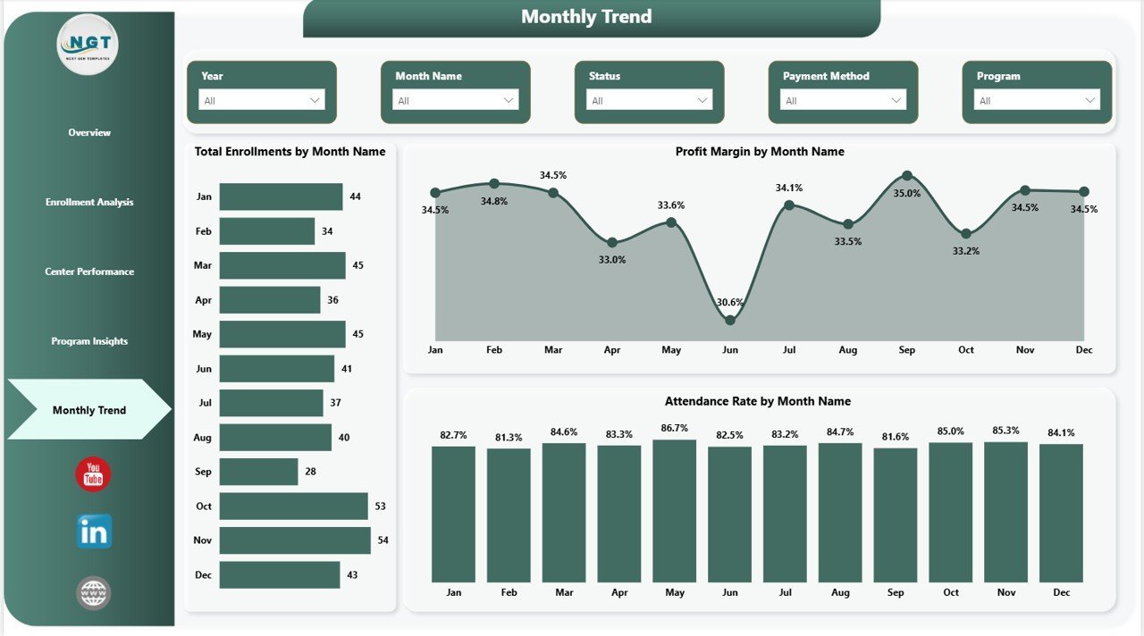
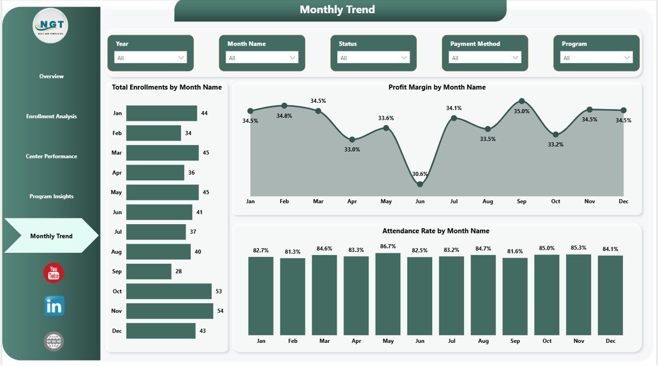
Page 5: Monthly Trend
The Monthly Trend page handles the time-series view. Visuals include Total Enrollments by Month Name, Profit Margin by Month Name, and Attendance Rate by Month Name. Use this page for board reviews, investor updates, and seasonality planning across the academic and fiscal year.
📊 Childcare Services Dashboard in Power BI vs. Tableau/Qlik vs. Paid Childcare SaaS — Where This Fits
| Feature | Childcare Services Dashboard in Power BI | Tableau / Qlik Sense | Brightwheel / Procare SaaS |
|---|---|---|---|
| Cost | $17.99 one-time | $70 / user / month (Tableau Creator) | $99–$300 / center / month |
| Platform | Power BI Desktop (free) | Tableau Desktop or Qlik Sense | Web app + iOS / Android |
| Setup time | Under 10 minutes ✅ | 2–4 hours to rebuild equivalent | 2–6 weeks onboarding |
| Slicer filtering | ✅ Native Power BI slicers | ✅ Native filters | ✅ Built-in filters |
| Multi-center P&L | ✅ Built-in on Page 3 | ✅ Custom build required | ✅ Enterprise tier only |
| Customizable visuals | ✅ Unlimited | ✅ Unlimited | Limited to vendor schema |
| Per-user fees | ✅ Free for desktop use | ❌ $70+ / user / month | ❌ $5–$15 / user / month |
| Year-1 cost at 3 centers | $17.99 | ~$2,520+ | $3,564–$10,800 |
For childcare operators that want full P&L visibility across centers in Power BI without paying a SaaS bill per location, the Childcare Services Dashboard in Power BI sits in the sweet spot.
👥 Who This Template Is For — and Who It’s Not For
✅ This template is built for:
- Childcare and daycare owners running 1–20 centers who already standardize on Power BI for other reporting.
- Preschool and after-school program directors who present monthly KPI reports to a board or parent committee using Power BI.
- Multi-branch operations managers replacing scattered spreadsheets with one connected .pbix file.
- Education consultants delivering a polished Power BI deliverable to client centers without 20 hours of custom build.
❌ This template is NOT for:
- Large national chains needing SOC 2, SSO, integrated billing, and parent-facing mobile apps — use Brightwheel or Procare for those modules.
- Teams that don’t want to install Power BI Desktop and prefer to stay inside Excel — pick the Childcare Services Dashboard in Excel instead.
- Single home-based providers with under 5 children — a simple tracker is enough.
⚙️ How to Use the Childcare Services Dashboard in Power BI
- Download the .zip from your purchase email and extract the .pbix file to your computer.
- Install Power BI Desktop (free from Microsoft) if you don’t already have it, then open the .pbix file.
- Click Transform Data → Data source settings and point the source to your own childcare Excel or CSV. Keep the same column names as the sample.
- Click Refresh in the Home ribbon. Every visual on every page updates automatically.
- Open the Overview page and use the slicers to filter by Center, Region, Program, Enrollment Type, Gender, Status, or Month.
- Navigate between Enrollment Analysis, Center Performance, Program Insights, and Monthly Trend pages for deeper analysis.
- (Optional) Publish to Power BI Service with a Power BI Pro license to share with your team via the web and mobile app.
💼 Real-World Use Cases
Priya runs three childcare centers in Mumbai. She uses the Childcare Services Dashboard in Power BI to track monthly Net Profit by Program, identify which centers have falling Avg Satisfaction, and present quarterly enrollment trends to her parent investors — without paying ₹15,000 per month for a multi-center SaaS subscription. Every month-end she exports the Center Performance page as PDF for the investor update.
David is a program director at a US-based preschool chain. He uses Page 3 (Center Performance) and Page 4 (Program Insights) every month to find centers where Avg Revenue Per Child is below the network average, then sits with regional managers to rework pricing or staffing before the next enrollment cycle — with the .pbix as the shared source of truth.
Aarti is an independent childcare consultant in Bengaluru. She keeps a clean copy of the Childcare Services Dashboard in Power BI as a template, drops each client’s data in via Transform Data, and walks them through their own numbers using slicers. She bills $150 per hour for the engagement and never licenses a separate BI platform.
❓ Frequently Asked Questions
What KPIs does the Childcare Services Dashboard in Power BI track?
The Childcare Services Dashboard in Power BI tracks 4 headline KPIs — Total Enrollments, Total Operating Cost, Total Revenue, and Avg Satisfaction — plus 16+ secondary visuals including Net Profit by Program, Profit Margin by Month Name, Attendance Rate by Status, Avg Revenue Per Child by Program, and Total Enrollments by Center Name. Every visual recalculates the instant you refresh the data.
How long does setup take?
Most owners finish setup in under 10 minutes. Open the .pbix in Power BI Desktop, click Transform Data to point the source to your enrollment Excel or CSV, then click Refresh. Every visual on every page of the Childcare Services Dashboard in Power BI updates together with no manual edits.
Do I need a Power BI Pro license to use this dashboard?
No. Power BI Desktop is free from Microsoft and lets you open, edit, and refresh the Childcare Services Dashboard in Power BI on your own machine. You only need a Power BI Pro license if you want to publish to Power BI Service and share interactive reports with teammates via the web or the Power BI mobile app.
How does this compare to Brightwheel or Procare?
Brightwheel and Procare are full childcare management platforms with billing, attendance check-in, and parent communication, running $99 to $300 per center per month. The Childcare Services Dashboard in Power BI is a $17.99 one-time analytics layer focused on multi-center P&L, enrollment, and satisfaction reporting. Many operators run both side by side.
Can I use this template for multiple childcare centers?
Yes. The sample data already includes a Center column and the dashboard ships with a Center slicer on every page. Add as many centers and regions as you need — the visuals and slicers auto-extend at the next Refresh with no rebuild work.
What’s the difference between the Excel, Google Sheets, and Power BI versions?
The Excel version uses pivot tables and slicers in one .xlsx file. The Google Sheets version runs in the browser for real-time collaboration. The Childcare Services Dashboard in Power BI uses a richer data model and can publish to Power BI Service for web and mobile sharing — best when Power BI is already your team’s standard.
Is there a tutorial video?
Yes — step-by-step walkthroughs for the Childcare Services Dashboard in Power BI and dozens of related Power BI Dashboards are on the PK: An Excel Expert YouTube channel, with 300K+ subscribers across our three channels.
👤 About the Author
Built by PK — Microsoft Certified Professional with 15+ years of Excel, Google Sheets, and Power BI experience. Founder of NextGenTemplates, reaching 300K+ subscribers across YouTube channels (@PK-AnExcelExpert, @NextGenTemplates, @NeoTechNavigators). Every template is hand-built and tested before release.
🔗 Explore Related Templates
- Also available as: Childcare Services Dashboard in Excel — pivot-driven Excel sibling with the same 5 pages.
- Childcare Services KPI Dashboard in Excel — MTD/YTD scorecard alternative focused on KPI vs target.
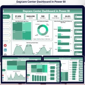
- Daycare Center Dashboard in Power BI — adjacent Power BI dashboard covering meal cost, fees, and parent satisfaction.
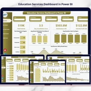
- Education Services Dashboard in Power BI — broader education-services analytics in Power BI.
- Browse the full Power BI Dashboards collection on NextGenTemplates.
📖 Click here to read the Detailed Blog Post
🎥 Visit our YouTube channel for step-by-step video tutorials
👉 YouTube.com/@NextGenTemplates
📅 Last updated: May 2026
Watch the step-by-step video tutorial:
YouTube


Reviews
There are no reviews yet.