


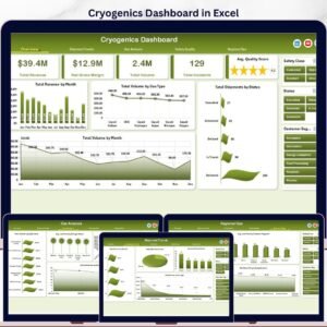
Cryogenics Dashboard in Excel gives cryogenic gas distributors, industrial gas teams, facility managers, and operations analysts a ready-to-use workbook for tracking revenue, gross margin, gas volume, shipment status, safety incidents, compliance, and quality in one place. The dashboard includes 5 analytical pages, 5 top-level KPI cards, 18+ charts, multiple slicers, a structured Data Sheet, and a hidden Support Sheet powered by pivot tables. Join 8,400+ teams in 40+ countries using NextGenTemplates to replace manual reporting and expensive SaaS dashboards with one-time-purchase Excel templates. Instant download, lifetime access, no subscription, and no per-user fees.
Key Features of Cryogenics Dashboard in Excel
- 5 interactive analysis pages: Overview, Shipment Trends, Gas Analysis, Safety Quality, and Regional Ops.
- 5 executive KPI cards: Total Revenue, Net Gross Margin, Total Volume, Total Incidents, and Avg. Quality Score.
- 18+ pre-built charts: Track month trends, gas type mix, shipment status, compliance, technician quality, facility volume, lead time, and region revenue.
- Multiple slicers: Filter the dashboard quickly by relevant dimensions such as month, region, gas type, facility, status, customer segment, and application.
- Pivot-driven Excel architecture: Update the Data Sheet, click Refresh All, and every pivot table and chart refreshes automatically.
- Editable workbook: Customize charts, colors, headings, columns, pivots, and slicers to match your cryogenic operations reporting process.
What’s Inside the Cryogenics Dashboard in Excel
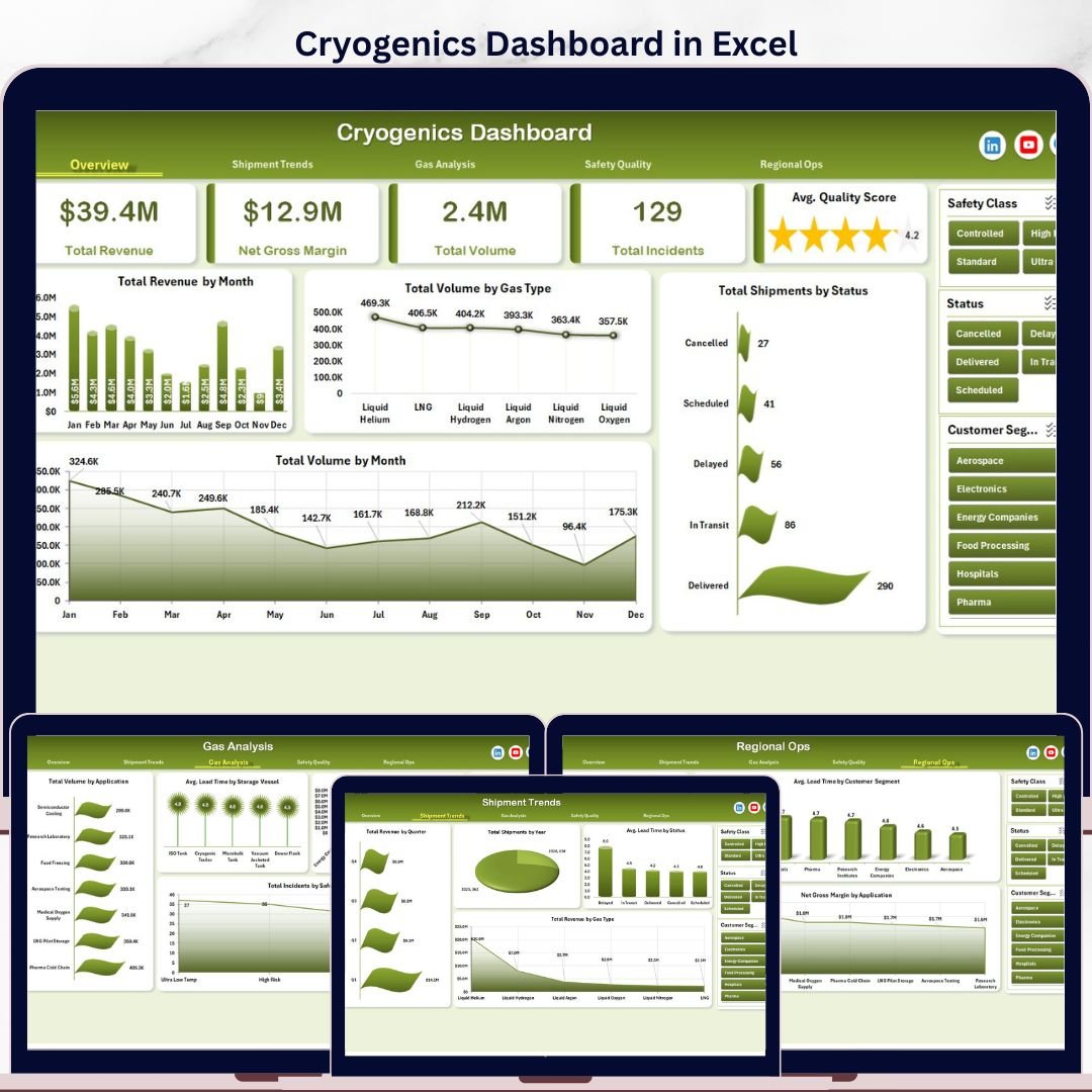
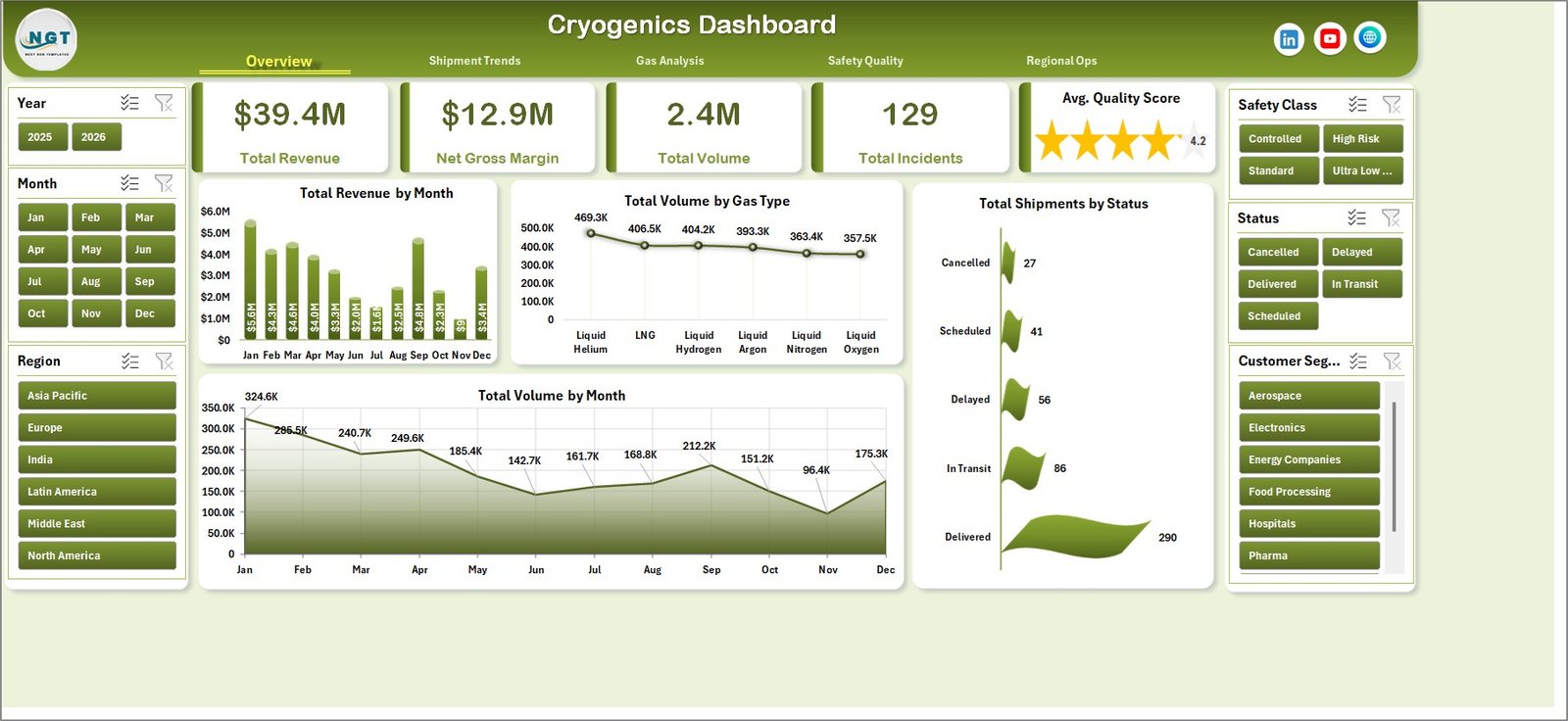
1. Overview Page
The Overview page gives a high-level view of cryogenics performance with cards for Total Revenue, Net Gross Margin, Total Volume, Total Incidents, and Avg. Quality Score. It is built for fast leadership review before moving into shipment, gas, safety, and regional details.
Total Revenue by Month shows how revenue moves across the year. Use it to spot demand peaks, slow periods, and month-over-month performance changes.
Total Volume by Gas Type compares shipped volume across cryogenic gases. This helps teams see whether nitrogen, oxygen, argon, hydrogen, helium, or other gas categories are driving operational load.
Total Shipments by Status breaks shipments into delivery statuses. It helps operations teams identify completed, delayed, pending, or cancelled shipment patterns quickly.
Total Volume by Month tracks monthly gas movement. Use it beside revenue to understand whether value changes are caused by volume shifts or pricing and margin differences.
Cryogenics Dashboard in Excel
2. Shipment Trends
This sheet focuses on shipment performance, timing, and revenue movement. It includes Total Revenue by Quarter, Total Shipments by Year, Avg. Lead Time by Status, and Total Revenue by Gas Type.
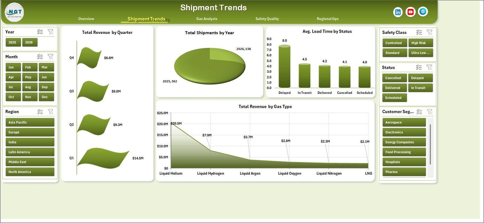
Shipment Trends
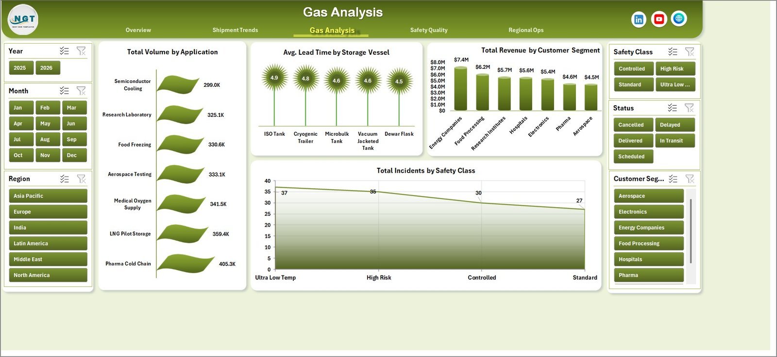
3. Gas Analysis
The Gas Analysis page explains how volume, lead time, revenue, and incident counts change by application, storage vessel, customer segment, and safety class. It is useful for product mix and operational planning.
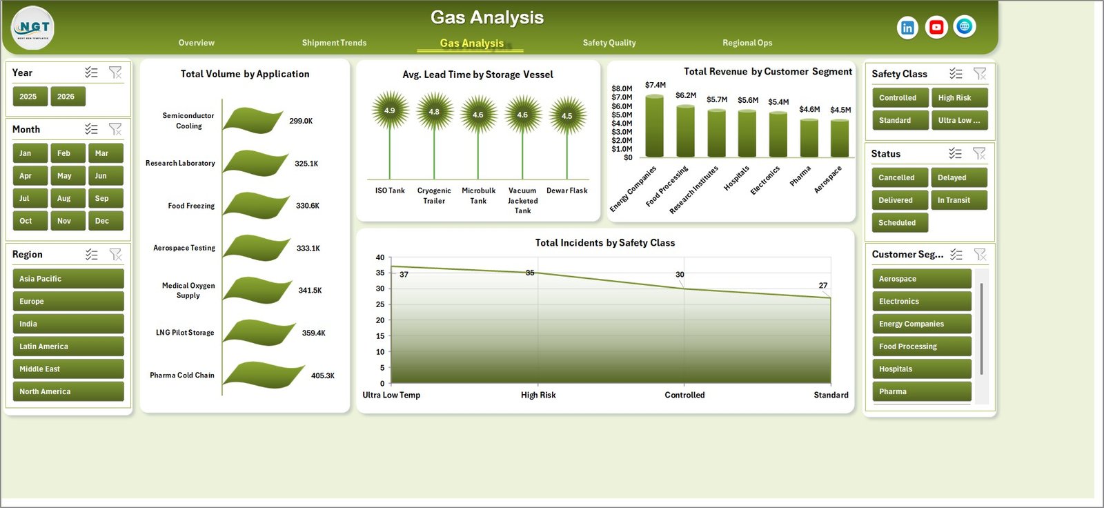
Gas Analysis
4. Safety Quality
The Safety Quality page connects margin, compliance, technician quality, facility pass rate, and regional revenue. Teams can use it to review whether profitable operations are also safe, compliant, and quality controlled.
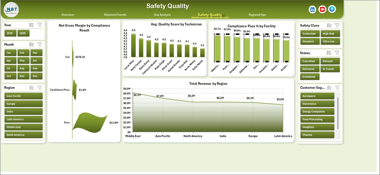
Safety Quality
5. Regional Ops
The Regional Ops page compares facility volume, customer-segment lead time, and gross margin by application. It helps regional managers identify capacity concentration, service delays, and high-margin applications.
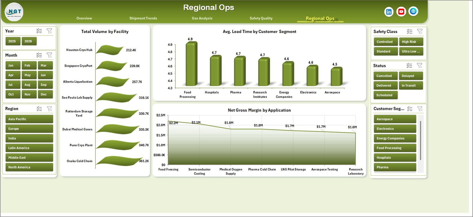
Regional Ops
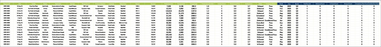
6. Data Sheet Tab
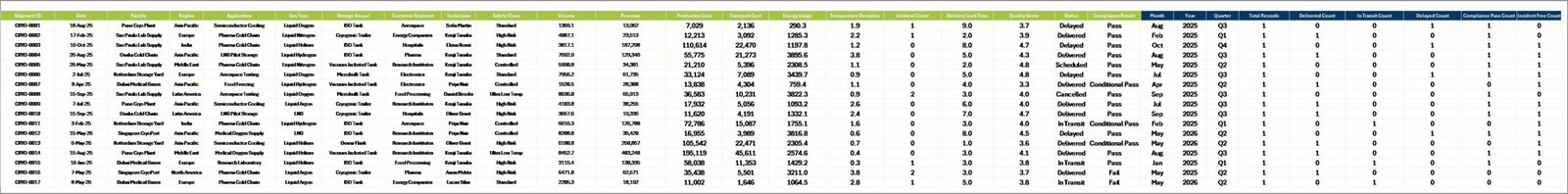
The Data Sheet is where you add or replace the sample data in the same column format. Once the data is updated, refresh the workbook to rebuild the dashboard visuals.
Data Sheet tab
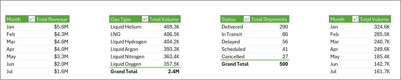
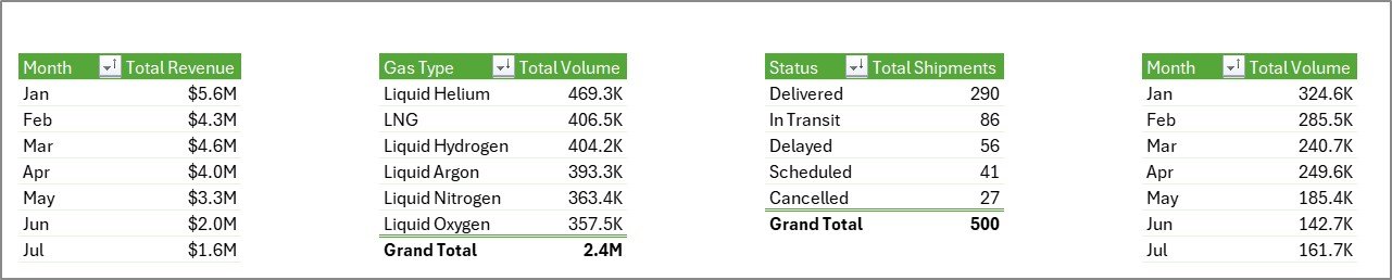
7. Support Sheet
The Support Sheet contains the pivot tables used to create the dashboard dynamically. After updating the Data Sheet, go to the Data tab in the Excel Ribbon and click Refresh All. All pivots and charts refresh together, and you can keep this sheet hidden.
Support sheet tab
Cryogenics Dashboard in Excel vs. Google Sheets vs. Paid Operations SaaS – Where This Fits
| Feature | This Excel Dashboard | Google Sheets Alternative | Paid SaaS Alternative |
|---|---|---|---|
| Cost | $17.99 one-time | Low cost, online dependent | Monthly or annual subscription |
| Platform | Microsoft Excel | Browser-based sheets | Vendor-controlled cloud app |
| Setup time | Update data and refresh | Copy sheet and rebuild formulas | Implementation and configuration |
| Works offline | Yes | Limited | No |
| Customizable fields | Fully editable workbook | Editable sheet | Depends on vendor plan |
| Year-1 cost at 5 users | $17.99 total | Usually low | Often hundreds or thousands of dollars |
Who This Template Is For – and Who It’s Not For
This template is for cryogenic gas distributors, industrial gas suppliers, plant operations teams, logistics coordinators, quality managers, safety teams, and analysts who need repeatable Excel reporting for shipments, gas volume, quality, compliance, revenue, and margin.
It is not a live ERP, telematics, SCADA, or fleet-routing system. If you need sensor-level tank telemetry, automatic dispatch optimization, or real-time driver tracking, use this dashboard as a reporting layer beside those systems.
How to Use the Cryogenics Dashboard in Excel
- Download and unzip the product file.
- Open the workbook in Microsoft Excel.
- Go to the Data Sheet and replace the sample records with your own cryogenics operations data.
- Keep the same column structure for best results.
- Click Data, then Refresh All in the Excel Ribbon.
- Use slicers on each dashboard page to filter by gas type, region, facility, status, customer segment, or time period.
- Keep the Support Sheet hidden when sharing the workbook with end users.
Real-World Use Cases
Ravi, Operations Manager: Ravi reviews Total Shipments by Status and Avg. Lead Time by Status every Monday to spot delayed cryogenic deliveries before customer complaints increase.
Meera, Quality Lead: Meera uses Avg. Quality Score by Technician and Compliance Pass % by Facility to prepare monthly audit follow-ups.
Daniel, Finance Analyst: Daniel compares Total Revenue by Gas Type, Net Gross Margin by Application, and Total Revenue by Region before the quarterly business review.
Frequently Asked Questions
What KPIs are included?
The dashboard includes Total Revenue, Net Gross Margin, Total Volume, Total Incidents, and Avg. Quality Score as top-level KPI cards.
Does this require macros?
No. The workbook is designed around Excel tables, pivot tables, slicers, and charts. You only need to refresh the workbook after updating data.
Can I add my own gas types and facilities?
Yes. Add your own gas types, facility names, regions, customer segments, applications, and shipment statuses in the Data Sheet, then refresh the pivots.
Can I hide the Support Sheet?
Yes. The Support Sheet can be hidden after setup because it only stores the pivot tables powering the charts.
Which Excel version should I use?
Use Microsoft Excel 2016 or later, including Microsoft 365, for the best pivot chart and slicer experience.
Is this a one-time purchase?
Yes. It is a one-time download with no subscription and no per-user fee.
About the Author
Built by PK – Microsoft Certified Professional with 15+ years of Excel, Google Sheets, and Power BI experience. Founder of NextGenTemplates, reaching 300K+ subscribers across YouTube channels. Every template is hand-built and tested before release.
Explore Related Templates
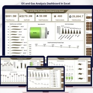
Explore more Excel Dashboard Templates and Manufacturing Excel Templates. Related products include Oil and Gas Analysis Dashboard in Excel, Cement Products Dashboard in Excel, Specialty Chemicals KPI Dashboard in Excel, and Retail Supply Chain KPI Dashboard in Excel.
Ready to monitor cryogenic gas operations in Excel? Download the Cryogenics Dashboard in Excel, update the Data Sheet, refresh the workbook, and start reviewing revenue, volume, shipments, safety, quality, and regional operations today.
🔗 Click here to read the Detailed blog post


Reviews
There are no reviews yet.