

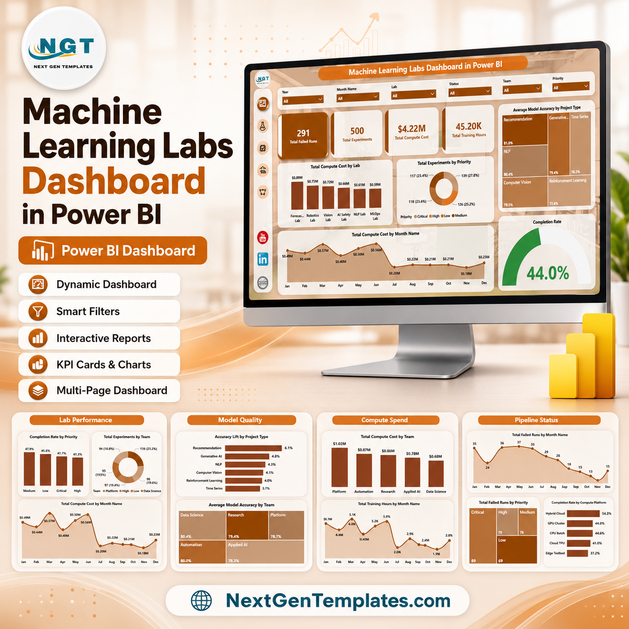
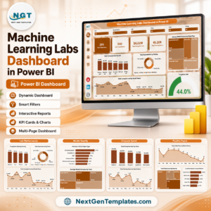
Machine Learning Labs Dashboard in Power BI helps AI lab managers review 5 report pages, 4 executive KPI cards, 16 focused visuals, and slicer-driven analysis for experiments, failed runs, compute cost, training hours, model accuracy, completion rate, labs, teams, priorities, project types, model families, platforms, statuses, and months. Instead of stitching together experiment trackers, cloud billing exports, and status files, this editable PBIX gives research and data science leaders a cleaner reporting layer for a one-time purchase. Built by PK with 15+ years of Excel and Power BI experience and 300K+ subscribers across training channels. Instant ZIP download, no subscription, and a practical file-match review if the delivered file does not match this description.
Key Features of Machine Learning Labs Dashboard in Power BI
- 5 Power BI pages: Overview Page, Lab Performance, Model Quality, Compute Spend, and Pipeline Status.
- 4 high-level cards: Total Failed Runs, Total Experiments, Total Compute Cost, and Total Training Hours.
- 16 analysis visuals: Review compute spend, priority, accuracy, project type, month, completion rate, team, model family, platform, status, training hours, and failed runs.
- Interactive slicers: Apply filters quickly and compare selected labs, priorities, project types, teams, model families, platforms, statuses, and months.
- Power BI-ready layout: Open the PBIX in Power BI Desktop, connect or replace data, refresh, and customize visuals as needed.
- ML operations focus: Built for AI research labs, data science teams, innovation hubs, ML platform owners, and analytics leaders.
What’s Inside the Machine Learning Labs Dashboard in Power BI
1 – Overview Page
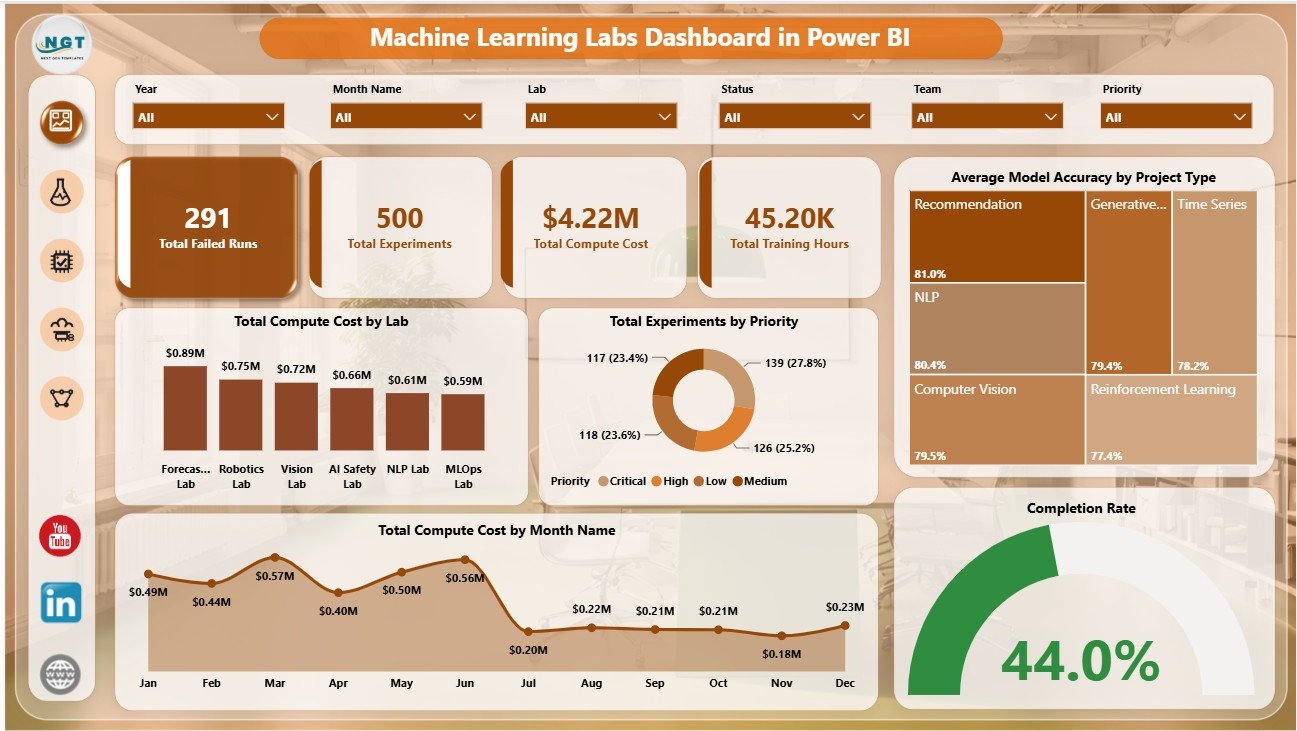
The Overview Page gives leaders a fast read on scale, cost, effort, and execution risk. The top cards show Total Failed Runs, Total Experiments, Total Compute Cost, and Total Training Hours so managers can start with the most important numbers before drilling into the visuals.
Total Compute Cost by Lab: This chart compares infrastructure spend across labs. It helps leaders identify high-cost labs and review whether that cost is aligned with experiment volume and outcomes.
Total Experiments by Priority: This visual shows experiment volume by priority level. It helps teams confirm whether critical work is getting enough focus.
Average Model Accuracy by Project Type: This chart compares model quality across project categories. It helps teams see which project types are producing stronger results.
Total Compute Cost by Month Name: This trend shows how spend changes month by month. It helps spot cost spikes from heavy training cycles or new experiment waves.
Completion Rate by Overall Pipeline: This visual summarizes pipeline completion performance. It helps managers review whether experiments are moving from start to finish reliably.
2 – Lab Performance
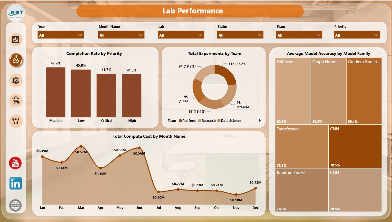
The Lab Performance page compares completion, team workload, model family quality, and monthly spend. It is useful for lab managers who need to understand which teams and priorities are performing well.
Completion Rate by Priority: This chart compares completion rate across priority levels. It helps leaders check whether high-priority work is being completed at the expected pace.
Total Experiments by Team: This visual shows experiment volume by team. It helps identify capacity patterns, workload concentration, and teams that may need support.
Average Model Accuracy by Model Family: This chart compares accuracy by model family. It helps data science leaders see which approaches are delivering stronger predictive quality.
Total Compute Cost by Month Name: This trend tracks compute cost over time. It supports budget reviews and makes recurring cost spikes easier to investigate.
3 – Model Quality
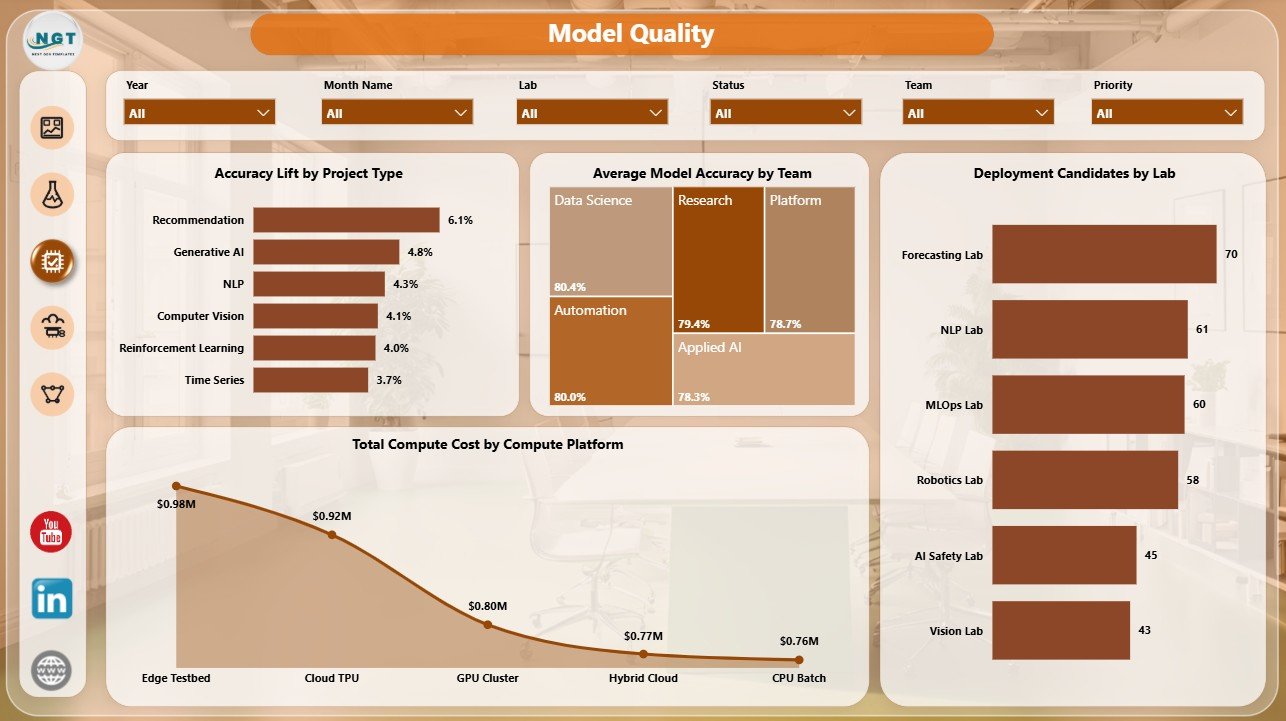
The Model Quality page connects accuracy lift, team performance, deployment candidates, and platform spend. It helps leaders move beyond experiment counts and focus on model outcomes.
Accuracy Lift by Project Type: This chart shows which project categories improved accuracy the most. It helps teams identify where experimentation is creating measurable model gains.
Average Model Accuracy by Team: This visual compares team-level accuracy. It helps managers identify strong modeling practices and teams that may need data, feature, or methodology review.
Deployment Candidates by Lab: This chart shows where deployable models are concentrated. It helps leadership connect lab activity with production-ready outcomes.
Total Compute Cost by Compute Platform: This chart compares spend across platforms. It helps ML platform teams review whether cloud, GPU, CPU, or internal environments are driving cost.
4 – Compute Spend
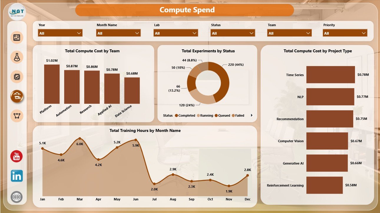
The Compute Spend page is built for finance, ML operations, and platform cost review. It connects spend with teams, project types, experiment status, and training hours.
Total Compute Cost by Team: This chart compares team-level spend. It helps managers review whether team cost is aligned with output and model quality.
Total Experiments by Status: This visual breaks experiments into status groups. It helps leaders see how much work is active, completed, delayed, failed, or waiting.
Total Compute Cost by Project Type: This chart compares infrastructure cost by project category. It helps identify project types that consistently require heavier compute resources.
Total Training Hours by Month Name: This trend shows training workload over time. It helps teams compare training effort against accuracy gains and deployment readiness.
5 – Pipeline Status
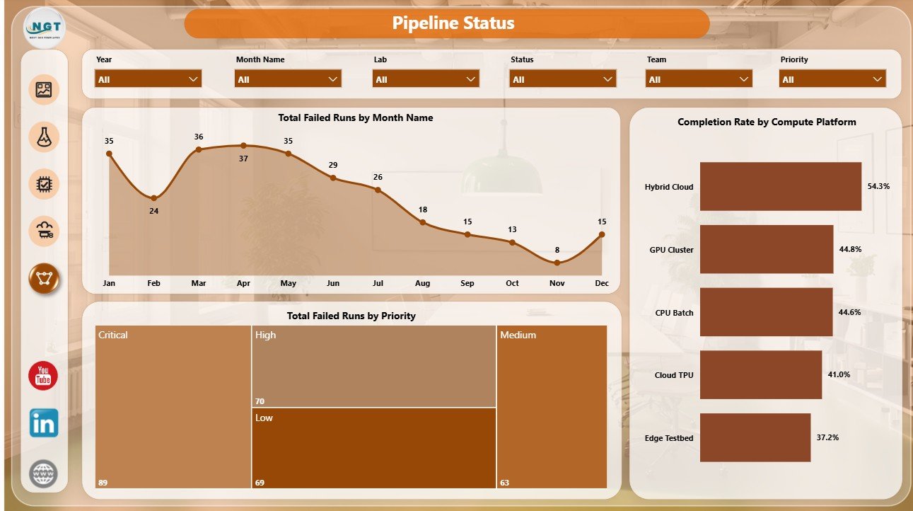
The Pipeline Status page focuses on failed runs and completion health. It helps teams detect risk before failed experiments create delays or waste compute budget.
Total Failed Runs by Month Name: This trend shows whether pipeline failures are rising or falling. It supports monthly engineering reviews and root-cause discussions.
Total Failed Runs by Priority: This chart shows failed runs by priority. It helps leaders see whether urgent work is being blocked by pipeline instability.
Completion Rate by Compute Platform: This visual compares reliability across compute platforms. It helps platform owners identify environments where jobs complete more consistently.
Machine Learning Labs Dashboard in Power BI vs. Tableau vs. Paid ML Ops SaaS – Where This Fits
| Feature | This Power BI dashboard | Tableau or Qlik alternative | Paid ML Ops SaaS |
|---|---|---|---|
| Cost | $17.99 sale price, one-time | License plus report build time | Monthly or annual subscription |
| Platform | Power BI Desktop / Power BI Service | Tableau, Qlik, or another BI platform | Vendor-hosted cloud app |
| Setup time | Open PBIX, replace or connect data, refresh | Build or adapt visuals | Implementation and onboarding |
| Real-time team collaboration | Available through Power BI Service when published | Available with cloud plans | Usually included |
| Mobile access | Available through Power BI mobile after publishing | Plan dependent | Usually included |
| Customizable fields | Editable model, measures, visuals, and pages | Editable with BI skills | Depends on vendor permissions |
| Share with link | Available through Power BI Service | Available with cloud publishing | Login controlled |
| Year-1 cost at 5 users | $17.99 plus any Microsoft licensing | License and build cost dependent | Often hundreds or thousands |
| ML lab pages | Overview, Lab Performance, Model Quality, Compute Spend, Pipeline Status | Must be designed | Depends on module purchased |
Who This Template Is For – and Who It’s Not For
This template is for machine learning lab managers, AI research leads, data science team heads, ML platform teams, analytics leaders, academic research labs, innovation hubs, and consultants who need a ready Power BI reporting layer for experiment and compute tracking.
It is not a live experiment tracker, model registry, CI/CD pipeline, feature store, cloud billing connector, or governance platform. Use it as a reporting dashboard after your ML lab data is available in a structured source.
How to Use the Machine Learning Labs Dashboard in Power BI
- Download and unzip the template package.
- Open the PBIX file in Power BI Desktop.
- Review the sample pages, cards, charts, slicers, and model fields.
- Replace the sample data or connect your prepared ML lab dataset.
- Refresh the report and validate compute cost, training hours, experiments, failed runs, accuracy, and completion rate.
- Use slicers to filter by lab, team, priority, project type, model family, platform, status, and month.
Real-World Use Cases
Anika, ML operations lead: reviews failed runs, compute cost, training hours, and completion rate before the weekly platform meeting.
Rahul, data science manager: compares accuracy by team, model family, and project type before assigning coaching or data review work.
Maria, research director: checks monthly spend, deployment candidates, and priority completion before approving the next compute budget.
Frequently Asked Questions
What software do I need?
You need Power BI Desktop to open, edit, refresh, and customize the PBIX file.
How many pages are included?
The report includes 5 pages: Overview Page, Lab Performance, Model Quality, Compute Spend, and Pipeline Status.
Can I customize this dashboard?
Yes. You can edit visuals, slicers, colors, fields, measures, page names, and model logic in Power BI Desktop.
Does this connect live to cloud ML platforms?
No live connector is included. You can replace the sample data or connect your own structured source in Power BI.
Is this suitable for academic research labs?
Yes. It can be used by academic labs, enterprise AI teams, consulting groups, and innovation units that track structured experiment data.
Does it replace ML Ops software?
No. It is a reporting dashboard, not an experiment tracking, deployment, governance, or model registry system.
About the Author
Built by PK – Microsoft Certified Professional with 15+ years of Excel, Google Sheets, and Power BI experience. Founder of NextGenTemplates, reaching 300K+ subscribers across YouTube channels. Every template is hand-built and tested before release.
Explore Related Templates
- Machine Learning Labs Dashboard in Excel – Excel version for ML lab analysis.
- Machine Learning Labs KPI Dashboard in Power BI – KPI-focused ML lab tracking.
- AI Art Studios Dashboard in Excel – creative AI operations reporting.
- Browse Power BI templates.
- Browse Power BI dashboard templates.
Read the detailed blog post for Machine Learning Labs Dashboard in Power BI.
Download the Machine Learning Labs Dashboard in Power BI and start reviewing experiments, model quality, compute spend, and pipeline health in one editable PBIX report.
Last updated: July 6, 2026.












Reviews
There are no reviews yet.