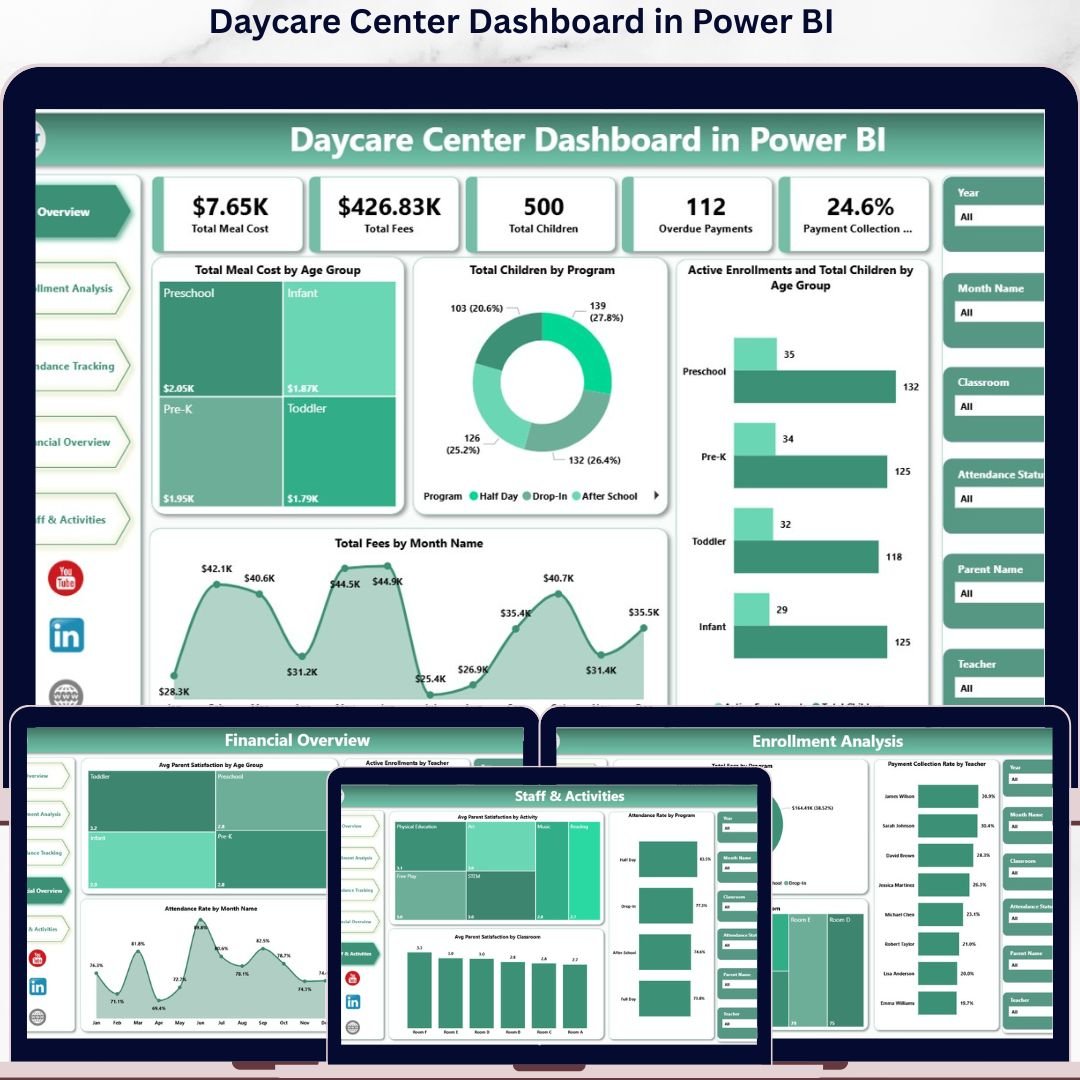
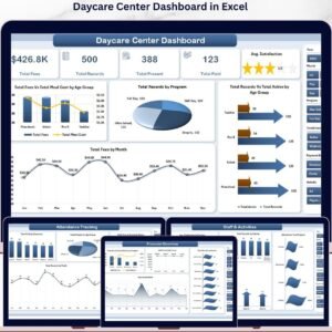
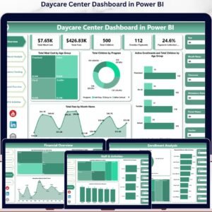
The Daycare Center Dashboard in Power BI tracks 5 high-level KPI cards across 5 interactive Power BI pages, with 16+ pre-built pivot-driven visuals and slicer-based filtering. Setup takes under 10 minutes — point the data source at your daycare records in Excel or CSV, click Refresh, and every visual, KPI card, and slicer updates automatically.
🌍 Join 8,400+ teams in 40+ countries using NextGenTemplates to replace paid SaaS tools with one-time-purchase Excel, Google Sheets, Power BI, and HTML templates.
✅ Instant download · One-time payment · No subscription · No per-user fees · Lifetime access
Whether you run a single childcare center or a multi-branch daycare network, the Daycare Center Dashboard in Power BI gives you operational and financial visibility in a single .pbix file — from enrollment planning and fee collection to teacher workload and parent satisfaction. 📊👶
🔑 Key Features of the Daycare Center Dashboard in Power BI
📊 5 Interactive Power BI Pages — Overview, Enrollment Analysis, Attendance Tracking, Financial Overview, and Staff & Activities — each purpose-built for a specific management view inside one .pbix file.
🎯 5 High-Level KPI Cards — Track Total Meal Cost, Total Fees, Total Children, Overdue Payments, and Payment Collection % at a glance on the Overview page so owners and managers see the center’s health in 10 seconds.
📈 16+ Pre-Built Power BI Visuals — Every chart is driven by the underlying Power BI data model, so changing the source file refreshes every visual on every page in one click — no manual chart edits required.
🧭 Multiple Slicers — Filter the Overview page by age group, program, classroom, payment status, or month with a single click. Every visual and KPI card responds instantly thanks to Power BI’s native cross-filtering.
📋 Connect to Your Own Data — Replace the sample Excel data source with your daycare records using Power BI’s Transform Data window. The data model stays bound to the same column structure, so visuals continue working without rebuild.
🔒 One-Time Purchase — No monthly fees, no per-user pricing, no subscription. You own the .pbix file forever and can use it across unlimited workstations and centers.
📦 What’s Inside the Daycare Center Dashboard in Power BI
This Power BI template is organized into five purpose-built report pages that cover every angle of daycare operations:
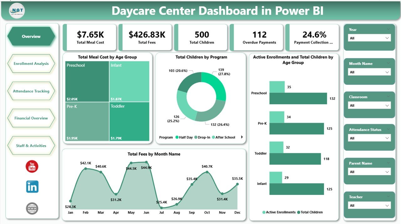
Page 1: Overview Page
The executive summary. Five KPI cards across the top — Total Meal Cost, Total Fees, Total Children, Overdue Payments, and Payment Collection % — give an instant read on the center’s financial and operational health. Below the cards, four visuals show high-level performance: Total Meal Cost by Age Group (meal expense by toddler/preschool/pre-K cohort), Total Children by Program (enrollment distribution across programs), Active Enrollments and Total Children by Age Group (active vs total enrolled comparison), and Total Fees by Month Name (revenue trend over the year). Slicers at the top filter the entire page in one click.
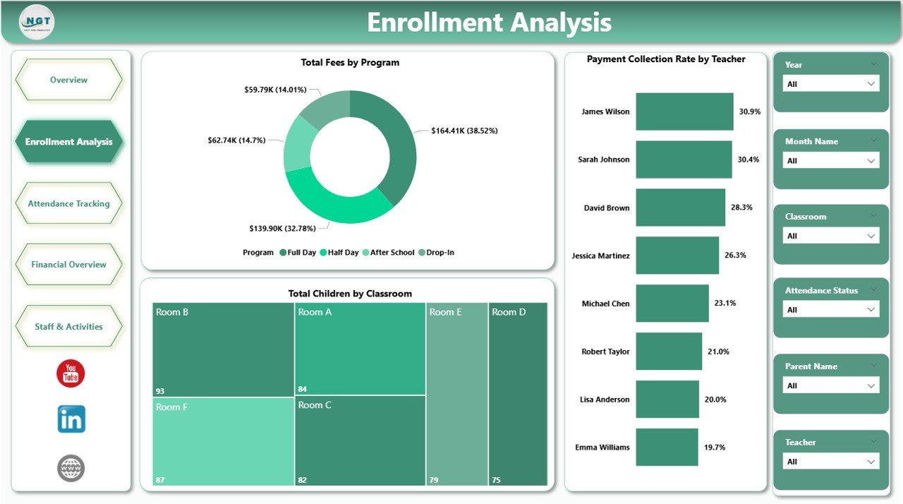
Page 2: Enrollment Analysis
The enrollment growth view. Visuals include Total Fees by Program (revenue contribution of each program), Total Children by Classroom (capacity utilization per classroom), and Payment Collection Rate by Teacher (collection performance against teacher portfolio). Use this page to see which programs are filling up, which classrooms are under-loaded, and which teachers consistently collect on time.
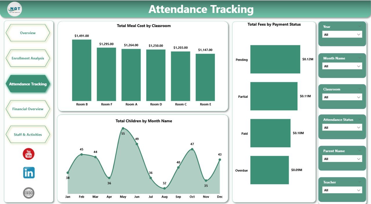
Page 3: Attendance Tracking
The day-to-day operations view. Visuals include Total Meal Cost by Classroom (meal spend at the classroom level), Total Children by Month Name (enrollment seasonality), and Total Fees by Payment Status (paid, pending, overdue split). Quickly spot meal cost overruns, monthly enrollment dips, and payment delays before they affect cash flow.
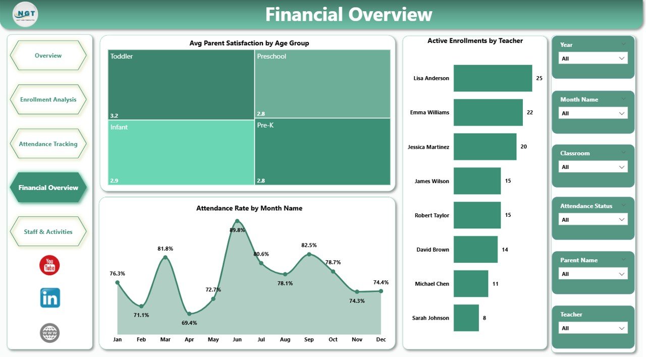
Page 4: Financial Overview
The blended money-and-experience view. Visuals include Avg Parent Satisfaction by Age Group (satisfaction by cohort), Attendance Rate by Month Name (engagement seasonality), and Active Enrollments by Teacher (workload concentration across staff). This page connects financial signals to parent experience so leadership can act before satisfaction issues turn into withdrawals.
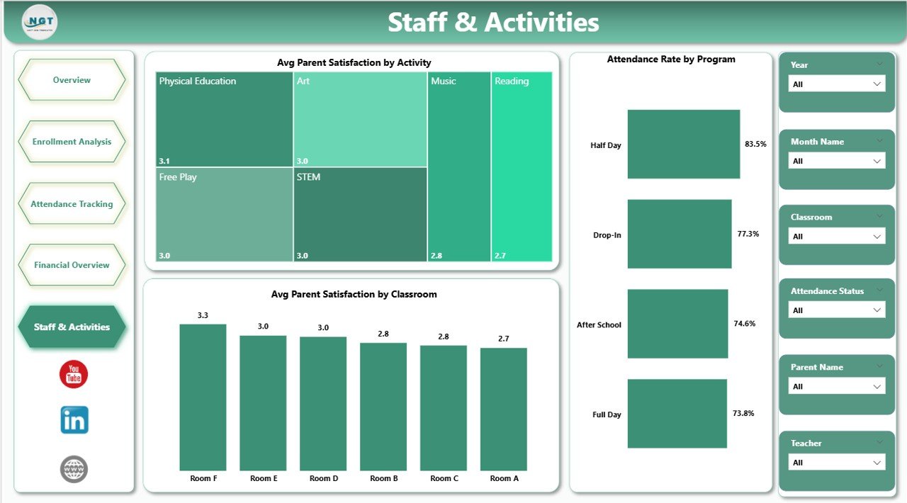
Page 5: Staff and Activities
The team and curriculum view. Visuals include Avg Parent Satisfaction by Activity (which activities parents value most), Avg Parent Satisfaction by Classroom (room-level parent feedback), and Attendance Rate by Program (engagement by program). Use this page during quarterly staff reviews and curriculum planning sessions.
📊 Daycare Center Dashboard in Power BI vs. Tableau / Qlik vs. Paid Daycare SaaS — Where This Fits
| Feature | Daycare Center Dashboard in Power BI | Tableau / Qlik Sense | Paid Daycare SaaS (Procare / brightwheel / HiMama) |
|---|---|---|---|
| Cost | $17.99 one-time | $70 / user / month (Tableau Creator) | $59-149 / center / month |
| Platform | Power BI Desktop (free) | Tableau Desktop or Qlik Sense | Web + mobile app |
| Setup time | Under 10 minutes | 2-4 hours to rebuild equivalent | 2-4 weeks onboarding |
| Slicer filtering | ✅ Native Power BI slicers | ✅ Native filters | ✅ Built-in filters |
| Mobile view | ✅ Power BI mobile app (with Pro) | ✅ Tableau Mobile | ✅ Native mobile app |
| Multi-branch view | ✅ Add Location column | ✅ Custom build required | ✅ Native multi-site |
| Per-user fees | ✅ Free for desktop use | ❌ $70+ / user / month | ❌ $5-15 / user / month |
| Year-1 cost at 5 users | $17.99 total | ~$4,200 total | ~$3,540 – $8,940 |
| Cloud sharing (optional) | ✅ Publish to Power BI Service | ✅ Tableau Cloud | ✅ Built-in |
For daycare owners who want operational, financial, and staff visibility without paying $59-149 / center / month, the Daycare Center Dashboard in Power BI sits in the sweet spot.
👥 Who This Template Is For — and Who It’s Not For
✅ This template is built for:
- Daycare center owners running 1-5 locations who want one .pbix file as their operating dashboard
- Childcare and preschool managers tracking enrollment, attendance, fees, and parent satisfaction in Power BI
- Franchise operators and multi-branch directors who already standardize on Power BI for other reporting
- Education consultants who need a ready-made Power BI dashboard to hand to client centers
- Finance and admin teams at small-to-mid daycare networks that prefer Power BI over Excel for sharing
❌ This template is NOT for:
- Large daycare chains (50+ centers) that need SOC 2, SSO, and centralized parent-billing — they should use Procare or brightwheel
- Teams that don’t want to install Power BI Desktop and prefer to stay inside Excel — pick the Excel version instead
- Centers that need real-time parent messaging, photo sharing, and check-in/check-out — Power BI is reporting, not a parent app
⚙️ How to Use the Daycare Center Dashboard in Power BI
1️⃣ Download the .zip from your purchase email and extract the .pbix file to your computer.
2️⃣ Install Power BI Desktop (free from Microsoft) if you don’t already have it, then open the .pbix file.
3️⃣ Click Transform Data → Data source settings and point the source to your own daycare Excel/CSV. Keep the same column names as the sample.
4️⃣ Click Refresh in the Home ribbon. Every visual on every page updates automatically.
5️⃣ Open the Overview Page and use the slicers to filter by age group, program, classroom, payment status, or month.
6️⃣ Navigate between Enrollment, Attendance, Financial, and Staff pages for deeper analysis on each topic.
7️⃣ (Optional) Publish to Power BI Service with a Power BI Pro license to share with your team via the web and mobile app.
💼 Real-World Use Cases
Aisha owns a 35-child daycare in Pune. She uses the Daycare Center Dashboard in Power BI to track monthly fees collected against meal costs by age group, identify which classrooms have the highest payment collection rates, and present quarterly enrollment trends to her parent investors — without paying ₹6,000 per month for a daycare SaaS subscription.
Marcus runs a 3-branch childcare network in Atlanta. He added a Location column to the source data and now uses Power BI slicers to switch between branches. Every Monday his admin team refreshes the data, publishes to Power BI Service, and the leadership team reviews the Financial Overview page on mobile before the weekly ops call.
Priya is an education consultant. She delivers the Daycare Center Dashboard in Power BI to four small daycare clients during onboarding and saves about 20 hours of custom Power BI build work per engagement. The Childcare Services KPI Dashboard in Excel sits alongside it for MTD/YTD scorecards.
❓ Frequently Asked Questions
What KPIs does the Daycare Center Dashboard in Power BI track?
The Daycare Center Dashboard in Power BI tracks five headline KPI cards — Total Meal Cost, Total Fees, Total Children, Overdue Payments, and Payment Collection % — alongside 16+ visuals covering meal cost by age group, fees by program, enrollment by classroom, payment collection rate by teacher, and parent satisfaction by activity.
How does this compare to paid daycare SaaS like Procare or brightwheel?
The Daycare Center Dashboard in Power BI is a one-time-purchase analytics report — Procare and brightwheel are full-service daycare platforms with billing, parent apps, and check-in. At $17.99 vs $59-149 per month, the cost gap is significant. Many centers run this dashboard alongside a SaaS for reporting investors and accountants can consume without a SaaS login.
Do I need a Power BI Pro license to use this dashboard?
No. Power BI Desktop is free from Microsoft and lets you open, edit, and refresh the Daycare Center Dashboard in Power BI on your own machine. You only need a Power BI Pro license if you want to publish to Power BI Service and share interactive reports with teammates via the web or mobile app.
How long does setup take?
Setup of the Daycare Center Dashboard in Power BI takes under 10 minutes. Open the .pbix file in Power BI Desktop, click Transform Data to point the source to your daycare Excel or CSV, click Refresh, and every visual and KPI card on the five pages updates automatically.
Can I use this template for multiple daycare locations?
Yes. Add a Location column to your source data, drop in records for each branch, then drag Location onto a slicer on the Overview page. You can also save a separate copy of the .pbix file per branch if you prefer fully isolated dashboards.
What is the difference between the Excel and Power BI versions of this daycare dashboard?
The Excel version of the Daycare Center Dashboard uses pivot tables, slicers, and Refresh All inside one .xlsx file — best for teams that already live in Excel. The Power BI version uses the same KPI structure but runs on Power BI Desktop, supports a richer data model, and can publish to Power BI Service for web/mobile sharing.
Is this a one-time purchase or a subscription?
The Daycare Center Dashboard in Power BI is a one-time purchase with lifetime access — no subscription, no per-user fees, no renewal. You can use the .pbix file across unlimited workstations and centers.
👤 About the Author
Built by PK — Microsoft Certified Professional with 15+ years of Excel, Google Sheets, and Power BI experience. Founder of NextGenTemplates, reaching 300K+ subscribers across YouTube channels (@PK-AnExcelExpert, @NextGenTemplates, @NeoTechNavigators). Every template is hand-built and tested before release.
🔗 Explore Related Templates
📌 Daycare Center Dashboard in Excel — Pivot-driven Excel version of this dashboard for teams that prefer Microsoft Excel and offline access.
📌 Childcare Services KPI Dashboard in Excel — MTD/YTD KPI scorecard companion for senior-level performance monitoring.
📌 School Admin Dashboard in Power BI — Adjacent Power BI dashboard for school admin teams in the same education vertical.
📌 Browse all Power BI Dashboard Templates and our wider Dashboard Templates collection.
Also available as: Excel version — pick the platform your team already uses.
📖 Click here to read the Detailed Blog Post
🎥 Visit our YouTube channel for step-by-step video tutorials
👉 YouTube.com/@NextGenTemplates


Reviews
There are no reviews yet.