

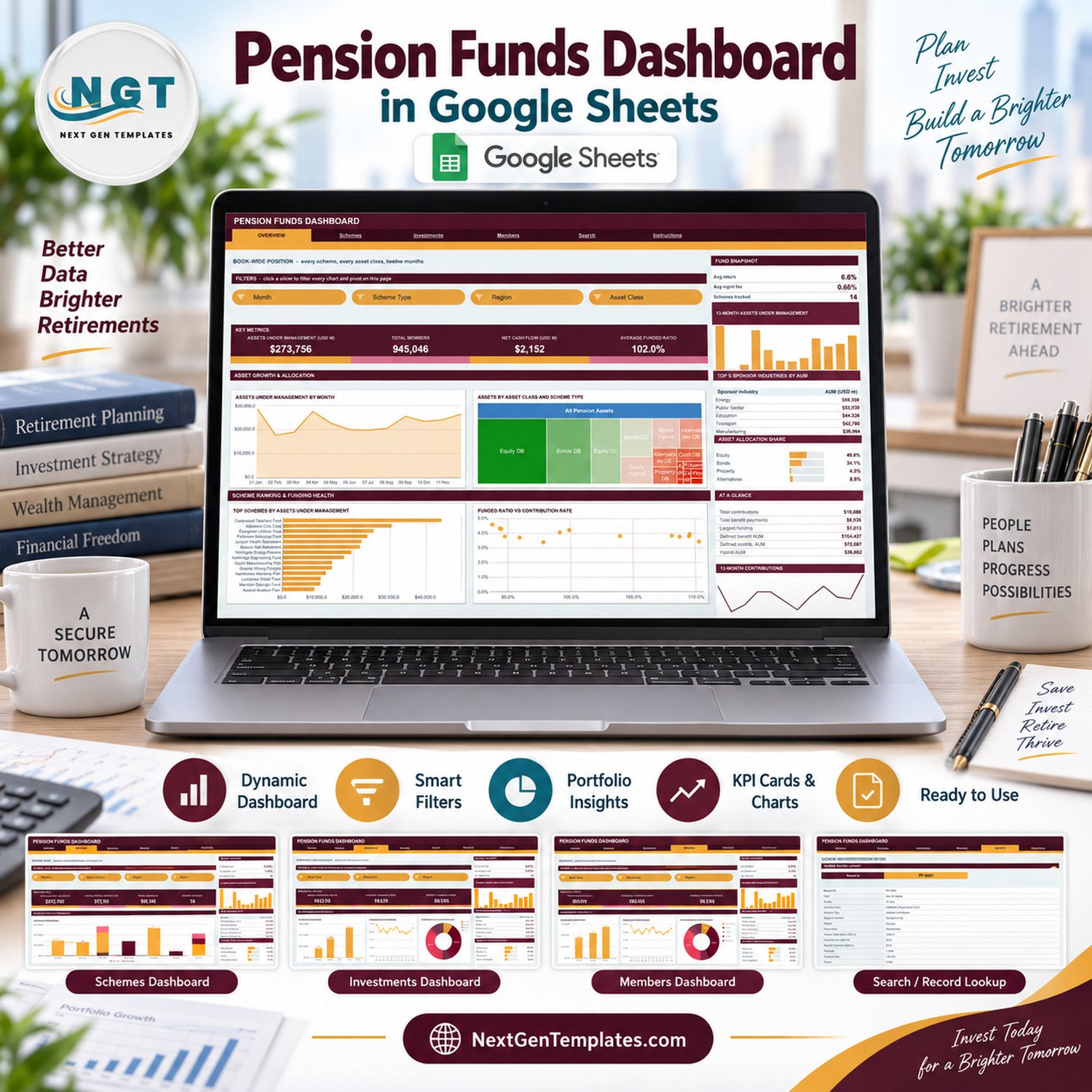
The Pension Funds Dashboard in Google Sheets turns a log of pension scheme records into a six-page report: 500 sample records, 16 KPI cards, 18 charts and 15 slicers, all driven by native Google Sheets pivot tables. The sample book covers 14 fictional schemes, 3 scheme types (Defined Benefit, Defined Contribution and Hybrid), 8 sponsor industries, 6 regions, 5 asset classes and 8 trustee firms across twelve months, and every pivot already reads 1,000 data rows. Make your copy, paste your own scheme records over the sample rows and the charts redraw themselves.
🌍 Join 8,400+ teams in 40+ countries using NextGenTemplates to replace paid SaaS tools with one-time-purchase Excel, Google Sheets, Power BI and HTML templates.
✅ Instant download · One-time payment · No subscription · No per-user fees · Lifetime access
🔑 Key Features of the Pension Funds Dashboard in Google Sheets
🔹 Four KPI cards on each analysis page. Overview reads Assets Under Management (USD M) $273,756, Total Members 945,046, Net Cash Flow (USD M) $2,152 and Average Funded Ratio 102.0% in the sample. Schemes, Investments and Members each carry their own four cards, sixteen in all.
🔹 Scheme, portfolio and membership views in one file. Assets are cut by scheme type, sponsor industry, region, asset class, trustee and month; members by region, scheme type and month; contributions and benefit payments by asset class, region and month.
🔹 Fifteen slicers in an orange FILTERS strip. Overview filters by Month, Scheme Type, Region and Asset Class; Schemes by Scheme Type, Sponsor Industry and Region; Investments by Asset Class, Scheme Type, Month and Region; Members by Region, Scheme Type, Trustee and Month.
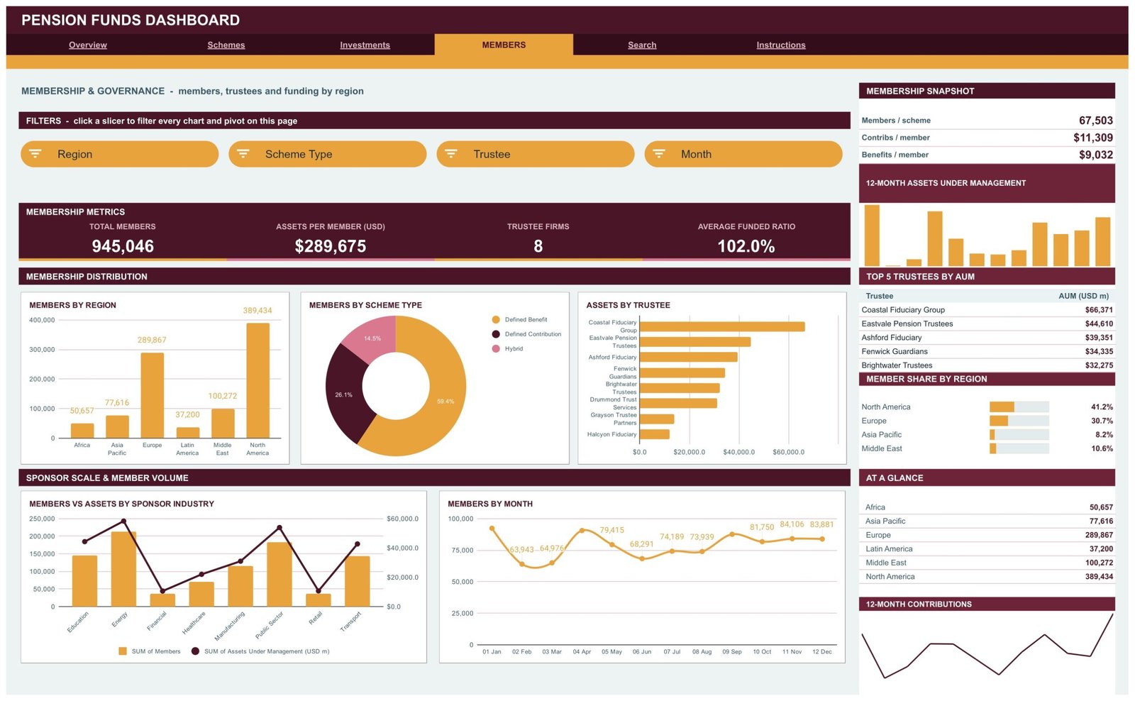
🔹 A sidebar on every analysis page. A snapshot box, a 12-Month Assets Under Management column chart, a Top 5 table, a share-bar panel, an AT A GLANCE list and a 12-Month Contributions trend line sit to the right of the charts.
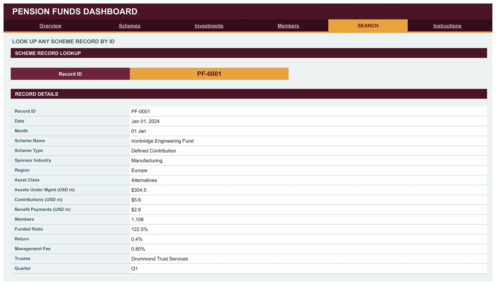
🔹 A scheme record Search page. Pick a Record ID such as PF-0001 and read the full record: date, scheme, type, sponsor industry, region, asset class, AUM, contributions, benefit payments, members, funded ratio, return, fee, trustee and quarter.
🧾 What This Template Does, and What It Deliberately Does Not Do
This is a reporting template for pension scheme data you already hold. It summarises assets, members, cash flows, funded ratios, returns and fees. It is not pension administration, member recordkeeping or actuarial valuation software, it calculates no liabilities, and it gives no investment, actuarial, fiduciary or retirement advice. It makes no regulatory or compliance claim under ERISA, The Pensions Regulator, IRDAI, PFRDA or any other regime, and it promises no returns. Every scheme, trustee and figure in the sample (Cedarwood Teachers Fund, Coastal Fiduciary Group and so on) is fictional.
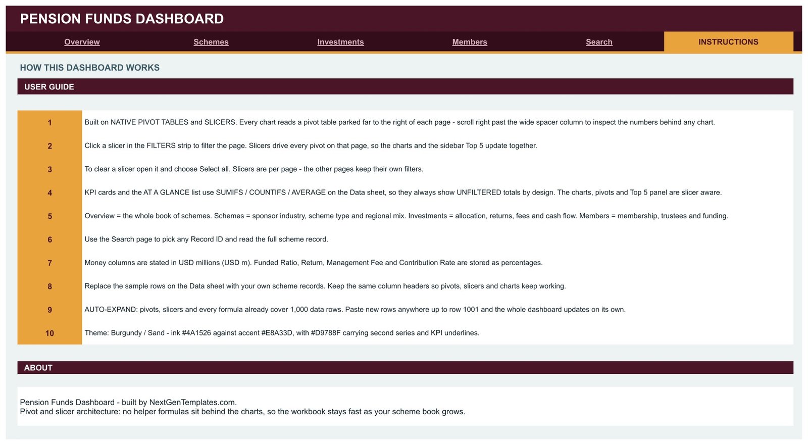
Two design choices to know before you buy: the KPI cards and AT A GLANCE lists use SUMIFS, COUNTIFS and AVERAGE on the Data sheet, so they always show unfiltered totals, while the charts, pivots and Top 5 tables follow the slicers. And because assets are stored per record across twelve months, the AUM card adds every record rather than showing a single month-end balance; use the Month slicer on the charts for a one-month view.
📦 What’s Inside the Pension Funds Dashboard
Page 1: Overview, the book-wide position
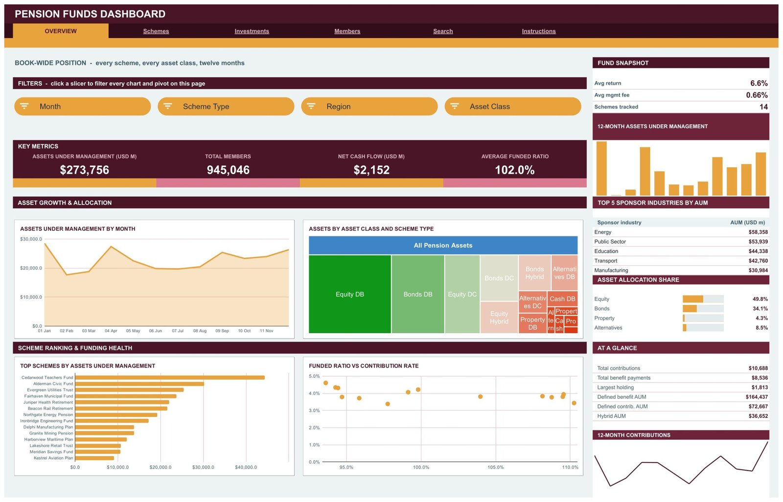
Overview shows the four headline cards, Assets Under Management by Month, Assets by Asset Class and Scheme Type (Equity DB is the largest block), Top Schemes by Assets Under Management across all 14 schemes and Funded Ratio vs Contribution Rate. The sidebar lists average return 6.6%, average management fee 0.66%, the Top 5 Sponsor Industries by AUM (Energy leads at $58,358M) and Asset Allocation Share.
Page 2: Schemes, sponsor industry, scheme type and regional mix
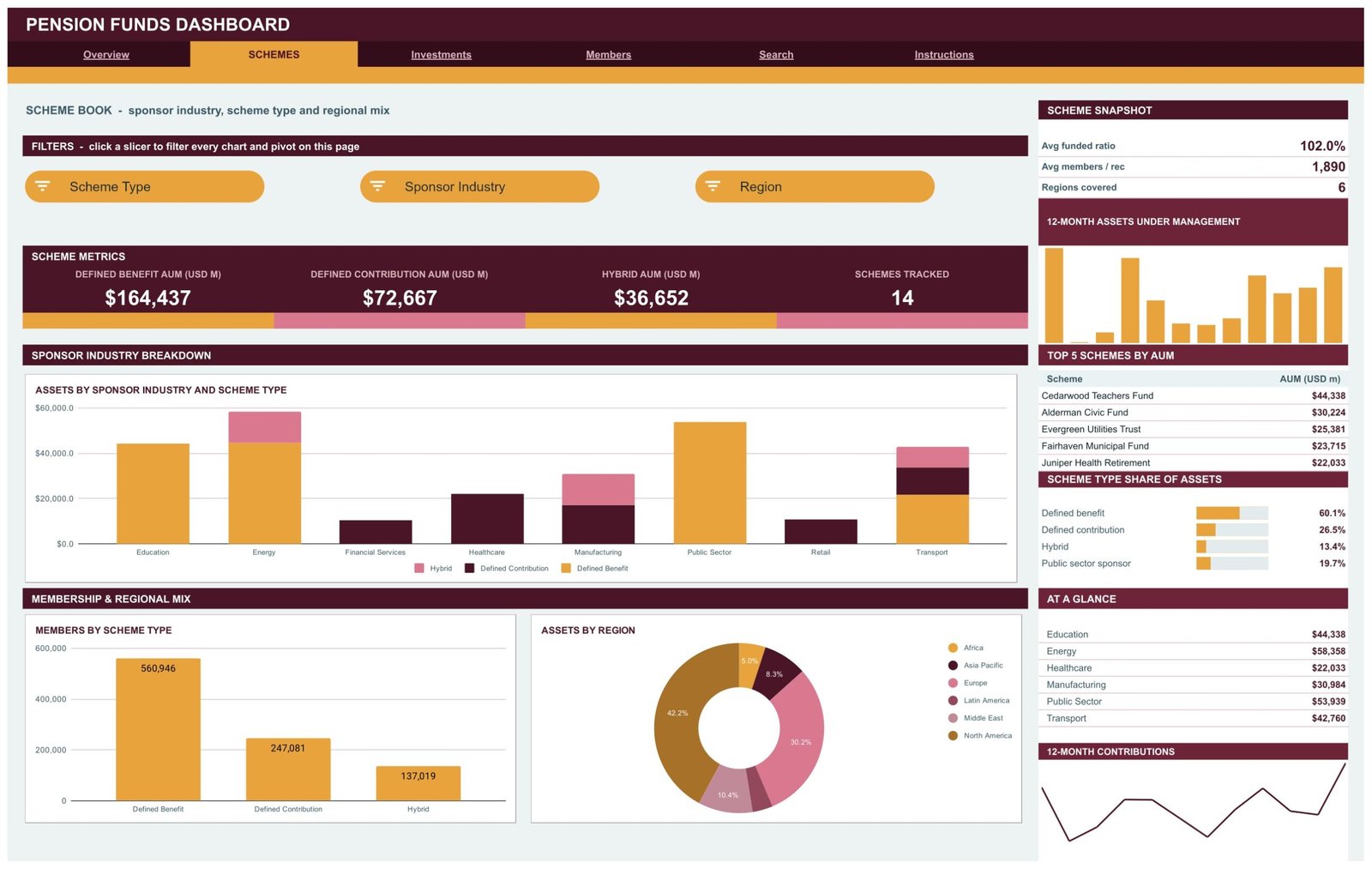
Schemes splits assets into Defined Benefit AUM $164,437M, Defined Contribution AUM $72,667M and Hybrid AUM $36,652M. Charts include Assets by Sponsor Industry and Scheme Type, Members by Scheme Type and Assets by Region, with a Top 5 Schemes by AUM table headed by Cedarwood Teachers Fund at $44,338M.
Page 3: Investments, allocation, returns, fees and cash flow
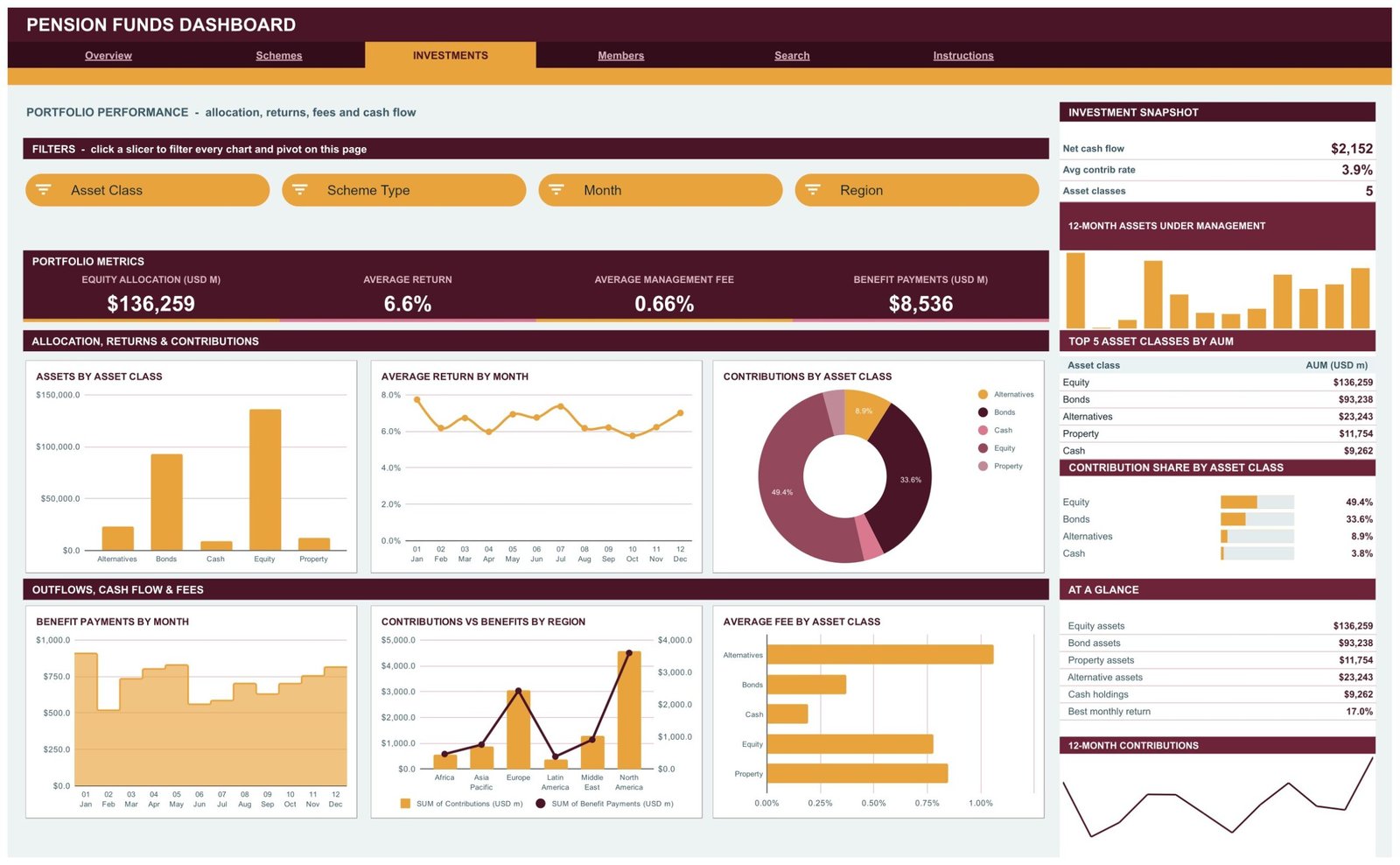
Investments carries Equity Allocation $136,259M, Average Return 6.6%, Average Management Fee 0.66% and Benefit Payments $8,536M. Six charts cover Assets by Asset Class, Average Return by Month, Contributions by Asset Class, Benefit Payments by Month, Contributions vs Benefits by Region and Average Fee by Asset Class.
Page 4: Members, membership and trustees
Members shows Total Members 945,046, Assets per Member $289,675, 8 Trustee Firms and Average Funded Ratio 102.0%. Charts include Members by Region (North America 389,434), Members by Scheme Type, Assets by Trustee, Members vs Assets by Sponsor Industry and Members by Month, plus a Top 5 Trustees by AUM table.
Page 5: Search, look up any scheme record by ID
Search pulls one record straight from the Data sheet. Choose a Record ID and the 17 fields fill in, from date and scheme name to funded ratio, return, management fee, trustee and quarter.
Page 6: Instructions, the user guide inside the file
Ten numbered notes explain the pivot and slicer design, how to clear a slicer, why the cards stay unfiltered, what each page covers, the USD millions convention, how to replace the sample rows and the 1,000-row auto-expand range.
📊 Google Sheets Dashboard vs. an Excel Dashboard vs. a Paid BI Suite, Where This Fits
| Feature | This Google Sheets dashboard | Microsoft Excel dashboard | Power BI Pro / Tableau Creator |
|---|---|---|---|
| Cost | $9.99 one-time ✅ | $17.99 one-time + Microsoft 365 | $14-75 / user / month |
| Platform | Google Sheets, browser only ✅ | Desktop Excel | Desktop authoring + service |
| Setup time | Under 10 minutes ✅ | Under 15 minutes | Days: model, publish, licence |
| Real-time team collaboration | Built in ✅ | Only via OneDrive co-authoring | Yes, per seat |
| Mobile access | Google Sheets app ✅ | Excel mobile, limited slicers | Vendor app, per seat |
| Share with a link | Any Google account ✅ | File send or OneDrive link | Viewers need a licence |
| Year-1 cost at 5 users | $9.99 ✅ | $17.99 + 5 Microsoft 365 seats | $840-4,500 |
| Scheme record lookup | Search page, no add-ons ✅ | Needs a lookup sheet | Drillthrough page |
| Row capacity out of the box | 1,000 scheme records | Excel row limit | Millions ✅ |
For a pensions reporting team that wants its scheme data summarised without paying per-seat BI licences, this Google Sheets dashboard sits in the sweet spot.
👥 Who This Template Is For, and Who It’s Not For
✅ Built for:
- Pension fund analysts and reporting leads who already keep scheme-level figures in a spreadsheet and want a monthly management pack
- Trustee board secretaries and consultants preparing a one-page view of assets, members and cash flow for a meeting
- Finance lecturers and trainers who need realistic, clearly fictional pension data to teach DB, DC and Hybrid concepts
❌ Not for:
- Anyone looking for investment, retirement or actuarial advice, or a liability and funding valuation model
- Administrators needing member recordkeeping, benefit calculations, audit trails or regulatory filings
- Books far beyond 1,000 records or live custodian feeds; a database-backed BI tool fits better
⚙️ How to Use the Dashboard
- Open the PDF in your download and click the link to make your own copy in Google Drive.
- Open the Data sheet and replace the sample rows, keeping every column header exactly as it is.
- Enter money columns in USD millions and Funded Ratio, Return, Management Fee and Contribution Rate as percentages.
- Keep the Month label format such as 03 Mar so the monthly charts stay in order.
- Click the slicers on each page to filter, and choose Select all to clear them.
💼 Real-World Use Cases
Helen prepares the quarterly pack for a multi-employer scheme board. She pastes the quarter’s records in, filters Schemes by sponsor industry and brings Assets by Sponsor Industry and Scheme Type to the meeting instead of rebuilding pivots by hand. The decisions stay with the trustees; the dashboard only organises the figures.
Rahul is a reporting analyst at a pensions consultancy. He uses Investments to show a client how contributions, benefit payments and fees split by asset class and region, then opens Search to answer a question about one record on the spot.
Anna teaches a retirement-finance module. The fictional schemes and trustees let her students compare Defined Benefit, Defined Contribution and Hybrid books without touching anyone’s real pension data.
❓ Frequently Asked Questions
What does the Pension Funds Dashboard in Google Sheets track?
It tracks assets under management, members, contributions, benefit payments, net cash flow, funded ratio, return, management fee and contribution rate, then cuts them by scheme, scheme type, sponsor industry, region, asset class, trustee and month across 18 charts on four analysis pages.
Are the schemes, trustees and figures real?
No. Every scheme, trustee and figure in the 500 sample records is fictional. Nothing in the file is investment, actuarial, fiduciary or retirement advice, and no return is implied or promised. Replace the sample rows with your own records.
Is this pension administration or actuarial software?
No. It is a reporting template. It does not keep member records, calculate benefits or liabilities, run an actuarial valuation or produce regulatory filings, and it makes no ERISA, TPR, IRDAI or PFRDA compliance claim. It summarises figures you have already recorded.
Do the KPI cards follow the slicers?
No, by design. The built-in Instructions page says the KPI cards and AT A GLANCE lists always show unfiltered totals, while the charts, pivots and Top 5 tables follow each page’s slicers. Slicers are per page, so other pages keep their own filters.
How is it different from the Pension Fund KPI Dashboard?
The KPI Dashboard editions are month-picker scorecards with targets and traffic lights. This Google Sheets dashboard is an analytical workbook built on scheme records, with pivot charts, slicers and a Search page.
How long does setup take, and how many records can it hold?
Most users are running in under 10 minutes: make a copy, paste rows, done. Pivots, slicers and formulas already cover 1,000 data rows, so paste new rows anywhere up to row 1001 and the dashboard updates on its own.
👤 About the Author
Built by PK, a Microsoft Certified Professional with 15+ years of Excel, Google Sheets and Power BI experience. Founder of NextGenTemplates, reaching 300K+ subscribers across YouTube channels (@PKAnExcelExpert, @NextGenTemplates, @NeoTechNavigators). Every template is hand-built and tested before release.
🔗 Explore Related Templates
Browse the full range of Google Sheets Dashboards and the wider Google Sheets template library. Google’s own guide to slicers in Google Sheets explains the filters this workbook uses.
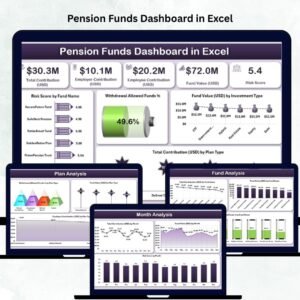
Same subject, other platforms: the Pension Funds Dashboard in Excel and the Pension Funds Dashboard in Power BI are separate builds with their own layouts and sample data, not ports of this file.
Different family, same subject: the Pension Fund KPI Dashboard in Google Sheets and the Pension Funds KPI Dashboard in Excel are month-picker scorecards with traffic lights.
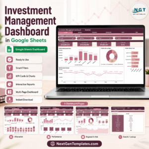
Pair it with the Investment Management Dashboard in Google Sheets, the Tax Advisory Dashboard in Google Sheets or the Retirement Savings Tracker in Google Sheets.
📖 Click here to read the Detailed Blog Post
🎥 Visit our YouTube channel for step-by-step video tutorials
👉 YouTube.com/@NextGenTemplates
Watch the step-by-step video Demo:
📅 Last updated: September 2026






















Reviews
There are no reviews yet.