

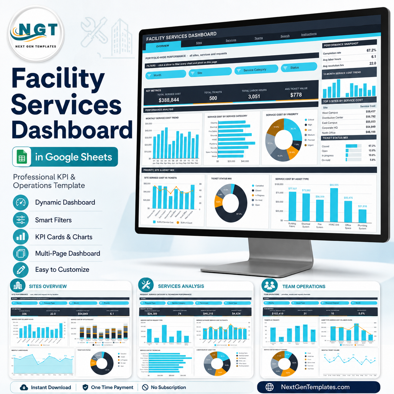

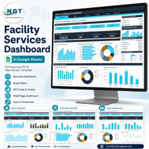
The Facility Services Dashboard in Google Sheets turns a flat ticket log into a six-page analytical report. The sample build ships with 500 service tickets, $388,844 of service cost, 3,051 labor hours across 8 sites, 9 service categories and 10 technicians — every figure driven by native pivot tables and slicers, not by fragile helper formulas. It is built by NextGenTemplates, whose Google Sheets and Excel templates are used by teams following 300K+ subscribers across our YouTube channels. One-time payment, no subscription, no add-on, no account to create: you get a PDF with a “Make a copy” link, and the sheet is yours to edit forever.
Key Features of the Facility Services Dashboard in Google Sheets
- Six ready-built pages — Overview, Sites, Services, Teams, Search and Instructions, plus the Data sheet that feeds them all.
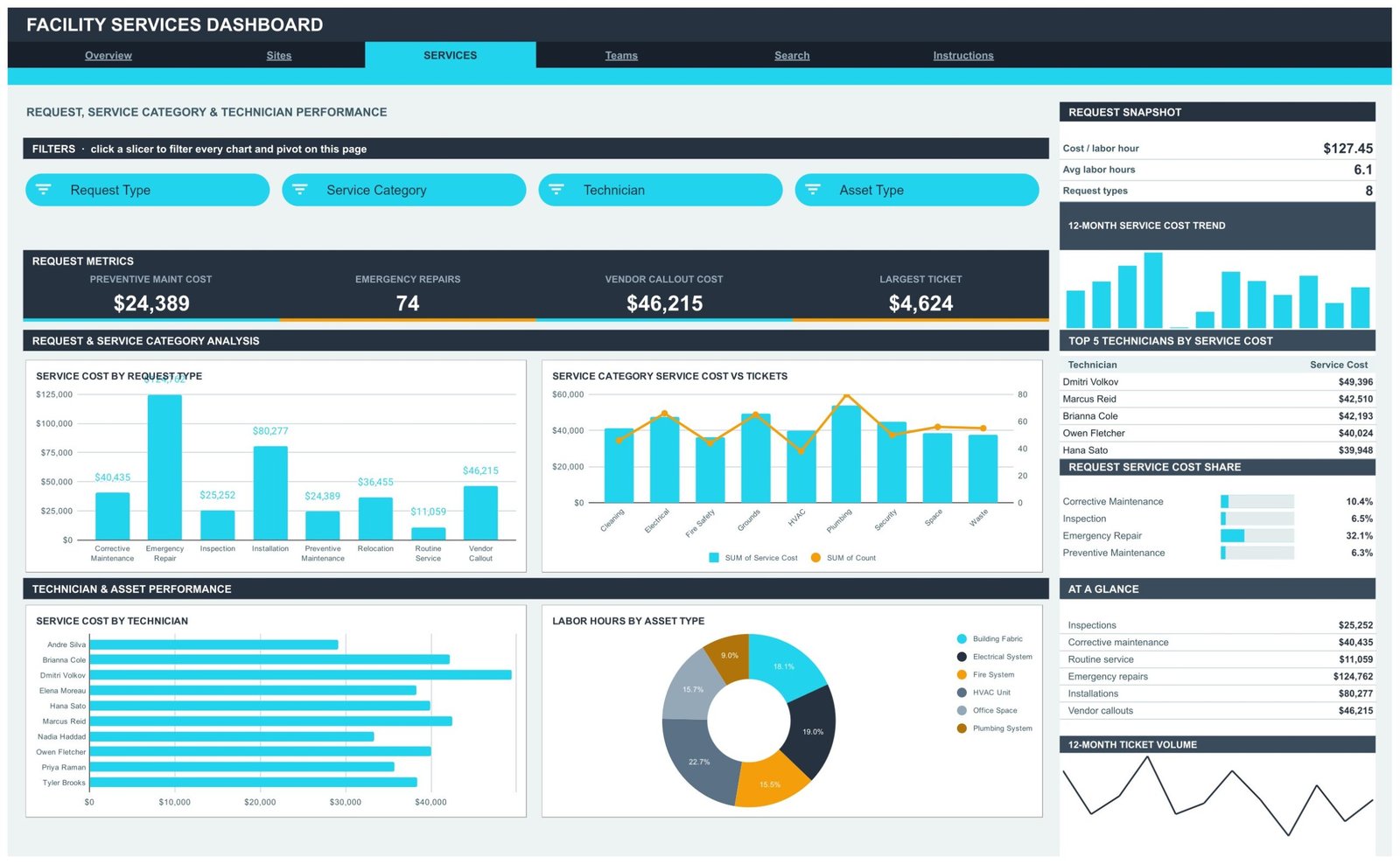
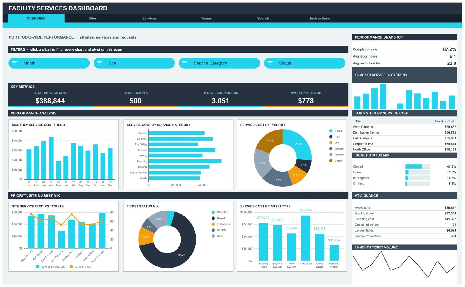
- 16 KPI cards across four analysis pages, including Total Service Cost, Total Tickets, Total Labor Hours, Avg Ticket Value, Closed Tickets, Avg Resolution Hrs, Preventive Maint Cost, Emergency Repairs, Vendor Callout Cost, Critical Request Cost, High Priority Tickets and On Hold Rate.
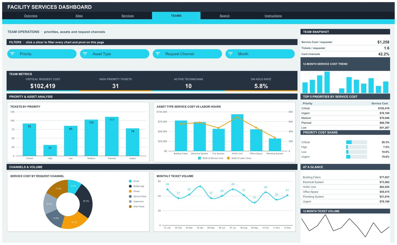
- 16 slicers, four per analysis page — Month, Site, Service Category, Status on Overview; Site, Request Type, Month, Priority on Sites; Request Type, Service Category, Technician, Asset Type on Services; Priority, Asset Type, Request Channel, Month on Teams.
- Native pivot tables behind every chart, parked to the right of each page so you can scroll across and audit the numbers behind any visual.
- A right-hand snapshot rail on every analysis page — a Top 5 league table, a percentage share panel, an At a Glance list, a 12-month cost trend and a 12-month ticket volume line.
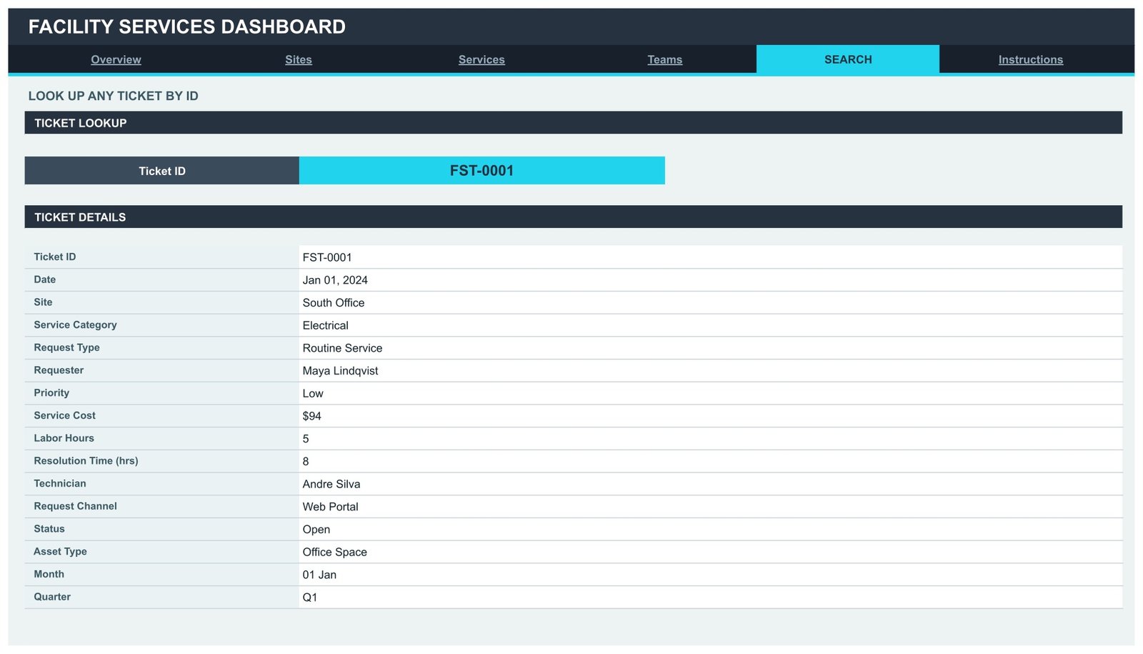
- A Ticket ID lookup page that returns all 16 fields of any single ticket — date, site, service category, request type, requester, priority, service cost, labor hours, resolution time, technician, request channel, status, asset type, month and quarter.
- Auto-expanding to 1,000 rows — pivots, slicers and formulas already cover row 1001, so pasting new tickets needs no re-ranging.
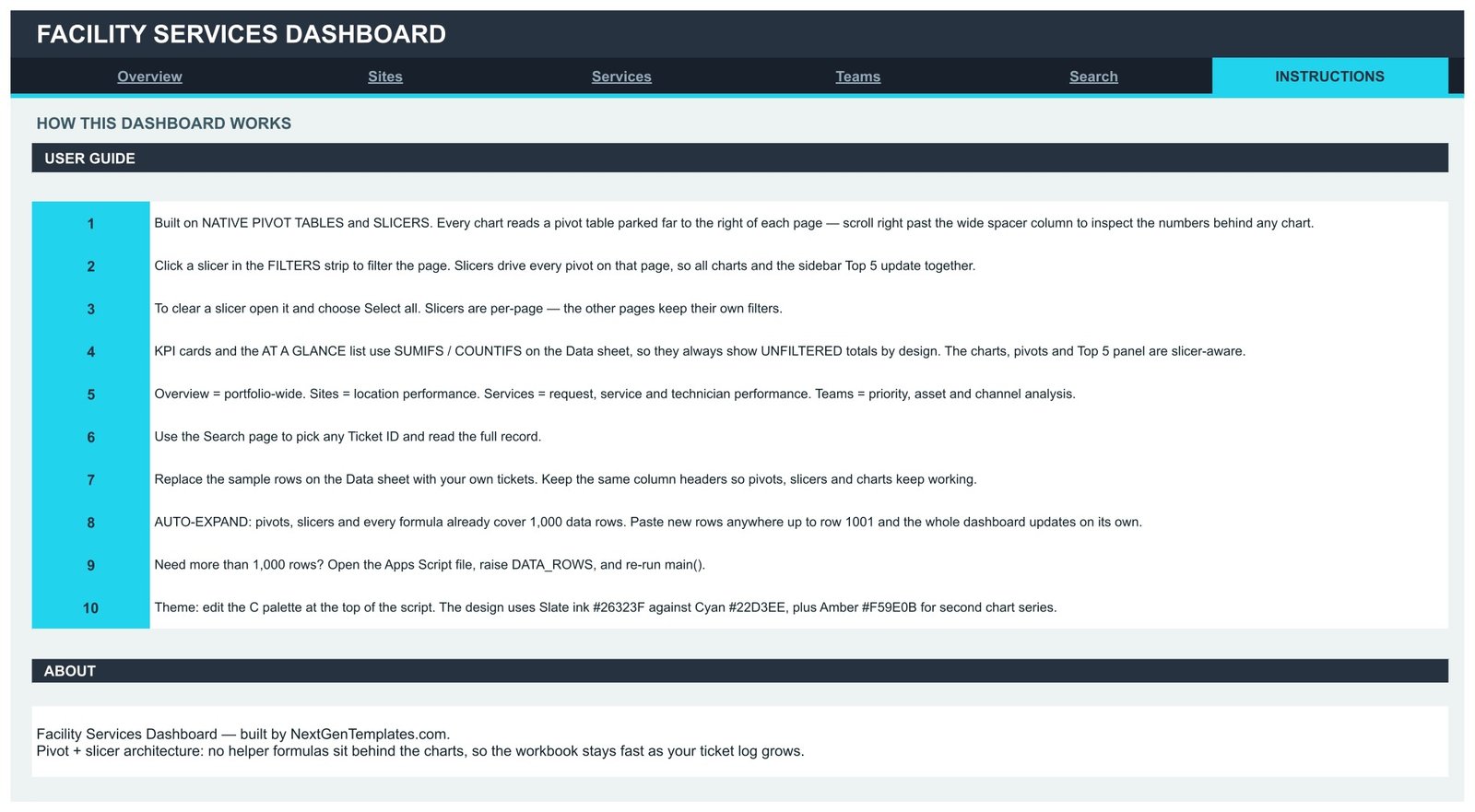
- One-line re-theming — the colour palette lives at the top of the bundled Apps Script; the shipped design uses Slate #26323F, Cyan #22D3EE and Amber #F59E0B.
What’s Inside the Facility Services Dashboard in Google Sheets
Overview — the portfolio-wide page. Four KPI cards sit above six charts: Monthly Service Cost Trend, Service Cost by Service Category, Service Cost by Priority, Site Service Cost vs Tickets, Ticket Status Mix and Service Cost by Asset Type. The rail carries a Performance Snapshot (completion rate 67.2%, avg labor hours 6.1, avg resolution 22.0 hrs) and a Top 5 Sites by Service Cost table led by West Campus at $59,437.
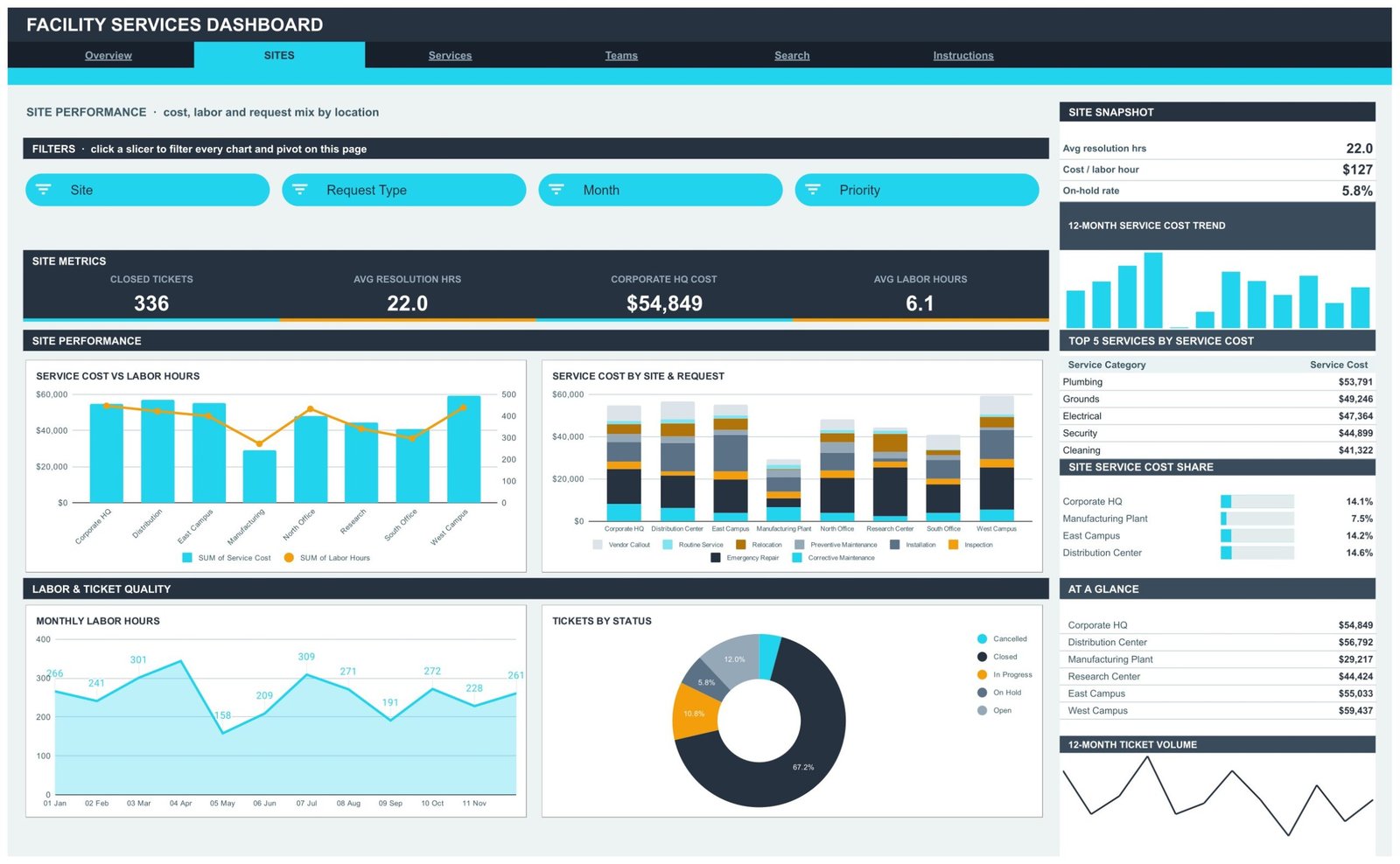
Sites — cost, labor and request mix by location. Service Cost vs Labor Hours puts a cost column against a labor-hours line for all eight sites; Service Cost by Site & Request stacks the eight request types inside each site’s bar; Monthly Labor Hours and Tickets by Status finish the page. The rail adds cost per labor hour ($127) and a Top 5 Services by Service Cost table led by Plumbing at $53,791.
Services — request, service category and technician performance. Service Cost by Request Type shows where the money actually goes ($124,762 on emergency repair against $24,389 on preventive maintenance), Service Category Service Cost vs Tickets pairs spend with volume, Service Cost by Technician ranks all ten names, and Labor Hours by Asset Type splits the effort. Top 5 Technicians by Service Cost is on the rail.
Teams — priorities, assets and request channels. Tickets by Priority, Asset Type Service Cost vs Labor Hours, Service Cost by Request Channel and Monthly Ticket Volume, with Top 5 Priorities by Service Cost and a priority cost share panel alongside.
Search — pick a Ticket ID such as FST-0001 and read the complete record. Instructions — a numbered ten-point guide plus notes on the pivot-and-slicer architecture.
Facility Services Dashboard in Google Sheets vs. Excel vs. Paid CAFM/CMMS Software — Where This Fits
| This Google Sheets template | Excel facilities dashboard | Paid CAFM/CMMS SaaS | |
|---|---|---|---|
| Cost | $9.99 one time | $13.99 one time | $35-$100 per user per month |
| Platform | Google Sheets, browser only | Desktop Excel | Vendor cloud |
| Setup time | Under 10 minutes | Under 15 minutes | 2-6 weeks onboarding |
| Real-time team collaboration | Yes, native | Only via OneDrive co-authoring | Yes |
| Mobile access | Google Sheets app | Excel mobile, limited | Dedicated app |
| Customizable fields | Full — it is your sheet | Full | Restricted to vendor schema |
| Share with a link | Yes | No | Seat-based |
| Year-1 cost at 5 users | $9.99 | $13.99 | $2,100-$6,000 |
| Slicer-driven cross-filtering | 16 slicers, 4 per page | Yes | Yes |
| Ticket ID record lookup | Built-in Search page | Built-in | Yes |
| Who owns the data | You, in your Drive | You, on your disk | The vendor |
Who This Template Is For — and Who It’s Not For
It fits facilities managers running 2-20 sites, in-house maintenance teams, campus and estates offices, property and building services companies, and operations analysts who need a monthly service-cost report without buying a CMMS seat for everyone who only ever reads it.
It is not for you if you need mobile work-order dispatch to technicians in the field, asset barcode scanning, IoT sensor feeds, preventive-maintenance auto-scheduling, or a full audit trail for regulatory inspection. Those are CMMS jobs. This is a reporting layer over a ticket log — it explains where cost, labor and delay concentrate; it does not run the work. It also expects tidy data: keep the Data sheet column headers exactly as shipped, or the pivots lose their fields.
How to Use the Facility Services Dashboard in Google Sheets
- Open the PDF in your download and click the “Make a copy” link. The dashboard lands in your own Google Drive.
- Read the Instructions page first — it explains that pivots sit to the right of each page and that KPI cards use SUMIFS/COUNTIFS on the Data sheet, so cards stay unfiltered by design while charts, pivots and the Top 5 panel are slicer-aware.
- Open the Data sheet and replace the 500 sample tickets with your own, keeping the 16 column headers unchanged.
- Paste anywhere up to row 1001 — everything auto-expands. Need more? Open the bundled Apps Script, raise DATA_ROWS and re-run main().
- Click a slicer in the FILTERS strip of any page. Every chart and pivot on that page re-filters together; each page keeps its own filter state.
- Use Select all inside a slicer to clear it, and use the Search page to pull a single ticket’s full record.
- Re-theme in one place by editing the C palette at the top of the script, then share the sheet with your team from Google Sheets’ own Share button.
Real-World Use Cases
Priya, facilities manager for an eight-site manufacturing group. Her monthly board pack used to be a pivot table rebuilt by hand. She now filters Overview to last month, screenshots the Top 5 Sites table and the Service Cost by Priority donut, and is done in four minutes. The number that changed her budget conversation: $124,762 on emergency repair versus $24,389 on preventive maintenance.
Daniel, estates coordinator at a university campus. He uses the Sites page with the Request Type slicer to show which buildings drive vendor callouts, and the Teams page’s Service Cost by Request Channel donut to argue for pushing requests from phone into the web portal.
Amara, operations analyst at a building services contractor. She filters the Services page by technician to compare cost per labor hour across the ten-person crew, then uses the Search page to pull the exact ticket behind any outlier before she raises it in a review.
Frequently Asked Questions
Do I need Excel or any add-on to use this?
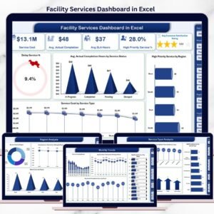
No. It runs entirely in Google Sheets in a browser with a free Google account. There is no add-on, extension or subscription. If you prefer a desktop workbook, the same topic ships as the Facility Services Dashboard in Excel.
How do I get the file after buying?
Your download is a PDF that contains the “Make a copy” link. Click it and Google Sheets creates an editable copy in your own Drive. Nothing is shared with anyone else, and your copy is not affected by later updates.
Can I add my own sites, service categories or technicians?
Yes. Type them into the Data sheet columns and they appear automatically in the slicers, pivots and charts. Nothing is hard-coded to the sample values.
How many tickets can it hold?
1,000 rows are pre-wired. Beyond that, open the bundled Apps Script, raise the DATA_ROWS constant and re-run main() to rebuild the pivots and slicers at the larger size.
Why do the KPI cards not change when I click a slicer?
That is deliberate. The KPI cards and the At a Glance list use SUMIFS/COUNTIFS against the whole Data sheet so you always keep a portfolio-wide reference number on screen. The charts, pivots and the Top 5 panel are the slicer-aware part of each page.
Is this a KPI scorecard with targets and traffic lights?
No — this is the analytical dashboard line. It profiles cost, labor, priority and channel mix across your ticket log. If you want a month-picker scorecard with targets and RAG status instead, browse the Google Sheets category for the KPI dashboard range.
Can my team edit it at the same time?
Yes. Share the sheet from Google Sheets as you would any other file; slicer selections are per-user views of the same underlying data, and edits save in real time.
About the Author
Built by PK – Microsoft Certified Professional with 15+ years of Excel, Google Sheets, and Power BI experience. Founder of NextGenTemplates, reaching 300K+ subscribers across YouTube channels. Every template is hand-built and tested before release.
Explore Related Templates
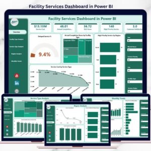
- Facility Services Dashboard in Power BI — the same subject with drillthrough and DAX measures.
- Facilities Management Analysis Dashboard in Google Sheets — a wider estates view.
- Housekeeping Service Analytics Dashboard in Google Sheets — soft-services detail.
- Cleaning Service Dashboard in Google Sheets — contract cleaning operations.
- Browse every dashboard in the Google Sheets Dashboard category.
Get the Facility Services Dashboard in Google Sheets for $9.99 — one payment, instant download, yours to keep and edit. Add it to your cart above and you will be filtering your own ticket log within ten minutes.
Last updated: August 2026.























Reviews
There are no reviews yet.