

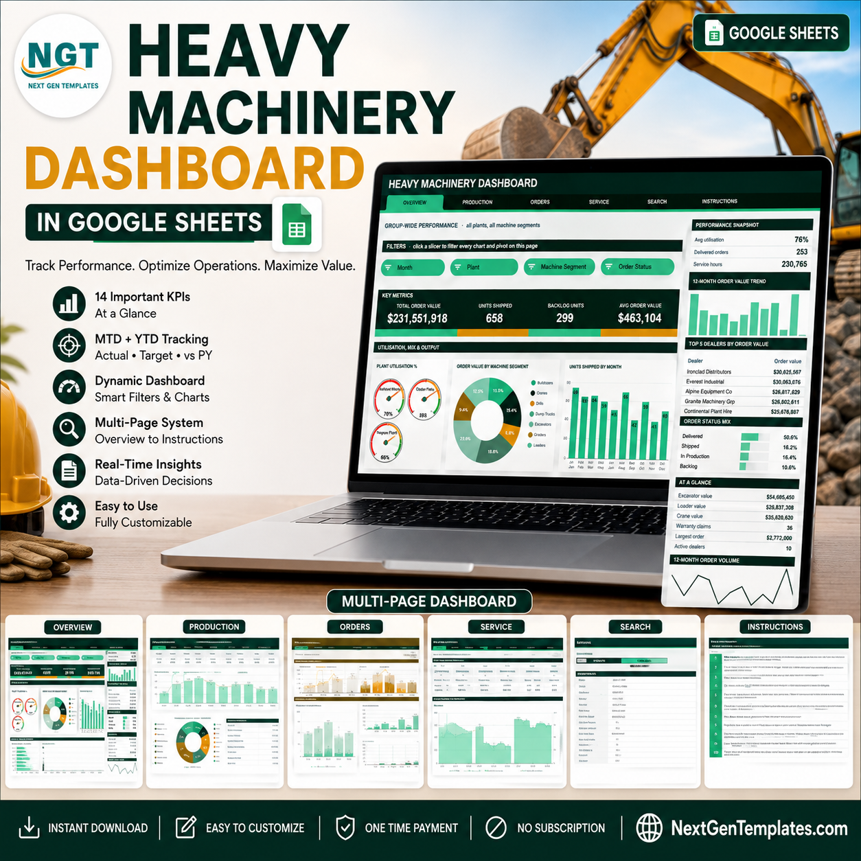
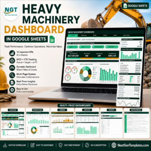
The Heavy Machinery Dashboard in Google Sheets tracks 16 KPI cards and 18 charts across 6 linked pages, driven by 15 native slicers over a 500-order sample book that auto-expands to 1,000 rows. Setup takes under 10 minutes: paste your own orders onto the Data sheet and every pivot, chart and Top 5 panel refreshes on its own.
🌍 Join 8,400+ teams in 40+ countries using NextGenTemplates to replace paid SaaS tools with one-time-purchase Excel, Google Sheets, Power BI and HTML templates.
✅ Instant download · One-time payment · No subscription · No per-user fees · Lifetime access
🔑 Key Features of the Heavy Machinery Dashboard in Google Sheets
- 📊 Four analysis pages plus a lookup page. Overview covers group-wide utilisation, mix, output and order size. Production covers plant output and segment mix. Orders covers dealer, industry and pipeline. Service covers service hours, warranty claims and utilisation.
- 🎛️ 15 slicers in a single Filters strip. Each page carries its own set — Month, Plant, Machine Segment, Order Status on Overview and Production; Dealer, Industry, Order Status and Month on Orders; Plant, Machine Segment and Month on Service. One click re-filters every chart, pivot and Top 5 panel on that page.
- ⚙️ Built on native pivot tables, not helper formulas. Every chart reads a pivot parked to the right of its page, so the file stays fast as the order book grows and you can audit the numbers behind any visual.
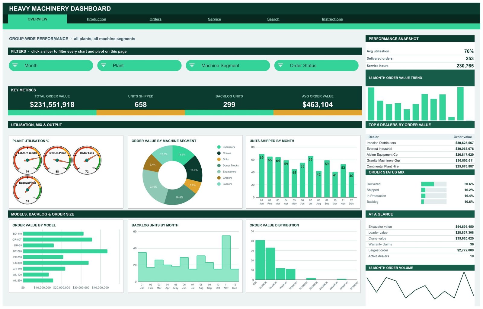
- 🏭 Plant-level utilisation gauges. Four dial gauges show utilisation per plant — Ashford Works, Bremen Plant, Cedar Falls Works and Nagoya Plant — against the 76% group average.
- 🚜 Seven machine segments modelled. Bulldozers, Cranes, Drills, Dump Trucks, Excavators, Graders and Loaders, across nine models from BD-410 to WL-250.
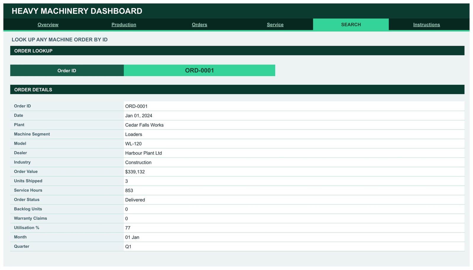
- 🔍 Order lookup page. Pick any Order ID from a dropdown and the Search page returns all 16 fields for that record — date, plant, segment, model, dealer, industry, order value, units shipped, service hours, status, backlog units, warranty claims, utilisation, month and quarter.
- 📈 Auto-expanding to 1,000 rows. Pivots, slicers and every formula already cover row 1001, so pasted rows need no range editing.
📦 What’s Inside the Heavy Machinery Dashboard in Google Sheets
Page 1: Overview
Group-wide performance across all plants and machine segments. KPI cards show Total Order Value, Units Shipped, Backlog Units and Avg Order Value, with a snapshot panel for average utilisation, delivered orders and service hours. Charts include Plant Utilisation %, Order Value by Machine Segment, Units Shipped by Month, Order Value by Model, Backlog Units by Month and Order Value Distribution, plus a sidebar carrying 12-Month Order Value Trend, Top 5 Dealers by Order Value and Order Status Mix.
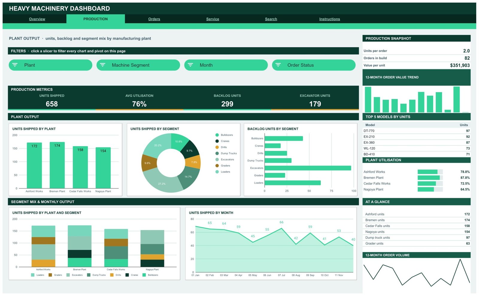
Page 2: Production
Plant output, backlog and segment mix by manufacturing plant. KPI cards show Units Shipped, Avg Utilisation, Backlog Units and Excavator Units, with a snapshot for units per order, orders in build and value per unit. Charts include Units Shipped by Plant, Units Shipped by Segment, Backlog Units by Segment, Units Shipped by Plant and Segment, and Units Shipped by Month, alongside a Top 5 Models by Units table and a plant utilisation bar panel.
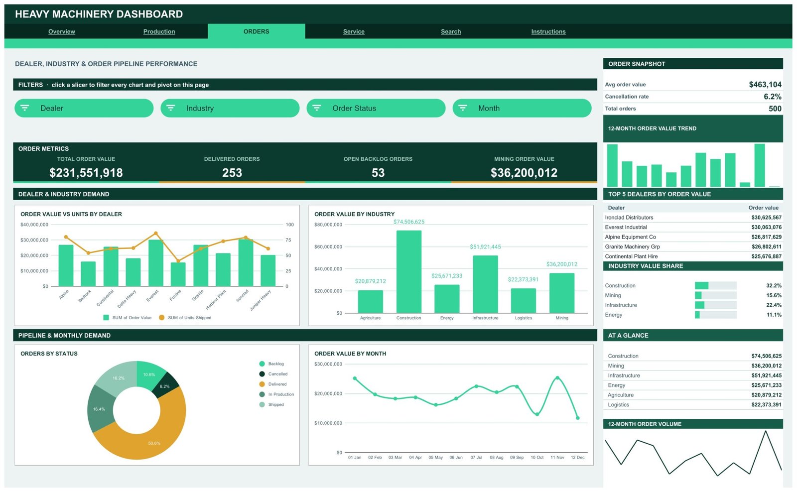
Page 3: Orders
Dealer, industry and order pipeline performance. KPI cards show Total Order Value, Delivered Orders, Open Backlog Orders and Mining Order Value, with a snapshot for average order value, cancellation rate and total orders. Charts include Order Value vs Units by Dealer, Order Value by Industry, Orders by Status and Order Value by Month, plus an Industry Value Share panel covering Construction, Infrastructure, Mining and Energy.
Page 4: Service
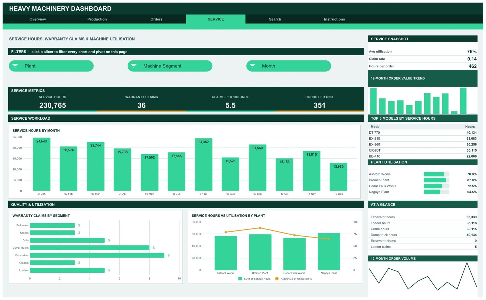
Service hours, warranty claims and machine utilisation. KPI cards show Service Hours, Warranty Claims, Claims per 100 Units and Hours per Unit, with a snapshot for average utilisation, claim rate and hours per order. Charts include Service Hours by Month, Warranty Claims by Segment and Service Hours vs Utilisation by Plant, plus a Top 5 Models by Service Hours table.
Page 5: Search
An order lookup page. Choose any Order ID from the dropdown and the Order Details table returns the full record — date, plant, machine segment, model, dealer, industry, order value, units shipped, service hours, order status, backlog units, warranty claims, utilisation %, month and quarter.
Page 6: Instructions
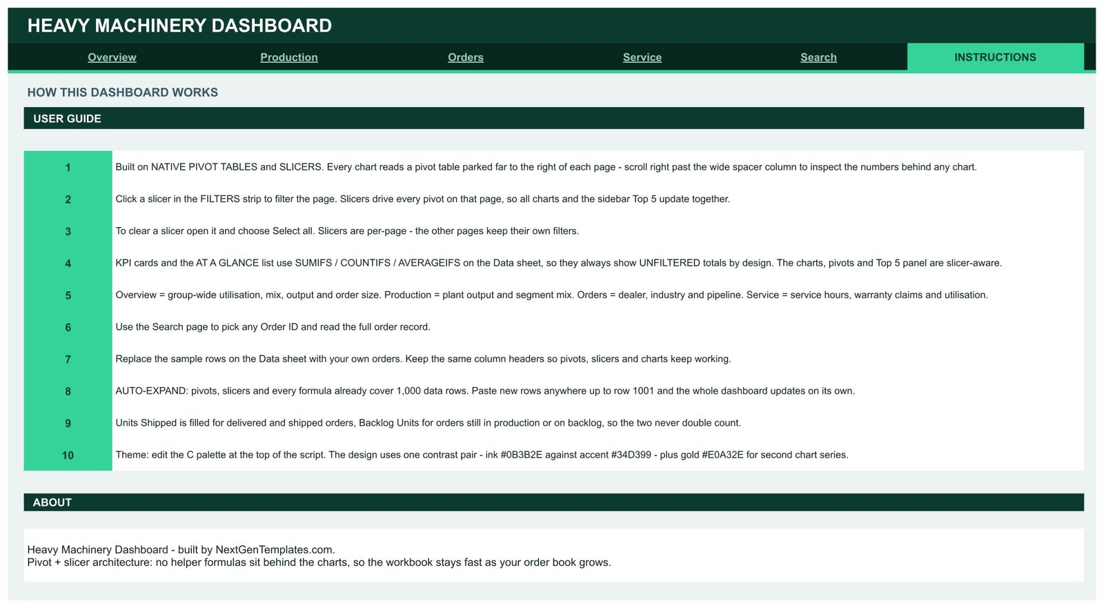
A 10-step user guide covering how the slicers drive the pivots, how to clear a filter, why the KPI cards stay unfiltered by design, how to swap in your own order data, and how to change the colour palette. The Data sheet holding the 500 sample orders sits behind these pages.
📊 Heavy Machinery Dashboard in Google Sheets vs. Microsoft Excel Dashboard vs. Paid ERP/SaaS — Where This Fits
| Feature | Heavy Machinery Dashboard in Google Sheets | Microsoft Excel Dashboard | SAP Business One / NetSuite ERP |
|---|---|---|---|
| Cost | $9.99 one-time ✅ | $18-30 one-time + Office licence | $99-250 / user / month |
| Platform | Any browser, Android and iOS ✅ | Windows or Mac desktop Excel | Web plus vendor mobile app |
| Setup time | Under 10 minutes ✅ | 15-30 minutes | 4-12 weeks of implementation |
| Real-time team collaboration | Yes, native in Google Drive ✅ | Only via OneDrive co-authoring | Yes |
| Mobile access | Yes, Google Sheets app ✅ | Limited on the Excel mobile app | Yes |
| Customisable fields and charts | Fully editable pivots and slicers ✅ | Fully editable | Change requests, often billable |
| Share with a link | Yes, one Drive link ✅ | File attachment or OneDrive link | Named seats only |
| Machine segment and plant analysis | Built in, 7 segments and 4 plants ✅ | Built in | Built in, after configuration |
| Year-1 cost at 5 users | $9.99 total ✅ | $18-30 + 5 Office licences | $5,940-15,000 |
For plant and dealer teams that want machine-level order, backlog and service reporting without an ERP implementation, the Heavy Machinery Dashboard in Google Sheets sits in the sweet spot.
👥 Who This Template Is For — and Who It’s Not For
✅ This template is built for:
- Plant and production managers at heavy equipment manufacturers running 2-10 sites
- Sales and dealer managers who need order value and units by dealer and industry in one view
- Service and warranty managers tracking service hours, claims per 100 units and utilisation
- Equipment rental and construction fleet owners who want a shared browser dashboard
- Analysts and consultants who need a working pivot-and-slicer model to adapt for a client
❌ This template is NOT for:
- Teams needing live IoT telemetry or machine sensor feeds — this reads a manual order table
- Enterprises requiring SOC 2, SSO and audited role-based permissions
- Order books beyond 1,000 rows without extending the pivot and slicer ranges yourself
- Anyone wanting a month-picker KPI scorecard with traffic lights — that is our separate Heavy Machinery KPI Dashboard, a different template
⚙️ How to Use the Heavy Machinery Dashboard in Google Sheets
- Download the PDF guide and click the “Make a copy” link to save your own editable Google Sheets file to Drive.
- Open the Instructions page and read the 10-step user guide so the pivot and slicer design is clear.
- Go to the Data sheet and replace the 500 sample orders with your own, keeping every column header exactly as it is.
- Paste new rows anywhere up to row 1001 — pivots, slicers and formulas already cover that range.
- Return to Overview and click any slicer in the Filters strip to re-filter every chart and pivot on that page.
- Use the Search page to pull the full record for any single Order ID.
- Share the file with your team using a normal Google Drive share link.
💼 Real-World Use Cases
Marcus runs production planning for a four-plant excavator manufacturer. He uses the Production page to compare units shipped by plant, spot that Nagoya is running at 64.5% utilisation against Bremen’s 87.8%, and move backlog work between sites before the monthly build review.
Priya manages dealer accounts for a construction equipment group. She filters the Orders page by Industry and reads Order Value vs Units by Dealer to see which dealers sell high-value machines in low volume, then builds her quarterly dealer plan from the Top 5 Dealers panel.
Tom heads aftersales at an equipment rental firm. He watches Claims per 100 Units and Warranty Claims by Segment on the Service page, catches that excavators generate the highest claim count, and schedules a preventive service campaign on that fleet.
❓ Frequently Asked Questions
What KPIs does the Heavy Machinery Dashboard in Google Sheets track?
The Heavy Machinery Dashboard in Google Sheets tracks 16 KPI cards including total order value, units shipped, backlog units, average order value, average utilisation, delivered orders, open backlog orders, service hours, warranty claims, claims per 100 units and hours per unit.
How long does setup take?
Under 10 minutes. Copy the file to your Drive, open the Data sheet, replace the 500 sample orders with your own while keeping the column headers, and every pivot, chart and slicer in the Heavy Machinery Dashboard in Google Sheets updates automatically.
How does this compare to an ERP like SAP Business One or NetSuite?
An ERP runs your whole business and costs $99-250 per user per month after a multi-week implementation. The Heavy Machinery Dashboard in Google Sheets is a $9.99 one-time reporting layer you can run today over an order table you already maintain.
Do I need Excel or any add-on to use it?
No. The Heavy Machinery Dashboard in Google Sheets runs entirely in Google Sheets in any modern browser, with no Excel licence, no macros and no third-party add-ons. It also opens in the Google Sheets mobile app.
How many orders can the dashboard handle?
Pivots, slicers and formulas in the Heavy Machinery Dashboard in Google Sheets already cover 1,000 data rows. Beyond that you extend the pivot source range and slicer ranges once, and the rest of the design keeps working.
Why do the KPI cards ignore my slicer selection?
By design. In the Heavy Machinery Dashboard in Google Sheets the KPI cards and At A Glance panel use SUMIFS, COUNTIFS and AVERAGEIFS on the Data sheet so they always show unfiltered totals as a stable baseline. The charts, pivots and Top 5 panels are slicer-aware.
Is this the same as the Heavy Machinery KPI Dashboard?
No. The Heavy Machinery KPI Dashboard is a month-picker scorecard with traffic lights and trend pages. The Heavy Machinery Dashboard in Google Sheets is an analytical, slicer-driven dashboard covering production, orders and service. They are separate templates.
👤 About the Author
Built by PK — Microsoft Certified Professional with 15+ years of Excel, Google Sheets and Power BI experience. Founder of NextGenTemplates, reaching 300K+ subscribers across YouTube channels (@PK-AnExcelExpert, @NextGenTemplates, @NeoTechNavigators). Every template is hand-built and tested before release.
🔗 Explore Related Templates
If you plan production daily rather than monthly, the Daily Production Output Tracker in Google Sheets logs shift output alongside this dashboard. Engineering teams often pair it with the Engineering Dashboard in Google Sheets, while heavy-materials suppliers use the Cement and Steel Dashboard in Google Sheets. Browse the full Google Sheets Dashboards range or the wider Dashboard Templates library.
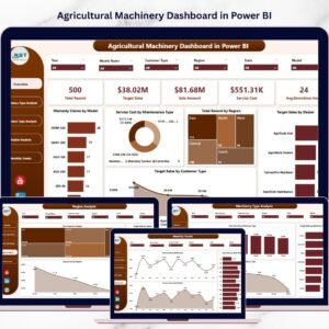
Also available as: the Agro Machinery Rental Dashboard in Excel and the Agricultural Machinery Dashboard in Power BI cover the same machine-fleet questions on other platforms.
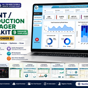
💎 Save more — get the Plant Production Manager Toolkit — 9 Premium Templates (Excel + Power BI) →
📖 Click here to read the Detailed Blog Post
🎥 Visit our YouTube channel for step-by-step video tutorials
👉 YouTube.com/@NextGenTemplates
Watch the step-by-step video Demo:
📅 Last updated: August 2026


























Reviews
There are no reviews yet.