

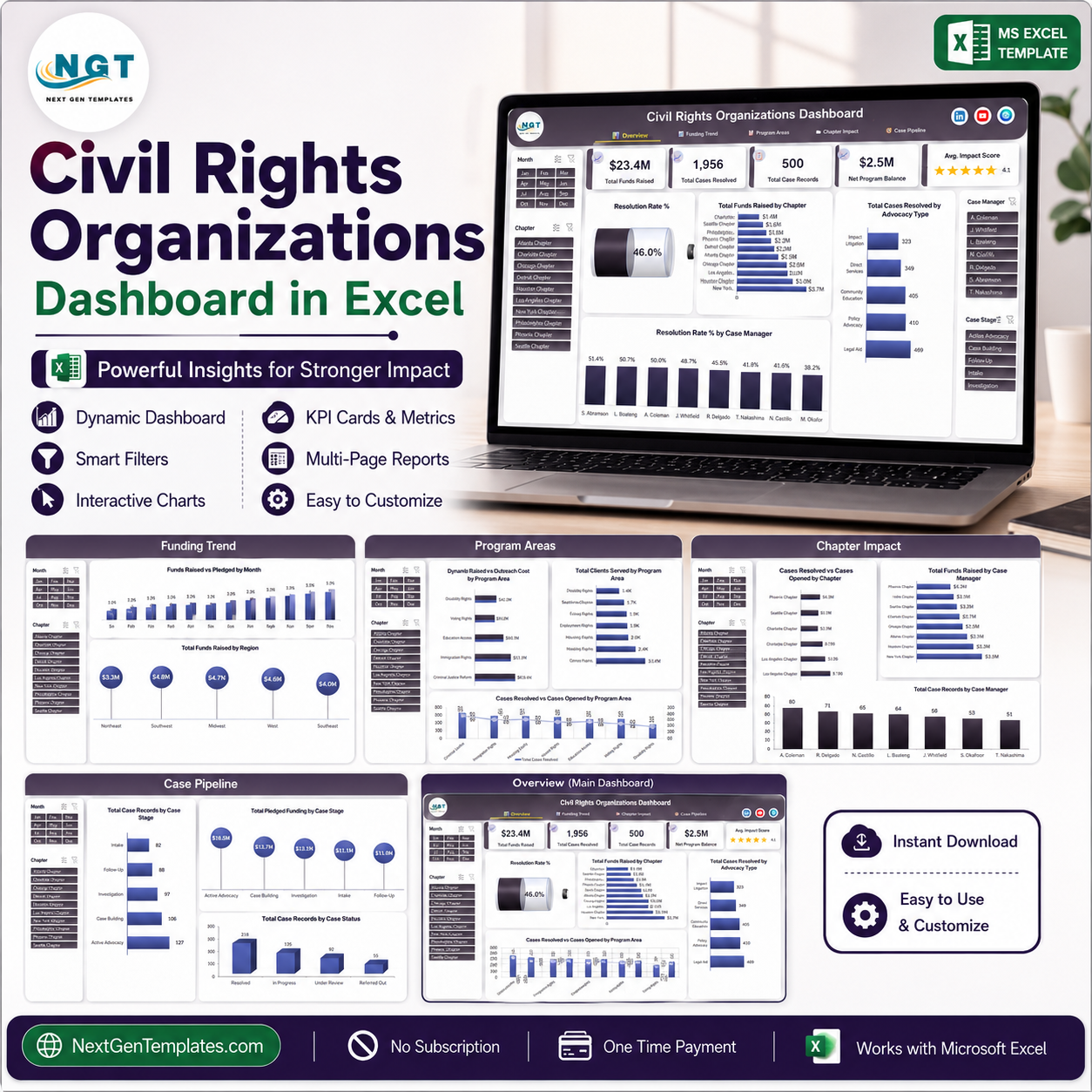
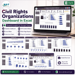
The Civil Rights Organizations Dashboard in Excel is a five-page reporting template for an advocacy or non-profit organisation that already keeps its own operational records. It takes a flat case-and-funding table and turns it into a set of linked, filterable summaries: how many case records exist, how many were opened and resolved, what was raised and pledged, what outreach cost, and how the workload is distributed across chapters, case managers and programme areas.
It is a reporting layout, not a case-management system and not an assessment tool. It reads whatever your team records and adds it up. It does not evaluate the merits of a matter, does not measure discrimination, and does not produce legal, regulatory or human-rights findings. Every label you see in the screenshots – programme areas, case types, stages and statuses – is a placeholder in the sample data and is meant to be replaced with your organisation’s own vocabulary.
The workbook ships with 500 rows of demo data. The names, chapters, amounts and counts on every screenshot are invented for preview purposes only. They describe no real organisation, no real matter and no real person. Delete them and paste your own records in their place.
What You Get
- Five linked report pages – Overview, Funding Trend, Program Areas, Chapter Impact and Case Pipeline – with a navigation strip across the top of each.
- Page-synced slicers for Month, Chapter, Case Manager and Case Stage. Choose a filter on one page and it holds as you move through the others.
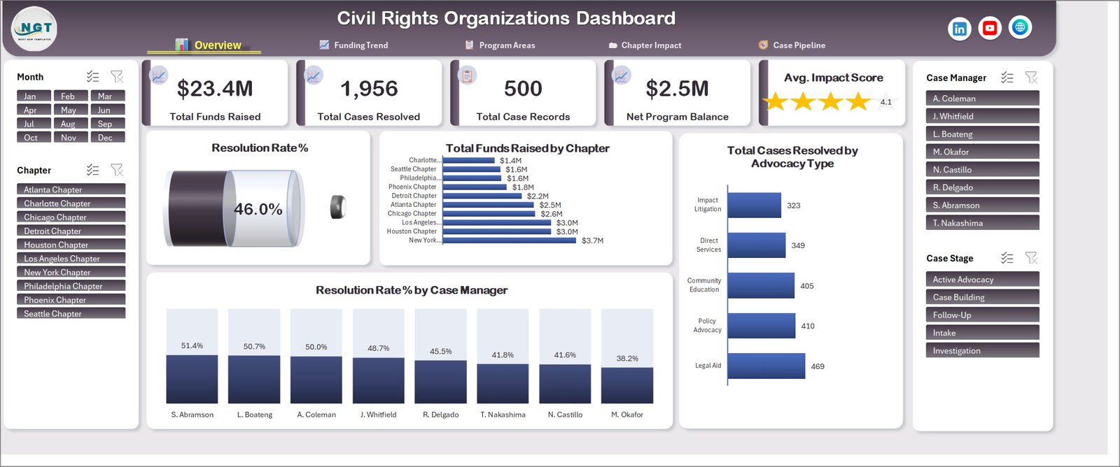
- Five headline cards on the Overview page: Total Funds Raised, Total Cases Resolved, Total Case Records, Net Program Balance and an Average Impact Score tile.
- Seventeen pivot charts across the five pages, each driven by a pivot table on a hidden support sheet.
- A single flat data sheet – one row per case record – so there is nothing to re-wire when you swap the data.
- No macros and no add-ins. The file is a plain .xlsx; nothing needs to be enabled or trusted.
Key Features
- Refresh, don’t rebuild. Replace the sample rows, hit Refresh All, and all five pages update together.
- Every metric is a plain sum or count of what you entered. There are no hidden weightings, scores or benchmarks behind the numbers.
- Editable labels throughout. Programme areas, advocacy types, case stages and case statuses are ordinary text columns in the data sheet – rename them to match your own intake form and the charts follow.
- Funding and cost side by side so raised, pledged and outreach spend can be read against the same programme area or month.
- Works offline in desktop Excel. No account, no connector, no subscription.
Inside the Dashboard – Page by Page
Page 1 – Overview
The landing page. Five cards across the top carry Total Funds Raised, Total Cases Resolved, Total Case Records, Net Program Balance and an Average Impact Score tile with a star rating. Below them sit a Resolution Rate % gauge, Total Funds Raised by Chapter, Total Cases Resolved by Advocacy Type and Resolution Rate % by Case Manager. Slicers for Month and Chapter sit on the left, Case Manager and Case Stage on the right.
Page 2 – Funding Trend
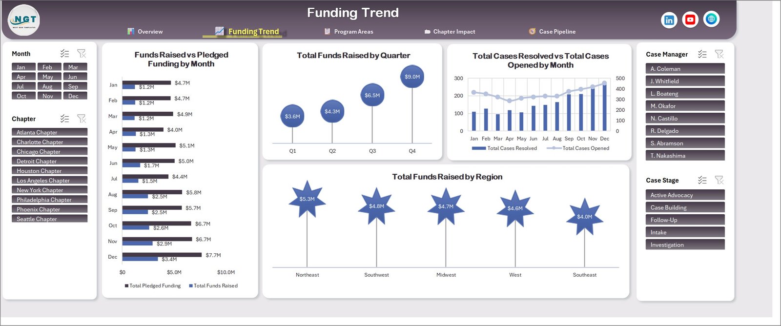
Everything time-based. Funds Raised vs Pledged Funding by Month puts committed money next to received money for all twelve months. Total Funds Raised by Quarter condenses the same figure into four points, Total Cases Resolved vs Total Cases Opened by Month shows workload in against workload out on a shared axis, and Total Funds Raised by Region splits the annual total five ways.
Page 3 – Program Areas
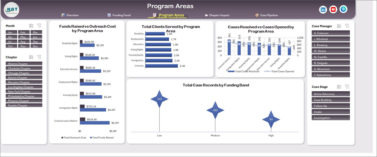
Where the money and the caseload go. Funds Raised vs Outreach Cost by Program Area reads spend against income for each of the seven programme labels in the sample data; Total Clients Served by Program Area counts people reached; Cases Resolved vs Cases Opened by Program Area pairs the two counts; and Total Case Records by Funding Band groups records into low, medium and high bands. The seven programme labels shown are demo placeholders – swap them for your own programme list.
Page 4 – Chapter Impact
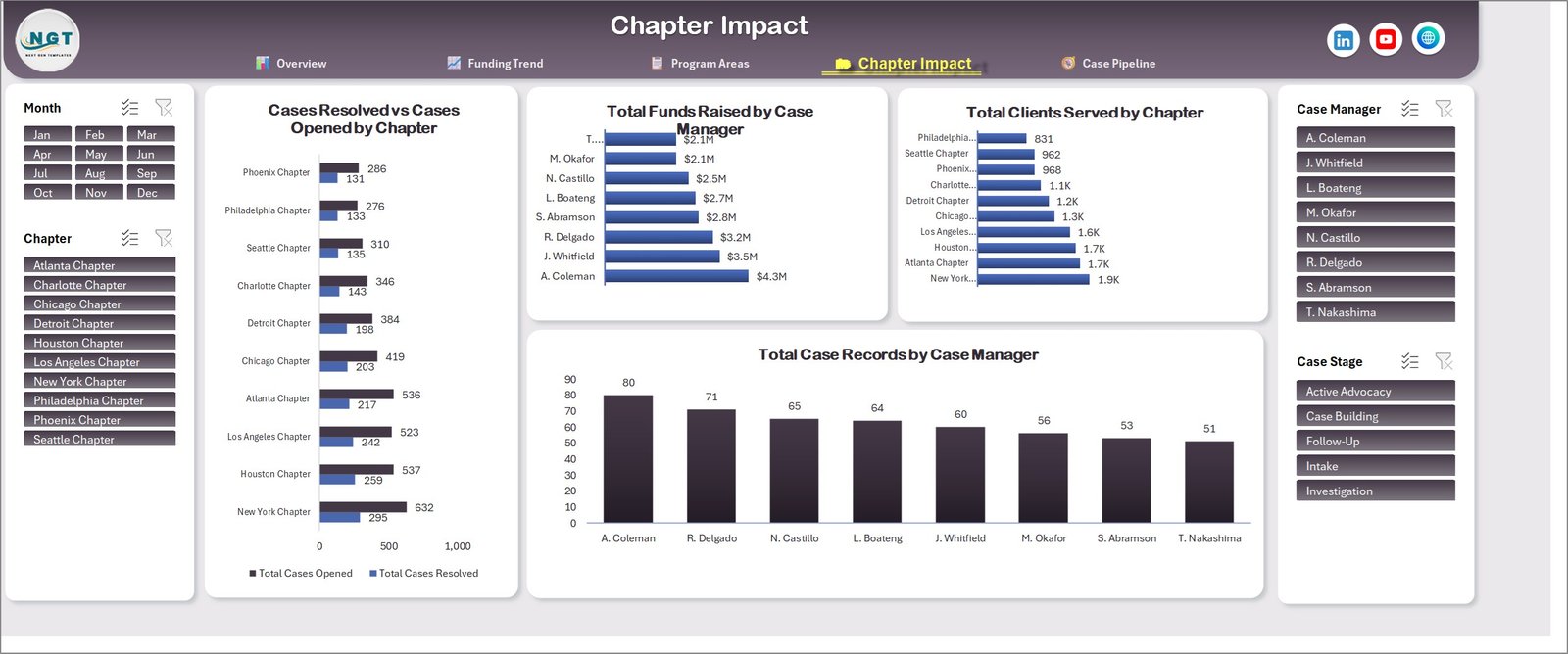
The same picture cut by location and by staff member. Cases Resolved vs Cases Opened by Chapter ranks the ten sample chapters, Total Funds Raised by Case Manager and Total Case Records by Case Manager split the workload eight ways, and Total Clients Served by Chapter shows reach per location. Useful for a straightforward capacity conversation – who is carrying what.
Page 5 – Case Pipeline
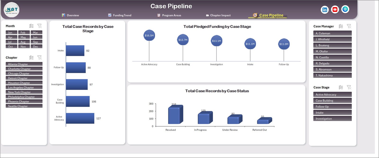
A stage-by-stage view. Total Case Records by Case Stage counts records sitting at each of the five stages in the sample data, Total Pledged Funding by Case Stage puts committed funding beside those same stages, and Total Case Records by Case Status splits the file into resolved, in progress, under review and referred out. Stage and status names are text values in the data sheet, so they rename cleanly to your own workflow.
Also Available in Power BI
The same five-page layout is published as a Power BI report for teams that already work in Power BI Desktop: Civil Rights Organizations Dashboard in Power BI. Same structure, same metric names, different tool. Pick whichever your team already has.
If you want a compact month-by-month scorecard instead of an analytical dashboard, the Civil Rights Organizations KPI Dashboard in Excel is a different, smaller template built for that job.
Who It Is For
- Programme and operations staff at an advocacy or non-profit organisation who already keep case records in a spreadsheet.
- Chapter or regional coordinators who need a consistent monthly summary rather than a new database.
- Development and grants staff reporting raised against pledged funding by programme.
- Analysts and consultants who want a finished Excel layout to point at a client’s existing export.
- Anyone learning pivot-table dashboard construction who wants a complete, working example to take apart.
How to Use It
- Download the ZIP and open the .xlsx in Microsoft Excel.
- Click through all five pages with the demo data still in place, so you can see what each chart is fed by.
- Open the data sheet and delete the 500 sample rows.
- Paste your own records in, keeping the column headers exactly as they are.
- Rename the programme, advocacy type, stage and status values to your organisation’s own terms – either in the data or in the source lists.
- Press Data > Refresh All. Every pivot table, chart, card and slicer updates.
- Recolour the header bar and charts to your own palette if you want it branded.
Requirements
- Microsoft Excel 2016 or later on Windows or Mac, or Microsoft 365. Slicers need the desktop app – Excel for the web will display the file but slicer behaviour is limited.
- Roughly 1 MB of disk space. No macros, no add-ins, no internet connection required.
- Basic familiarity with pasting data and pressing Refresh All. No formula or VBA knowledge needed.
What This Template Does Not Do
Being clear about this saves everyone time:
- It is not a case-management system. There is no intake form, no document store, no reminders, no user accounts and no audit trail.
- It does not assess, score or establish anything about the matters you record. It counts and sums the rows you give it, nothing more.
- It makes no legal, regulatory, compliance or advocacy-outcome claims, and it is not legal advice. Nothing in it substitutes for professional counsel.
- It is not a grant or donor reporting standard. If a funder requires a specific reporting format, produce that format; this is an internal management view.
- The sample data is invented and is supplied purely so the charts render before you load your own. It represents no real organisation, matter or individual.
- It does not handle personal or sensitive records for you – your own data-protection obligations still apply, and how you store the completed file is your decision.
Frequently Asked Questions
Does this template measure discrimination, legal merit or human-rights outcomes?
No. It is an arithmetic reporting layer over your own records. It adds up counts and amounts you have already entered and presents them as charts. It reaches no conclusions of any kind.
Are the numbers and names in the screenshots real?
No. All 500 rows are demo data generated for preview. Chapters, case managers, amounts and counts are invented. Delete them before you use the file.
Can I change the programme areas, case types and stages?
Yes – that is expected. They are ordinary text columns in the data sheet. Replace them with your own terms and refresh; the charts pick up the new labels automatically.
Does it contain macros?
No. It is a plain .xlsx workbook. Nothing needs to be enabled and no security warning appears.
How do I add my own data?
Delete the sample rows, paste yours under the same headers, then Data > Refresh All. Keeping the header row unchanged is the only requirement.
Can I add more months, chapters or programme areas?
Yes. The pivot tables read the whole data range, so extra rows and new label values appear after a refresh with no rebuilding.
Will it work in Google Sheets or Excel for the web?
The charts will display, but slicers and pivot-chart behaviour are only fully supported in desktop Excel. Use the desktop app for the intended experience.
Is there a Power BI version?
Yes – Civil Rights Organizations Dashboard in Power BI covers the same five pages.
Can I edit and rebrand it?
Yes. Colours, fonts, logo and chart layout are all editable. It is supplied for your own or your client’s internal use; it is not for resale as a template.
More Dashboards From This Release
- Channel Development Teams Dashboard in Excel
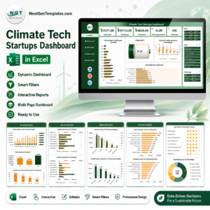
- Climate Tech Startups Dashboard in Excel
- Cloud Gaming Dashboard in Excel
Browse the full range in Excel Dashboards.
Instant Download
Checkout gives you the ZIP straight away – one .xlsx workbook, ready to open. Unlimited re-downloads, no expiry. Because the file is delivered digitally and immediately, it is non-refundable once downloaded; the screenshots above show every page in full so you can see exactly what you are buying first.


Reviews
There are no reviews yet.