

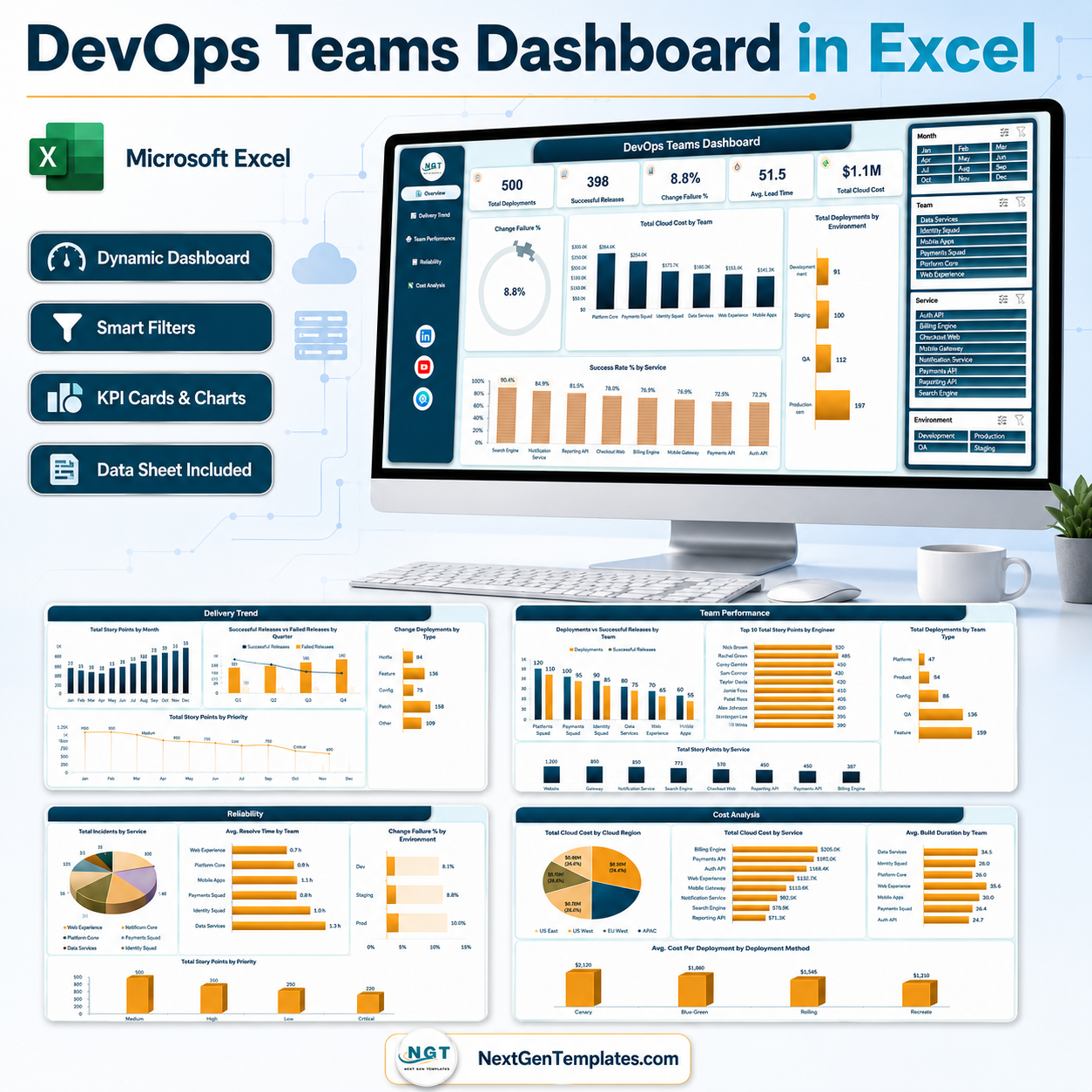

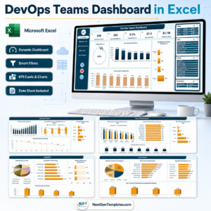
The DevOps Teams Dashboard in Excel is a five-page reporting workbook for engineering managers, platform leads and delivery managers who need deployment, reliability and cloud-cost reporting in one file. It ships with 500 sample deployment records covering 3 January 2025 to 1 January 2026, 28 data columns, 25 pivot tables, 20 charts and 4 slicers (Month, Team, Service, Environment) repeated on every page so one click filters the whole report. Paste your own deployment log over the sample rows, press Refresh All, and you have deployment frequency, change failure rate, lead time, restore time and cloud spend without buying another observability seat. Instant download, no macros, no add-ins, and it runs in Excel 2016 or later and Microsoft 365 on Windows and Mac.
Key Features of the DevOps Teams Dashboard in Excel
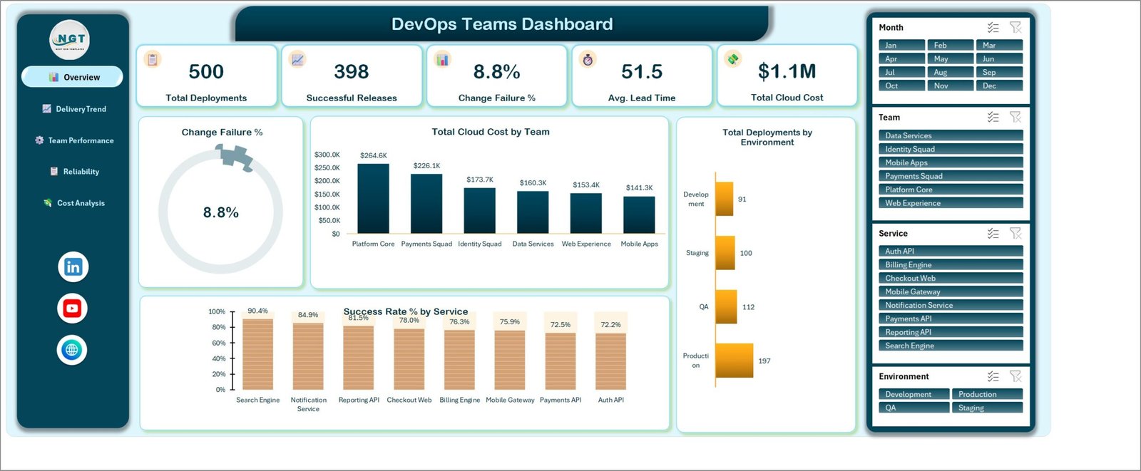
- Five KPI cards on the Overview page – Total Deployments (500), Successful Releases (398), Change Failure % (8.8%), Avg. Lead Time (51.5 hours) and Total Cloud Cost ($1.1M) on the sample year, each recalculating against whatever the slicers are set to.
- A Change Failure % gauge reading 8.8% on the sample data, so the one number every DORA conversation starts with is visible before you scroll.
- Six delivery teams built into the model – Platform Core, Payments Squad, Identity Squad, Web Experience, Mobile Apps and Data Services – each with its own deployment count, success rate, restore time and build duration.
- Eight services tracked end to end – Search Engine, Notification Service, Reporting API, Checkout Web, Billing Engine, Mobile Gateway, Payments API and Auth API – ranked by success rate, story points, incidents and cloud cost.
- Four environments (Development, QA, Staging, Production) with deployment counts and a change failure rate per environment, so a 10.0% Staging figure next to 8.1% in Production is impossible to miss.
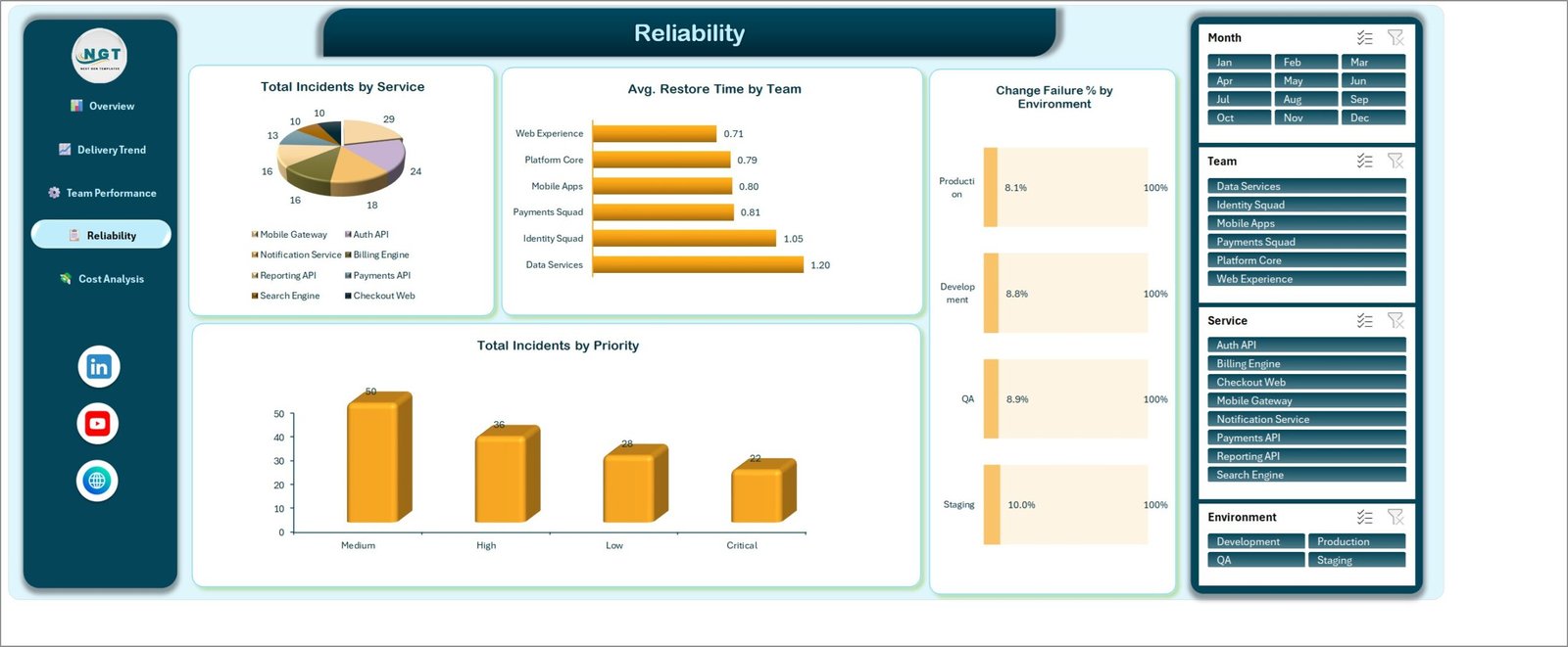
- A dedicated Reliability page covering incidents by service, incidents by priority (Critical, High, Medium, Low), average restore time by team and change failure rate by environment.
- A dedicated Cost Analysis page – cloud cost by region across five regions, cloud cost by service, average build duration by team and average cost per deployment by deployment method (Canary, Blue-Green, Rolling, Recreate).
- Engineer-level output without a survey – a Top 10 Total Story Points by Engineer chart drawn from the 14 engineers in the sample data.
- A clean 28-column source table named TblData, so pasted rows extend the pivot range automatically.
- No macros and no external connections – a plain .xlsx that opens without a security prompt and can sit in a shared drive or SharePoint library.
What’s Inside the DevOps Teams Dashboard in Excel
The download is a single ZIP containing DevOps Teams Dashboard in Excel.xlsx and an Excel Dashboard – User Manual.pdf. The workbook holds seven sheets: five dashboard pages, the Data sheet and a Support sheet carrying the pivot output the charts read from.
- Overview – the five KPI cards, the Change Failure % gauge, Total Cloud Cost by Team (Platform Core $264.6K down to Mobile Apps $141.3K), Total Deployments by Environment (Production 197, QA 112, Staging 100, Development 91) and Success Rate % by Service (Search Engine 90.4% down to Auth API 72.2%).
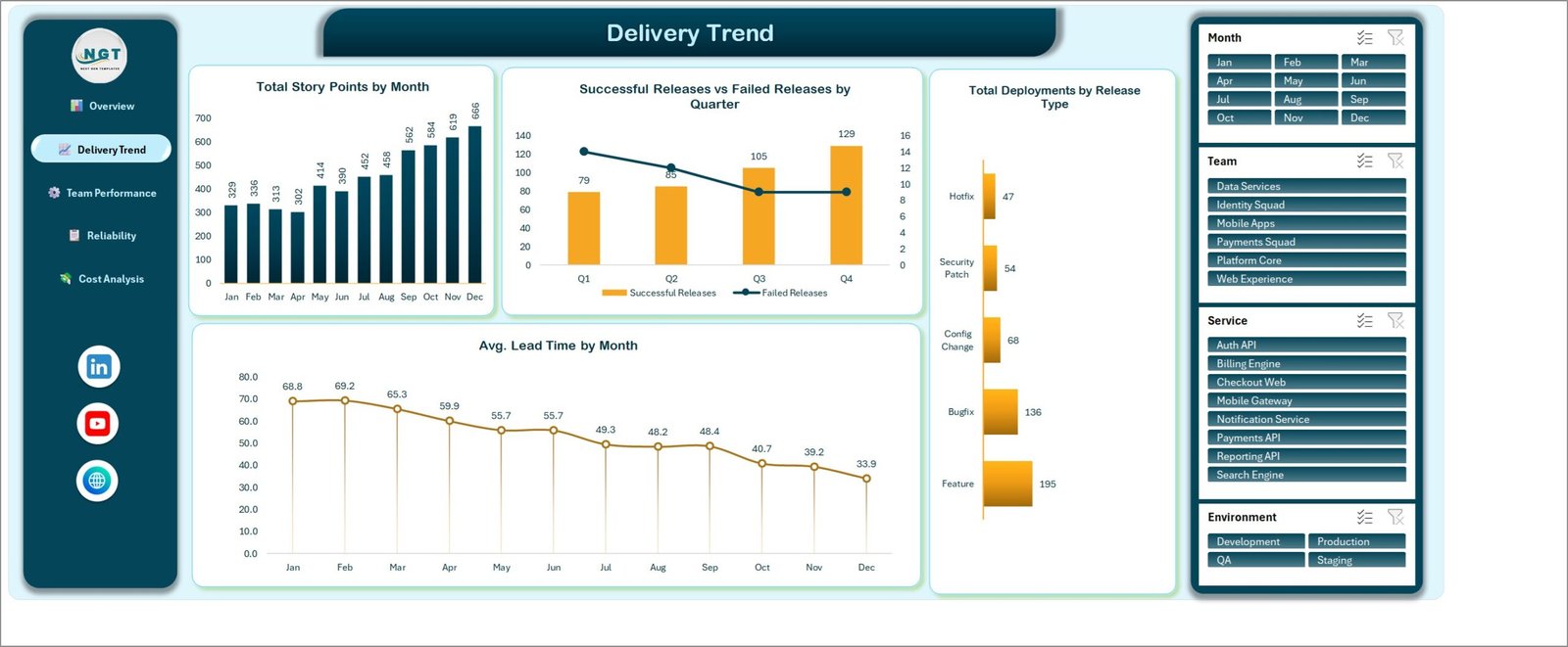
- Delivery Trend – Total Story Points by Month, Successful Releases vs Failed Releases by Quarter, Total Deployments by Release Type (Feature 195, Bugfix 136, Config Change 68, Security Patch 54, Hotfix 47) and Avg. Lead Time by Month, which falls from 68.8 hours in January to 33.9 in December on the sample year.
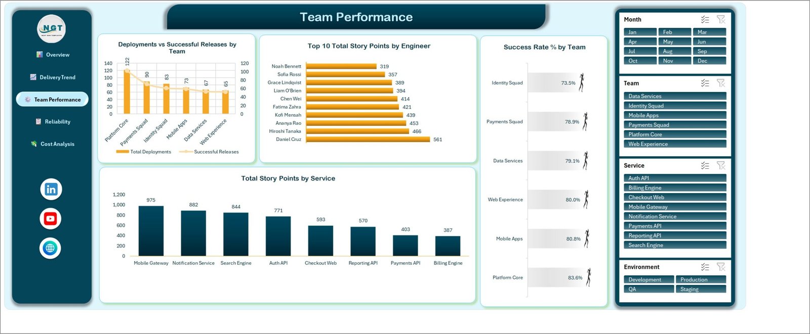
- Team Performance – Deployments vs Successful Releases by Team, Top 10 Total Story Points by Engineer, Success Rate % by Team (Platform Core 83.6% at the top, Identity Squad 73.5% at the bottom) and Total Story Points by Service.
- Reliability – Total Incidents by Service, Avg. Restore Time by Team (Web Experience 0.71 hours through to Data Services 1.20), Change Failure % by Environment and Total Incidents by Priority (Medium 50, High 36, Low 28, Critical 22).
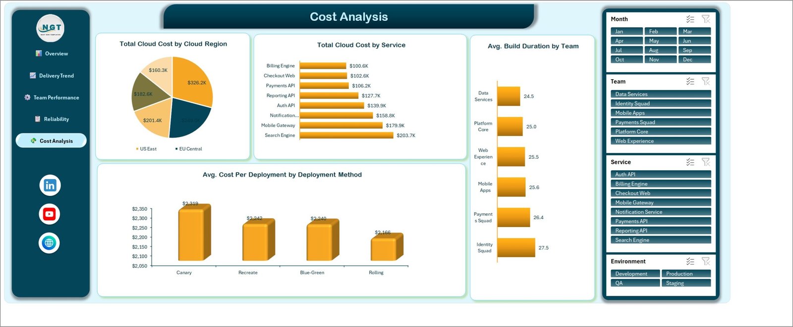
- Cost Analysis – Total Cloud Cost by Cloud Region, Total Cloud Cost by Service (Search Engine $203.7K down to Billing Engine $100.6K), Avg. Build Duration by Team in minutes and Avg. Cost Per Deployment by Deployment Method ($2,319 Canary against $2,166 Rolling).
- Data – the TblData table, rows 4 to 503, with Deployment ID, Date, Team, Service, Environment, Release Type, Cloud Region, Deployment Method, Engineer, Priority, Status, Build Duration Mins, Deploy Duration Mins, Lead Time Hours, Restore Time Hours, Incidents, Code Commits, Story Points, Cloud Cost, Month, Year, Quarter and six counter columns.
DevOps Teams Dashboard in Excel vs. a Google Sheets Build vs. a Paid DevOps Analytics Tool
| This Excel dashboard | A Google Sheets build | A paid DevOps analytics platform | |
|---|---|---|---|
| Cost | One payment, yours permanently | Free tool, your build time | Per-contributor monthly fee |
| Platform | Excel 2016+, Microsoft 365, Windows and Mac | Browser | Browser, SaaS only |
| Setup time | Paste your deployment log, Refresh All | Days of pivot and chart building | Connect repos and CI, then wait for backfill |
| Live pipeline data | No – you export and paste | No, unless you script it | Yes, via integrations |
| Cloud cost in the same view as delivery | Yes, on its own page | You would build it | Usually a separate FinOps product |
| Real-time team collaboration | Via OneDrive or SharePoint co-authoring | Yes, natively | Yes |
| Customisable fields | All 28 columns are yours to rename | Yes | Fixed schema |
| Works offline on last quarter’s data | Yes | No | No |
| Year-1 cost for a 20-engineer org | The one-off price on this page | Your build hours | Recurring, and it scales with headcount |
| Data leaves your network | No | Google Drive | Yes, to the vendor |
Who This Template Is For – and Who It’s Not For
It fits engineering managers who report deployment frequency and change failure rate monthly, platform and SRE leads who need restore time and incident counts by team, delivery managers running several squads against shared services, consultancies that report DevOps health to a client, and FinOps-minded leads who want cloud spend sitting next to delivery numbers instead of in a separate tool.
It is not for you if you want live pipeline telemetry. It does not connect to GitHub, GitLab, Azure DevOps, Jenkins, Datadog, PagerDuty or any cloud billing API – numbers arrive by export and paste, not by sync, so it is a reporting layer over data you already have. It is not an incident management tool: it counts incidents and restore times you record, it does not page anyone. It does not calculate official DORA classifications or benchmark you against an industry band, and it holds no source code, no credentials and no customer data. The 14 engineer names in the sample rows are fictional; if you put real people’s output in the file, how you use that internally is your call and your responsibility.
How to Use the DevOps Teams Dashboard in Excel
- Unzip the download and open DevOps Teams Dashboard in Excel.xlsx. No macro prompt appears – there are none.
- Read the five pages against the sample year first, so you can see what each chart is meant to answer before your own data hides it.
- Go to the Data sheet and replace rows 4 to 503 with your own deployments, one row per deployment. Keep the 28 headers in row 3 as they are, or rename them and update the chart titles to match.
- Fill Month, Year and Quarter to match each Date, and set the six counter columns – Total Records, Successful Deploys, Failed Deploys, Rolled Back Deploys, Production Deploys and Hotfix Releases – to 1 or 0. Those columns are what the KPI cards and the Change Failure % gauge count.
- Press Ctrl+Alt+F5 (Data > Refresh All). The workbook has no auto-refresh, so this step is not optional after a paste.
- Use the Month, Team, Service and Environment slicers on any page to narrow the whole report; clear them with the filter icon in each slicer header.
- Save a dated copy each quarter if you want a history – the workbook reports the rows currently in the table, it does not archive them.
Real-World Use Cases
Ravi manages four squads and reports DORA-style metrics to a CTO every month. His Success Rate % by Team chart puts Identity Squad at 73.5% against Platform Core at 83.6%, and the Change Failure % by Environment chart shows Staging at 10.0% while Production sits at 8.1% – so the conversation becomes “fix the staging gate”, not “the teams are all fine”.
Elena is an SRE lead who has to justify a reliability sprint. The Reliability page shows Data Services averaging 1.20 hours to restore against Web Experience at 0.71, with Mobile Gateway carrying the most incidents of any service. One screenshot and the sprint is approved.
Tom owns the cloud bill and is asked why it grew. Cost Analysis ranks Search Engine at $203.7K against Billing Engine at $100.6K, and Avg. Cost Per Deployment shows Canary at $2,319 against Rolling at $2,166 – so he moves two low-risk services off canary releases and can show the delivery impact on the same file.
Frequently Asked Questions
Does this connect to GitHub, Jenkins or my cloud billing account?
No. There are no live connections anywhere in the file. You export your deployment log from whatever system you already use and paste it onto the Data sheet, then run Refresh All. That is deliberate: it means the workbook opens on any machine, works offline, and nothing leaves your network.
Is this the same as the DevOps Teams KPI Dashboard in Excel?
No, and it is worth being clear about it. The DevOps Teams KPI Dashboard in Excel is a month-picker KPI scorecard with MTD/YTD columns and traffic-light targets. This file is the analytical dashboard: five pages of pivot-driven charts with slicers, built for exploring the data rather than scoring it against targets. Plenty of teams buy both, but they are different templates.
Do I need macros or any add-in?
No. It is a plain .xlsx built on pivot tables, slicers and standard charts. Nothing to enable, nothing to install, and it will not trigger a macro security warning.
Which Excel versions does it work in?
Excel 2016 and later, plus Microsoft 365, on Windows and Mac. Slicers need the desktop app; Excel for the web will render the pages but slicer behaviour is limited. Microsoft’s own guide to slicers covers the basics if they are new to you.
Will the charts update when I load more than 500 deployments?
Yes. The source range is an Excel table called TblData, so pasting below the last row extends it automatically. Run Refresh All afterwards and every pivot and chart picks up the new rows.
Can I change the teams, services or environments?
Yes – they are values in the data, not hard-coded lists. Type your own team and service names and refresh. Chart titles are ordinary text you can edit, so a team using “Tribe” and “Domain” instead of “Team” and “Service” can still use the same file.
Does it calculate official DORA metrics?
It reports the underlying numbers – deployment counts, change failure rate, lead time in hours and restore time in hours – from what you enter. It does not apply DORA’s Elite/High/Medium/Low banding or benchmark you against anyone else. If you want those labels, the figures are all on the page to apply them yourself.
Is the sample data real?
No. The 500 rows are realistic fictional deployment records spanning January 2025 to January 2026, there so you can see every chart working before your own numbers go in. The engineer names are invented.
About the Author
Built by PK – Microsoft Certified Professional with 15+ years of Excel, Google Sheets, and Power BI experience. Founder of NextGenTemplates, reaching 300K+ subscribers across YouTube channels. Every template is hand-built and tested before release.
Explore Related Templates
If you report on more than deployments, the same structure exists next door: DevOps KPI Dashboard in Excel for a targets-and-traffic-lights view, API Development Dashboard in Excel for endpoint-level delivery, SaaS Development Dashboard in Excel for product and revenue alongside engineering, Cloud Computing KPI Dashboard in Excel for the infrastructure side and IT and Tech Operations KPI Dashboard in Excel for the wider ops picture. If your team lives in Google Sheets, DevOps KPI Dashboard in Google Sheets is the browser equivalent, and DevOps Teams KPI Dashboard in Power BI covers the Power BI route. Browse the full Excel Dashboard category or everything under MS Excel.
Download the DevOps Teams Dashboard in Excel now and turn your deployment log into a report you can put in front of a CTO. Instant download, lifetime access, free bug fixes to this file.
Last updated: 30 August 2026.










Reviews
There are no reviews yet.