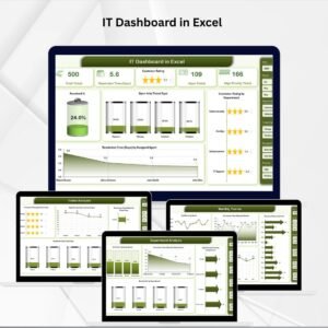
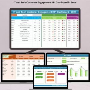
Managing customer relationships in tech requires clarity, data, and speed. The IT and Tech Customer Engagement KPI Dashboard in Excel offers a powerful solution to help IT leaders, support teams, and CX strategists track what truly matters—without coding or complex software.
Whether you’re running a SaaS company, managing a helpdesk, or leading product support, this plug-and-play dashboard gives you clear insights into engagement, satisfaction, and retention. With real-time visuals, dynamic charts, and customizable KPIs, you can turn feedback into strategy and service into loyalty.
🗂️ What’s Inside This Dashboard?
This dashboard is structured into 7 purpose-built Excel worksheets, making it simple and intuitive for your entire team:
🏠 Home Sheet

Navigate your entire dashboard from a central hub using 6 clickable buttons that take you to each key section.
📊 Dashboard Sheet – MTD & YTD Performance
The main visual interface to track Month-to-Date and Year-to-Date values for every KPI:
Drop-down selector (cell D3) to choose the month
Up/down arrow icons with conditional formatting for trends
Comparison across Actual vs. Target vs. Previous Year
Instant visual cues for each KPI’s health
📈 KPI Trend Sheet
Visualize performance over time using combo charts:
Select any KPI from a dropdown menu
View MTD & YTD trends side-by-side
Track progress, dips, or surges using line and bar charts
Great for monthly reviews and forecasting
📥 Actual Numbers Input Sheet
Enter MTD and YTD values for each KPI. No formulas to break—just input and go.
Dynamic month selection via cell E1
Data is cleanly separated for fast updates
Drives all dashboard visualizations
🎯 Target Sheet
Store your monthly and annual KPI targets:
Keep your goalposts visible
Enables automatic variance and % calculations on the dashboard
🕒 Previous Year Numbers Sheet
Keep last year’s MTD/YTD data for accurate YoY (Year-over-Year) comparisons.
Benchmark success
Spot seasonal patterns or recurring challenges
🧾 KPI Definition Sheet
Ensure every user understands what each metric means:
KPI Name, Group, Unit, Formula, and a Short Description
Define each KPI as UTB (Upper The Better) or LTB (Lower The Better)
Perfect for onboarding new team members or sharing reports cross-functionally
🌟 Key Benefits of the Dashboard
✅ Real-Time Engagement Monitoring – Instantly see which KPIs are improving and which need attention
✅ All-in-One Reporting – MTD, YTD, and PY stats in one place
✅ Strategic Decision-Making – Visual trends help identify what’s driving retention and satisfaction
✅ No Monthly Subscription – Pay once and reuse for every reporting cycle
✅ Customizable and Scalable – Add your own KPIs, logos, or department-level filters
✅ Beginner-Friendly – Designed for non-technical users, no coding required
📌 Common KPIs Tracked
Net Promoter Score (NPS)
Customer Satisfaction Score (CSAT)
First Contact Resolution (FCR)
Ticket Volume
Average Response Time
Escalation Rate
Churn Rate
Self-Service Usage Rate
Customer Retention Rate
Customer Lifetime Value (CLTV)
You can always add more using the KPI Definition Sheet!
💼 Who Should Use This Dashboard?
IT & Helpdesk Managers
SaaS Product Teams
Customer Experience Executives
Support Desk Coordinators
B2B Tech Firms
Digital Service Providers
If your business depends on tech-enabled customer touchpoints, this dashboard is for you.
🔧 Customization Options
Add more KPIs or visual charts
Change color schemes to match your brand
Add slicers for region, product line, or client tier
Export to PDF for board presentations
🛠️ Tools Needed
Microsoft Excel 2016 or above
Macros not required
Compatible with Office 365 desktop
📘 Detailed User Guide
YouTube Tutorials
See how to set up and customize with full video walkthroughs:
🎥 YouTube.com/@PKAnExcelExpert