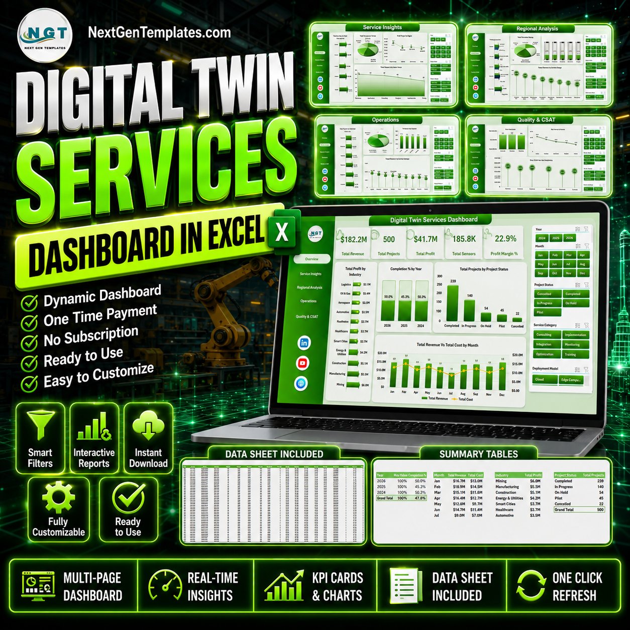


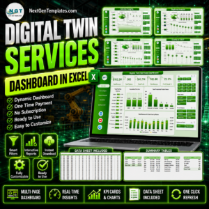
Digital Twin Services Dashboard in Excel helps service leaders, delivery managers, engineering teams, and digital transformation consultants track revenue, cost, profit, projects, sensors, uptime, accuracy, and customer satisfaction across a multi-page Excel dashboard. Digital twin programs can involve hardware sensors, simulation workloads, deployment models, industry-specific twins, and regional delivery teams, so a clear reporting layer is essential. Trusted by 8,400+ teams across 40+ countries, this one-time purchase gives you an editable Excel dashboard with no SaaS subscription, no per-user fee, and a familiar workflow your team can update from a structured data sheet.
Key Features of Digital Twin Services Dashboard in Excel
- 5 dashboard analysis pages: Overview, Service Insights, Regional Analysis, Operations, and Quality & CSAT.
- High-level KPI cards: Track Total Revenue, Total Projects, Total Profit, Total Sensors, and Profit Margin % on the Overview page.
- 20 ready-made charts: Analyze profit, revenue, cost, project status, twin type, deployment model, region, complexity, engineer performance, uptime, accuracy, and CSAT.
- Interactive slicers: Filter dashboard pages quickly and review focused views by your selected business dimensions.
- Structured Data Sheet: Replace the sample records with your own digital twin service data using the same format.
- Pivot-driven Support Sheet: All charts are powered by pivot tables, so you can refresh the full dashboard from the Excel Data ribbon.
- No monthly software fee: Use Microsoft Excel to review performance without buying a dedicated digital twin analytics SaaS tool.
What’s Inside the Digital Twin Services Dashboard in Excel
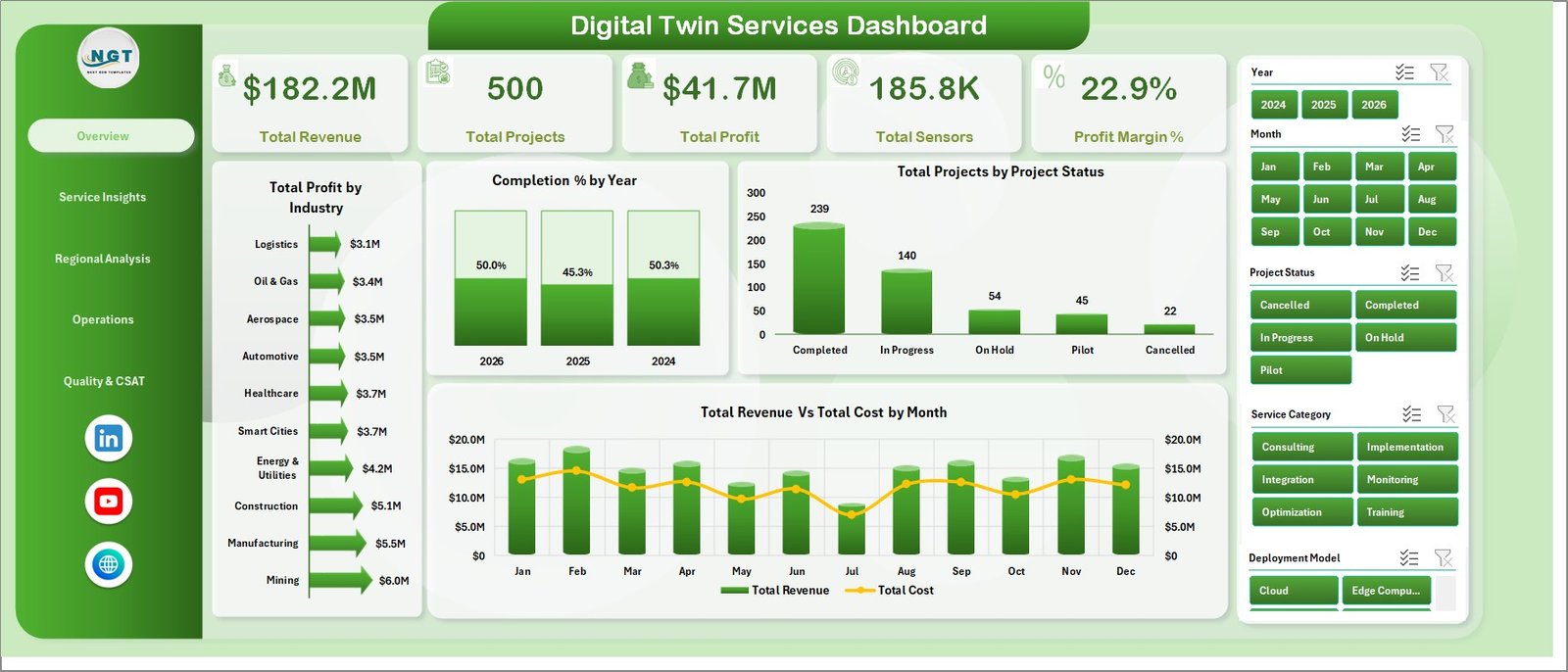
1. Overview Page
The Overview Page gives executives and delivery teams a quick snapshot of Total Revenue, Total Projects, Total Profit, Total Sensors, and Profit Margin %. Multiple slicers help users filter the full dashboard instantly and focus on a specific industry, year, status, region, or service segment.
Total Profit by Industry compares profit contribution across industries. It helps leaders see which sectors produce the strongest return from digital twin delivery.
Completion % by Year shows how project completion performance changes over time. This supports annual planning and delivery maturity reviews.
Total Projects by Project Status breaks projects into status groups such as completed, active, delayed, or planned. It helps teams monitor workload and delivery risk at a glance.
Total Revenue Vs Total Cost by Month compares monthly revenue and cost side by side. It is useful for spotting margin pressure, seasonal demand, and cost spikes.
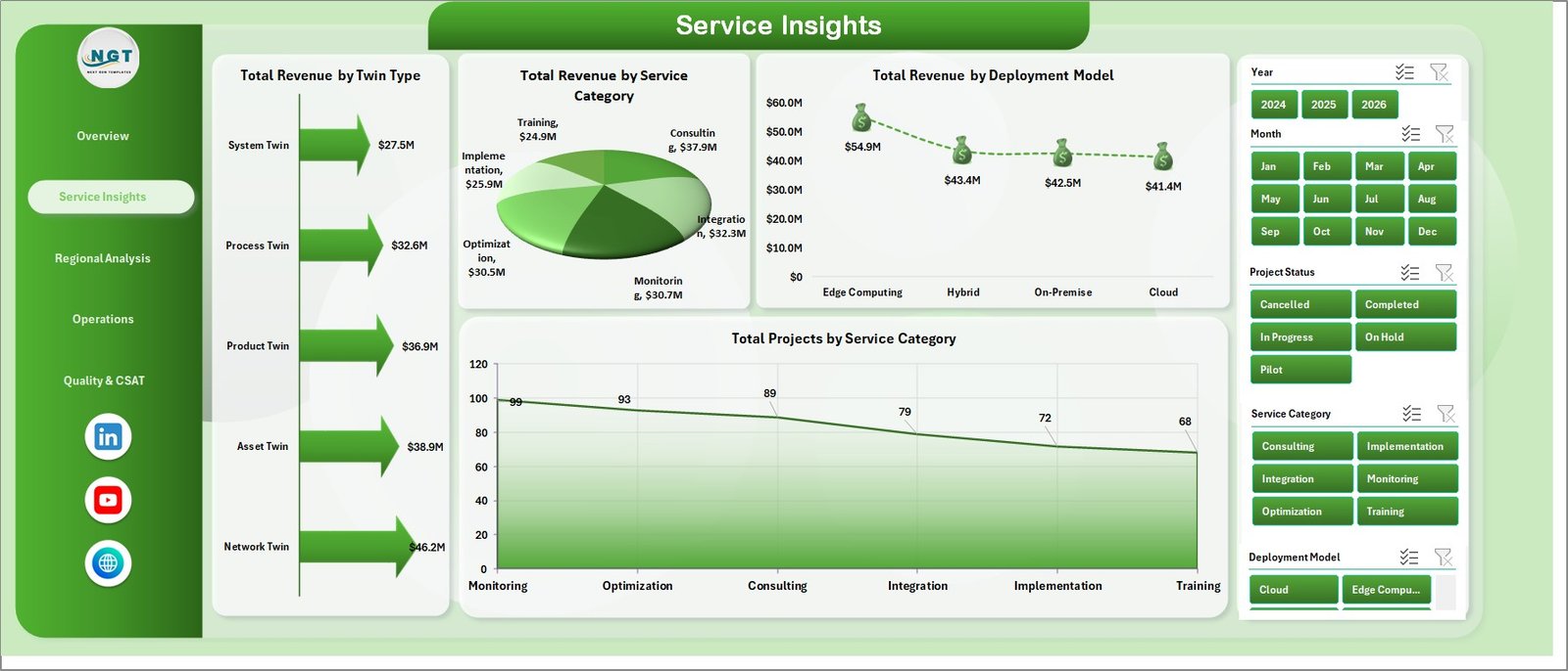
2. Service Insights
The Service Insights page explains how digital twin revenue and project volume are distributed by twin type, service category, and deployment model.
Total Revenue by Twin Type shows which twin types produce the highest revenue. Use it to identify high-value service lines and prioritize commercial focus.
Total Revenue by Service Category compares revenue across consulting, implementation, monitoring, simulation, and support-style categories. It helps teams see which services drive the business.
Total Revenue by Deployment Model breaks revenue across cloud, on-premise, hybrid, or other deployment models. This helps leaders align architecture choices with revenue performance.
Total Projects by Service Category shows delivery volume by service category. It helps separate high-volume work from high-revenue work.
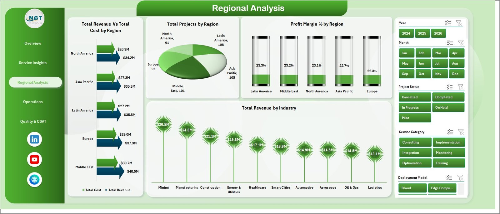
3. Regional Analysis
The Regional Analysis page helps managers compare revenue, cost, project count, profit margin, and industry performance across geographic regions.
Total Revenue Vs Total Cost by Region compares financial performance across regions. It highlights where delivery is profitable and where costs may need review.
Total Projects by Region shows project distribution by geography. It helps resource managers understand regional workload and capacity needs.
Profit Margin % by Region identifies which regions deliver stronger margins. This supports pricing, staffing, and delivery model decisions.
Total Revenue by Industry compares industry revenue inside the regional view. It helps teams see which sectors are contributing most to growth.
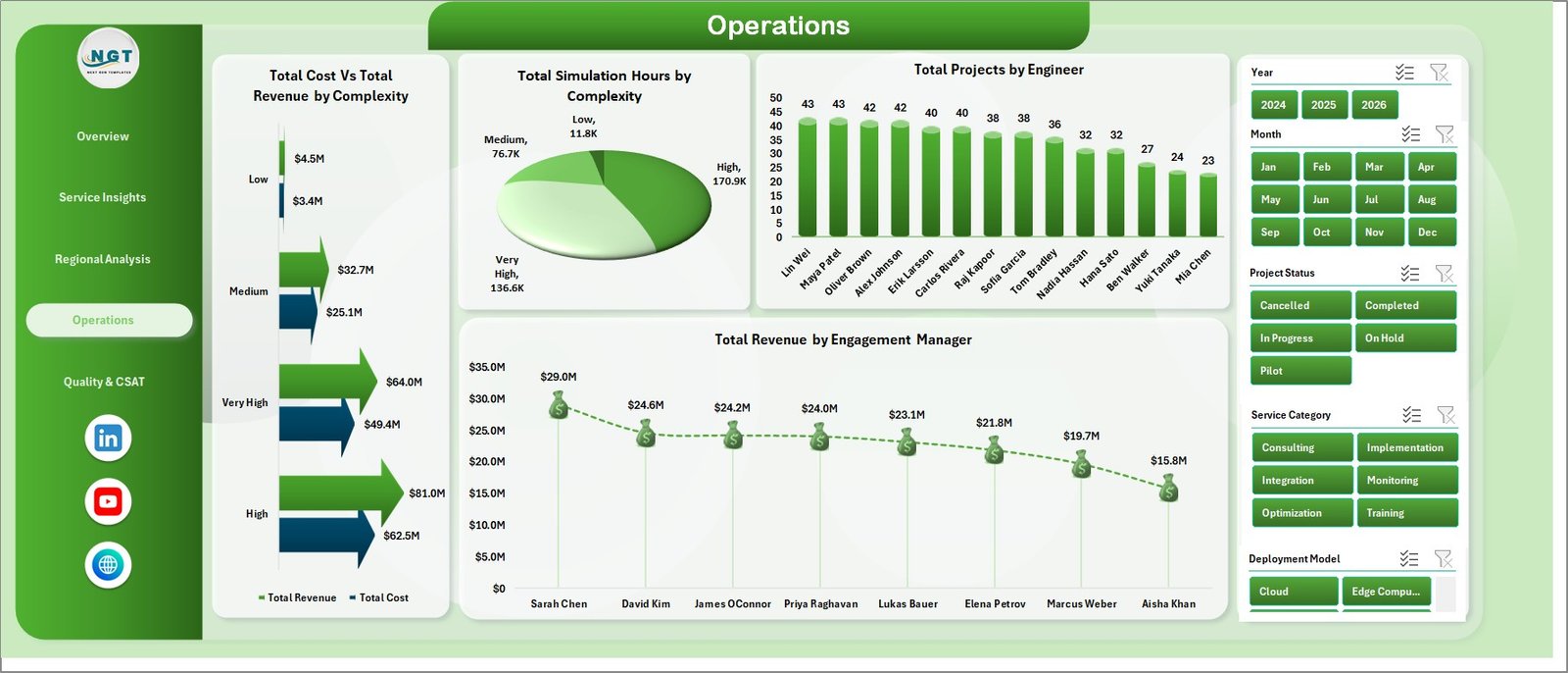
4. Operations
The Operations page focuses on project complexity, simulation load, engineer contribution, and engagement manager revenue.
Total Cost Vs Total Revenue by Complexity compares cost and revenue for each complexity level. It helps teams understand whether complex projects are priced correctly.
Total Simulation Hours by Complexity shows simulation workload by complexity. This is helpful for planning compute resources and technical staffing.
Total Projects by Engineer compares delivery volume across engineers. It supports workload balancing and capacity planning.
Total Revenue by Engagement Manager shows commercial contribution by manager. It helps leadership review portfolio ownership and account performance.
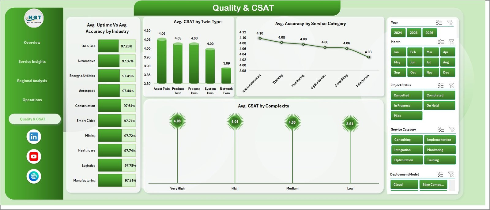
5. Quality & CSAT
The Quality & CSAT page brings service quality, technical accuracy, uptime, and customer satisfaction into one view.
Avg. Uptime Vs Avg. Accuracy by Industry compares operational reliability and model accuracy across industries. It helps teams identify where digital twin outcomes are strongest.
Avg. CSAT by Twin Type shows customer satisfaction by twin type. It helps product and service leaders understand which offerings create the best client experience.
Avg. Accuracy by Service Category compares model or service accuracy by category. Use it to locate improvement areas in delivery quality.
Avg. CSAT by Complexity shows how customer satisfaction changes as project complexity increases. This helps teams plan support and communication for difficult projects.
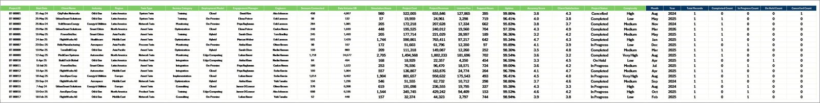
6. Data Sheet Tab
The Data Sheet is where you enter or paste your digital twin service records in the same structured format. After updating the data, refresh the workbook so all pivot tables, KPI cards, slicers, and charts reflect the latest values.
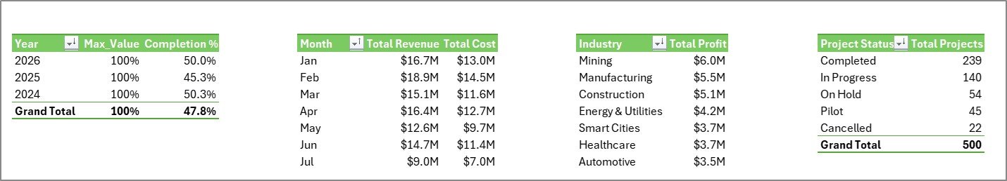
7. Support Sheet
The Support Sheet contains the pivot tables that power the entire dashboard dynamically. After updating the Data Sheet, go to the Data tab in the Excel Ribbon and click Refresh All. You can keep this sheet hidden during normal use.
Digital Twin Services Dashboard in Excel vs. Google Sheets vs. Paid Digital Twin SaaS – Where This Fits
| Feature | This Excel dashboard | Google Sheets alternative | Paid digital twin SaaS |
|---|---|---|---|
| Cost | $17.99 one-time | Low cost, but manual dashboard build | Monthly or annual subscription |
| Platform | Microsoft Excel | Google Sheets | Vendor-hosted web platform |
| Setup time | Replace data and refresh pivots | Build formulas, pivots, and charts | Implementation project required |
| Customizable fields | Editable workbook | Editable sheet | Depends on vendor plan |
| Digital twin service analytics | Built in across 5 pages | Must be designed | Usually built in, but less flexible |
| Year-1 cost at 5 users | $17.99 total | Usually low, plus build time | Often hundreds or thousands |
Who This Template Is For – and Who It’s Not For
This template is for digital twin service providers, engineering consultants, smart manufacturing teams, IoT solution teams, operations analysts, project managers, engagement managers, and leaders who need a practical Excel reporting layer. It is not a live IoT platform, simulation engine, sensor data pipeline, ERP replacement, or automated integration tool.
How to Use the Digital Twin Services Dashboard in Excel
- Download and unzip the product file.
- Open the Excel workbook in Microsoft Excel.
- Go to the Data Sheet and replace the sample rows with your own records using the same columns.
- Click Data > Refresh All in the Excel Ribbon.
- Use slicers on each dashboard page to filter by the dimensions relevant to your review.
- Keep the Support Sheet hidden if you only want end users to see the dashboard pages.
Real-World Use Cases
Arjun, digital twin program manager: Arjun uses the Overview and Operations pages before monthly steering meetings to explain revenue, cost, profit, complexity, and simulation workload.
Maya, service delivery lead: Maya reviews engineer workload, project status, and engagement manager revenue to balance project assignments and reduce delivery delays.
Daniel, IoT consulting director: Daniel uses Regional Analysis and Service Insights to identify which regions, industries, twin types, and deployment models deserve more sales focus.
Frequently Asked Questions
What does this dashboard track?
It tracks revenue, cost, profit, projects, sensors, profit margin, completion percentage, service category, twin type, deployment model, region, complexity, simulation hours, engineer, engagement manager, uptime, accuracy, and CSAT.
Do I need macros or VBA?
No. The dashboard is designed around Excel data, pivot tables, slicers, KPI cards, and charts.
Can I replace the sample data?
Yes. Replace the records in the Data Sheet using the same structure, then click Refresh All to update pivots and charts.
Can I customize the workbook?
Yes. You can edit labels, formulas, pivot tables, charts, slicers, colors, and worksheet names in Excel.
Does it connect directly to IoT sensors?
No. This is a reporting dashboard, not a live IoT connector or simulation platform. You can paste or import prepared service records into the Data Sheet.
Which Excel version should I use?
Use a modern desktop version of Microsoft Excel that supports pivot tables, slicers, and standard charts.
About the Author
Built by PK – Microsoft Certified Professional with 15+ years of Excel, Google Sheets, and Power BI experience. Founder of NextGenTemplates, reaching 300K+ subscribers across YouTube channels. Every template is hand-built and tested before release.
Explore Related Templates
You may also like IT and Cybersecurity Operations Bundle, IT Support Ticket Dashboard in Excel, IT Asset Management Dashboard in Power BI, and Cloud Hosting Services Dashboard in Excel. Browse more MS Excel templates and Excel dashboard templates.
Download the Digital Twin Services Dashboard in Excel today and turn digital twin service data into clear, refreshable Excel reporting.
Last updated: June 2026
Watch the step-by-step video tutorial:


Reviews
There are no reviews yet.