

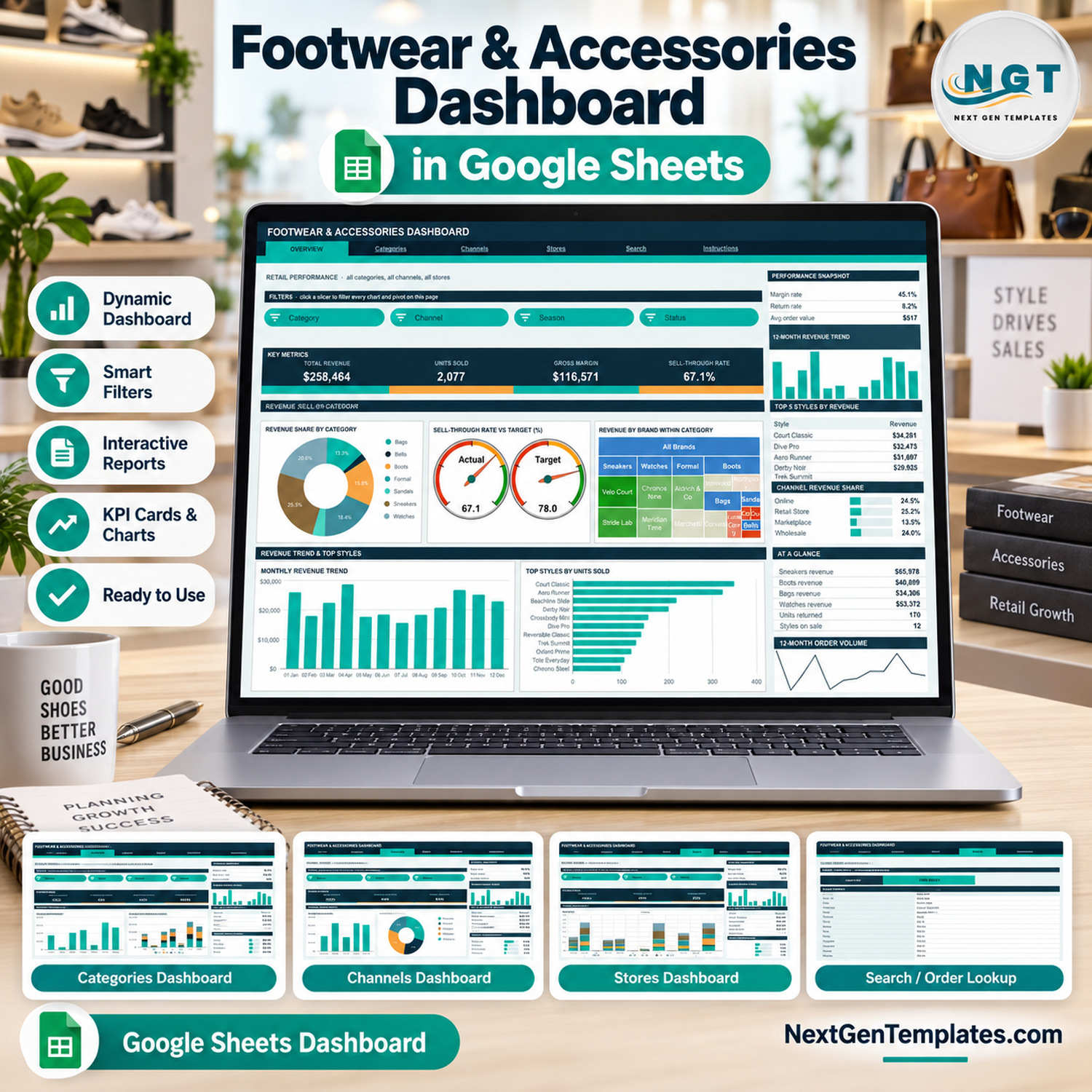
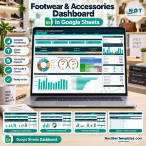
The Footwear and Accessories Dashboard in Google Sheets turns a 500-order sample log into 16 KPI cards, 19 charts and 15 slicers spread over six tabs — Overview, Categories, Channels, Stores, Search and Instructions. The sample file already reads $258,464 in revenue, 2,077 units sold, $116,571 gross margin and a 67.1% sell-through rate against a 78% target. Setup takes under 10 minutes: paste your own orders onto the Data sheet and every pivot, chart and Top 5 panel redraws itself.
🌍 Join 8,400+ teams in 40+ countries using NextGenTemplates to replace paid SaaS tools with one-time-purchase Excel, Google Sheets, Power BI and HTML templates.
✅ Instant download · One-time payment · No subscription · No per-user fees · Lifetime access
🔑 Key Features of the Footwear and Accessories Dashboard in Google Sheets
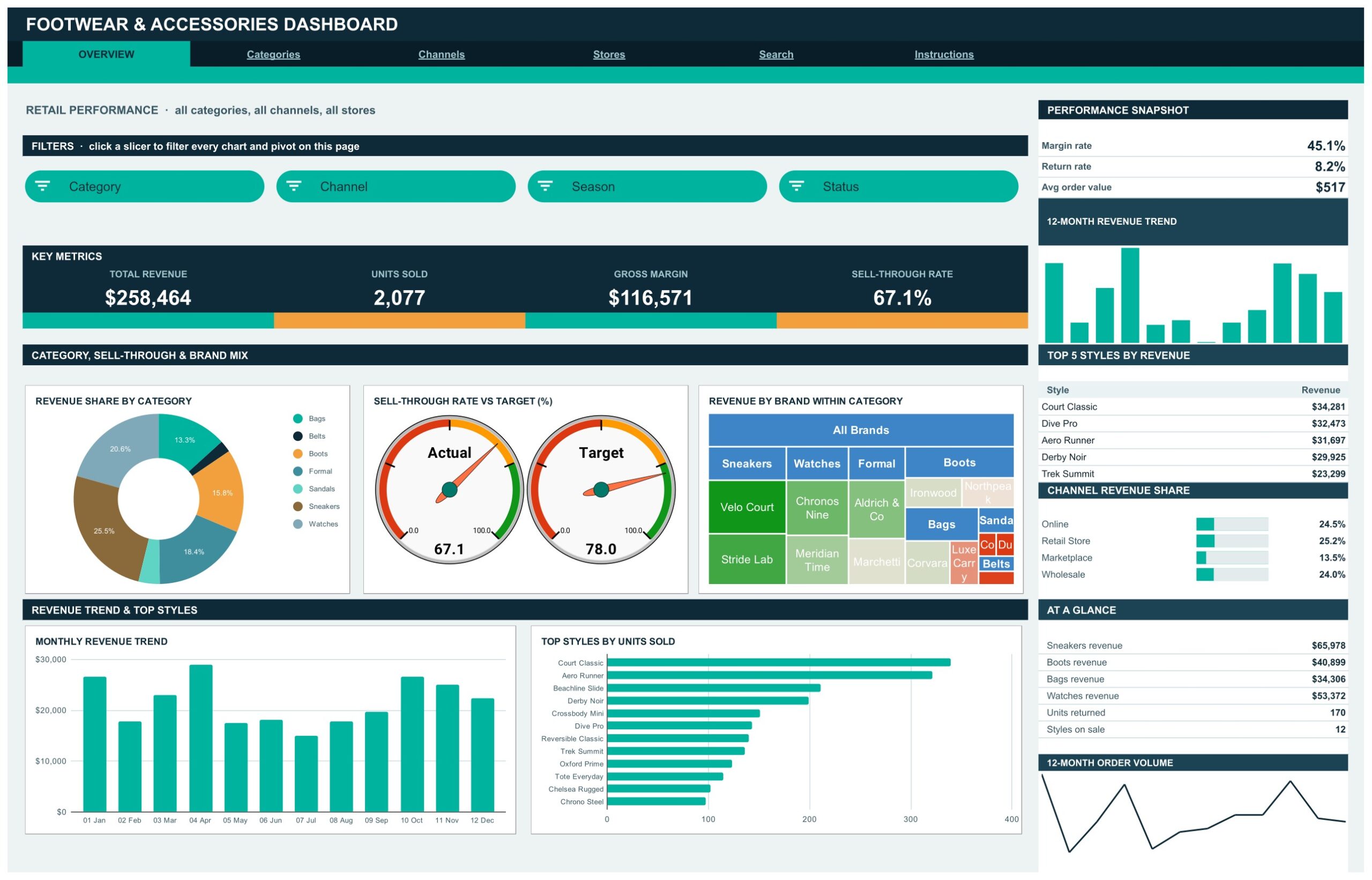
📊 Four analysis tabs, four KPI cards each. Overview carries Total Revenue, Units Sold, Gross Margin and Sell-Through Rate. Categories carries Sneaker Revenue, Accessory Units, Avg Selling Price and Margin Rate. Channels carries Online Revenue, Wholesale Units, Units Returned and Return Rate. Stores carries Flagship Revenue, Outlet Units, Stores Trading and Revenue per Order.
🎚️ 15 native slicers, grouped per page. Overview filters by Category, Channel, Season and Status. Categories filters by Category, Brand, Season and Segment. Channels filters by Channel, Segment, Month and Status. Stores filters by Store, Region and Size. One click redraws every chart and pivot on that tab, and each tab keeps its own filter state.
🎯 A live sell-through gauge against a target you control. The Overview page shows an Actual gauge at 67.1 beside a Target gauge at 78.0. The target lives in cell BL5 on the Overview sheet, so you can reset it per season without touching a formula.
🧱 Native pivot tables, no helper columns. Every chart reads a pivot parked to the right of its page rather than a block of array formulas, which is why the file stays quick as the order log grows. Scroll past the wide spacer column on any tab to inspect the numbers behind a chart.
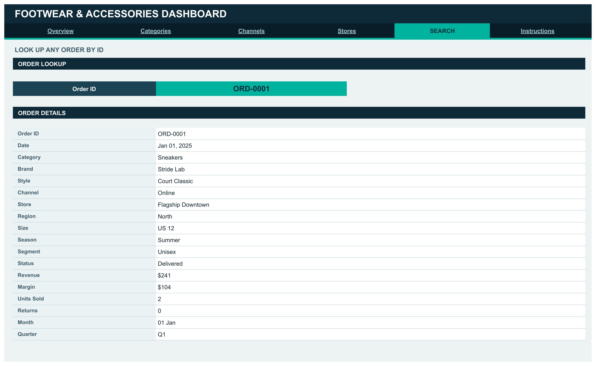
🔎 An order lookup that returns 18 fields. Pick any Order ID on the Search tab and the record opens out into Date, Category, Brand, Style, Channel, Store, Region, Size, Season, Segment, Status, Revenue, Margin, Units Sold, Returns, Month and Quarter.
📈 Auto-expand to 1,000 rows. Pivots, slicers and formulas already cover 1,000 data rows. Paste new orders anywhere up to row 1001 and the whole workbook updates on its own.
📦 What Is Inside
Page 1: Overview — Retail Performance
A company-wide read across all categories, channels and stores. Four KPI cards sit above Revenue Share by Category, Sell-Through Rate vs Target, Revenue by Brand within Category, Monthly Revenue Trend and Top Styles by Units Sold. The sidebar adds a Performance Snapshot (45.1% margin rate, 8.2% return rate, $517 average order value), Top 5 Styles by Revenue — Court Classic leads at $34,281 — and a Channel Revenue Share bar strip.
Page 2: Categories — Category and Season Performance
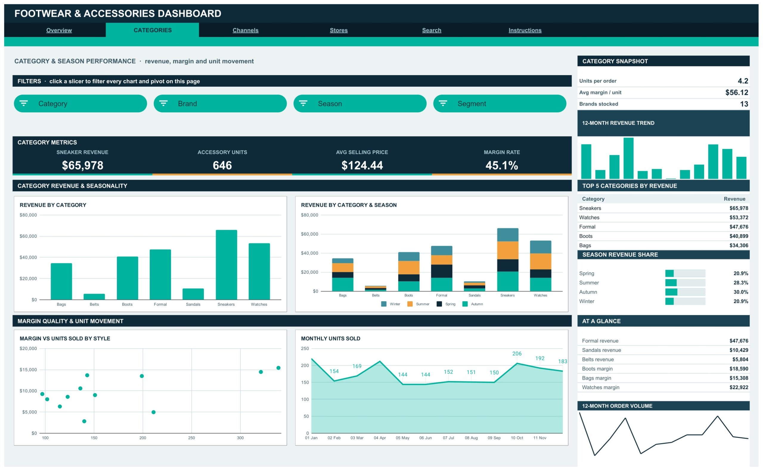
Revenue, margin and unit movement across the seven categories the sample stocks: Bags, Belts, Boots, Formal, Sandals, Sneakers and Watches. Charts are Revenue by Category, Revenue by Category & Season, Margin vs Units Sold by Style and Monthly Units Sold. The Category Snapshot reports 4.2 units per order, $56.12 average margin per unit and 13 brands stocked, with a Season Revenue Share panel showing Autumn ahead at 30.0%.
Page 3: Channels — Channel, Segment and Returns Analysis
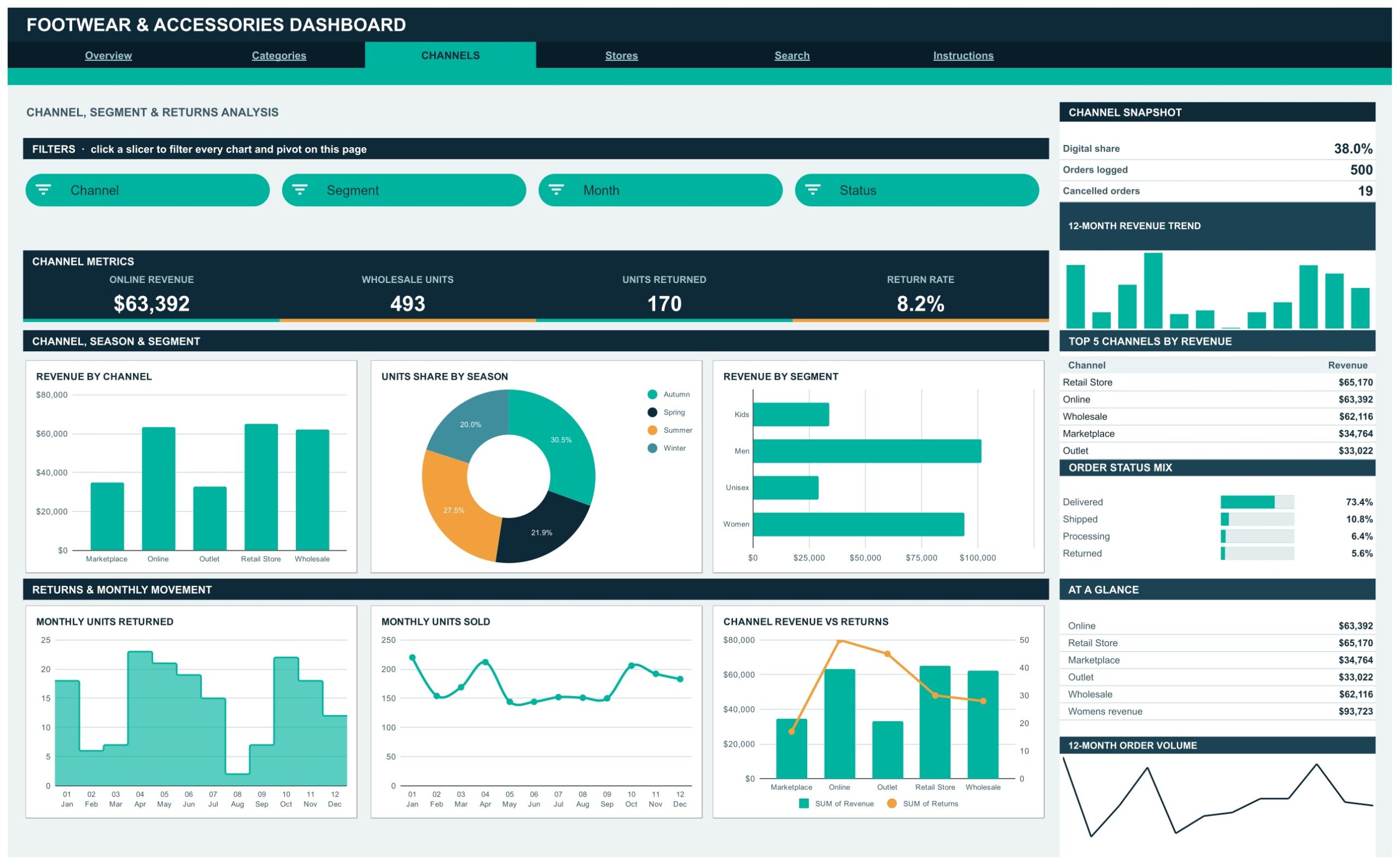
Six charts cover Revenue by Channel, Units Share by Season, Revenue by Segment, Monthly Units Returned, Monthly Units Sold and Channel Revenue vs Returns. The Channel Snapshot reads 38.0% digital share, 500 orders logged and 19 cancelled orders, and an Order Status Mix strip splits Delivered 73.4%, Shipped 10.8%, Processing 6.4% and Returned 5.6%. Retail Store tops the channel table at $65,170.
Page 4: Stores — Store, Region and Size Curve Analysis
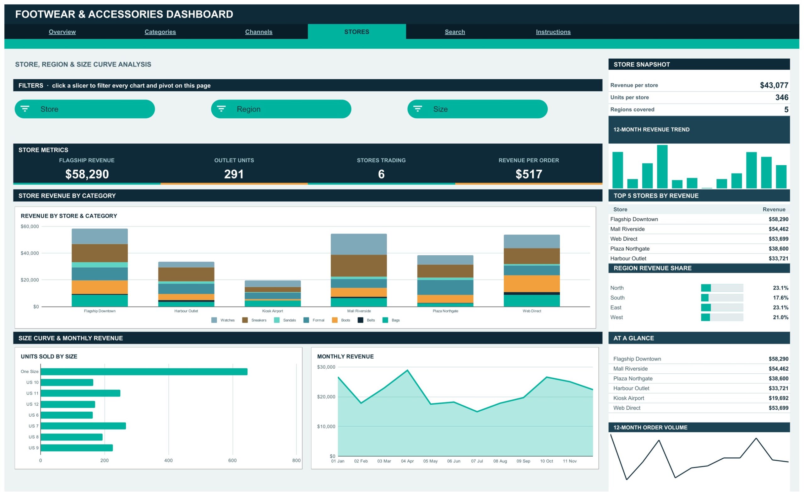
Revenue by Store & Category stacks all seven categories across the six trading locations, while Units Sold by Size gives you the size curve from US 6 to US 12 plus One Size accessories, and Monthly Revenue tracks the year. The Store Snapshot reports $43,077 revenue per store, 346 units per store and 5 regions covered, and Flagship Downtown leads at $58,290.
Page 5: Search — Order Lookup
Choose an Order ID from the dropdown and the Order Details table returns the full 18-field record for that line, from category and brand through to margin, returns and quarter. It is the fastest way to settle a query without scrolling the Data sheet.
Page 6: Instructions — User Guide
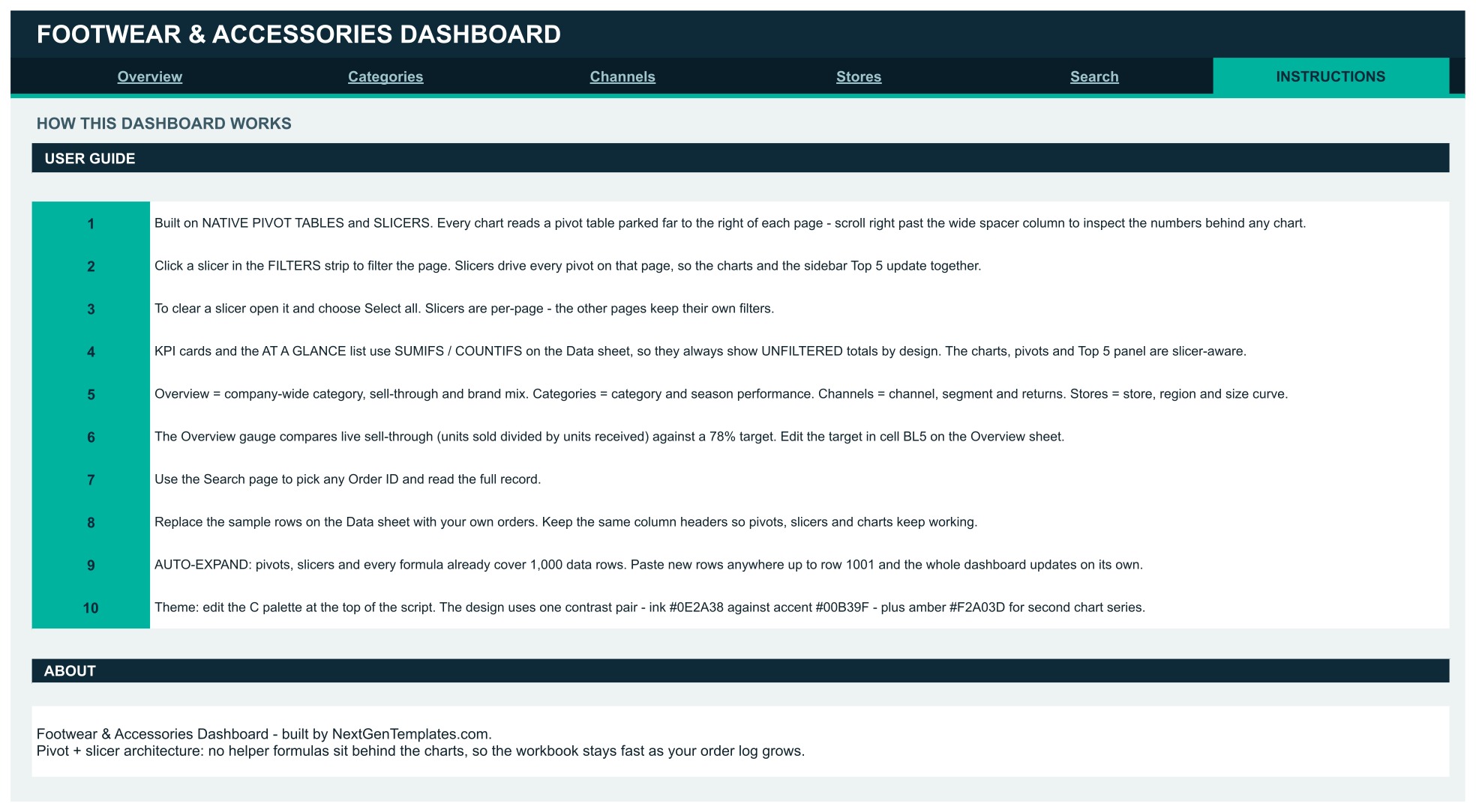
A 10-step guide explaining the pivot-and-slicer architecture, how to clear a slicer with Select all, why the KPI cards and At a Glance lists deliberately show unfiltered totals while the charts stay slicer-aware, where the sell-through target lives, and how to recolour the whole file from one palette block.
📊 Footwear & Accessories Dashboard vs. Excel vs. Paid Retail BI
| Feature | Footwear & Accessories Dashboard (Google Sheets) | Microsoft Excel dashboard | Zoho Inventory / NetSuite ERP |
|---|---|---|---|
| Cost | $16.99 one-time (on sale at $9.99) | $20-30 one-time, plus an Office licence | $39-999 per month |
| Platform | ✅ Any browser, no install | Desktop Excel, Windows or Mac | Vendor cloud |
| Setup time | ✅ Under 10 minutes | 15-30 minutes | Days to weeks of onboarding |
| Real-time team collaboration | ✅ Built in via Google Drive | Needs OneDrive co-authoring | ✅ Yes |
| Mobile access | ✅ Google Sheets app | Limited on mobile Excel | ✅ Native app |
| Customisable fields and charts | ✅ Edit any pivot or palette | ✅ Yes | Restricted to vendor schema |
| Share with a link | ✅ One Drive share link | File attachment or OneDrive | Seat-based invite |
| Size-curve and sell-through views | ✅ Included out of the box | Build it yourself | ✅ Yes, on higher tiers |
| Year-1 cost at 5 users | $16.99 total | $25 plus licences | $2,340-12,000 |
For a shoe and accessories retailer that wants sell-through, size curve and return-rate visibility without an ERP contract, the Footwear and Accessories Dashboard in Google Sheets sits in the sweet spot.
👥 Who This Template Is For — and Who It Is Not For
✅ Built for:
- Independent footwear and accessories retailers running 1-10 doors plus a web channel
- Buyers and merchandisers who need a weekly size-curve and sell-through read
- Wholesale and marketplace sellers reconciling returns by channel
- Store managers who want one shared link instead of emailed spreadsheets
❌ Not for:
- Anyone needing a live feed — this workbook connects to no POS, ERP or e-commerce platform and ships with sample data only, so orders arrive by paste or import
- Teams with more than 1,000 order lines per reporting cycle without extending the ranges first
- Businesses that need stock-on-hand, purchase orders or supplier payments — this is a sales analytics file, not an inventory system
⚙️ How to Use It
- Open the PDF in your download and click the Make a copy link to create your own editable Google Sheets file.
- Open the Data sheet and replace the sample orders with your own, keeping the existing column headers.
- Paste up to row 1001, because pivots, slicers and formulas already cover that range.
- Set your season target for sell-through in cell BL5 on the Overview sheet.
- Click any slicer in the FILTERS strip to focus a page, and use Select all to clear it.
- Open the Search tab and pick an Order ID whenever you need a single record in full.
💼 Real-World Use Cases
Priya buys footwear for a five-store chain. Every Monday she opens the Stores tab, reads Units Sold by Size against Revenue by Store & Category, and spots that Kiosk Airport is under-selling US 10 and US 11 while Mall Riverside clears them. Her reorder split changes that afternoon.
Daniel runs wholesale and marketplace for an accessories brand. He filters the Channels tab to Marketplace, watches Channel Revenue vs Returns, and catches a return rate climbing above the 8.2% company figure on one segment before the quarter closes.
Aisha manages a single flagship plus a web shop. She shares one view-only link with her two supervisors instead of mailing a workbook, and uses the Categories tab to see that Autumn carries 30.0% of revenue, so she pulls her Winter buy forward.
❓ Frequently Asked Questions
What does the Footwear and Accessories Dashboard in Google Sheets actually measure?
It measures revenue, units sold, gross margin, sell-through rate, return rate, average order value and average selling price, broken out by category, brand, style, channel, segment, store, region, size and season across four analysis tabs.
Does it connect to my POS or online store?
No. The workbook holds sample data only and connects to no POS, ERP or e-commerce system. You paste or import your own order lines onto the Data sheet, which keeps it platform-neutral and means no API credentials ever leave your Drive.
How long does setup take?
Under 10 minutes. Make your copy from the link in the PDF, paste your orders over the sample rows with the headers intact, set the sell-through target in cell BL5, and every chart and pivot on all four analysis pages redraws itself.
Why do the KPI cards ignore my slicer selection?
By design. The KPI cards and the At a Glance lists use SUMIFS and COUNTIFS against the Data sheet, so they always show unfiltered company totals as a constant reference. The charts, the pivots and the Top 5 sidebar panels are slicer-aware and do respond.
How does this compare to Zoho Inventory or NetSuite?
Those are full inventory and ERP platforms charging $39 to $999 a month. This is a $16.99 one-time analytics layer that answers the sell-through, size-curve and return questions a buyer asks weekly, without onboarding, seats or a contract.
Can I change the colours?
Yes. The design runs on one palette block: ink #0E2A38 against accent #00B39F, with amber #F2A03D for the second chart series. Edit those values and the banners, cards and charts follow.
How many orders can it hold?
1,000 rows out of the box, which the sample fills to 500. Beyond that you extend the pivot and slicer ranges yourself before pasting, or split the file by trading year.
👤 About the Author
Built by PK — Microsoft Certified Professional with 15+ years of Excel, Google Sheets and Power BI experience. Founder of NextGenTemplates, reaching 300K+ subscribers across YouTube. Every template is hand-built and tested before release.
🔗 Explore Related Templates
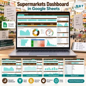
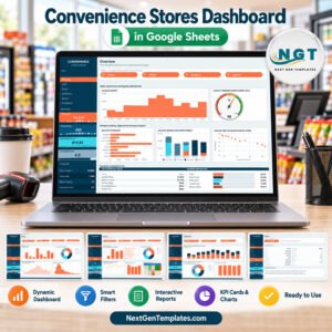
Retailers usually pair this file with one of its neighbours in our Google Sheets Dashboards range: the Convenience Stores Dashboard in Google Sheets for basket and footfall analysis, or the Supermarkets Dashboard in Google Sheets for multi-department grocery reporting.
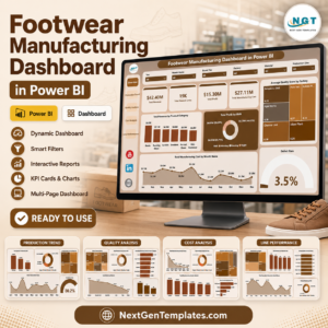
If your question is production rather than retail, the Footwear Manufacturing Dashboard in Excel and the Footwear Manufacturing Dashboard in Power BI cover output, defects and line efficiency instead. For an e-commerce scorecard view, see the Fashion E-commerce KPI Dashboard in Excel. Browse everything in Dashboard Templates.
New to pivot tables in Sheets? The official Google guide to creating and using pivot tables explains the mechanics this file is built on.
📖 Click here to read the Detailed Blog Post
🎥 Visit our YouTube channel for step-by-step video tutorials
👉 YouTube.com/@NextGenTemplates
Watch the step-by-step video Demo:
📅 Last updated: September 2026
























Reviews
There are no reviews yet.