

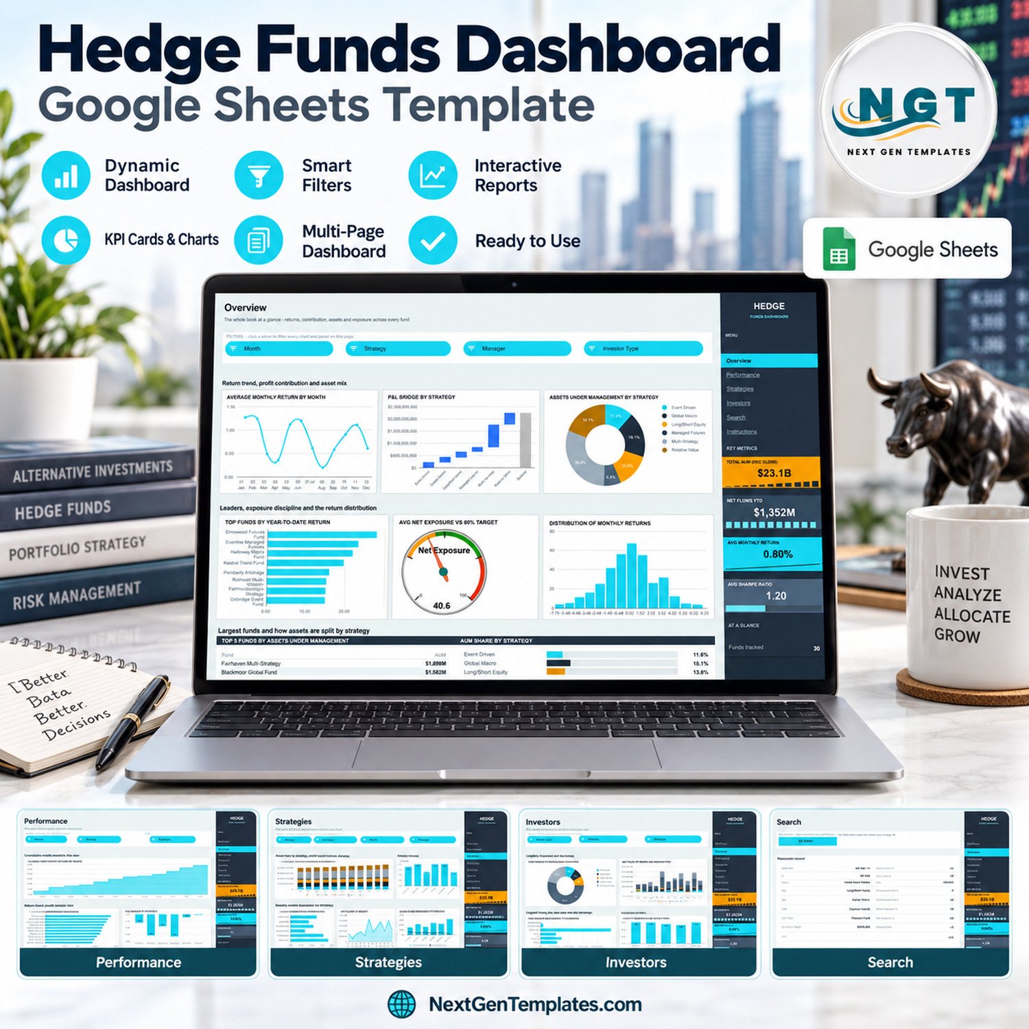
The Hedge Funds Dashboard in Google Sheets turns a fund-month register into a six-page reporting workbook: 360 sample records for 30 fictional funds across six strategies and twelve months, 18 charts, 15 slicers and a right-hand rail of four KPI cards, all driven by native Google Sheets pivot tables. It reports assets under management, net flows, monthly and year-to-date returns, P&L, fees, gross and net exposure, Sharpe ratio and drawdown by fund, strategy, manager, domicile and investor type. Make your copy, paste your own records over the sample rows and the whole book redraws itself.Hedge Funds Dashboard in Google Sheets
🌍 Join 8,400+ teams in 40+ countries using NextGenTemplates to replace paid SaaS tools with one-time-purchase Excel, Google Sheets, Power BI and HTML templates.
✅ Instant download · One-time payment · No subscription · No per-user fees · Lifetime access
🔑 Key Features of the Hedge Funds Dashboard in Google Sheets
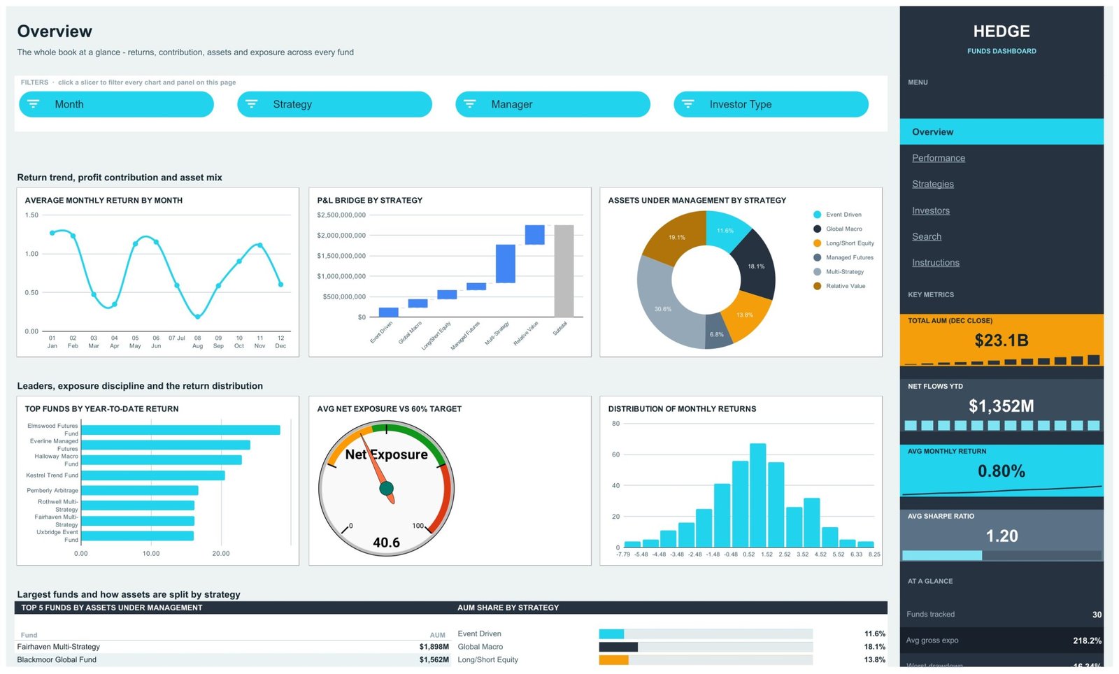
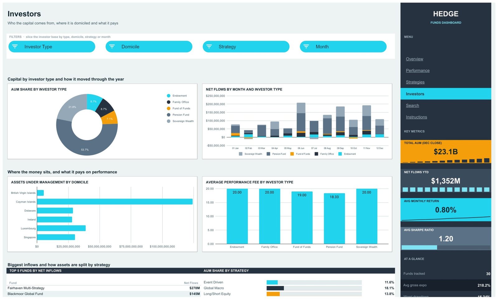
🔹 Four headline KPI cards on every page. The dark navigation rail carries Total AUM (Dec Close) $23.1B, Net Flows YTD $1,352M, Avg Monthly Return 0.80% and Avg Sharpe Ratio 1.20, each with a small in-card trend or bar, plus an AT A GLANCE list: 30 funds tracked, 218.2% average gross exposure, a worst drawdown of -16.34% and a 1.75% average management fee.
🔹 Returns, risk and capital in one file. Four analysis pages cover the whole book (Overview), how it compounded (Performance), what each strategy runs and charges (Strategies) and where the capital comes from (Investors).
🔹 Eighteen charts, including a gauge, a P&L waterfall and a return histogram. The Avg Net Exposure vs 60% Target gauge reads 40.6 in the sample, the P&L Bridge by Strategy steps from Event Driven to a subtotal, and the Distribution of Monthly Returns buckets all 360 fund-months from -7.79% to 8.25%.
🔹 Native pivot tables and slicers. Each chart reads a pivot table parked to the right of its page (from column Z). Fifteen slicers sit in the FILTERS strips: Month, Strategy, Manager, Investor Type, Fund Name and Domicile, applied per page, so each page keeps its own view.
🔹 Top 5 panels and share bars. Every analysis page ends with a Top 5 list (by AUM, by P&L, by average fund size or by net inflows) beside an AUM Share by Strategy bar list. The built-in Instructions page states that charts, the Top 5 panel and the share bars all follow the slicer selection.
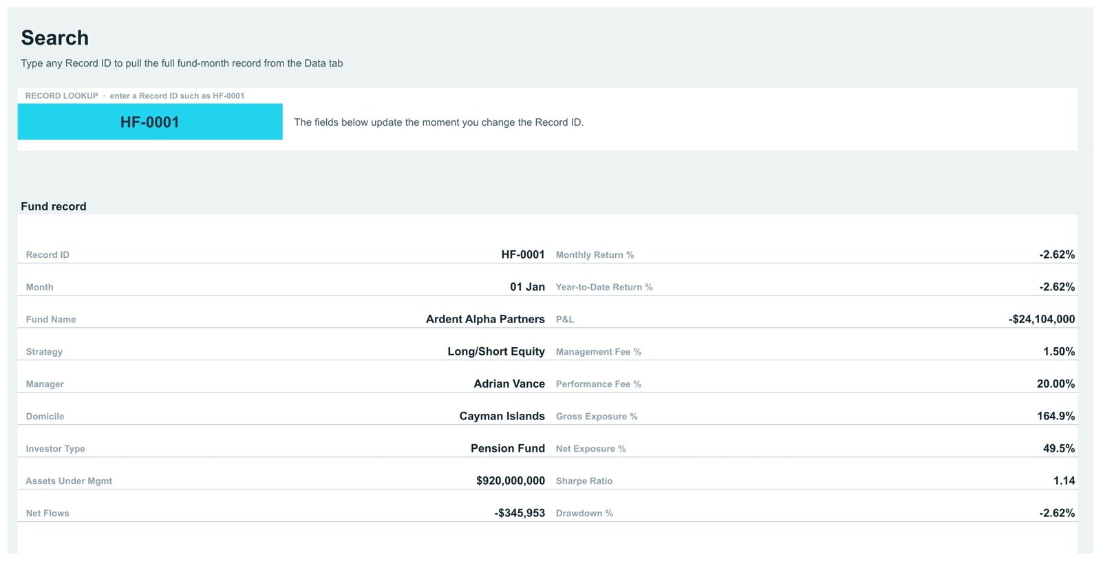
🔹 A record-level Search page. Type any Record ID such as HF-0001 and read all 19 fields of that fund-month record.
🔹 Room for 1,000 records. The pivots read Data!A1:S1001, so you can hold 1,000 fund-month rows before anything needs extending.
🧾 What This Template Does, and What It Deliberately Does Not Do
This is a reporting template for a fund-month register you already keep. It summarises the AUM, flows, returns, P&L, fees, exposure, Sharpe ratio and drawdown figures you type or paste in. It is not portfolio-management, order-management, risk-engine, fund-administration or investor-reporting software. It holds no market prices, connects to no live market feed, prime broker or administrator, and does not calculate returns, Sharpe ratios or drawdowns from prices; those columns are inputs.
It gives no investment, financial or tax advice and promises no returns. Strategy labels, the 60% net exposure target on the gauge and the fee levels are sample values for grouping and illustration, not recommendations. The template makes no claim of conformity with SEC, FCA or any other regulator’s rules. All fund, manager and investor names and every figure in the sample are fictional.
📦 What’s Inside the Hedge Funds Dashboard in Google Sheets
Page 1: Overview, the whole book at a glance
Slicers for Month, Strategy, Manager and Investor Type sit above six charts: Average Monthly Return by Month, P&L Bridge by Strategy (a waterfall), Assets Under Management by Strategy (a donut where Multi-Strategy holds 30.6% and Relative Value 19.1%), Top Funds by Year-to-Date Return, Avg Net Exposure vs 60% Target (a gauge at 40.6) and Distribution of Monthly Returns. Below them, Top 5 Funds by Assets Under Management is led by Fairhaven Multi-Strategy at $1,898M.
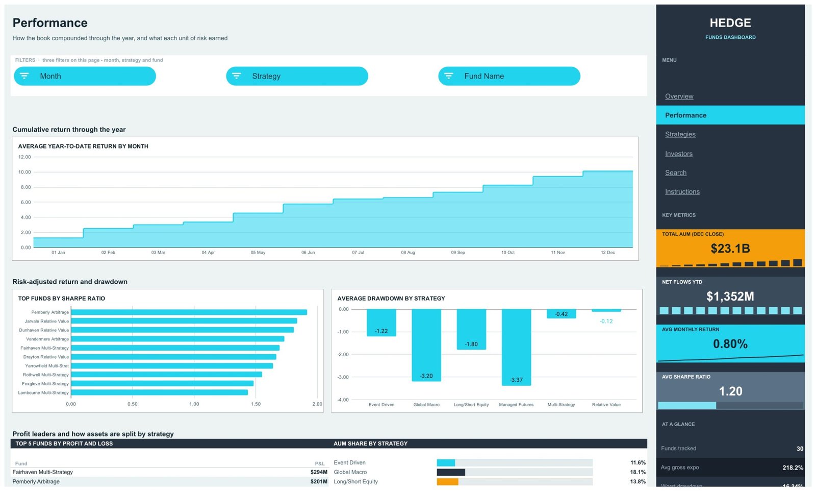
Page 2: Performance, how the book compounded and what risk earned
Filtered by Month, Strategy and Fund Name. Average Year-to-Date Return by Month climbs as a stepped area to just over 10 by December. Top Funds by Sharpe Ratio is led by Pemberly Arbitrage, and Average Drawdown by Strategy shows Managed Futures (-3.37) and Global Macro (-3.20) deepest, Relative Value (-0.12) shallowest. Top 5 Funds by Profit and Loss opens with Fairhaven Multi-Strategy at $294M.
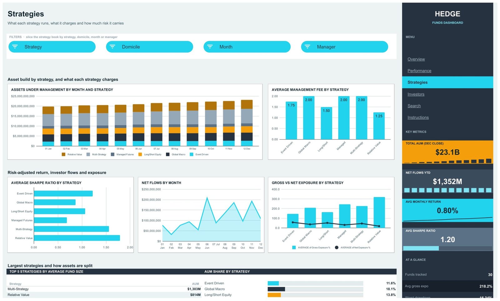
Page 3: Strategies, what each strategy runs, charges and risks
Filtered by Strategy, Domicile, Month and Manager. Charts are Assets Under Management by Month and Strategy (stacked columns), Average Management Fee by Strategy (1.25 for Relative Value up to 2.00 for Global Macro, Managed Futures and Multi-Strategy), Average Sharpe Ratio by Strategy, Net Flows by Month, and Gross vs Net Exposure by Strategy. Top 5 Strategies by Average Fund Size is led by Multi-Strategy at $1,303M.
Page 4: Investors, who the capital comes from and where it is domiciled
Filtered by Investor Type, Domicile, Strategy and Month. AUM Share by Investor Type shows Pension Fund at 53.7% and Sovereign Wealth at 21.8%. Net Flows by Month and Investor Type stacks each month’s flows, Assets Under Management by Domicile compares British Virgin Islands, Cayman Islands, Delaware, Ireland, Luxembourg and Singapore, and Average Performance Fee by Investor Type runs from 18.33 to 20.00. Top 5 Funds by Net Inflows opens with Fairhaven Multi-Strategy at $278M.
Page 5: Search, look up any fund-month record
Enter a Record ID and the Fund record table returns Month, Fund Name, Strategy, Manager, Domicile, Investor Type, Assets Under Mgmt, Net Flows, Monthly Return %, Year-to-Date Return %, P&L, Management Fee %, Performance Fee %, Gross Exposure %, Net Exposure %, Sharpe Ratio and Drawdown %.
Page 6: Instructions, the user guide inside the file
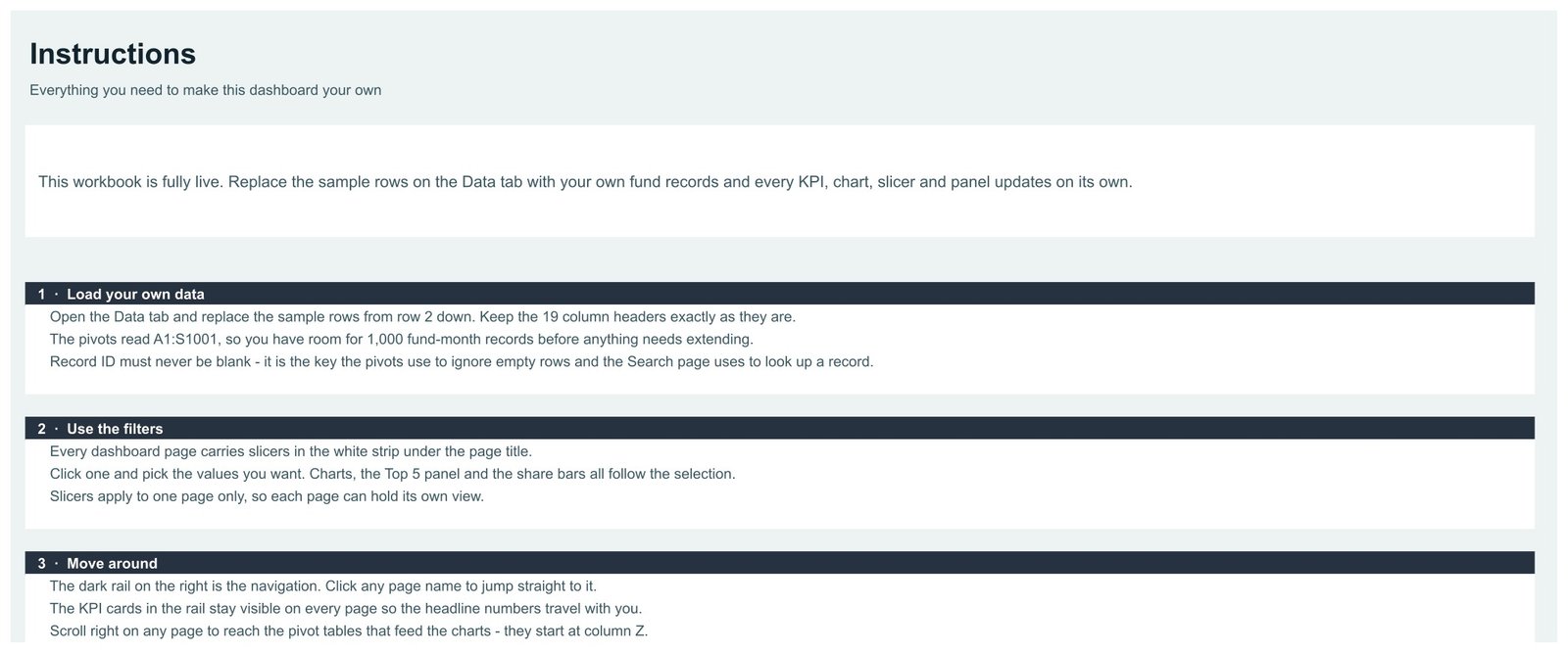
Numbered sections explain how to load your own data (keep the 19 column headers, never leave Record ID blank), how the per-page slicers work, and how to move around with the navigation rail.
🔍 Honest Notes Before You Buy
- Assets Under Management by Domicile adds up every month’s AUM, so its axis runs past $100B while the book closes December at $23.1B. Read it for relative size between domiciles, not as a balance.
- Top Funds by Year-to-Date Return ranks the sum of each fund’s monthly returns, not a compounded figure. Use the Year-to-Date Return % column on the Search page for a fund’s own December value.
- On the gauge, the “Net Exposure” title sits under the needle, and the AT A GLANCE list runs to the bottom edge of the rail on a small screen. Neither affects the numbers.
📊 Google Sheets Dashboard vs. an Excel Dashboard vs. a Paid Fund Reporting Platform, Where This Fits
| Feature | This Google Sheets dashboard | Microsoft Excel dashboard | Paid fund reporting platform |
|---|---|---|---|
| Cost | $9.99 one-time ✅ | $13.99 one-time + Microsoft 365 | Quote-based, per seat or per fund |
| Platform | Google Sheets, browser only ✅ | Desktop Excel | Vendor web app |
| Setup time | Under 10 minutes ✅ | Under 15 minutes | Weeks: data feeds and onboarding |
| Real-time team collaboration | Built in ✅ | Only via OneDrive co-authoring | Yes, per seat |
| AUM, return, exposure and drawdown views by strategy | Ready-made ✅ | Ready-made in our Excel edition | Configured per firm |
| Share with a link | Any Google account ✅ | File send or OneDrive link | Named users only |
| Market data feeds and calculated performance | Not included | Not included | Included ✅ |
For a small team that already keeps fund-month figures in a spreadsheet and wants them summarised without a platform contract, this Google Sheets dashboard sits in the sweet spot.
👥 Who This Template Is For, and Who It’s Not For
✅ Built for:
- Operations and investor-relations staff at small fund managers who already keep monthly fund figures in a spreadsheet
- Family offices and fund-of-funds analysts summarising the managers they allocate to
- Finance students and trainers who want a realistic hedge fund reporting layout to learn pivot tables and slicers
❌ Not for:
- Anyone looking for trading, order-management, risk or fund-administration software
- Teams that need live prices, calculated performance attribution or regulatory filings
- Books with well over 1,000 fund-month records, or that need a live feed from an administrator
⚙️ How to Use the Dashboard
- Open the PDF in your download and click the Google Sheets link, then use File > Make a copy.
- Read the Instructions page first.
- Paste your fund-month records over the sample rows on the Data tab, keeping all 19 headers and filling every Record ID.
- Click any slicer in a FILTERS strip to filter that page’s charts, Top 5 panel and share bars together.
- Use the Search page to pull any single record by its Record ID.
💼 Real-World Use Cases
An investor-relations lead at a multi-strategy manager opens the Investors page before a quarterly call, filters Investor Type to Pension Fund and reads Net Flows by Month and Investor Type instead of rebuilding a flows table.
A fund-of-funds analyst uses the Performance page, filtered by Strategy, to compare Top Funds by Sharpe Ratio and Average Drawdown by Strategy across the managers in the book.
A COO reviewing fee terms reads Average Management Fee by Strategy next to Average Performance Fee by Investor Type to see where fee levels differ.
❓ Frequently Asked Questions
What does the Hedge Funds Dashboard in Google Sheets track?
AUM, net flows, monthly and year-to-date return, P&L, management and performance fees, gross and net exposure, Sharpe ratio and drawdown, by fund, strategy, manager, domicile, investor type and month, across four KPI cards and 18 charts.
Does it give investment advice or pull live market data?
No. It summarises the records you enter. It has no market feed, calculates no returns from prices and gives no investment, financial or tax advice.
How is it different from the Hedge Funds KPI Dashboard?
The KPI Dashboard editions are month-picker scorecards with targets and traffic lights. This template is an analytical dashboard over fund-month records, with pivot charts, slicers, Top 5 panels and a Search page.
How many records can it hold?
The pivots read rows 2 to 1001 of the Data tab, so 1,000 fund-month records. The sample fills 360.
How long does setup take?
Under 10 minutes: make your copy from the PDF link, paste your records over the sample rows with the headers unchanged, and every pivot, chart and slicer updates.
👤 About the Author
Built by PK, Microsoft Certified Professional with 15+ years of Excel, Google Sheets and Power BI experience. Founder of NextGenTemplates, reaching 300K+ subscribers across YouTube channels (@PKAnExcelExpert, @NextGenTemplates, @NeoTechNavigators). Every template is hand-built and tested before release.
🔗 Explore Related Templates
Browse the full range of Google Sheets Dashboards and the wider Google Sheets template library. New to slicers? Google’s own guide to pivot tables in Google Sheets explains the feature this build runs on.
Same subject, other platforms: the Hedge Funds Dashboard in Excel and the Hedge Funds Dashboard in Power BI are built separately for those platforms, with their own layouts.
Different family, same subject: the Hedge Funds KPI Dashboard in Excel and Hedge Funds KPI Dashboard in Power BI are month-picker scorecards.
Pair it with the Wealth Management Dashboard in Google Sheets or the VC Portfolio Dashboard in Google Sheets.
📖 Click here to read the Detailed Blog Post
🎥 Visit our YouTube channel for step-by-step video tutorials
👉 YouTube.com/@NextGenTemplates
Watch the step-by-step video Demo:
📅 Last updated: September 2026






















Reviews
There are no reviews yet.