

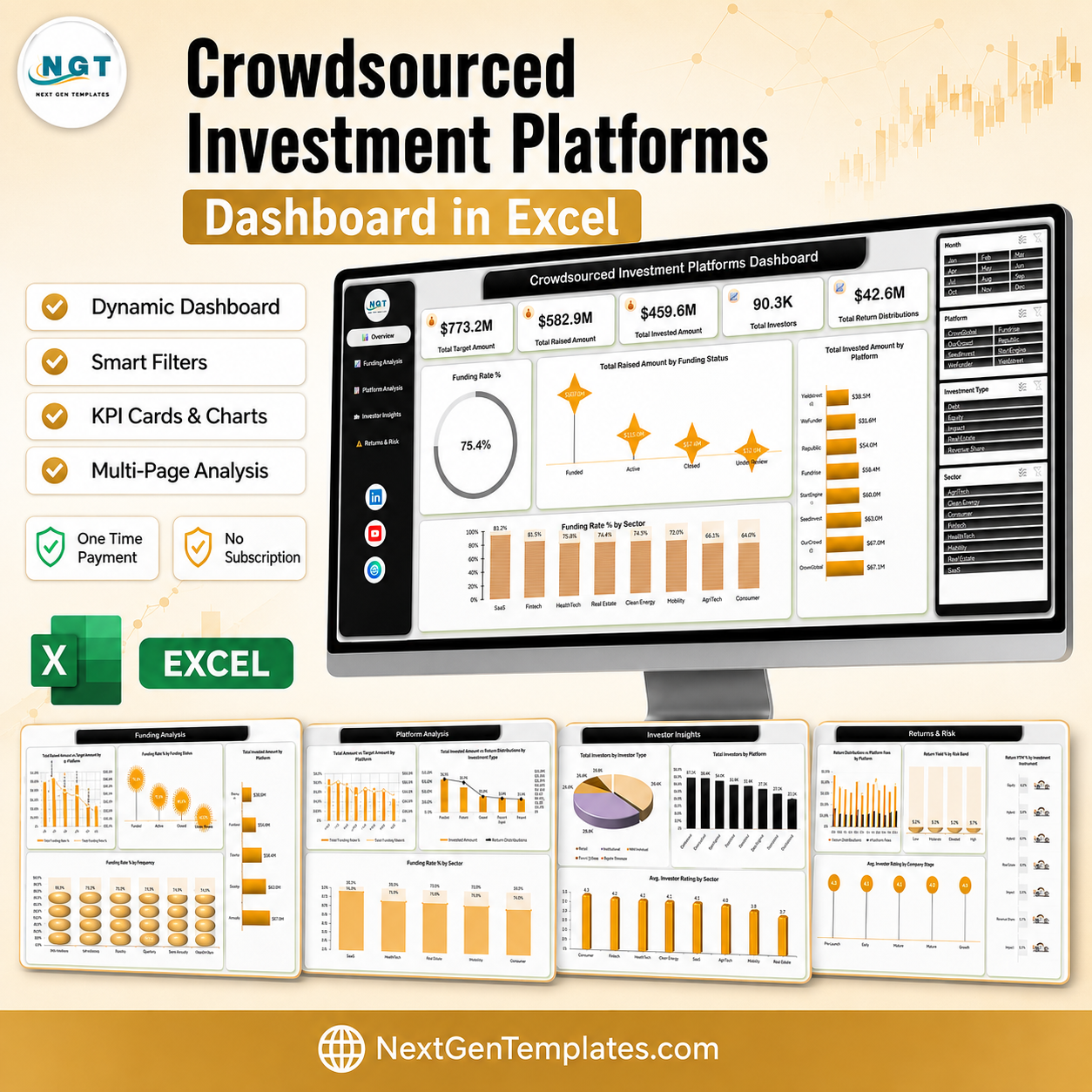

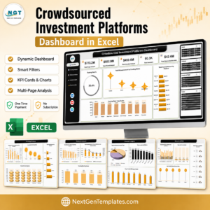
The Crowdsourced Investment Platforms Dashboard in Excel turns 500 raised-capital records into five linked report pages in the time it takes to paste a column. The sample file already tracks $773.2M in target capital, $582.9M raised, $459.6M invested and 90,300 investors across eight platforms – Crowdcube, OurCrowd, SeedInvest, StartEngine, Fundrise, Republic, Wefunder and Yieldstreet – and lands on a blended 75.4 percent funding rate. Every chart is driven by a native Excel pivot cache, so there is no add-in, no macro and no subscription. Replace the sample rows with your own campaign export, hit Refresh All, and the five pages redraw. One payment, lifetime file, and a user manual in the download.
Key Features of the Crowdsourced Investment Platforms Dashboard in Excel
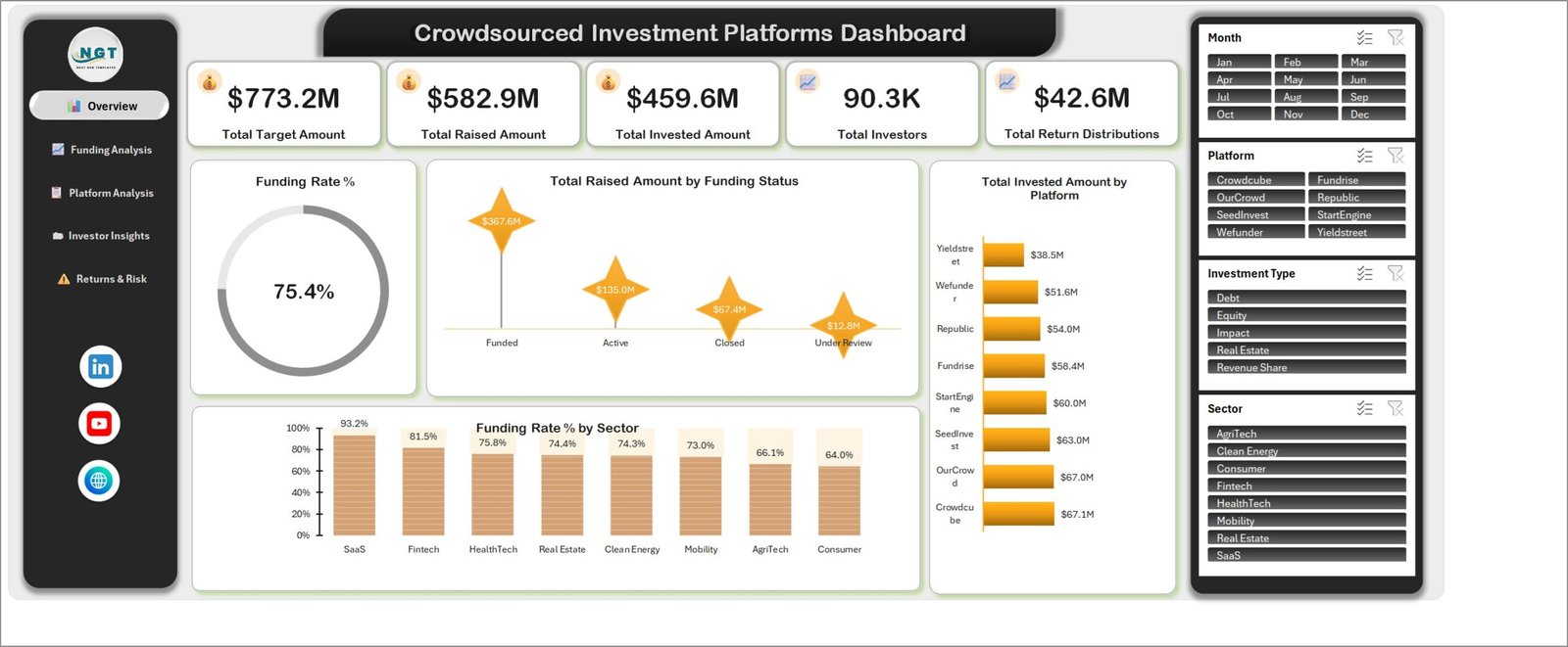
- Five KPI cards on page one – Total Target Amount, Total Raised Amount, Total Invested Amount, Total Investors and Total Return Distributions, all recalculated the moment a slicer changes.
- Four synced slicers – Month, Platform, Investment Type and Sector are wired to every chart on all five pages, so a single click on “Fintech” re-cuts the whole report.
- A funding rate donut that reads 75.4 percent on the sample data and moves with the filters.
- Platform league tables – invested capital by platform runs from Crowdcube at $67.1M down to Yieldstreet at $38.5M, alongside a raised-versus-target combo chart per platform.
- Sector funding rates – SaaS 93.2 percent, Fintech 81.5 percent, HealthTech 75.8 percent, Real Estate 74.4 percent, Clean Energy 74.3 percent, Mobility 73.0 percent, AgriTech 66.1 percent and Consumer 64.0 percent.
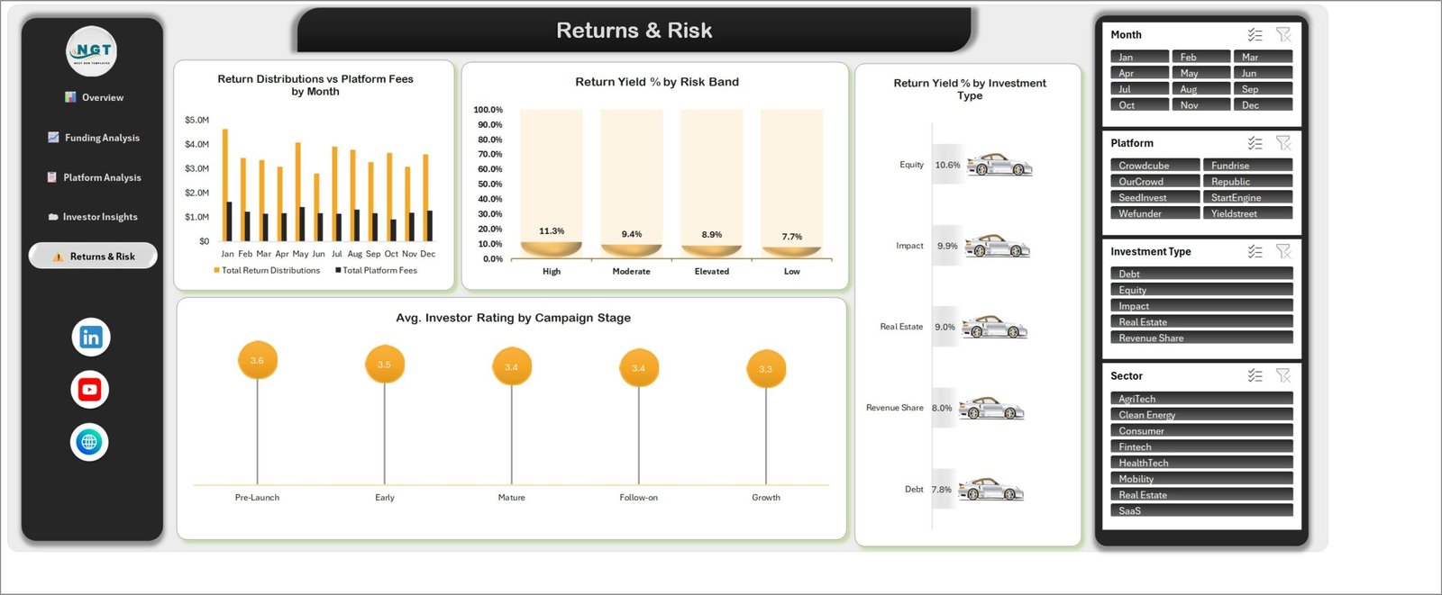
- Risk and yield views – return yield by risk band (High 11.3 percent through Low 7.7 percent) and by investment type (Equity 10.6 percent, Impact 9.9 percent, Real Estate 9.0 percent, Revenue Share 8.0 percent, Debt 7.8 percent).
- A left-hand navigation rail on every page, so a reader moves between Overview, Funding Analysis, Platform Analysis, Investor Insights and Returns & Risk without hunting for sheet tabs.
- 500 sample investment records across 27 columns laid out as a proper Excel table, so your own export drops straight in and the ranges extend themselves.
What Is Inside the Crowdsourced Investment Platforms Dashboard in Excel
The workbook ships with seven visible sheets: five report pages, a Data sheet and a Support sheet that holds the lookup lists the slicers read.
1. Overview
The five KPI cards, the Funding Rate % donut at 75.4 percent, Total Raised Amount by Funding Status (Funded $367.6M, Active $135.0M, Closed $67.4M, Under Review $12.8M), Total Invested Amount by Platform, and Funding Rate % by Sector. This is the page you screenshot for a weekly update.
2. Funding Analysis
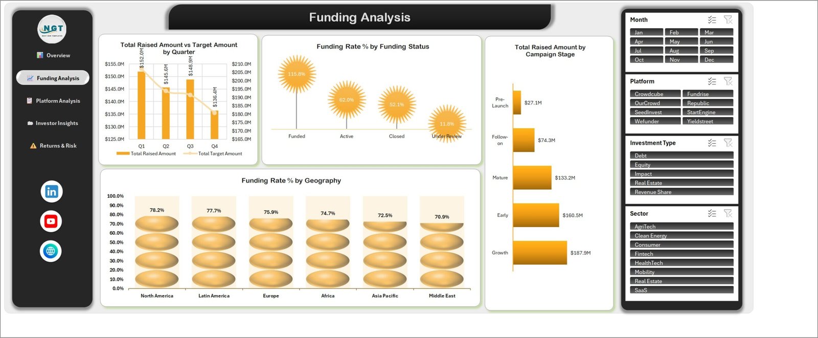
Total Raised Amount vs Target Amount by Quarter (Q1 $152.0M, Q2 $145.6M, Q3 $148.9M, Q4 $136.4M against the target line), Funding Rate % by Funding Status where Funded campaigns overshoot at 115.8 percent while Under Review sits at 11.8 percent, Total Raised Amount by Campaign Stage (Growth $187.9M, Early $160.5M, Mature $133.2M, Follow-on $74.3M, Pre-Launch $27.1M) and Funding Rate % by Geography from North America at 78.2 percent to the Middle East at 70.9 percent.
3. Platform Analysis
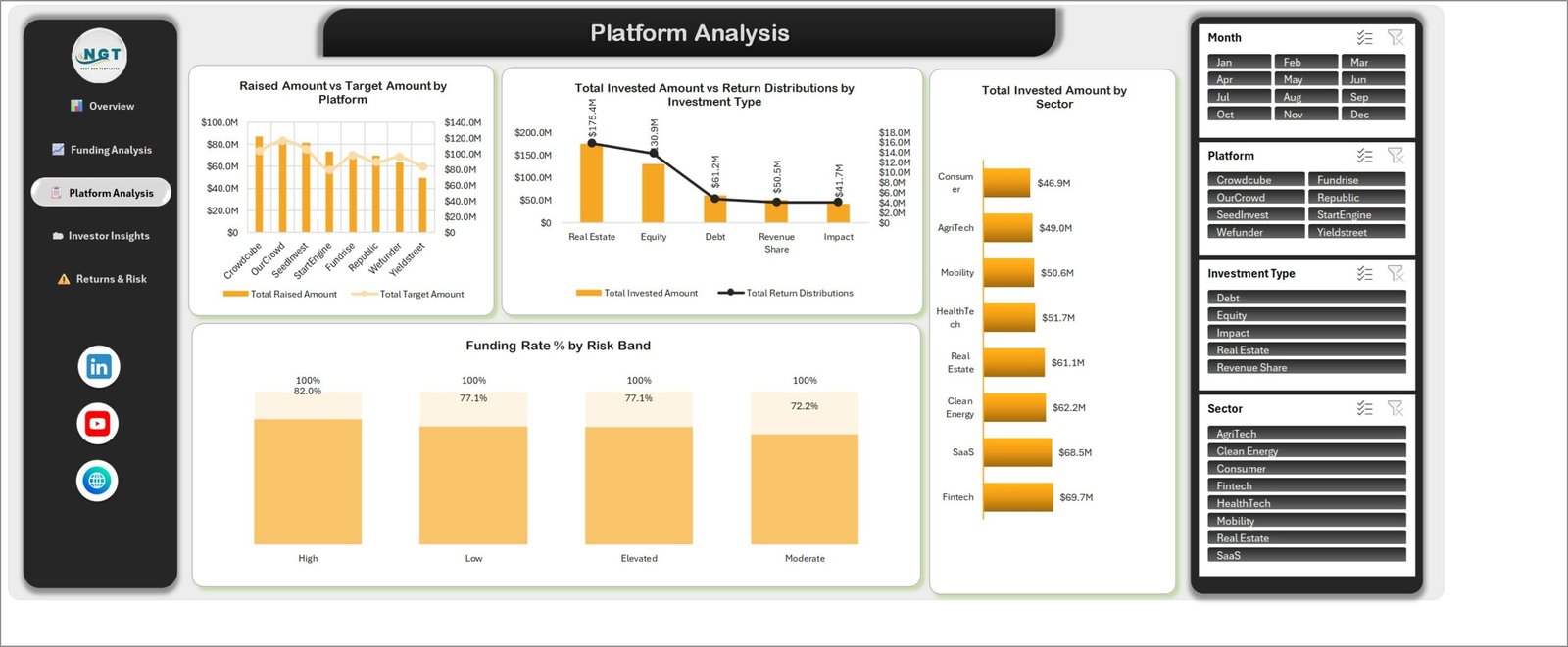
Raised Amount vs Target Amount by Platform for all eight platforms, Total Invested Amount vs Return Distributions by Investment Type with Real Estate leading at $175.4M of invested capital, Funding Rate % by Risk Band (High 82.0 percent, Low 77.1 percent, Elevated 77.1 percent, Moderate 72.2 percent) and Total Invested Amount by Sector from Fintech at $69.7M down to Consumer at $46.9M.
4. Investor Insights
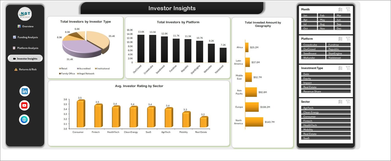
Total Investors by Investor Type as a pie – 35.4K retail, 31.4K accredited, 8.9K institutional, 8.0K family office and 6.6K angel network – plus Total Investors by Platform (OurCrowd 13.6K, Crowdcube 13.5K, SeedInvest 12.8K through Yieldstreet at 7.2K), Avg. Investor Rating by Sector on a 3.2 to 3.5 spread, and Total Invested Amount by Geography where North America contributes $143.7M and Africa $25.2M.
5. Returns & Risk
Return Distributions vs Platform Fees by Month across all twelve months, Return Yield % by Risk Band, Return Yield % by Investment Type and Avg. Investor Rating by Campaign Stage, where Pre-Launch campaigns rate highest at 3.6 and Growth lowest at 3.3.
6. Data and Support
The Data sheet holds 500 rows over 27 columns: Investment ID, Investment Date, Platform, Investment Type, Sector, Geography, Investor Type, Campaign Stage, Risk Band, Campaign Name, Funding Status, Investors, Target Amount, Raised Amount, Invested Amount, Fees, Return Distributions, Holding Period Months, Risk Score, Investor Rating and the Month, Year and Quarter helper columns the charts group on. Support holds the slicer lists.
Excel vs. Google Sheets vs. Paid Portfolio SaaS – Where This Fits
| This Excel Dashboard | Google Sheets Build | Paid Portfolio SaaS | |
|---|---|---|---|
| Cost | One payment, no renewal | Free tool, your build time | Typically $50-$300 per user per month |
| Platform | Excel 2016 or later, Microsoft 365, Windows or Mac | Browser | Browser, vendor hosted |
| Setup time | Paste your data, Refresh All, about 10 minutes | Days of chart and formula work | Onboarding call plus data mapping |
| Real-time team collaboration | Via OneDrive or SharePoint co-authoring | Yes, native | Yes, native |
| Mobile access | Excel mobile app, view and filter | Yes | Yes |
| Customisable fields | All 27 columns are yours to rename or extend | Yes | Only what the vendor exposes |
| Share with a link | Yes, through OneDrive | Yes | Yes, seat permitting |
| Year-1 cost at 5 users | The purchase price, once | Free plus your hours | $3,000-$18,000 |
| Your raise data leaves your machine | No, the file is local | Stored in Google Drive | Yes, vendor hosted |
| Works with a platform CSV export | Yes, paste into the Data table | Yes | Connector dependent |
Who This Template Is For – and Who It Is Not For
It fits syndicate leads and angel-group managers tracking capital across several portals, crowdfunding platform operations teams reporting funding rate by sector and stage, fund analysts who need a quarterly raised-versus-target picture without waiting on BI, and finance students or advisors modelling how equity, debt, revenue share, impact and real-estate deals compare on yield.
It does not fit anyone who needs a live API feed from Crowdcube or Republic – this is a paste-and-refresh workbook, not a connector. It is not a cap-table or share-registry system, it does not run KYC or AML checks, and it does not compute IRR or XIRR schedules per deal. If you want a month-picker scorecard with traffic lights rather than an analytical dashboard, the Crowdfunding Platforms KPI Dashboard in Excel is the closer match.
How to Use the Crowdsourced Investment Platforms Dashboard in Excel
- Unzip the download and open the workbook in Microsoft Excel. Read the included Excel Dashboard user manual first – it is two minutes and it covers the refresh step most people miss.
- Open the Data sheet and look at the 27 headers before you touch anything. Keep the header row exactly as it is.
- Paste your own campaign export under the header row. Because Data is a real Excel table, the pivot ranges grow on their own.
- Check that Month, Year and Quarter are filled for every new row – the quarterly and monthly charts group on those three columns.
- Press Ctrl+Alt+F5 (Data > Refresh All). All five pages, both donuts and every slicer rebuild from the new rows.
- Update the Support sheet if you added a platform, sector or investment type that was not in the sample lists, then refresh once more so the slicers pick it up.
- Filter with the four slicers on the right rail and use the left navigation to move between pages. To share a snapshot, use File > Export > Create PDF.
Real-World Use Cases
Priya runs a 40-member angel syndicate. Her members back deals on four portals and she was rebuilding a summary deck every quarter. She now pastes each portal’s export into the Data sheet, filters the Platform slicer to the two portals the syndicate actually uses, and sends the Overview and Returns & Risk pages as a two-page PDF. The quarterly deck takes about fifteen minutes.
Daniel is head of operations at a mid-size equity crowdfunding portal. His board asks the same question every month: which sectors are closing and which are stalling. The Funding Rate % by Sector chart answers it in one look, and the Funding Rate % by Funding Status chart shows him that funded campaigns overshoot target by roughly sixteen percent, which changed how his team sets goals.
Meera teaches an alternative-investments module. She hands students the workbook, tells them to filter to one investment type, and asks why Equity yields 10.6 percent while Debt yields 7.8 percent on the same platform set. The slicers make the exercise interactive without anyone writing a formula.
Frequently Asked Questions
Which Excel versions does this dashboard work in?
Excel 2016 and later on Windows, Microsoft 365 on Windows or Mac, and Excel for Mac 2019 or later. The charts and slicers are all native Excel objects. Excel for the web can display the file but slicer behaviour is limited there, so use the desktop app for real work.
Does it need macros or an add-in?
No. It is a plain .xlsx workbook with pivot tables, pivot charts and slicers. There is nothing to enable and no security prompt.
Can I connect it directly to Crowdcube, Republic or Fundrise?
Not out of the box. The workbook is built for a paste-and-refresh workflow using the CSV export those platforms provide. If you are comfortable with Power Query you can point a query at your own export folder and load it into the Data table.
How many records can I load?
The sample carries 500. Excel pivot caches handle tens of thousands of rows comfortably, so a few years of campaign history is not a problem. Past roughly 200,000 rows you will feel the refresh, and that is the point to move the source into Power Query or Power BI.
Can I change the currency, the platform names or the sectors?
Yes to all three. Currency is a number format on the value fields, and platform, sector, geography and investment type are just text columns. Edit the Data sheet, mirror the change on the Support sheet, then refresh.
Is the sample data real?
No. The 500 rows are realistic but synthetic, generated so every chart, slicer and rating band has something to show. Delete them once your own export is in.
What exactly do I get in the download?
A ZIP containing the .xlsx workbook and an Excel Dashboard user manual in PDF. Immediate download after checkout, and the file is yours to keep and reuse across your own projects.
About the Author
Built by PK – Microsoft Certified Professional with 15+ years of Excel, Google Sheets, and Power BI experience. Founder of NextGenTemplates, reaching 300K+ subscribers across YouTube channels. Every template is hand-built and tested before release.
Explore Related Templates
- Real Estate Crowdfunding Dashboard in Excel – the property-only cousin of this build.
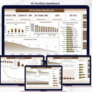
- VC Portfolio Dashboard in Excel – for tracking a fund’s holdings rather than a platform’s campaigns.
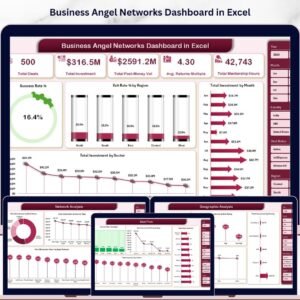
- Business Angel Networks Dashboard in Excel – syndicate and network activity.
- Peer-to-Peer Lending KPI Dashboard in Excel – the debt-side scorecard.
- VC Portfolio Dashboard in Google Sheets – if your team lives in a browser.
- Browse every Excel Dashboard template or the wider Excel Financial Tools category.
Buy the Crowdsourced Investment Platforms Dashboard in Excel once, download it immediately, and use it on every raise you report on. No subscription, no seat count, no vendor holding your capital data.
Last updated: 26 August 2026.













Reviews
There are no reviews yet.