

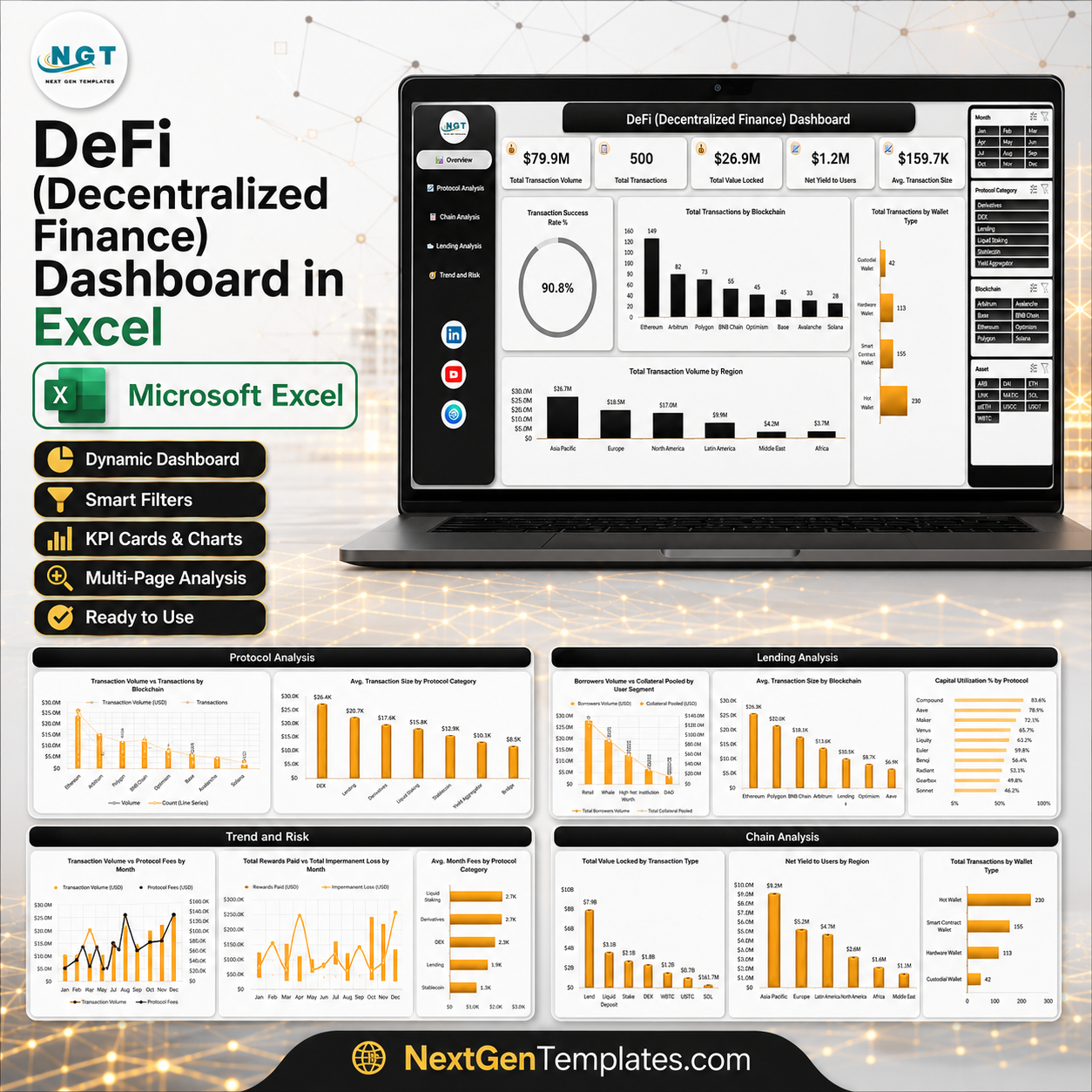


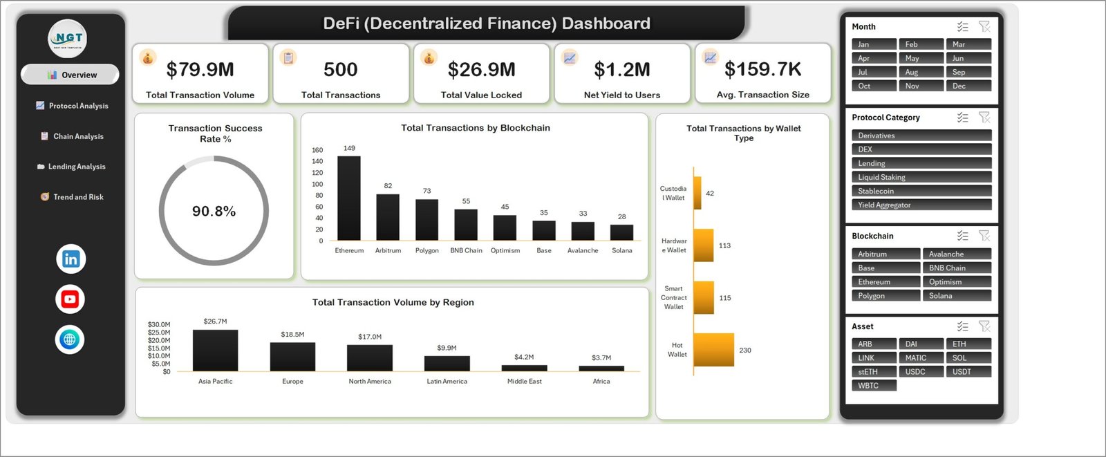
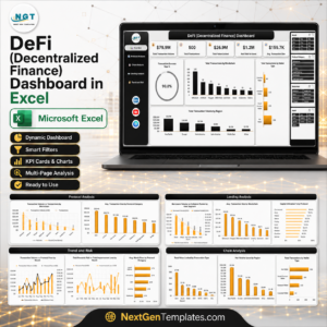
The DeFi (Decentralized Finance) Dashboard in Excel turns a flat export of protocol activity into a five-page reporting pack: 500 sample transactions, 31 data columns, 25 pivot tables, 20 charts and four slicers that filter every page at once. The demo file opens on $79.9M of transaction volume across 500 transactions, $26.9M in total value locked, $1.2M of net yield to users and a 90.8% transaction success rate – all recalculated the moment you paste your own export over the sample rows. One file, no add-ins, no subscription, and a user manual in the download. DeFi (Decentralized Finance) Dashboard in Excel
Please read this before buying: this is an offline Excel reporting workbook. It does not connect to any blockchain, wallet, exchange or price API, it does not pull live prices, and it contains no investment advice or recommendations. Every figure in the screenshots is sample data that you replace with your own records.
Key Features of the DeFi (Decentralized Finance) Dashboard in Excel
- Five reporting pages – Overview, Protocol Analysis, Chain Analysis, Lending Analysis and Trend and Risk, each reached from the left navigation rail.
- Five KPI cards on the Overview – Total Transaction Volume, Total Transactions, Total Value Locked, Net Yield to Users and Avg. Transaction Size.
- Four synced slicers – Month, Protocol Category, Blockchain and Asset. Click one and all 25 pivot tables and 20 charts respond together.
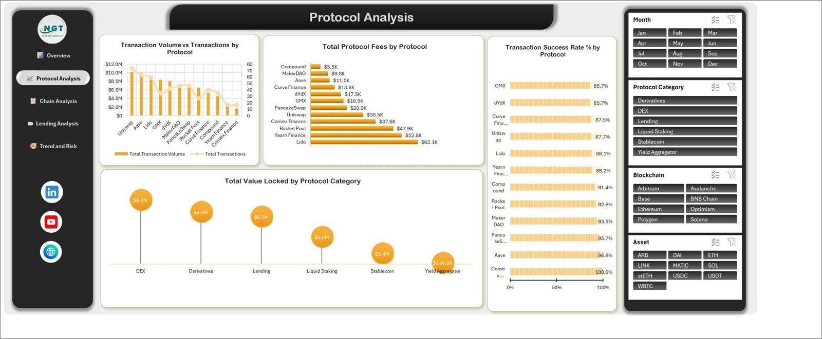
- Protocol-level fee and reliability reporting – Total Protocol Fees by Protocol runs from Lido at $62.1K down to Compound at $5.5K, alongside Transaction Success Rate % by Protocol.
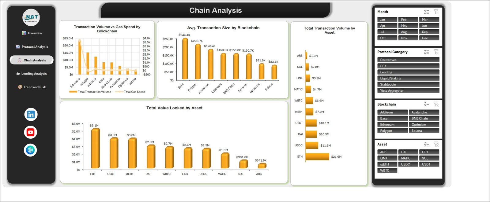
- Chain-level cost analysis – Transaction Volume vs Gas Spend by Blockchain and Avg. Transaction Size by Blockchain, where the sample data puts Base at $244.4K against Solana at $83.1K.
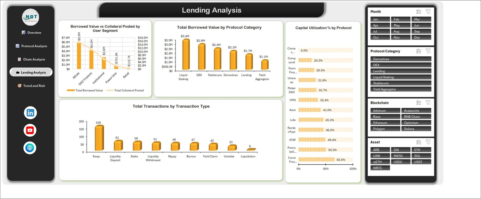
- Lending and collateral view – Borrowed Value vs Collateral Posted by User Segment, Total Borrowed Value by Protocol Category and Capital Utilization % by Protocol.
- Risk and seasonality – Avg. Health Factor by Protocol Category and a Total Rewards Paid vs Total Impermanent Loss by Month comparison.
- Table-driven data sheet – the source range is a real Excel Table, so extra rows are picked up without re-pointing a single pivot.
What’s Inside the DeFi (Decentralized Finance) Dashboard in Excel
The download is a single ZIP holding the .xlsx workbook and an Excel Dashboard user manual PDF. The workbook has seven sheets: the five dashboard pages, a Data sheet and a Support sheet that holds the pivot tables feeding the charts.
The Data sheet carries 500 sample rows under 31 columns: Transaction ID, Transaction Date, Wallet ID, User Segment, Protocol, Protocol Category, Blockchain, Asset, Transaction Type, Region, Wallet Type, Transaction Value, Gas Fee, Protocol Fee, Liquidity Provided, Collateral Value, Borrowed Amount, Rewards Earned, Impermanent Loss, APY, Health Factor, Transaction Status, Audited Protocol, Month and Year, plus six helper counter columns the KPI cards use.
The sample dimension members are the ones you can see in the slicers: twelve protocols (Uniswap, Aave, Lido, GMX, dYdX, MakerDAO, PancakeSwap, Rocket Pool, Curve Finance, Compound, Yearn Finance, Convex Finance), six protocol categories (DEX, Lending, Liquid Staking, Derivatives, Stablecoin, Yield Aggregator), eight blockchains (Ethereum, Arbitrum, Polygon, BNB Chain, Optimism, Base, Avalanche, Solana), ten assets (ETH, USDC, USDT, DAI, stETH, WBTC, MATIC, LINK, SOL, ARB), nine transaction types and four wallet types. Swap these lists for your own and the charts relabel themselves.
DeFi Dashboard in Excel vs. Google Sheets vs. a Paid Analytics Subscription – Where This Fits
| This Excel dashboard | Google Sheets build | Paid analytics subscription | |
|---|---|---|---|
| Cost | One payment, $17.99 on sale | Free platform, your build time | Typically $50-$500+ per month |
| Platform | Microsoft Excel 2016 or later, Microsoft 365 | Browser | Vendor’s web app |
| Setup time | Paste your export, press Refresh All | Days of pivot and chart work | Onboarding plus data mapping |
| Real-time team collaboration | Via OneDrive or SharePoint co-authoring | Yes, native | Yes |
| Mobile access | Excel mobile app, view and filter | Yes | Yes |
| Customizable fields | Every column, chart and slicer is yours to edit | Yes | Limited to the vendor’s schema |
| Share with link | Cloud link or send the file | Yes | Seat-based |
| Year-1 cost at 5 users | $17.99 total | $0 plus your hours | $3,000-$30,000 |
| Live chain or price feed | No – you paste exported data | No, unless you script one | Usually yes |
| Works offline | Yes | No | No |
Who This Template Is For – and Who It’s Not For
It fits a treasury or operations analyst who already exports protocol activity to CSV and needs a monthly reporting pack; a DAO contributor writing a transparency update; a fintech or research team that needs protocol, chain and asset breakdowns in a file they can email; a finance lead who wants pivot-driven numbers rather than a screenshot from a web app.
It does not fit anyone who wants live prices, wallet connection or on-chain streaming – this workbook never touches a network. It is not portfolio tracking software, not a trading tool, not a tax report, and it gives no buy, sell or allocation guidance. If your data lives only in a wallet UI with no export, you will have to get it out first. DeFi (Decentralized Finance) Dashboard in Excel
How to Use the DeFi (Decentralized Finance) Dashboard in Excel
- Unzip the download and open the
.xlsxfile in Microsoft Excel. Read the included Excel Dashboard user manual first – it walks through the layout. - Open the Data sheet and look at the header row so you know what each of the 31 columns expects.
- Delete the 500 sample rows and paste your own export beneath the header. Because the range is an Excel Table, new rows join it automatically.
- Keep the dimension spellings consistent – one stray “Uniswap v3” against “Uniswap” becomes a separate bar on every protocol chart.
- Press Refresh All on the Data tab (or Ctrl+Alt+F5). The workbook does not refresh on open, so this step is what updates the pivots and charts.
- Use the Month, Protocol Category, Blockchain and Asset slicers to filter. They are connected across all five pages.
- Print or export any page to PDF for a monthly pack, or take the screenshots straight into a deck.
Real-World Use Cases
Priya, treasury analyst at a DAO. She exports last month’s activity, pastes it in, filters the Month slicer to the closing month and takes the Lending Analysis page straight into the treasury update – Borrowed Value vs Collateral Posted by User Segment answers the “who is levered” question in one chart.
Daniel, operations lead at a wallet company. He runs the Chain Analysis page each week. Transaction Volume vs Gas Spend by Blockchain tells him where routing costs are climbing, and Avg. Transaction Size by Blockchain shows which chains carry the large transfers.
Aisha, research associate at a fintech consultancy. She uses Protocol Analysis for client briefings, pairing Total Protocol Fees by Protocol with Transaction Success Rate % by Protocol so a fee ranking is never read without its reliability column.
Frequently Asked Questions
Does this dashboard connect to a blockchain, wallet or exchange?
No. There is no API, no web query and no live price feed anywhere in the workbook. You export your data yourself and paste it into the Data sheet.
Is any of this financial or investment advice?
No. It is a reporting template. It reports the numbers you give it and makes no recommendation about any asset, protocol or strategy.
Are the figures in the screenshots real?
No – they are sample data generated to demonstrate the layout. The $79.9M volume, the 90.8% success rate and every protocol figure are placeholders you overwrite.
Which Excel versions does it work in?
Excel 2016 or later on Windows, and Microsoft 365. Slicers and pivot charts need the desktop app – Excel for the web will display the file but will not drive the slicers reliably. No macros are used, so no security prompt appears.
How many rows can I add?
The sample is 500 rows and the pivot engine handles far more; tens of thousands of rows are comfortable. Very large exports are better summarised before pasting.
My charts did not change after I pasted new data. Why?
The workbook is not set to refresh on open. Press Refresh All on the Data tab, or Ctrl+Alt+F5, and the pivots and charts update.
Can I add my own protocols, chains or assets?
Yes. Type them in the relevant column and refresh – the slicers and chart axes rebuild from your values. Nothing is hard-coded to the sample list.
About the Author
Built by PK – Microsoft Certified Professional with 15+ years of Excel, Google Sheets, and Power BI experience. Founder of NextGenTemplates, reaching 300K+ subscribers across YouTube channels. Every template is hand-built and tested before release. DeFi (Decentralized Finance) Dashboard in Excel
Explore Related Templates
- Blockchain Finance Dashboard in Excel – broader chain-level finance reporting.
- Digital Wallets KPI Dashboard in Excel – a KPI scorecard view of wallet performance.
- Crowdsourced Investment Platforms Dashboard in Excel – the same five-page build for platform investment data.
- Crypto Portfolio Tracker in Google Sheets – if you would rather work in a browser.
- Finance & Accounting Command Center bundle – eight finance templates in one purchase.
- Browse more in Excel Dashboards and Excel Financial Tools.
Download the DeFi (Decentralized Finance) Dashboard in Excel today and have your protocol, chain and lending reporting laid out before your next review. Instant download, lifetime access, free bug fixes to this template.
Last updated: 30 August 2026. DeFi (Decentralized Finance) Dashboard in Excel











Reviews
There are no reviews yet.