

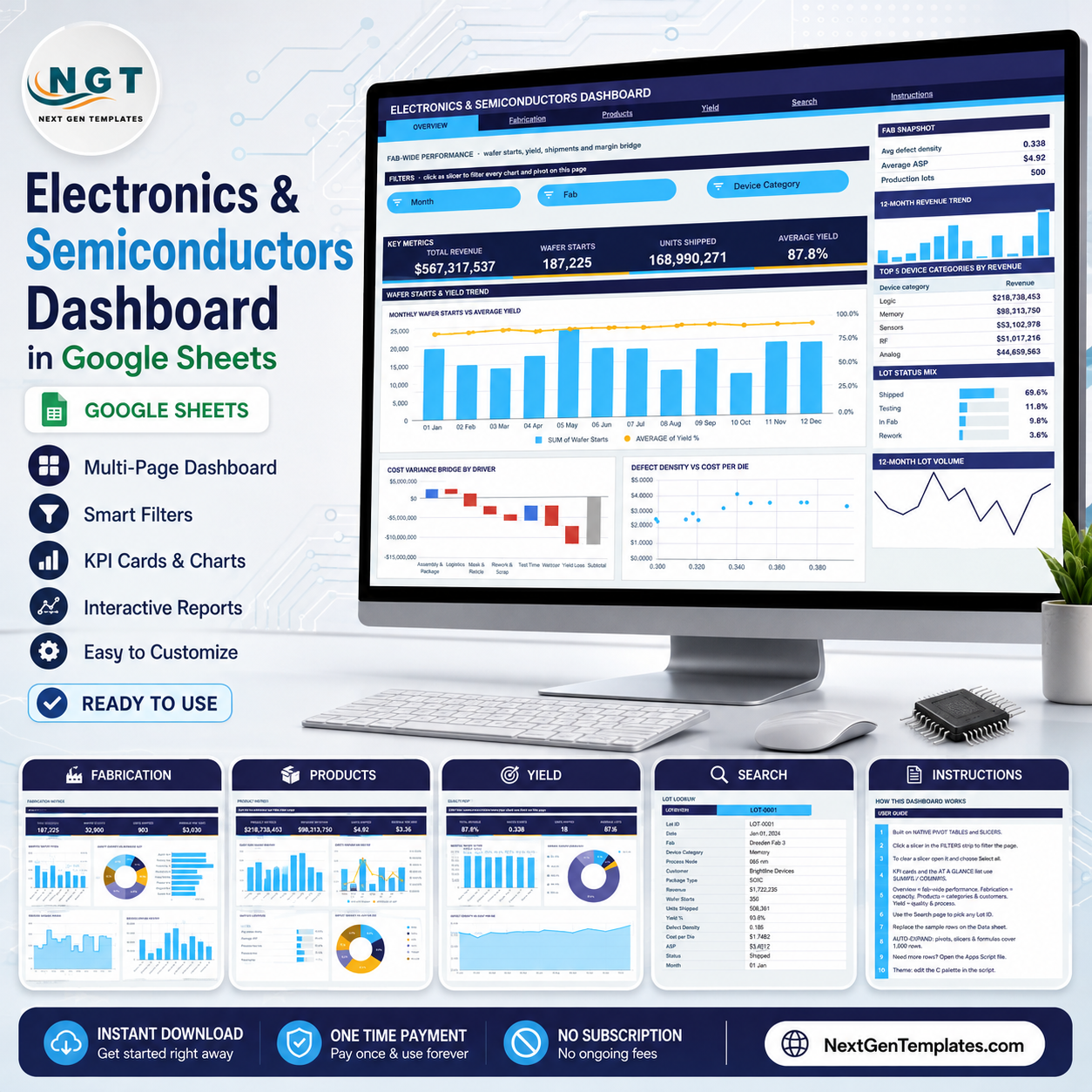
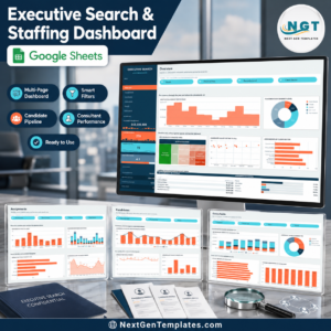
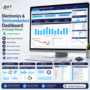
The Electronics & Semiconductors Dashboard in Google Sheets covers 6 pages, 16 KPI cards, 18 charts and 15 slicers, all driven by native Google Sheets pivot tables. The sample file carries 500 production lots spread across 8 fabs, 8 device categories, 7 process nodes and 12 customers. Setup takes under 10 minutes: paste your own lot log over the sample rows and every chart, pivot and Top 5 panel redraws on its own.
🌍 Join 8,400+ teams in 40+ countries using NextGenTemplates to replace paid SaaS tools with one-time-purchase Excel, Google Sheets, Power BI and HTML templates.
✅ Instant download · One-time payment · No subscription · No per-user fees · Lifetime access
🔑 Key Features of the Electronics & Semiconductors Dashboard in Google Sheets
📊 Pivot-and-slicer architecture. Every chart on this dashboard reads a native Google Sheets pivot table parked to the right of its page. There are no helper formula blocks feeding the visuals, which is why the file stays responsive when your production log grows from 500 lots to several thousand.
🎛️ 15 slicers across four analysis pages. The Overview page filters by Month, Fab and Device Category. Fabrication adds Process Node and Status. Products swaps in Customer and Package Type. Yield combines Fab, Device Category, Process Node and Status, so quality questions can be sliced four ways at once.
📈 16 KPI cards and 18 charts. The cards report Total Revenue, Wafer Starts, Units Shipped, Average Yield, Dies per Wafer, Revenue per Wafer, Logic Revenue, Memory Revenue, Average ASP, Revenue per Unit, Average Defect Density, Rework Lots and On Hold Lots. The charts include a cost variance bridge, a wafer-starts-versus-yield combo and a defect-density scatter.
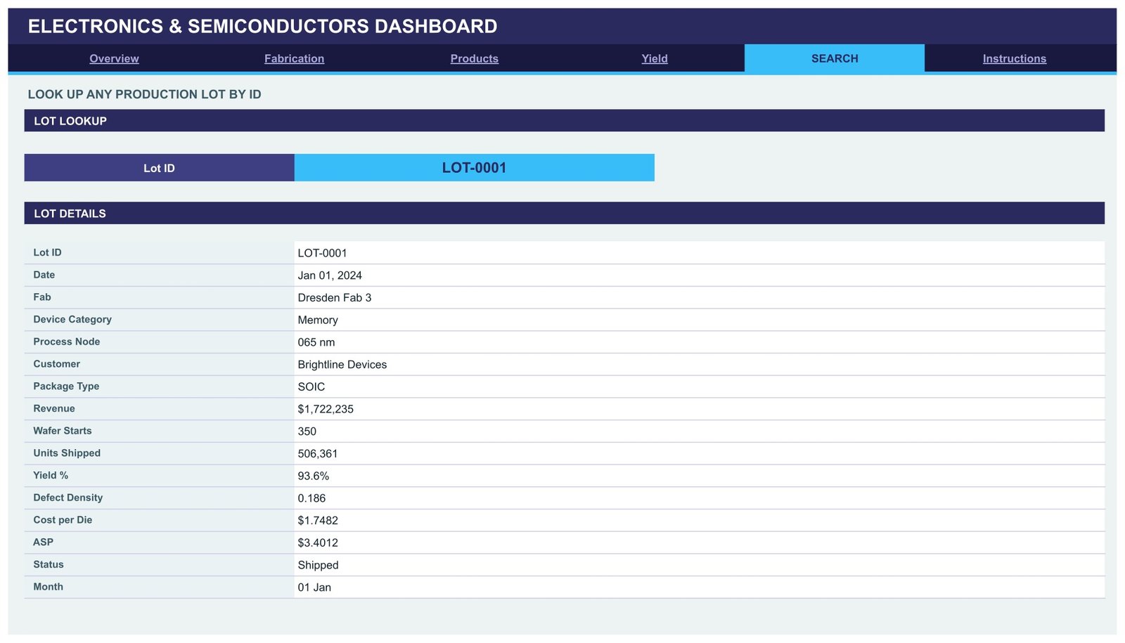
🔍 A one-lot lookup page. The Search page takes a single Lot ID and returns all 16 stored fields for that lot: date, fab, device category, process node, customer, package type, revenue, wafer starts, units shipped, yield %, defect density, cost per die, ASP, status and month.
🧾 Right-hand context panel on every analysis page. Each page carries a snapshot block, a 12-month revenue trend, a Top 5 table, a share-bar breakdown and an At a Glance list, so the numbers behind a chart never need a second tab. You will find more Google Sheets Dashboards built the same way across the catalogue.
🎨 One-line theming. The design runs on a single contrast pair – ink #2A2A5E against accent #38BDF8, with amber #FBBF24 for second chart series. Edit the palette at the top of the bundled Apps Script and the whole workbook restyles.
📦 What’s Inside the Electronics & Semiconductors Dashboard in Google Sheets
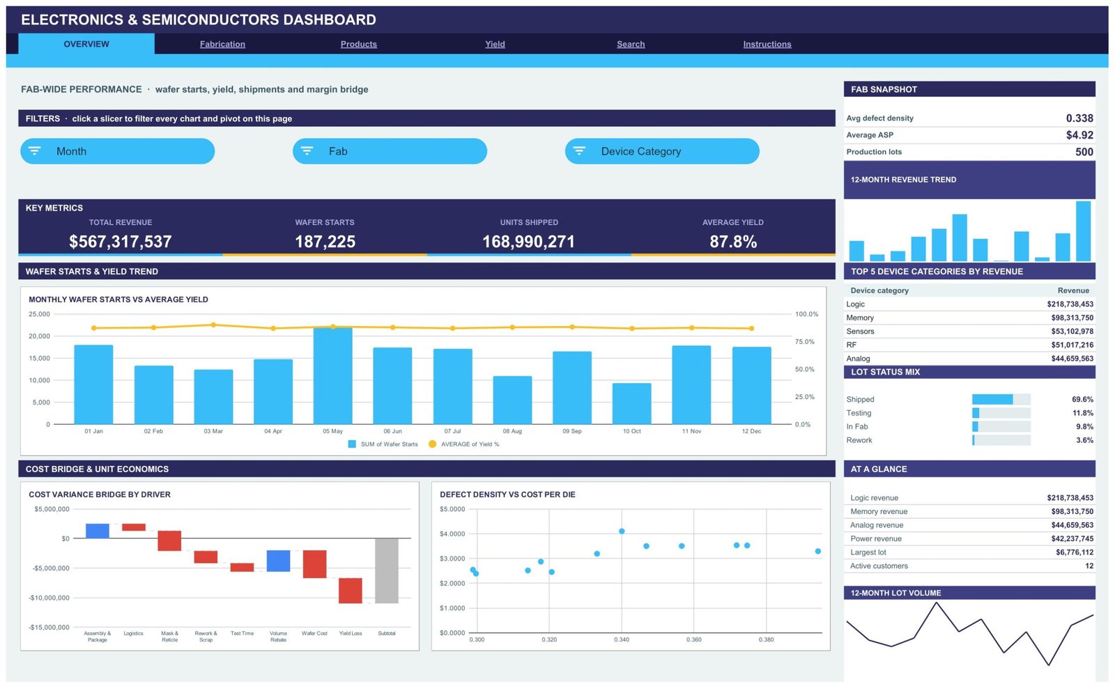
Page 1: Overview – Fab-Wide Performance
The landing page reports Total Revenue, Wafer Starts, Units Shipped and Average Yield, filtered by Month, Fab and Device Category slicers. Charts are Monthly Wafer Starts vs Average Yield, Cost Variance Bridge by Driver (assembly and package, logistics, mask and reticle, rework and scrap, test time, volume rebate, wafer cost and yield loss) and Defect Density vs Cost per Die. The side panel lists Top 5 Device Categories by Revenue and a lot status mix.
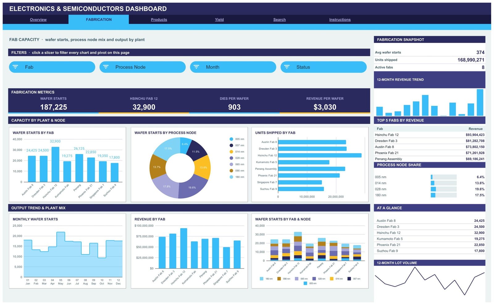
Page 2: Fabrication – Capacity by Plant and Node
This page tracks Wafer Starts, the leading fab’s volume, Dies per Wafer and Revenue per Wafer, with Fab, Process Node, Month and Status slicers. Charts include Wafer Starts by Fab, Wafer Starts by Process Node, Units Shipped by Fab, Monthly Wafer Starts, Revenue by Fab and Wafer Starts by Fab and Node. The panel ranks Top 5 Fabs by Revenue and shows process node share.
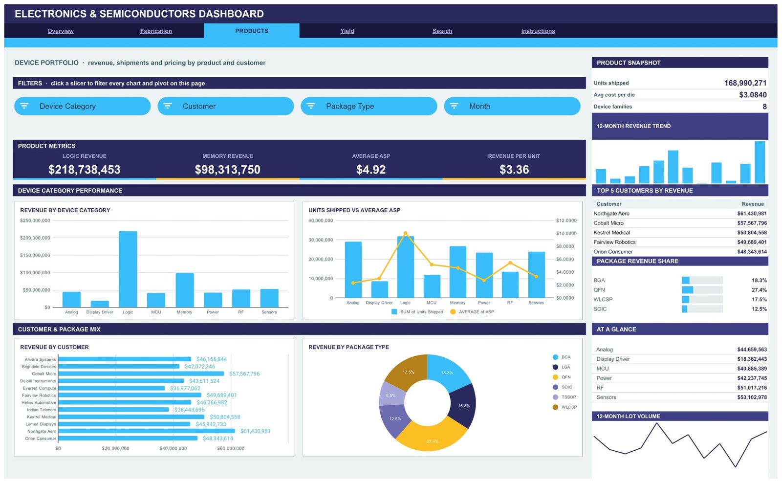
Page 3: Products – Device Portfolio
The product page reports Logic Revenue, Memory Revenue, Average ASP and Revenue per Unit, sliced by Device Category, Customer, Package Type and Month. Charts are Revenue by Device Category, Units Shipped vs Average ASP, Revenue by Customer and Revenue by Package Type. The panel ranks Top 5 Customers by Revenue and breaks out package revenue share across BGA, LGA, QFN, SOIC, TSSOP and WLCSP.
Page 4: Yield – Defects, Lot Status and Process Control
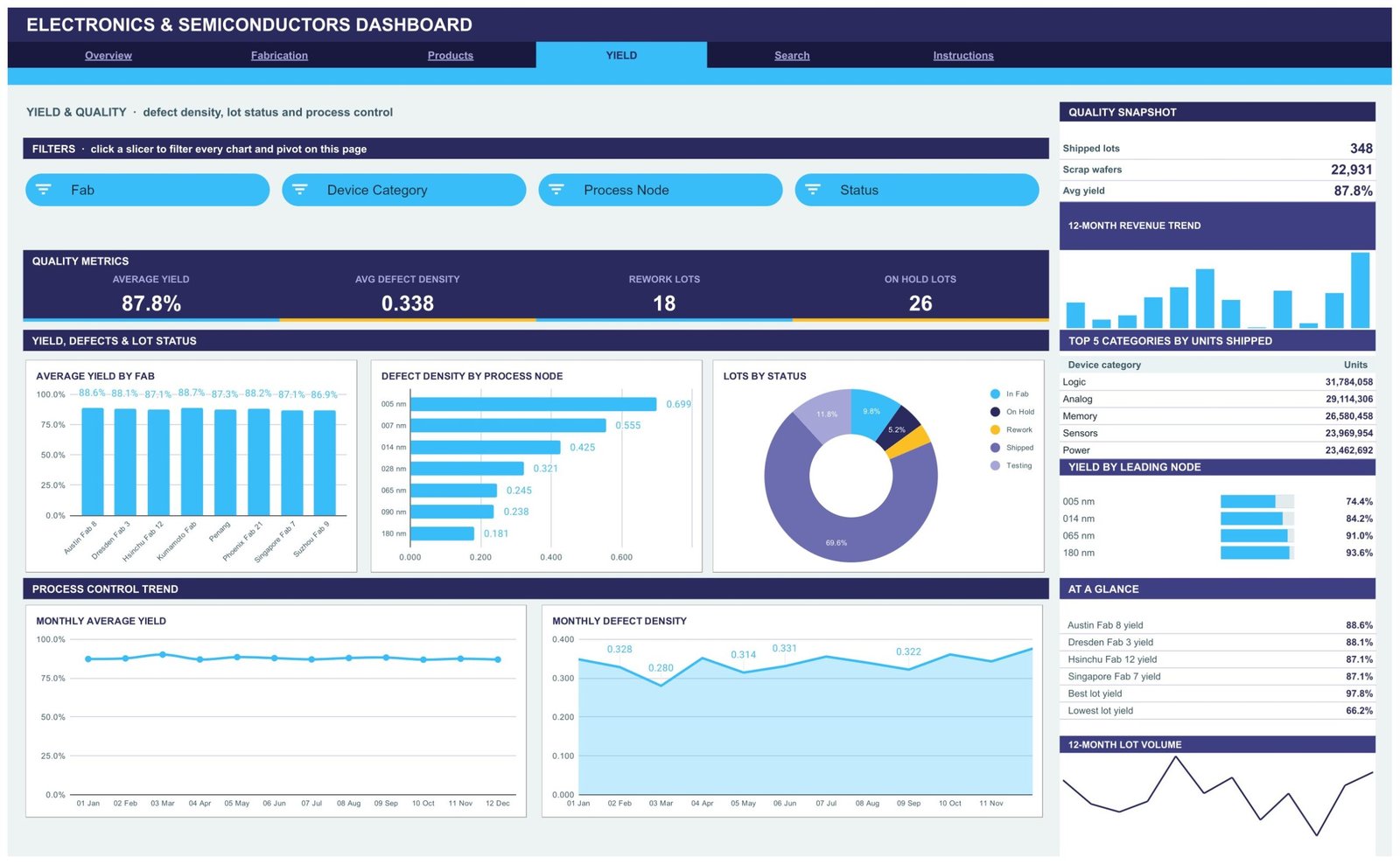
The quality page reports Average Yield, Average Defect Density, Rework Lots and On Hold Lots, sliced by Fab, Device Category, Process Node and Status. Charts are Average Yield by Fab, Defect Density by Process Node, Lots by Status, Monthly Average Yield and Monthly Defect Density. The panel lists Top 5 Categories by Units Shipped plus yield by leading node.
Page 5: Search – Lot Lookup
Pick any Lot ID from the dropdown and the Lot Details table fills in the full production record for that lot – date, fab, device category, process node, customer, package type, revenue, wafer starts, units shipped, yield %, defect density, cost per die, ASP, status and month.
Page 6: Instructions – User Guide
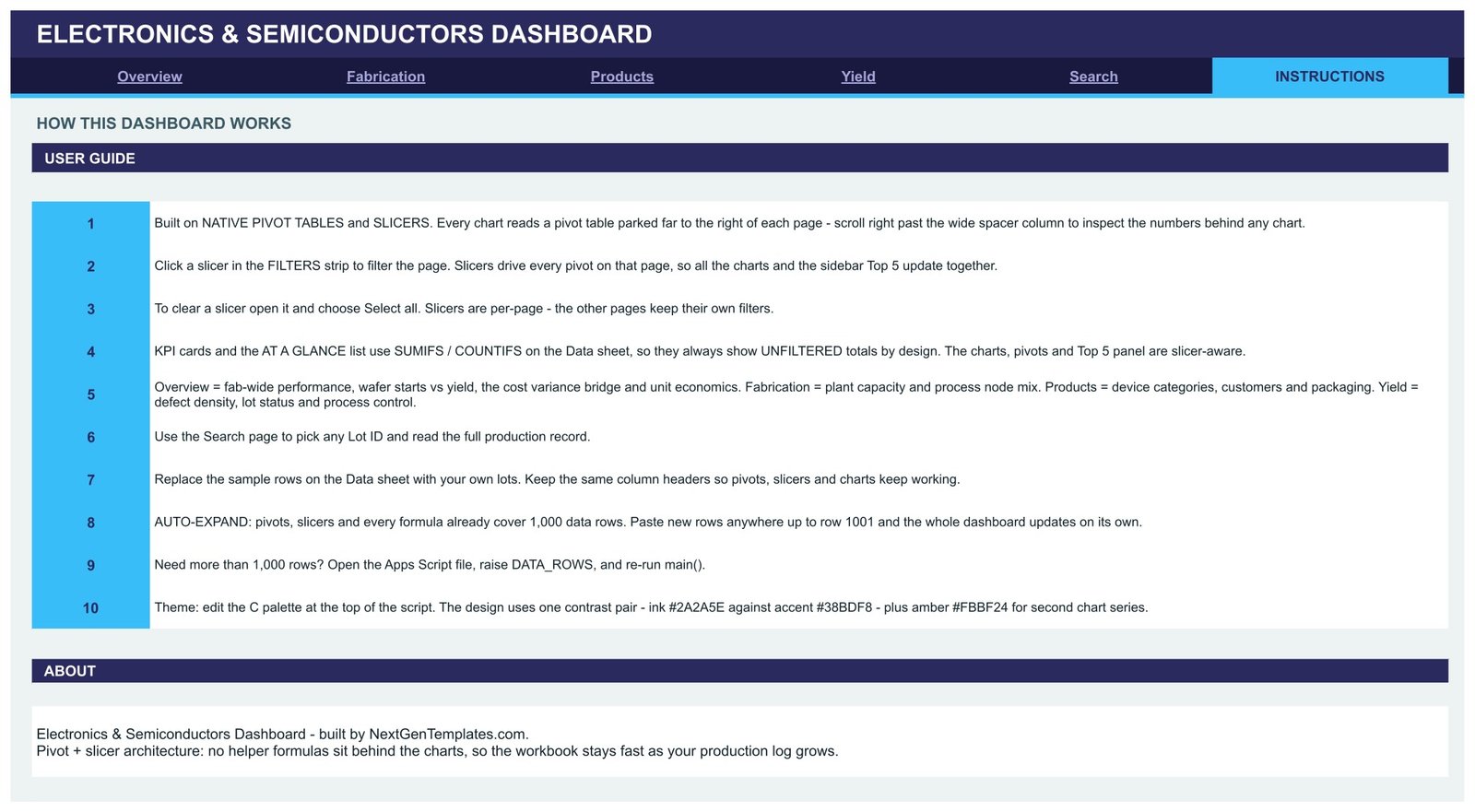
A 10-step guide covering how the slicers drive each page, how to clear a filter, where the pivot tables sit, how to swap in your own lots, how the 1,000-row auto-expand works and how to raise the row limit or restyle the theme in the bundled Apps Script.
📊 Google Sheets vs. Microsoft Excel vs. Paid BI SaaS – Where This Fits
| Feature | Electronics & Semiconductors Dashboard in Google Sheets | Microsoft Excel Dashboard | Paid BI SaaS (Tableau / Domo) |
|---|---|---|---|
| Cost | $9.99 one-time | $13.99-$19.99 one-time + Microsoft 365 | $70-$190 / user / month |
| Platform | Browser, nothing to install ✅ | Desktop Excel required | Browser + connector setup |
| Setup time | Under 10 minutes ✅ | 15-20 minutes | Days, usually with IT |
| Real-time team collaboration | Built in, native to Sheets ✅ | Only via OneDrive co-authoring | Built in ✅ |
| Mobile access | Google Sheets app ✅ | Excel mobile, limited slicers | Dedicated app ✅ |
| Customisable fields | Edit the Data sheet directly ✅ | Edit the Data sheet ✅ | Admin / data-model change |
| Share with a link | Yes, standard Drive sharing ✅ | File send or OneDrive link | Yes, per licensed seat |
| Fab, node, package and customer slicers | 15 slicers, page-scoped ✅ | Excel slicers ✅ | Filters ✅ |
| Year-1 cost at 5 users | $9.99 total ✅ | $19.99 + existing licences | $4,200-$11,400 |
For a fab or a fabless team that wants wafer, yield and margin reporting in a shared browser tab without paying per seat, the Electronics & Semiconductors Dashboard in Google Sheets sits in the sweet spot.
👥 Who This Template Is For – and Who It’s Not For
✅ This template is built for:
- Production and planning managers at semiconductor, PCB and electronics assembly plants who report weekly on wafer starts, yield and shipped units
- Fabless and OSAT account teams tracking revenue, ASP and package mix per customer
- Operations analysts who currently rebuild the same fab report by hand in a spreadsheet each month
- Consultants and MBA students who need a working manufacturing analytics model to adapt
❌ This template is NOT for:
- Teams needing a live MES, SPC or APC system – this reads a log you paste or import, it does not talk to equipment
- Anyone expecting statistical process control limits, wafer maps, die-level bin analysis or SEMI E10 equipment states – none of that is included
- Engineers who need defect density or yield to be measured; both are numbers you supply in the Data sheet
- Organisations that require SSO, audit logging or row-level security on their reporting layer
- Anyone looking for export-control, ITAR or trade-compliance functionality – this template makes no compliance claims of any kind
⚙️ How to Use the Electronics & Semiconductors Dashboard in Google Sheets
- Open the PDF in your download and click the Google Sheets copy link to create your own editable copy in Drive.
- Open the Data sheet and replace the 500 sample lots with your own production records, keeping the column headers exactly as they are.
- Paste up to row 1001 – pivots, slicers and formulas already cover 1,000 data rows, so nothing needs re-pointing.
- Go to the Overview page and click any slicer chip to filter every chart and pivot on that page.
- To clear a filter, open the slicer and choose Select all. Slicers are page-scoped, so each page keeps its own view.
- Use the Search page to pull the full record for a single Lot ID.
- Need more than 1,000 rows? Open the bundled Apps Script, raise DATA_ROWS and re-run main().
- To restyle, edit the colour palette at the top of the script and re-run.
💼 Real-World Use Cases
Meera plans production at a mid-size analog fab. Every Monday she pastes the previous week’s lot log into the Data sheet and uses the Fabrication page to compare wafer starts and revenue per wafer across her eight plants, then screenshots the Top 5 Fabs panel straight into the ops review deck.
Daniel handles key accounts at a fabless design house. He filters the Products page by Customer and Package Type to see where ASP is slipping, and uses Revenue by Package Type to argue for moving a slow-moving line from SOIC to QFN.
Priya is a yield engineer’s analyst. She keeps the Yield page filtered to leading nodes, watches Defect Density by Process Node week over week, and uses the Search page to pull the full record for any lot that lands on hold – all without a Tableau seat.
❓ Frequently Asked Questions
What KPIs does the Electronics & Semiconductors Dashboard in Google Sheets track?
The Electronics & Semiconductors Dashboard in Google Sheets tracks 16 KPI cards across four pages, including total revenue, wafer starts, units shipped, average yield, dies per wafer, revenue per wafer, logic and memory revenue, average ASP, average defect density, rework lots and on-hold lots.
How long does setup take?
Under 10 minutes. Open the PDF, click the copy link, then paste your production lots over the sample rows in the Data sheet. Because the Electronics & Semiconductors Dashboard in Google Sheets already covers 1,000 rows, every pivot, slicer and chart updates without any re-pointing.
Do the KPI cards change when I click a slicer?
No, and that is deliberate. In the Electronics & Semiconductors Dashboard in Google Sheets the four KPI cards and the At a Glance list use SUMIFS and COUNTIFS on the Data sheet, so they always show unfiltered totals. The charts, pivots and Top 5 panel are the slicer-aware parts.
Is this an MES or SPC system?
No. The Electronics & Semiconductors Dashboard in Google Sheets is a reporting layer over a production log you maintain. It does not connect to fab equipment, compute control limits, produce wafer maps or make any compliance, safety or export-control claim.
How does this compare to Tableau or Domo?
Paid BI platforms run $70-$190 per user per month and need connector work. The Electronics & Semiconductors Dashboard in Google Sheets is a $9.99 one-time purchase that opens in a browser tab your team already has, with sharing handled by normal Google Drive permissions.
Can I add more than 1,000 production lots?
Yes. The Electronics & Semiconductors Dashboard in Google Sheets ships pre-sized for 1,000 rows. To go further, open the bundled Apps Script file, raise the DATA_ROWS value and re-run main() so the pivots, slicers and formulas re-cover the larger range.
Is the sample data real?
No. The 500 lots, the eight fab names and the twelve customer names in the Electronics & Semiconductors Dashboard in Google Sheets are fictional demo data generated purely to show the layout working. Replace them with your own records before drawing any conclusion.
👤 About the Author
Built by PK – Microsoft Certified Professional with 15+ years of Excel, Google Sheets and Power BI experience. Founder of NextGenTemplates, reaching 300K+ subscribers across YouTube channels (@PK-AnExcelExpert, @NextGenTemplates, @NeoTechNavigators). Every template is hand-built and tested before release.
🔗 Explore Related Templates
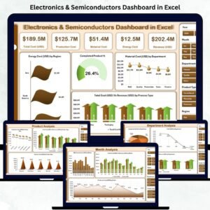
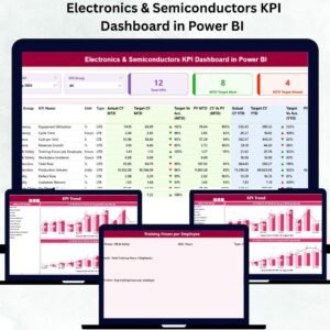
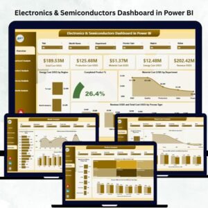
Also available as: the same topic ships on two other platforms – the Electronics & Semiconductors Dashboard in Power BI for teams standardised on Power BI Desktop, and the Electronics & Semiconductors Dashboard in Excel for offline desktop work. If you want a compact month-picker scorecard instead of this analytical build, look at the Electronics & Semiconductors KPI Dashboard in Excel – it is a different template, not a duplicate of this one.
Teams running multi-site production usually pair this with the Contract Manufacturing Dashboard in Google Sheets and the Warehouse Efficiency Dashboard in Google Sheets. Browse the full range of Dashboard Templates for other departments.
📖 Click here to read the Detailed Blog Post
🎥 Visit our YouTube channel for step-by-step video tutorials
👉 YouTube.com/@NextGenTemplates
Watch the step-by-step video Demo:
📅 Last updated: August 2026


























Reviews
There are no reviews yet.