

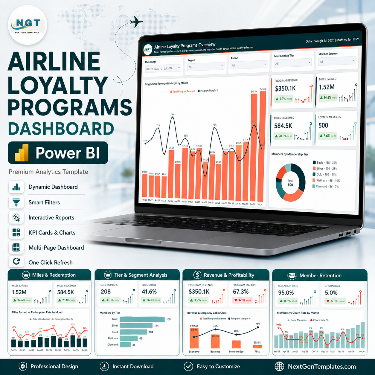
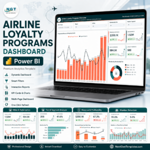
The Airline Loyalty Programs Dashboard in Power BI is a finished .pbix report for frequent-flyer teams who need earn, burn, cost and retention on the same screen. It ships with a star-schema semantic model, 95 DAX measures, six report pages, five synced slicers per page, a hidden Details drillthrough page bound to nine fields, and two tooltip pages. The bundled 500-record sample dataset covers 18 months across eight airlines, six regions, five membership tiers and six earn partners, so every filter, drillthrough and tooltip works the first time you open it. Instant download, lifetime access, free updates, and it opens in Power BI Desktop – which Microsoft gives away for free. Every figure in the screenshots below is sample data included for demonstration; no real airline or member information is supplied Airline Loyalty Programs Dashboard in Power BI.
Key Features of the Airline Loyalty Programs Dashboard in Power BI
- A real semantic model, not a flat sheet. One 21-column fact table (Data) is joined to a Power Query date table on a single active relationship, so time intelligence, month-over-month deltas and the Month Year Short axis all behave.
- 95 measures written for you. Base measures such as Total Miles Earned, Total Miles Redeemed and Total Loyalty Cost; ratios such as Redemption Rate %, Breakage Rate %, Program Margin %, Engagement Rate % and Churn Rate %; and a full set of MoM % variants that feed the KPI card deltas.
- SVG KPI cards with direction. Each card carries the value, a green or red month-over-month delta and a lollipop sparkline of the last dozen months, so a number never sits alone without its trend.
- Slicers that stay in step. Date Range, Region, Airline and Membership Tier are synced across the report; the fifth slot changes per page – Member Segment on Overview, Earn Partner on Miles Activity, Cabin Class on Tier Analysis, Route Type on Revenue Insights and Member Status on Member Retention.
- Drillthrough to the row detail. Right-click any airline, region, tier, segment, enrolment channel, cabin class, route type, earn partner or member status and land on the hidden Details page filtered to that selection.
- Tooltip pages instead of tooltips. Trend Detail and Category Detail are 280×360 report pages that render on hover, so a bar gives you a small chart rather than a single number.
- Custom NGT theme. A JSON theme file drives the deep-teal and coral palette, so restyling the whole report to your airline’s brand is one file edit, not 60 visual edits. Airline Loyalty Programs Dashboard in Power BI
What’s Inside the Airline Loyalty Programs Dashboard in Power BI
Page 1 – Airline Loyalty Programs Overview
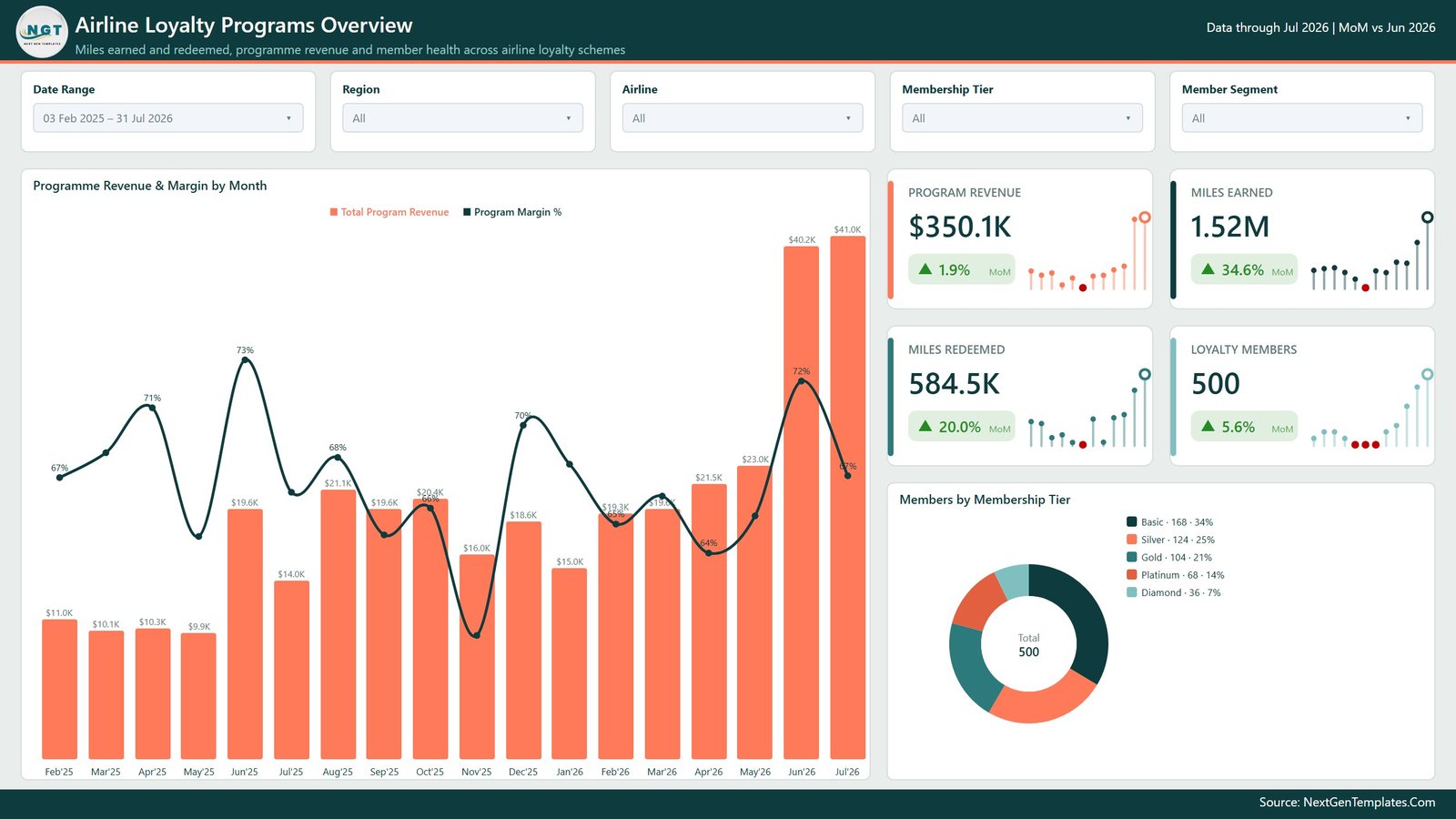
The landing page answers “is the programme paying for itself”. Four KPI cards show Program Revenue, Miles Earned, Miles Redeemed and Loyalty Members, each with its MoM delta. A combo chart plots Total Program Revenue as columns against Program Margin % as a line by month, and a donut breaks the member base into Basic, Silver, Gold, Platinum and Diamond.
Page 2 – Miles Activity (Miles & Redemption)
Five cards cover Miles Earned, Miles Redeemed, Outstanding Miles, Redemption Rate and Breakage Rate – the liability side of a loyalty programme in one row. Below them, Miles Earned vs Redemption Rate by Month, Miles Earned by Earn Partner (Flight, Co-Brand Card, Hotel, Car Rental, Dining, Retail), Miles Redeemed by Cabin Class and Miles Expired by Month.

Page 3 – Tier Analysis (Tier & Segment Analysis)
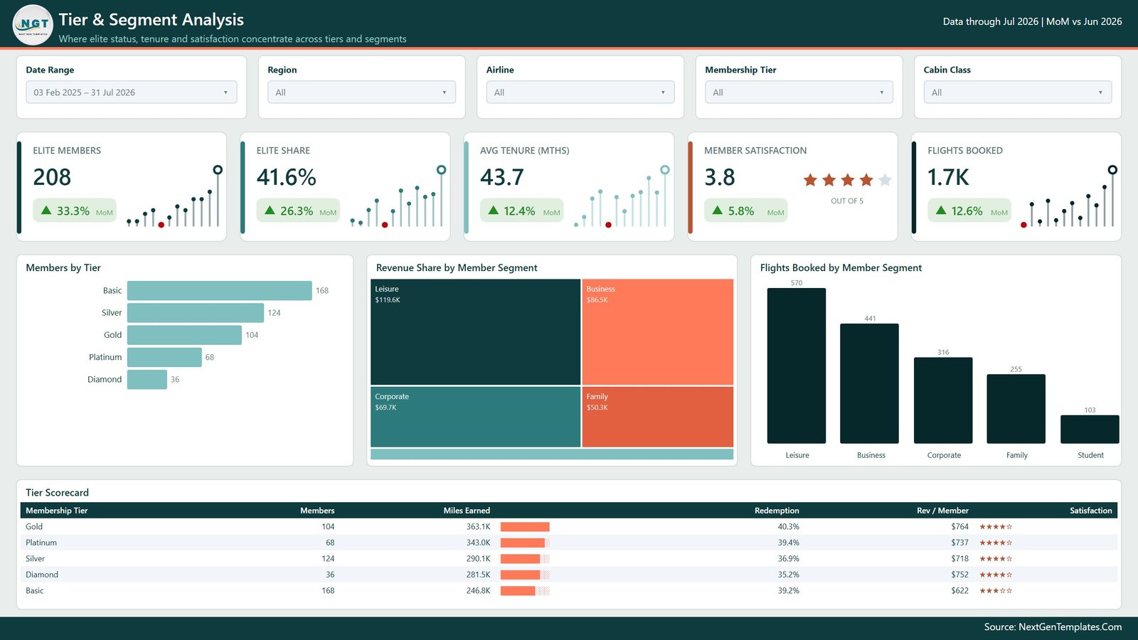
Elite Members, Elite Share, Avg Tenure (Mths), Member Satisfaction and Flights Booked sit above a Members by Tier bar chart, a Revenue Share by Member Segment treemap and Flights Booked by Member Segment. The Tier Scorecard table closes the page with members, miles earned, redemption, revenue per member and a star rating for each tier. Airline Loyalty Programs Dashboard in Power BI
Page 4 – Revenue Insights (Revenue & Profitability)
Program Revenue splits into Ticket Revenue and Ancillary Revenue, then meets Loyalty Cost and Program Margin. Revenue & Margin by Cabin Class, a Revenue vs Margin by Airline scatter sized by members, an Airline P&L table with revenue, loyalty cost, net contribution and margin per carrier, and Revenue by Region complete the page.

Page 5 – Member Retention
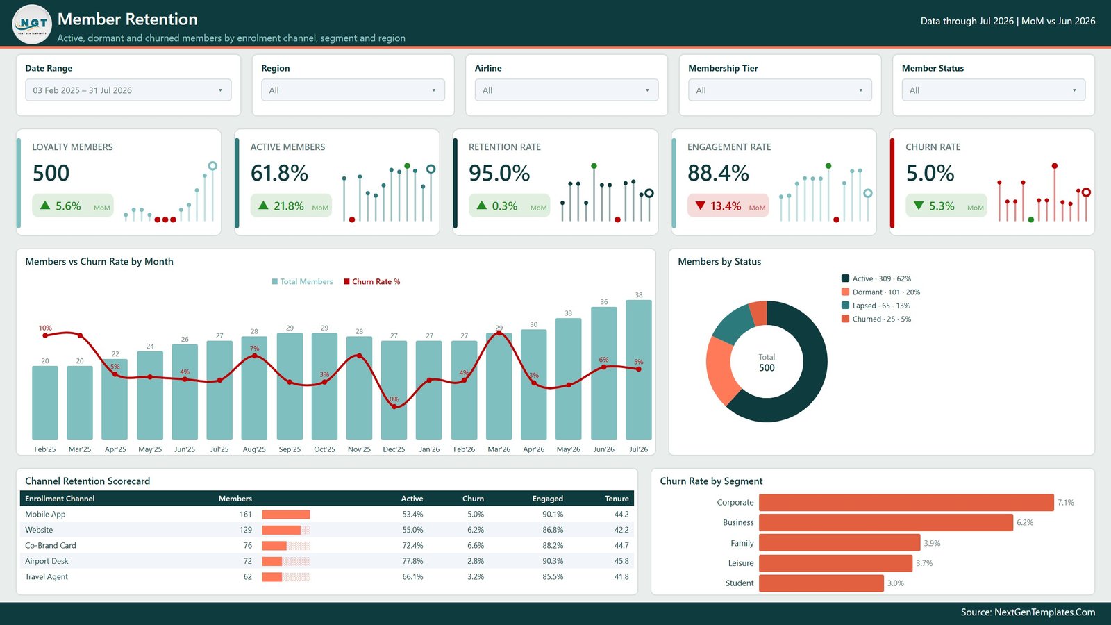
Loyalty Members, Active Members, Retention Rate, Engagement Rate and Churn Rate head the page. Members vs Churn Rate by Month, a Members by Status donut (Active, Dormant, Lapsed, Churned), a Channel Retention Scorecard for Mobile App, Website, Co-Brand Card, Airport Desk and Travel Agent, and Churn Rate by Segment show where members are actually leaving.
Page 6 – Get More Dashboards
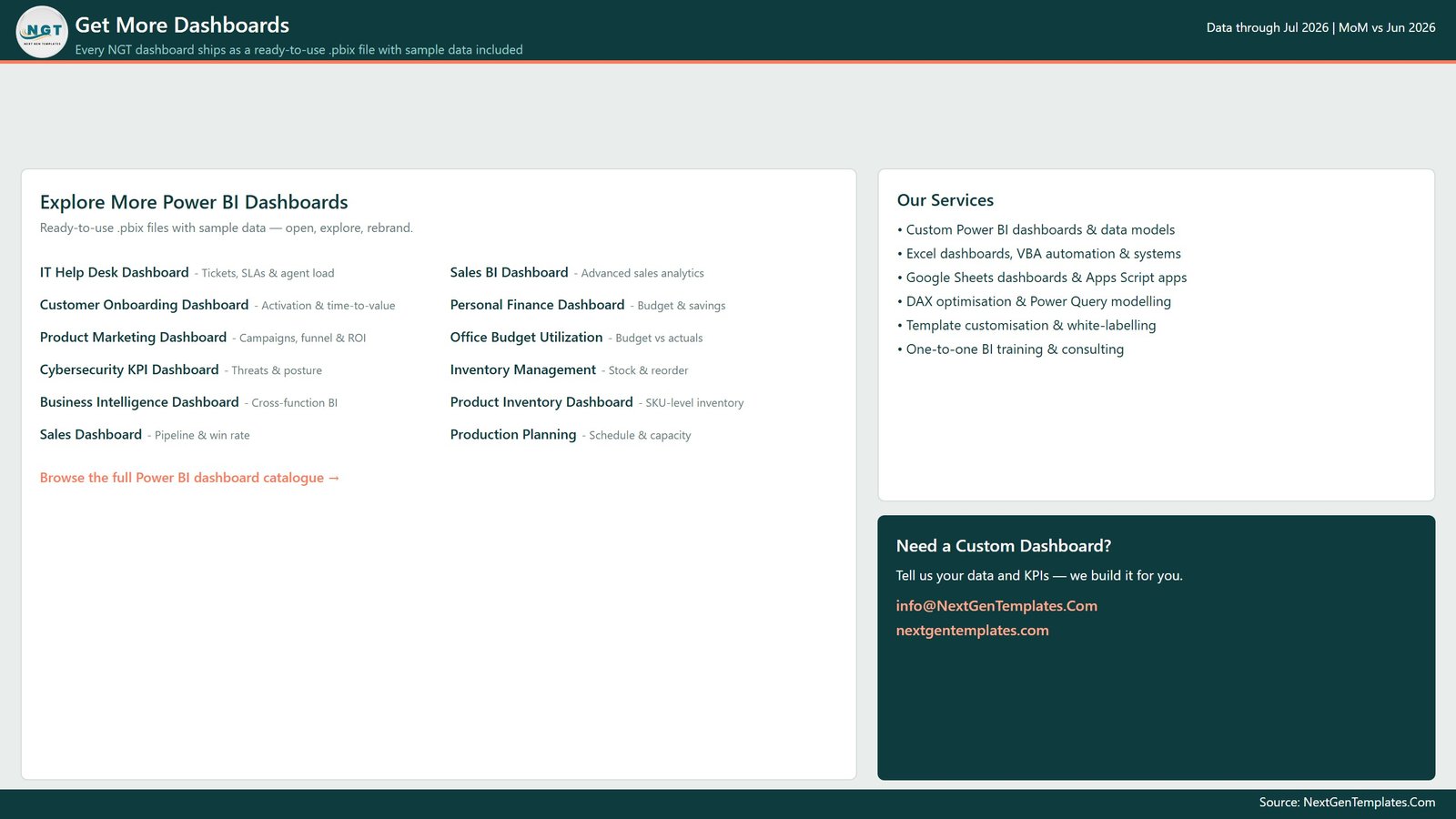
A navigation page listing other NextGenTemplates Power BI reports and how to commission a custom build. Delete it in ten seconds before you share the report internally. Airline Loyalty Programs Dashboard in Power BI
Hidden pages you will not see in the tab strip
Details is a drillthrough target holding the row-level records for whatever you right-clicked. Trend Detail and Category Detail are tooltip pages. All three are hidden in view mode and visible in Power BI Desktop, so you can edit them without unhiding anything.
Airline Loyalty Programs Dashboard in Power BI vs. Tableau vs. Paid Loyalty SaaS – Where This Fits
| This Power BI template | Tableau / Qlik build | Paid loyalty analytics SaaS | |
|---|---|---|---|
| Cost | 29.99 one time (17.99 on sale) | Tableau Creator from ~70 per user per month | Typically 500+ per month, annual contract |
| Platform | Power BI Desktop, free from Microsoft | Tableau Desktop or Qlik Sense licence | Vendor cloud only |
| Setup time | Open the .pbix, repoint the source, refresh | Days to model and lay out from scratch | Weeks of onboarding and data mapping |
| Measures included | 95 DAX measures already written | Build every calculation yourself | Vendor-defined, rarely editable |
| Drillthrough and tooltip pages | Included and pre-wired | Manual configuration | Depends on the plan |
| Customisable fields | Full – it is your model | Full | Limited to vendor schema |
| Share with a link | Publish to Power BI Service or send the file | Tableau Server or Cloud | Built in |
| Year-1 cost at 5 users | 29.99 total | ~4,200 in licences | 6,000+ |
| Miles liability view (outstanding, breakage) | Built in | Build it | Usually included |
| Works offline | Yes | Yes | No |
If you already run a loyalty engine that reports on itself, buy nothing. If your loyalty data ends up in a warehouse, a CSV export or a spreadsheet and somebody rebuilds the same monthly deck by hand, this is the cheaper path.
Who This Template Is For – and Who It’s Not For
A good fit if you are a loyalty programme manager, airline revenue analyst, CRM analyst or BI developer who already has member-level data with miles earned, miles redeemed, revenue and status, and you want a working report today rather than a two-week build. It also suits consultants who need a credible client-ready starting point and BI learners who want to read 95 finished measures instead of a tutorial. Airline Loyalty Programs Dashboard in Power BI
Not a good fit if you need real-time streaming from a live loyalty engine (this refreshes on Airline Loyalty Programs Dashboard in Power BI’s schedule, not per second), if you need award-seat inventory or fare-class optimisation (this reports on the programme, it does not price it), if you want the actuarial breakage liability calculation your finance team files (Breakage Rate % here is a simple expired-over-earned ratio, not an IFRS 15 model), or if you have no member-level data at all – a dashboard cannot invent history. Airline Loyalty Programs Dashboard in Power BI
How to Use the Airline Loyalty Programs Dashboard in Power BI
- Unzip and open. Extract the download and open the .pbix in Power BI Desktop. It opens with the 500 sample records loaded, so click through all six pages first.
- Look at the model. Model view shows the Data fact table joined to the Date table. Keep that relationship; every MoM measure depends on it.
- Point it at your data. Transform data, then edit the source step of the Data query to your own file, folder or database. Match the 21 column names – Record ID, Date, Airline, Region, Membership Tier, Member Segment, Enrollment Channel, Cabin Class, Route Type, Earn Partner, Miles Earned, Miles Redeemed, Miles Expired, Ticket Revenue, Ancillary Revenue, Redemption Cost, Program Cost, Flights Booked, Tenure Months, Satisfaction Score, Member Status – and nothing else needs touching.
- Refresh and check the cards. The Report Context measure in the header prints the latest month and the comparison month; if that line reads correctly, the date table has rebuilt properly.
- Rebrand. Swap the logo image, then edit the theme JSON under View – Themes to move the whole report onto your palette.
- Publish. Delete the Get More Dashboards page, publish to your workspace, and set a refresh schedule.
Real-World Use Cases
Priya, loyalty programme manager at a mid-size carrier. Her monthly board pack took two days of pivot tables. She repoints the Data query at the warehouse export, refreshes on the first working day, screenshots the Overview and Revenue Insights pages, and spends the rest of the morning on the commentary instead of the arithmetic.
Daniel, revenue analyst. He is asked why margin dipped. He filters Route Type to long-haul on Revenue Insights, sees which carrier’s net contribution fell in the Airline P&L table, right-clicks it to the Details page and has the underlying rows in front of him before the meeting ends.
Amara, CRM lead. Churn is her number. On Member Retention she compares Churn Rate by Segment, notices which enrolment channel carries the weakest active share in the Channel Retention Scorecard, and takes a targeted re-engagement list to marketing rather than a blanket campaign.
Frequently Asked Questions
Do I need a Power BI Pro licence?
No. Power BI Desktop is free and opens the file, refreshes it and lets you edit everything. A Pro or Premium licence is only needed if you want to publish to the Power BI Service and share with colleagues.
Is my own data included, or is this sample data?
The file ships with 500 generated sample member records so every visual, slicer and drillthrough works out of the box. Every number in the screenshots is that sample data. Replace it with your own export in Power Query.
Can I add my own DAX measures?
Yes. Nothing is locked. The 95 existing measures are grouped by theme in the Data table and follow plain naming, so a new measure sits alongside them without breaking anything.
What if my column names are different?
Rename them in Power Query to match the 21 names listed above and the whole report keeps working. That is far faster than editing the measures.
Does it handle multiple airlines or just one?
Multiple. Airline is a slicer and a drillthrough field, and the Revenue Insights page has an Airline P&L table, so a group with several carriers can report on each one and on the total.
Is this a substitute for a loyalty accounting model?
No. It reports and visualises the data you feed it. Breakage Rate % is expired miles over earned miles – a monitoring ratio, not the deferred-revenue liability your finance team reports.
Is there an Excel version?
Yes. The same dashboard is available as the Airline Loyalty Programs Dashboard in Excel if your team works in pivot tables and slicers rather than Power BI.
About the Author
Built by PK – Microsoft Certified Professional with 15+ years of Excel, Google Sheets, and Power BI experience. Founder of NextGenTemplates, reaching 300K+ subscribers across YouTube channels. Every template is hand-built and tested before release.
Explore Related Templates
- Airline Loyalty Programs Dashboard in Excel – the same five report pages built with pivot tables and slicers.
- Airlines Dashboard in Power BI – route, load factor and on-time performance rather than loyalty.
- Airports Dashboard in Power BI – terminal traffic, turnaround and airport revenue.
- Airline Catering Dashboard in Power BI – meal service cost and quality on board.
- Business Travel Services Dashboard in Power BI – corporate travel spend and supplier performance.
- Browse the whole Power BI range or just the Power BI Dashboard category.
Download the Airline Loyalty Programs Dashboard in Power BI and have a working earn-and-burn report on screen this afternoon. One file, 95 measures, six pages, no subscription. Instant download, lifetime access and free updates to this template.
Last updated: 14 August 2026.

















Reviews
There are no reviews yet.