
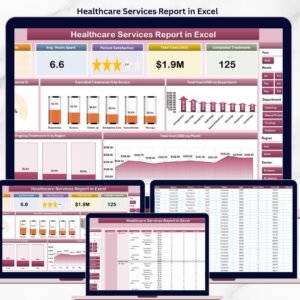
The Healthcare Services Report in Excel tracks 5 core KPIs across 4 structured sheets, with 5 interactive charts covering cancelled treatment percentages, departmental cost analysis, regional ongoing treatment ratios, and monthly cost trends. Setup takes under 10 minutes — replace the sample data and every chart, card, and slicer refreshes automatically through pivot tables. ⚡
🌍 Join 8,400+ teams in 40+ countries using NextGenTemplates Excel reports to replace paid healthcare SaaS tools with one-time-purchase Excel, Google Sheets, Power BI, and HTML templates.
✅ Instant download · One-time payment · No subscription · No per-user fees · Lifetime access
Healthcare Services Report in Excel – Summary Page
🔑 Key Features of the Healthcare Services Report
This report gives hospital administrators, clinic managers, and healthcare finance teams a single Excel file for tracking treatment volumes, cancellation rates, departmental costs, and regional service delivery — without paying $200 to $500 per user per month for hospital management SaaS.
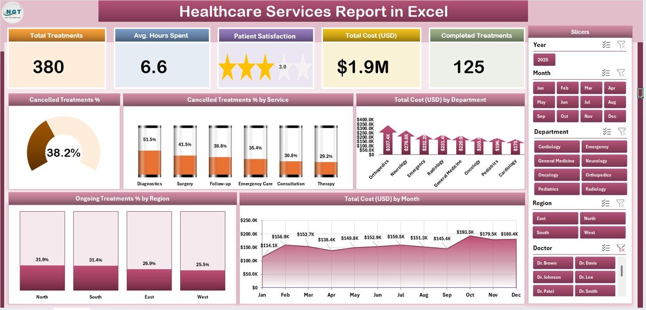
🔹 Five-KPI Summary Page – The top of the Summary Page displays 5 card-style KPIs giving leadership an instant snapshot of service-line performance. A right-side slicer panel lets you filter the entire report by department, region, service category, or time period.
🔹 Cancelled Treatment % chart – A headline visual showing the share of bookings that ended in cancellation. Hospital ops teams use this to spot scheduling friction, no-show patterns, and capacity loss before they hit the bottom line.
🔹 Cancelled Treatment % by Service – Breaks down cancellation rates across service categories (Surgery, Cardiology, Orthopaedics, Diagnostics, Outpatient, etc.) so service-line owners see exactly which programs are leaking revenue.
🔹 Total Cost by Department – Ranks departments by total spend, helping CFOs and department heads compare cost concentration against patient volume and service revenue in a single view.
🔹 Ongoing Treatment % by Region – Shows the share of in-progress treatments by geographic region — useful for multi-location hospital networks tracking care continuity, capacity, and inter-region transfers.
🔹 Total Cost by Month – A 12-month trend view of total service cost. Use it for annual budget reviews, quarterly board reporting, and spotting seasonal cost spikes that justify staffing changes.
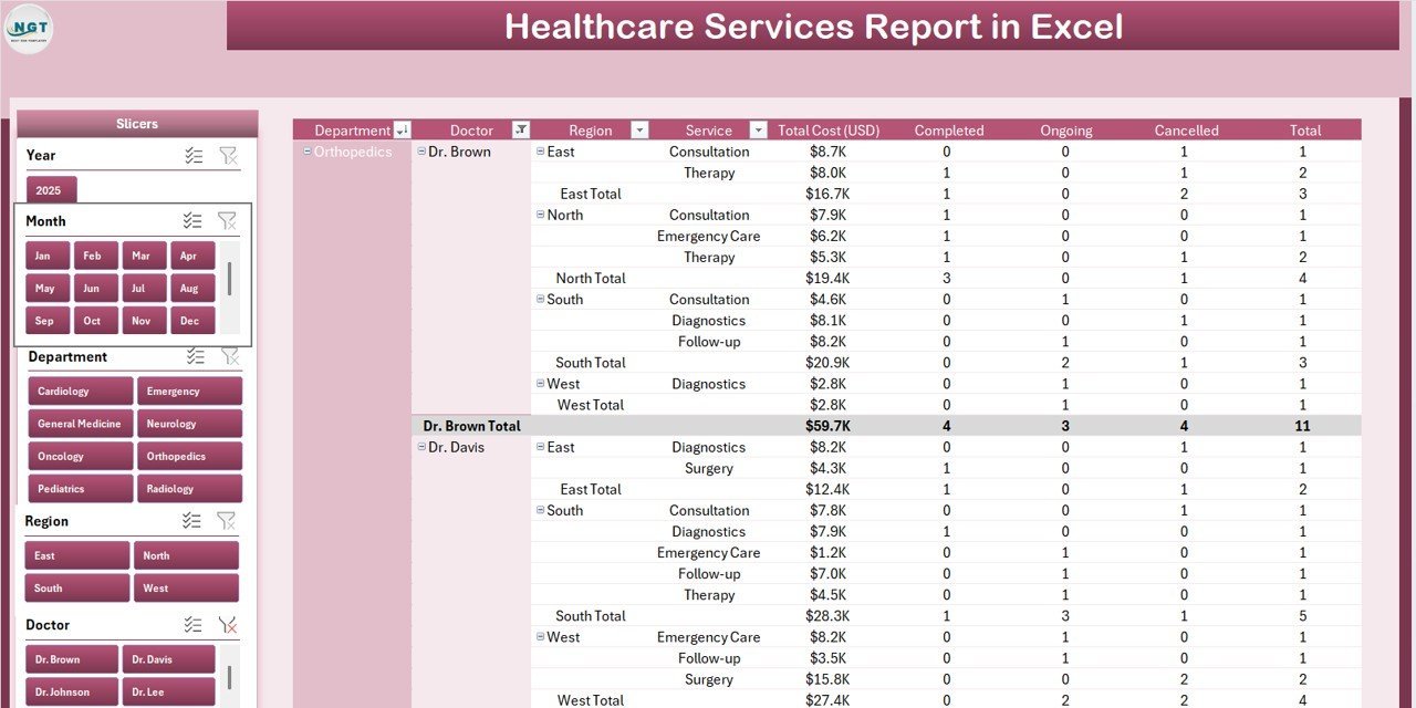
🔹 Detailed Report Page with Information Table – A separate Report Page with a left-side slicer and a transaction-level information table — built for auditing individual cases, preparing payer reports, and exporting line-item data for accountants.
🔹 100% Pivot-Table Driven – The Support sheet holds every pivot table that feeds the dashboard. Update the Data sheet once, hit Data → Refresh All, and every card, chart, and slicer rebuilds automatically — no formulas to edit.
🔹 Works offline on Windows and Mac Excel – No internet, no cloud, no subscription. Patient and treatment data stays on your device, which matters for HIPAA, GDPR, and DPDP-aligned workflows.
📦 What’s Inside the Healthcare Services Report
The file includes 4 Excel sheets, each with a defined role in the monthly reporting workflow.
1. Summary Page — The main dashboard view. At the top, 5 KPI cards display headline metrics at a glance. A right-side slicer panel filters the entire page by department, region, service, and time period. Five interactive charts cover the core questions hospital leadership asks every month: Cancelled Treatment %, Cancelled Treatment % by Service, Total Cost by Department, Ongoing Treatment % by Region, and Total Cost by Month.
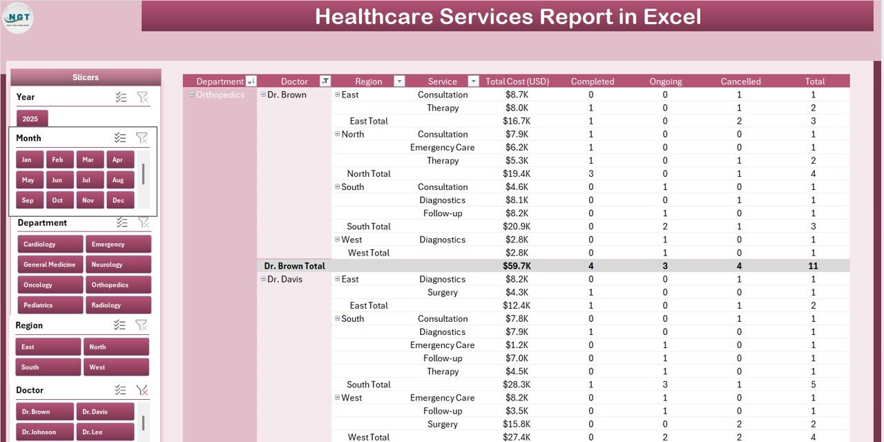
Report Page with slicer and information table
2. Report Page — A left-side slicer drives a detailed information table with transaction-level records. Use this page to pull case-level lists for insurance audits, departmental reviews, or month-end reconciliation with the finance team.
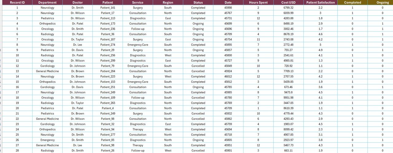
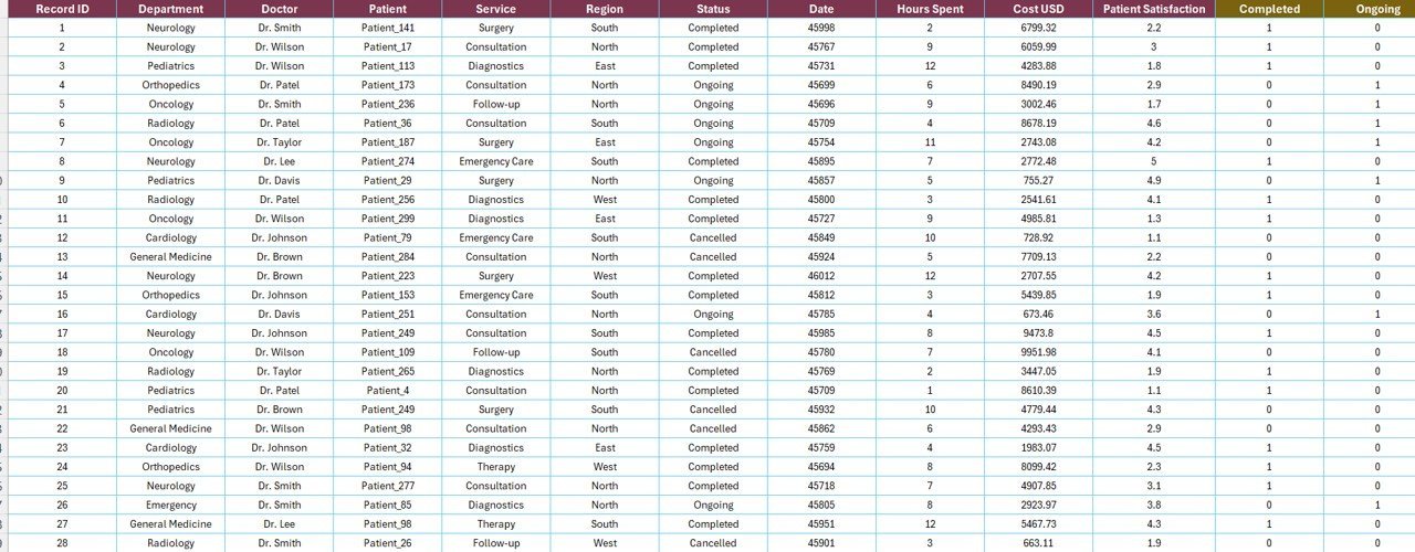
Data Sheet – paste your service-level records here
3. Data Sheet — The raw input sheet. Paste your service-level records into the same column structure (Date, Department, Region, Service Category, Status, Treatment Cost, etc.). Keep the headers identical — every pivot in the Support sheet references them directly.
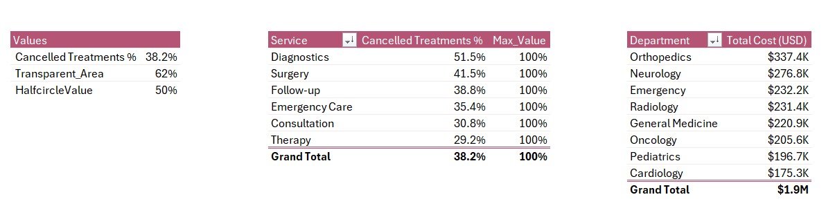
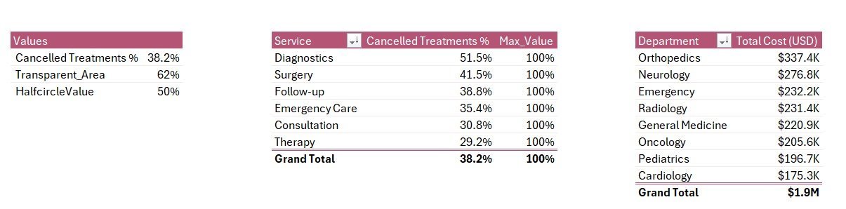
Support Sheet with pivot tables driving every chart
4. Support Sheet — Holds every pivot table that feeds the Summary Page charts and KPI cards. After updating the Data sheet, click Data → Refresh All in the Excel ribbon and every pivot recalculates. Hide this sheet in production — your team only needs to see the Summary Page and Report Page.
📊 Healthcare Services Report in Excel vs. Google Sheets Equivalent vs. Athenahealth / Kareo — Where This Fits
| Feature | Healthcare Services Report in Excel | Google Sheets equivalent | Athenahealth / Kareo / AdvancedMD |
|---|---|---|---|
| Cost | $7.99 one-time ✅ | ~$10 one-time template | $140–$500 / provider / month |
| Platform | Microsoft Excel (desktop) | Google Sheets (browser) | Web + mobile SaaS |
| Works offline | ✅ Yes | ❌ Requires internet | ❌ Requires internet |
| Setup time | Under 10 minutes ✅ | ~15 minutes | 4–12 weeks onboarding |
| Customizable KPIs & charts | ✅ Fully editable | ✅ Editable | ❌ Fixed reporting modules |
| Per-user licence fees | None — share freely | None | $140+ per provider / month |
| Data stays on your device | ✅ Yes | ❌ Cloud (Google servers) | ❌ Vendor cloud |
| Year-1 cost at 5 providers | $7.99 ✅ | ~$10 | $8,400 – $30,000 |
| Department + region breakdown | ✅ Pre-built | Needs rebuild | ✅ Pre-built |
For hospitals and clinics that want department, region, and service-line cost visibility without paying $8,000+ per year in SaaS fees, the Healthcare Services Report in Excel sits in the sweet spot.
👥 Who This Template Is For — and Who It’s Not For
✅ This template is built for:
- Hospital administrators tracking departmental cost and treatment-cancellation trends month over month
- Multi-branch clinic owners running 2–10 locations who need regional service comparisons
- Healthcare finance and revenue-cycle managers preparing CFO and board reports
- Service-line directors (Cardiology, Orthopaedics, Surgery, Diagnostics) reviewing cancellation and cost performance
- Healthcare consultants and BPOs delivering monthly client reports without rebuilding charts in PowerPoint
❌ This template is NOT for:
- Enterprise hospital networks needing HIPAA-certified cloud infrastructure with SSO, role-based access, and audit logs (use Epic, Cerner, or Athenahealth)
- Teams that need integrated patient scheduling, e-prescribing, telehealth, and billing in one EHR system
- Clinics that only use Google Sheets — browse our Google Sheets Healthcare Dashboards instead
- Real-time dashboards with second-by-second updates from connected medical devices
⚙️ How to Use the Healthcare Services Report
- Download and open the .xlsx file in Microsoft Excel 2016 or later, on Windows or Mac.
- Go to the Data sheet and replace the sample rows with your hospital or clinic’s service-level records. Keep all column headers identical.
- Click Data → Refresh All in the Excel ribbon. Every pivot table on the Support sheet recalculates.
- Open the Summary Page. All 5 KPI cards and 5 charts now reflect your data. Use the right-side slicer to filter by department, region, service, or period.
- Switch to the Report Page to pull filtered line-item views for insurance audits, departmental reviews, or accountant exports.
- Hide the Support sheet before sharing the file with non-finance staff — they only need the Summary Page and Report Page.
💼 Real-World Use Cases
Dr. Anand runs operations at a 120-bed multi-speciality hospital in Pune. He uses the Healthcare Services Report each month to spot which service categories are losing the most revenue to cancelled treatments. The Cancelled Treatment % by Service chart helped him identify that orthopaedic day-care surgeries had a 14% cancellation rate — he restructured the pre-admission workflow and recovered an estimated ₹18 lakh per quarter.
Lisa is a regional manager for a 6-clinic network in the Midwest US. She uses the Ongoing Treatment % by Region and Total Cost by Department views every Monday to compare clinic-level performance. After spotting that her Indianapolis branch had 30% higher costs but matching patient volume, she rebalanced staffing and saved roughly $42,000 in the next quarter — without paying $14,000 a year for an Athenahealth analytics module.
Kavya is a freelance healthcare consultant working with mid-size Indian hospital chains. She uses the Healthcare Services Report as her standard monthly client deliverable. Each engagement gets the same 4-sheet model — replace data, refresh, screenshot the Summary Page into the client’s PowerPoint deck. Cuts her reporting prep from 6 hours to 45 minutes per client.
❓ Frequently Asked Questions
What KPIs does the Healthcare Services Report in Excel track?
The Healthcare Services Report tracks 5 headline KPIs on the Summary Page shown as card visuals, plus 5 interactive charts: Cancelled Treatment %, Cancelled Treatment % by Service, Total Cost by Department, Ongoing Treatment % by Region, and Total Cost by Month. All metrics update automatically when you refresh the pivot tables after pasting new data.
How does this compare to Athenahealth or Kareo?
Athenahealth and Kareo charge $140 to $500 per provider per month — roughly $1,680 to $6,000 per provider per year. The Healthcare Services Report in Excel is a $7.99 one-time purchase with no per-user fees, works offline, and keeps treatment data on your device. It’s a reporting layer, not a replacement for an EHR or revenue-cycle platform.
How long does setup take?
Setup takes under 10 minutes. Open the .xlsx file, paste your service-level data into the Data sheet keeping the column headers identical, then click Data → Refresh All. Every card, chart, and slicer on the Summary Page updates automatically. No formulas to rewrite, no DAX, no macros.
Does this template work on Mac Excel?
Yes. The Healthcare Services Report in Excel uses only pivot tables and slicers — no VBA, no macros — so it runs identically on Windows Excel and Mac Excel 2016 or later. No internet connection is required, which makes it ideal for hospital networks with strict data-isolation policies.
Can I add my own departments, regions, or service categories?
Yes. Add new departments, regions, services, or treatment statuses directly to the Data sheet. After adding rows, click Data → Refresh All in the ribbon and every pivot table on the Support sheet picks up the new categories. The Summary Page charts populate automatically — no manual chart edits.
Is patient data safe with this template?
Treatment data stays entirely on your device. The Healthcare Services Report in Excel doesn’t connect to any cloud service, API, or external database. For full HIPAA, GDPR, or DPDP compliance you’ll still need to encrypt the file and control access — but no third party can see your records by default, unlike with vendor-cloud SaaS tools.
Can I share the report with my hospital team?
Yes. Email the .xlsx file or share via OneDrive, Dropbox, or SharePoint. There’s no per-user licence — administrators, department heads, and finance staff can open and filter the report freely with any Microsoft Excel installation. For multi-user editing, use OneDrive co-authoring or a shared SharePoint location.
👤 About the Author
Built by PK — Microsoft Certified Professional with 15+ years of Excel, Google Sheets, and Power BI experience. Founder of NextGenTemplates, reaching 300K+ subscribers across YouTube channels (@PK-AnExcelExpert, @NextGenTemplates, @NeoTechNavigators). Every template is hand-built and tested before release.
🔗 Explore Related Templates
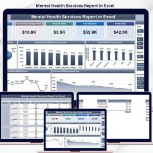
🔹 Mental Health Services Report in Excel — A peer report built for therapy and counselling clinics tracking session-level financials.
🔹 Medical Practice Dashboard in Excel — A broader medical-practice dashboard covering appointments, patient mix, and revenue.
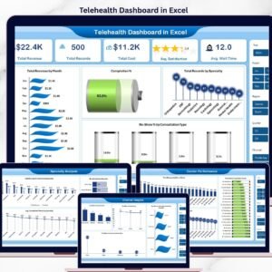
🔹 Telehealth Dashboard in Excel — For practices running virtual visits, with no-show and connection-quality tracking.
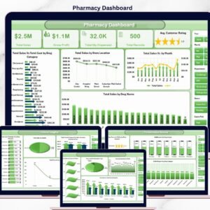
🔹 Pharmacy Dashboard in Excel — A complementary template for hospital pharmacies tracking dispensing volumes and revenue.
🔹 Hospital Patient Flow Dashboard in Google Sheets — A Google Sheets companion for teams that prefer browser-based tools.
Also browse all our Excel Dashboard Templates for more healthcare-industry reports.
📖 Click here to read the Detailed Blog Post
🎥 Visit our YouTube channel for step-by-step video tutorials
👉 YouTube.com/@NextGenTemplates
Watch the step-by-step video tutorial:


Reviews
There are no reviews yet.