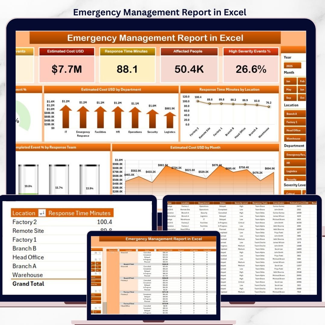
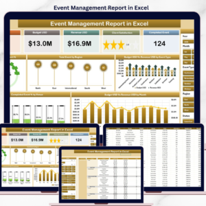
The Emergency Management Report in Excel tracks 5 KPI cards and 5 interactive charts across 2 fully wired pages — a Summary page with a side slicer for instant filtering and a Report page with a detailed Information Table. Setup takes under 10 minutes — paste your incident records into the Data sheet, click Data → Refresh All, and every card, slicer, and chart updates automatically. ⚡
🌍 Join 8,400+ teams in 40+ countries using NextGenTemplates to replace paid emergency-response SaaS tools with one-time-purchase Excel, Google Sheets, Power BI, and HTML templates.
✅ Instant download · One-time payment · No subscription · No per-user fees · Lifetime access
Emergency Management Report in Excel — Summary Page
🔑 Key Features of the Emergency Management Report in Excel
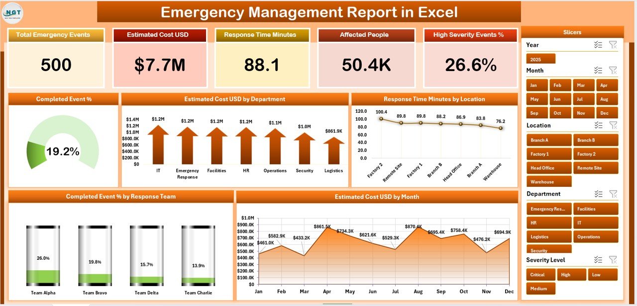
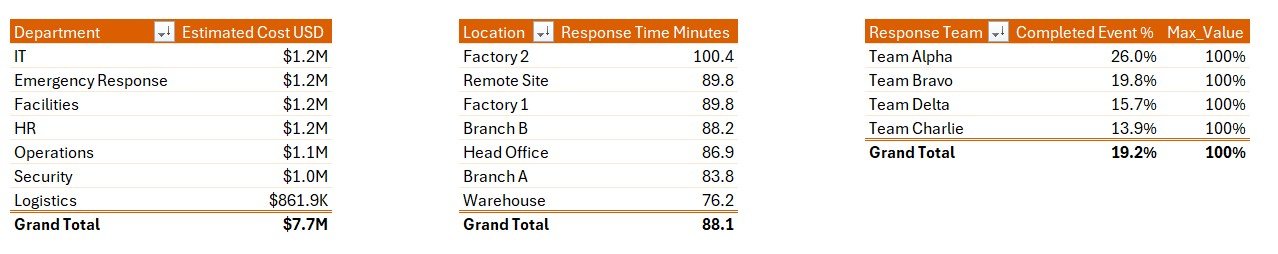
📌 5 KPI Cards on the Summary Page – The top of the Summary page displays 5 high-level cards covering total events, estimated cost, completed events, average response time, and overall completion percentage. Each card refreshes the moment any slicer is applied, giving emergency operations leads the headline numbers their leadership asks for first — without scrolling through the workbook.
📌 5 Pre-Built Pivot Charts on the Summary Page – The Emergency Management Report in Excel ships with five charts wired to the same data model: Completed Event %, Estimated Cost by Department, Response Time Minutes by Location, Completed % by Response Team, and Estimated Cost by Event Category. Together they answer the five questions a duty officer reviews every morning.
📌 Side Slicer for One-Click Filtering – A vertical slicer panel sits on the right side of the Summary page so a coordinator can filter by department, response team, location, event category, or month and watch every card and chart redraw at once. No formula edits, no pivot rebuilds, no cell selection.
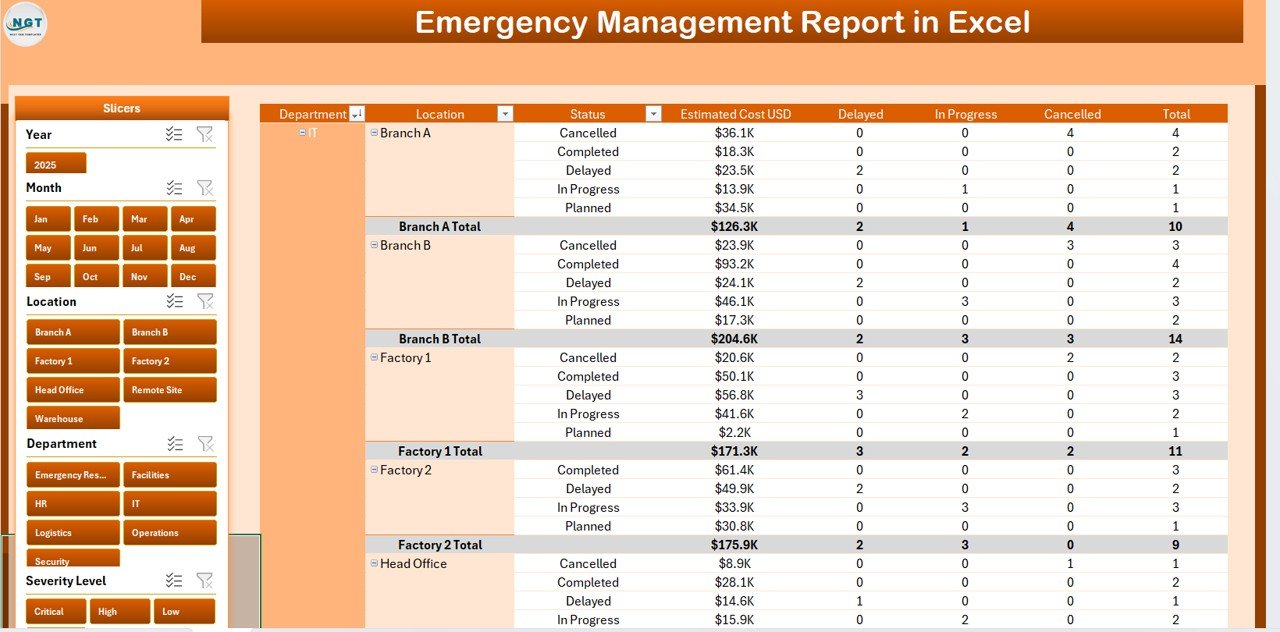
📌 Dedicated Report Page with Information Table – Page 2 hosts a sortable Information Table with a left-side slicer, listing every event with response team, location, status, response time in minutes, and estimated cost. Filter once on the slicer and the entire table redraws — useful for after-action reviews and audit committee handouts.
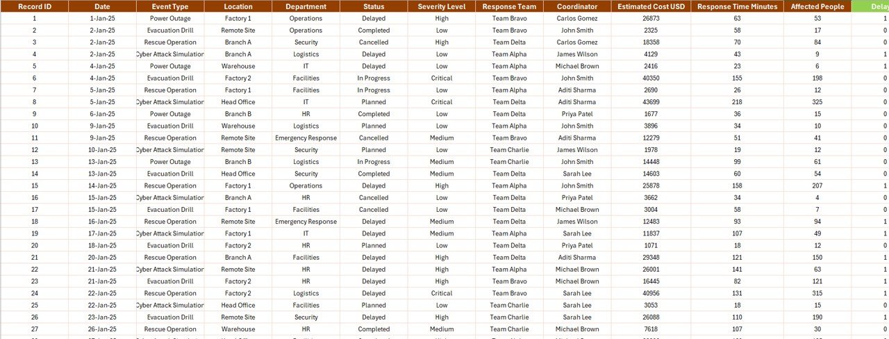
📌 Single Data Sheet Architecture – Every visual on every page reads from a single Data sheet. Replace the sample rows with your own incident log keeping the column headers intact, and the report rebuilds end-to-end. No VLOOKUPs to repair, no DAX to rewrite, no Power Query refresh.
📌 Hidden Support Sheet with Pivot Tables – All pivot tables that drive the cards and charts live on a Support sheet you can hide before sharing with leadership. One click on Data → Refresh All in the Excel ribbon rebuilds the pivots and every visual on the Summary and Report pages updates simultaneously.
📌 Works Offline in Excel 2016, 2019, 2021, and Microsoft 365 – No macros, no Power Pivot add-in, no Power Query — the Emergency Management Report in Excel uses only standard pivot tables and charts. Runs on Windows and macOS, and opens fine in Excel for the web for read-only review.
📦 What’s Inside the Emergency Management Report in Excel
📁 The .xlsx workbook ships with 4 sheets covering the full emergency-management reporting cycle. Below is a breakdown of each page and what it contains.
1. Summary Page
The Summary opens with 5 KPI cards across the top — Total Events, Total Estimated Cost, Total Completed Events, Average Response Time, and Overall Completion % — followed by 5 charts arranged below: Completed Event %, Estimated Cost by Department, Response Time Minutes by Location, Completed % by Response Team, and Estimated Cost by Event Category. A vertical slicer panel on the right side filters the entire page in one click.
Summary Page — KPI cards, 5 charts, and side slicer
2. Report Page
The Report page is built around a detailed Information Table listing every emergency event with its response team, location, event category, status, response time minutes, and estimated cost. A left-side slicer lets responders filter by team, region, or event type — perfect for incident-by-incident drill-downs and after-action review packs.
Report Page — Information Table with left-side slicer
3. Data Sheet
The Data sheet is where you replace the sample rows with your own incident log. Keep the column headers — Event ID, Date, Department, Response Team, Location, Event Category, Status, Response Time (Minutes), Estimated Cost, and Completion % — and every chart, card, and slicer on the Summary and Report pages picks up the new data after a single Refresh All.
4. Support Sheet
The Support sheet houses every pivot table that feeds the dashboard. After updating the Data sheet, click Data → Refresh All in the Excel ribbon and every pivot rebuilds — which means every chart and KPI on every page refreshes automatically. Hide this sheet before sharing the file with leadership for a cleaner end-user view.
Data Sheet and Support Sheet — single source of truth, one-click refresh
📊 Emergency Management Report in Excel vs. Google Sheets Equivalent vs. Resolver/Everbridge — Where This Fits
| Feature | Emergency Management Report in Excel | Google Sheets Emergency Tracker | Resolver / Everbridge / D4H |
|---|---|---|---|
| Cost | $7.99 one-time | $5–10 one-time | $39–$199 / user / month |
| Platform | ✅ Microsoft Excel (offline) | Google Sheets (browser) | Cloud SaaS, login required |
| Setup time | ✅ Under 10 minutes | 10–15 minutes | 2–6 weeks vendor onboarding |
| 5 KPI cards + 5 charts on Summary | ✅ Yes — pre-built | Build manually | Yes (locked layout) |
| Side-slicer filtering | ✅ Yes — native pivot slicers | Filter views only | Yes |
| Information Table on Report page | ✅ Yes — sortable, filterable | Yes | Yes |
| Customizable fields | ✅ Full column-level edit | Full edit | Vendor-controlled schema |
| Year-1 cost at 5 users | ✅ $7.99 total | $5–10 total | $2,340–$11,940 |
| Works offline | ✅ Yes | ❌ Requires internet | ❌ |
For emergency operations teams that want SaaS-grade reporting without paying SaaS-grade subscription fees, the Emergency Management Report in Excel sits in the sweet spot.
👥 Who This Template Is For — and Who It’s Not For
✅ This template is built for:
- Emergency operations managers and duty officers at organizations with 50–5,000 staff
- Public safety departments, fire and rescue services, and EMS agencies tracking event response time and cost
- Business continuity teams reporting incident outcomes to executive committees
- Municipal emergency management offices coordinating multi-department drills and real events
- HSE consultants delivering after-action reports and benchmarking studies to client boards
- Risk and resilience teams already standardized on Microsoft Excel
❌ This template is NOT for:
- Teams that need real-time alerting, two-way SMS, or geofenced notifications — use Everbridge or AlertMedia
- Organizations requiring SOC 2 Type II + SSO + role-based access trails — use a SaaS platform like Resolver
- Use cases needing live ingestion from CAD systems or ServiceNow — this report is refresh-based, not streaming
- Mobile-first responders who need a mobile app instead of a workbook on a laptop
⚙️ How to Use the Emergency Management Report in Excel
1. Download the .xlsx file and open it in Microsoft Excel 2016 or later (Windows or macOS).
2. Go to the Data sheet and replace the sample rows with your own emergency event log — keep the column headers unchanged.
3. Click Data → Refresh All in the Excel ribbon. Every pivot in the Support sheet rebuilds, and every chart and KPI updates.
4. Open the Summary page and use the right-side slicer to filter by department, response team, location, event category, or month.
5. Open the Report page and use the left-side slicer on the Information Table for incident-by-incident drill-downs.
6. Hide the Support sheet (right-click sheet tab → Hide) before sharing with leadership for a cleaner experience.
💼 Real-World Use Cases
Carlos manages emergency operations at a county fire department. Each month he pastes the incident log into the Data sheet of the Emergency Management Report in Excel, refreshes the workbook, and presents the Summary page to his chief — the Response Time Minutes by Location chart anchors the discussion, and the Estimated Cost by Department chart answers the city manager’s favorite budget question before it’s asked.
Priya runs business continuity at a 1,200-employee fintech. She uses the Report page Information Table to log every BCP drill and real incident, filtered by response team, then exports the table to PDF for her quarterly resilience steering committee — replacing a $99-per-user-per-month Resolver seat with a $7.99 one-time download.
Marcus is an HSE consultant delivering after-action reports. He white-labels the Emergency Management Report in Excel for each client, drops in their incident records, and ships a fully formatted Summary + Report deliverable on day two of the engagement instead of building one from scratch in Power BI.
❓ Frequently Asked Questions
What KPIs does the Emergency Management Report in Excel track?
The Emergency Management Report in Excel tracks 5 KPI cards on the Summary page — Total Events, Total Estimated Cost, Total Completed Events, Average Response Time, and Overall Completion % — plus 5 chart-level metrics covering Completed Event %, Estimated Cost by Department, Response Time Minutes by Location, Completed % by Response Team, and Estimated Cost by Event Category.
How long does setup take?
Setup takes under 10 minutes. Open the .xlsx file, paste your event records into the Data sheet using the existing column structure, then click Data → Refresh All. Every pivot, chart, and KPI on both the Summary and Report pages updates automatically — no formula or pivot edits needed.
How does this compare to Resolver or Everbridge?
Resolver and Everbridge are SaaS platforms that cost $39–$199 per user per month. The Emergency Management Report in Excel is a one-time $7.99 download with no per-user fees, no subscription, and no vendor lock-in. It does not replace SaaS for real-time alerting, but it covers reporting, KPI tracking, and after-action analysis at a fraction of the cost.
Which Excel versions does this report work with?
The Emergency Management Report in Excel works on Microsoft Excel 2016, 2019, 2021, and Microsoft 365 on both Windows and macOS. It uses standard pivot tables and charts — no macros, no Power Pivot add-in, and no Power Query required. The file also opens in Excel for the web for read-only review.
Can I add new event categories or response teams?
Yes. The Emergency Management Report in Excel is fully customizable. Add any new value (event category, response team, department, or location) to the Data sheet, click Data → Refresh All, and the slicer and chart will pick up the new category automatically — no formula or DAX rewrites needed.
Does the report include a tutorial or walkthrough?
Yes. Visit YouTube.com/@PK-AnExcelExpert and @NextGenTemplates for step-by-step walkthroughs on replacing the sample data, customizing the slicer, and hiding the Support sheet before sharing the workbook with leadership.
Is the data secure — does anything phone home?
No data leaves your machine. The Emergency Management Report in Excel is a self-contained .xlsx file with no macros, no add-ins, and no network calls. NextGenTemplates has no access to your incident data at any point — the workbook runs entirely offline on your laptop or shared drive.
👤 About the Author
Built by PK — Microsoft Certified Professional with 15+ years of Excel, Google Sheets, and Power BI experience. Founder of NextGenTemplates, reaching 300K+ subscribers across YouTube channels (@PK-AnExcelExpert, @NextGenTemplates, @NeoTechNavigators). Every template is hand-built and tested before release.
🔗 Explore Related Templates
📌 Public Safety Report in Excel — Sister Excel report focused on public-safety incident metrics, the natural companion for municipal teams.
📌 Crisis Response KPI Dashboard in Power BI — The Power BI version with 16-column MTD/YTD KPI tracking and drill-through definitions for teams already on Power BI Desktop.
📌 Disaster Relief KPI Dashboard in Google Sheets — Google Sheets alternative for disaster-relief teams that prefer cloud-first workflows and native sharing.
📌 Transportation Safety KPI Scorecard In Google Sheets — Companion scorecard for transportation safety KPIs with traffic-light status logic.
💎 Save 40%+ — Get all 8 safety templates in the Safety & Compliance Commander Bundle →
Browse more Excel Dashboard Templates.
📖 Click here to read the Detailed Blog Post
🎥 Visit our YouTube channel for step-by-step video tutorials
👉 YouTube.com/@NextGenTemplates
Watch the step-by-step video tutorial:


Reviews
There are no reviews yet.