


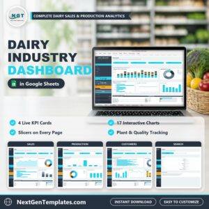
The Dairy Industry Dashboard in Google Sheets reports a full year of dairy orders across six plants, eight products, five sales channels, five US regions and twelve customers, laid out over four dashboard pages plus a Search page, an Instructions page and a Data tab. Four KPI cards, fifteen slicers and seventeen charts show revenue, volume shipped in pounds, gross margin and product quality. It works as a ready-made dairy dashboard for a processing plant, a milk co-op or a dairy distributor: paste your own order lines over the 500 sample rows on the Data tab and every KPI, chart, slicer and table updates on its own.
✅ Instant download · One-time payment · No subscription · No per-user fees · Lifetime access
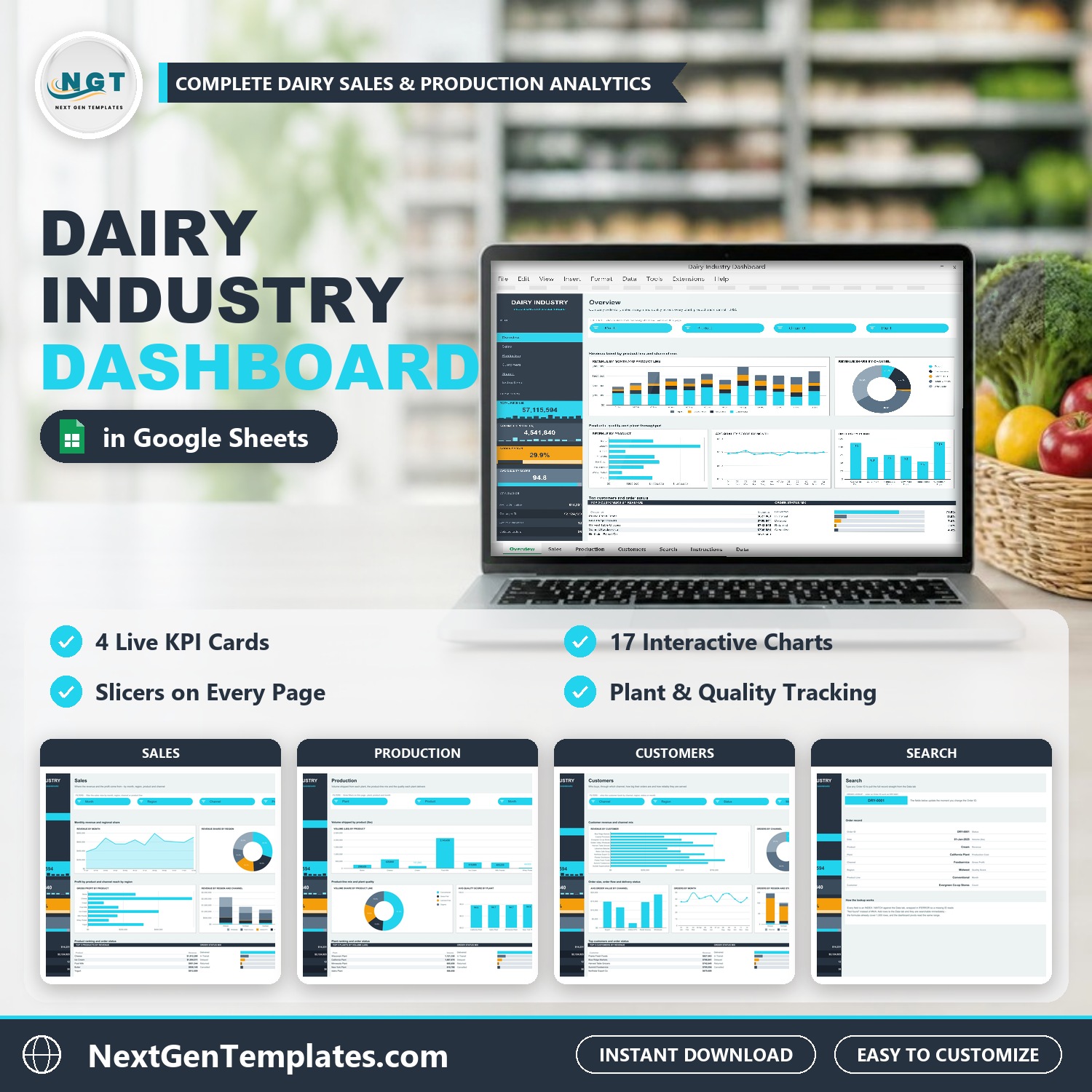
Watch the Dairy Industry Dashboard in Google Sheets walkthrough
🔑 Key Features of the Dairy Industry Dashboard in Google Sheets
📊 Four KPI cards in a dark side rail. Total Revenue ($7,115,594 on the sample data), Volume Shipped (4,541,840 lbs), Gross Margin (29.9%) and Avg Quality Score (94.8) stay in view on every page, each with a small monthly trend strip or progress bar.
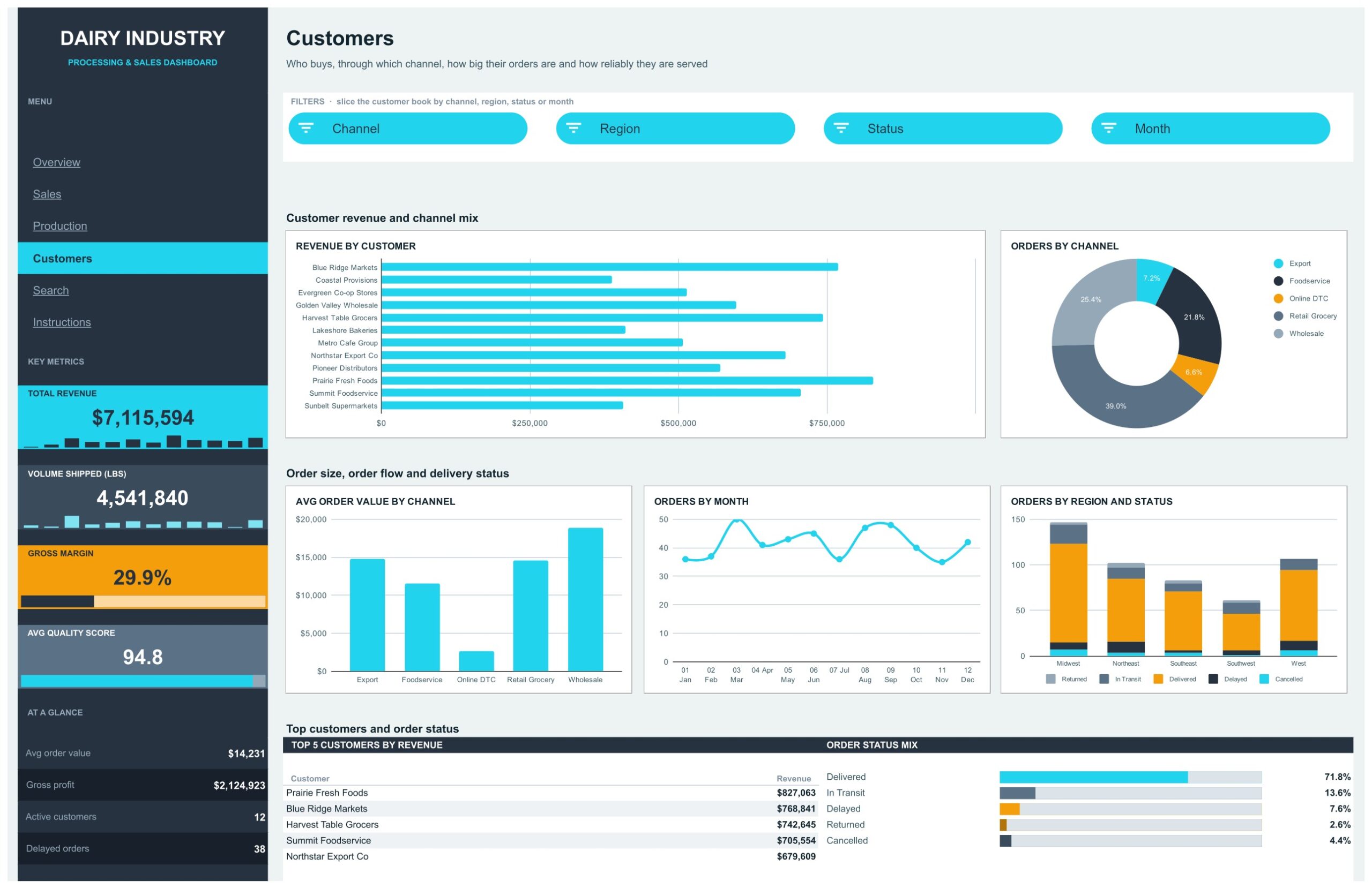
🎛️ Fifteen cyan slicers across four pages. Overview filters by Month, Product, Channel and Plant. Sales filters by Month, Region, Channel and Product Line. Production filters by Plant, Product and Month. Customers filters by Channel, Region, Status and Month. Each slicer filters the charts and the Top 5 table on its own page, while the side rail cards keep the full-year picture.
🏭 Plant and quality tracking. Orders by Plant, Avg Quality Score by Plant, Avg Quality Score by Month and a Top 5 Plants by Volume table show which of the six plants carry the load and whether quality holds up.
🧀 Product and product line insight. Compare butter, cheese, cream, fluid milk, ice cream, milk powder, whey protein and yogurt by revenue, gross profit and volume, and see the conventional, grass-fed, lactose-free and organic product lines side by side.
🚚 Customer, channel and order status view. Revenue by Customer, Orders by Channel, Avg Order Value by Channel and Orders by Region and Status show who buys, through which route and how reliably each order is delivered.
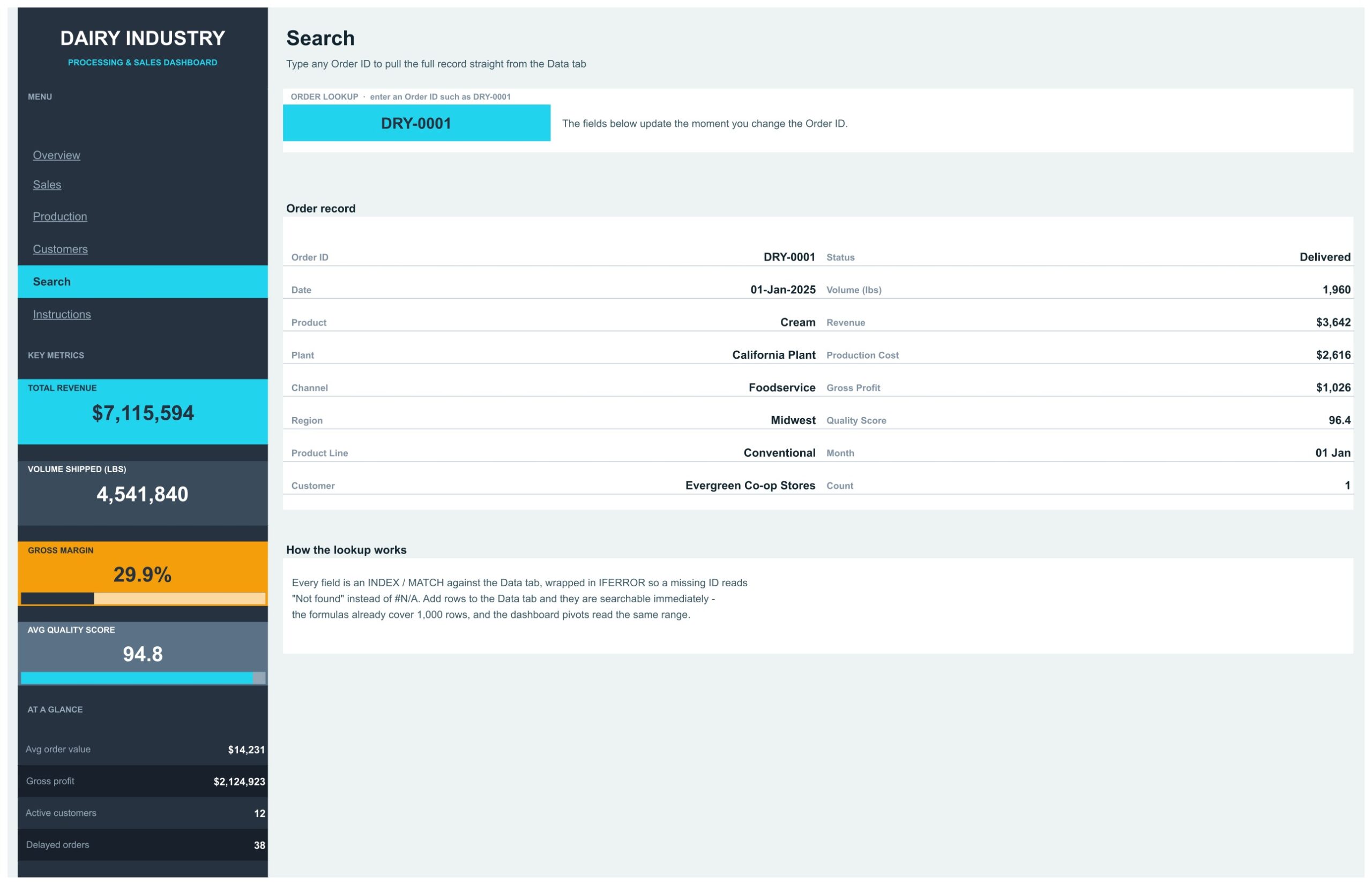
🔍 Order lookup on the Search page. Type an Order ID such as DRY-0001 and the full order line is pulled from the Data tab instantly.
🧩 Room for 1,000 order lines. The pivots and the Search formulas already cover 1,000 rows, so you can paste your own orders over the sample rows without extending any range.
📦 What Is Inside the Dairy Industry Dashboard
Page 1: Overview, Revenue, Channels and Plant Throughput
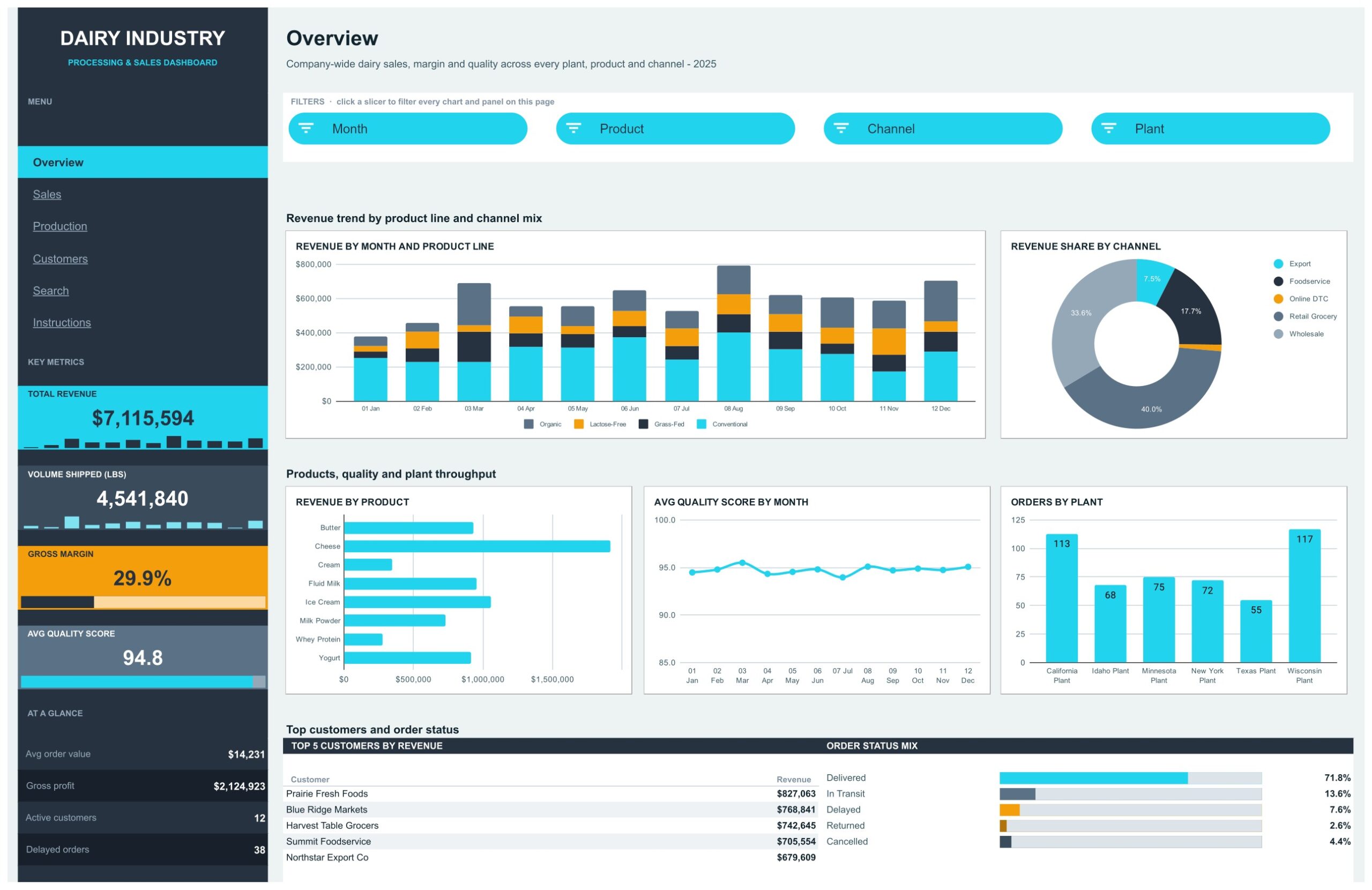
The landing page reports every plant, product and channel together. Charts are Revenue by Month and Product Line, Revenue Share by Channel, Revenue by Product, Avg Quality Score by Month and Orders by Plant. The side rail adds an At a Glance block with a $14,231 average order value, $2,124,923 gross profit, 12 active customers and 38 delayed orders. At the bottom, a Top 5 Customers by Revenue table is led by Prairie Fresh Foods ($827,063), next to an Order Status Mix showing 71.8% of orders delivered.
Page 2: Sales, Monthly Revenue and Regional Share
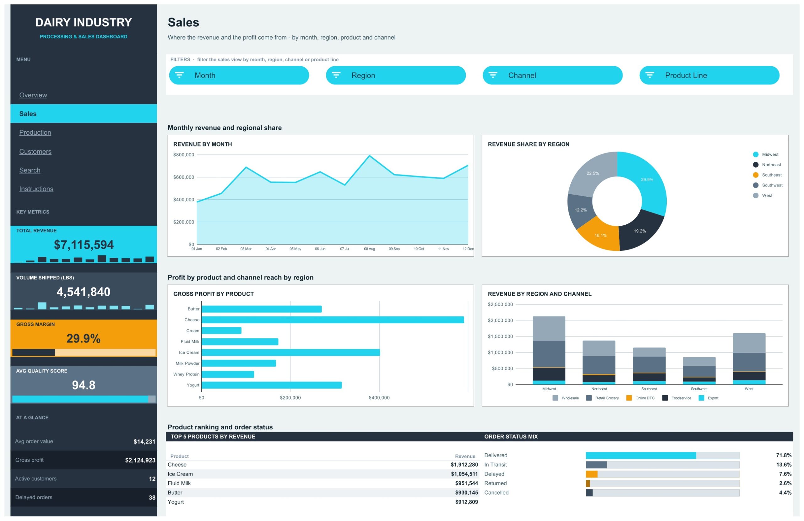
This page shows where the revenue and the profit come from. Charts are Revenue by Month, Revenue Share by Region, Gross Profit by Product and Revenue by Region and Channel. The Midwest leads with 29.9% of revenue, and a Top 5 Products by Revenue table puts cheese first at $1,912,280, ahead of ice cream, fluid milk, butter and yogurt. For a buyer comparing a plain google sheets sales dashboard with an industry layout, this page is the sales core.
Page 3: Production, Volume, Product Line Mix and Plant Quality
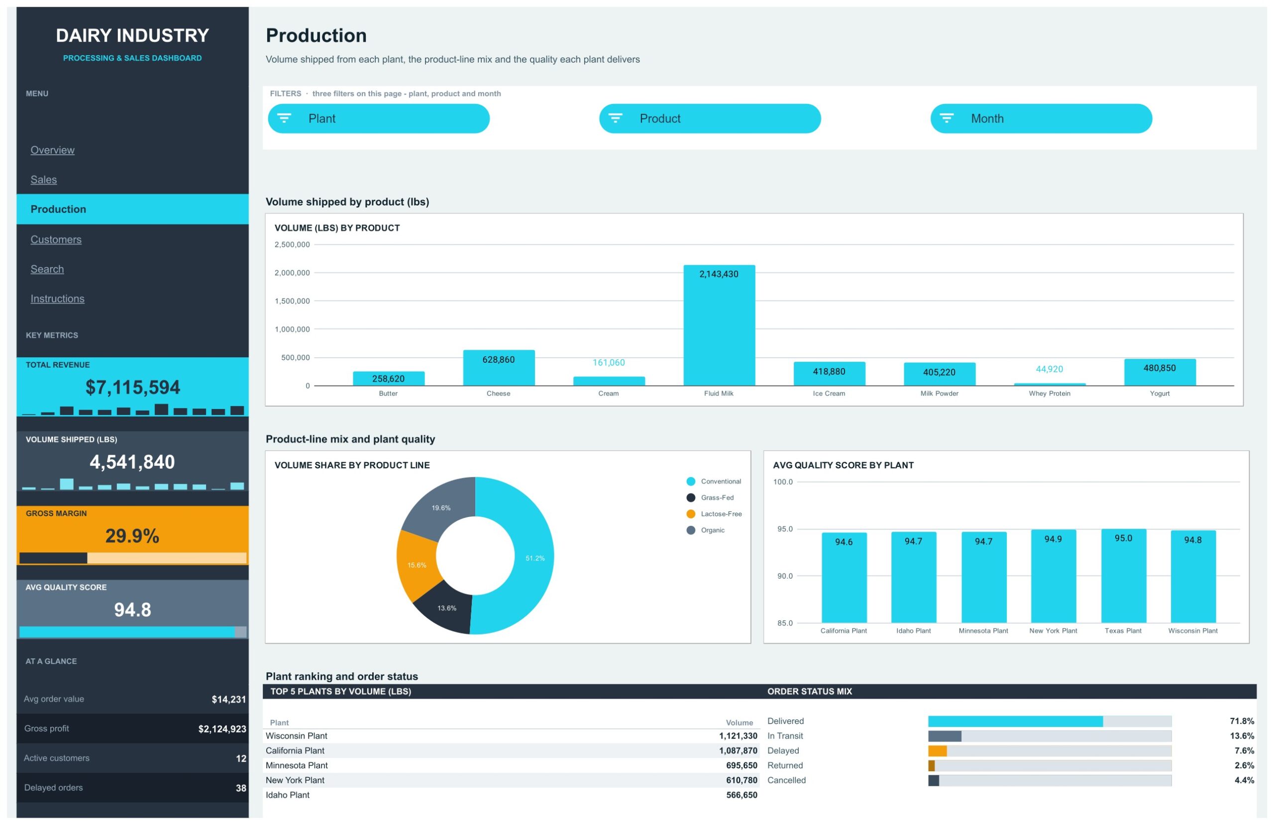
Volume shipped from each plant, the product line mix and the quality each plant delivers. Charts are Volume (lbs) by Product, Volume Share by Product Line and Avg Quality Score by Plant. Fluid milk is the largest product at 2,143,430 lbs, conventional products are 51.2% of volume, and the Texas plant leads quality at 95.0. A Top 5 Plants by Volume table ranks Wisconsin first at 1,121,330 lbs.
Page 4: Customers, Order Size and Delivery Status
Who buys, through which channel, how big their orders are and how reliably they are served. Charts are Revenue by Customer, Orders by Channel, Avg Order Value by Channel, Orders by Month and Orders by Region and Status. Retail grocery places the most orders, wholesale orders are the largest by value, and the Status slicer isolates the delayed orders for follow-up.
Page 5: Search, Order Lookup
Type any Order ID into the cyan input box and the page pulls the full order line from the Data tab: date, product, plant, channel, region, product line, customer, status, volume, revenue, production cost, gross profit and quality score. Every field is an INDEX / MATCH wrapped in IFERROR, so a missing ID shows Not found instead of an error.
Page 6: Instructions, User Guide
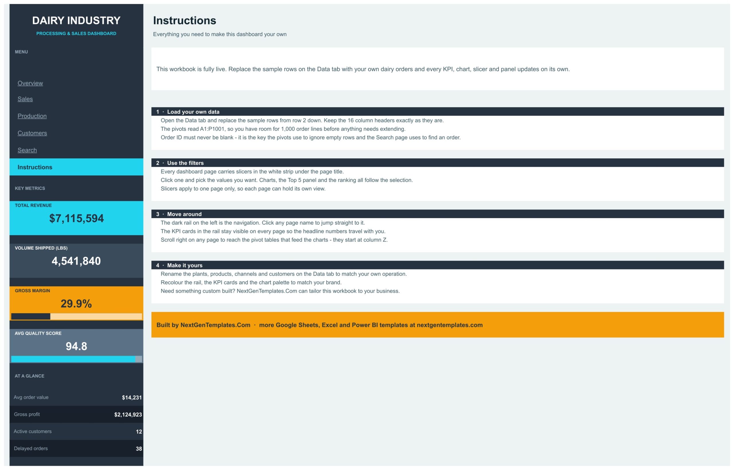
A short guide explains how to load your own data in the Data tab, how to use the slicers, how to move between pages with the side rail menu, and how to rename the plants, products, channels and customers or change the colors.
Data Tab
Behind the visible pages sits the Data tab with 500 sample order lines for 2025 and 16 columns, from Order ID and Date to Quality Score, Month and Count. Keep the Order ID filled in on every row, because the pivots use it to skip empty rows and the Search page uses it to find an order.
📊 Dairy Industry Dashboard vs. an Excel Dashboard vs. a Paid BI Suite
| Feature | Dairy Industry Dashboard (Google Sheets) | Microsoft Excel dashboard | Paid BI suite (Tableau, Domo) |
|---|---|---|---|
| Cost | One-time purchase ✅ | One-time purchase plus Microsoft 365 | Per-user monthly subscription |
| Platform | Any browser, nothing to install ✅ | Desktop Excel | Browser plus a data pipeline |
| Setup | Paste your orders and go ✅ | Build or adapt the dashboard first | Connectors and data modelling first |
| Real-time team collaboration | Built in ✅ | Only via OneDrive co-authoring | Yes, on paid seats |
| Mobile access | Google Sheets app ✅ | Limited on mobile Excel | Yes, on paid seats |
| Customisable fields | Rename any plant, product or channel ✅ | Yes | Admin-controlled schema |
| Share with a link | Yes, view or edit ✅ | File attachment or OneDrive link | A seat is required to view |
| Order-level lookup | Search page, type an Order ID ✅ | Needs a lookup formula | Yes, via a detail view |
For a dairy plant or distributor that wants a finished google sheets dashboard template without paying per seat every month, this template sits in the sweet spot.
👥 Who This Template Is For, and Who It Is Not For
✅ Built for:
- Dairy processing plants and milk co-ops that keep an order log in a spreadsheet and want a dairy dashboard they can open in any browser
- Dairy distributors comparing retail grocery, wholesale, foodservice, export and online direct-to-consumer channels
- Operations managers who need volume and quality by plant on one page
- Sales managers tracking customers, regions and delayed orders
- Analysts and consultants who want a finished sales dashboard google sheets layout to drop a client’s export into
❌ Not for:
- Teams that need a live ERP, MES or herd management connection. The template reads a Data tab you paste into, with sample data only and no sync
- Herd, milking or feed records on a dairy farm. The dashboard reports orders, volume and quality, not animal data
- Order logs far beyond 1,000 lines without extending the ranges first
- Enterprises that need row-level security, SSO or an audited data warehouse
⚙️ How to Use the Dairy Industry Dashboard
- Open the PDF in your download and click the Make a copy link to put your own editable copy in Google Drive.
- Open the Data tab and read the 16 column headers. Keep them exactly as they are.
- Replace the sample rows from row 2 down with your own order lines. Anything up to 1,000 rows is already covered.
- Open the Overview page and click a cyan slicer to filter that page. Choose Select all inside a slicer to clear it.
- Work through Sales, Production and Customers for regional, plant and customer questions.
- Use the Search page to pull any single order by its Order ID.
- Rename plants, products, channels or customers in the Data tab and recolor the cards to match your own brand.
💼 Real-World Use Cases
A dairy plant manager pastes the month’s order export over the Data tab, opens the Production page and compares volume and Avg Quality Score by Plant before the weekly operations meeting.
A dairy distributor’s sales lead uses the Customers page, selects Delayed in the Status slicer and gets the list of late orders by customer, channel and month to follow up the same morning.
A food industry consultant keeps one copy of this google sheets dashboard template per client, drops their export in and has a review ready the same afternoon instead of rebuilding pivots from scratch.
❓ Frequently Asked Questions
What does the Dairy Industry Dashboard in Google Sheets track?
It tracks revenue, volume shipped in pounds, gross margin, gross profit, quality score and order status across 6 plants, 8 products, 4 product lines, 5 channels, 5 US regions and 12 customers, on 500 sample orders you replace with your own.
How long does setup take?
Open the PDF, click Make a copy, then paste your order rows over the sample data on the Data tab. Nothing needs re-ranging for up to 1,000 order lines.
Does it connect to my ERP or plant system?
No. This is a reporting template with sample data only and no live connection. You paste or import your own export into the Data tab.
Are the sample customers and figures real?
No. Every customer, order and figure on the sample Data tab is fictional and exists only to show how the dashboard works.
Can I use it on my phone?
It runs in the Google Sheets mobile app like any other sheet. The multi-chart layout is far easier to read on a tablet or desktop screen.
Do I need any add-on or code?
No. The dashboard is built with pivot tables, formulas and native Google Sheets slicers. There is no add-on, script or macro to install.
👤 About the Author
Built by PK, Microsoft Certified Professional with 15+ years of Excel, Google Sheets and Power BI experience. Founder of NextGenTemplates, reaching 300K+ subscribers across YouTube channels (@PKAnExcelExpert, @NextGenTemplates, @NeoTechNavigators). Every template is hand-built and tested before release.
🔗 Explore Related Templates
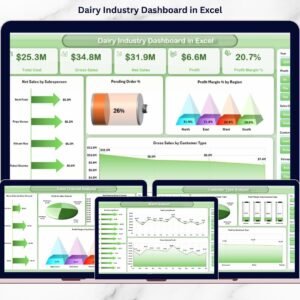
- Dairy Industry Dashboard in Excel: the dairy dashboard for desktop Excel users.
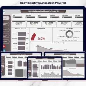
- Dairy Industry Dashboard in Power BI: the Power BI edition.
- Dairy Products Processing Plant Dashboard in Power BI: a plant-focused view for processors.
- Dairy Product Sales Data Entry System in Excel: capture daily dairy sales in a form.
- Agriculture Farm Dashboard in Google Sheets: a neighbouring agri-food dashboard.
- Food and Beverage Dashboard in Google Sheets: sales analysis for a wider food business.
Browse the full range of Google Sheets Dashboards.
New to slicers? Google’s own guide to adding slicers to a sheet explains the control this template builds four pages around.
Ready to turn a flat order export into a dairy business review? The Dairy Industry Dashboard in Google Sheets gives you the KPIs, the slicers and the plant and quality view already wired up.
📖 Click here to read the Detailed Blog Post
🎥 Visit our YouTube channel for step-by-step video tutorials
👉 YouTube.com/@NextGenTemplates
📅 Last updated: October 2026























Reviews
There are no reviews yet.