

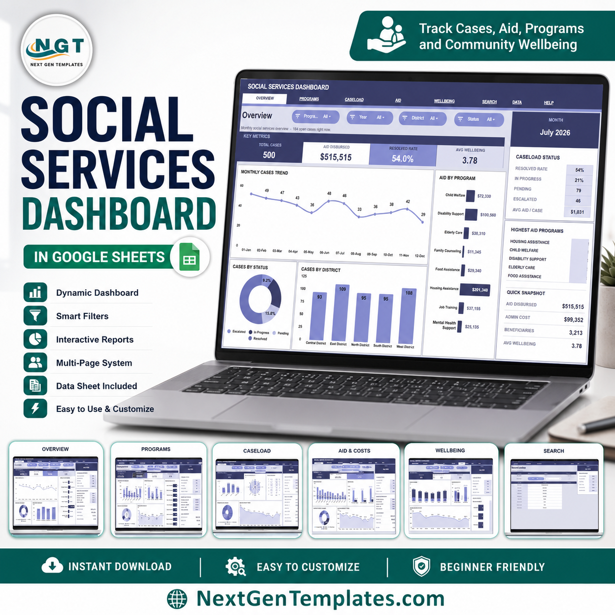

Social Services Dashboard in Google Sheets helps social service teams track cases, aid disbursed, program cost, workload, and citizen wellbeing in one shareable workbook. In FY2023, the U.S. Administration for Children and Families Office of Community Services reported $8.64B appropriated and 36.7M individuals served across OCS programs, which shows why clean reporting matters. Built by PK, a Microsoft Certified Professional with 15+ years of Excel, Google Sheets, and Power BI experience and 300K+ YouTube subscribers, this one-time template gives you editable reporting without committing to a paid case-management platform.
Key Features of Social Services Dashboard in Google Sheets
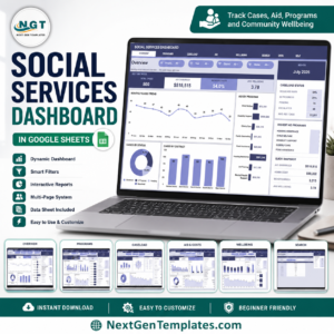
- 7 worksheet tabs: Overview, Program Performance, Caseload Management, Aid & Costs, Citizen Wellbeing, Search Sheet, and Data Sheet.
- 4 KPI cards: Total Cases, Aid Disbursed, Resolved Rate, and Avg Wellbeing give managers a quick health check.
- 20 analysis charts: Review monthly cases, status mix, district performance, aid distribution, costs, teams, referrals, and wellbeing trends.
- Multiple slicers: Filter the dashboard quickly by the fields in your data and review focused views without rebuilding charts.
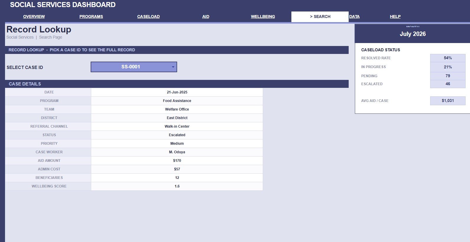
- Record lookup: Select a Case ID on the Search Sheet and view the full record details instantly.
- Editable Google Sheets format: Update the Data Sheet in the same column format and keep ownership in your own Google Drive.
What’s Inside the Social Services Dashboard in Google Sheets
1. Overview Page
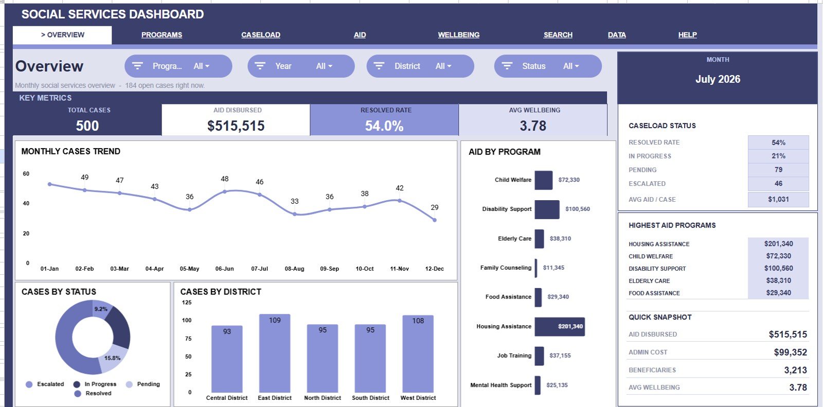
The Overview page shows the high-level social services picture with cards for Total Cases, Aid Disbursed, Resolved Rate, and Avg Wellbeing. It also includes slicers so managers can filter the page quickly by the available case dimensions.
Monthly Cases by Month: This chart shows how case volume changes month by month. It helps leaders see demand peaks, quieter periods, and changes that may need staffing attention.
Cases by Status: This chart separates cases by status such as open, in progress, and resolved. It helps identify backlog pressure and whether resolution work is moving fast enough.
Cases by District: This chart compares case volume across districts. It helps teams see where service demand is concentrated and where outreach or resources may be needed.
Aid Disbursed by Program: This chart shows how aid is distributed across programs. It helps finance and program teams understand which services are receiving the most direct support.
2. Program Performance
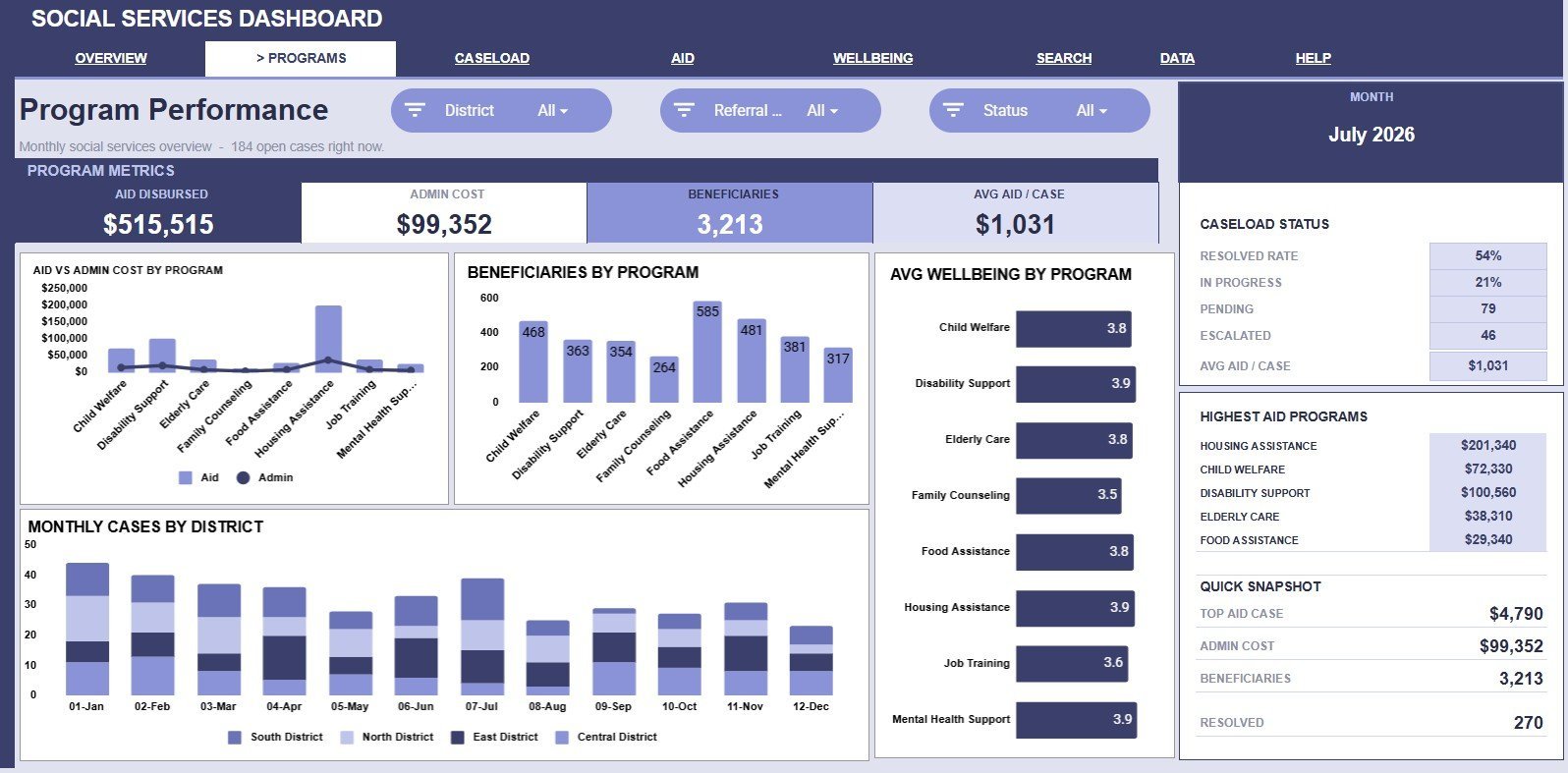
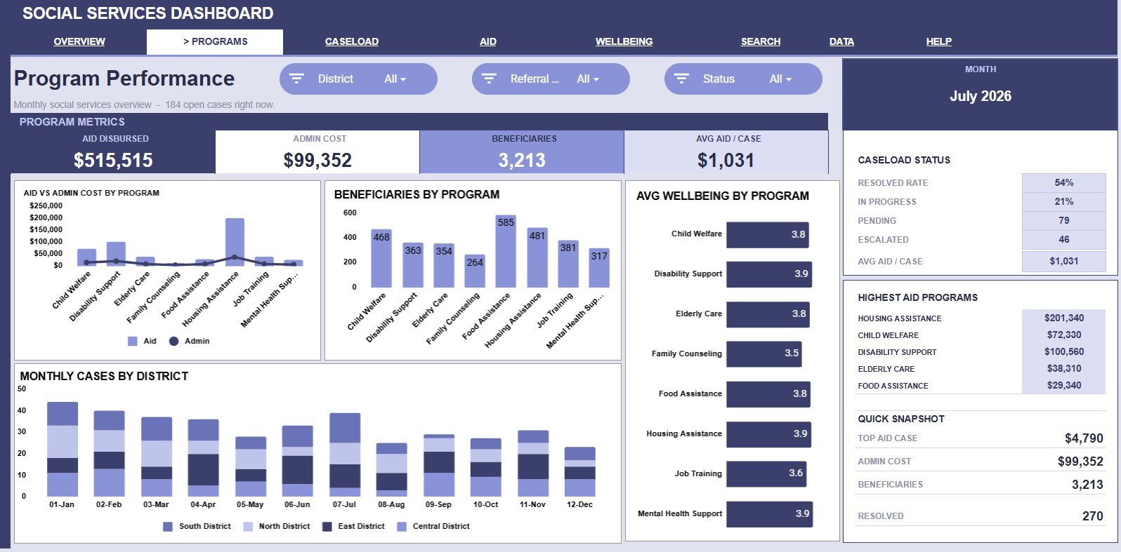
The Program Performance tab focuses on how each program is serving people and using funds. Aid and Admin Cost by Program compares direct support with administrative cost, while Beneficiaries by Program shows how many people each program reaches.
Avg Wellbeing by Program connects program activity to citizen outcome quality. Monthly Cases by District adds a trend view so program managers can see whether district demand is rising, falling, or shifting over time.
3. Caseload Management
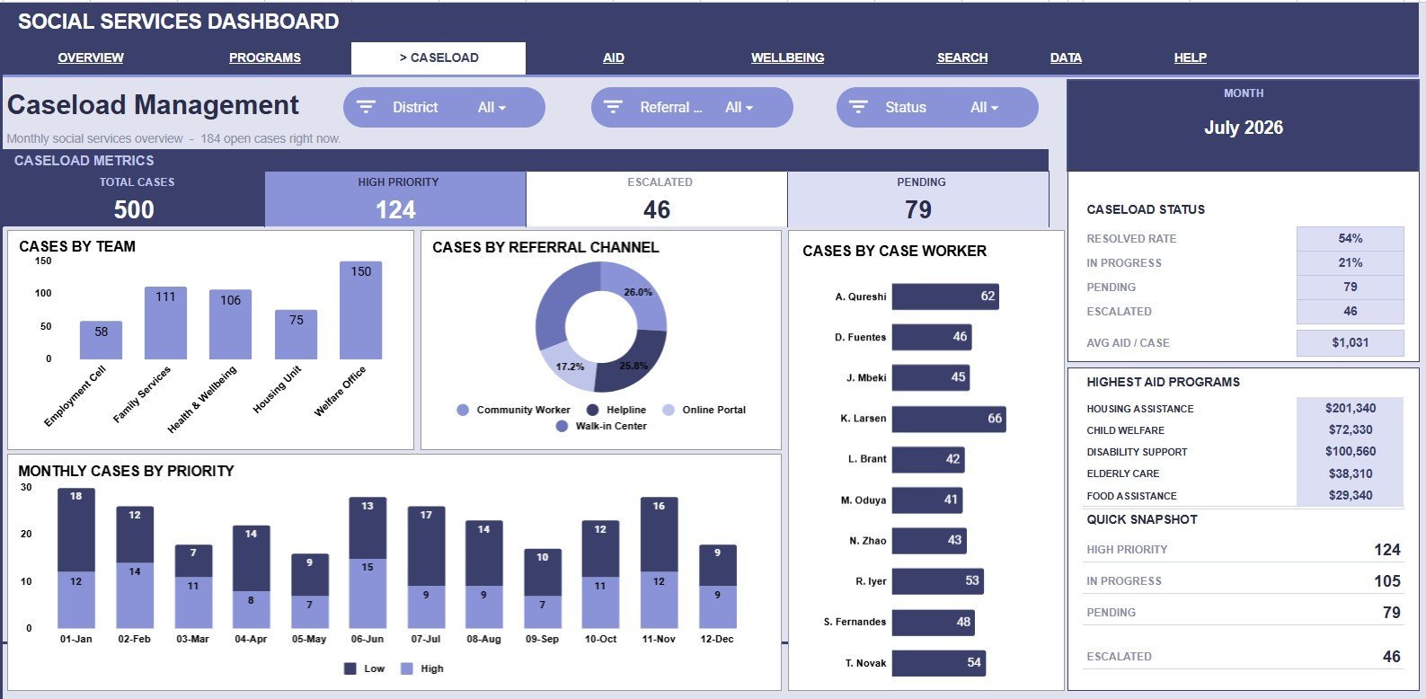
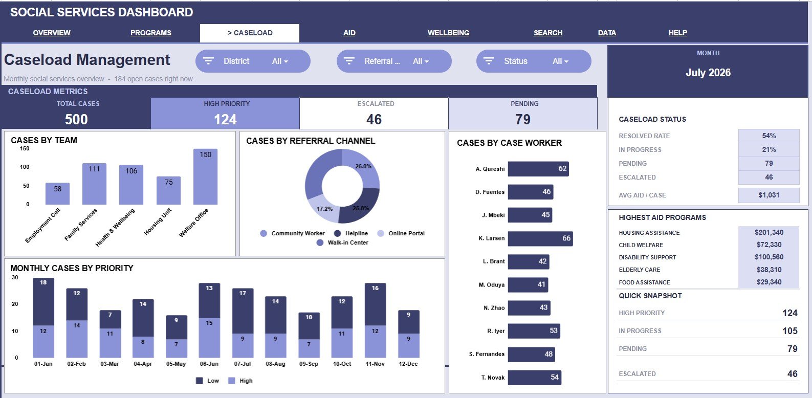
The Caseload Management tab is built for supervisors who need to understand workload. Cases by Team compares team-level volume, Cases by Referral Channel shows where cases enter the system, and Cases by Case Worker highlights individual assignment load.
Monthly Cases by Priority shows how urgent work changes across the year. It helps supervisors plan follow-up routines, staffing support, and escalation reviews.
4. Aid & Costs
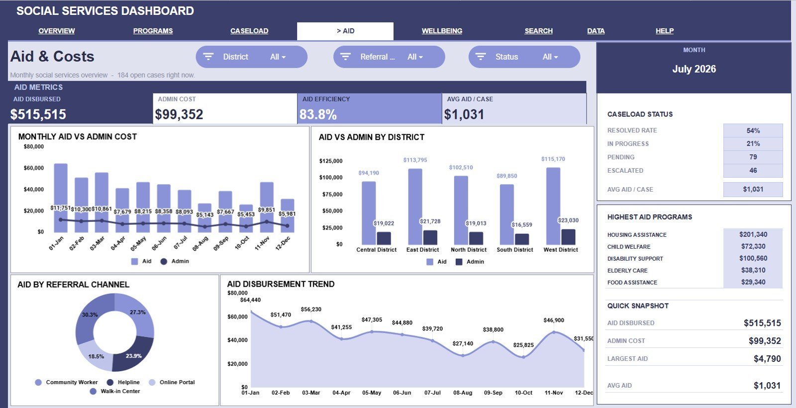
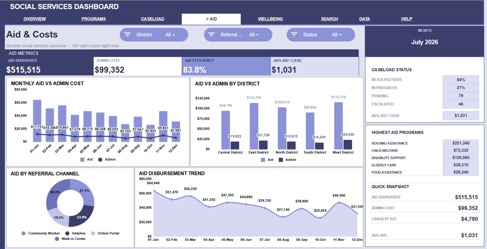
The Aid & Costs tab gives a finance-focused view of service delivery. Aid and Admin Cost by Month tracks direct aid and operating cost over time, while Aid and Admin Cost by District compares cost patterns across districts.
Aid Disbursed by Referral Channel shows whether certain intake paths are linked to higher aid amounts. Aid Disbursement by Month helps teams review funding seasonality and prepare for monthly cash-flow needs.
5. Citizen Wellbeing
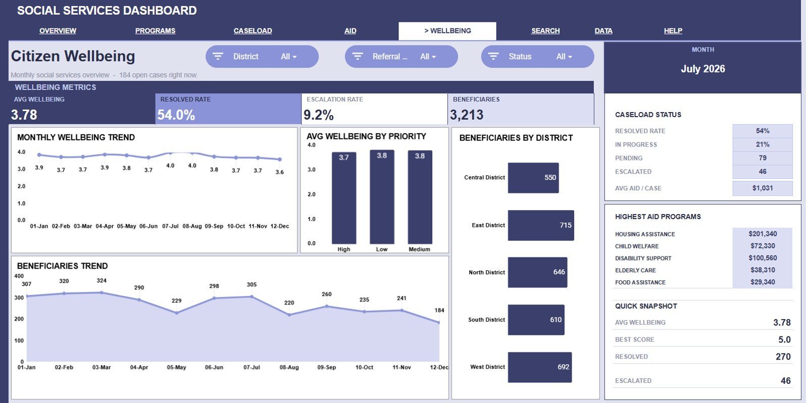
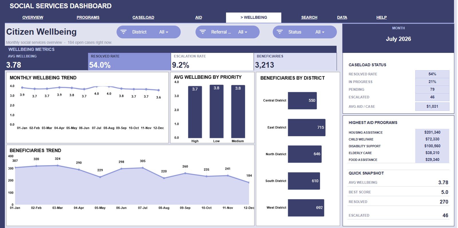
The Citizen Wellbeing tab connects service activity to people served and outcome movement. Avg Wellbeing by Month shows how the score changes over time, and Avg Wellbeing by Priority compares outcomes across urgency levels.
Beneficiaries by District reveals which districts are reaching the most people. Beneficiaries by Month helps teams see seasonal outreach patterns and plan service capacity.
6. Search Sheet Tab
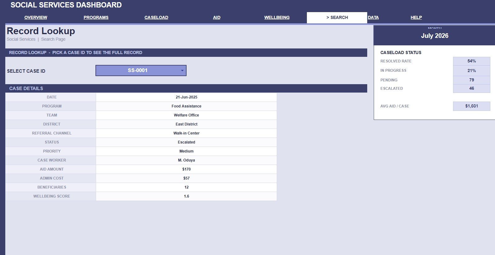
The Search Sheet lets users select a Case ID and see the full record in a clean lookup view. It can display date, program, team, district, referral channel, status, priority, case worker, aid amount, admin cost, beneficiaries, and wellbeing score.
7. Data Sheet Tab
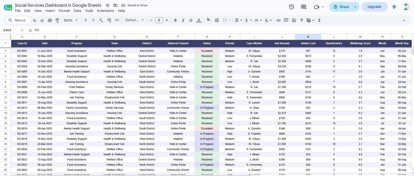
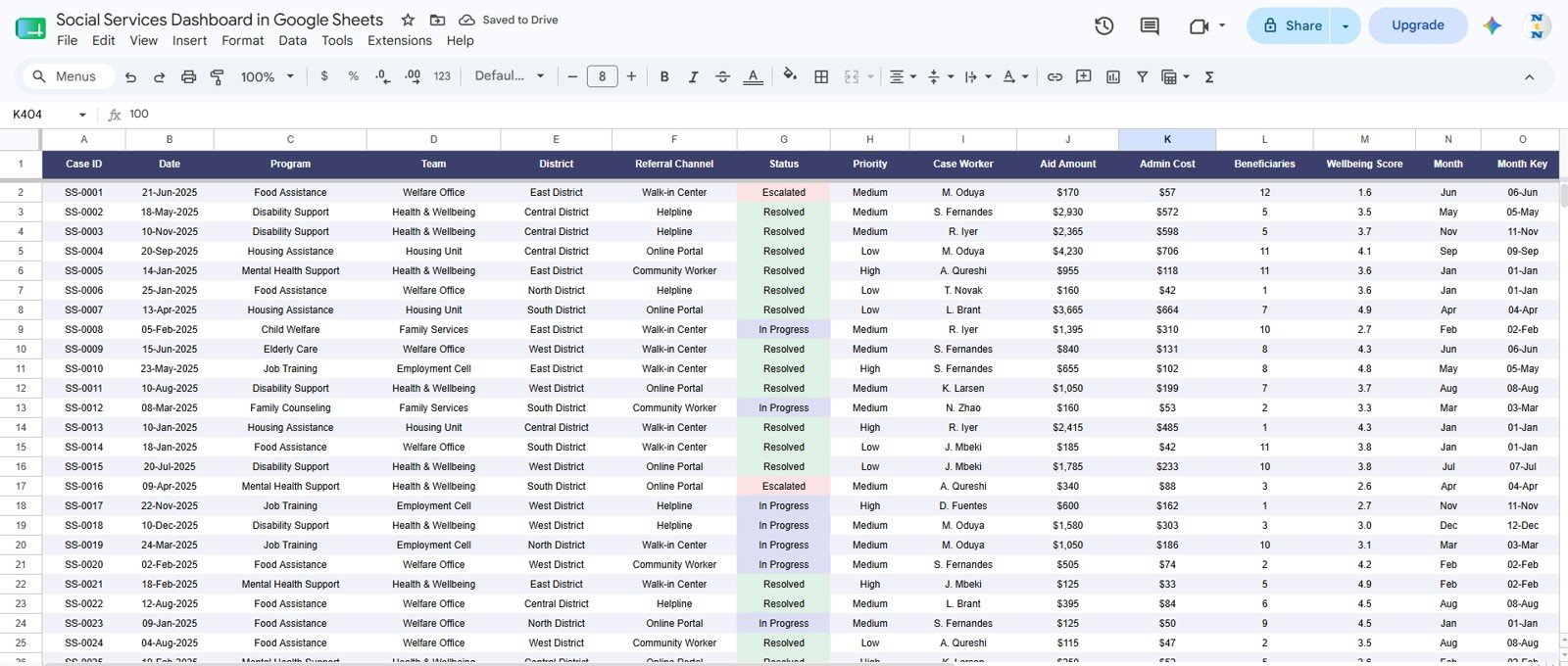
The Data Sheet is where users add records in the same format as the sample data. Keeping program, district, referral channel, status, priority, cost, beneficiary, and wellbeing fields consistent keeps the slicers, cards, and charts reliable.
Social Services Dashboard in Google Sheets vs. Microsoft Excel Dashboard vs. Paid CRM/SaaS – Where This Fits
| Comparison Point | This Google Sheets Template | Excel Dashboard | Paid CRM/SaaS |
|---|---|---|---|
| Cost | One-time template purchase | One-time file, usually desktop-first | Monthly or annual subscription |
| Setup time | Duplicate, add data, and review dashboards | Open locally or through Microsoft 365 | Needs onboarding, configuration, and users |
| Collaboration | Share through Google Sheets permissions | Best with Microsoft 365 | Usually seat-based |
| Case reporting | Built-in cards, slicers, charts, and Case ID lookup | Possible with pivots and formulas | Depends on vendor reporting module |
| Best fit | Small teams, agencies, NGOs, and program managers that need quick reporting | Teams standardized on Excel | Large organizations needing workflow automation |
Who This Template Is For – and Who It’s Not For
This template is for social service departments, nonprofit teams, community program managers, field supervisors, welfare coordinators, and analysts who already track cases in spreadsheets and want cleaner reporting. It is not a full case-management system, does not send automated notices, and does not replace secure client databases for regulated personally identifiable information.
How to Use the Social Services Dashboard in Google Sheets
- Open the Google Sheets copy from your purchased file guide.
- Review the sample records on the Data Sheet and keep the same column format.
- Replace sample data with your own case, aid, cost, program, district, referral, and wellbeing data.
- Use slicers and dashboard tabs to review filtered trends.
- Use the Search Sheet when you need one complete Case ID record.
Real-World Use Cases
Anika, program director: Anika reviews aid by program and beneficiaries by program before monthly funding meetings. She uses the district charts to explain where demand is growing.
Marcus, caseload supervisor: Marcus checks Cases by Team, Cases by Case Worker, and Monthly Cases by Priority to rebalance workload. The Search Sheet helps him answer case questions without scanning the raw table.
Leena, monitoring analyst: Leena uses wellbeing and beneficiary charts to prepare stakeholder updates. She compares outcome trends with aid and cost movement before recommending program changes.
Frequently Asked Questions
What is the Social Services Dashboard in Google Sheets?
It is a ready-made Google Sheets dashboard for tracking cases, aid disbursement, administrative costs, program performance, workload, beneficiaries, and citizen wellbeing.
How many dashboard pages are included?
The workbook includes seven tabs: Overview, Program Performance, Caseload Management, Aid & Costs, Citizen Wellbeing, Search Sheet, and Data Sheet.
Can I filter the dashboard?
Yes. The dashboard includes multiple slicers so users can quickly filter the analysis by available dimensions in the data.
What does the Search Sheet do?
The Search Sheet lets users select a Case ID and view full record details such as program, team, district, status, priority, case worker, aid amount, admin cost, beneficiaries, and wellbeing score.
Can I customize the template?
Yes. Because it is built in Google Sheets, you can edit labels, formulas, charts, and sample data. Major column changes may require formula and chart updates.
Is this a replacement for case-management software?
No. It is a reporting and dashboard template. Teams that need intake automation, secure client records, document workflows, or compliance-grade permissions should use appropriate case-management systems.
About the Author
Built by PK – Microsoft Certified Professional with 15+ years of Excel, Google Sheets, and Power BI experience. Founder of NextGenTemplates, reaching 300K+ subscribers across YouTube channels. Every template is hand-built and tested before release.
Explore Related Templates
Explore more public service and nonprofit reporting tools in the Google Sheets templates category and the Google Sheets dashboard category. Related options include Government Citizen Services Performance Dashboard in Google Sheets, Nonprofit Organizations Dashboard in Google Sheets, International Development Dashboard in Google Sheets, Nonprofit Fundraising Dashboard in Google Sheets, and Social Services KPI Dashboard in Google Sheets.
Watch the step-by-step video Demo:
Ready to organize social service reporting? Add the Social Services Dashboard in Google Sheets to your toolkit and start replacing scattered case files with a clean dashboard workflow.
Last updated: July 21, 2026.
Compatibility and Requirements
- Works in Google Sheets. You need a free Google account and a web browser.
- The dashboard uses slicers and a Case ID lookup on the Search Sheet. Google explains charts in Add and edit a chart or graph.
Related Social Services Templates
- Social Services Dashboard in Excel: the same dashboard for Excel users
- Social Services KPI Dashboard in Excel: a KPI view of social services in Excel
- Social Services KPI Dashboard in Power BI: the Power BI edition of the KPI dashboard
- Social Services KPI Scorecard in Excel: a scorecard view of social services metrics
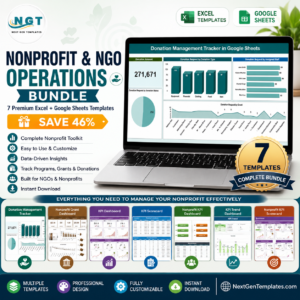
- Nonprofit & NGO Operations Bundle: 7 Excel and Google Sheets templates for nonprofit teams in one download
Browse all Google Sheets dashboards.




Reviews
There are no reviews yet.