

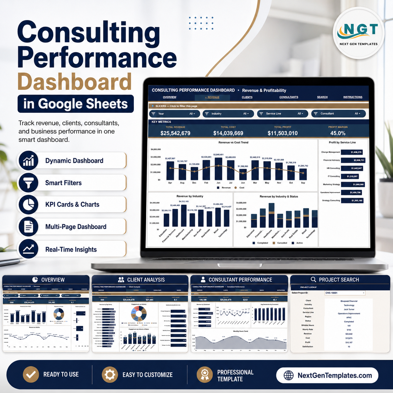
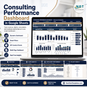
Consulting Performance Dashboard in Google Sheets gives consulting partners, practice managers, finance leads, and operations teams 6 connected sheet tabs, 4 executive cards, 16 chart views, multiple slicers, and a Project ID lookup for a one-time $9.99 sale price. It tracks revenue, profit, billable hours, consultant output, service-line mix, region performance, project status, industry, clients, and satisfaction without monthly PSA software. Join 8,400+ teams in 40+ countries using NextGenTemplates to replace recurring reporting tools with editable spreadsheet templates. You keep the formulas, data, and sharing controls in your own Google Drive.
Key Features of Consulting Performance Dashboard in Google Sheets
- 6 Google Sheets tabs: Overview, Revenue & Profitability, Client Analysis, Consultant Performance, Search, and Data Sheet.
- 4 top-level KPI cards: Total Revenue, Total Profit, Total Billable Hours, and Avg Satisfaction give leaders a fast performance readout.
- 16 chart views: Review service lines, regions, status, month, industry, clients, consultants, profit, billable hours, and satisfaction.
- Interactive slicers: Filter dashboard results quickly by the available dimensions so partner meetings stay focused.
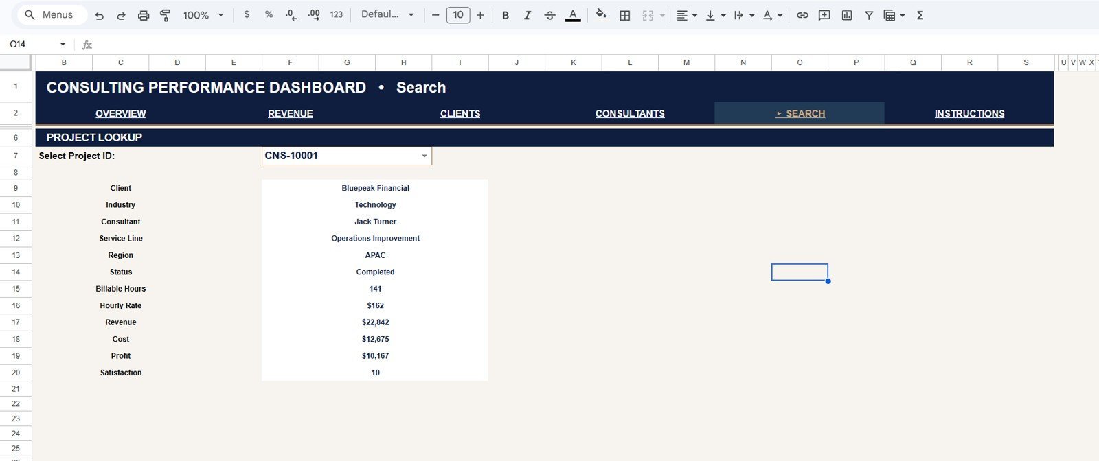
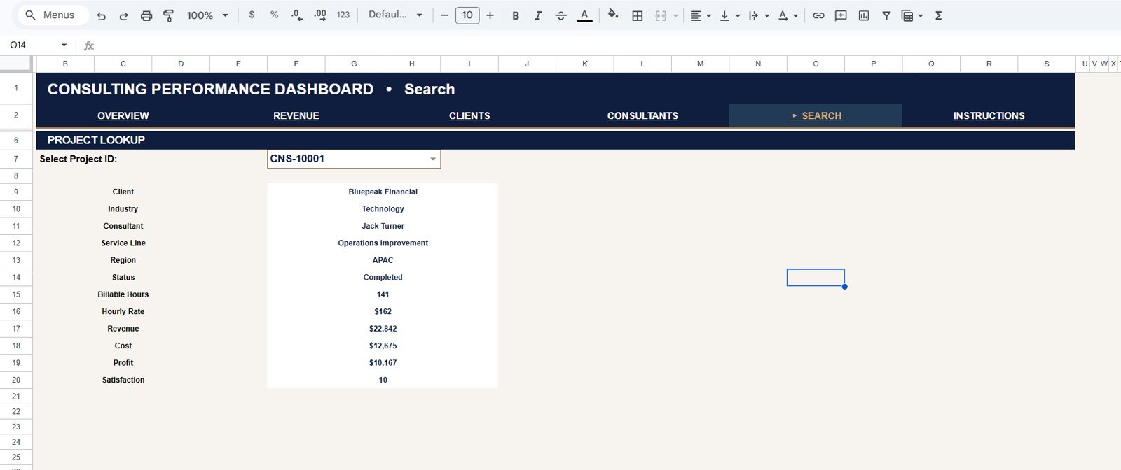
- Project Lookup page: Select a Project ID from the dropdown and view the full project record without scrolling through raw data.
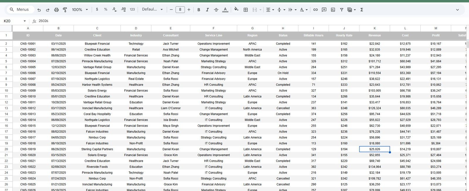
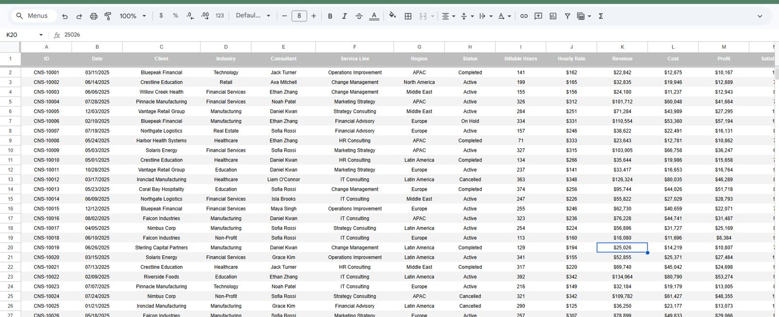
- Structured Data Sheet: Add your own consulting project rows in the same format and keep the dashboard connected to one source table.
- Google Sheets collaboration: Share view-only or edit access with partners, analysts, delivery managers, and finance teams.
What’s Inside the Consulting Performance Dashboard in Google Sheets
1 – Overview Page
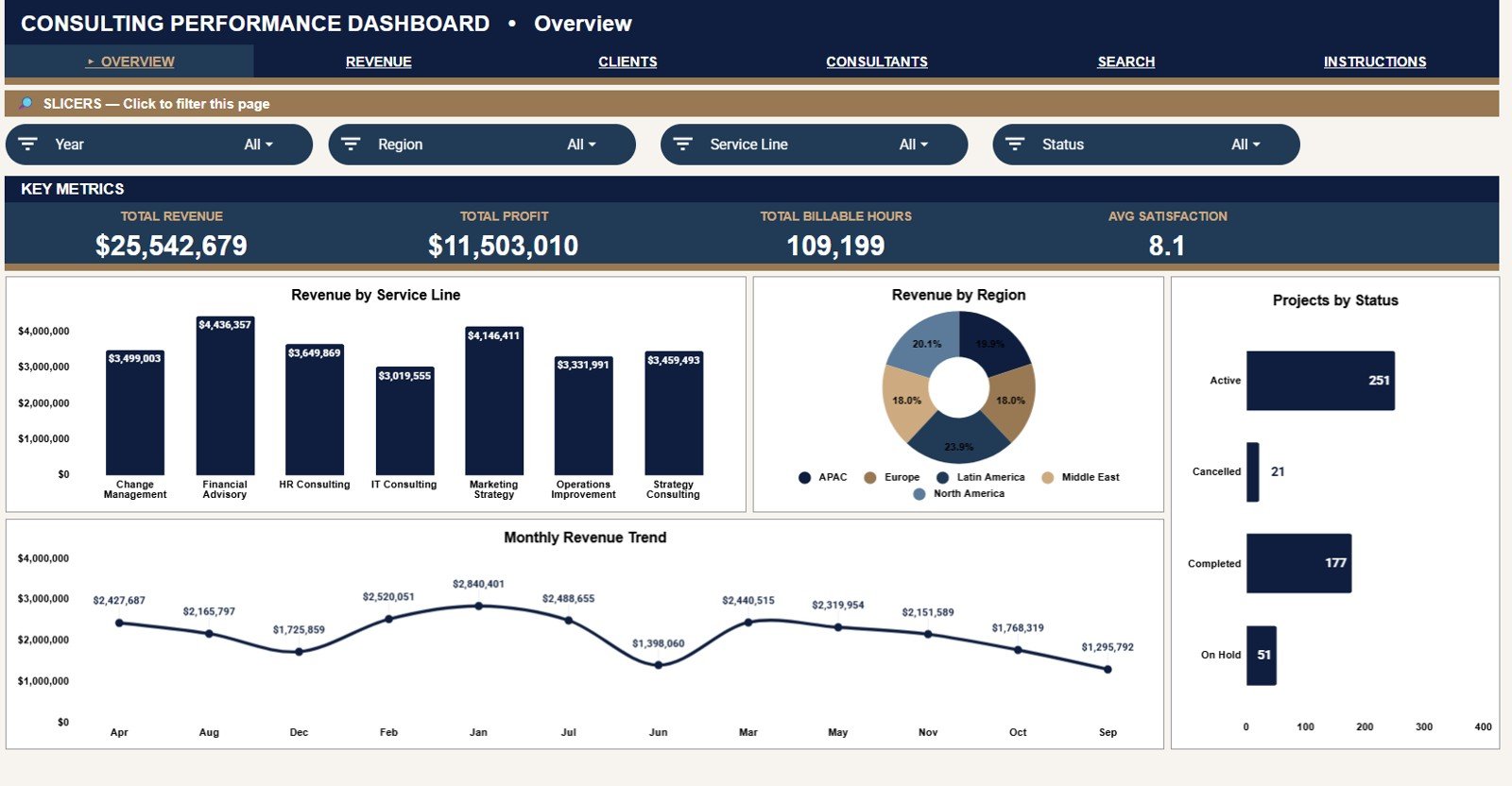
The Overview Page is the executive summary for the consulting practice. The top cards show Total Revenue, Total Profit, Total Billable Hours, and Avg Satisfaction, so users can check financial performance, delivery volume, and client sentiment before reviewing deeper pages.
Revenue by Service Line: This chart shows which consulting services generate the most revenue across the selected filters. It helps leaders prioritize high-demand service lines and review offerings that may need pricing, packaging, or sales support.
Revenue by Region: This chart compares revenue across geographic regions. It helps firms see where demand is strongest and whether regional performance is balanced or concentrated.
Projects by Status: This chart breaks projects into status groups such as active, completed, delayed, or on hold. It helps engagement managers watch delivery flow and spot status mix issues early.
Revenue by Month: This trend chart shows revenue movement by month. It helps users review seasonality, growth momentum, and periods that need closer pipeline or billing attention.
2 – Revenue & Profitability
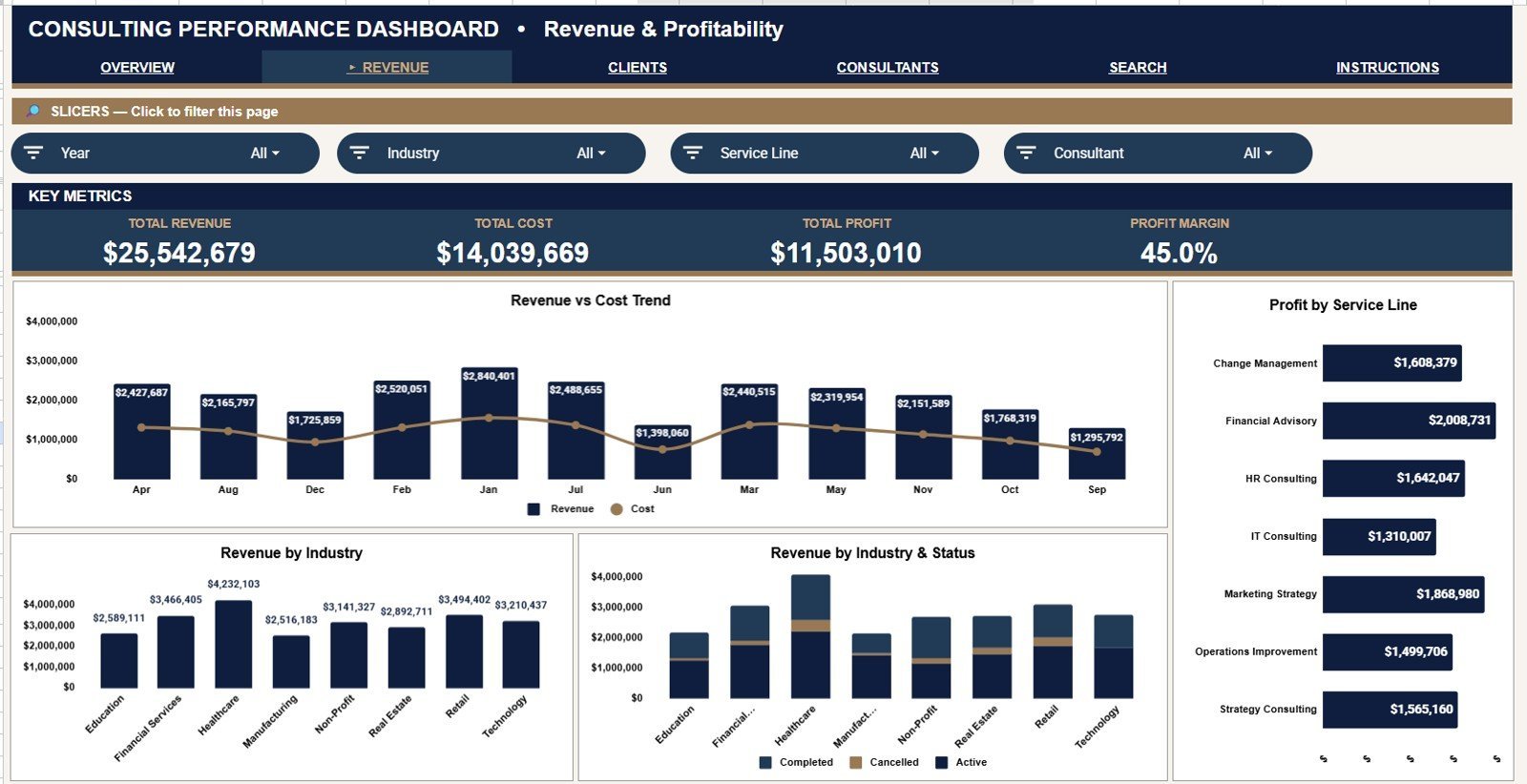
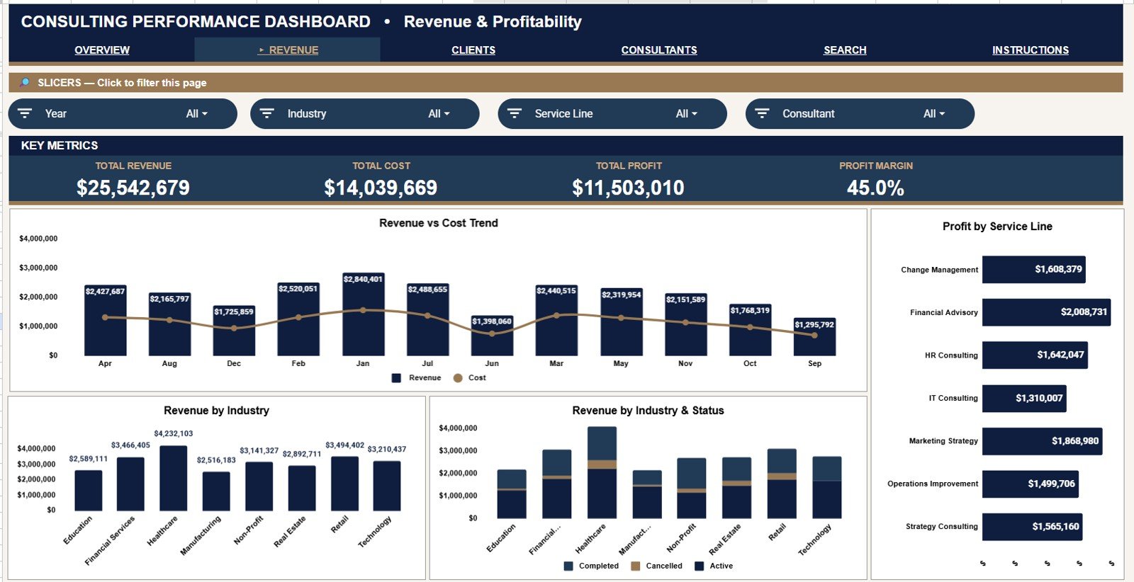
The Revenue & Profitability tab helps teams move beyond top-line revenue and understand margin patterns. It is useful for partner reviews, month-end reporting, and service-line profitability checks.
Revenue and Cost by Month: This chart compares monthly revenue against delivery cost. It helps teams see whether growth is profitable or whether cost is rising faster than revenue.
Profit by Service Line: This chart ranks service lines by profit contribution. It helps partners identify which offerings deserve more sales attention and which may need margin improvement.
Revenue by Industry: This chart shows revenue distribution across client industries. It helps consulting firms understand market concentration and decide where to focus business development.
Revenue by Industry and Status: This combined view connects industry revenue with project status. It helps users see whether delayed or active work is concentrated in specific industries.
3 – Client Analysis
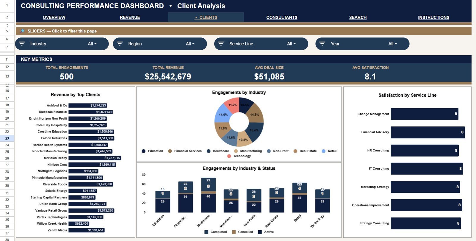
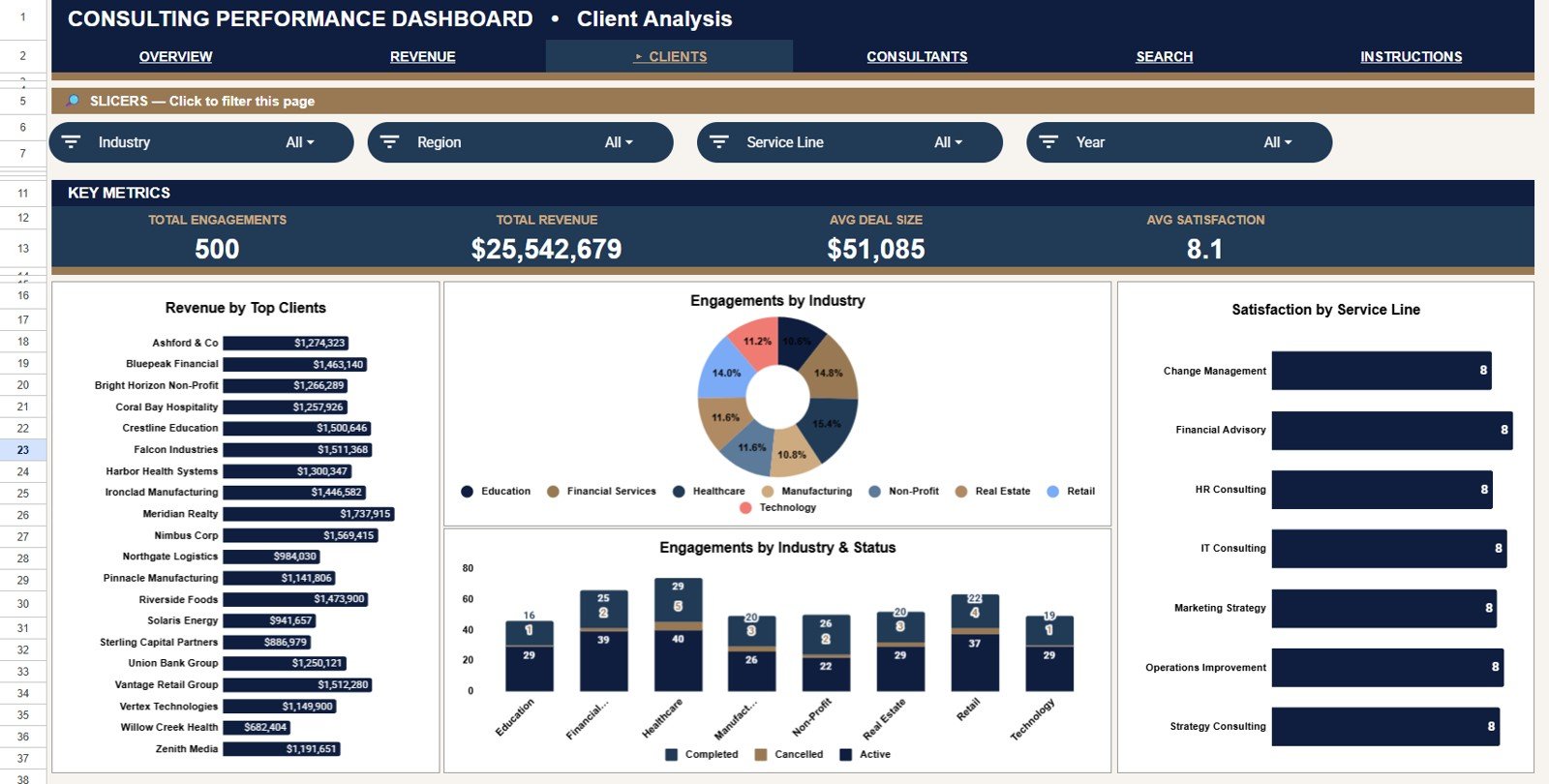
The Client Analysis tab is built for account concentration, industry mix, and satisfaction review. It helps consulting leaders understand which clients and segments are driving the practice.
Revenue by Top Clients: This chart ranks the highest-revenue clients. It helps identify key accounts, concentration risk, and clients that may need deeper relationship management.
Engagements by Industry: This chart counts consulting engagements by industry. It helps users see which industries create the most project volume, even when revenue differs by project size.
Satisfaction by Service Line: This chart compares average satisfaction by service line. It helps teams connect delivery quality with the services clients are buying most often.
Engagements by Industry and Status: This view combines project status with client industry. It helps managers check whether certain industries have more completed, active, or delayed engagements.
4 – Consultant Performance
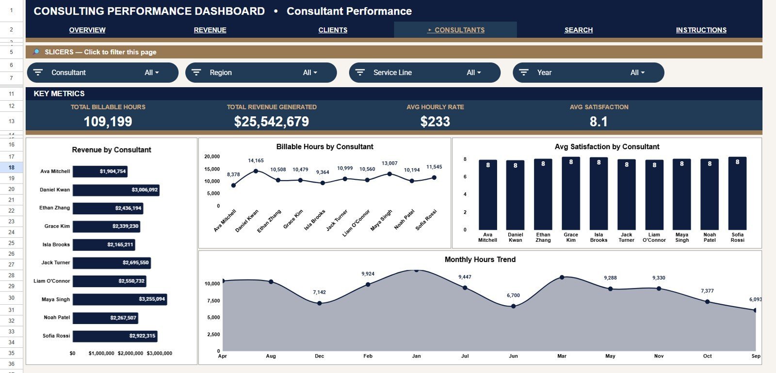
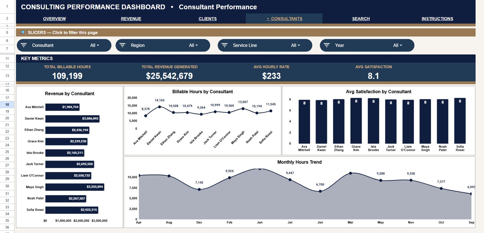
The Consultant Performance tab focuses on individual contribution and workload. It supports utilization review, coaching, staffing decisions, and delivery quality discussions.
Revenue by Consultant: This chart compares revenue contribution by consultant. It helps leaders see which consultants are tied to the highest-value engagements.Consulting Performance Dashboard in Google Sheets
Billable Hours by Consultant: This chart shows delivery volume by consultant. It helps managers identify high utilization, low utilization, and potential workload imbalance.Consulting Performance Dashboard in Google Sheets
Average Satisfaction by Consultant: This chart compares client satisfaction by consultant. It helps leadership pair delivery output with client experience rather than looking only at hours or revenue.
Billable Hours by Month: This monthly trend shows how billable time changes over the reporting period. It helps teams spot busy months, capacity pressure, and staffing gaps.Consulting Performance Dashboard in Google Sheets
5 – Search Page
The Search tab includes a Project Lookup feature. Select a Project ID from the dropdown and instantly view Project ID, Client, Industry, Consultant, Service Line, Region, Status, Billable Hours, Hourly Rate, Revenue, Cost, Profit, and Satisfaction.Consulting Performance Dashboard in Google Sheets
6 – Data Sheet Tab
The Data Sheet is where you add or replace consulting project records in the same format. Keeping Project ID, Client, Industry, Consultant, Service Line, Region, Status, Billable Hours, Hourly Rate, Revenue, Cost, Profit, and Satisfaction in one clean table lets the dashboard pages and lookup sheet stay aligned.Consulting Performance Dashboard in Google Sheets
Consulting Performance Dashboard in Google Sheets vs. Microsoft Excel Dashboard vs. Paid PSA/CRM SaaS – Where This Fits
| Feature | This Google Sheets dashboard | Microsoft Excel dashboard | Paid PSA/CRM SaaS |
|---|---|---|---|
| Cost | $9.99 one-time | Template cost plus possible Microsoft 365 cost | Monthly or annual subscription |
| Platform | Google Sheets in browser | Excel desktop or web | Vendor cloud platform |
| Setup time | Copy file, replace sample data, review dashboard | Open workbook, replace data, refresh if needed | Implementation, user setup, and workflow configuration |
| Real-time team collaboration | Native Google Drive sharing | Requires OneDrive or SharePoint | Usually included, plan dependent |
| Mobile access | Google Sheets mobile app and browser | Excel mobile app, plan dependent | Vendor mobile app or responsive portal |
| Customizable fields | Edit sheets, labels, formulas, and charts | Edit workbook structure | Often limited by admin settings |
| Share with link | Yes, through Google Drive permissions | Yes, if hosted in Microsoft cloud | Usually requires paid user seats |
| Year-1 cost at 5 users | $9.99 total template cost | Template plus license costs | Often hundreds or thousands per year |
| Project ID lookup | Built-in Search Sheet tab | Possible with formulas | Usually available inside project records |
| Consultant performance review | Revenue, hours, and satisfaction views | Possible with custom build | Plan and setup dependent |
Who This Template Is For – and Who It’s Not For
This template is for consulting partners, boutique firms, project managers, practice operations leads, finance analysts, and solo consultants who track projects in spreadsheets and need a visual view of revenue, profit, hours, clients, consultants, status, service lines, and satisfaction.Consulting Performance Dashboard in Google Sheets
It is not a full professional services automation platform, timesheet entry system, invoicing engine, CRM, or automated accounting connector. If you need role-based workflow approvals, API sync, billing automation, or enterprise audit controls, use this as a reporting layer rather than your core operating system.Consulting Performance Dashboard in Google Sheets
How to Use the Consulting Performance Dashboard in Google Sheets
- Open the PDF guide included with the purchase and click the Google Sheets copy link.
- Create your own editable copy in Google Drive.
- Go to the Data Sheet and replace the sample records using the same column format.
- Review the Overview Page for Total Revenue, Total Profit, Total Billable Hours, and Avg Satisfaction.
- Use slicers to filter by fields such as client, industry, consultant, service line, region, status, or month.
- Open the Search tab, select a Project ID, and verify the matching project details.Consulting Performance Dashboard in Google Sheets
Real-World Use Cases
Ava, managing partner: reviews revenue by service line, region, and month before the monthly partner meeting.
Nikhil, operations lead: checks billable hours by consultant and billable hours by month to plan staffing for upcoming engagements.Consulting Performance Dashboard in Google Sheets
Morgan, independent consultant: uses the Project Lookup tab to answer client questions about project status, revenue, cost, profit, and satisfaction without searching through raw data.Consulting Performance Dashboard in Google Sheets
Frequently Asked Questions
What does this consulting dashboard track?
It tracks Total Revenue, Total Profit, Total Billable Hours, Avg Satisfaction, service line revenue, regional revenue, project status, monthly revenue, costs, profit, industry mix, top clients, consultants, billable hours, and Project ID details.
Does it work in Google Sheets?
Yes. The template is built for Google Sheets and is designed to be copied into your own Google Drive for editing, sharing, and collaboration.
Can I filter the dashboard?
Yes. The dashboard includes slicers so you can filter results quickly and review selected clients, industries, consultants, service lines, regions, statuses, or periods.Consulting Performance Dashboard in Google Sheets
How does the Project Lookup page work?
Select a Project ID from the dropdown and the sheet returns the matching project fields, including client, industry, consultant, service line, region, status, hours, rate, revenue, cost, profit, and satisfaction.Consulting Performance Dashboard in Google Sheets
Can I customize the data fields?
Yes. Since it is a Google Sheets file, you can edit labels, formulas, chart settings, colors, slicers, and data columns after making your own copy.Consulting Performance Dashboard in Google Sheets
Is this a replacement for PSA software?
No. It is a spreadsheet dashboard for reporting and analysis. It does not replace time entry, automated invoicing, CRM workflows, or enterprise project management systems.Consulting Performance Dashboard in Google Sheets
About the Author
Built by PK – Microsoft Certified Professional with 15+ years of Excel, Google Sheets, and Power BI experience. Founder of NextGenTemplates, reaching 300K+ subscribers across YouTube channels. Every template is hand-built and tested before release.
Explore Related Templates
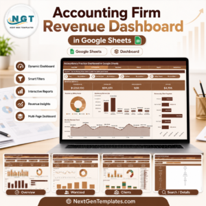
- Accounting Firm Revenue Dashboard in Google Sheets – track fees, billable hours, WIP, clients, and billing status for professional services teams.
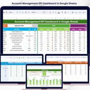
- Account Management KPI Dashboard in Google Sheets – monitor account KPIs, targets, and trends.
- Project Task Management Dashboard in Google Sheets – track project tasks, cost, progress, and contractor performance.
- Consulting Report in Excel – Excel-based consulting project and client satisfaction report.
- Browse Google Sheets templates.
- Browse Google Sheets dashboard templates.
Download the Consulting Performance Dashboard in Google Sheets and start tracking consulting revenue, profit, billable hours, clients, consultants, project status, and satisfaction in one editable spreadsheet.
Watch the step-by-step video Demo:
Last updated: July 9, 2026.






















Reviews
There are no reviews yet.