

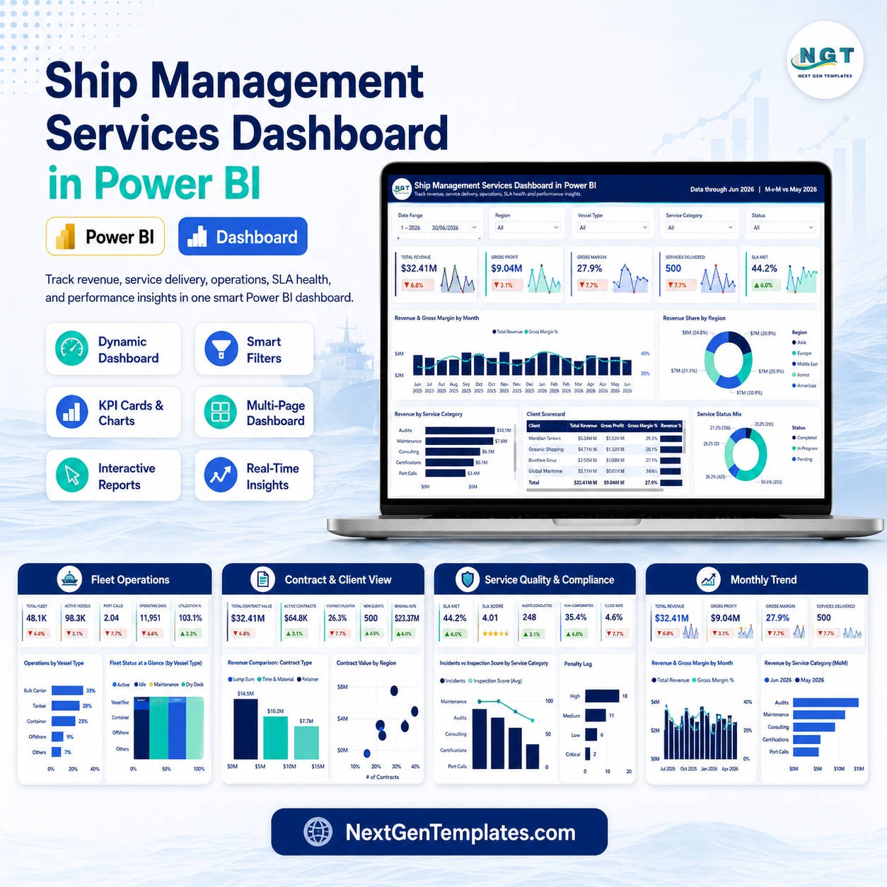
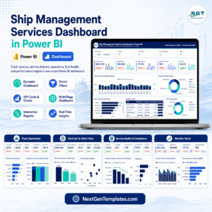
Ship Management Services Dashboard in Power BI gives maritime service teams a ready reporting model for revenue, gross profit, SLA performance, fleet operations, contracts, quality, compliance, and monthly trends across 5 Power BI report pages. For ship management companies, port service teams, fleet operators, and account managers, even a small delay in SLA delivery or a recurring cost increase can affect client trust and profitability. This template gives you a practical one-time-purchase dashboard with a clear starting point: use the sample structure first, then adapt the PBIX report to your own service data before using it in live reviews.
Key Features of Ship Management Services Dashboard in Power BI
- 5 report pages: Overview, Fleet Operations, Contract and Client View, Service Quality and Compliance, and Monthly Trend.
- Executive KPI cards: Total Revenue, Gross Profit, Gross Margin, Services Delivered, and SLA Met.
- Fleet operations analysis: compare operating hours by port, fuel burn by vessel type, crew deployed by region, and vessel operations.
- Contract and client view: review revenue composition, client value, margin, contract costs, and account manager performance.
- Quality and compliance tracking: monitor incidents, inspection scores, priority mix, port-level issues, and client quality results.
- Monthly trend reporting: analyze revenue, service volume, cost, gross profit, inspection score, and fuel consumption over time.
What’s Inside the Ship Management Services Dashboard in Power BI
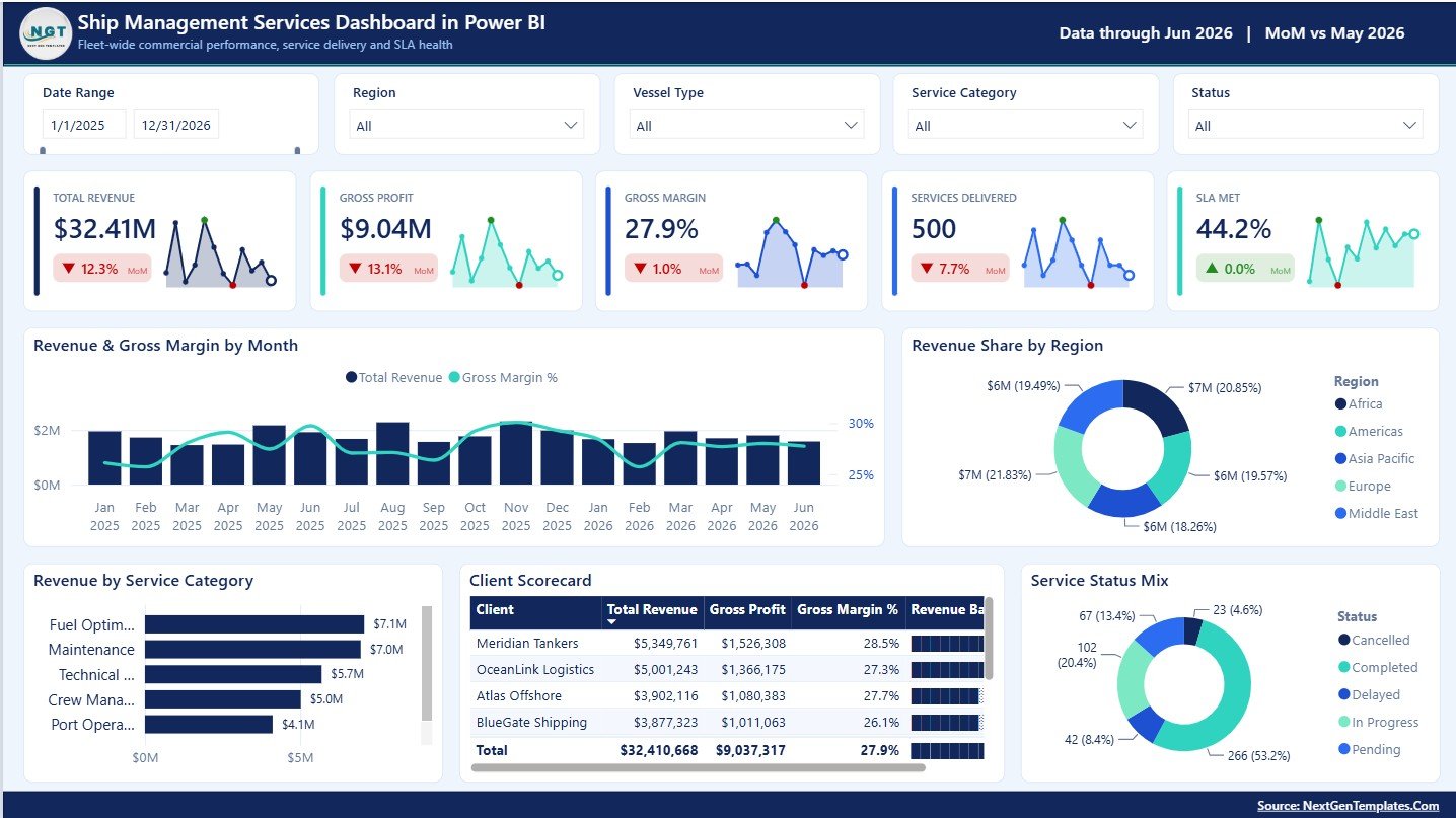
1 – Overview Page
The Overview Page gives the high-level summary of commercial and service performance. The cards show Total Revenue, Gross Profit, Gross Margin, Services Delivered, and SLA Met so leaders can understand the core business position quickly.
Revenue and Gross Margin by Month: This chart compares revenue movement with gross margin over time. It helps managers identify strong months, weaker margin periods, and possible seasonality.
Revenue Share by Region: This chart shows how revenue is distributed across operating regions. It helps leadership understand which regions contribute the largest share.
Revenue by Service Category: This visual breaks revenue down by service category. It helps teams see which service lines are producing the highest revenue.
Client Scorecard by Client: This scorecard compares client-level performance in one place. It supports account reviews across client value, margin, service delivery, and quality signals.
Service Status Mix by Status: This chart groups services by status. It helps operations teams quickly see completed, pending, delayed, or other status groups.
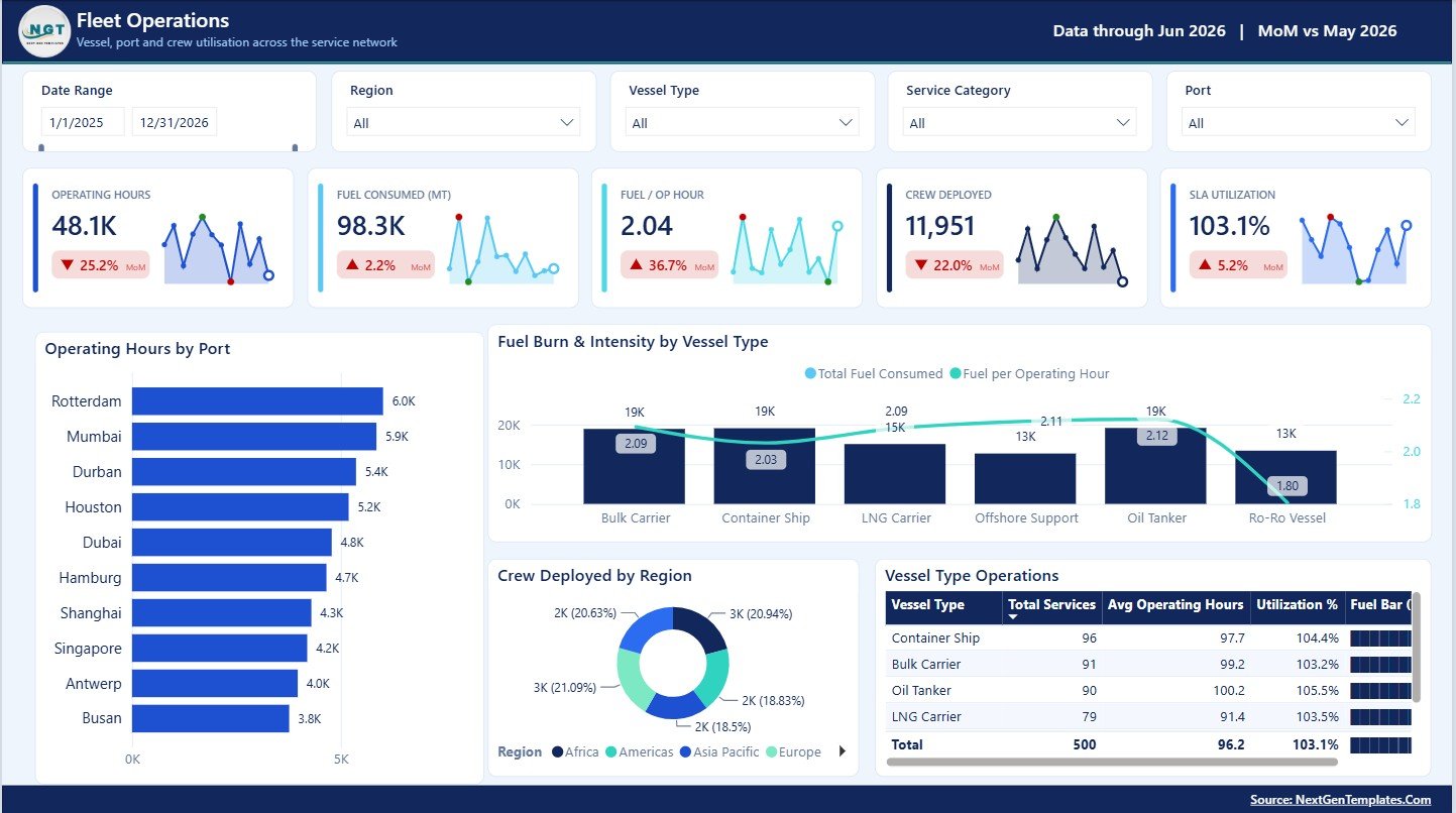
2 – Fleet Operations
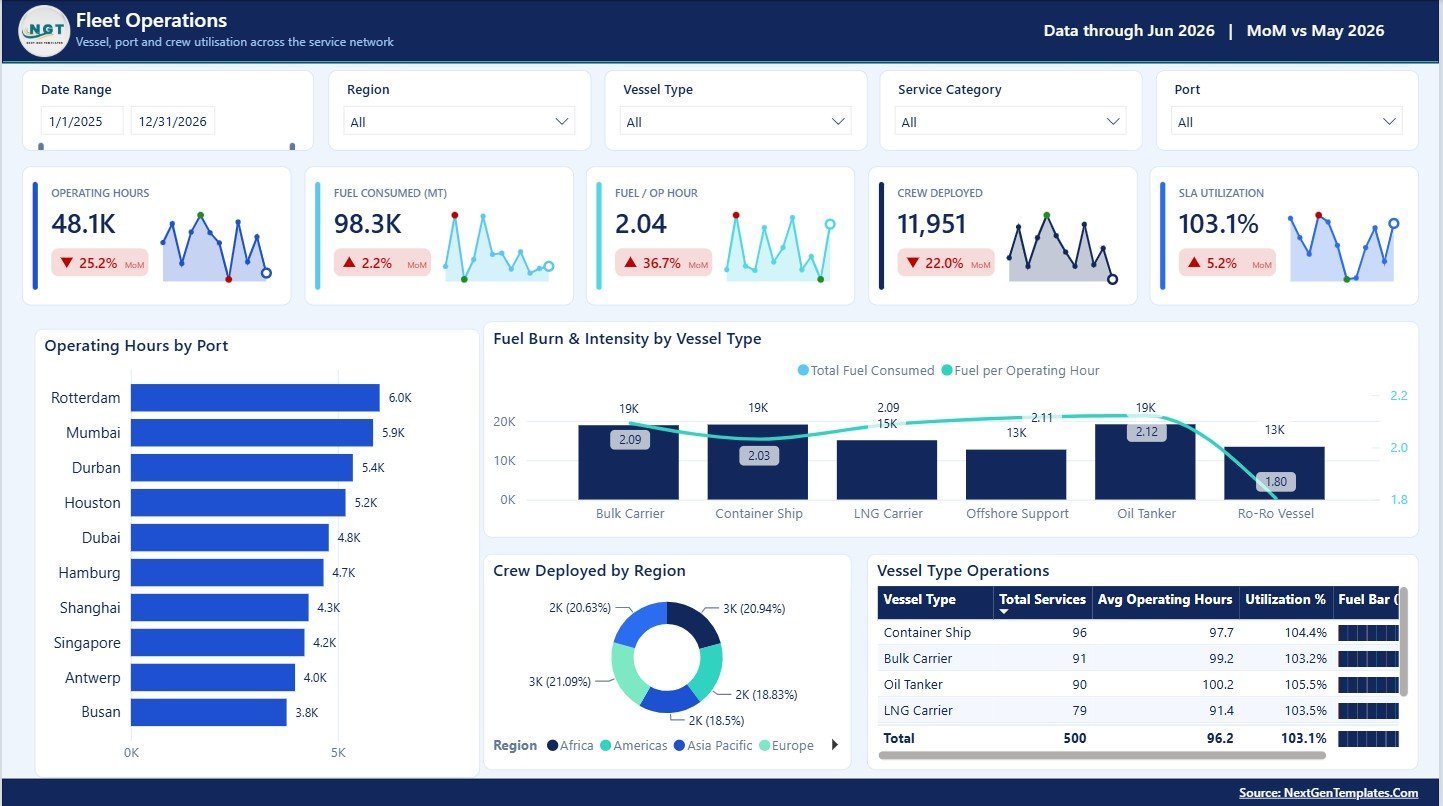
The Fleet Operations page focuses on port workload, vessel type performance, fuel behavior, and crew deployment patterns.
Operating Hours by Port: This chart shows how operating hours are distributed across ports. It helps port coordinators identify busy locations and compare workload pressure.
Fuel Burn and Intensity by Vessel Type: This visual compares fuel consumption and intensity across vessel types. It helps operations teams spot vessel classes that may need efficiency review.
Crew Deployed by Region: This chart shows crew allocation by region. It helps managers understand whether staffing levels are aligned with service volume.
Vessel Type Operations by Vessel Type: This chart compares operational activity by vessel type. It helps users understand which vessel groups drive the most service work.
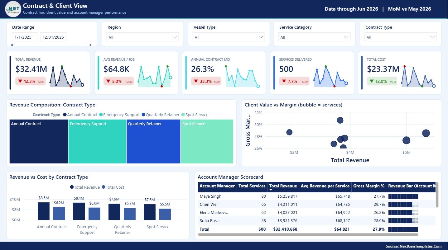
3 – Contract and Client View
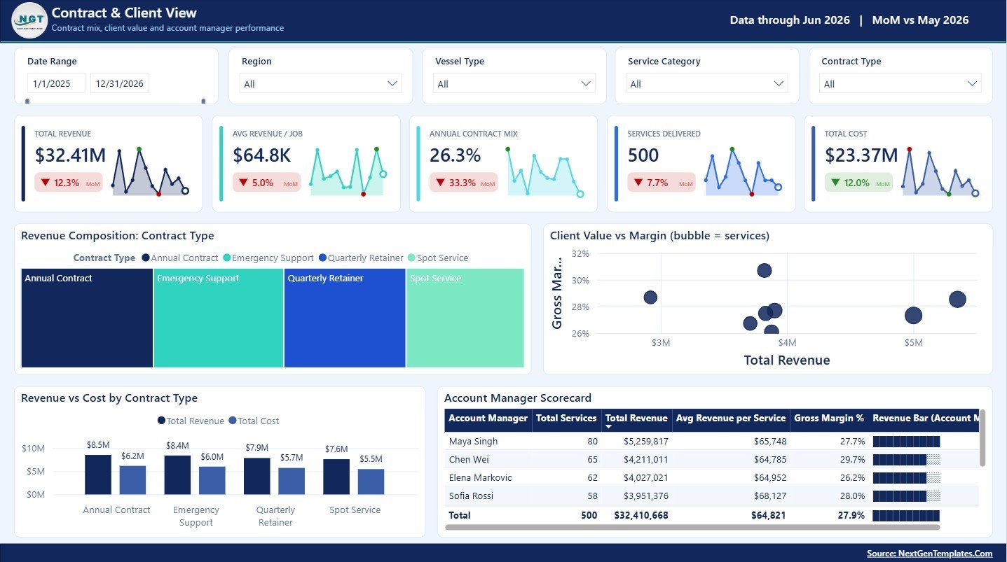
The Contract and Client View page is designed for commercial reviews, client profitability discussions, and account manager performance tracking.
Revenue Composition by Contract Type: This chart shows how revenue is split across contract types. It helps commercial teams understand which contract models are driving the business.
Client Value vs Margin by Client: This chart compares client value against margin. It helps account managers identify high-value clients, low-margin clients, and accounts that may need renegotiation.
Revenue vs Cost by Contract Type: This visual places revenue and cost side by side for each contract type. It helps teams see whether specific contract structures are creating profit pressure.
Account Manager Scorecard by Account Manager: This scorecard compares account manager performance. It supports internal reviews by showing account ownership and margin-related outcomes.
4 – Service Quality and Compliance
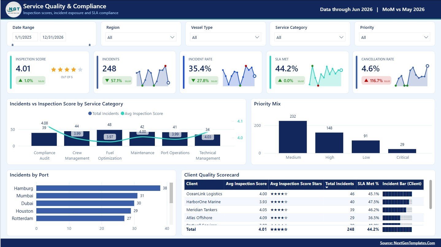
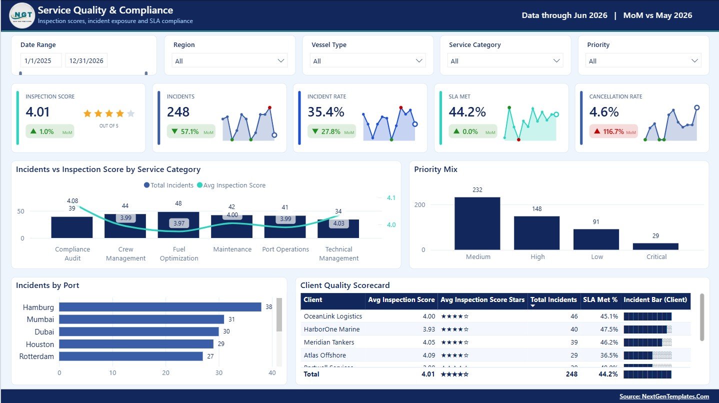
The Service Quality and Compliance page supports safety, quality, SLA, and inspection review meetings.
Incidents vs Inspection Score by Service Category: This chart compares incident volume with inspection performance by service category. It helps quality teams find service areas where incidents and lower inspection scores may be connected.
Priority Mix by Priority: This chart shows the distribution of work or issues by priority level. It helps managers understand how much activity is urgent, high priority, normal, or low priority.
Incidents by Port: This visual compares incident volume across ports. It helps identify locations that may need additional supervision, process changes, or training.
Client Quality Scorecard by Client: This scorecard compares client quality results. It is useful for client-facing reviews and internal quality improvement planning.
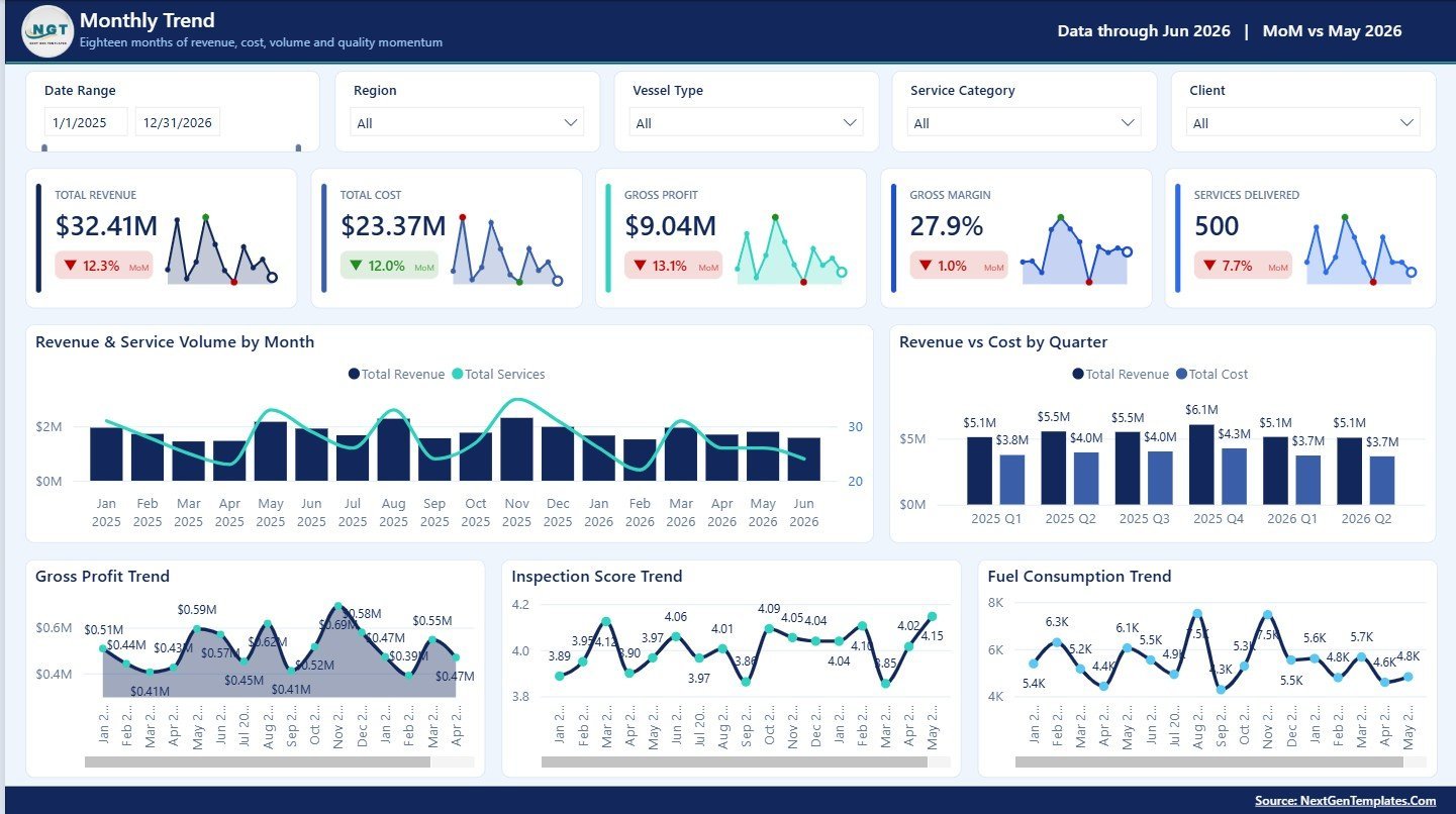
5 – Monthly Trend
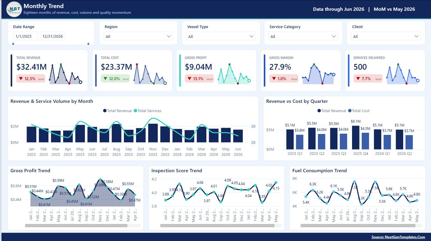
The Monthly Trend page gives users a time-based view of service and financial performance for monthly and quarterly review meetings.
Revenue and Service Volume by Month: This chart compares revenue with delivered service volume month by month. It helps users see whether revenue growth is supported by more activity or stronger pricing and mix.
Revenue vs Cost by Quarter: This visual compares quarterly revenue and cost. It helps finance teams understand whether quarterly growth is creating healthy profitability.
Gross Profit Trend by Month: This chart tracks gross profit across months. It helps managers identify profit improvement, decline, or volatility.
Inspection Score Trend by Month: This chart shows how inspection scores change over time. It helps quality teams monitor whether service standards are improving or slipping.
Fuel Consumption Trend by Month: This visual tracks monthly fuel consumption. It helps fleet teams monitor fuel usage patterns and investigate unusually high consumption periods.
Ship Management Services Dashboard in Power BI vs. Tableau vs. Paid CRM/SaaS – Where This Fits
| Feature | This Power BI dashboard | Tableau alternative | Paid maritime SaaS |
|---|---|---|---|
| Cost | $17.99 sale price | License plus build time | Subscription or contract pricing |
| Platform | Power BI Desktop and Power BI Service | Tableau Desktop or Cloud | Vendor cloud platform |
| Setup time | Open, replace or connect data, refresh, and customize | Build model and visuals | Vendor onboarding required |
| Customizable fields | Edit pages, measures, relationships, visuals, and filters | Editable if built internally | Limited by vendor permissions |
| Year-1 cost at 5 users | $17.99 plus Microsoft licensing | Usually higher with licenses and build effort | Often much higher with subscriptions |
| Best fit | Recurring ship service reporting and management review | Teams standardized on Tableau | Live operational execution and workflow control |
Who This Template Is For – and Who It’s Not For
This template is for ship management companies, marine service providers, fleet operations teams, port coordinators, quality managers, compliance teams, contract managers, account managers, and analysts who need a ready Power BI dashboard for recurring performance reporting.
It is not for teams that need live vessel tracking, dispatch execution, maintenance work orders, crew payroll, invoice processing, regulatory filing, or a full maritime ERP. This is an analytical reporting template, not an operational transaction system.
How to Use the Ship Management Services Dashboard in Power BI
- Download and unzip the product package.
- Open the PBIX report in Power BI Desktop.
- Review the 5 report pages and sample metrics.
- Replace or connect the sample source with your own cleaned ship management service data.
- Refresh the model and validate the KPI cards, slicers, and visuals before sharing.
Real-World Use Cases
Arjun, fleet operations manager: reviews operating hours by port, fuel intensity by vessel type, and crew deployed by region before planning the next service cycle.
Maria, contract account lead: compares client value, revenue composition, contract cost, and account manager scorecards before renewal meetings.
Kevin, quality supervisor: checks incidents, priority mix, inspection score trends, and client quality results during monthly compliance reviews.
Frequently Asked Questions
What does this dashboard track?
It tracks revenue, gross profit, gross margin, services delivered, SLA met, service categories, regions, clients, statuses, ports, vessel types, fuel burn, crew deployment, contract types, incidents, inspection scores, priorities, and monthly trends.
How many pages are included?
The report includes 5 pages: Overview, Fleet Operations, Contract and Client View, Service Quality and Compliance, and Monthly Trend.
Can I use my own ship management data?
Yes. You can replace or connect the sample source with your own data, then refresh the model in Power BI Desktop.
Do I need Power BI Desktop?
Yes. Power BI Desktop is recommended for opening and editing the PBIX file.
Is this full ship management software?
No. This is a reporting dashboard template. It does not manage live operations, dispatch, payroll, invoicing, or regulatory filings.
Can I customize the visuals?
Yes. Users with Power BI knowledge can edit pages, visuals, measures, filters, slicers, and data connections.
About the Author
Built by PK – Microsoft Certified Professional with 15+ years of Excel, Google Sheets, and Power BI experience. Founder of NextGenTemplates, reaching 300K+ subscribers across YouTube channels. Every template is hand-built and tested before release.
Explore Related Templates
- Roadside Assistance Networks Dashboard in Excel
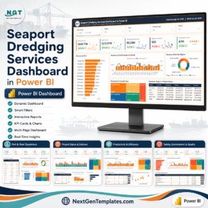
- Seaport Dredging Services Dashboard in Power BI
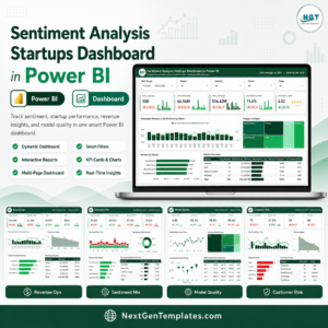
- Sentiment Analysis Startups Dashboard in Power BI
- Browse Power BI Dashboard Templates
Download the Ship Management Services Dashboard in Power BI and turn ship service records into a clear management-ready report.
Last updated: August 10, 2026



















Reviews
There are no reviews yet.