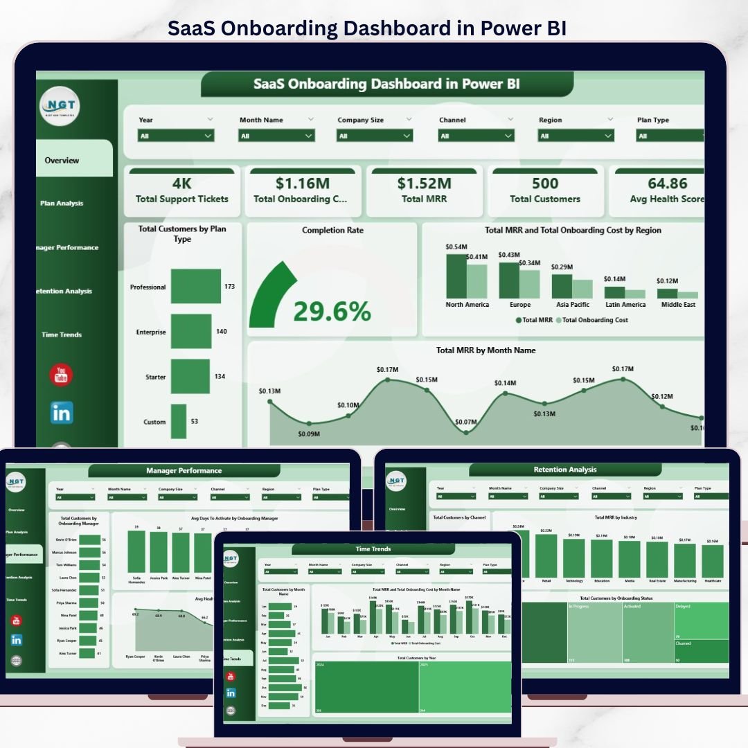
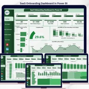
The SaaS Onboarding Dashboard in Power BI turns a single customer onboarding export into 5 KPI cards and 14 interactive Power BI visuals across 5 report pages — Overview, Plan Analysis, Manager Performance, Retention Analysis, and Time Trends. Every visual recalculates automatically when you click Refresh in Power BI Desktop, so a 4-hour Customer Success reporting ritual becomes a 5-minute dashboard refresh.
🌍 Join 8,400+ teams in 40+ countries using NextGenTemplates to replace paid SaaS tools with one-time-purchase Excel, Google Sheets, Power BI, and HTML templates.
✅ Instant download · One-time payment · No subscription · No per-user fees · Lifetime access
🔑 Key Features of SaaS Onboarding Dashboard in Power BI
This SaaS Onboarding Dashboard in Power BI monitors customer activation health across the entire post-signup journey. It tracks Total Support Tickets, Total Onboarding Cost, Total MRR, Total Customers, and Avg Health Score as headline KPIs, then breaks performance down by Plan Type, Company Size, Onboarding Manager, Industry, Channel, Region, and time period — so Customer Success leaders can see exactly where activation is stalling within minutes, not days.
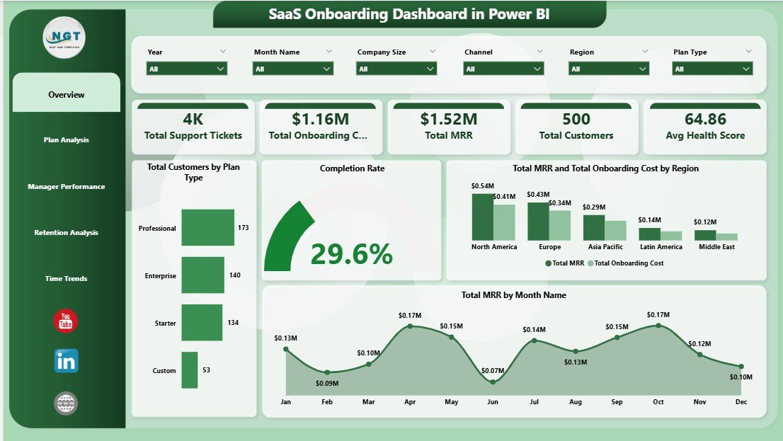
📌 5 Headline KPI Cards – Total Support Tickets, Total Onboarding Cost, Total MRR, Total Customers, and Avg Health Score displayed at the top of the Overview page for instant pulse checks
📌 14 Interactive Power BI Visuals – Cards, bar charts, column charts, line charts, and donut charts spread across 5 analytical pages, all driven by Power BI’s native cross-filtering
📌 Multi-Slicer Filtering – Filter every chart and KPI by Plan Type, Region, Industry, Company Size, Channel, Year, or Onboarding Manager with a single click
📌 5 Analytical Views – Overview, Plan Analysis, Manager Performance, Retention Analysis, and Time Trends — each engineered around a different SaaS Customer Success question
📌 Manager Scorecard – Compare Avg Days To Activate, Avg Health Score, and Total Customers across each Onboarding Manager to coach the team with numbers, not opinions
📌 Refresh Workflow – Update the source Excel data file, click Refresh in Power BI Desktop, and every visual rebuilds in 2–3 seconds
📌 Pre-Built DAX Measures – Standard SaaS KPIs (MRR, Health Score, Activation Rate, Onboarding Cost) are already wired up; you only edit measures if you want to add new ones
📌 Plug-and-Play Schema – The Excel data model column structure is pre-configured; just paste your CRM/billing export and the data model takes over
📦 What’s Inside the SaaS Onboarding Dashboard in Power BI
The .pbix file contains 5 fully built report pages, each with KPI cards, slicers, and 3–4 visuals — all sourced from a single Excel data model and orchestrated through Power BI’s native cross-filtering.
1 — Overview Page. The Overview surfaces 5 KPI cards (Total Support Tickets, Total Onboarding Cost, Total MRR, Total Customers, Avg Health Score) on top, followed by Total Customers by Plan Type, Completion Rate, Total MRR and Total Onboarding Cost by Region, and Total MRR by Month Name charts, with slicers above for one-click filtering.
SaaS Onboarding Dashboard in Power BI
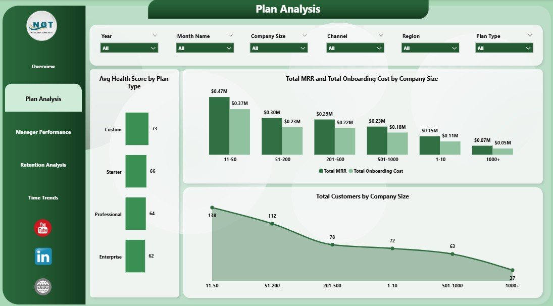
2 — Plan Analysis. This page shows Avg Health Score by Plan Type, Total MRR and Total Onboarding Cost by Company Size, and Total Customers by Company Size — perfect for pricing-tier ROI reviews and answering whether higher-MRR segments justify their onboarding investment.
Plan Analysis
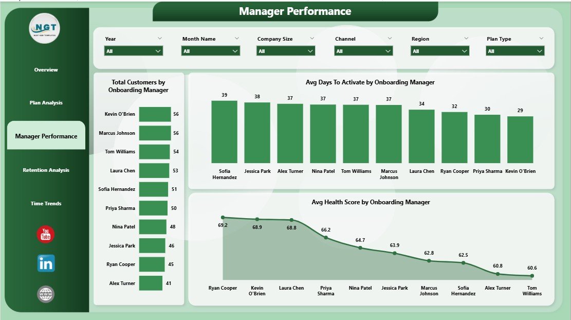
3 — Manager Performance. Compare Total Customers by Onboarding Manager, Avg Days To Activate by Onboarding Manager, and Avg Health Score by Onboarding Manager — built-in coaching scorecard for monthly 1:1s and quarterly bonus decisions grounded in numbers.
Manager Performance
4 — Retention Analysis. Drill into Total Customers by Channel, Total MRR by Industry, and Total Customers by Onboarding Status to spot which acquisition sources convert and stick — and which industries are most profitable to onboard.
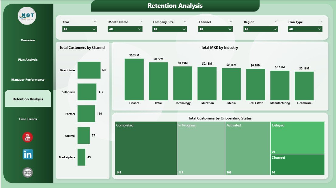
Retention Analysis
5 — Time Trends. Track Total Customers by Month Name, Total MRR and Total Onboarding Cost by Month Name, and Total Customers by Year — your monthly board-deck view for unit economics, seasonality, and momentum analysis.
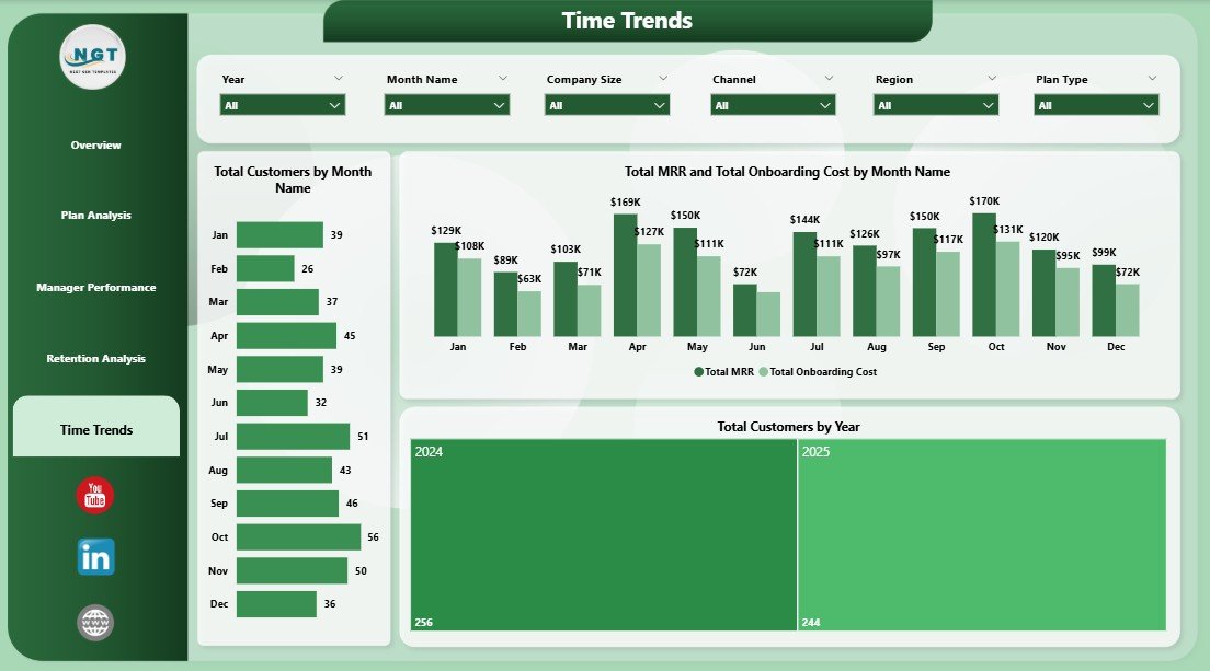
Time Trends
📊 SaaS Onboarding Dashboard in Power BI vs. Tableau / Qlik vs. ChurnZero / Gainsight — Where This Fits
| Feature | SaaS Onboarding Dashboard in Power BI | Tableau / Qlik Alternative | ChurnZero / Gainsight |
|---|---|---|---|
| Cost | $17.99 one-time | $70–$75 / user / month | $1,200–$3,500 / month minimum |
| Platform | Power BI Desktop (free) | Tableau Desktop or Qlik Sense | Vendor-hosted cloud only |
| Setup time | Under 10 minutes | 2–4 hours for similar build | 4–8 weeks implementation |
| MRR / Health Score / Activation tracking | ✅ | ✅ | ✅ |
| Onboarding Manager scorecard | ✅ Built in | ❌ Manual build required | ✅ |
| Customizable visuals & DAX measures | ✅ Full control | ✅ But requires re-licensing | ⚠️ Vendor-locked schema |
| Data ownership | ✅ 100% local .pbix + Excel | ✅ Yes | ❌ Vendor-owned cloud database |
| Year-1 cost at 5 users | $17.99 | $4,200–$4,500 | $15,000–$42,000 |
For SaaS teams that want MRR, churn, and activation visibility in Power BI without paying $15K/year for Customer Success software or $4K+ per Tableau seat, the SaaS Onboarding Dashboard in Power BI sits in the sweet spot.
👥 Who This Template Is For — and Who It’s Not For
✅ This template is built for:
- Customer Success Managers at SaaS startups (5–500 employees) who report onboarding KPIs in Power BI Service every month
- SaaS Operations and RevOps analysts graduating from Excel pivots to Power BI’s cross-filtering and DAX measures
- Founders running early-stage SaaS who can’t yet justify ChurnZero or Gainsight pricing but want a polished Power BI report for board decks
- Customer Success consultants who deliver onboarding playbooks to multiple SaaS clients and want a Power BI starting template
❌ This template is NOT for:
- Enterprise SaaS teams that require SOC 2 audit logs, SSO, and live API ingestion from product event data
- Teams that need automated email playbooks triggered by health-score thresholds — that’s what Gainsight is for
- Mac-only teams without a Windows VM (Power BI Desktop is Windows-only — use the SaaS Onboarding Dashboard in Excel instead)
⚙️ How to Use the SaaS Onboarding Dashboard in Power BI
- Download and unzip the file, then open the .pbix file in Power BI Desktop (free from Microsoft).
- Open the source Excel data file. Replace the sample rows with your own onboarding records, keeping the same column structure.
- Back in Power BI Desktop, click Refresh in the Home ribbon. Every visual, KPI card, and slicer on all 5 report pages updates instantly.
- Use the slicers at the top of each page to filter by Plan Type, Region, Industry, Channel, Year, or Onboarding Manager.
- Publish the report to Power BI Service (requires a Pro license) for team-wide access via the Power BI mobile app.
- Save the .pbix as a master copy each month for historical comparison and audit trail.
💼 Real-World Use Cases
Priya leads Customer Success at a 40-person B2B SaaS company. Every Friday she pastes a fresh Stripe export into the source Excel file, clicks Refresh in Power BI Desktop, publishes the updated report to Power BI Service, and sends the Manager Performance page link to her three CSMs — keeping coaching conversations grounded in Avg Days To Activate and Health Score deltas, not opinions.
Marco is a fractional RevOps consultant working with four early-stage SaaS startups. He delivers each client a copy of this dashboard pre-configured with their pricing tiers and channel taxonomy. The Plan Analysis and Retention Analysis pages give founders a clear answer to “which plan and which channel is actually retaining?” within their first board meeting in Power BI.
Lena is a SaaS founder pre-Series A. She uses the Time Trends page in every investor update to show MRR-versus-Onboarding-Cost trajectory and month-over-month customer growth — without paying for Gainsight before she has the budget for it.
❓ Frequently Asked Questions
What KPIs does the SaaS Onboarding Dashboard in Power BI track?
The SaaS Onboarding Dashboard in Power BI tracks 5 headline KPIs — Total Support Tickets, Total Onboarding Cost, Total MRR, Total Customers, and Avg Health Score — plus 14 analytical visuals covering Plan Type, Company Size, Onboarding Manager, Industry, Channel, Region, and monthly time trends across 5 interactive Power BI report pages.
How is this different from ChurnZero or Gainsight?
ChurnZero and Gainsight are real-time SaaS platforms starting at $1,200 per month with multi-week implementations. The SaaS Onboarding Dashboard in Power BI is a one-time $17.99 purchase that runs locally in Power BI Desktop, gives you the same MRR, health-score, and activation views, and lets you customize every visual or DAX measure to match your unique SaaS Customer Success workflow.
How long does setup take?
Setup takes under 10 minutes. Open the .pbix file in Power BI Desktop, point the data source at your own onboarding-records Excel file, click Refresh, and every chart, KPI card, and slicer on the SaaS Onboarding Dashboard in Power BI updates automatically. No DAX measure rewrites or visual rebuilds needed.
Do I need a Power BI Pro license?
No, not for personal use. Power BI Desktop is free and runs the SaaS Onboarding Dashboard fully offline on Windows 10 or 11. You only need a Power BI Pro license ($10/user/month) if you want to publish the report to Power BI Service and share it across your Customer Success team.
Can I add my own pricing tiers, channels, or industries?
Yes. The SaaS Onboarding Dashboard in Power BI uses an Excel data source, so any new Plan Type, Channel, Industry, or Onboarding Manager you add to the source file is picked up automatically after clicking Refresh. The data model auto-detects new categorical values without any visual or measure rebuild.
Does this dashboard work on Mac?
Power BI Desktop is Windows-only, so the SaaS Onboarding Dashboard authoring experience runs on Windows machines. Mac users can either run Power BI Desktop in a Windows VM, view published reports through the browser-based Power BI Service, or use the SaaS Onboarding Dashboard in Excel, which runs natively on Excel for Mac.
Will this work for non-SaaS subscription businesses?
Yes. Although built around SaaS metrics like MRR and Activation, the SaaS Onboarding Dashboard in Power BI works equally well for any subscription business — fitness memberships, B2B services retainers, online courses — by relabeling the Plan Type and Onboarding Status columns in the source Excel file to match your model.
👤 About the Author
Built by PK — Microsoft Certified Professional with 15+ years of Excel, Google Sheets, and Power BI experience. Founder of NextGenTemplates, reaching 300K+ subscribers across YouTube channels (@PK-AnExcelExpert, @NextGenTemplates, @NeoTechNavigators). Every template is hand-built and tested before release.
🔗 Explore Related Templates
Want this on a different platform or paired with adjacent SaaS analytics? Explore these companion templates:
📌 SaaS Onboarding Dashboard in Excel — the Excel sibling for Mac users and teams that prefer pivot tables to DAX.
📌 SaaS Customer Success Dashboard in Google Sheets — the cloud-native sibling for teams that live in Google Workspace.
📌 SaaS Financial Model Dashboard in HTML — pair onboarding analytics with a forward-looking SaaS financial model.
📌 Browse the full Power BI Dashboard Templates library or explore Excel Dashboard Templates for cross-platform options.
📖 Click here to read the Detailed Blog Post
🎥 Visit our YouTube channel for step-by-step video tutorials
👉 YouTube.com/@NextGenTemplates
📅 Last updated: April 2026
Watch the step-by-step video tutorial:


Reviews
There are no reviews yet.