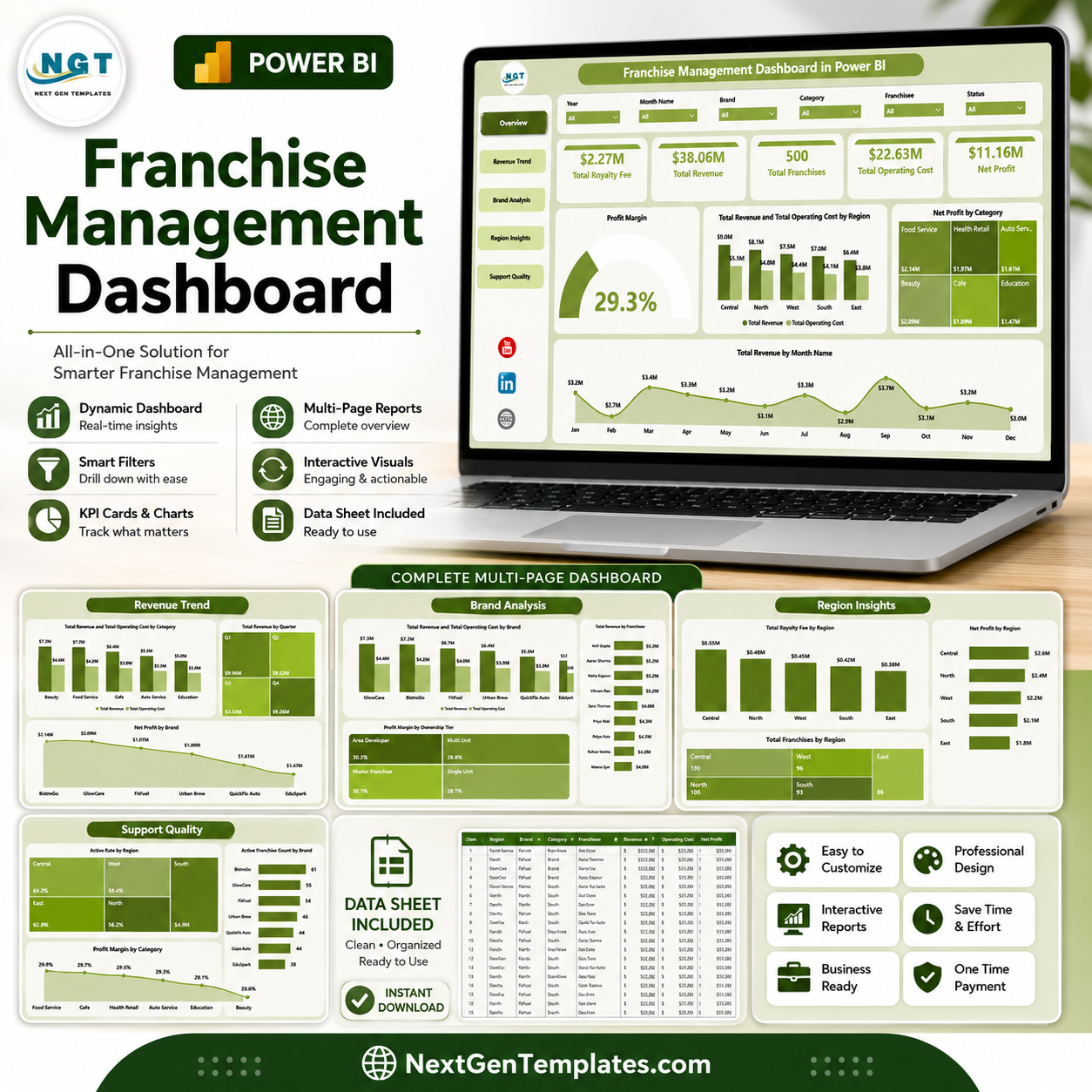
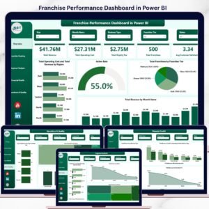
Franchise Management Dashboard in Power BI helps franchisors, franchise owners, regional managers, and finance teams monitor royalty fees, revenue, operating cost, net profit, franchise count, active rate, brands, categories, ownership tiers, and regions in one interactive PBIX report. It includes 5 Power BI pages, 5 executive KPI cards, multiple slicers, and 17 focused analysis visuals. Join 8,400+ teams in 40+ countries using NextGenTemplates for one-time-purchase business templates. Instant download, lifetime file access, and no monthly SaaS subscription.
Key Features of Franchise Management Dashboard in Power BI
- 5 Power BI report pages: Overview, Revenue Trend, Brand Analysis, Region Insights, and Support Quality.
- Executive KPI cards: Total Royalty Fee, Total Revenue, Total Franchises, Total Operating Cost, and Net Profit.
- Interactive slicers: Filter the dashboard quickly by available brand, region, category, franchisee, ownership tier, and time fields.
- Financial visibility: Compare revenue, operating cost, royalty fee, net profit, and profit margin across key franchise dimensions.
- Editable PBIX file: Open in Power BI Desktop and customize visuals, measures, fields, relationships, and branding.
What’s Inside the Franchise Management Dashboard in Power BI
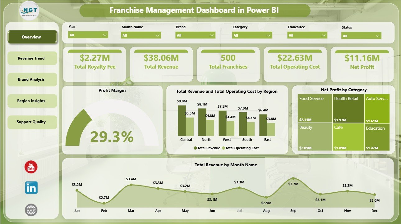
1. Overview Page
The Overview page gives leadership a quick read on network health. KPI cards show Total Royalty Fee, Total Revenue, Total Franchises, Total Operating Cost, and Net Profit, while slicers help users filter the full dashboard instantly.
Profit Margin by Overall Franchise Performance: This visual shows the overall margin position of the franchise network. It helps owners judge whether revenue growth is translating into healthy profitability.
Total Revenue and Total Operating Cost by Region: This chart compares income and cost by geography. It helps regional managers find territories where cost pressure is reducing performance.
Net Profit by Category: This visual ranks franchise categories by net profit contribution. It supports category-level expansion, pricing, and cost-control decisions.
Total Revenue by Month Name: This chart shows month-by-month revenue movement. It helps users identify seasonality, strong periods, and months that need deeper investigation.
2. Revenue Trend
The Revenue Trend page focuses on cost, profit, brand, and time-based movement so managers can understand where financial momentum is coming from.
Total Revenue and Total Operating Cost by Category: Compare revenue and operating cost side by side for each category. This helps identify profitable categories and categories where cost needs review.
Net Profit by Brand: Review brand-level profit contribution across the franchise network. This helps leadership see which brands are creating stronger returns.
Total Revenue by Quarter: Track revenue by quarter to spot growth patterns and seasonal shifts. It is useful for quarterly reviews and leadership reporting.

3. Brand Analysis
The Brand Analysis page compares brand, franchisee, and ownership tier performance for deeper portfolio review.
Total Revenue and Total Operating Cost by Brand: Compare brand revenue against operating cost to understand brand-level margin pressure. It helps teams decide where to invest, coach, or control spend.
Total Revenue by Franchisee: Rank franchisees by revenue contribution. This is useful for performance reviews, recognition, and targeted support.
Profit Margin by Ownership Tier: Compare margin performance by ownership tier. It helps franchisors understand whether owner-operated, multi-unit, or other tiers perform differently.

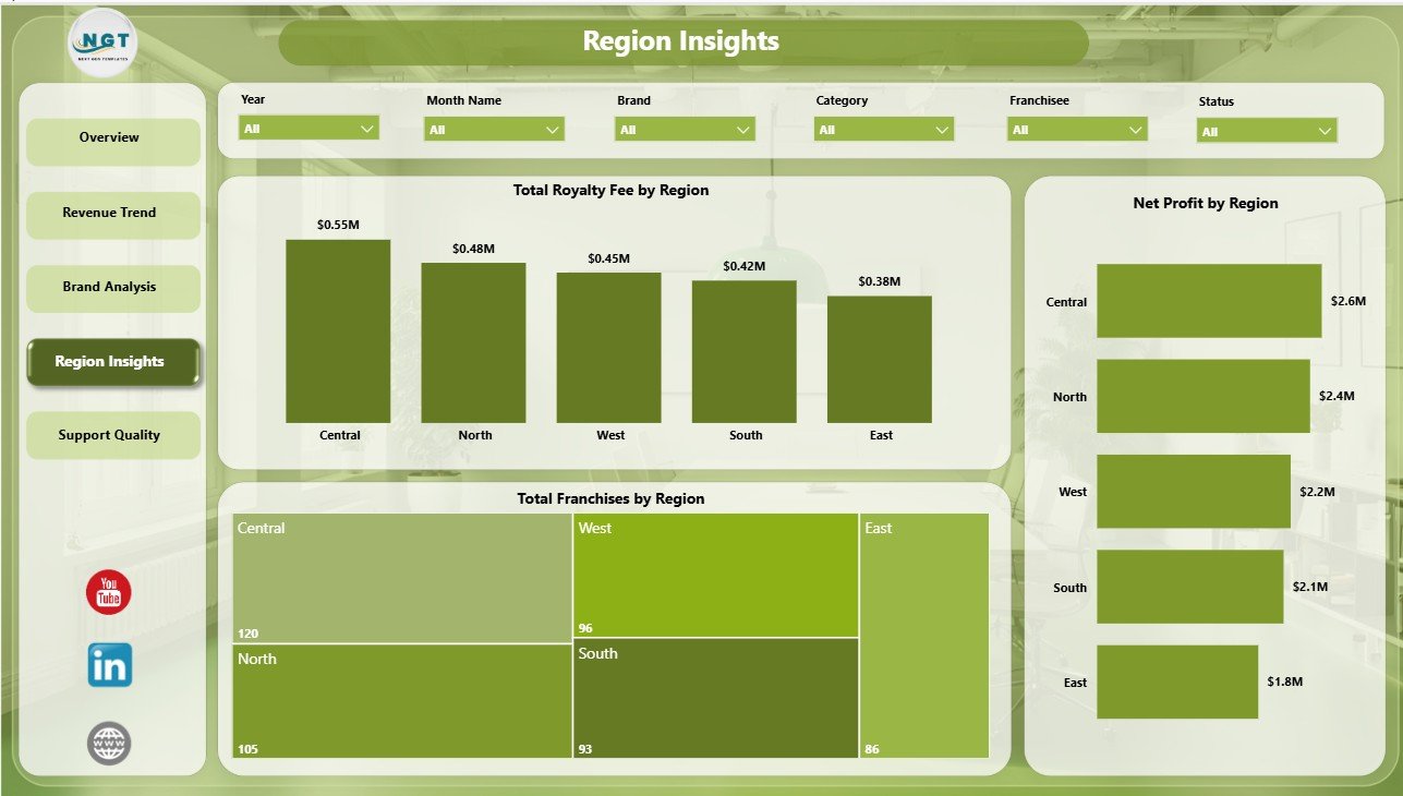
4. Region Insights
The Region Insights page gives a geographic view of royalty, franchise count, and profit performance.
Total Royalty Fee by Region: Compare royalty contribution by geography. It helps finance teams understand which regions drive stronger recurring fees.
Total Franchises by Region: See franchise distribution across territories. This helps planning teams compare network size against revenue and profit output.
Net Profit by Region: Compare regional profitability at a glance. It helps identify high-performing regions and areas that need cost or revenue action.
5. Support Quality
The Support Quality page connects franchise activity, category margin, and brand-level active franchise count.
Active Rate by Region: Review active franchise percentage across regions. This helps support teams identify territories where franchise engagement may need attention.
Profit Margin by Category: Compare category-level profitability and spot lower-margin groups. It supports pricing, cost control, and operating model decisions.
Active Franchise Count by Brand: See how many active franchises each brand has. It helps leadership understand brand scale and operational coverage.

Franchise Management Dashboard in Power BI vs. Tableau vs. Paid Franchise SaaS – Where This Fits
| Feature | This Power BI Dashboard | Tableau Alternative | Paid Franchise SaaS |
|---|---|---|---|
| Cost | $17.99 one-time template purchase | License plus report build time | Monthly or annual subscription |
| Platform | Power BI Desktop / Power BI Service | Tableau Desktop / Tableau Cloud | Vendor cloud platform |
| Setup time | Open PBIX, connect or replace data, refresh | Build model and visuals manually | Implementation and onboarding |
| Mobile access | Power BI mobile app after publishing | Tableau mobile app after publishing | Vendor app or browser |
| Franchise analytics | Royalty, revenue, cost, brand, category, region, and active-rate reporting | Requires custom setup | Depends on module and plan |
Who This Template Is For – and Who It’s Not For
This template is for franchisors, multi-unit franchise owners, regional managers, finance teams, operations leaders, and Power BI consultants who need a structured reporting layer for royalty fees, revenue, costs, net profit, franchise count, active rate, category, brand, franchisee, region, and ownership tier.
It is not a replacement for POS software, legal franchise management, royalty collection automation, payroll, CRM workflows, or live API integration. It works best when you already have structured franchise data and want a ready Power BI dashboard for analysis.
How to Use the Franchise Management Dashboard in Power BI
- Download and unzip the Power BI dashboard package.
- Open the PBIX file in Power BI Desktop, which is free from Microsoft.
- Review the sample data structure and map your own franchise records to the same fields.
- Refresh the report after replacing or connecting the data source.
- Use slicers to filter by brand, region, category, franchisee, ownership tier, and period.
- Customize visuals, measures, fields, relationships, and colors if needed.
Real-World Use Cases
Priya, Franchise Operations Manager: reviews royalty fee, revenue, operating cost, net profit, and active rate before monthly franchise performance meetings.
Marcus, Multi-Unit Franchise Owner: filters Brand Analysis and Region Insights to compare revenue, cost, and profit across brands and territories.
Elena, Franchise Consultant: uses ownership tier, category margin, and active franchise visuals to prepare improvement recommendations for clients.
Frequently Asked Questions
Does this dashboard work in Power BI Desktop?
Yes. Open the PBIX file in Power BI Desktop, then review, replace, or connect the source data.
What pages are included?
The report includes Overview, Revenue Trend, Brand Analysis, Region Insights, and Support Quality pages.
Can I use my own franchise data?
Yes. Map your data to the same field structure and refresh the Power BI model.
Is this a full franchise CRM?
No. It is an analytics dashboard, not a full CRM, royalty billing system, POS system, or operations platform.
Can I customize the report?
Yes. Power BI users can edit visuals, measures, fields, relationships, formatting, and report pages.
About the Author
Built by PK – Microsoft Certified Professional with 15+ years of Excel, Google Sheets, and Power BI experience. Founder of NextGenTemplates, reaching 300K+ subscribers across YouTube channels. Every template is hand-built and tested before release.
Explore Related Templates
You may also like the Franchise Management Dashboard in Excel, Franchise Management KPI Dashboard in Power BI, Franchise Performance Dashboard in Power BI, and Franchise Management KPI Dashboard in Excel. Browse more Power BI Dashboard templates and Power BI templates.
Click here to read the detailed blog post.
Download the Franchise Management Dashboard in Power BI today and turn franchise data into clear royalty, revenue, cost, profit, region, brand, and quality insights.
Last updated: June 15, 2026.


Reviews
There are no reviews yet.