

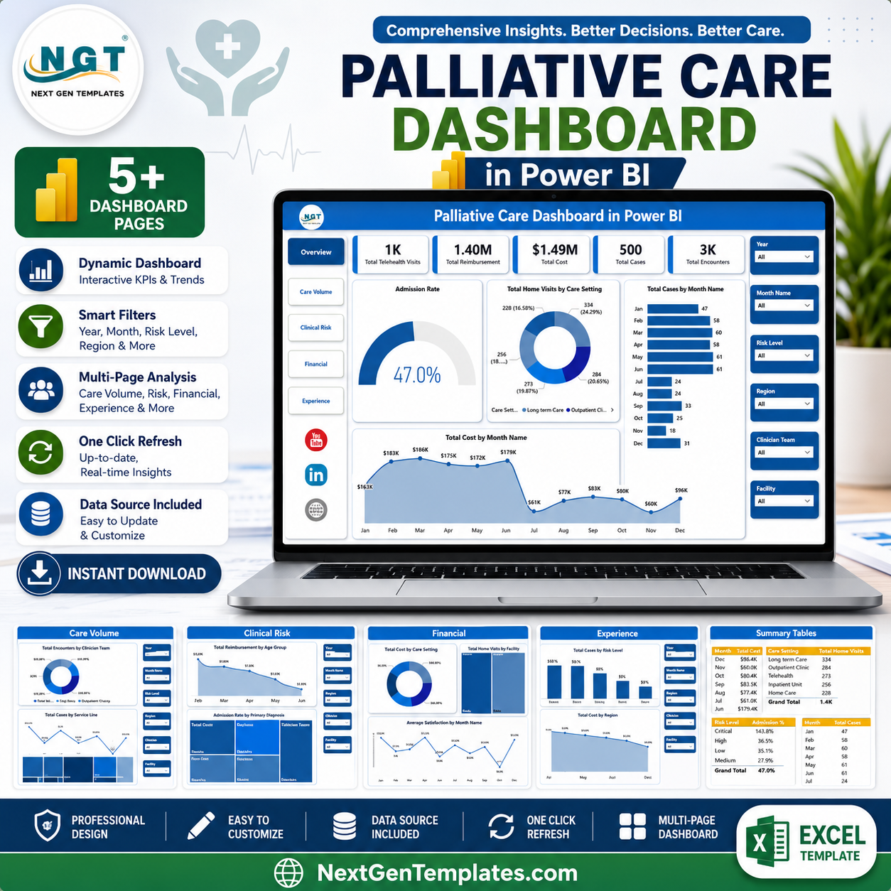



Palliative Care Dashboard in Power BI helps hospice leaders, palliative care coordinators, clinical analysts, finance teams, and healthcare administrators review telehealth visits, reimbursements, cost, cases, encounters, admissions, home visits, diagnosis, payer type, care setting, referral source, region, and satisfaction in one editable Power BI report. MedPAC reported that in 2023, more than 1.7 million Medicare beneficiaries received hospice services and Medicare hospice spending reached about $25.7 billion. When care quality, access, reimbursement, and cost all need attention, this dashboard gives your team a ready reporting layer. Built by PK, trusted by 300K+ subscribers, with one-time pricing, instant download, and editable PBIX access.
Key Features of Palliative Care Dashboard in Power BI
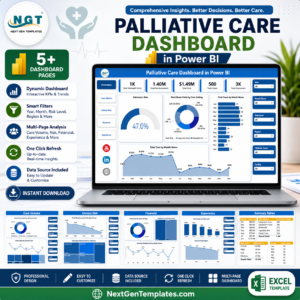
- 5 Power BI pages: Overview, Care Volume, Clinical Risk, Financial, and Experience.
- 5 executive KPI cards: Total Telehealth Visits, Total Reimbursement, Total Cost, Total Cases, and Total Encounters.
- 17 analysis visuals: Review admissions, home visits, cost, reimbursement, cases, encounters, diagnosis, age group, payer, care setting, facility, service line, referral source, region, and satisfaction.
- Interactive slicers: Filter the report quickly during clinical, operational, or financial review meetings.
- Editable PBIX file: Open in Power BI Desktop and connect or replace the sample source with your own prepared data.
- Healthcare-focused layout: Built around palliative care workflow, care volume, clinical risk, financial review, and patient experience.
What’s Inside the Palliative Care Dashboard in Power BI
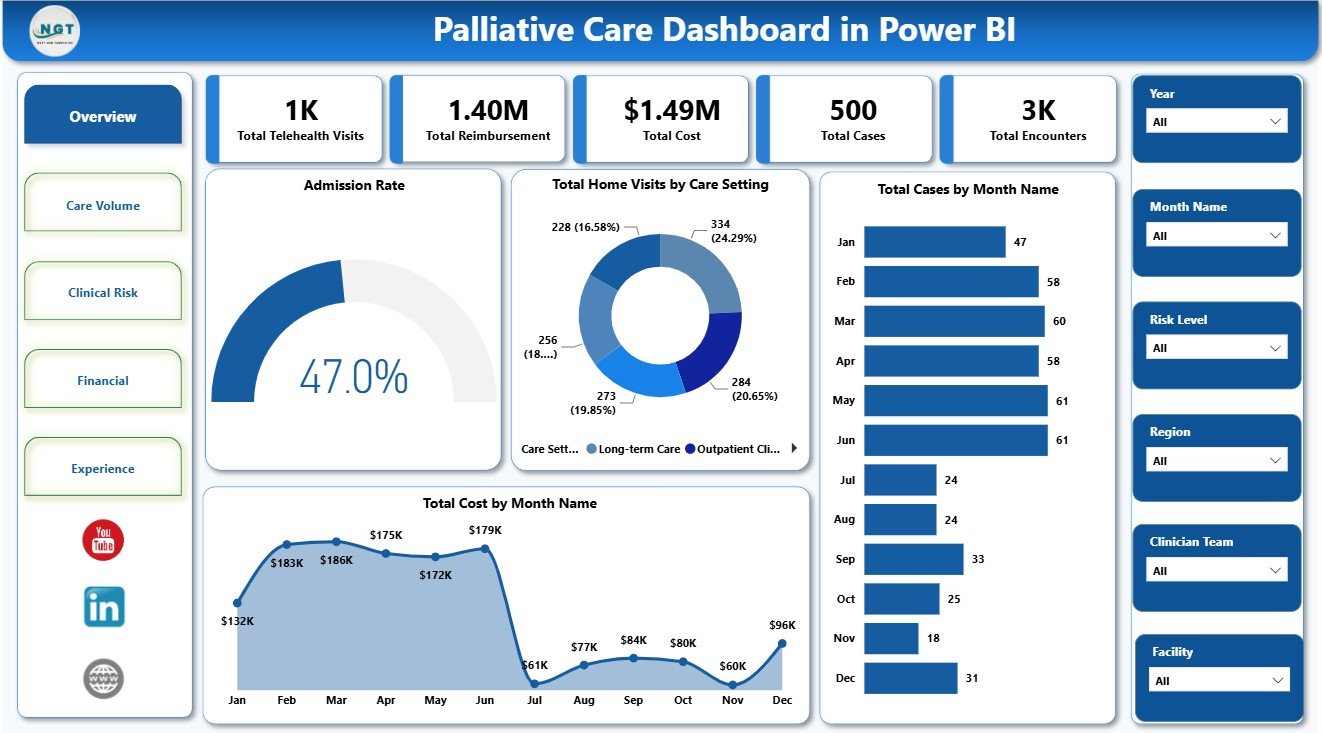
1 – Overview Page
The Overview page gives leadership a high-level snapshot of palliative care performance. KPI cards show Total Telehealth Visits, Total Reimbursement, Total Cost, Total Cases, and Total Encounters for a fast view of access, workload, revenue, and cost.
Admission Rate by Overall Cases: Shows admission rate against the selected case base. It helps teams see whether specific facilities, diagnoses, regions, or periods are connected with higher hospital admission exposure.
Total Home Visits by Care Setting: Compares home visit volume across care settings. It helps managers understand where in-person care activity is concentrated and where staffing or outreach may need review.
Total Cases by Month Name: Tracks monthly case movement so care teams can identify demand changes, seasonal patterns, and periods that may need additional planning.
Total Cost by Month Name: Shows how cost changes month by month. It supports finance reviews, budget monitoring, and follow-up when spending rises outside expectation.
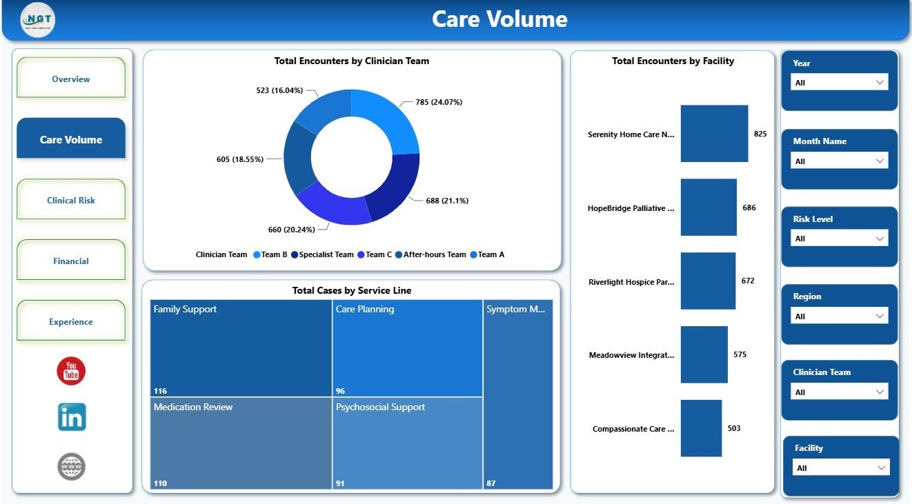
2 – Care Volume
The Care Volume page focuses on workload distribution across teams, facilities, and services. Total Encounters by Clinician Team compares encounter volume by team, helping managers review workload balance. Total Encounters by Facility highlights which facilities handle the largest service volume. Total Cases by Service Line shows the service areas carrying the most cases for capacity and planning discussions.

3 – Clinical Risk
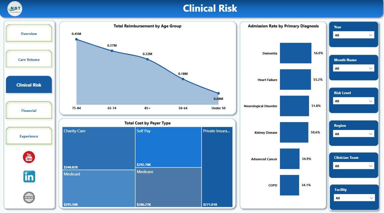
The Clinical Risk page connects reimbursement, diagnosis, cost, and payer mix. Total Reimbursement by Age Group helps teams compare reimbursement distribution across patient age bands. Admission Rate by Primary Diagnosis shows which diagnoses are associated with higher admission risk. Total Cost by Payer Type supports payer-level cost review and financial analysis.
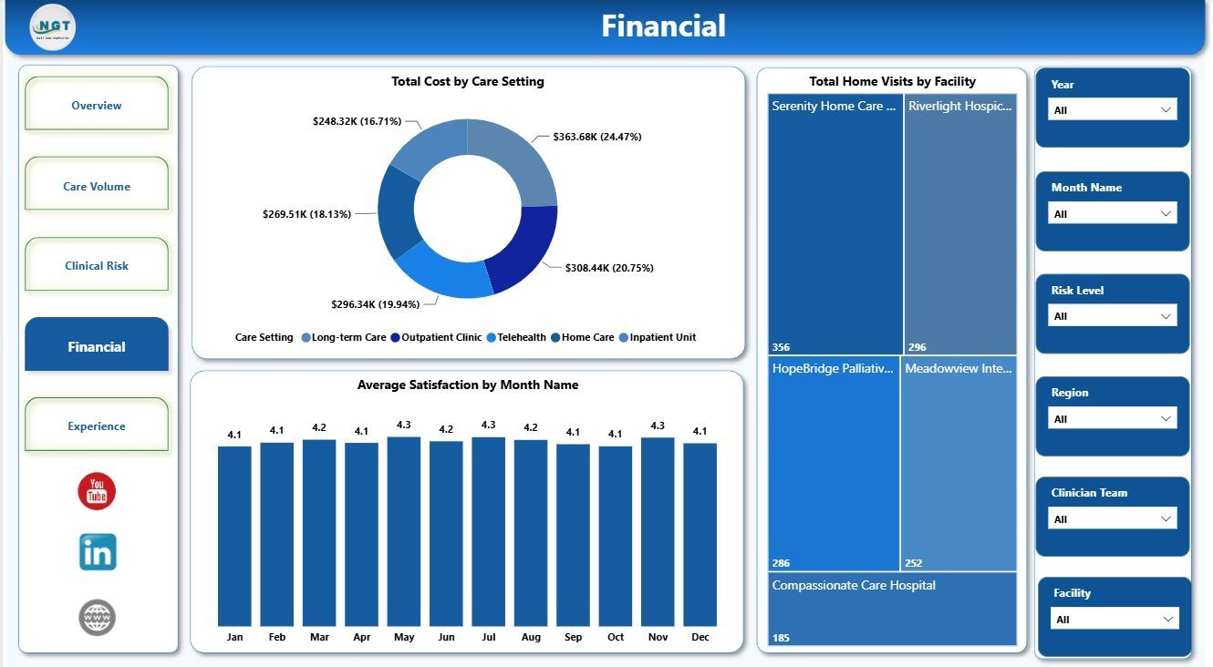
4 – Financial
The Financial page helps users review cost, visit activity, and satisfaction together. Total Cost by Care Setting shows where spending is concentrated across delivery settings. Total Home Visits by Facility compares facility-level visit activity. Average Satisfaction by Month Name tracks patient or family experience movement over time.

5 – Experience
The Experience page supports risk, referral, and regional review. Total Cases by Risk Level shows how the case mix is distributed by patient risk. Total Cost by Referral Source helps users compare the financial profile of different referral channels. Total Cost by Region highlights geographic cost concentration for regional performance conversations.

Palliative Care Dashboard in Power BI vs. Tableau vs. Paid CRM/SaaS – Where This Fits
| Feature | This Power BI dashboard | Tableau or Qlik alternative | Paid healthcare SaaS |
|---|---|---|---|
| Cost | $17.99 sale price, one-time | License cost plus dashboard build time | Monthly or annual subscription |
| Platform | Power BI Desktop and optional Power BI Service | Tableau or Qlik environment | Vendor cloud system |
| Setup time | Open PBIX, replace or connect data, refresh | Build model, measures, and visuals manually | Implementation and onboarding |
| Real-time team collaboration | Available after publishing to Power BI Service | Available by platform plan | Usually included by plan |
| Mobile access | Power BI mobile app after publishing | Vendor mobile app | Usually included |
| Customizable fields | Edit pages, slicers, visuals, measures, and data model | Editable with analyst skills | Often limited by vendor configuration |
| Share with link | Available through Power BI permissions | Available through platform permissions | Usually login controlled |
| Year-1 cost at 5 users | Template price plus any Microsoft licensing | License cost plus analyst time | Often hundreds or thousands |
| Palliative care reporting | Built for cases, encounters, telehealth, visits, admissions, reimbursement, cost, risk, payer, region, referral source, and satisfaction | Requires custom design | Depends on reporting module and export access |
Who This Template Is For – and Who It’s Not For
This template is for hospice and palliative care administrators, clinical operations managers, care coordinators, nurse leaders, healthcare analysts, finance teams, and consultants who already have structured data and need a repeatable Power BI report.
It is not an EHR, claims processing platform, clinical decision support system, patient registry, billing engine, compliance system, or live admission feed. Use it after your operational data has been exported or prepared for reporting.
How to Use the Palliative Care Dashboard in Power BI
- Download and unzip the product file.
- Open the PBIX file in Power BI Desktop.
- Review the sample pages, cards, slicers, and charts.
- Replace the sample source or connect your own structured palliative care dataset.
- Refresh the report and validate the cards and visuals.
- Use slicers to filter by month, facility, team, service line, diagnosis, payer, region, referral source, care setting, or risk level.
- Publish to Power BI Service if your team needs browser access, sharing, or scheduled refresh.
Real-World Use Cases
Maria, palliative care program director: reviews cases, encounters, admissions, telehealth visits, and care-setting activity before weekly leadership meetings.
James, healthcare finance analyst: compares reimbursement, cost, payer type, month, region, and referral source to identify financial pressure points.
Anita, quality improvement lead: tracks admission rate by diagnosis, risk-level case mix, and monthly satisfaction trends for performance improvement discussions.
Frequently Asked Questions
What does this Power BI dashboard track?
It tracks telehealth visits, reimbursement, cost, cases, encounters, admission rate, home visits, clinician team, facility, service line, age group, diagnosis, payer type, care setting, satisfaction, risk level, referral source, region, and month.
Do I need Power BI Desktop?
Yes. Open the PBIX file in Power BI Desktop, which is free from Microsoft. Power BI Service is optional for sharing and scheduled refresh.
Can I use my own data?
Yes. Replace or connect the sample source with your own structured dataset, then refresh the report.
Can I customize the dashboard?
Yes. You can edit report pages, visuals, measures, slicers, labels, colors, and source connections in Power BI Desktop.
Is this a clinical system?
No. It is an analytics dashboard for prepared data, not an EHR, clinical decision tool, claims system, billing product, or care plan platform.
Is this a subscription?
No. It is a one-time downloadable Power BI template purchase.
About the Author
Built by PK – Microsoft Certified Professional with 15+ years of Excel, Google Sheets, and Power BI experience. Founder of NextGenTemplates, reaching 300K+ subscribers across YouTube channels. Every template is hand-built and tested before release.
Explore Related Templates
Pair this dashboard with Palliative Care Dashboard in Excel, Palliative Care KPI Dashboard in Power BI, and Online Therapy Apps Dashboard in Power BI. Browse more Power BI Dashboard templates and Power BI templates.
Read the detailed blog post: Palliative Care Dashboard in Power BI Template.
Download the Palliative Care Dashboard in Power BI to review palliative care volume, risk, reimbursement, cost, admissions, and experience in one editable report.
Last updated: July 19, 2026.
Watch the step-by-step video tutorial:
Compatibility and Requirements
- Works in Power BI Desktop, which is free from Microsoft. Open the PBIX file there to edit pages, visuals, slicers and the data source.
- Power BI Service is optional and only needed for browser access, sharing and scheduled refresh. Microsoft explains the download in Get Power BI Desktop.


















Reviews
There are no reviews yet.